These projects have at least one thing in common: there is a list of items everywhere. For example, a list of phonebook contacts or a list of your profile settings.
Our projects use RecyclerView for lists. I am not going to tell you how to write an Adapter for the RecyclerView or how to update the data in the list correctly. In my article I will tell you about another important and often overlooked component - RecyclerView.ItemDecoration, I will show you how to use it for list layout and what it can do.

In addition to the data in the list, the RecyclerView also contains important decorative elements, for example, cell separators, scroll bars. And here RecyclerView.ItemDecoration will help us to draw the entire decor and not produce unnecessary Views in the layout of the cells and the screen.
ItemDecoration is an abstract class with 3 methods:
Method for rendering decor before rendering ViewHolder
public void onDraw(Canvas c, RecyclerView parent, State state)Method for rendering decor after rendering ViewHolder
public void onDrawOver(Canvas c, RecyclerView parent, State state)Method for indenting ViewHolder when filling RecyclerView
public void getItemOffsets(Rect outRect, View view, RecyclerView parent, State state)By the signature of the onDraw * methods, you can see that 3 main components are used to draw the decor.
- Canvas - for rendering the necessary decor
- RecyclerView - for accessing the parameters of the RecyclerVIew itself
- RecyclerView.State - contains information about the state of the RecyclerView
Connecting to RecyclerView
There are two methods to connect an ItemDecoration instance to the RecyclerView:
public void addItemDecoration(@NonNull ItemDecoration decor)
public void addItemDecoration(@NonNull ItemDecoration decor, int index)
All connected RecyclerView.ItemDecoration instances are added to one list and all are rendered at once.
Also RecyclerView has additional methods for manipulating ItemDecoration.
Removing ItemDecoration by Index
public void removeItemDecorationAt(int index)Removing an ItemDecoration instance
public void removeItemDecoration(@NonNull ItemDecoration decor)Get ItemDecoration by index
public ItemDecoration getItemDecorationAt(int index)Get current count of connected ItemDecoration in RecyclerView
public int getItemDecorationCount()Redraw current ItemDecoration list
public void invalidateItemDecorations()The SDK already has heirs to RecyclerView.ItemDecoration, for example, DeviderItemDecoration. It allows you to draw separators for cells.
It works very simply, you need to use a drawable and DeviderItemDecoration will draw it as a cell separator.
Let's create divider_drawable.xml:
<shape xmlns:android="http://schemas.android.com/apk/res/android"
    android:shape="rectangle">
    <size android:height="1dp" />
    <solid android:color="@color/gray_A700" />
</shape>
And connect the DividerItemDeoration to the RecyclerView:
val dividerItemDecoration = DividerItemDecoration(this, RecyclerView.VERTICAL)
dividerItemDecoration.setDrawable(resources.getDrawable(R.drawable.divider_drawable))
recycler_view.addItemDecoration(dividerItemDecoration)
We get:
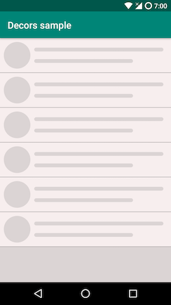
Ideal for simple occasions.
Everything is elementary under the "hood" of DeviderItemDecoration:
final int childCount = parent.getChildCount();
for (int i = 0; i < childCount; i++) {
     final View child = parent.getChildAt(i);
     parent.getDecoratedBoundsWithMargins(child, mBounds);
     final int bottom = mBounds.bottom + Math.round(child.getTranslationY());
     final int top = bottom - mDivider.getIntrinsicHeight();
     mDivider.setBounds(left, top, right, bottom);
     mDivider.draw(canvas);
}
For each onDraw (...) call, loop through all the current View in the RecyclerView and draw the passed drawable.
But the screen can contain more complex layout elements than a list of identical elements. The screen may include:
a. Several types of cells;
b. Several types of dividers;
c. Cells can have rounded edges;
d. Cells can have different vertical and horizontal indents depending on some conditions;
e. All of the above at once.
Let's look at point e. Let's set ourselves a difficult task and consider its solution.
Task:
- There are 3 kinds of unique cells on the screen, let's call them a, b and c .
- All cells are indented 16dp horizontally.
- Cell b also has a vertical offset of 8dp.
- Cell a has rounded edges at the top if it is the first cell in the group and at the bottom if it is the last cell in the group.
- Dividers are drawn between cells with, BUT there should not be a divider after the last cell in the group.
- A picture with a parallax effect is drawn against the background of cell c .
It should end up like this:
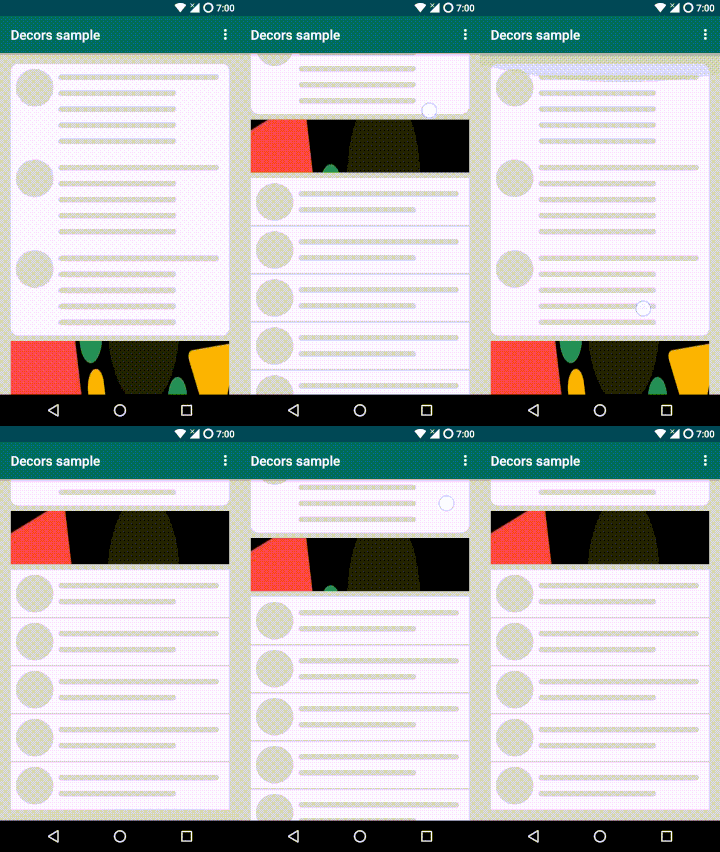
Consider the options for solving:
Filling the list with cells of different types.
You can write your own Adapter, or you can use your favorite library.
I will be using EasyAdapter .
Indenting cells.
There are three ways:
- Set paddingStart and paddingEnd for RecyclerView.
This solution will not work if not all cells have the same indentation. - Set layout_marginStart and layout_marginEnd on the cell.
All cells in the list will have to be indented the same. - Write an ItemDecoration implementation and override the getItemOffsets method.
Even better, the solution will be more versatile and reusable.
Rounding corners for groups of cells.
The solution seems obvious: I want to immediately add some enum {Start, Middle, End} and put it in the cell along with the data. But the cons immediately pop up:
- The data model in the list gets more complicated.
- For such manipulations, you will have to calculate in advance which enum to assign to each cell.
- After deleting / adding an element to the list, you will have to recalculate it.
- ItemDecoration. You can understand which cell in the group is and correctly draw the background in the onDraw * ItemDecoration method.
Drawing dividers.
Drawing dividers inside a cell is a bad practice, as the result will be a complicated layout, complex screens will have problems with dynamic displaying of dividers. And so ItemDecoration wins again. The ready-made DeviderItemDecoration from the sdk will not work for us, since it draws dividers after each cell, and this cannot be solved out of the box. You need to write your own implementation.
Parallax on the background of the cell.
An idea may come to mind to put the RecyclerView OnScrollListener and use some custom View to render the picture. But here again ItemDecoration will help us out, since it has access to the Canvas Recycler and all the necessary parameters.
In total, we need to write at least 4 ItemDecoration implementations. It is very good that we can reduce all the points to working only with ItemDecoration and not touch the layout and business logic of the feature. Plus, all ItemDecoration implementations can be reused if we have similar cases in the application.
However, over the past few years, complex lists have appeared in our projects more and more often and each time we had to write an ItemDecoration set for the needs of the project. A more universal and flexible solution was needed so that it could be reused on other projects.
What goals did you want to achieve:
- Write as few ItemDecoration heirs as possible.
- Separate the rendering logic on the Canvas and the padding.
- Have the benefits of working with onDraw and onDrawOver methods.
- Make decorators more flexible in customization (for example, drawing dividers by condition, rather than all cells).
- Make a decision without reference to Dividers, because ItemDecoration is capable of more than drawing horizontal and vertical lines.
- This can be easily exploited by looking at the sample project.
As a result, we have a RecyclerView decorator library .
The library has a simple Builder interface, separate interfaces for working with Canvas and indents, as well as the ability to work with onDraw and onDrawOver methods. ItemDecoration implementation is only one.
Let's go back to our problem and see how to solve it using the library.
Our decorator's Builder looks simple:
Decorator.Builder()
            .underlay()
            ...
            .overlay()
            ...
            .offset()
            ...
            .build()
- .underlay (...) - needed for rendering under the ViewHolder.
- .overlay (...) - needed to draw over the ViewHolder.
- .offset (...) - used to set the offset of the ViewHolder.
There are 3 interfaces used for drawing decor and setting indents.
- RecyclerViewDecor - Renders the decor to the RecyclerView.
- ViewHolderDecor - Renders the decor to the RecyclerView, but gives access to the ViewHolder.
- OffsetDecor - used to set indents.
But that's not all. ViewHolderDecor and OffsetDecor can be bound to a specific ViewHolder using viewType, which allows you to combine several types of decors on one list or even cell. If the viewType is not passed, then the ViewHolderDecor and OffsetDecor will apply to all ViewHolders in the RecyclerView. RecyclerViewDecor does not have such an opportunity, since it is designed to work with RecyclerView in general, and not with ViewHolders. Plus, the same ViewHolderDecor / RecyclerViewDecor instance can be passed both to overlay (...) or underlay (...).
Let's start writing the code
The EasyAdapter library uses ItemControllers to create a ViewHolder. In short, they are responsible for creating and identifying the ViewHolder. For our example, one controller is enough, which can display different ViewHolders. The main thing is that the viewType is unique for each cell layout. It looks like this:
private val shortCardController = Controller(R.layout.item_controller_short_card)
private val longCardController = Controller(R.layout.item_controller_long_card)
private val spaceController = Controller(R.layout.item_controller_space)
To set the indents, we need a descendant of OffsetDecor:
class SimpleOffsetDrawer(
    private val left: Int = 0,
    private val top: Int = 0,
    private val right: Int = 0,
    private val bottom: Int = 0
) : Decorator.OffsetDecor {

    constructor(offset: Int) : this(offset, offset, offset, offset)

    override fun getItemOffsets(
        outRect: Rect,
        view: View,
        recyclerView: RecyclerView,
        state: RecyclerView.State
    ) {
        outRect.set(left, top, right, bottom)
    }
}
To draw rounded corners, ViewHolder needs an inheritor of ViewHolderDecor. Here we need an OutlineProvider so that the press-state is also clipped at the edges.
class RoundDecor(
    private val cornerRadius: Float,
    private val roundPolitic: RoundPolitic = RoundPolitic.Every(RoundMode.ALL)
) : Decorator.ViewHolderDecor {

    override fun draw(
        canvas: Canvas,
        view: View,
        recyclerView: RecyclerView,
        state: RecyclerView.State
    ) {

        val viewHolder = recyclerView.getChildViewHolder(view)
        val nextViewHolder =
            recyclerView.findViewHolderForAdapterPosition(viewHolder.adapterPosition + 1)
        val previousChildViewHolder =
            recyclerView.findViewHolderForAdapterPosition(viewHolder.adapterPosition - 1)

        if (cornerRadius.compareTo(0f) != 0) {
            val roundMode = getRoundMode(previousChildViewHolder, viewHolder, nextViewHolder)
            val outlineProvider = view.outlineProvider
            if (outlineProvider is RoundOutlineProvider) {
                outlineProvider.roundMode = roundMode
                view.invalidateOutline()
            } else {
                view.outlineProvider = RoundOutlineProvider(cornerRadius, roundMode)
                view.clipToOutline = true
            }
        }
    }
}
To draw dividers, we will write one more ViewHolderDecor heir:
class LinearDividerDrawer(private val gap: Gap) : Decorator.ViewHolderDecor {

    private val dividerPaint = Paint(Paint.ANTI_ALIAS_FLAG)
    private val alpha = dividerPaint.alpha

    init {
        dividerPaint.color = gap.color
        dividerPaint.strokeWidth = gap.height.toFloat()
    }

    override fun draw(
        canvas: Canvas,
        view: View,
        recyclerView: RecyclerView,
        state: RecyclerView.State
    ) {
        val viewHolder = recyclerView.getChildViewHolder(view)
        val nextViewHolder = recyclerView.findViewHolderForAdapterPosition(viewHolder.adapterPosition + 1)

        val startX = recyclerView.paddingLeft + gap.paddingStart
        val startY = view.bottom + view.translationY
        val stopX = recyclerView.width - recyclerView.paddingRight - gap.paddingEnd
        val stopY = startY

        dividerPaint.alpha = (view.alpha * alpha).toInt()

        val areSameHolders =
            viewHolder.itemViewType == nextViewHolder?.itemViewType ?: UNDEFINE_VIEW_HOLDER

        val drawMiddleDivider = Rules.checkMiddleRule(gap.rule) && areSameHolders
        val drawEndDivider = Rules.checkEndRule(gap.rule) && areSameHolders.not()

        if (drawMiddleDivider) {
            canvas.drawLine(startX.toFloat(), startY, stopX.toFloat(), stopY, dividerPaint)
        } else if (drawEndDivider) {
            canvas.drawLine(startX.toFloat(), startY, stopX.toFloat(), stopY, dividerPaint)
        }
    }
}
To configure our divader, we will use the Gap.kt class:
class Gap(
    @ColorInt val color: Int = Color.TRANSPARENT,
    val height: Int = 0,
    val paddingStart: Int = 0,
    val paddingEnd: Int = 0,
    @DividerRule val rule: Int = MIDDLE or END
)
It will help to adjust the color, height, horizontal padding and drawing rules of the
divider. The last inheritor of ViewHolderDecor remains. For drawing a picture with a parallax effect.
class ParallaxDecor(
    context: Context,
    @DrawableRes resId: Int
) : Decorator.ViewHolderDecor {

    private val image: Bitmap? = AppCompatResources.getDrawable(context, resId)?.toBitmap()

    override fun draw(
        canvas: Canvas,
        view: View,
        recyclerView: RecyclerView,
        state: RecyclerView.State
    ) {

        val offset = view.top / 3
        image?.let { btm ->
            canvas.drawBitmap(
                btm,
                Rect(0, offset, btm.width, view.height + offset),
                Rect(view.left, view.top, view.right, view.bottom),
                null
            )
        }
    }
}
Let's put everything together now.
private val decorator by lazy {
        Decorator.Builder()
            .underlay(longCardController.viewType() to roundDecor)
            .underlay(spaceController.viewType() to paralaxDecor)
            .overlay(shortCardController.viewType() to dividerDrawer2Dp)
            .offset(longCardController.viewType() to horizontalOffsetDecor)
            .offset(shortCardController.viewType() to horizontalOffsetDecor)
            .offset(spaceController.viewType() to horizontalAndVerticalOffsetDecor)
            .build()
    }
We initialize the RecyclerView, add our decorator and controllers to it:
private fun init() {
        with(recycler_view) {
            layoutManager = LinearLayoutManager(this@LinearDecoratorActivityView)
            adapter = easyAdapter
            addItemDecoration(decorator)
            setPadding(0, 16.px, 0, 16.px)
        }

        ItemList.create()
            .apply {
                repeat(3) {
                    add(longCardController)
                }
                add(spaceController)
                repeat(5) {
                    add(shortCardController)
                }
            }
            .also(easyAdapter::setItems)
    }
That's all. The decor on our list is ready.
We managed to write a set of decorators that can be easily reused and flexibly customized.
Let's see how else decorators can be applied.
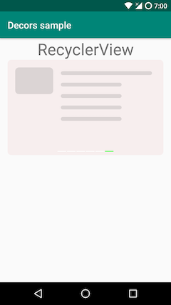
PageIndicator for horizontal RecyclerView
 |
|---|
| CarouselDecoratorActivityView.kt |
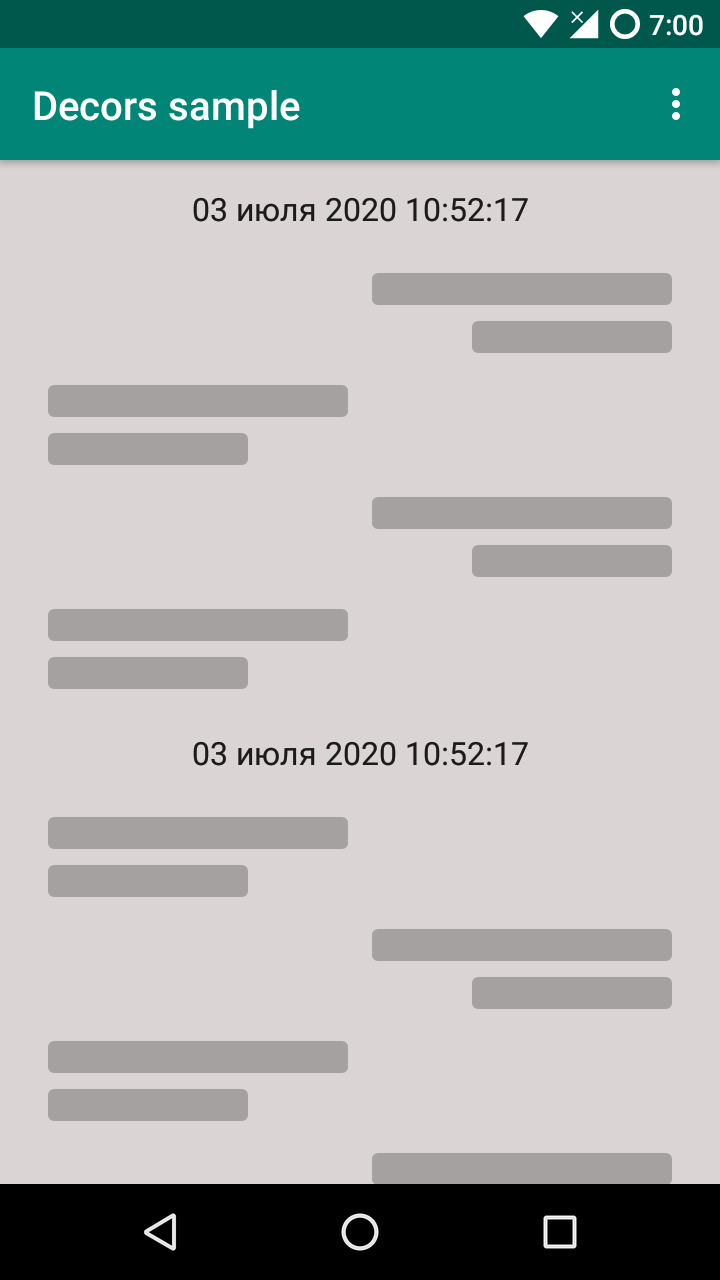
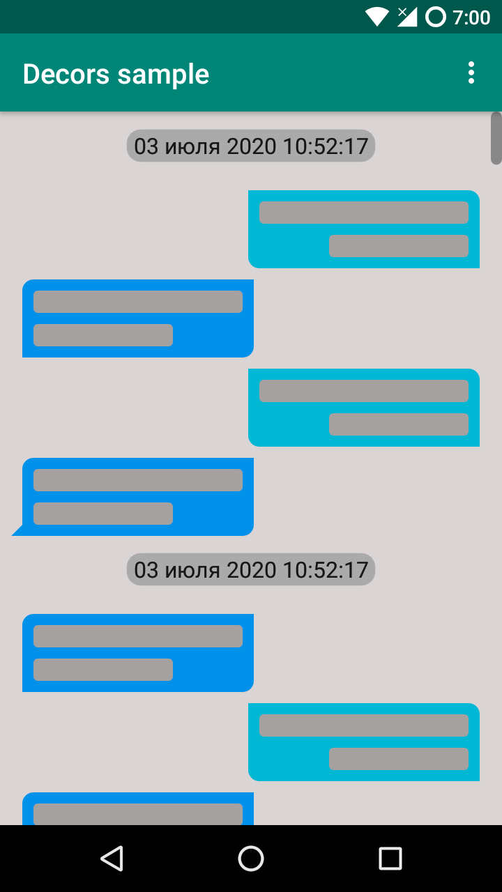
Bubble chat messages and scroll bar:
 |
 |
|---|---|
| ChatActivityView.kt | |
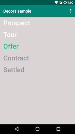
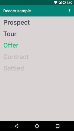
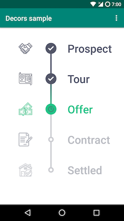
A more complex case - drawing shapes, icons, changing the theme without reloading the screen:
 |
 |
 |
 |
|---|---|---|---|
| TimeLineActivity.kt | |||
Sticky header
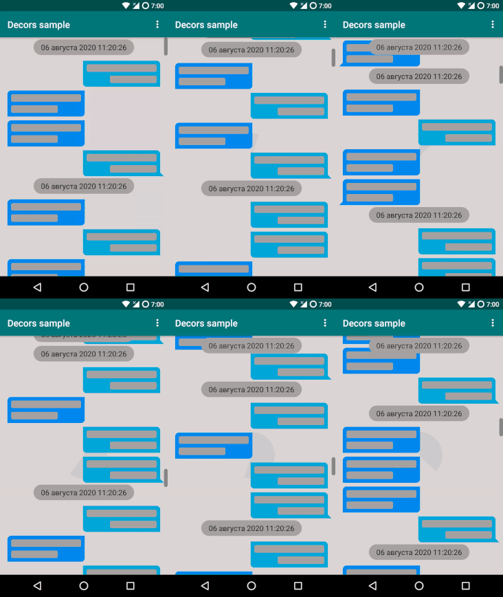 |
|---|
| StickyHeaderDecor.kt |
Source code with examples
Conclusion
Despite the simplicity of the ItemDecoration interface, it allows you to do complex things with the list without changing the layout. I hope I was able to show that this is a powerful enough tool and worthy of your attention. And our library will help you decorate your lists easier.
Thank you all for your attention, I will be glad to hear your comments.
UPD: 08/06/2020 added example for Sticky header