Here I will introduce some CSS properties that I hope you find worth considering. While talking about some of them that do not have perfect browser support, I will talk about how to apply them using progressive enhancement technology. This will allow you to enjoy these properties without worrying about browser support.

Using place-items property with CSS Grid

Example of using the place-items property
I learned about this trick from this tweet. The property
place-itemsallows you to center the element horizontally and vertically, while doing it with a minimum amount of CSS code.
Here is the HTML that was used to form the page from the previous figure:
<div class="hero">
    <div class="hero-wrapper">
        <h2><font color="#3AC1EF">CSS is awesome</font></h2>
        <p>Yes, this is a hero section made for fun.</p>
        <a href="#">See more</a>
    </div>
</div>
Here is the style code:
.hero {
    display: grid;
    place-items: center;
}
Before getting into the details, I think it's worth mentioning that a property
place-itemsis an abbreviation used to set properties justify-itemsand align-items. If this property were not used, then the above CSS code would look like this:
.hero {
    display: grid;
    justify-items: center;
    align-items: center;
}
You may be interested in the details of how this property works. Let me tell you about them. When a property
place-itemsis used, it is applied to every cell in the grid. This means that it will center-align the contents of all cells. That is, it can be used to style everything that is placed in the cells of the grid. To demonstrate this, let's look at styling a multi-cell grid:
.hero {
    display: grid;
    grid-template-columns: 1fr 1fr;
    place-items: center;
}
Using a style like this will produce the result shown in the following figure.
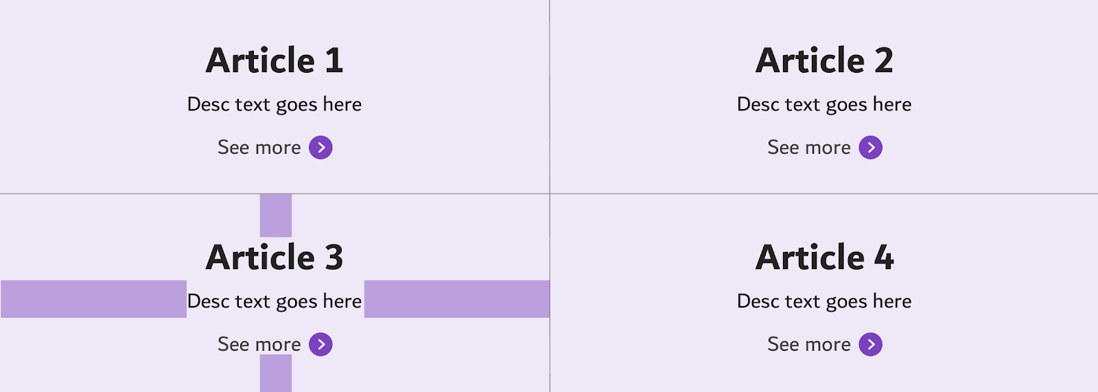
The contents of all cells are centered
Using the good old margin property with CSS Flexbox
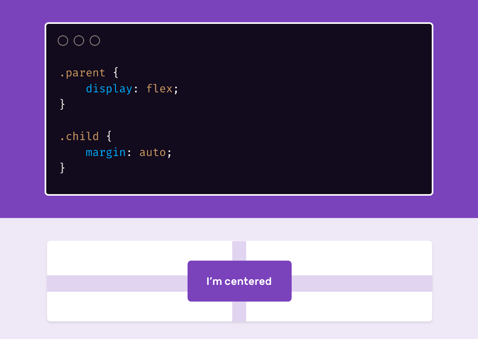
Aligning items to the center when working with a Flexbox layout
Using design
margin: autoin Flexbox layouts makes it very easy to center, horizontally and vertically align items.
Here's the markup:
<div class="parent">
    <div class="child"></div>
</div>
Here's the style:
.parent {
    width: 300px;
    height: 200px;
    background: #ccc;
    display: flex;
}

.child {
    width: 50px;
    height: 50px;
    background: #000;
    margin: auto;
}
Styling list bullets
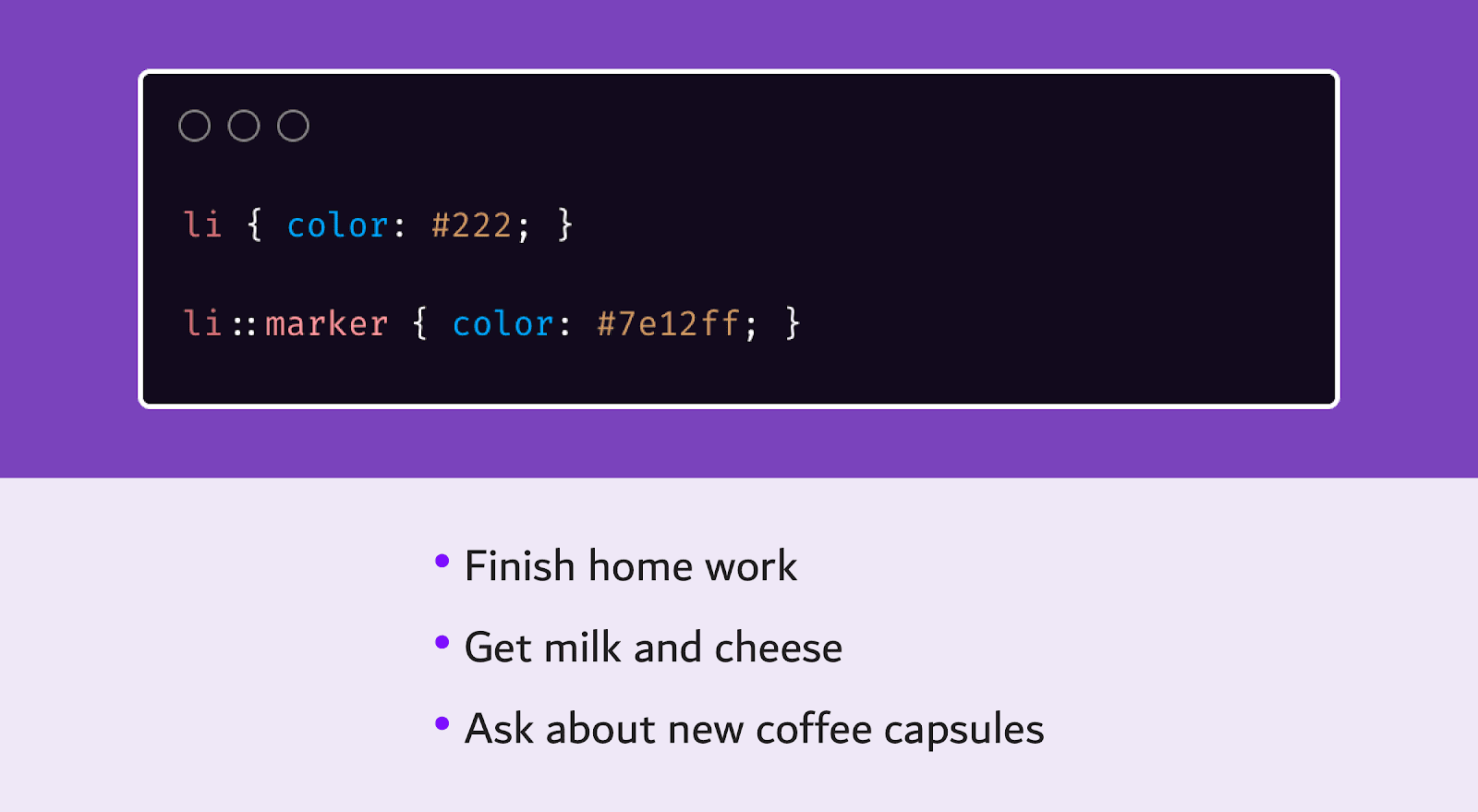
Stylized List
Bullets First, let me admit that I was unaware of the fact that the little circles next to each bulleted list item are called bullets. Before I knew about the existence of the pseudo-element
::marker, I set up these circles by resetting the list style and using the::beforeorpseudo-elements::after. But this is completely impractical and wrong. I mean the following:
ul {
    list-style: none;
    padding: 0;
}

li {
    color: #222;
}

li::before {
    content: "•";
    color: #ccc;
    margin-right: 0.5em;
}
As you can see, here the element color is
<li>set as #222, and the pseudo element color ::beforeis this #ccc. If you wanted y <li>and ::beforeto have the same color, then since the marker inherits the color <li>, there would be no need for the pseudo-element.
And here's how the same task is solved using
::marker:
li {
    color: #222;
}

li::marker {
    color: #ccc;
}
As for me, this approach is much simpler and more convenient than the one where the pseudo-element was used
::before.
The pseudo-element is
::marker supported in Firefox 68+ and Safari 11.1+. And in Chrome and Edge 80+ to enable its support, you need to activate the corresponding flag.
The text-align property
As the popularity of CSS Grid and CSS Flexbox grows, some developers who have just started using CSS often use modern mechanisms to center and align their content rather than the old property
text-align. But this property is still perfectly functional.
Use
text-align: centerallows you to quickly and conveniently align page materials. Let's look at an example.

Aligning content at the top of the page The
content of the section must be centered. What to use to layout this section? Flexbox or Grid? In fact, this problem can be easily solved by just using the property
text-align.
What about this property with browser support? I suggest you find out for yourself.
The inline-flex value of the display property

Using the inline-flex display property value
Have you ever needed to display multiple icons in a Flexbox container that is an inline element, making each of those icons a Flexbox element? The
inline-flexpropertyvalue is intended to solve this problemdisplay.
Here is the markup describing a set of elements:
<span class="badge"><svg></svg></span>
<span class="badge"><svg></svg></span>
<span class="badge"><svg></svg></span>
<span class="badge"><svg></svg></span>
Here's the code for styling these elements:
.badge {
    display: inline-flex; /*    */
    justify-content: center;
    align-items: center;
}
Next time you need an inline element with Flexbox layout functionality, be sure to use
inline-flex. It is very convenient.
Column-rule property
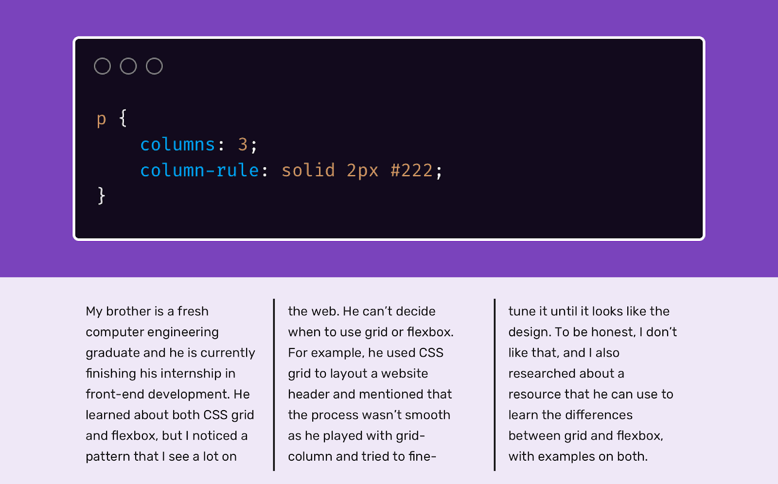
Applying the column-rule property Column-based
typesetting is a special technique for creating page layouts. When you use it, the elements are arranged in columns. Usually this technique is used to align text placed in elements
<p>. But multi-column layout has one feature that is used much less often than it should be. It's about the ability to add column separators. I learned about this from this article.
p {
    columns: 3;
    column-rule: solid 2px #222;
}
The name of the property
column-ruledoes not seem to accurately reflect its purpose. It would be more logical to name it, for example, "border-right". This property is very well supported by all current browsers (IE 10+, Firefox 3.5+, Chrome 4+, Safari 3.1+, Edge 12+).
The object-fit property
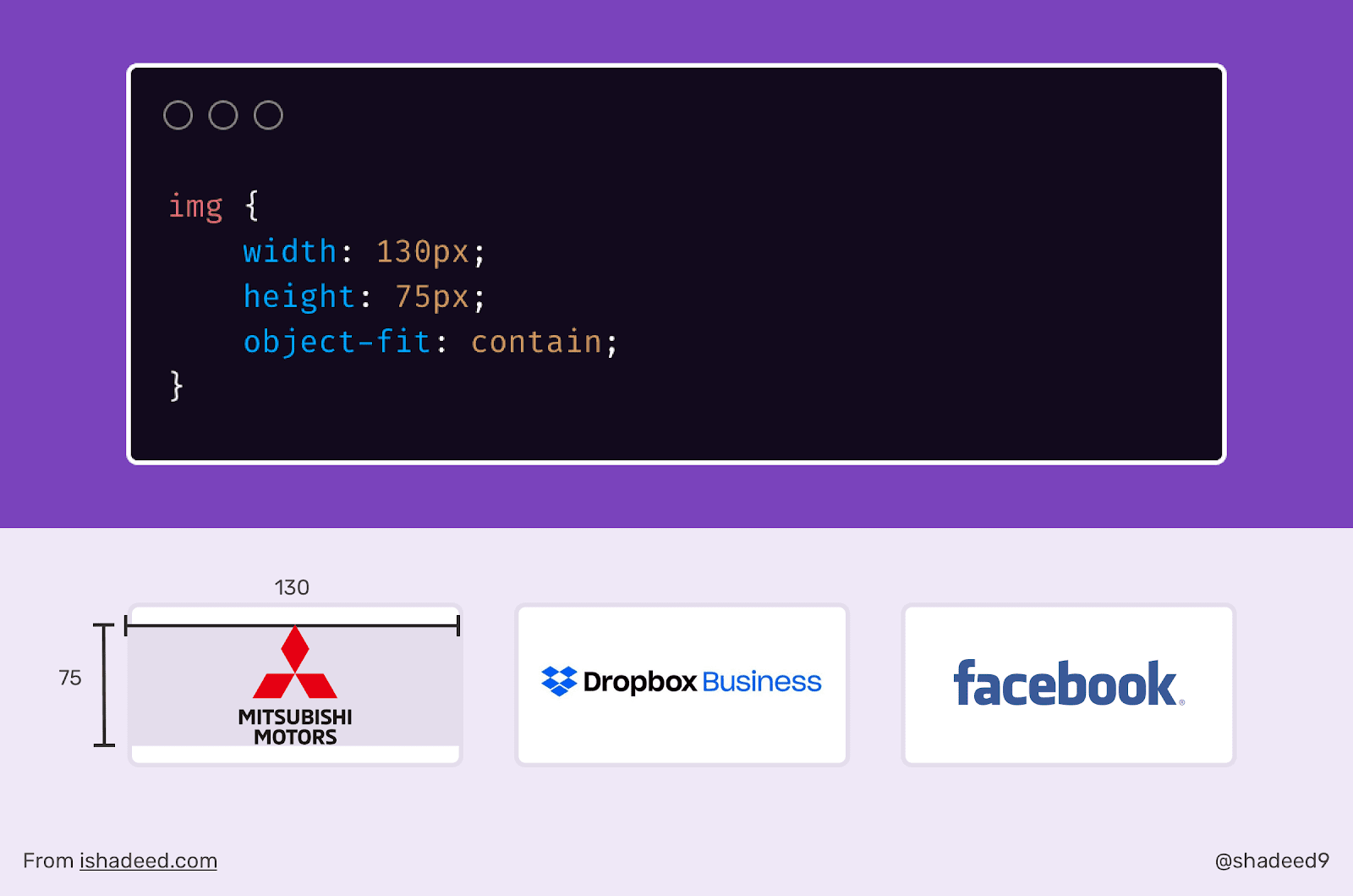
Applying the object-fit
property The CSS property
object-fitis a web designer's magic wand. When I found out about it, using it, I began to work in a new way, which made my life much easier. For example, I recently worked on a section of one site that displayed a set of logos. These sections are sometimes quite difficult to create due to the fact that the logos are of different sizes. Some of them are stretched horizontally, some are vertical.
Using the property
object-fit: containI was able to manipulate the propertieswidthandheightlogos, which allowed me to place the logos in areas with a predetermined width and height.
Here's the markup:
<ul class="brands">
    <li class="brands__item">
        <a href="#">
            <img src="img/logo.png" alt="">
        </a>
    </li>
    <li> <!--   --> </li>
</ul>
Here's the style:
img {
    width: 130px;
    height: 75px;
    object-fit: contain;
}
By setting properties
widthand heightelements <img>, we can control the area in which the logo will be placed. It is very convenient. Better yet, we can put the above code in a directive @supportsto avoid stretching images in browsers that don't support object-fit.
@supports (object-fit: contain) {
  img {
    object-fit: contain;
    height: 75px;
  }
}
Do you know about some interesting but little-known CSS properties?
