In this article, I'm going to look at different ways to place a group of logos on a page, different approaches to high-quality CSS alignment. I believe that web designers will like this article, as the techniques discussed in it will help them to simplify the solution of the problem of perfect alignment of logos in the corresponding sections of the sites they are working on.
A few words about design
Before we dive into the CSS and talk about how to best organize and style logos of various sizes, I would like to talk a little about how I, as a designer, work with logos in a custom application. I'll be talking about Sketch here, but you can use any other similar tool.
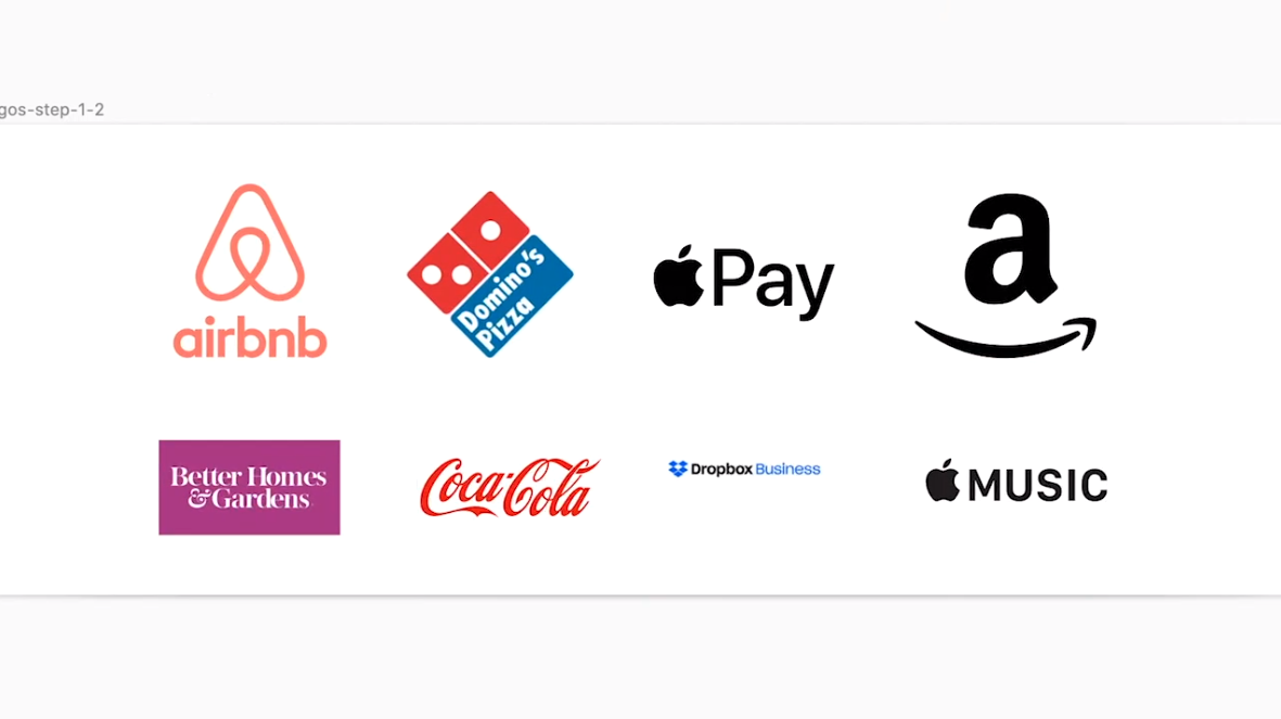
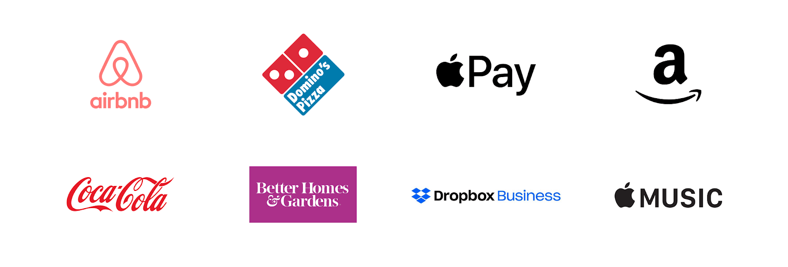
So, I have eight logos to be placed in the grid. The first thing I do is select them and drag them onto the Sketch workspace.

Logos
This bunch of logos looks pretty ugly. Let's fix this.
When highlighting logos, make sure that the ratio of their width to height is locked, and then bring their width or height to
150px. In this video shows the change in size of the logo and place them in the grid.
Placing logos in the grid
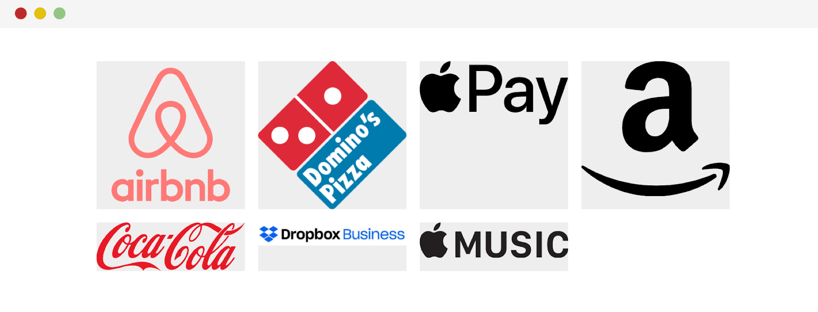
Please note that some logos appear larger than others. The Airbnb logo is the largest of all. In order to understand what is happening, I usually place them in rectangles. These rectangles help me better judge the size of the logos, their alignment in relation to each other and the distance between them.
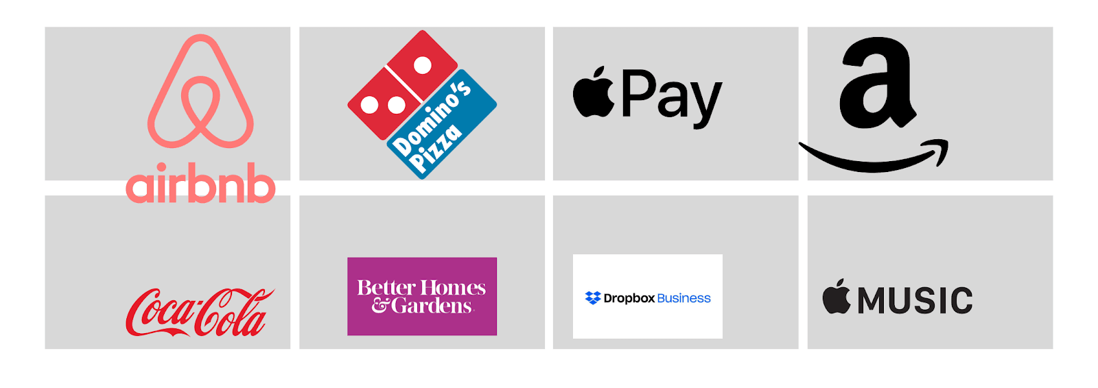
Analysis of logos
Keep in mind that the distance between all rectangles must be the same. In Sketch, this can be easily achieved by selecting a row, clicking on in the upper right corner
Tidy, and adjusting the distance. It is best if this distance is at least10px.
Now that we have drawn the rectangles onto the page, it becomes clearly visible that some of the logos are misaligned, that some of them are noticeably larger than others, and that some logos are completely in the wrong place. This is what happened after I adjusted the sizes of the logos and aligned them to the center.
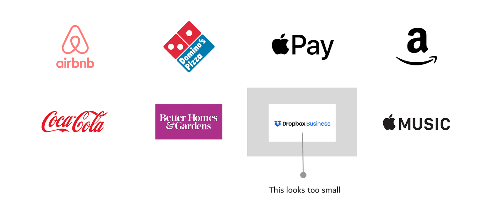
Result of resizing and aligning logos. The Dropbox Business logo looks too small after that
After resizing and aligning the logos, we discovered an issue with one of them - the Dropbox Business logo. To make this problem more noticeable, I left the corresponding auxiliary rectangle in the previous figure. For starters, this logo is oriented horizontally (it is very long) and also has a white background. You can fix this by cropping the background in Sketch and enlarging the logo.
Correcting the Dropbox Business logo
We now have a nice layout ready to be recreated with HTML and CSS. Keep in mind that in the following sections we will proceed from the assumption that you are a web programmer, and you, from the designer, got logos that no one paid much attention to the size of.
Implementing a layout for logos based on CSS Grid
Let's talk about how to create a section of a page containing logos, considering the following requirements:
- The logo section should follow the guidelines for responsive web design.
- The sizes of the logos should be as close to each other as possible. That is, it is not recommended that among the logos, for example, there would be some very large logo, and some very small one.
- It is necessary that the minimum / maximum sizes be set in advance for the logos.
Here's the HTML:
<ul class="brands">
    <li class="brands__item">
        <a href="#">
            <img src="img/logo.png" alt="">
        </a>
    </li>
    <li> <!--   --> </li>
</ul>
In this example, I will design a section layout using CSS Grid. But this should not limit you in the choice of technology for creating such sections. Use here what works for you and what browsers you are interested in support.
Here's the style:
.brands {
  display: grid;
  grid-template-columns: repeat(auto-fit, minmax(150px, 1fr));
  grid-gap: 1rem;
}

.brands__item {
    background: #eee;
}

.brands__item img {
    display: block;
    /*     max-width */
    max-width: 100%;
}
Getting started on the section of the site with logos
As you can see, as a result, it turned out that the logos take up the entire width of the parent elements. The sizes of the logos are not uniform. So let's start improving our section by setting up a property for logos
width:
.brands__item img {
    display: block;
    /*     max-width */
    max-width: 100%;
    width: 100px;
}
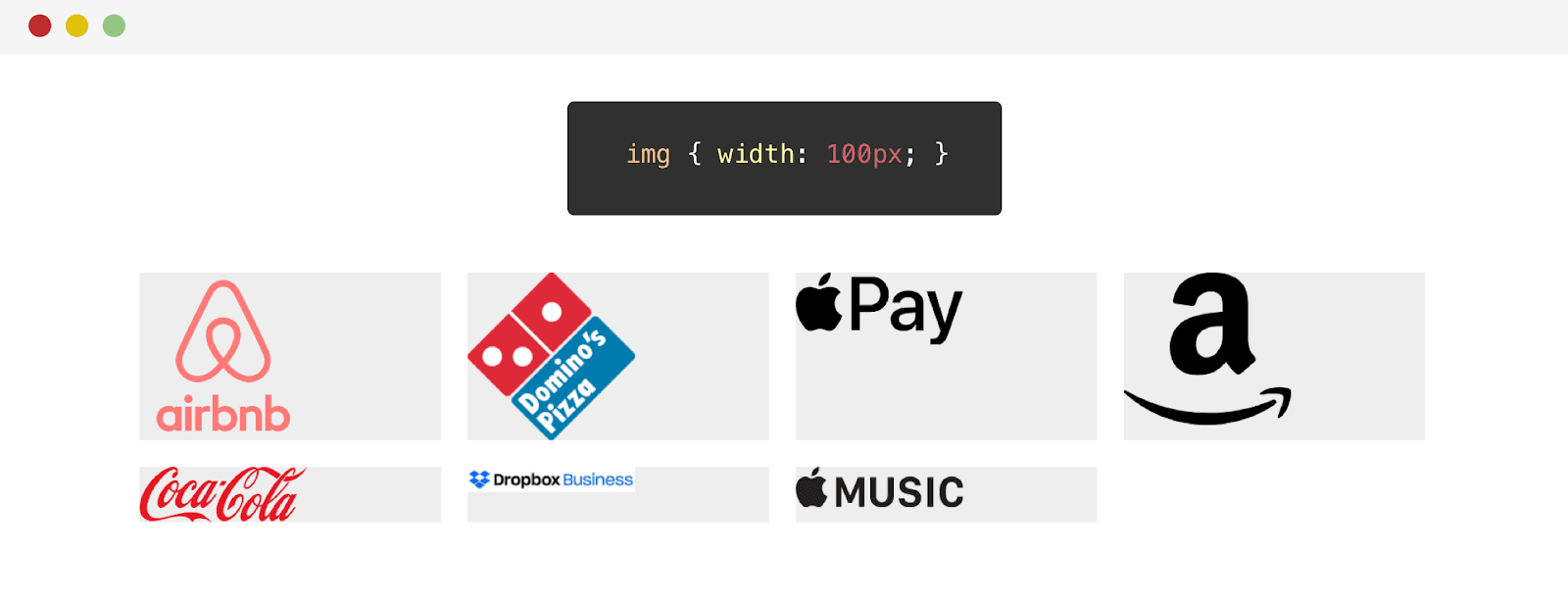
Result of adjusting the width of the logos
Changing the width has worked well on some logos. But, for example, the appearance of the Dropbox logo only worsened. The point is that this is a horizontal logo. Before looking at a solution to this problem, let's try adjusting the height of the logos:
.brands__item img {
    display: block;
    /*     max-width */
    max-width: 100%;
    height: 70px;
}
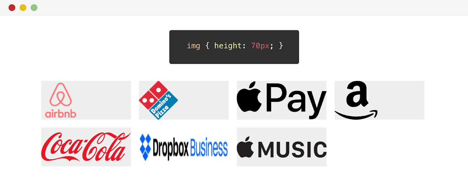
Result of adjusting the height of logos
So, we have a problem. The Dropbox logo is not well stretched in height. The point is that the height of this logo is less than that of others. As a result, the CSS value
heightfor this logo is too high. Its application leads to stretching of the logo out of proportion.
You can solve this problem by using the property
object-fit:
.brands__item img {
    /*   */
    object-fit: contain;
}
As a result, I will focus on the solution for now using the property
width.
Our next step will be to align the logos horizontally and vertically.
.brands__item a {
    display: flex;
    justify-content: center;
    align-items: center;
    height: 100%;
}
Flexbox styles made it possible to center logos. This is how they look now.
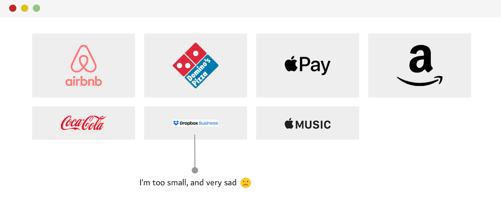
The logos are centered, but the Dropbox logo is too small.
Note that the Dropbox logo is too small. This allows us to conclude that the width setting alone is not suitable for it. How should we be? Another approach I tried to solve this problem that worked better than the width approach was to combine the
widthandpropertiesheight. But this, if you remember, led to the deformation of the logo. This, however, can be fixed using the propertyobject-fit: contain.
.brands__item img {
    width: 130px;
    height: 75px;
    object-fit: contain;
}
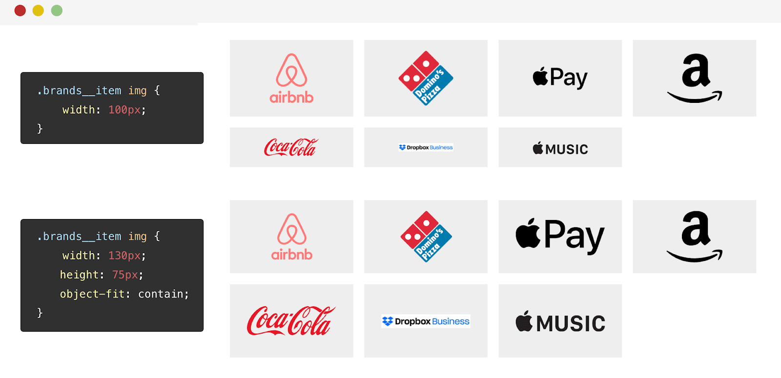
The results of applying different approaches to styling logos This
property is
object-fit: containgood in that it, regardless of the width or height of the logo, makes the image take up the space allotted to it and at the same time not distort.
About the directive supports and about the object-fit property
I, after the publication of this material, added this section to it. Namely, we are talking about using a directive
@supportsto detect browser support for a property object-fit. If the browser supports this property, then it is used together with the property height. This is to prevent logos from stretching in browsers that do not support object-fit. Thanks to Luis for the tip.
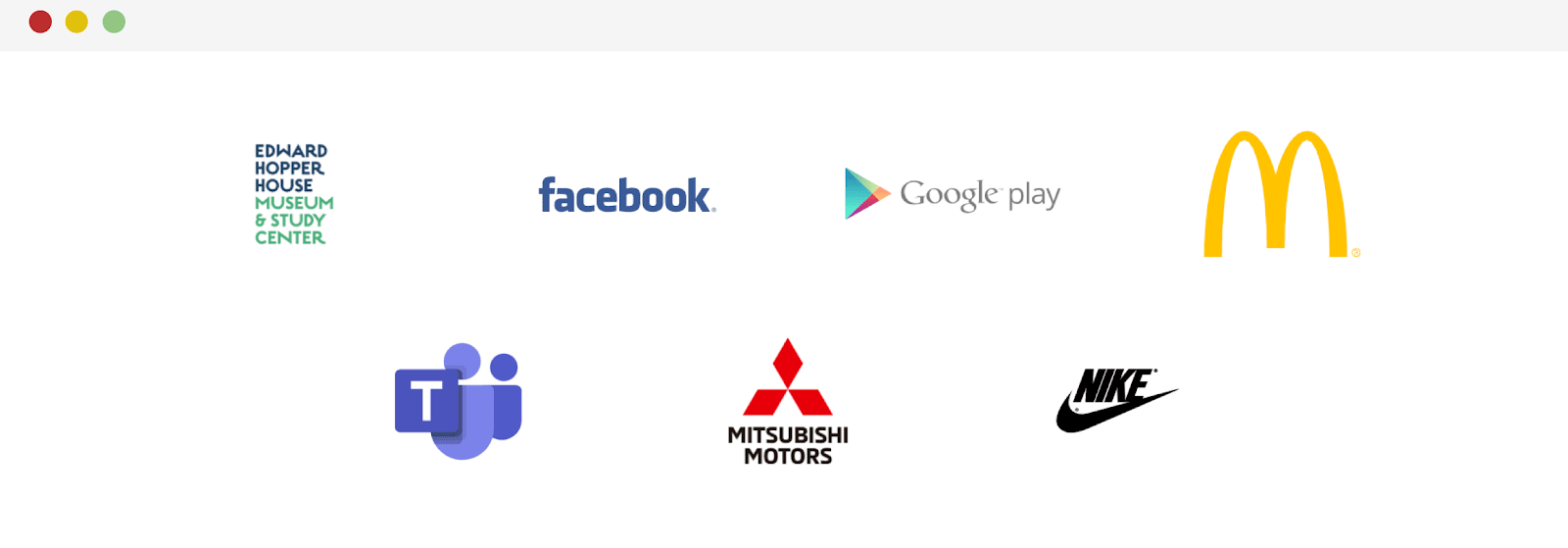
To make sure this technique works as expected, I tested it on another set of logos. I liked the result.
Using the object-fit property
Here I would like to demonstrate one illustration that is intended to show the strengths of the property
object-fit. Notice that in the following illustration, the logos are contained within two lines. If, given their aspect ratio, they are unable to fill all the space available to them, they are aligned in the center.
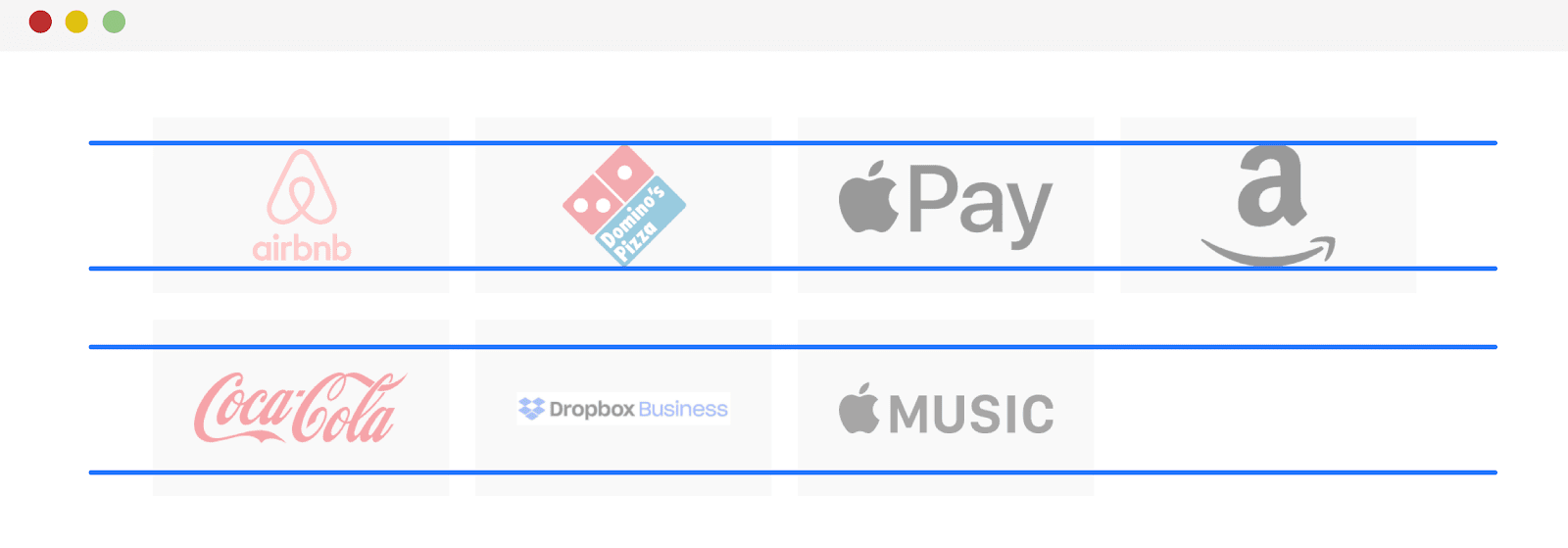
Analysis of logo placement
Using mix-blend-mode property to remove white background
The logos are placed on a gray background. Thanks to this, we can notice that some of them, being JPG images, have a white opaque background.
If you can't get your hands on a version of the logo image with a transparent background, you can still use the CSS property to get rid of the background
mix-blend-mode. With it, the white background will disappear as if by magic.
.brands__item img {
    width: 130px;
    height: 75px;
    object-fit: contain;
    mix-blend-mode: multiply;
}
It is done! The white background has disappeared. It is worth noting, though, that this technique can make some logos darker. For example - it happened with the McDonald's logo.
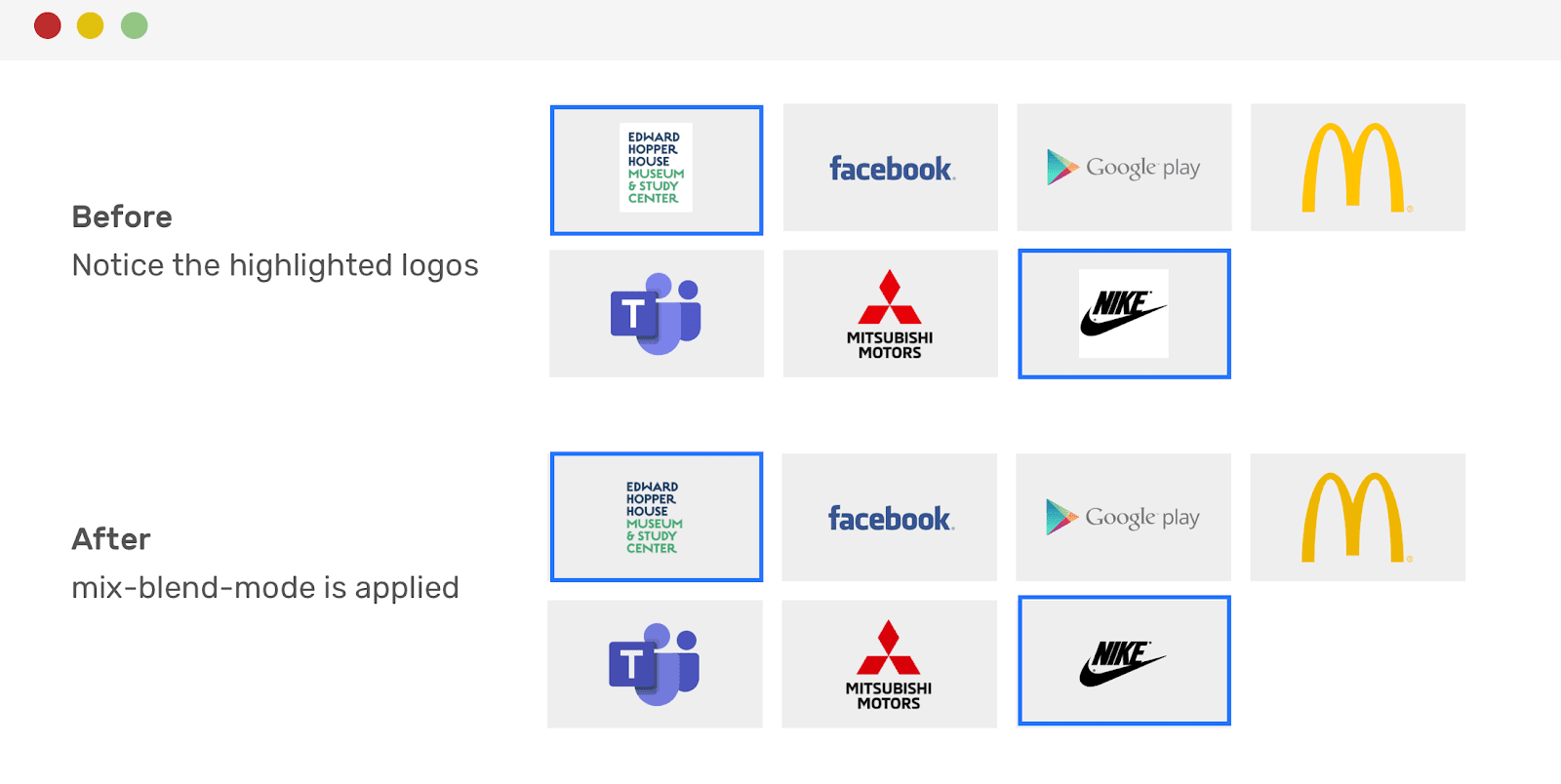
Logos before and after getting rid of white. Pay attention to the highlighted images
Using CSS Selectors
After publication, I made another addition to the article. The thing is, in this tweet, I was asked to use CSS selectors to apply the property
mix-blend-modeonly to .jpg and .png images:
.brands__item img[src$='.jpg'],
.brands__item img[src$='.png'] {
  mix-blend-mode: multiply;
}
Align the last row of logos to the center
When displaying a set of logos on a page and using a grid layout, you cannot be completely sure that all the places in the last row will be occupied. The empty space in the last row of logos (this is the last row in our example) does not look very good. In order to align the last row of logos in the center, it is best to use Flexbox instead of Grid to design the layout of the corresponding section.
.brands {
    display: flex;
    flex-wrap: wrap;
    justify-content: center;
}

.brands__item {
    flex: 0 0 50%;
}

@media (min-width: 700px) {
    .brands__item {
        flex: 0 0 33.33%;
    }
}

@media (min-width: 1100px) {
    .brands__item {
        flex: 0 0 25%;
    }
}
The last row of logos will now be neatly centered.
Flexbox layout and center alignment of the last row of logos
Final recommendations
Before I wrap up this article, I would like to give you some tips that you can take into account when working on a grid layout for the section of the page where you plan to display logos:
- Check the actual width and height of the logo images. For example, some of them may have dimensions like 2500x1200. That's a lot for a logo. If you come across such images, discuss with the designer the possibility of resizing too large logos, talk about how to bring all images to approximately the same size. For example, it could be something like 250x100.
- , . , , ,
mix-blend-mode.
-, ?
