Hi, I'm Anton, UX designer. I am working on the eLama component library. I'll tell you about how we discovered one of the library's flaws and how we fixed it.
When we started working on the components, initially we paid little attention to contrast. We realized this quickly thanks to feedback from disgruntled users.
One user filled out a form but was unable to submit it: the submit button was blocked even though all fields looked complete. In fact, one field was empty, just the information from the placeholder coincided with the real data, and the placeholder itself was bright and contrasting enough.
We did not take into account that the color rendering of monitors, working conditions and peculiarities of users' vision are quite different, so one cannot distinguish a placeholder from a filled field, and the other can see the text of a locked button.

A bit of theory
— . 1:1 21:1, 1:1 — , , , 21:1 — ( ).

- (WCAG) . 2 :
AA — ( 0,5 20/40)
AAA — ( 0,25 20/80)

«» :

Semrush «» :


- ? . — , . , , — , .
eLama
Figma Contrast:

, : , . , :

. , 4,5:1:

. 13:1.
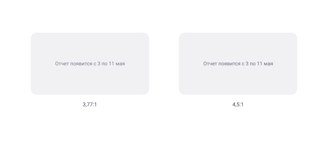
4,25:1. , 4,5:1. , :

, 3,5:1. 4,5:1, . 3,77:1 4,5:1 , — .
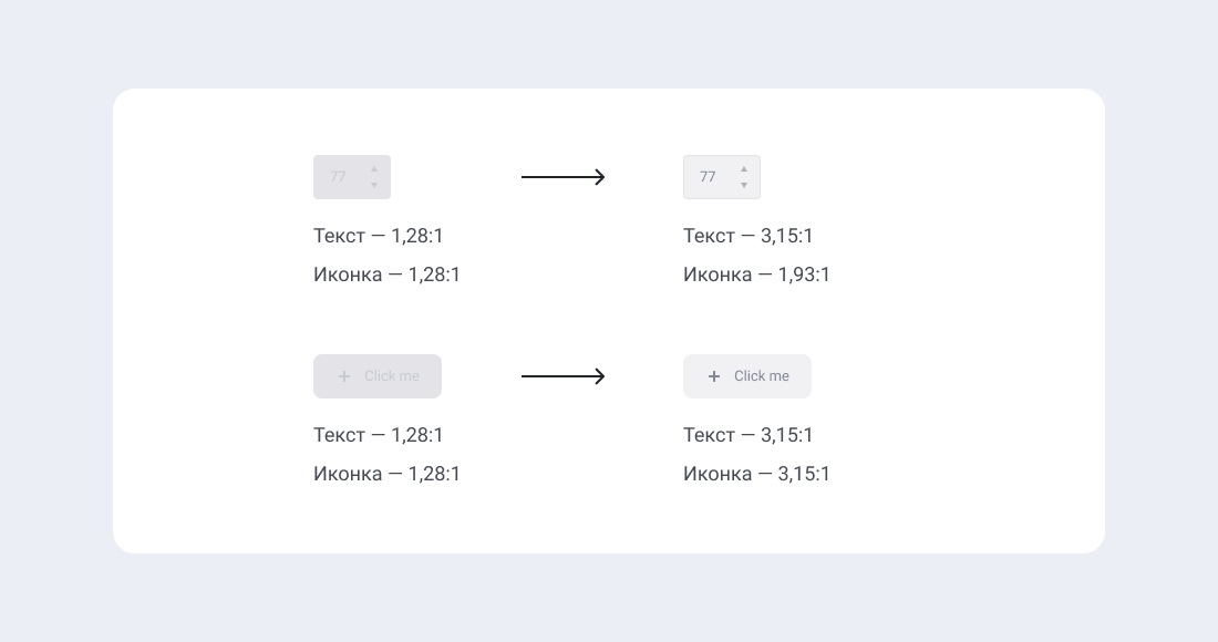
, , , , , . :

- . WCAG , 4,5:1, . - , , .
, 2,5:1 3,5:1 — , .
— , - — 1,5:1 2:1, :
. , .