When I review CSS, I often come across some errors related to Flexbox. In this article, I want to share them so you don't have to do them again.
justify-content vs column-gap
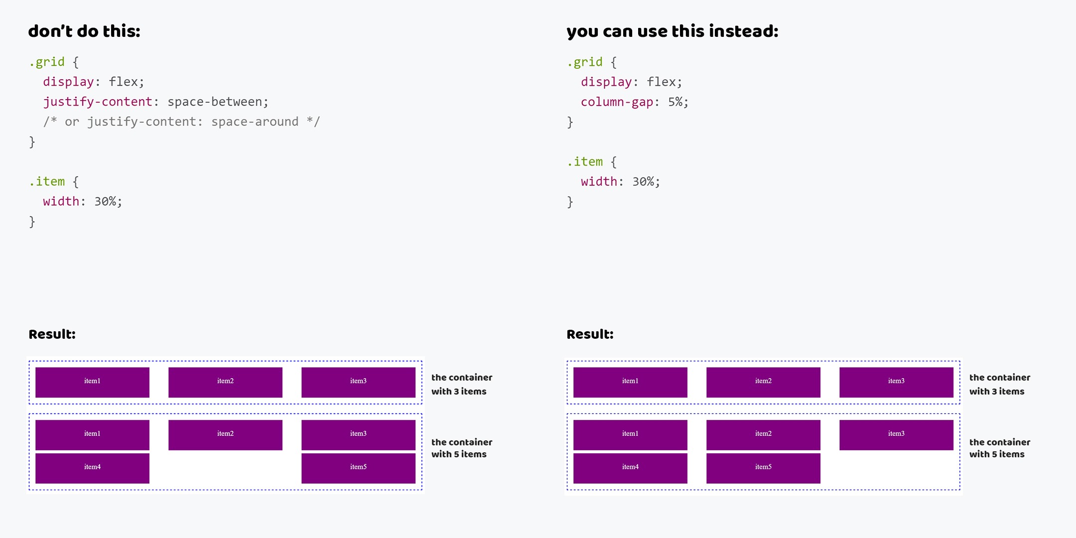
When Flexbox first appeared, many were encouraged by the justify-content property, which allows you to simply arrange grid items evenly using space-between or space-around values. And of course, many began to use it. But there's a problem.
When you use these values, you don't think the cardinality will change. For example, if I add more items to a 4-column grid, they will not be positioned at the beginning of the line as expected.
I want to suggest another way. There is a column-grid property with which you can also simply set the spacing between items and your grid will behave as the user expects.
Do not do this
<div class="grid">
<div class="item"><span>item 1</span></div>
<div class="item"><span>item 2</span></div>
<div class="item"><span>item 3</span></div>
<div class="item"><span>item 4</span></div>
<div class="item"><span>item 5</span></div>
</div>
.grid {
display: flex;
justify-content: space-between; /* or space-around */
}
.item {
width: 30%;
}
You can use this
<div class="grid">
<div class="item"><span>item 1</span></div>
<div class="item"><span>item 2</span></div>
<div class="item"><span>item 3</span></div>
<div class="item"><span>item 4</span></div>
<div class="item"><span>item 5</span></div>
</div>
.grid {
display: flex;
column-gap: 5%;
}
.item {
width: 30%;
}
justify-content and align-items vs margin: auto
When we are solving problems of positioning items, we like to use the justify-content and align-items properties. I do not dispute that this is a convenient and easy way of positioning. But again, there is a problem that is especially common with vertical positioning.
, justify-content align-items flex-. flex- flex-, flex- , .
, , - . .
margin auto. flex- auto flex-. flex- , flex-, . , flex-.
<div class="modal">
<div class="modal__main"></div>
</div>
.modal {
display: flex;
justify-content: center;
align-items: center;
}
<div class="modal">
<div class="modal__main"></div>
</div>
.modal {
display: flex;
}
.modal__main {
margin: auto;
}

flex-
Flexbox , flex- ( display: flex), (flex-) blockified.
, display, . , inline inline-block, block, inline-flex -> flex, inline-grid -> grid inline-table -> table.
display: block, inline, inline-block flex-. , .
.grid {
display: flex;
}
.item {
display: block; /* inline or inline-block */
}
.grid {
display: flex;
}
P.S. CSS/HTML, , , . .