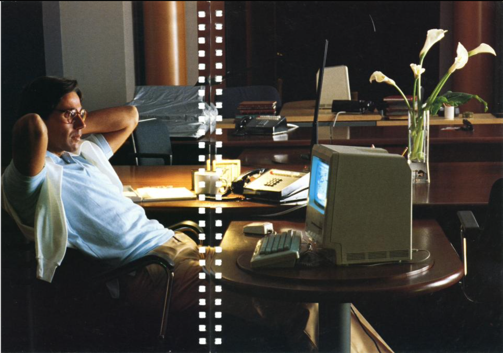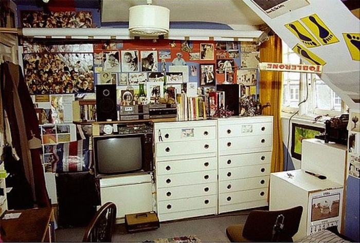
Just think about something serious before you hit the tennis court. From Macintosh (1984) by Apple Computer.
We've had a durable desktop operating system for nearly 40 years. While some mechanisms have proven to be extremely reliable, the use of modern computers is very different from the context in which they were born, and it's time to rethink this a bit.
I'm going to outline the original idea, illustrate some of the changes in computer use, and suggest some new ways of thinking.
(I have been a Mac user for a long time, so my experience and examples refer to this platform. Maybe Windows is great now, I don't know, my last real exposure was XP when I was working at Microsoft.)

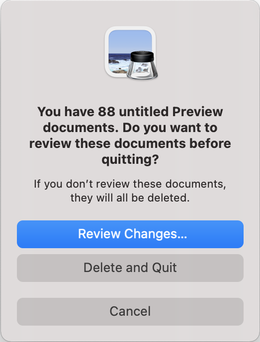
You have 88 unnamed documents to preview. Do you want to review these documents before leaving? If you do not view these documents, they will be deleted. View changes ... Delete and exit. Cancellation.
This is the dialog I see every time I want to close the Preview app to clear the desktop of all the clutter in a rush before making a video call. I need the option that I am missing: exit, but save all documents.
This is partly just silly UX: the app already stores all those unsaved images. So I am using force quit to get out of the preview because it does what I want. But forced exit is not for that, and in any case the reason it makes no sense here has to do with a philosophical inconsistency, illustrated quite aptly.
Anything that is outdated in desktop usability is captured in this dialog.

Survival and Prosperity at Consolidated Companies, Inc. From "9 to 5" (1980).
What is a desktop metaphor?
Since the introduction of the graphical user interface operating system to mainstream computers in the mid-1980s, they have been designed largely around what was then called the "desktop metaphor," and it is more useful to describe it as a document-centric system:
- It seems that you, the user, are looking at the top of an old-fashioned pre-computer desk, which is littered with documents for your work: notes, spreadsheets, images. The most important thing is what you are working on right now.
- A “document” is stored in a “file,” and that file resides in a “folder” (for example, in a filing cabinet) or temporarily on your desktop.
- Since this was designed as a kind of metaphor, every document is a file, and every file is stored in exactly one place, and you must create a filing system that makes sense for your work.
This should sound familiar (yes, that's why they're called folders, and the icon still looks like a beige folder) and might also sound like a musty metaphor to you. In this case, using the computer is seen as a business function and inspires the way office productivity took place half a century ago.
This design worked in the 1980s and 1990s. This spurred a revolution in productivity and utility, as productive work was displayed more or less directly on the screen, just with a lot more functionality. Need to write a note? Ditch the typewriter, open Word and edit whatever your heart desires. Then save it to a folder on disk for later access. Ditto with the budget table, etc. Just taking small notes? Maybe save them to a file on your desktop so you can easily come back to it again. At the end of your day, turn off your computer, close your office door and go home!
Of course, in those days you couldn't search your hard drive, you had to remember which folder you saved which file. However, this was not difficult, since all the files were documents that you created on purpose with a handful of computer programs, and the disks were small and did not hold much. And you didn't feel any inconvenience, because remember that it was very similar to what you did in the real world, just transferred to a small screen.

From Tim Berners-Lee's Plan for the World Wide Web (1989).
The Internet has completely changed what we use computers for
There is a whole techno-economic and social history of how we have lived from then until now, but the details are not important. The important thing is that if you were running an old Macintosh from the 1980s (or even the 1990s) today, you would find the interface surprisingly familiar, but you'd be stuck with the question: OK, but does it ... does anything?
This is because the Internet is at the heart of almost everything we do on the computer today. How many browser windows do you have open now? (I have 37 windows open, with over 75 tabs.) Email, calendar, cloud document collaboration, Twitter, Instagram — for the most part, or even all in a browser. What else? iMessages and Slack are applications that require the Internet to perform any action. Nothing like this existed in 1985.
And instead of creating documents - kind of a heavyweight work product - a lot of what we currently work with on our computers is snippets: URLs and meme gifs that we copy and paste between windows or chats, a PDF, which we upload to print or fill in and email. Data that we copy from one table to another. Photos from the phone that we crop to upload elsewhere. Videos of baby nieces doing something cute.
Some of these snippets become files in our Downloads or Desktop folders because that's the default location for them. Still others we try to keep somewhere more durable. Many never have “on our computer” at home, but go through the computer as a temporary copy and paste clipboard before disappearing into programs or cloud-based software such as chat apps or email. We use a set of "open documents" (tabs) as a kind of memory or to-do list.
But all this behavior is still grafted onto this desktop and filing cabinet. The cognitive load generated by modern internet usage on top of a 1980s metaphor is high: I have 132 icons scattered across my desktop (currently). I have a Downloads folder with (currently) several hundred files, most of which I can safely delete, but who has time to figure it out? It's the same with “open documents” in Safari, Preview, Pages, Numbers, TextMate, and more.
Meanwhile, there is a lot that I cannot find - a link from maybe last week? or was it a week earlier? Who did I copy this to again? Or the tax form, which I definitely downloaded in the last few months, but I really can't remember what it was called and whether I saved it or not. A webpage that I left open a couple of days ago because I knew I would want to take a closer look at it later, but now it takes me longer to find it than to Google it again.
Thus, there are two problems:
- An ever-growing pile of disorganized and often temporary material, accumulating indefinitely in folders, on the desktop, and in all sets of open program documents.
- An ever-growing set of ideas and pieces of information that are worth storing and accessing, but which either are not stored on disk in the form of files in the traditional sense, or they live exclusively in cloud services accessible through a browser, or they are so difficult to restore which is easier just google it and email it again. (It might also give you over-download as a bonus; you now have Docs Final-4.zip to make you feel stupid about having watched this five times.)
If that sounds naive as a problem statement, it probably is. We already have partial solutions for it, for a while.

The predominance of (good) search over organization
It is known that Yahoo was founded as a directory of the young world wide web. He used a tree structure to categorize all available web pages. This was okay, because there aren't many websites yet, and it was much easier to find what you wanted in Jerry and David's Guide to the World Wide Web than to remember the URL to type.
In just a few years, this system became hopeless. The Internet grew exponentially in terms of "sites", but it also evolved an ever-changing way of presenting and creating snippets and pieces of content, so the top-level site directory format was not even a great way to catalog the world. let alone find your way in it.
Thus began the era of search that still exists today, where Google analyzes all content in all its forms, and then performs your search using extremely complex heuristics and gives you results ranked by "relevance." Of course, there were others before Google (rest in peace, AltaVista), but they were pretty much bad, and the reason Google is driving is because it was and remains the best at what it does.
You probably also understand how Google can direct you to the specific thing you want, not just the site that contains it. (We've all experienced the frustration that built-in search on a bad website is far worse than Google would be.)
This fundamentally changed the way we organized and thought about finding information in the public sphere. The world might be in complete disarray, but as long as our interface with it was a blank white page with a search box, the real complexity was hidden.
Does any of this sound familiar? Our computers have been taking small steps to solve our own information retrieval tasks for many years. They try and only partially manage to close this creaky structure of the desktop.
On Mac, Spotlight (the search box that appears when you press command-space) has been around since 2005. Its job is to add search to “computer stuff”. It's not a bad job, but not wonderful. It still mostly understands information in terms of local files and relevance in terms of text and date matching. It's much closer to AltaVista than Google.
Safari, meanwhile, has a browsing history that is technically searchable, but difficult to access and not searchable in the way you probably want.
The clipboard (an invisible temporary location that is the destination of the Copy command and the source of the Paste command) is still a relic of the 20th century - it stores one thing, forgetting everything that came before. I use the handy Yoink utility (there are many similar ones) to make my clipboard a little easier. However, all sorts of images, links and other useful snippets go through my clipboard every day and then get lost.
It all seems like a huge missed opportunity.

Computer for the modern user
I think it's time to rethink what the desktop is used for and rebuild the UX around that. Here are some guidelines:
- , , , . , , , /, , , . , : , -, , , . «», , iMessage — ..
- , . (, , , , ..). « » - , . , . .
- « » (, , , ) (: ). , , , , . . , , Google - , , «» , , 2013 ( , ).
- « 88 ». , . , ( !), , . , , . , . ( (, iOS) — 500 , Safari, , , , )
- , , - . , , , . : , , , . , . , .
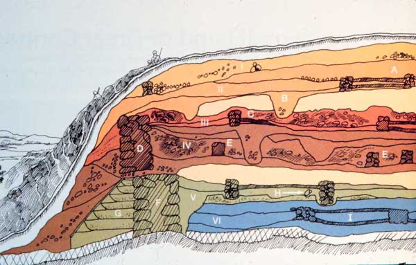
Think of everything that has been preserved, but not recently accessed, as something that goes back to the lower layers of archaeological time. They are still there, but deeply buried. They don't appear, surprise, or bother you, you need to dig. The question arises as to what exactly to delete in order to save space. This is a good question and I really don't know the answer to it.
One answer: who cares, disks are big, save everything, forever. (If you saw that my computer blindly copied desktop subfolders to three laptops in time, you would know that it is possible to live this way already.)
Another answer: instead of each app providing its own lousy and time-consuming “browsing open documents” experience or expecting people to waste time periodically reorganizing their folders, we could create very fast and efficient user interfaces for bulk deletion / controls that will allow us to carefully analyze down into layers, armed with contextual metadata, and quickly erase large amounts of saved junk if necessary.
There is a lot of information you are interested in that is in the cloud, either on a web page or inside a fenced-in service (Google Docs, etc.). This is the path of the future for a lot of things, and I don't want to suggest going back to the 80s here. But Spotlight on my Mac isn't optimal if it highlights junk files in my downloads folder but not in my google docs, right? Perhaps today's desktop makes more sense as a deeply capable air traffic controller / librarian rather than as a major documentation center.
There are also services that do different levels of what I suggest. Evernote is a great example of a brilliant tool (wrapped in a long-suffering program) that indexes everything you add to it, including text found in images, so when searching for it actually works, it becomes pretty magical. A friend told me about Notion, which claims to take on some related roles for teams. But this is not your computer's desktop, the nerve center, which is located at the junction of your keyboard and monitor, local disk and Internet connection. A thing that's still a walnut countertop and a shabby metal filing cabinet.

This is all really a story about access to information. I'm not really sure what the future of the desktop metaphor of the desktop should be. All this with a bunch and a bunch of windows that are open all the time, has always been a problem. But now screen sharing in meetings has become commonplace. Anyone can take a look at your messy desktop. Or you might have to tidy it up very quickly before the meeting. (And then we'll come back to that dialog from the preview at the top of this article.)
I also often think of my own “snippets” in terms of project context (am I working on paying taxes? Collecting research for use in an article like this?), And today all the various open windows scattered around the computer are undifferentiated soup. It seems that in this sense, computers do not work for us the way we do now.
I don't know if the snippets above are the correct answer. I know that mobile operating systems such as iOS, as noted above, tended to start over in their UX and had much more deeply integrated information management (and relied much less on any notion of "files") than squeaky computer laptops. But I am the most productive and feel best in front of a real desktop computer, and I would like this desktop to become simpler and more transparent in many ways, as a kind of private version of what the Internet has become for public information.