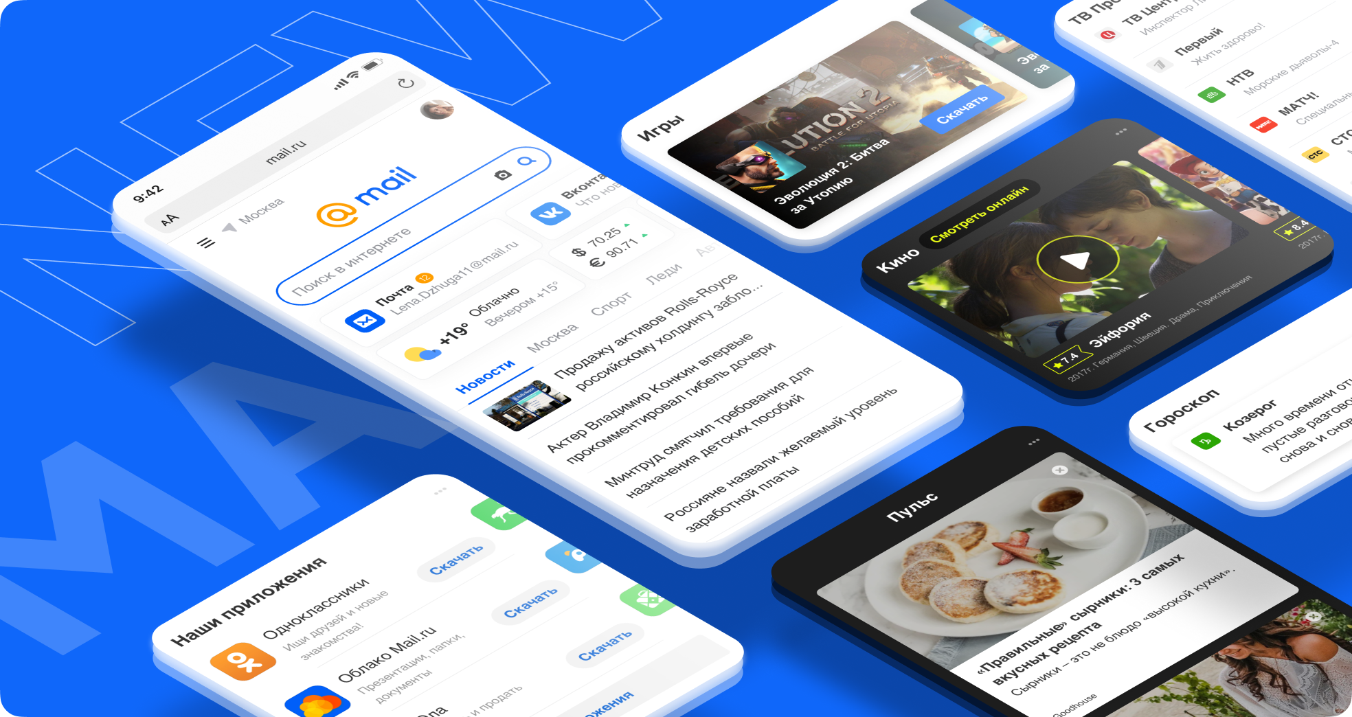
The emergence of new services became a test for the main page of Mail.ru - it became more difficult for users to find the sections they needed, and the company decided to update the design. Mail.ru Group specialists talked about the changes in the mobile version of the portal's main page, what tasks it solves and what results it has achieved.
As it was before
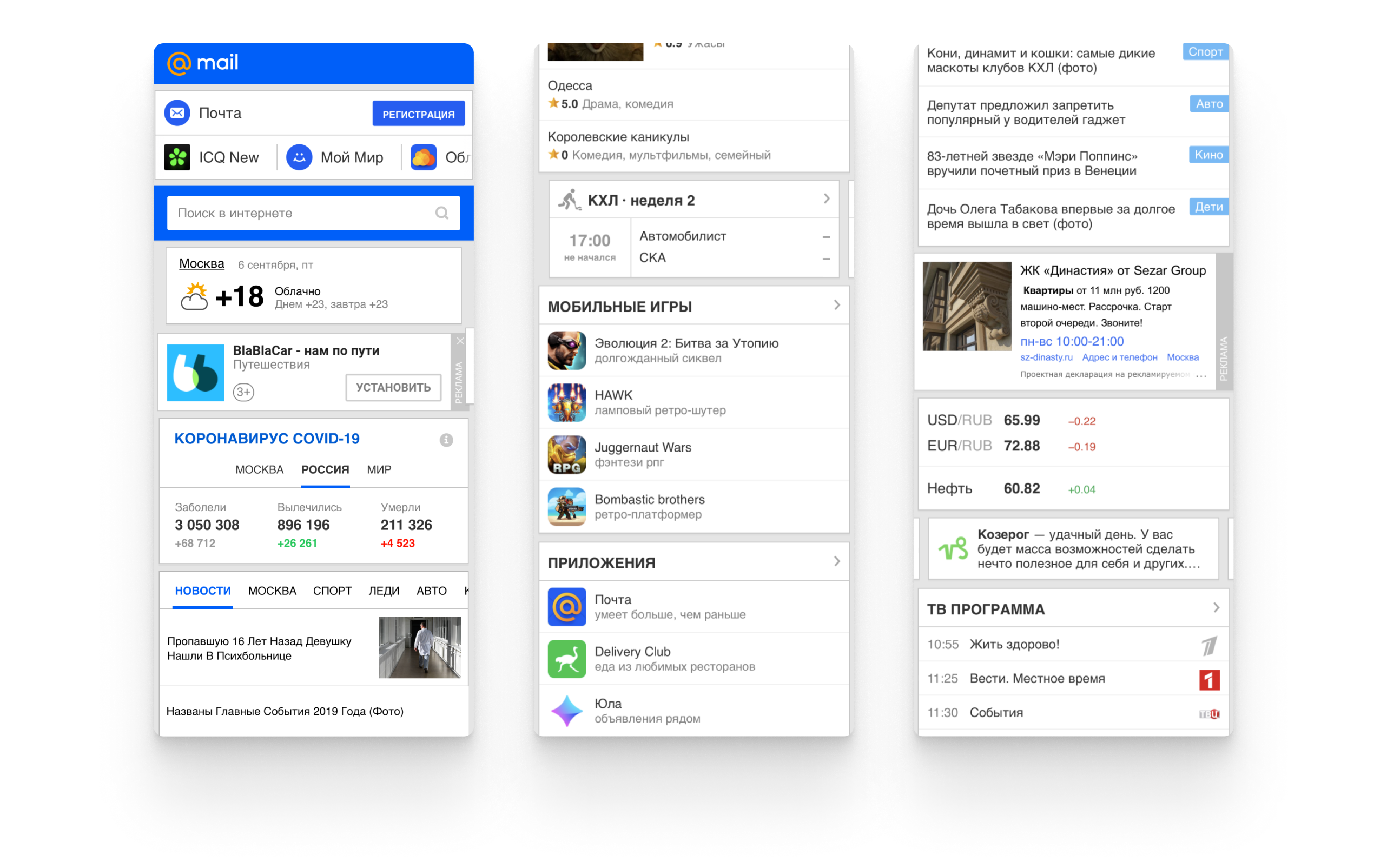
The old version of the mobile homepage for several years completely solved the tasks that were expected of it. Users easily moved between tabs, easily found "Mail", "Search" and "News". However, the emergence of new Mail.ru Group products became an increasing challenge - it was more difficult to integrate them into the current version, and there was fragmentation between the blocks. For example, the “Search” line or the “Mail” login window began to notice worse, the page scrolling depth dropped, and users left the middle of the news feed. Old mobile version of the main page Mail.ru
In addition, due to the redesign of the Mail.ru brand, Mail and Poisk began to noticeably differ from the visual style of the main page. It became clear that it was time to completely update the main one - to organically arrange the company's current products, to lay the foundation for new services and partners.
The plan looked like this:
- Change the visual style of the main page based on the new design of the Mail.ru system;
- Make access to all services convenient and fast;
- Add entertaining page navigation through individual recommendations of materials and methods of their design;
- Maintain the visibility of all products and take into account the interests of those to which users most often go from the main page - "Mail", "Search" and "News";
- Adapt changes for devices with small screens, so that every user is comfortable.
Where did you start
Strong changes in the UX of any product can lead to difficulties for users. To make the adaptation to the new design less painful, we decided to update the main one in stages.
To begin with, we decided to direct the user's attention to important elements with visual tools only. First UI page options
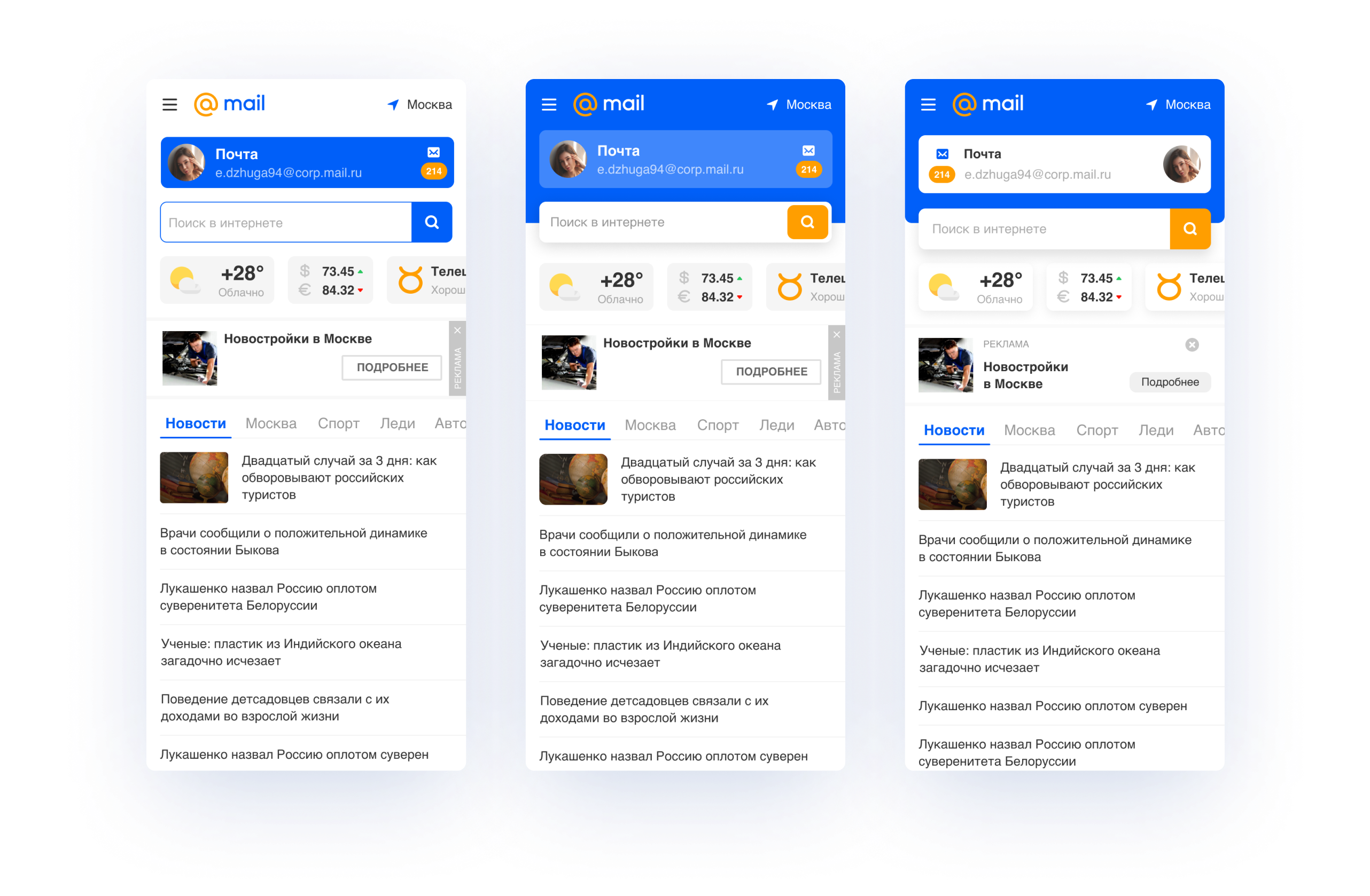
At the first stage, three versions of the main page were developed. The same sequence of blocks is visible: "Mail" at the top, "Search" in the middle, then advertising and "News". We have removed all non-priority elements from the first screen in order to focus the user's attention on key products and not distract from Mail and Search. In these options, we globally changed only the UI, partially applied our new design system, namely: rounded blocks and buttons, added a shadow and made weather and quotes widgets, but left a lot of accent color.
Then we worked on the rest of the scrolling products. Each block and product acquired its own design, which helped to fulfill their functions. New Ribbon
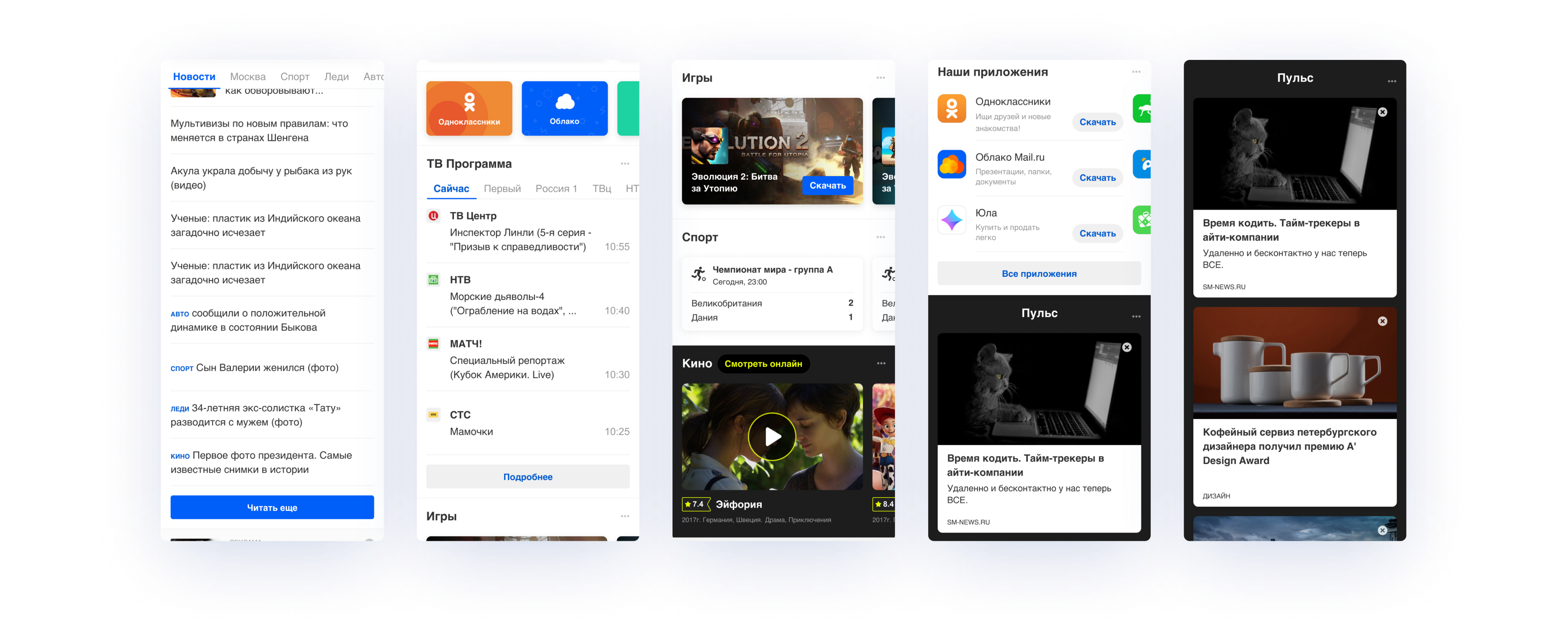
For example, for "Kino Mail.ru" they made a dark background - this way multimedia content is more convenient to perceive. For games, we added large cards with a cover, on which updates are noticeable. A convenient switching between channels was added to the TV program to make it easier for the user to find programs that interest him. We also recently introduced Pulse, a personalized recommendation feed. On the new main page, we slightly changed its style, added a dark background, which increased the clickability.
While changing the main page, we conducted a series of usability studies in our laboratory to understand how real users perceive the changes. According to the results of the first studies, 80% of respondents, regardless of the location of the advertisement, chose the blue hat as brighter and more attractive. They left her. But the problem with prioritizing products remained - the blue color attracted a lot of attention, which is why the "Search" was lost. Users did not notice it or thought it was a password panel to log into their mail account.
Changing the page UX
It's time to rebuild the page structure. Through previous research and strategic product vision, we understood that the structure of the first screen should allow the user to instantly navigate the home screen. Homepage variations for UX research For testing in the UX lab, we put together several layouts with different block arrangements to determine which combination would be better for users. In them, we changed the structure, namely:

- "Search" was placed at the top, as it means the beginning of studying the page, and this arrangement is generally more familiar to the user;
- «» «» , . «», , «» . . : , ;
- «» «». , «» «». ;
- .
UX testing showed the following. Users immediately saw "Search", which is what we wanted. "Mail" became less noticeable, but we then corrected it visually, added color and animation at the entrance.
"News" remained in the same place, but we did a little work on the block itself: we changed the amount of news (the tests also showed the need for this), added indents between the materials and increased the font size. “Pulse” was added to the feed, making it endless, so the footer was moved to the burger menu at the top left - this is how we got a place for other Mail.ru Group projects without losses for the design and the user.
Initially, we decided that advertising would be at the top, separate from the rest of the blocks - it seemed to us that it was more convenient. But the test takers perceived the entire page as an ad, so they placed it below.
For further design development, the option with the best result after testing in the laboratory was chosen, where:
- At the top there is a navigation block with a menu, geolocation and profile;
- "Search" above "Mail", and "Weather" next to "News";
- Less accent color (only the logo and Search remain blue).
Final touches
We have decided on the structure, now there is no less important thing left - the visual part.
We had several options with different shapes and details. As a result, the page became "clean": white with well-branded key blocks. The corporate color organically distinguished "Search", "Mail" and "News". The "Search" line was made rounded so that it stands out more and does not merge with the widgets below. Separated “weather” and quotes - horizontal blocks are more adaptive and allow adding new elements. Adding Widgets You can now add multiple products next to the Mail widget without breaking anything. In other versions, this cannot be done due to the double carousel. As a result, you can compare how it was and how it became.
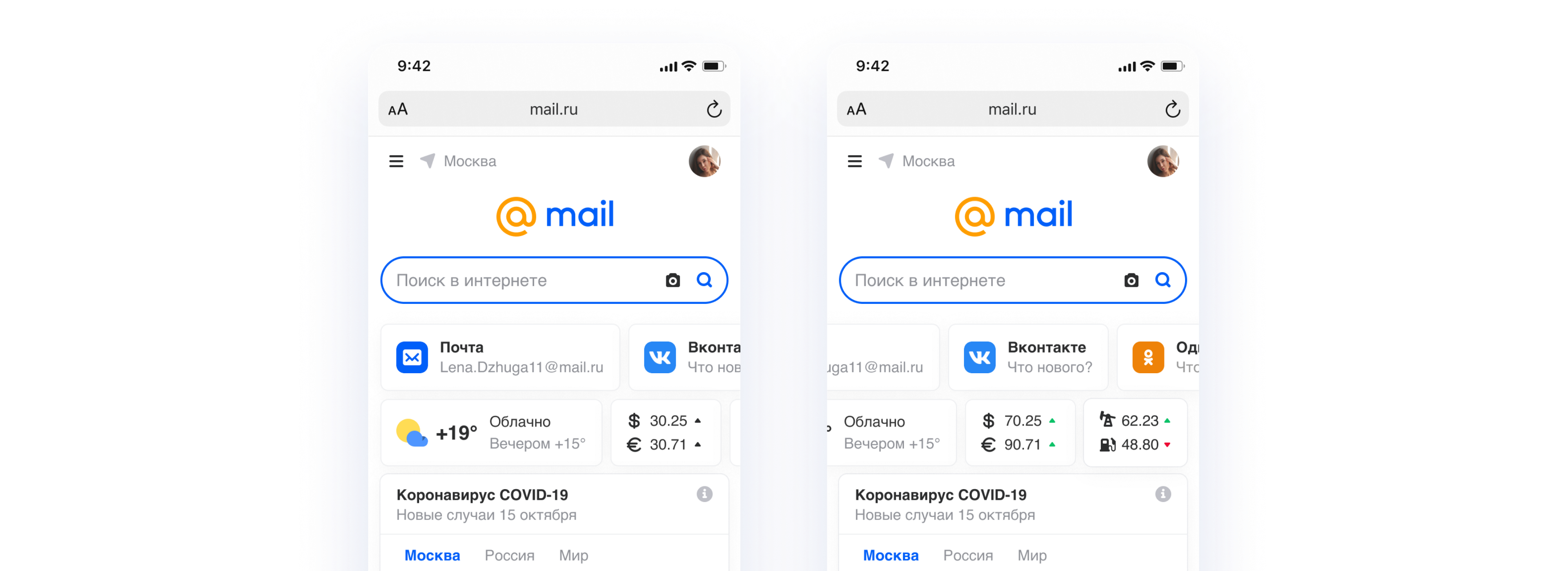

Comparison of the old and new design of the mobile version of the main page of Mail.ru
How the new home lives and thrives
“We always roll out the update gradually so as not to break the usual user scenarios. Users positively perceived the new design, which was confirmed by the increase in conversion and referrals, ”says Vyacheslav Yashkov.

As a result, we noticed the following changes:
- + 12% to transitions to media projects, including weather and covid;
- + 4% to transitions to "Search";
- + 5% to the transitions to the "Mail".
At the moment, we are actively working on personalizing the page in order to provide only useful and relevant information. For ecosystem users, the integration will go much deeper.
The composition of the creative group:
- Alena Kitabova - Product Manager.
- Vyacheslav Yashkov - Head of the Search & AI design team.
- — Search & AI.
- — frontend- .
- — frontend- .
- — frontend- .
- — frontend- .
- — .