The article contains a more detailed analysis of the principles and detailed examples from practice that did not fit into the report. I recommend reading it if you want to dive deep into the topic and learn how we write reusable components. If you want to get acquainted with the world of reusable components in general terms, then, in my opinion, the recording of the report is more suitable for you.
Everyone knows that code duplication is bad because it is often talked about: in a book on your first programming language, in programming courses, in books on writing quality code such as Perfect Code and Clean Code.
Let's see why it is so difficult to avoid duplication in the frontend and how to write reusable components correctly. And the principles of SOLID will help us.
Why is it hard to stop duplicating code?
It would seem that the principle sounds simple. And at the same time, it is easy to check whether it is being respected: if there is no duplication in the codebase, then everything is fine. Why is it so difficult in practice?
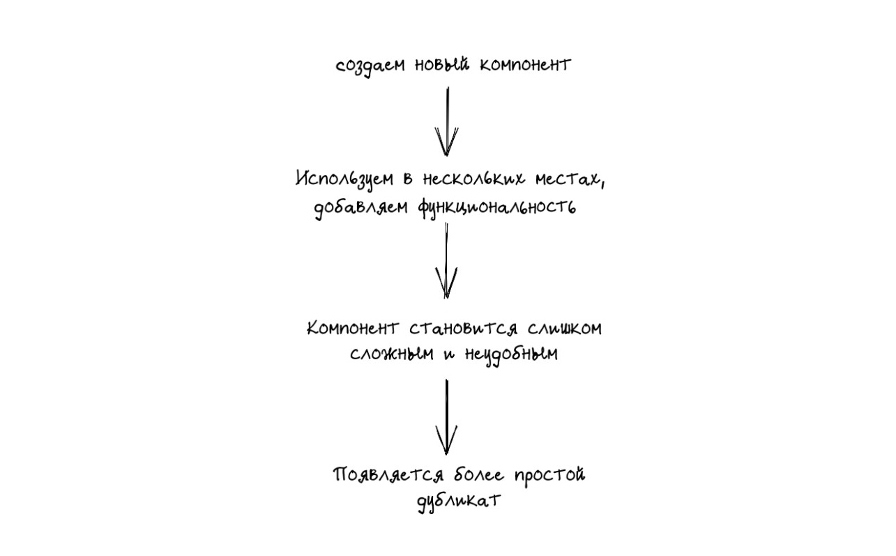
Let's analyze an example with a library of components Ya. Tutorial. Once upon a time, the project was a monolith. Later, for convenience, the developers decided to move the reusable components into a separate library. One of the first to get there was a button component. The component has evolved, over time, new "skills" and settings for the button have appeared, the number of visual customizations has increased. After some time, the component became so sophisticated that it became inconvenient to use it for new tasks and expand further.
And so, in the next iteration, a copy of the component appeared - Button2. This happened a very long time ago, no one remembers the exact reasons for the appearance. However, the component was created.

It would seem that it's okay - let there be two buttons. After all, it's just a button. However, in reality, having two buttons in a project had very unpleasant long-term consequences.
Each time, when it was necessary to update the styles, it was not clear in which component to do this. I had to check where which component is used so as not to accidentally break styles in other places. When a new version of the button display appeared, we decided which of the components to extend. Every time we saw a new feature, we wondered which of the buttons to use. And sometimes in one place we needed several different buttons, and then we imported two button components into one project component at once.
Despite the fact that in the long run the existence of the two components of the button turned out to be painful, we did not immediately understand the seriousness of the problem and managed to do something similar with icons. We created a component, and when we realized that it was not very convenient for us, we made Icon2, and when it turned out to be unsuitable for new tasks, we wrote Icon3.
Almost the entire set of negative effects of button duplication was repeated in the icon components. It was a little easier because icons are used less frequently in the project. Although, to be honest, it all depends on the feature. Moreover, both for the button and for the icon, the old component was not deleted when creating a new one, because deleting required a lot of refactoring with the possible appearance of bugs throughout the project. So what do the button and icon cases have in common? The same scheme for the appearance of duplicates in the project. It was difficult for us to reuse the current component, adapt it to new conditions, so we created a new one.
By creating a duplicate of a component, we complicate our future life. We wanted to assemble an interface from ready-made blocks, like a constructor. To do this conveniently, you need quality components that you can simply take and use. The root of the problem is that the component we were planning to reuse was written incorrectly. It was difficult to extend and apply it elsewhere.
A reusable component should be versatile enough and simple at the same time. Working with him should not cause pain and resemble shooting a sparrow from a cannon. On the other hand, the component should be customizable enough that with a small change in the script, it does not become clear that it is easier to write "Component2".
SOLID Towards Reusable Components
To write quality components, we need a set of rules behind the acronym SOLID. These rules explain how to combine functions and data structures into classes, and how classes should be combined with each other.
Why SOLID and not any other set of principles? SOLID rules tell you how to properly architect your application. So that you can safely develop the project, add new functions, change existing ones and at the same time not break everything around. When I tried to describe what, in my opinion, a good component should be, I realized that my criteria are close to the principles of SOLID.
- S is the principle of sole responsibility.
- O - the principle of openness / closeness.
- L is the Liskov substitution principle.
- I - the principle of separation of interfaces.
- D - Dependency Inversion Principle.
Some of these principles work well for describing components. Others look more far-fetched in a frontend context. But all together they describe my vision of a quality component well.
We will follow the principles out of order, but from simple to complex. First, let's look at basic things that can be useful in a large number of situations, and then - more powerful and specific ones.
The article provides examples of code in React + TypeScript. I chose React as the framework I work with the most. In its place can be any other framework that you like or suit. Instead of TS, there can be pure JS, but TypeScript allows you to explicitly describe contracts in code, which simplifies the development and use of complex components.
Basic
The open / close principle
Software entities must be open for extension and closed for modification. In other words, we should be able to extend functionality with new code without changing the existing one. Why is it important? If every time you have to edit a bunch of existing modules to add new functionality, the whole project will become unstable. There will be many places that can break due to the fact that they are constantly being changed.
Let's consider the application of the principle on the example of a button. We've created a button component and it has styles. So far, everything has been working well. But here comes a new challenge, and it turns out that in one specific place for this button, you need to apply different styles.
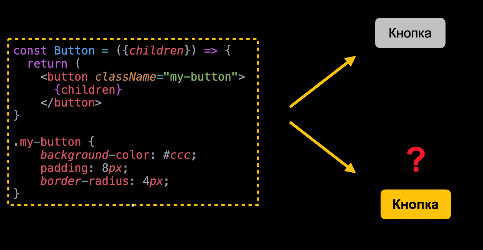
The button is written in such a way that it cannot be changed without editing the code
To apply different styles in the current version, you will have to edit the button component. The problem is that the component is not customizable. We will not consider the option to write global styles, since it is unreliable. Anything can break with any edit. The consequences are easy to imagine if you put something more complex in place of the button, for example, a date picker component.
According to the principle of openness / closedness, we should write the code so that when adding a new style, we do not have to rewrite the button code. Everything will work out if part of the component's styles can be thrown outside. To do this, we will create a prop into which we will pass the required class to describe the new styles of the component.
//    ,
import cx from 'classnames';

//    — mix
const Button = ({ children, mix }) => {
  return (
    <button
      className={cx("my-button", mix)}
    >
      {children}
    </button>
}
Done, now you don't need to edit its code to customize a component.
This rather popular method allows you to customize the appearance of a component. It is called a mix because the additional class is mixed in with the component's own classes. Note that passing a class is not the only way to style a component from the outside. You can pass an object with CSS properties to a component. You can use CSS-in-JS solutions, the essence will not change. Mixes are used by many component libraries, for example: MaterialUI, Vuetify, PrimeNG and others.
What conclusion can be drawn about mixes? They are easy to implement, versatile, and allow you to flexibly customize the look of your components with minimal effort.
But this approach also has its drawbacks. It allows a lot of freedom, which can lead to problems with the specificity of selectors. It also breaks encapsulation. In order to form the correct css selector, you need to know the internal structure of the component. This means that such code can break when refactoring a component.
Component variability
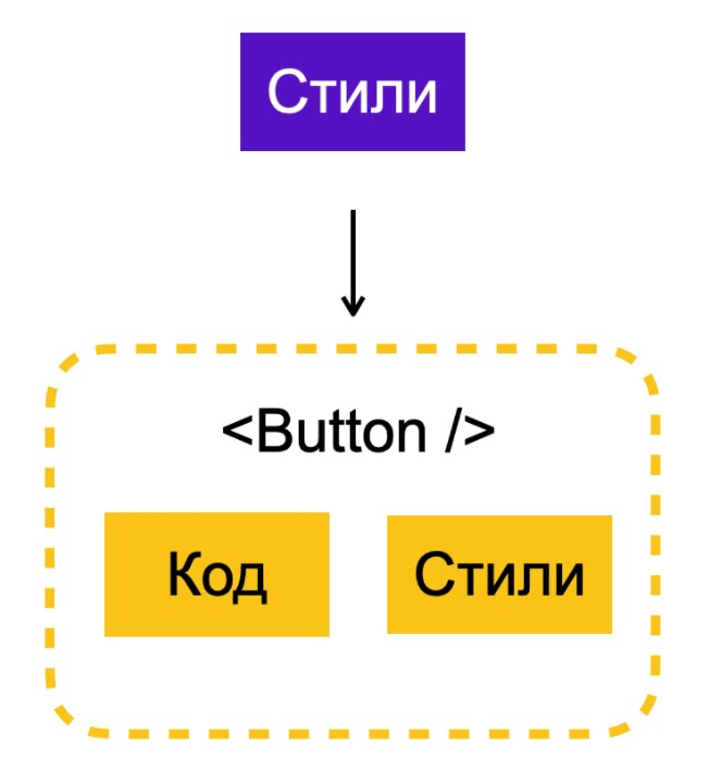
A component has parts that are its core. If we change them, we get a different component. For a button, it is a set of states and behavior. Users distinguish a button from, for example, a checkbox, thanks to its hover and click effect. There is a general logic of work: when the user clicks, the event handler is triggered. This is the core of the component, what makes a button a button. Yes, there are exceptions, but this is how it works in most use cases.
There are also parts in the component that can change depending on the place of use. Styles belong to this group. Maybe we need a button of a different size or color. With a different stroke and fillet, or with a different hover effect. All styles are modifiable part of the component. We don't want to rewrite or create a new component every time the button looks different.
What changes frequently should be tweaked without changing the code. Otherwise, we will find ourselves in a situation where it is easier to create a new component than to customize and add an old one, which turned out to be not flexible enough.
Theming
Let's go back to customizing the component visual using the example of a button. The next way is to apply themes. By theming, I mean the ability of a component to appear in multiple modes, differently in different places. This interpretation is broader than theming in the context of light and dark themes.
The use of themes does not exclude the previous method with mixes, but complements it. We explicitly say that a component has several display methods and, when used, requires you to specify the desired one.
import cx from 'classnames';
import b from 'b_';

const Button = ({ children, mix, theme }) => (
  <button
    className={cx(
     b("my-button", { theme }), mix)}
  >
    {children}
  </button>
)
Theming allows you to avoid the zoo of styles, when, for example, you have 20 buttons in your project and everything looks a little different due to the fact that the styles of each button are set at the place of application. The approach can be applied to all new components without fear of overengineering. If you understand that a component can look different, it's best to explicitly theme from the beginning. This will simplify further development of the component.
But there is also a drawback - the method is only suitable for customizing the visual and does not allow influencing the behavior of the component.
Component nesting
I have not listed all the ways to avoid changing the component code when adding new functions. Others will be demonstrated in the discussion of the remaining principles. Here I would like to mention child components and slots.
The web page is a tree-like hierarchy of components. Each component decides for itself what and how to render. But it's not always the case. For example, a button allows you to specify what content will be rendered internally. In React, the main tool is the children prop and render props. Vue has a more powerful concept of slots. There are no problems when writing simple components using these capabilities. But it is important not to forget that even in complex components, you can use the throwing of some of the elements that the component should display from above.
Advanced
The principles described below are suitable for larger projects. Corresponding techniques give more flexibility, but increase the complexity of design and development.
Single Responsibility Principle
The principle of single responsibility means that a module must have one and only one reason to change.
Why is it important? The consequences of violating the principle include:
- Risk of breaking another when editing one part of the system.
- Bad abstractions. The result is components that can perform several functions, which makes it difficult to understand what exactly the component should do and what not.
- Inconvenient work with components. It is very difficult to make improvements or fix bugs in a component that does everything at once.
Let's go back to the theming example and see if the principle of single responsibility is respected. Already in its current form, theming copes with its tasks, but this does not mean that the solution has no problems and it cannot be improved.
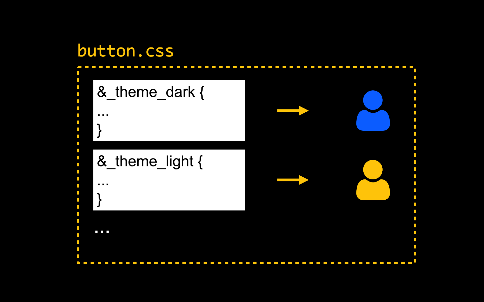
One module is edited by different people for different reasons
Let's say we put all styles in one css file. It can be edited by different people for different reasons. It turns out that the principle of sole responsibility has been violated. Someone can refactor the styles, and another developer will tweak the new feature. So you can easily break something.
Let's take a look at what SRP-compliant theming might look like. The perfect picture: we have a button and, separately, a set of themes for it. We can apply a theme to a button and get a themed button. As a bonus, I would like to be able to assemble a button with several available themes, for example, to be placed in a component library.
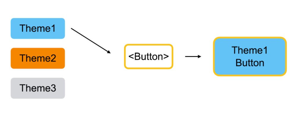
Desired painting. A theme is a separate entity and can be applied to a button. A
theme wraps a button. This is the approach used in Lego, our internal component library. We use HOC (High Order Components) to wrap the base component and add new features to it. For example, the ability to display with a theme.
HOC is a function that takes a component and returns another component. A HOC with a theme can throw an object with styles inside the button. Below is more of an educational option; in real life, you can use more elegant solutions, for example, throw a class into the component, the styles of which are imported into the HOC, or use CSS-in-JS solutions.
An example of a simple HOC for theming a button:
const withTheme1 = (Button) =>
(props) => {
    return (
        <Button
            {...props}
            styles={theme1Styles}
        />
    )
}

const Theme1Button = withTheme1(Button);
The HOC can only apply styles if a specific theme is specified, otherwise it does nothing. So we can assemble a button with a set of themes and activate the one we need by specifying the theme prop.
Using multiple HOCs to collect a button with the desired themes:
import "./styles.css";

//   .
const ButtonBase = ({ style, children }) => {
 console.log("styl123e", style);
 return <button style={style}>{children}</button>;
};

const withTheme1 = (Button) => (props) => {
 // HOC  ,     "theme1"
 if (props.theme === "theme1") {
   return <Button {...props} style={{ color: "red" }} />;
 }

 return <Button {...props} />;
};

const withTheme2 = (Button) => (props) => {
 // HOC  ,     "theme2"
 if (props.theme === "theme2") {
   return <Button {...props} style={{ color: "green" }} />;
 }

 return <Button {...props} />;
};

// -      HOC
const compose = (...hocs) => (BaseComponent) =>
 hocs.reduce((Component, nextHOC) => nextHOC(Component), BaseComponent);

//  ,
const Button = compose(withTheme1, withTheme2)(ButtonBase);

export default function App() {
 return (
   <div className="App">
     <Button theme="theme1">"Red"</Button>
     <Button theme="theme2">"Green"</Button>
   </div>
 );
}
And here we come to the conclusion that we need to divide areas of responsibility. Even if it seems that you have one component, think - is it really so? Perhaps it should be divided into several layers, each of which will be responsible for a specific function. In almost all cases, the visual layer can be decoupled from the component logic.
Separating a theme into a separate entity gives advantages to the usability of the component: you can place a button in a library with a basic set of themes and allow users to write their own if necessary; topics can be conveniently fumbled between projects. This allows you to preserve the consistency of the interface and not overload the original library.
There are different options for implementing the division into layers. The example above was with HOC, but composition is also possible. However, I believe that in the case of theming, HOCs are more appropriate, since the theme is not a stand-alone component.
It is not only the visual that can be brought into a separate layer. But I do not plan to consider in detail the transfer of business logic to the HOC, because the question is very holistic. My opinion is that you can do this if you understand what you are doing and why you need it.
Composite components
Let's move on to more complex components. Let's take Select as an example and see what is the use of the Single Responsibility Principle. Select can be thought of as a composition of smaller components.
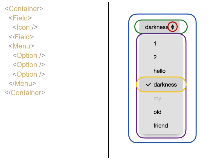
- Container - communication between other components.
- Field - the text for the usual select and the input for the CobmoBox component, where the user enters something.
- Icon - a traditional icon in the field for select.
- Menu is a component that displays a list of items for selection.
- Item is a separate item in the menu.
To comply with the principle of single responsibility, you need to take all the entities into separate components, leaving everyone with only one reason to edit. When we cut the file, the question arises: how now to customize the resulting set of components? For example, if you need to set a dark theme for the field, enlarge the icon and change the color of the menu. There are two ways to accomplish this.
Overrides
The first way is straightforward. Move all the settings of the nested components to the source props. However, if you apply the solution "head-on", it turns out that the select has a huge number of props, which are difficult to understand. You need to organize them somehow conveniently. This is where override comes in. This is a config that is forwarded to a component and allows you to customize each of its elements.
<Select
  ...
  overrides={{
    Field: {
      props: {theme: 'dark'}
    },
    Icon: {
      props: {size: 'big'},
    },
    Menu: {
      style: {backgroundColor: '#CCCCCC'}
    },
  }}
/>
I gave a simple example where we override props. But override can be thought of as a global config - it configures everything the components support. You can see how this works in practice in the BaseWeb library .
All in all, using override you can flexibly customize composite components, and this approach also scales well. Cons: configs for complex components turn out to be very large, and the power of override has a downside. We get full control over the internal components, which allows us to do strange things and expose invalid settings. Also, if you do not use libraries, but want to implement the approach yourself, you will have to teach the components to understand the config or write wrappers that will read it and configure the components correctly.
Dependency Inversion Principle
To understand the alternative to override configs, let's turn to the letter D in SOLID. This is the Dependency Inversion Principle. He argues that the code that implements the high-level policy should not depend on the code that implements the low-level details.
Let's go back to our selection. Container is responsible for communication between other parts of the component. In fact, it is the root that controls the rendering of the rest of the blocks. To do this, he must import them.
This is how the root of any complex component will look like, if you do not use dependency inversion:
import InputField from './InputField';
import Icon from './Icon';
import Menu from './Menu';
import Option from './Option';
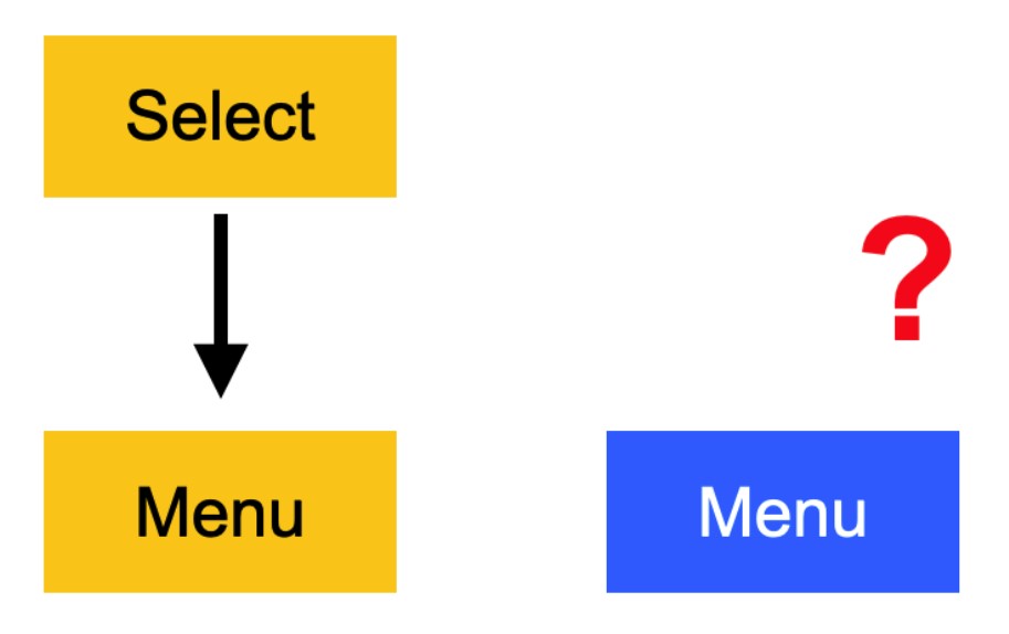
Let's analyze the dependencies between the components to understand what can go wrong. Now the higher-level Select depends on the lower-level Menu, because it will import it into itself. The dependency inversion principle is broken. This creates problems.
- First, if you change the Menu, you will have to edit Select.
- Secondly, if we want to use a different menu component, we also have to edit the select component.
It is not clear what to do when you need Select with a different menu.
You need to expand the dependency. Make the menu component depend on the select. Dependency inversion is done through dependency injection - Select must accept a menu component as one of the parameters, props. This is where typing comes in handy. We will indicate which component the Select expects.
//     Select
const Select = ({
  Menu: React.ComponentType<IMenu>
}) => {
  return (
    ...
    <Menu>
      ...
    </Menu>
    ...
  )
...
}
This is how we declare that the select needs a menu component whose props satisfy a certain interface. Then the arrows will point in the opposite direction, as the DI principle dictates.
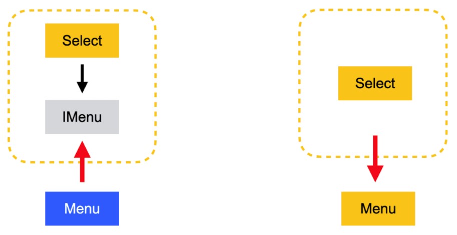
The arrow is expanded, this is how Dependency Inversion works.
We've solved the dependency issue, but a little syntactic sugar and helper tools are welcome here.
Every time, throwing all the dependencies into a component at the render location is tedious, but the bem-react library has a dependency registry and a composition process. With their help, you can package dependencies and settings once, and then just use the ready-made component.
import { compose } from '@bem-react/core'
import { withRegistry, Registry } from '@bem-react/di'

const selectRegistry = new Registry({ id: cnSelect() })

...

selectRegistry.fill({
    'Trigger': Button,
    'Popup': Popup,
    'Menu': Menu,
    'Icon': Icon,
})

const Select = compose(
    ...
    withRegistry(selectRegistry),
)(SelectDesktop)
The example above shows part of the component assembly using bem-react as an example. The complete example code and sandbox can be found in the yandex UI storybook .
What do we get from using Dependency Inversion?
- Full control - the freedom to customize all the components of a component.
- Flexible encapsulation - the ability to make components very flexible and fully customizable. If necessary, the developer will override all the blocks that make up the component and get what he wants. In this case, there is always an option to create already configured, ready-made components.
- Scalability - This method works well for libraries of any size.
We in Yandex.Tutorial write our own components using DI. The internal Lego component library also takes this approach. But it has one significant drawback - a much more complex development.
Difficulties in developing reusable components
What is the difficulty in developing reusable components?
First, a long and careful design. You need to understand what parts the components are made of and what parts can change. If we make all the parts mutable, we end up with a huge amount of abstractions that are difficult to understand. If there are too few changeable parts, the component will not be flexible enough. It will need to be improved to avoid future reuse issues.
Secondly, the high requirements for the components. You understand what parts the components will consist of. Now you need to write them so that they do not know anything about each other, but can be used together. It's harder than developing without regard for reusability.
Thirdly, a complex structure as a consequence of the previous points. If you need serious customization, you will have to rebuild all the dependencies of the component. To do this, you need to deeply understand what parts it consists of. Good documentation is essential in the process.
The Tutorial has an internal component library where educational mechanics are located - a part of the interface that children interact with while solving tasks. And then there is a shared library of educational services. There we take out the components that we want to reuse between different services.
The transfer of one mechanic takes several weeks, provided that we already have a working component and we are not adding new functionality. Most of this work is to saw the component into independent chunks and enable them to be shared.
Liskov Substitution Principle
The previous principles were about what to do, and the last two will be about what not to break.
Let's start with Barbara Liskov's substitution principle. He says that objects in a program should be replaceable with instances of their subtypes without breaking the correct execution of the program.
We don't usually write components as classes and we don't use inheritance. All components are interchangeable out of the box. This is the foundation of the modern frontend. Strong typing helps you avoid mistakes and maintain compatibility.
How can out-of-the-box replaceability break down? The component has an API. By API, I mean a set of props for a component and mechanisms built into the framework, such as an event handler mechanism. Strong typing and linting in the IDE can highlight incompatibility in the API, but the component can interact with the outside world and bypass the API:
- read and write something to the global store,
- interact with window,
- interact with cookies,
- read / write local storage,
- make requests to the network.

All this is unsafe, because the component depends on the environment and can break if you move it to another location or to another project.
To comply with the Liskov substitution principle, you need:
- use typing capabilities,
- avoid interaction bypassing the component API,
- avoid side effects.
How to avoid non-API interaction? Put everything the component depends on in the API and write a wrapper that will forward data from the outside world to the props. For example, like this:
const Component = () => {
   /*
       ,     ,       .
      ,          .
          ,   ,   .
   */
   const {userName} = useStore();

   //     ,       ( ,       ).
   const userToken = getFromCookie();

   //  —   window      .
   const {taskList} = window.ssrData;

   const handleTaskUpdate = () => {
       //    API .      .
       fetch(...)
   }

   return <div>{'...'}</div>;
  };

/*
          .
      ,         .
*/
const Component2 = ({
   userName, userToken, onTaskUpdate
}) => {
   return <div>{'...'}</div>;
};
Interface Segregation Principle
Many special-purpose interfaces are better than one general-purpose interface. I was not able to transfer the principle to the front-end components in the same way. So I understand it as a need to keep an eye on the API.
It is necessary to transfer as few entities as possible to the component and not transfer data that is not used by it. A large number of props in a component is a reason to be wary. Most likely, it violates the SOLID principles.
Where and how do we reuse?
We've discussed principles to help you write quality components. Now let's see where and how we will reuse them. This will help you understand what other problems you might encounter.
The context can be different: you need to use a component elsewhere on the same page, or, for example, you want to reuse it in other company projects - these are completely different things. I highlight several options:
No reuse is required yet.You have written a component, you think that it is specific and do not plan to use it anywhere else. There is no need to make additional efforts. And you can do a few simple steps that will be useful if you still want to return to it. So, for example, you can check that the component is not tied too much to the environment, and the dependencies are wrapped. You can also make a reserve for customization for the future: adding themes or the ability to change the appearance of a component from the outside (as in the example with a button) - it does not take much time.
Reuse in the same project.You've written a component and are pretty sure you want to reuse it elsewhere in your current project. Everything written above is relevant here. Only now it is imperative to remove all dependencies in external wrappers and it is highly desirable to be able to customize from the outside (themes or mixes). If a component contains a lot of logic, you should think about whether it is needed everywhere, or if it should be modified in some places. For the second option, consider the possibility of customization. It is also important here to think about the structure of the component and break it up into parts if necessary.
Reuse on a similar stack.You understand that the component will be useful in a neighboring project that has the same stack as you. This is where all of the above becomes mandatory. In addition, I advise you to closely monitor dependencies and technologies. Does the neighboring project exactly use the same versions of the libraries as you? Are SASS and TypeScript using the same version?
I would also like to highlight reuse in another runtime environment , for example, in SSR. Decide if your component can and should be able to render on SSR. If so, make sure it renders as expected beforehand. Remember that there are other runtimes like deno or GraalVM. Consider their features if you use them.
Component Libraries
If components need to be reused between several repositories and / or projects, they should be moved to the library.
Stack
The more technologies are used in projects, the more difficult it will be to solve compatibility problems. It is best to reduce the zoo and minimize the number of technologies used: frameworks, languages, versions of large libraries. If you understand that you really need a lot of technology, you will have to learn to live with it. For example, you can use wrappers over web components, collect everything in pure JS, or use adapters for components.
The size
If using a simple component from your library adds a couple of megabytes to the bundle, that's not ok. Such components do not want to reuse, because the prospect of writing your own light version from scratch seems justified. You can solve the problem using size control tools, for example, size-limit.
Do not forget about modularity - a developer who wants to use your component should be able to take only it, and not drag all the library code into the project.
It is important that the modular library is not compiled into one file. You also need to keep track of the JS version that the library is going to. If you build the library in ES.NEXT, and projects in ES5, there will be problems. You also need to properly configure the assembly for older versions of browsers and make sure that all library users know what it is going into. If this is too complicated, there is an alternative - to set up your own library building rules in each project.
Updating
Think in advance about how you will update the library. It is good if you know all the clients and their custom scripts. This will help you think better about migrations and breaking changes. For example, a team using your library will find it extremely frustrating to learn about a major update with breaking changes ahead of release.
By moving components into a library that someone else is using, you lose the ease of refactoring. To prevent the burden of refactoring from becoming too heavy, I advise you not to drag new components into libraries. They are likely to change, which means you will have to spend a lot of time updating and maintaining compatibility.
Customization and design
Design doesn't affect reusability, but is an important part of customization. In our Tutorial, components do not live on their own, their appearance is designed by designers. Designers have a design system. If a component looks different in the system and in the repository, problems cannot be avoided. Designers and developers do not have the same ideas about the appearance of the interface, which can lead to poor decisions.
Components showcase
The component showcase will help to simplify interaction with designers. One of the popular showcase solutions is Storybook . Using this or another suitable tool, you can show project components to anyone outside of development.
Add interactivity to the showcase - designers should be able to interact with components and see how they display and work with different parameters.
Don't forget to set up automatic storefront updates when you update components. To do this, you need to move the process to CI. Now designers can always see what ready-made components are in the project and use them.
Design system
For a developer, a design system is a set of rules that govern the appearance of components in a project. To keep the zoo of components from growing, you can limit customizability to its limits.
Another important point is that the design system and the type of components in the project sometimes differ from each other. For example, when there is a big redesign and not everything can be updated in the code, or you have to adjust a component, but there is no time to make changes to the design system. In these cases, it is both in your interests and in the interests of the designers to synchronize the design system and the project as soon as the opportunity arises.
The last universal and obvious advice: communicate and negotiate. There is no need to perceive designers as those who stand aside from development and only create and edit layouts. Working closely with them will help you design and implement a quality interface. Ultimately, this will benefit the common cause and delight the users of the product.
conclusions
Duplicate code leads to difficulties in development and a decrease in the quality of the frontend. To avoid the consequences, you need to monitor the quality of the components, and the principles of SOLID help to write quality components.
It is much more difficult to write a good component with a reserve for the future than one that quickly solves the problem here and now. At the same time, good "bricks" are only part of the solution. If you bring components to the library, you need to make working with them convenient, and they also need to be synchronized with the design system.
As you can see, the task is not easy. It is difficult and time-consuming to develop high-quality reusable components. Is it worth it? I believe that everyone will answer this question for himself. For small projects, the overhead can be too high. For projects where long-term development is not planned, investing in code reuse is also a controversial decision. However, having said “we don’t need this now,” it’s easy to overlook how you end up in a situation where the lack of reusable components will bring a lot of problems that might not have happened. So don't repeat our mistakes and don't repeat yourself!
Watch the report