Thanks to quarantine and retirement, we suddenly gave museums a tool that could help them work with audiences in the future.
It started simply: Garage Museum of Contemporary Art opened an exhibition - the 2nd Triennial of Russian Contemporary Art "Beautiful Night of All People" in September 2020, that is, in quarantine. But they could not do it in full due to the pandemic. The museum contacted us to digitize this exhibition.
We have done. And we began to look at what exactly the users were looking at, how they “walk” around the exhibition, how long they interact with what, and so on. Collected from this dashboard and detailed reports. This instrument turned out to be new and unusual for the museum, on the one hand, and unexpectedly interesting, on the other.
How was the exhibition transformed into virtuality?
360-tour is developed based on the use of equidistant (spherical) panoramas. The spherical panorama is based on an image collected from six separate frames in a spherical (equidistant) projection. Selected so that there was the maximum possible viewing angle of space (360 × 180 degrees). After the completion of gluing and retouching of all panoramas, the interactive tour is assembled, as well as the placement of anchor points for the map. The map allows the user to navigate the tour by viewing all viewpoints. You don't need any special player, everything works natively in modern browsers.
You can see it here:
- Russian version - 2nd-triennial-360.garagemca.org/ru/index.html
- English version - 2nd-triennial-360.garagemca.org/en/index.html
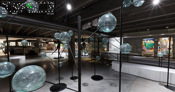
The interfaces were selected taking into account the browser restrictions so that the user “walked” through the exhibition as he would walk through it during a real visit to the museum.
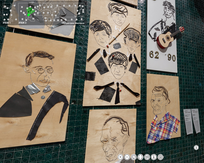
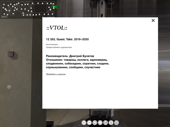
Near the exhibits there are information markers that open the card of this exhibit and allow you to learn more about it.
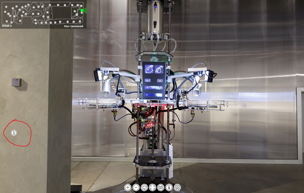
Here's what opens when clicked:
Plus there is a podcast (more precisely, a cut from the guide's speech) that runs on points. Integrated with Russian or English version. A little later, they noted that this is a very good decision, because when a person sits at home on December 31, has already drunk, wants something strange and is going to go to the exhibition with a guide in this state, they usually tell him: come on the 10th. And he sits down and listens to the podcast. Full immersive effect.
In total, 21 thousand viewers plunged into the show.
Dashboard
Here is an example of detailing by info points in the context of views + filter for segmentation. This allows us to understand which exhibition composition is the most popular:
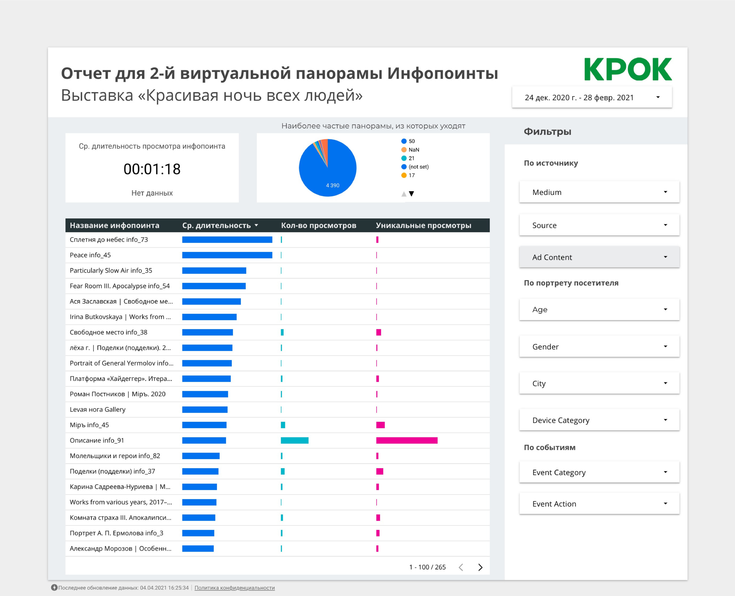
As you can see, again technically it is quite simple, but the museum receives data on what exactly the audience is watching. Moreover, in relation to demography and the source, one can draw conclusions that “the youth audience is interested in this,” “the residents of Chelyabinsk fell in love with such and such exhibit,” “everyone whom we called from a closed group of art critics behaved like this in this way".
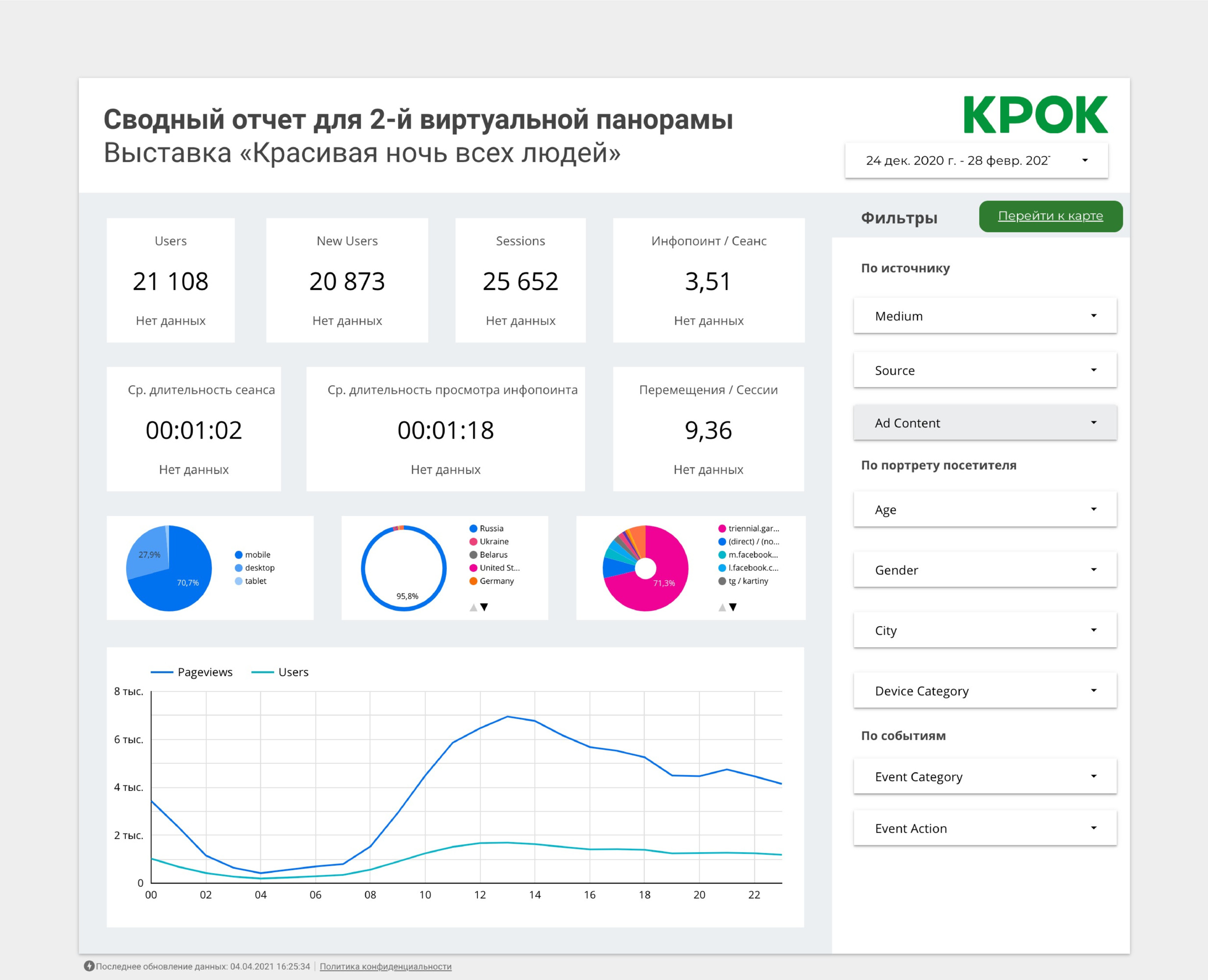
The main page of the dashboard is just general exhibition statistics. These are general metrics: users, sessions, new users, average number of info points, and visit time. This is important because you can see the dynamics and evaluate the main indicators, and this solves an important museum task - attracting sponsors and reporting to sponsors, because there are numbers about the use.
Below on the pie charts - a breakdown by device, city and source. This page helps to quickly assess the effectiveness of the exhibition, and with the help of filters you can already get a specific cut:
Here is a report on the panoramas:
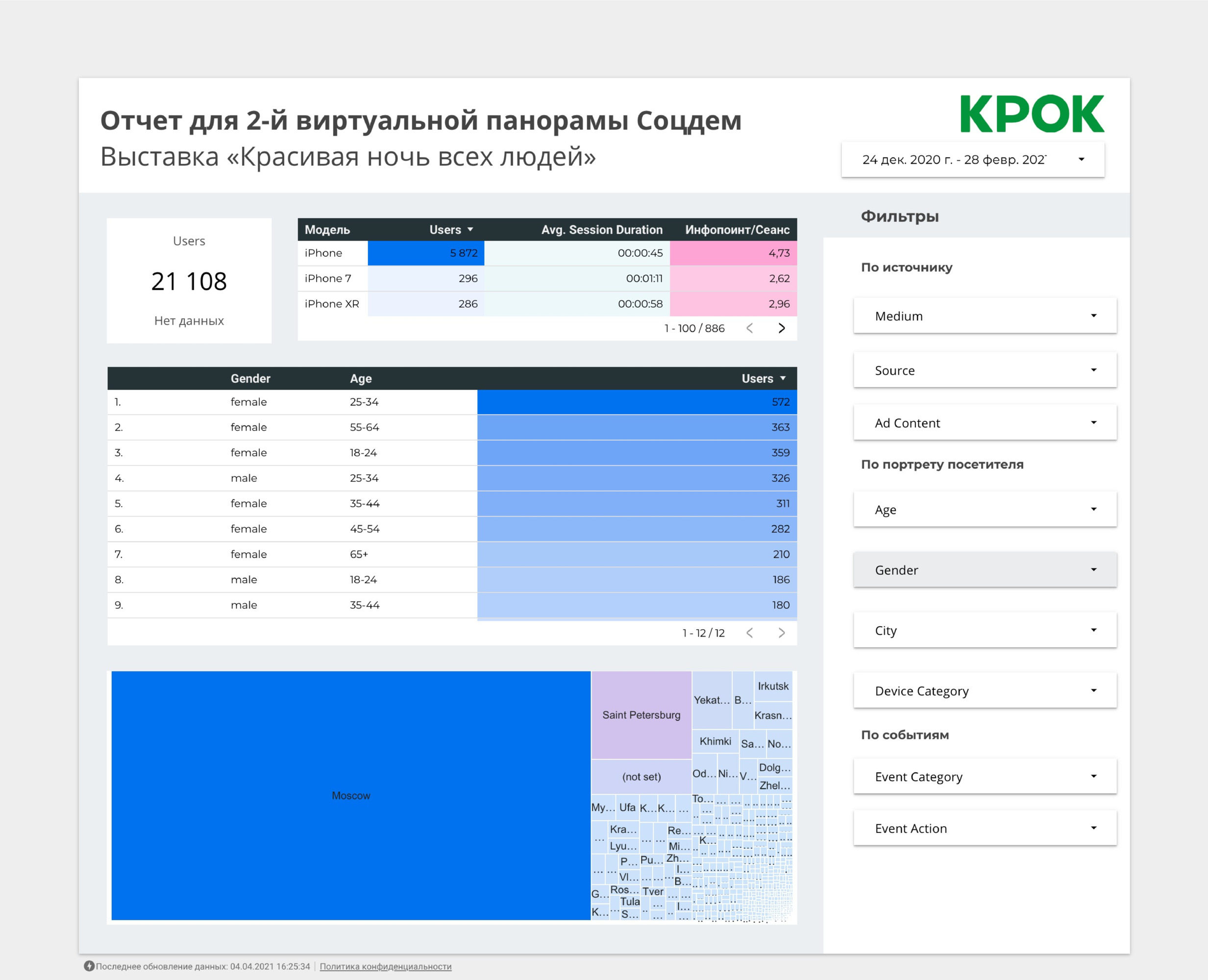
And this is social demographic and geography:
For the dashboard, the Google Cloud Platform stack was used: database - Google Big Query, visualization itself - Google Data Studio.
The museum got the opportunity to flexibly manage exhibitions: to think about replacing content, redistributing exhibits along the route, more accurately assessing which exhibit is interesting to which audience. Right now, it was used more as a demonstration of a technical novelty for museums (although the technical solution itself is not very difficult, it was rather just that no one did it especially). In the future, I really hope, museums will start testing different types of exhibits, descriptions, and so on, and come to the most interesting form for the audience. I would like to see the city museum of local lore, on which UX specialists have worked and for which exciting descriptions have been written by schoolchildren.
1. Summary report - user interaction with the panorama. Detailing by info points in the context of views. Added filter for segmentation. Allows you to understand which exhibition composition is most popular with users.
2. Summary report - social demographics, geography and devices. Socio-demographic data, breakdown by device and data by geography of visitors. Allows you to identify the most active audience and devices from which interaction with panoramas occurs.
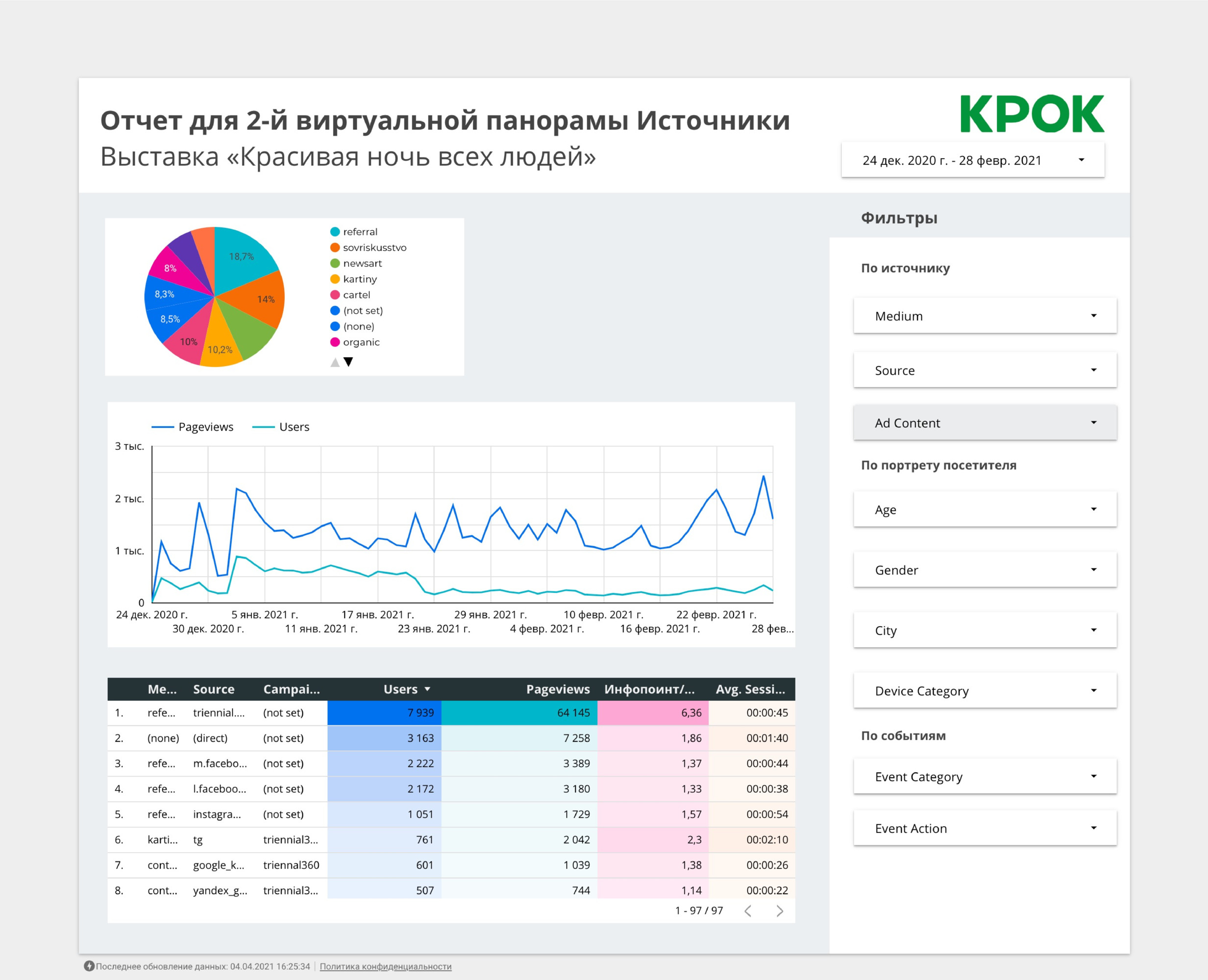
3. Summary report - traffic sources.
The dashboard allows you to evaluate the effectiveness of traffic sources in user metrics, average session duration and average number of viewed info points.
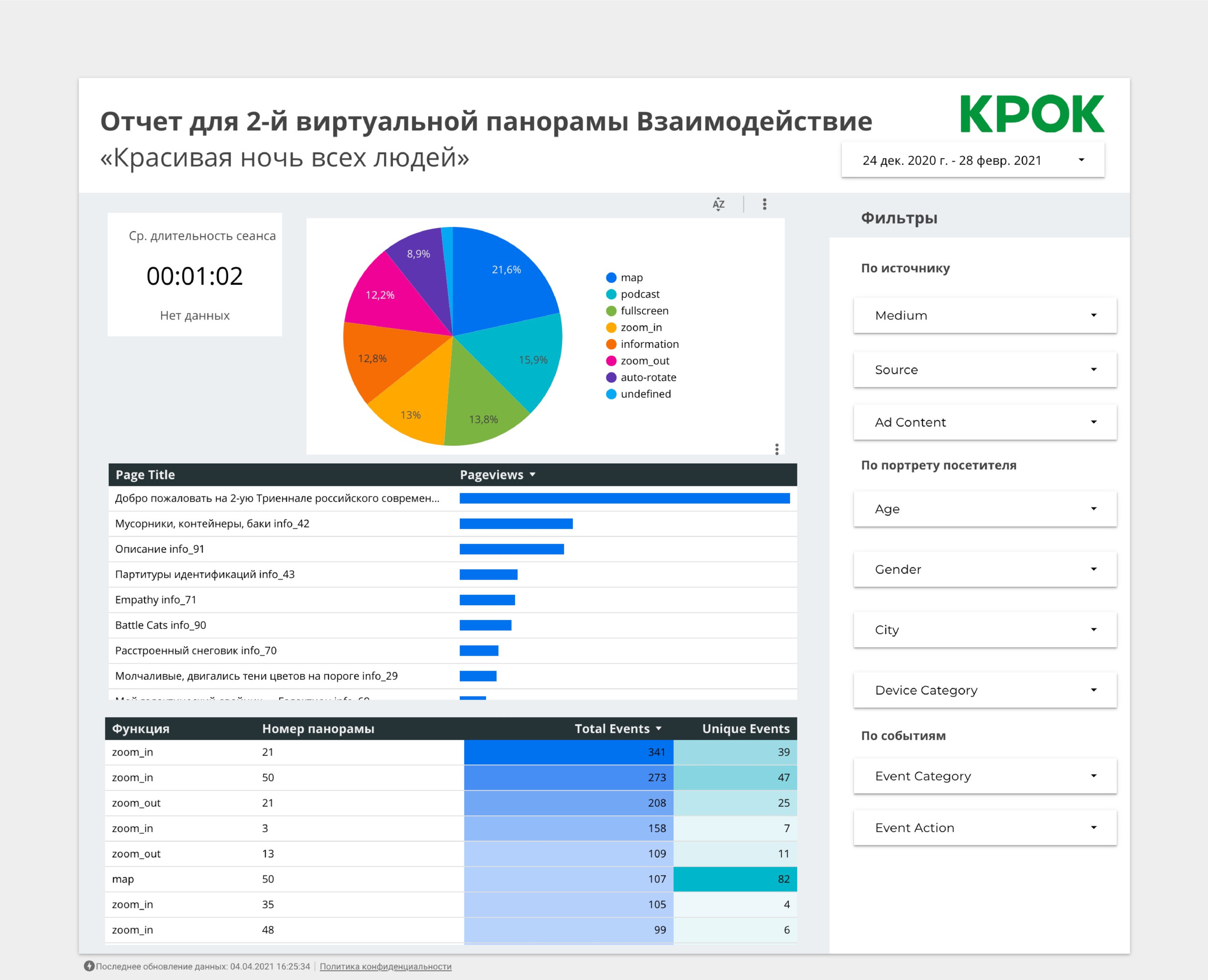
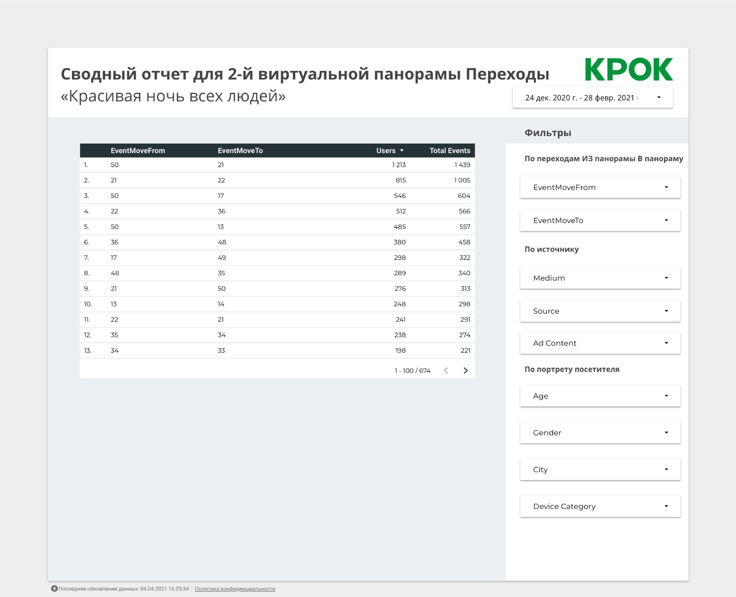
4. Summary report - the frequency of user transitions between info points. The most frequent graphs of transitions between info points, which indicates the behavioral behavior of users between them.
We did all this in a month and a half, and Garage later received the Stevie Awards for this project , because in the world of museums suffering from a pandemic, it was very cool!