
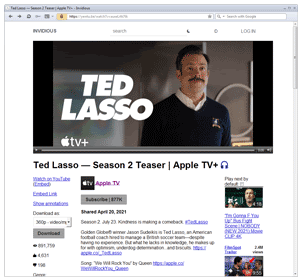
The animated GIF shows what happens on Invidious when I narrow down the browser window by a couple of pixels.
The layout of the elements on the page completely changes: the original three-column layout suddenly changes to a one-column layout, and the first thing is the contents of that small column that was located on the left edge and contained completely unimportant information.
I'm sure I'm not the only one who often comes across this. Personally, I like it when my browser windows are narrow enough, but in the last ten years, web pages have begun to react to this preference as if I wanted a mobile, functionally stripped-down version of the page. There is a big problem here, and not just one.
Spatial gaslighting
One of the fundamental concepts behind the design of the Macintosh, the first truly client-centric graphical user interface, is the idea of spatially arranging human-machine interactions when working with a computer. The user was relieved of the need to memorize text commands in order to arrange files on the disk, and provided the opportunity to shuffle the files so that it was visual and - here it is, the insight - to remember their position, as if in space. The user could remember where he put the file, and it is not so important what the file is called . This is how we remember where we put our wallet, keys or important document.
This idea of spatial orientation is fundamental to the design of any user interface and web design in particular. When a user visits your site over and over again, they gradually figure out how everything works here. The more time you devote to designing your site, the more efficiently users can manage it, and the more they will like your site. Have you ever wondered why there are so many high-profile scandals on the web related to redesign? Here is your answer. Users do not like it when the efforts they put into mastering the site are crossed out at the designer's whim, that the designer is simply bored with the old site.
This is exactly the problem I have with responsive design. Most responsive design implementations are essentially like redesigning your site whenever the user resizes the window. The most egregious example of this kind is when a horizontal menu bar turns into a vertical one. Everything that the user managed to visually remember about the location of the links on the panel flies into the pipe! Thought this option was hidden here? No, she's there!
Cross-site inconsistency
But even if users don't like responsive design, there's no getting around it. A lot of examples of so-called responsive design are implemented using media queries using CSS - essentially conditional statements that tell the browser to enforce a set of CSS rules when certain conditions are met, for example, if the browser window width exceeds or does not exceed a specified number of pixels ... The exact number in this case is chosen by the web designer; accordingly, two different web designers almost never choose the same width.
I think everyone will agree that on a desktop PC, we prefer to view most web pages in a full-width layout. There are exceptions in which the narrowed version of the page is more convenient., but they are rare, if not isolated. As a rule, working with a full-width web page is much nicer and easier.
In order not to have to deal with narrowed versions of web pages, the user has to adjust the width of the browser window himself, ensuring that the page fits in the entire window. But, since two web designers will almost never specify the same width in their media queries, it is impossible for a user to match a window width that is guaranteed to fit a full version of any web page, unless the user gives up and is satisfied. full screen mode or an overly wide window. However, it is important for the user not only to have access to full versions of web pages, but also to keep many windows in the scope at once, and for this reason the width of an individual window has to be limited.
It would seem why the user just doesn't adjust the window size if they land on a web page that requires a wider window to view. After all, this is how the user had to act before responsive design, when it was possible to simply switch between web pages with a given fixed width. But the reality is not so simple: on non-responsive pages, it is quite clear whether you need to resize the window to fit the entire page. And on a responsive web page, nothing tells the user, “hey! The whole page will not fit into a window like yours now. " There is no scrollbar or content clipping; at best (or worst, I suppose) there is a hamburger menu or some other weird "mobile-like" interface.
What should the user do?
It begs the thought that the user could solve this problem by disabling support for media queries in the browser. If only it were that simple! The root of the problem is that it is a common practice among web designers to assign a full - width design to a media query and serve a mobile version by default . By disabling media queries, we will get exactly the opposite result on such pages.
It would be more rational to somehow force the browser to give a uniform user-defined width to style sheets and scripts across all web pages. This is desirable, if only for privacy reasons.
The ideal solution is to provide the ability to identify a media query (if any) that would enable full width for the site, and activate it, while disabling all other media queries related to the selection of the window width. This could potentially be done as a browser extension using JavaScript that parses all media queries in the stylesheet, selectively removing them as needed.
What should a web designer do?
I left this section for last as it is the most important one. All of the above brings us to a simple conclusion: web designers need to think long and hard about how to implement responsive design .
True, at a higher level, one should ask the question, what is the general meaning of responsive design. Definitely, this design is very useful: modern users access the Internet from a variety of devices with different screen widths, and this problem is solved with the help of responsive design. But perhaps the problem with responsive design is the over-generalization of such a solution. It is designed to support every conceivable screen size, but are screens really that diverse? Rather, they are, on the contrary, standardized and subdivided into few, easily identifiable categories. Like these ones:
- Desktop PC / Laptop
- The tablet
- Smartphone
Wouldn't it be much more convenient for the user if the site design was done separately for each of these screen sizes? Then the user could usefully spend time learning the site interface, since it would look consistent across all devices of the same type.
I can't believe I'm saying this, but it might be better to go back to detecting a user agent, in one form or another:
let mobile = navigator.userAgent.match(/Mobi/); let ipad = navigator.userAgent.match(/iPad/); let android = navigator.userAgent.match(/Android/); if (mobile && !ipad) this is a phone else if (ipad || android) this is a tablet
The above code may be incomplete, but I think it covers many basic things. Just make sure to default to the PC version of the site, as not all PC browsers uniformly support JavaScript, but all smartphones and tablets do.
Our servers can be used for website development and hosting.
Register using the link above or by clicking on the banner and get a 10% discount for the first month of renting a server of any configuration!