Recently, a technological landing of experts from the M.Video-Eldorado Group landed at the site of the 10th anniversary Product Camp Russia (& EE) 2021 . It was a very cool, bright and unusual event for our post-pandemic present event.
Dozens of product managers from leading technology companies gathered at the conference site to share their experience with colleagues from different businesses and corners of the planet.
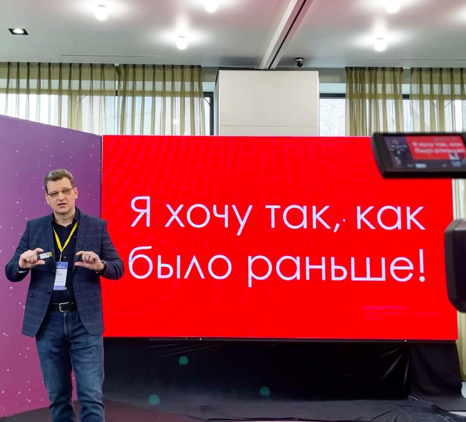
One of the brightest reports of the meeting was the speech of Andrey Pchelintsev - Head of Core Products "M.Video", who told the forum participants about the peculiarities of the company's website redesign in terms of using the product approach.
Next is the first-person narration. Questions, thoughts, ideas and suggestions are accepted in the comments to this publication. Welcome aboard!
Hello, I am...
Hello everyone, I'm ─ Andrey Pchelintsev, Head of Core Products M.Video. We are part of the M.Video-Eldorado Group , one of the top 10 largest sellers of electronics in the world.
CORE Products at M.Video-Eldorado are nine product teams working on the company's website and mobile application.
In the context of the crisis provoked by the coronavirus pandemic, our Group is very dynamically transforming, actively developing online channels. We already have more than 50% online share, which makes serious demands on the website and mobile application.
What is a product and what does the redesign have to do with it?
At all levels of our business, we strive to practice a product approach. What it is, in theory, is written in a variety of sources (tyk, tyk, tyk). But, as they say, "It was smooth on paper, but they forgot about the ravines, and walk on them." On the basis of this article, I would like to share with you my experience and the bumps filled in the process of working on current projects.
I believe that it is impossible to develop modern complex online systems focused on customer interaction outside of the product approach. Therefore, the product is the central link in any changes that are made.
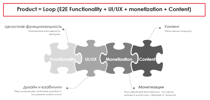
What is a product? In our understanding, a product is a holistic user experience that is decomposed into four components:
- Certain technical functionality;
- The resulting combination of design and usability;
- Filling content;
- Long term monetization.
Website redesign is a strategic step, it is work to change the appearance and functionality of the site. And the redesign itself corresponds to the characteristics of the product and, in my opinion, should be carried out within the framework of the product approach.
When is a redesign needed?
Obviously, redesign is a very serious activity and it is important to understand why it is needed, what is its reason. In my opinion, any of the parameters presented in the illustration below, even individually, can cause a redesign.
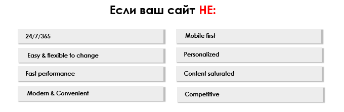
Again, any of the above parameters can lead to a redesign.
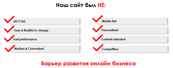
We had the whole set. The site did not meet any of the parameters and was a serious barrier to the development of online business. At the first stage, we updated the site interface.
Operation failed!
Do you know how many redesigns are lucky? How many are failing? More than 85% of redesign cases are failed!
There is no single explanation as to why this is happening. For myself, I explain this by the enormous complexity of the changes that must occur and the incorrectly established "diagnosis" for the redesign.
From the outside it may seem that it is extremely easy to change the design of the site, but this is true only for small sites. The redesign of a huge site like the M.Video site is a serious challenge, since there are dozens of different types of pages, countless interconnected elements and the most serious requirements for UI / UX.
It seems, from the outside, what is difficult to take and make a redesign ─ change the visual, style elements, fonts, etc., it is possible to change the functionality somewhere ─ quite standard work on changing the product.
Order matters
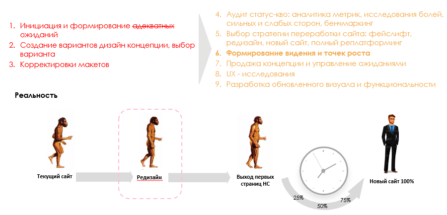
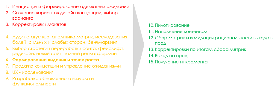
How do you approach a redesign? Let's take a look at the main steps and define the sequence. In my opinion, everything should be similar to how it is presented in the illustration below.
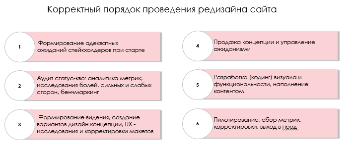
Let's look a little more in detail in an order of magnitude. And compare the plans with the fact.
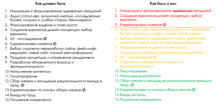
So, on the left is a detailed order of the steps in the order of the redesign. Everything is shown here in stages.
Let's take a look at our case on the right. We are not unique and in the case of our redesign we launched, of course, crookedly.
I divided all the stages into 3 areas - red when we did everything wrong, yellow when we tried to fix everything, and green when we did it well. I just joined the company at the end of the red block.
Don't create expectations and design concepts without analyzing and shaping a vision
Let's talk a little about goal setting using our example. It all started with the fact that we created the wrong expectations, both in terms of money and time. In addition, we did not have an understanding of the complexity of moving from the current site to a new site and, therefore, no strategy for moving to a new site. We did not have unambiguous answers to key questions:
- As it will be?
- Do we immediately change the new one to the old one or do it page by page?
- Do we give an opportunity to switch to the old one, etc.
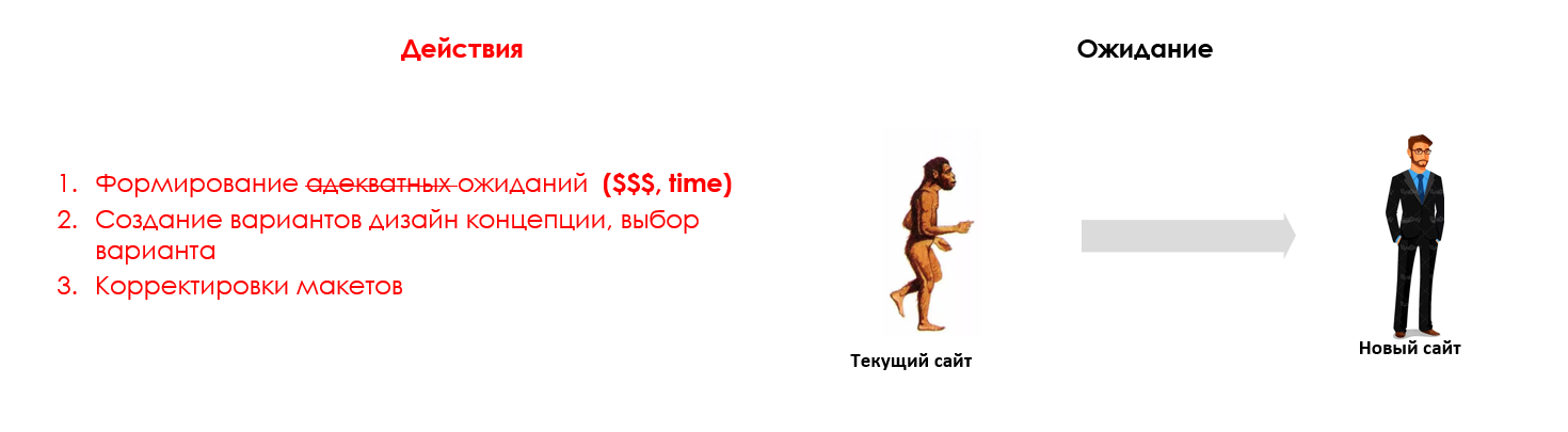
Initially, there was no understanding of the redesign itself. But there were already serious overestimated expectations both in terms of money and timing of the process, and in terms of the necessary resources.
I just joined the company at this stage. I still remember the central slide of the entire presentation on the sale of a new website within the company, the red background of the fill and white numbers in the increment of several billion rubles from the creation of a new website.
Of course, these numbers have been in front of everyone's eyes for a long time and incorrect expectations were initially created. There was a constant creation of some design concepts, their editing and discussion, although there was no normal analytics, no research, no understanding of users' pains, no competitive analysis, and, which is very important, no vision.
I believe that vision is a key element in building an online product and building a product in the absence of vision and strategy is like sailing without sails in an unknown direction.
It's never too late to start making amends
After immersion in the situation, it became clear that:
A. It needs to be corrected;
B. The problem of moving to the new site was much more serious and it was impossible to allow different customer experiences on the one hand, and on the other hand, there was no desire to repeat the visual of the outdated site.
As we dive into details, analyze and research, an approach was chosen - to go to a new site through a redesign. The aim of the redesign was the most seamless CJ for the newly created pages of the site, that is, uniformity:
- mesh;
- fonts;
- style elements;
- common elements (header, footer, etc.);
- colors and other things.
A basic movement strategy was chosen. Further, the vision and product strategy of the site was formulated, which designated "point B". It was a key element that formed an image of a single result for all participants in the process.
But to come up with a vision, of course, is good, but it still had to be planted in the design concept, in every possible way to lobby, to defend what is called “sell”.
Globally, in a large company, the sale stage is a key phase, since there are expectations of stakeholders of different levels on the one hand, and a large number of interested parties in the functionality, displaying any elements on the other hand. And linking all these expectations and "wishes" with each other, and also with the vision / concept is an absolutely non-trivial task. Moreover, it is important not only to sell it once, but also to maintain expectations in the future, synchronizing expectations.
We spent a serious amount of time on this activity, simultaneously conducting research, development, adjusting work as necessary, since many works were going in parallel due to an incorrect start.
Even if the "opening" is lost, there is a chance of winning the "endgame"
Thanks to the orange zone, where we “steered” the correct stages, created a vision, strategy, concepts, received arguments about how we were going and started development, we were able to progressively align activities and approach the last stage in a fairly correct organization of the process.
We were systematically ready for the piloting stage, conducting phased piloting, collecting metrics, validating the implementation, making adjustments, if necessary, we gradually approached to correctly roll everything out for food.
During the work, there were many curiosities and insights, for example, we forgot about some object, but the systematic tracking of metrics helped us to cope with everything.
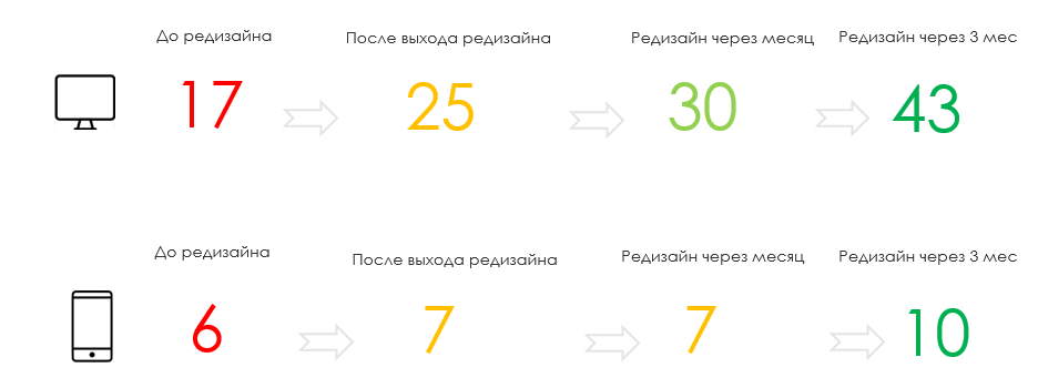
How to understand that "everything worked out"? View metrics!
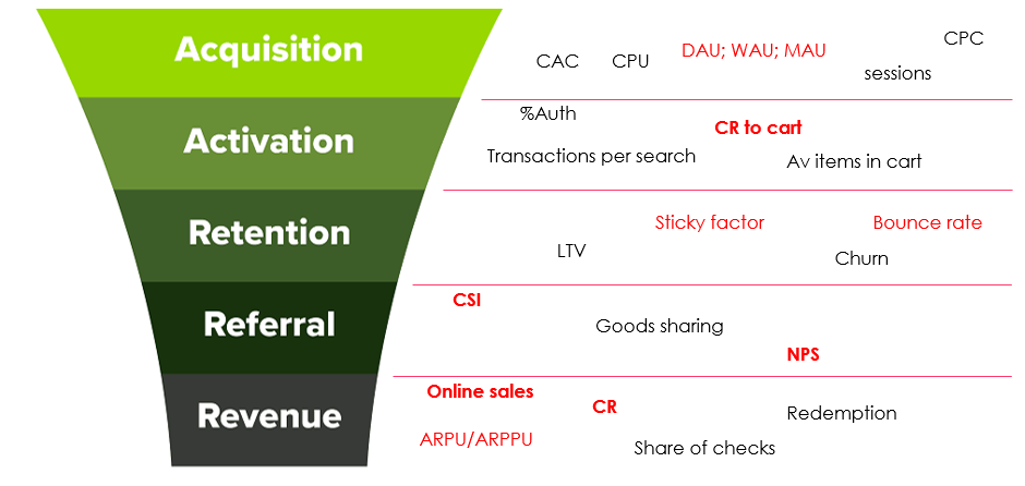
The main focus of the redesign was to improve the selection process. We didn't touch the basket and check-out. Our baseline metric, which we initially improved upon, was online sales.
Another metric that we initially looked at, of course, was both the total conversion from the “selection” process to the basket, and micro conversions by CJ stages. And, of course, we looked at the average check. These are very basic first-order metrics, in general, the number of monitored metrics exceeded several dozen.
User rating
In addition to business metrics, loyalty metrics were important for us - NPS, CSI, which we measure using the UX feedback widget. The widget gives us both quantitative and qualitative data, which allows us to receive information in dynamics.
Since we receive hundreds of thousands of responses, all statistical "outliers" are smoothed out, which makes the data fairly representative. Now we measure CSI at every stage of the Customer Journey, this also gives great food for the mind.
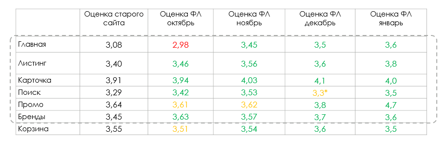
If you look at these metrics according to the results of the redesign, then we have grown by 15-25% depending on the section of the site. This is a lot considering, again, that we get hundreds of thousands of comments and ratings from users. It is very difficult to increase this indicator even by 5%.
Don't forget technical metrics
We took a close look at the site's loading speed. Increasing it was one of the goals of the redesign. We made a redesign on the "bones" of the old site, gradually weaving a new one into the infrastructure. As part of the design update, the loading speed has also improved.
In e-commerce, loading speed directly affects key metrics. There is a study by Amazon, according to which every extra 100ms of downloads reduces sales by 1%. Google has similar data - every 500 ms they reduce the amount of traffic by 20%. We also have internal studies where this dependence is expressed.
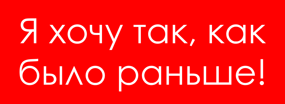
Durov, return the wall!
You can probably guess what the most popular reaction to updates is? "Put everything back as it was, your new awfully awkward one." This is usually said by 99.9% of Orthodox users. Whatever you do, there will still be people who want the "old design", that's okay. It is important to correctly track and respond to feedback.
Usually, when redesigning, users are given the opportunity to return to the old version of the site. We didn't do it on purpose. First, we were confident that the proposed solutions are much better for the customers than what was. It is clear that these are "hallucinations" in full, and it is very difficult to prove it. But the research, the metrics that we collected, confirmed step by step that we were right.
Secondly, we implemented a series of technical changes that provided the customer with a better user experience. Third, as the pilot rolled out, we looked at user feedback. Any redesign is a pain for the client. Usually, many users start to resent and ask to return everything as it was. We saw that there were very few such messages. Therefore, the further we rolled out, the bolder we became in our intentions.
Our expectations for metrics based on the pilot's results were flat, that is, we, conditionally, wanted to go “to zero” in terms of metrics. But the product metrics at the end of the pilot were significantly higher than on the old site, which gave confidence in the right path.
There was also an understanding that the format, the design that existed, was inappropriate. And we will definitely change it. Therefore, we decided that we would not offer a return to the old site. In which case we would leave the old site and finalize the interface. It was a risky move. Thank goodness we didn't have to use a reserve parachute.
Light muesli
Having passed the thorny path on the way from the old site to the new, I would like to briefly share with you short theses that I experienced in full growth.
1. Site speed and design are intertwined.
2. User tests and tools to track the instant OS from users are the key to success.
3. Whatever you do, there will still be people who will want the "old design", this is normal, you need to be able to get feedback and respond.
4. No need to wait for the "ideal" state, roll it out! At least for a pilot, conduct experiments, collect metrics there, the ideal state on test environments is not a guarantee of the result.
5. After the "completion of the redesign" work on the redesign does not stop.
6. Metrics are the best friends of the product and the team.
Thanks for attention!
ZY We still need cool programmers! Go to a meeting!