
At Playrix, a significant amount of resources are allocated for data preparation and analysis, we try to use advanced technologies and take employee training seriously. The company is among the top 3 mobile game developers in the world, so we try to keep the appropriate level in data analysis and specifically in Business Intelligence. More than 27 million users play our games every day, and this figure can give a rough idea of the amount of data generated by mobile devices every day. In addition, data is taken from dozens of services in various formats, after which it is aggregated and loaded into our storages. We work with AWS S3 as Data Lake, while Data Warehouse on AWS Redshift and PostgreSQL has limited use. We use these databases for analytics. Redshift is faster but more expensivethat's why we store the most requested data there. PostgreSQL is cheaper and slower, it stores either small amounts of data or data whose read speed is not critical. For pre-aggregated data, we use Hadoop cluster and Impala.
The main BI tool in Playrix is Tableau. This product is well known in the world, it has ample opportunities for data analysis and visualization, work with various sources. Plus, you don't have to write code for simple analysis tasks, so you can train users from different departments to analyze their business data on their own. The vendor of the tool Tableau Software also positions its product as a tool for self-analysis of data, that is, for Self-Service.
There are two main approaches to data analysis in BI:
- Reporting Factory . This approach has a department and / or people developing reports for business users.
- Self-Service. - .
The first approach is traditional, and most companies have an enterprise-wide reporting factory like this. The second approach is relatively new, especially for Russia. It is good because the data is researched by business users themselves - they know their local processes much better. This helps to unload developers, relieve them of the need to dive into the specifics of team processes and create the most basic reports every time. This helps solve what is probably the biggest problem - bridging the chasm between business users and developers. After all, the main problem of the Reporting Factory approach is precisely that most of the reports may remain unclaimed only due to the fact that programmers-developers misunderstand the problems of business users and, accordingly, create unnecessary reports.which are either altered later, or simply not used.
At Playrix, programmers and analysts were initially involved in the development of reports in the company, that is, specialists who work with data on a daily basis. But the company is developing very rapidly, and as users' needs for reports grow, the report developers have ceased to be in time to solve all the tasks of their creation and support. Then the question arose of either expanding the BI development group, or transferring competencies to other departments. The Self Service direction seemed promising to us, so we decided to teach business users to create their own projects and analyze data on their own.
In Playrix, the Business Intelligence division (BI Team) works on the following tasks:
- Collection, preparation and storage of data.
- Development of internal analytics services.
- Integration with external services.
- Development of web interfaces.
- Reporting development in Tableau.
We are engaged in the automation of internal processes and analytics. In a simplified way, our structure can be represented using the diagram:

Mini-teams BI Team The
rectangles here represent mini-teams. On the left - back teams, on the right - front teams. Each of them has sufficient competencies to work with the tasks of related teams and take on them when the other teams are overloaded.
The BI Team has a full development cycle: from collecting requirements to deploying on a product environment and subsequent support. Each mini-team has its own systems analyst, developers and test engineers. They serve as the Reporting Factory , preparing data and reports for internal use.
It is important to note here that in most Tableau projects we develop not simple reports, which are usually shown in demos, but tools with rich functionality, a large set of controls, extensive capabilities and connection of external modules. These tools are constantly being revised, new features are added.
However, simple local problems also come, which can be solved by the customer himself.
Transfer of competencies and launch of a pilot project
According to our experience of working and communicating with other companies, the main problems when transferring data-competencies to business users are:
- The reluctance of users themselves to learn new tools and work with data.
- Lack of support from management (investments in training, licenses, etc.).
We have colossal support from management, moreover, the management proposed to introduce Self-Service. Users have a desire to learn how to work with data and Tableau too - this is interesting for the guys, plus data analysis now is a very significant skill that most will definitely come in handy in the future.
Implementing a new ideology at once throughout the company usually requires a lot of resources and nerves, so we started with a pilot. The Self-Service pilot project was launched in the User Acquisition department a year and a half ago, and during the pilot process, mistakes and experience were accumulated to pass them on to other departments in the future.
The User Acquisition direction works on the tasks of increasing the audience of our products, analyzes the ways of purchasing traffic and chooses in which directions to attract users it is worth investing the company's funds. Previously, for this direction, reports were prepared by the BI team, or the guys themselves processed the uploads from the database using Excel or Google Sheets. But in a dynamic development environment, such analysis entails delays, and the number of analyzed data is limited by the capabilities of these tools.
At the start of the pilot, we conducted basic training for employees to work with Tableau, made the first common data source - a table in the Redshift database, in which there were more than 500 million rows and the necessary metrics. It should be noted that Redshift is a columnar (or columnar) database, and this database serves data much faster than relational databases. The pilot table in Redshift was really big for people who never worked with more than 1 million rows at the same time. But it was a challenge for the guys to learn how to work with data of such volumes.
We knew that performance issues would begin as these reports got more complex. We did not give users access to the database itself, but a source was implemented on the Tableau server, connected in live mode to a table in Redshift. Users had Creator licenses and could connect to this source either from the Tableau server, developing reports there, or from Tableau Desktop. I must say that when developing reports on the web (Tableau has a web edit mode), there are some limitations on the server. Tableau Desktop doesn't have such restrictions, so we mainly develop on Desktop. In addition, if only one business user needs analysis, it is not necessary to publish such projects on the server - you can work locally.
Training
It is customary in our company to conduct webinars and knowledge sharing, in which each employee can talk about new products, features or capabilities of the tools with which he works or that he is researching. All such activities are recorded and stored in our knowledge base. This process also works in our team, so we also periodically share knowledge or prepare fundamental training webinars.
For all users with Tableau licenses, we hosted and recorded a half-hour webinar on working with the server and dashboards. They talked about projects on the server, working with native controls of all dashboards - this is the top panel (refresh, pause, ...). It is imperative to tell all Tableau users about this so that they can fully work with native capabilities and do not make requests for the development of features that repeat the work of native controls.
The main obstacle to mastering a tool (and indeed something new) is usually the fear that it will not be possible to understand and work with this functionality. Therefore, training is perhaps the most important step in implementing the self-service BI approach. The result of the implementation of this model will greatly depend on him - whether it will take root in the company at all and, if so, how quickly. At launching webinars, the barriers to using Tableau should be removed.
There are two groups of webinars that we conducted for people who are not familiar with the work of databases:
- Beginner's Starter Knowledge Kit:
- Data connection, connection types, data types, basic data transformations, data normalization (1 hour).
- Basic visualizations, data aggregation, basic calculations (1 hour).
- /, (2 ).
In this first kick-off webinar, we cover everything related to data connectivity and data transformation in Tableau. Since people usually have a basic level of proficiency in MS Excel, it is important here to explain how working in Excel is fundamentally different from working in Tableau. This is a very important point, since you need to switch a person from the logic of tables with colored cells to the logic of normalized database data. At the same webinar, we explain the work of JOIN, UNION, PIVOT, and also touch on Blending. In the first webinar, we barely touch on data visualization, its goal is to explain how to work and transform your data for Tableau. It is important for people to understand that data is primary and most problems arise at the data level, not at the visualization level.
The second webinar on Self-Service aims to talk about the logic of building visualizations in Tableau. Tableau is very different from other BI tools precisely in that it has its own engine and its own logic. In other systems, for example, in PowerBI, there is a set of ready-made visuals (you can download additional modules in the store), but these modules are not customizable. In Tableau, you actually have a blank slate on which you can build whatever you want. Of course, Tableau has ShowMe - a menu of basic visualizations, but all these graphs and diagrams can and should be built according to the logic of Tableau. In our opinion, if you want to teach someone to work with Tableau, then you do not need to use ShowMe to build charts - most of them will not be useful to people at the start, but you need to teach exactly the logic of building visualizations. For business dashboards, it is enough to knowhow to build:
- Time Series. Line / Area Charts (line charts),
- Bar Charts
- Scatter Plots,
- Tables
This set of visualizations is enough for self-analysis of the data.
Time Series: they are used very often in business because it is interesting to compare metrics in different periods of time. Probably, all the employees of the company are looking at the dynamics of the business results. We use Bar Charts to compare metrics by category. Scatter Plots are rarely used, usually to find correlations between metrics. Tables: something that business dashboards cannot completely get rid of, but whenever possible we try to minimize their number. In tables, we collect the numerical values of metrics by category.
That is, we send people on a free float after 1 hour of training in working with data and 1 hour of training in basic calculations and visualizations. Then the guys themselves work with their data for some time, face problems, gain experience, just get their hands on it. This stage takes 2-4 weeks on average. Naturally, during this period there is an opportunity to consult with the BI Team if something does not work out.
After the first stage, colleagues need to improve their skills and explore new opportunities. For this, we have prepared in-depth training webinars. In them, we show how to work with LOD functions, table functions, Python scripts for TabPy. We work with live company data, which is always more interesting than fake or data from the basic Tableau dataset - Superstore. In the same webinars, we talk about the main features and tricks of Tableau that are used on proprietary dashboards, for example:
- Sheet Swapping
- Aggregation of charts using parameters,
- Date and metric formats
- Discarding incomplete periods for weekly / monthly aggregations.
All these tricks and features were customary to use a couple of years ago, so everyone in the company got used to them, and we adopted them in the dashboard development standards. We use Python scripts to calculate some internal metrics, all scripts are already ready, and for Self-Service we need to understand how to insert them into our calculations.
Thus, we only run 4 hours of webinars to start Self-Service, and this is usually enough for a motivated person to start working with Tableau and analyze the data on their own. In addition, for data analysts, we have our own webinars, they are publicly available, and you can get acquainted with them.
Development of data sources for Self-Service
After the pilot project was carried out, we considered it successful and expanded the number of Self-Service users. One of the big challenges was preparing data sources for different teams. The guys at Self-Service can work with 200+ million rows, so the Data Engineering team had to figure out how to implement such data sources. For most analytical tasks, we use Redshift due to the speed of reading data and ease of use. But giving access to the database to each person from Self-Service was risky from the point of view of information security.
The first idea was to create sources with a live connection to the database, that is, several sources were published on Tableau Server that looked either in tables or in prepared views of Redshift. In this case, we did not store data on the Tableau server, and users through these sources themselves went from their Tableau Desktop (clients) to the database. This works when tables are small (millions) or Tableau queries are not overly complex. As they developed, the guys began to complicate their dashboards in Tableau, use LODs, custom sorts, and Python scripts. Naturally, this led to a slowdown in the work of some Self-Service dashboards. Therefore, a few months after the start of Self-Service, we revised the approach to working with sources.
The new approach we have been using so far has implemented extracts published to Tableau Server. I must say that Self-Service constantly has new tasks, and they receive requests to add new fields to the source, of course, data sources are constantly being modified. We have developed the following strategy for working with sources:
- According to the TOR for the source from the Self-Service side, data is collected in the database tables.
- An immaterialized view is created in the Redshift database test schema.
- The submission is tested for correctness of the data by the QA team.
- In case of a positive result of the check, the view is raised on the prodoval Redshift scheme.
- The Data Engineering team takes a view for support - scripts for analyzing data validity are connected, ETL alarms are connected, and read rights are given to the Self-Service team.
- Tableau Server (), .
- ETL .
- .
- , Self-Service.
A little about point 7. Natively, Tableau allows you to create extracts on a schedule with a minimum difference of 5 minutes. If you know for sure that your tables in the database are always updated at 4 am, then you can simply set the extract at 5 am so that your data is collected. This covers a range of tasks. In our case, tables are collected according to data from various providers, including. Accordingly, if one provider or our internal service did not manage to update their part of the data, then the entire table is considered invalid. That is, you cannot just set a schedule for a fixed time. Therefore, we use the Tableau API to run extracts when tables are ready. Extracts launch signals are generated by our ETL service after it makes sure that all new data has arrived and is valid.
This approach allows you to have fresh valid data in the extract with minimal latency.
Publishing Self-Service Dashboards to Tableau Server
We deliberately do not limit people in experiments with their data and allow us to publish and share our workbooks. Within each team, if a person thinks that his dashboard is useful to others, or that employee needs a dashboard on the server, he can publish it. The BI team does not interfere in the internal experiments of the teams, respectively, they work out all the logic of the dashboards and calculations themselves. There are cases when an interesting project grows out of Self-Service, which is then completely transferred to the support of the BI team and goes to production. This is precisely the very effect of Self-Service, when people, having a good understanding of their business tasks, begin to work with their data and form a new strategy for their work. Based on this, we made the following scheme of projects on the server:
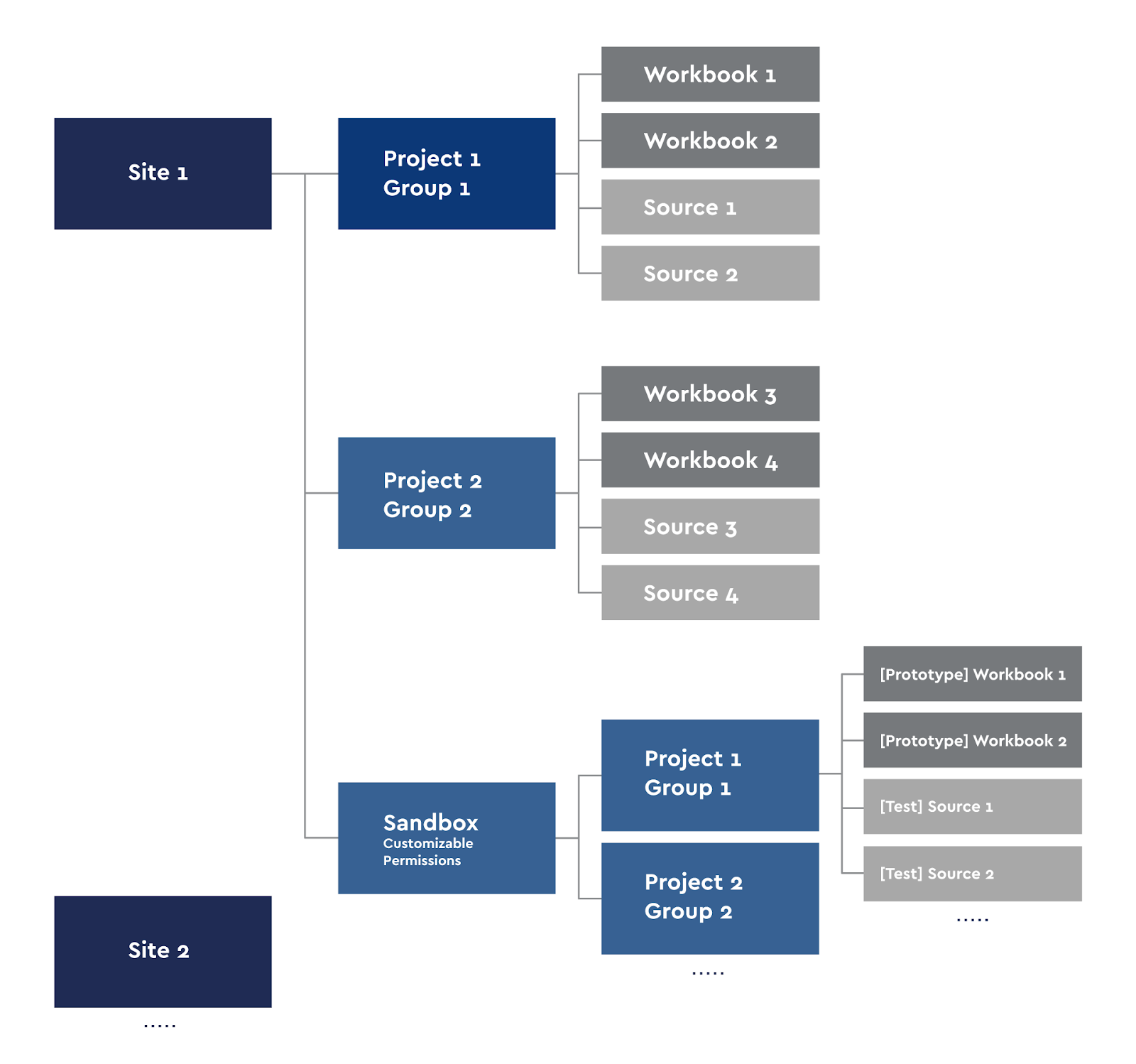
Tableau Server Project Diagram
Each Creator user can publish their workbooks to the server or do the analysis locally. For Self-Service, we made our own Sandbox with our project groups.
Sites in Tableau are ideologically divided so that users of one site do not see the content of another, so we divided the server into sites in areas that do not overlap: for example, game analytics and finance. We are using group access. Each site has projects in which the rights to their workbooks and sources are inherited. That is, the group of users Group 1 sees only their workbooks and data sources. The exception to this rule is the Sandbox site, which also has subprojects. We use Sandbox for prototyping, developing new dashboards, testing them and for the needs of Self-Service. Anyone with publish access to their Sandbox project can publish their prototypes.
Monitoring sources and dashboards on Tableau Server
Since we transferred the load of Self-Service dashboards requests from the database to the Tableau Server, we work with large data sources and do not limit people on requests to published sources, another problem arose - monitoring the performance of such dashboards and monitoring the created sources.
Monitoring the performance of dashboards and the performance of Tableau servers is a task faced by medium and large companies, therefore, quite a lot of articles have been written about the performance of dashboards and its tuning. We did not become pioneers in this area, our monitoring is several dashboards based on the internal PostgreSQL Tableau Server database. This monitoring works with all content, but you can select Self-Service dashboards and see their performance.
The BI Team solves dashboard optimization problems from time to time. Users sometimes come up with the question “Why is the dashboard slow?”, And we need to understand what “slow” is from the user's point of view and what numerical criteria can characterize this “slow”. In order not to interview the user and not take away his working time for a detailed retelling of the problems, we monitor and analyze http requests, find the slowest and find out the reasons. After that, we will optimize the dashboards, if this can lead to an increase in performance. It is clear that with a live connection to the sources, there will be delays associated with the formation of a view in the database, delays in receiving data. There are also network delays that we are investigating with our support team for the entire IT infrastructure, but we will not dwell on them in this article.
A bit about http requests
Each user interaction with the dashboard in the browser initiates its own http request, transmitted to the Tableau Server. The entire history of such queries is stored in the internal PostgreSQL Tableau Server database, the default storage period is 7 days. This period can be increased by changing the Tableau Server settings, but we did not want to increase the table of http requests, so we simply collect an incremental extract that only contains fresh data every day, while the old ones are not overwritten. This is a good way with a minimum of resources to keep in the extract on the server historical data that is no longer in the database.
Each http request has its own type (action_type). For example, _bootstrap is the initial loading of the view, relative-date-filter is the date filter (slider). Most types can be identified by the name, so it is clear what each user does with the dashboard: someone looks more at tooltips, someone changes parameters, someone makes their own custom_views, and someone unloads data.
Below is our service dashboard that allows us to define slow dashboards, slow request types and users who have to wait.
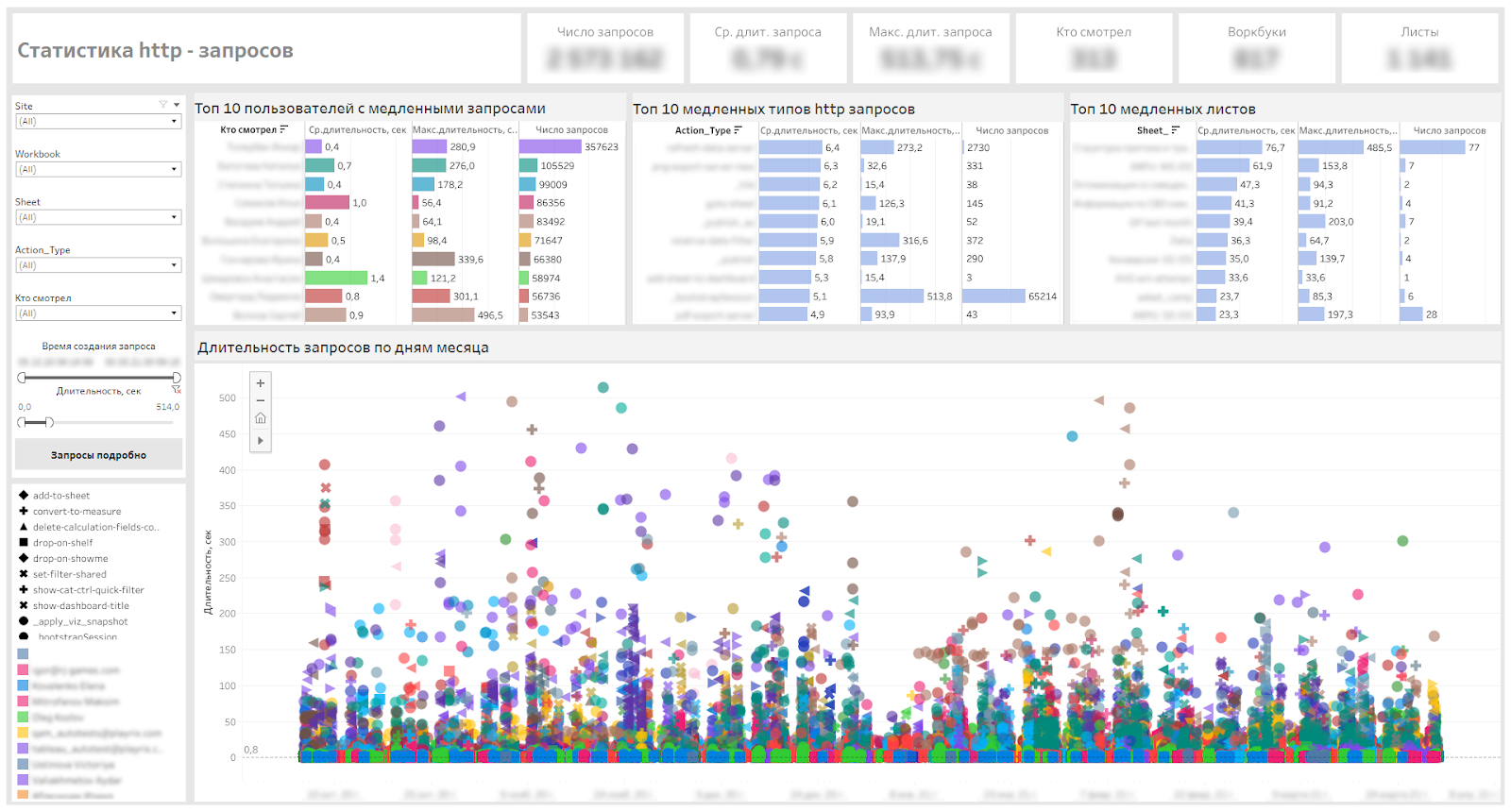
Dashboard for monitoring http requests
Monitoring VizQL Sessions
When a dashboard is opened in the browser, a VizQL session is launched on the Tableau server, within which visualizations are rendered, resources are also allocated to maintain the session. These sessions are dropped after 30 minutes of inactivity by default.
As the number of users on the server increased and the Self-Service was introduced, we received several requests to increase the VizQL session limits. The problem for users was that they opened dashboards, set filters, looked at something and moved on to their other tasks outside the Tableau Server, after a while they returned to open dashboards, but they were reset to the default view, and they had to be redone tune. Our task was to make the user experience more comfortable and to make sure that the load on the server does not increase critically.
The next two parameters on the server can be changed, but you must understand that the load on the server may increase.
vizqlserver.session.expiry.minimum 5
Number of minutes of idle time after which a VizQL session is eligible to be discarded if the VizQL process starts to run out of memory.
vizqlserver.session.expiry.timeout 30 Number of minutes of idle time after which a VizQL session is discarded.
Therefore, we decided to monitor VizQL sessions and track:
- Number of sessions,
- Number of sessions per user,
- Average duration of sessions,
- The maximum duration of sessions.
In addition, we needed to understand on which days and which hours the largest number of sessions opens.
The result is a dashboard like this:

Dashboard for monitoring VizQL sessions
Since the beginning of January this year, we began to gradually increase the limits and monitor the duration of sessions and load. The average session length increased from 13 to 35 minutes - this can be seen on the graphs of the average session duration. The final settings are as follows:
vizqlserver.session.expiry.minimum 120 vizqlserver.session.expiry.timeout 240
After that, we received positive feedback from users, which became much more pleasant to work - the sessions stopped fading.
The heatmaps of this dashboard also allow us to schedule service work during the hours of minimal server demand.
We monitor the change in the load on the cluster - CPU and RAM - in Zabbix and AWS console. We did not record significant changes in the load during the increase in timeouts.
If we talk about what can bend your Tableau server a lot, then it can be, for example, an unoptimized dashboard. For example, build a table in Tableau with tens of thousands of rows by categories and id of some events, and in Measure use LOD calculations at the id level. With a high probability, the display of the table on the server will not work, and you will get a crash with an Unexpected Error, since all LODs in minimum granulation will consume very much memory, and very soon the process will run into 100% of memory consumption.
This example is given here in order to make it clear that one non-optimal dashboard can eat up all the server resources, and even 100 VizQL sessions of the optimal dashboards will not consume so many resources.
Monitoring Server Data Sources
Above, we noted that for Self-Service, we prepared and published several data sources on the server. All sources are data extracts. The published sources are saved on the server and made available to the guys who work with Tableau Desktop.
Tableau has the ability to mark sources as certified. This is what the BI team does when preparing data sources for Self-Service. This ensures that the source itself has been tested.
Published sources can be as large as 200 million lines and 100 fields. For Self-Service, this is a very large volume, since not many companies have sources of such volumes for independent analytics.
Naturally, when collecting requirements for generating a source, we look at how we can reduce the amount of data in the source by grouping categories, breaking sources by project, or limiting time periods. But still, as a rule, sources are obtained from 10 million lines.
Since the sources are large, take up space on the server, use server resources to update extracts, all of them need to be monitored, to see how often they are used and how quickly they grow in volume. For this, we made monitoring of published data sources. It shows users connecting to sources, workbooks that use those sources. This allows you to find irrelevant sources or problematic sources that the extract cannot collect.
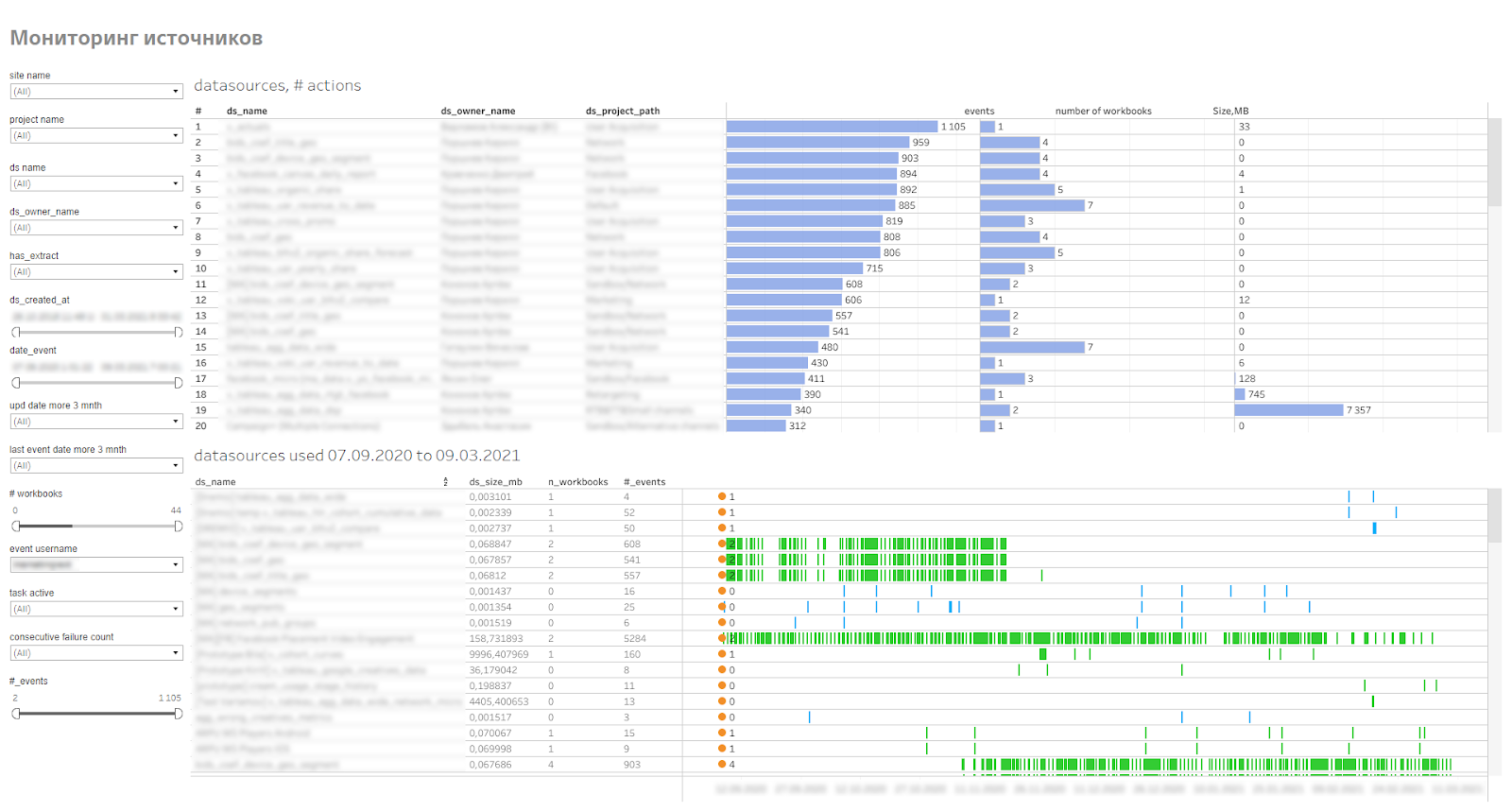
Source monitoring dashboard
Outcome
We have been using the Self-Service approach for 1.5 years. During this time, 50 users began to independently work with data. This reduced the load on the BI Team and allowed the guys not to wait until the BI Team comes to their specific task of developing a dashboard. About 5 months ago, we began to connect other areas to self-analytics.
We are planning to conduct training on data literacy and visualization best practices.
It is important to understand that the Self-Service process cannot be implemented quickly across the entire company; it will take some time. If the transition process is organic, without shocking employees, then after a couple of years of implementation, you can get fundamentally different processes for working with data in different departments and areas of the company.