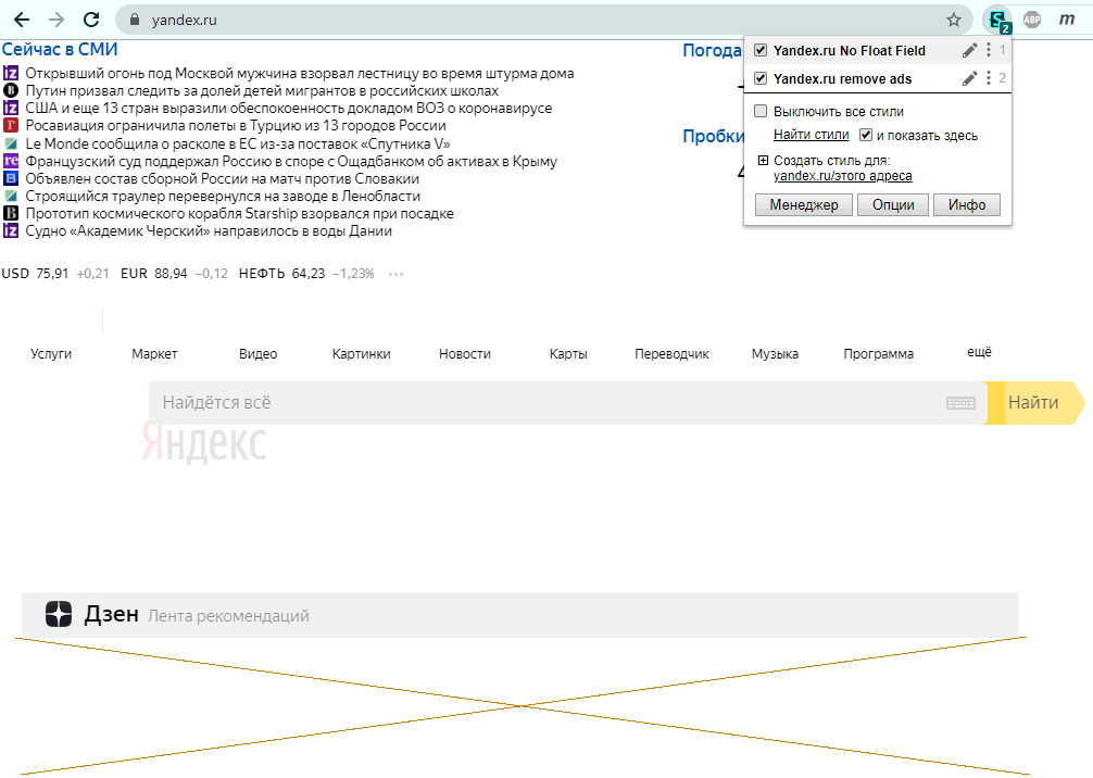
 We will talk about user-styles that help programmers not to be distracted by Zen and not close a part of the browser window with a Yandex search bar.
There is no doubt that the readers of the site know all this, but they do not often react to Yandex's wishes to improve the lives of the majority. I, too, although I once wrote these styles for myself, for almost a year did not react to the rebranding of Main Yandex, when the custom Widgets were finally removed and Zen was introduced. But today I put things in order (when it finally became clear that there was nothing special to watch, and if there was, then not in advertising mode), so that Yandex could be used more efficiently).
The appearance of Zen and self-launching videos pretty much interferes with the programmer or any researcher who came to the site for a request, and here - pictures and videos begin to show their own and take away the hard-won concentration on work) or just time.
Zen banners under search
To some, on the contrary, video and advertising will attract fresh associations and enrich the look of a meager search bar, but now we are talking about a user focused on his task. What does he need from the Yandex home page?
- search bar;
- contextual hints below it;
- no animations and banners around;
- without Zen , of course .
Suddenly, sometimes it is needed ? Or is the user not alone, or is he not always so focused and can afford to look? Okay, let's leave it hovering over the heading "Daen" below the search bar.
To solve this problem in a desktop browser, you need to install the user-style "Yandex remove ads" from the site userstyles.org. Before you install it, you need to install the extension (webextension) Stylus for Chrome (Yandex , Opera , Vivaldi , others) in your browser , for Firefox . And be patient a little ... Why?
Unfortunately, it can hardly cope with the flow of visitors, it is always very slow and can open a page in 1-2 minutes. But the site is useful, old, has collected many usersstyles, and the best hosting for them has not yet been invented - it has been in this state for the last 3 years.
If we succeed in delivering this style, solutions to such questions will be observed:
- A moving carousel of text news is shown statically, without animations ,
- Between the lines there is emptiness , because there sometimes appear banners, layout which changes periodically and changes the usual balance of mineral blocks. To ensure that changes are observed with less impact, space for banners is saved.
- , ,
- , , , . , , . «» — «» -, — « ».
- , , ( ) 4 , , .
- , , . , , , , . .
- , , , . .
- ( ), — , - .
From time to time (from “every day” to “every six months”), Yandex changes the styles of its pages, so the user style can break. But the code is open source, and the author of the style sometimes corrects it himself. Chances are that when you update the styling from userstyles.org, the features will again tweak in the right direction. If not, you can disable the broken extension in the toolbar on the Stylus extension icon (or fix it on your own).
How not to close part of the window with a floating search string?
There is another user style for this task - " Yandex No Float Field ". With it, the top field with the search line stops floating and covers part of the screen, and only the logo on the left floats, when you hover over which the search line appears (without scrolling up).
Additionally, this style makes the list of hints slightly transparent and does not completely overlap the useful content of the page. And 3 links to search on Google, Bing and Mail are placed higher, not at the very bottom of the page.
Eventually, we see that, if desired, some styles can improve the look of the search engine, which clutters the interface with visual effects. In addition to the named 2 styles, there are solutions of different authors in the form of user scripts with suppression of advertising banners, including those specific to this site.
Of course, I would like to see these conveniences in the functions of the Yandex site itself, so that in desktop and mobile designs it would not be necessary to use extensions to improve its direct search functions. For example, Google's interface with similar capabilities is simpler and more practical. (Although on the stuck line I also had to work out with him .)