The main content of the page and the main element
On any page, we can find the main content. It will differ from page to page, but it will definitely not repeat itself. For example, as on the Smashing Magazine website.


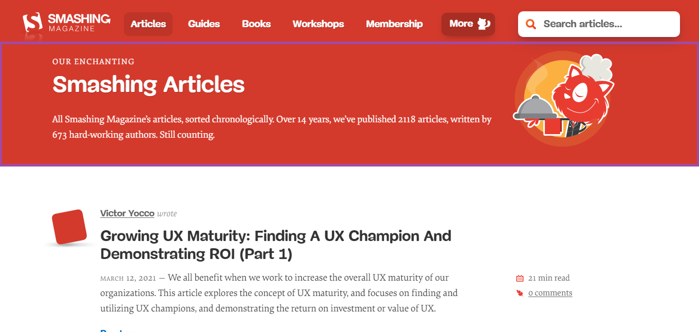
The page “Our Enchanting Smashing Articles” displays a list of articles, and on the page “Growing UX Maturity: Finding A UX Champion And Demonstrating ROI (Part 1)” we already see the text of the article.
But there is only one selection in the images, which is called main content or main content. This area should be marked using the main element.
Additional content to the main and aside element
In addition to the main content, there may be areas on the page that are thematically related to it. They complement the main content, but if removed from the page, the clarity of the content will not be affected.
For example, on the website Lenta.ru on the page with the news “Undefeated Joshua
will learn to keep youth from Ronaldo” there is a block “Related materials”.

The block contains an article about Cristiano Ronaldo, who was mentioned in the text of the main content, that is, a thematic connection is created, so the element can be marked with an aside element.
Also on this page with the aside element you can mark up the "Related links" block, because all links are thematically related to the content.

Thematically grouped content and the section element
The section element helps us highlight sections of the page. A section in this context is thematically grouped content, the meaning of which is determined by the title. Based on the definition, it is important to explain the term heading. A heading is a text that gives a "name" to the information.
To explain it better, I will give a few examples. Consider the “News” block on the BBC website.

First of all, it is important to find the title. The block contains the text “News”, which “gives the name” - “News” for 3 news items next to each other. Therefore, this structure is a great example of a section.
Next, let's look at the blocks that display pricing information on the Patreon website.

Now we need to find the title. In this example, the items “Lite”, “Pro”, and “Premium” are headings. Why? Imagine that I am discussing tariffs with someone and say: “Pro tariff”, then my interlocutor will immediately understand which block I am talking about and what information it contains. It turns out that “Pro tariff” is a “name”.
Now we have a title and information, as in the previous example, they can be grouped with a section element.
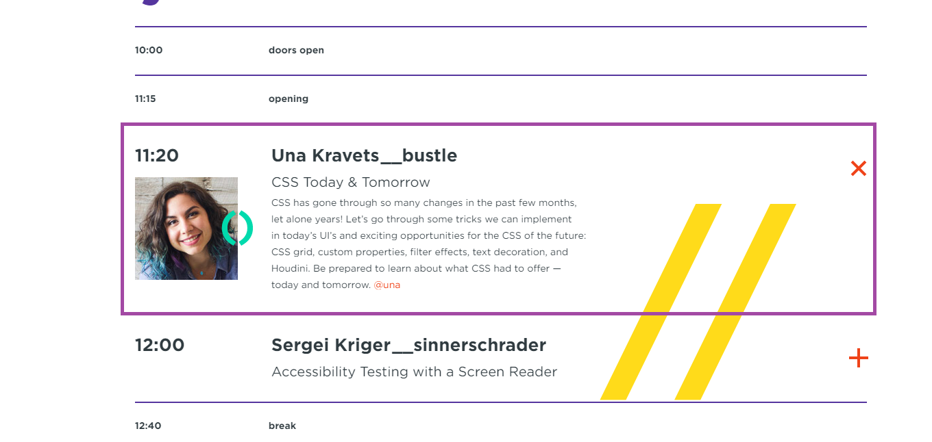
We will look at the last example on the PiterCSS site, where there is a block with information about the report.

Find the title again. Here is the title of the report, which combines the rest of the information about the report and the speaker. Next, I'll group it and the title with a section element.
I hope I was able to pass my rule for using the section element. We look for the title and the content related to it and group with the section element. And it's important to note that a section cannot exist without a heading, so the section element must contain one of the h1-h6 elements.
Independent page regions and the article element
The article element should be used to select independent areas on the page that can be taken out of their logical environment. This element is often confused with the section element, so I want to show the difference with examples.
On the BBC Sport website there is a block with the standings of the second league of the championship of England.

Now I will delete all the surrounding information.

I deleted everything on the page, but I still understand what the block is doing, which is showing the standings. It turns out that removing an element from its logical environment did not affect it in any way.
Now I will take the block with information about the "Pro" plan on the Patreon website and delete all the remaining elements.

I understand that this is a block with information about the "Pro" tariff. Fine. But this is the tariff of which product? What should I do with it? Unclear.
It turns out that removing a block from its logical environment affected it. As a user, I stopped understanding what to do with this block. If I embed it on another site, it looks "foreign".
This is where the essential difference between the section and article elements lies. This is a very fine line, but the point is that if the element is not "lost" when the surrounding context is removed, then it should be marked up with the article element. And if it is lost, then we have a section element.
Navigation and nav element along with ol and ul elements
To highlight the navigation on the page, we should use the nav element. But this is not enough. We often need to group items using a list. The ol and ul elements are suitable for this task. But how do you choose between them?
Based on this question, I will consider two types of navigation, namely strict item ordering and non-strict item ordering.
Strict clause ordering and nav along with ol
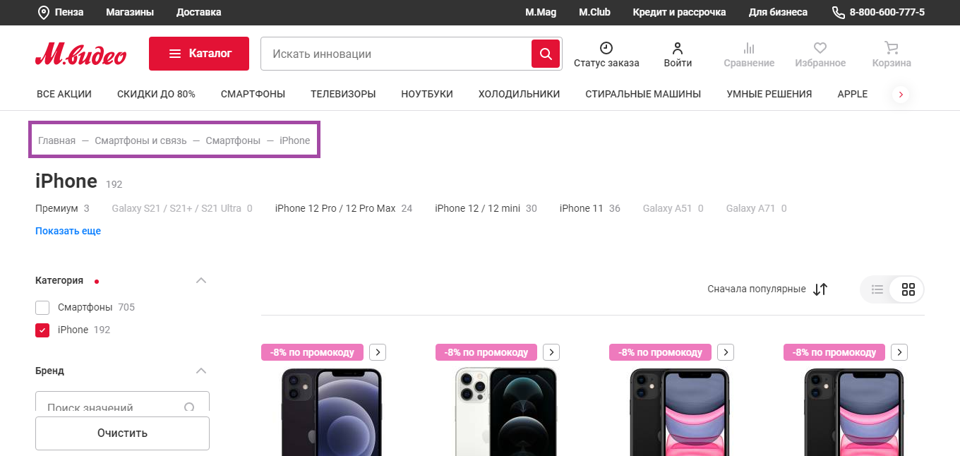
A popular example of navigation where the order of elements is strict are breadcrumbs on the Mvideo website.

Why am I calling this navigation with strict point ordering? If you swap the items, the navigation ceases to correspond to the structure of the site. For example, I will swap the items
"Home" and "Smartphones and communications".
- Smartphones and communication
- the main
- Smartphones
- iPhone
We got an error. We have to go to the home page from the "Smartphones and Communications" page, which is not possible. Based on this, I conclude that the order of the items is important, and for a list containing the strict order of the items, we should use the ol element.
In addition to breadcrumbs, pagination can be attributed to this type of navigation.

Loose item ordering and the nav element along with the ul
An example of such navigation is the menu on the Mvideo website.

I will swap the items again. For example, I will add the items "All promotions" and "Discounts up to 80%" to the end of the list:
- Smartphones
- TV sets
- Laptops
- Refrigerators
- Washing machines
- Smart solutions
- Apple
- All promotions
- Discounts up to 80%
Okay, the items are displayed in a different order, so what? Navigation works as before. It turns out that changing the order of the items did not affect the navigation, so the ul element is suitable here.
Introduction to content and the header element
There is an opinion on the Internet that the header element should be used to mark up the "header" of the site. I do not like this definition at all, because it does not fully reflect the picture.
Yes, we can use the header element to mark up the "top" of the site, but we can also use it inside the section, article, main, aside elements.
Header element inside main, aside, section and article elements
When we nest a header element within the main, aside, section, and article elements, it begins to describe the introductory information for that element.
For example, on Smashing Magazine's site, the header element describes an introduction to the main page content, which is marked up with a main element.

The element groups the “Our Enchanting Smashing Articles” heading and introductory text. This gives us an introduction to the articles that follow.
In the Recent Posts section of the Smashing Magazine home page, the header element can be used to combine the post date, title, and author of the post. In this case, the header element is inside the article element.

On a PiterCSS conference site, the header element can be used to combine the title and sponsor text within the section element.

Header element inside body element
In addition to introducing individual elements, we can mark it up for the entire site as a whole. To do this, we need to nest the header element within the body element.
For example, like on Smashing Magazine, where header elements combine logo, navigation and search.

In general, we can safely use the header element when we need to mark up an "introduction" to the content of either the body element or the main, aside, section, and article elements.
Background information and the footer element
It seems to me that the footer element is, unfortunately, a brother of the header element. If the second is advised to be used for the "header", then the first for the "basement".
The footer element is suitable for marking up background information that follows the element's content. As with the header element, the footer element can be used in several ways.
The footer element inside the article, aside and section elements
On the tutsPlus site, the footer element groups information about the author, the date and the category of the publication. In this case, the footer element is inside the article element.

Footer element inside body element
As I said above, background information also exists for the site as a whole. In this case, this area must be repeated on all pages.
For example, on Smashing Magazine, the footer element displays hashtags, secondary navigation.

Contact information and the address element
According to my observations, this element is one of the most unused, although contact information is on every site. Using the address element, you can mark up the address, phone number, links to social. networks, etc.
For example, on the Mvideo website, the address element should mark the block with the phone and social networks.

Conclusion
I hope that I have managed to show at least a little the variety of cases in which we can use different HTML elements. Hope you can try using this stencil in your projects.
If you like it, please use the address element. It seems to me that he is undeservedly forgotten. Also for those who want to ask “Why is this necessary?” I have one answer - just cool.
PS: I also write CSS / HTML tutorials on my Patreon. You can find it by the link in my profile on Habré.