We at ForePaaS have been experimenting with DevOps for some time now - first as a team, and now across the company. The reason is simple: the organization is growing. Previously, we only had one team for all occasions. She was involved in product architecture, design and security and was quick to respond to any problem. Now we are divided into several teams by specialization: front-end, back-end, development, operation ...
We realized that our previous methods would not be so effective and we need to change something, while maintaining speed without compromising quality and vice versa.
Previously, we called the team devops, which, in fact, did Ops, and was also responsible for development on the backend. Once a week, other developers told the DevOps team what new services should be deployed in production. This sometimes led to problems. On the one hand, the DevOps team did not really understand what was happening with the developers, on the other hand, the developers did not feel responsible for their services.
Recently, the guys at DevOps have been trying to awaken this responsibility in developers - for the availability, reliability and quality of the service code. To begin with, we needed to reassure the developers, who were alarmed by the load that had fallen on them. They needed more information to diagnose emerging problems, so we decided to implement system monitoring.
In this article, we will talk about what monitoring is and what it is eaten with, learn about the so-called four golden signals, and discuss how to use metrics and drill-down to explore current issues.

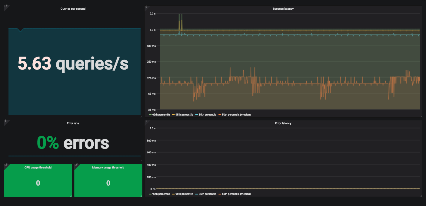
An example of a Grafana dashboard with four golden signals to monitor a service.
What is monitoring?
Monitoring is the creation, collection, aggregation and use of metrics that provide insight into the health of a system.
To monitor a system, we need information about its software and hardware components. Such information can be obtained through metrics collected using a special program or code instrumentation.
Instrumentation is changing your code so that you can measure its performance. We are adding code that does not affect the functionality of the product itself, but simply calculates and provides metrics. Let's say we want to measure the latency of a request. Add a code that will calculate how long it takes for the service to process the received request.
The metric created in this way still needs to be collected and combined with others. This is usually done with Metricbeat for collection and Logstash for indexing metrics in Elasticsearch . Then these metrics can be used for your own purposes. Typically, this stack is complemented by Kibana , which renders data indexed in Elasticsearch.
Why monitor?
You need to monitor the system for various reasons. For example, we monitor the current status of the system and its variations in order to generate alerts and populate dashboards. When we receive an alert, we look for the reasons for the failure on the dashboard. Sometimes monitoring is used to compare two versions of a service or analyze long-term trends.
What to monitor?
Site Reliability Engineering has a helpful chapter on monitoring distributed systems that describes Google's approach to tracking the Four Golden Signals.

Beyer, B., Jones C., Murphy, N. & Petoff, J. (2016) Site Reliability Engineering. How Google runs production systems. O'Reilly. Free online version: https://landing.google.com/sre/sre-book/toc/index.html
- — . . — , .
- — . API . , .
- . (, 500- ) . — , .
- , , . ? . . , , .
?
Take the technology stack, for example. We usually choose popular standard tools instead of custom solutions. Except when the available functionality is not enough for us. We deploy most of the services in Kubernetes environments and instrument the code to get metrics about each custom service. To collect these metrics and prepare them for Prometheus, we use one of the Prometheus client libraries . There are client libraries for almost all popular languages. In the documentation, you can find out everything you need to write your own library.
If it's a third-party open source service, we usually take the exporters suggested by the community. Exporters are the code that collects metrics from the service and formats them for Prometheus. They are typically used with services that do not generate Prometheus metrics.
We send metrics down the pipeline and store them in Prometheus as time series. In addition, we use kube-state-metrics in Kubernetes to collect and submit metrics to Prometheus. We can then create dashboards and alerts in Grafana using Prometheus requests. We will not go into technical details here, experiment with these tools yourself. They have detailed documentation, you can easily figure it out.
For example, let's look at a simple API that receives traffic and processes the received requests using other services.
Delay
Latency is the time it takes to process a request. We measure the latency separately for successful requests and for errors. We don't want these statistics to get mixed up.
Overall latency is usually taken into account, but this is not always a good choice. Better to track latency distribution because it is more in line with availability requirements. The proportion of requests that are processed faster than a given threshold is a common Service Level Indicator (SLI). Here is an example of a Service Level Objective (SLO) for this SLI:
"Within 24 hours, 99% of requests should be processed in less than 1 second."
The most visual way to represent latency metrics is with a time series graph. We put metrics in buckets and exporters collect them every minute. In this way, n-quantiles for service latencies can be calculated.
If 0 <n <1, and the graph contains q values, the n-quantile of this graph is equal to a value that does not exceed n * q out of q values. That is, the median, 0.5-quantile of a graph with x records is equal to a value that does not exceed half of x records.

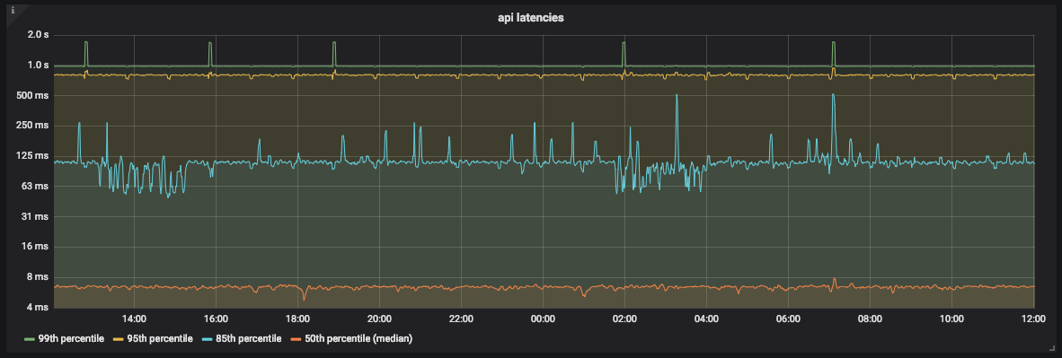
API Latency Graph
As you can see in the graph, most of the time the API processes 99% of requests in less than 1 second. However, there are also peaks around 2 seconds that do not correspond to our SLO.
Since we are using Prometheus, we need to be very careful when choosing the bucket size. Prometheus allows for linear and exponential bucket sizes. It doesn't matter which we choose, as long as estimation errors are accounted for .
Prometheus does not provide an exact value for the quantile. It determines which bucket the quantile is in and then uses linear interpolation and calculates an approximate value.
Traffic
To measure traffic for an API, you need to count how many requests it receives every second. Since we collect metrics once a minute, we will not get the exact value for a specific second. But we can calculate the average number of requests per second using the rate and irate functions in Prometheus.
To display this information, we use the Grafana SingleStat panel. It displays the current average requests per second and trends.

An example of a Grafana SingleStat panel with the number of requests our API receives per second
If the number of requests per second suddenly changes, we will see it. If in a few minutes the traffic is halved, we will understand that there is a problem.
Errors
It is easy to calculate the percentage of obvious errors - divide the HTTP 500 responses by the total number of requests. As with traffic, we use an average here.
The interval must be the same as for traffic. This will make it easier to track traffic with errors on one panel.
Let's say the error rate is 10% in the last five minutes and the API is processing 200 requests per second. It is easy to calculate that, on average, there were 20 errors per second.
Saturation
To monitor saturation, you need to define service limits. For our API, we started by measuring the resources of both the processor and memory, because we did not know which affects more. Kubernetes and kube-state-metrics provide these metrics for containers.

A graph of CPU utilization for our API
Saturation measurement allows you to predict downtime and schedule resources. For example, for database storage, you can measure free disk space and how fast it is filling to understand when to take action.
Detailed dashboards for monitoring distributed services
Let's take a look at another service. For example, a distributed API that acts as a proxy for other services. This API has multiple instances in different regions and multiple endpoints. Each of them depends on its own set of services. It soon becomes quite difficult to read graphs with dozens of rows. We need the ability to monitor the entire system, and, if necessary, detect individual failures.

CPU utilization graph for 12 instances of our API
For this we use drill-down dashboards. On each screen of one panel, we see a global view of the system and can click on individual elements to examine the details. For saturation, we do not use graphs, but simply colored rectangles showing the use of processor and memory resources. If the resource usage exceeds the specified threshold, the rectangle turns orange.

CPU and Memory Usage Indicators for API
Instances Click on the rectangle, go to details and see several colored rectangles representing different API instances.

CPU Usage Indicators for API Instances
If only one instance has a problem, we can click on the rectangle and find out more details. Here we see the region of the instance, received requests, and so on.

A granular view of the state of an API instance. From left to right, top to bottom: Provider region, instance hostname, last restart date, requests per second, CPU utilization, memory utilization, total requests per path, and total error percentage per path.
We do the same with the percentage of errors - we click and look at the percentage of errors for each endpoint of the API in order to understand where the problem is - in the API itself or the services with which it is associated.
We did the same for successful request delays and errors, although there are nuances here. The main goal is to make sure that the service is ok on a global scale. The problem is that the API has many different endpoints, each of which depends on multiple services. Each endpoint has its own delays and traffic.
It's a hassle to set up separate SLOs (and SLAs) for each service endpoint. Some endpoints will have a higher nominal latency than others. In this case, refactoring may be necessary. If separate SLOs are required, you need to divide the whole service into smaller services. Perhaps we will see that the coverage of our service was too wide.
We decided that it would be best to monitor the overall latency. The granularity simply allows the problem to be investigated when latency deviations are so large as to attract attention.
Conclusion
We've been using these methods to monitor systems for some time now and have noticed that the amount of time it takes to find problems and the mean time to recovery (MTTR) have decreased. Detailing allows us to find the actual cause of a global problem, and for us this ability has changed a lot.
Other development teams have also started to use these methods and see only advantages in them. Now they are not only responsible for the operation of their services. They go even further and can determine how changes to the code affect the behavior of services.
The four golden signals do not solve all problems at all, but they are very helpful with the most common ones. With almost no effort, we were able to significantly improve monitoring and reduce MTTR. Add as many metrics as needed, as long as there are four golden signals among them.