However, this publication rarely attracts close attention, unlike, say, Fox News. And there are good reasons for that! Fox News is a theater of absurdity with clowns, and they totally deserve all the criticism they get.
But I’m still curious about the New York Times. They represent the world around them in a certain light, and their vision (at least in my circles), although one can agree or disagree with it, is perceived as something accepted by default.
I wanted to take a closer look at this vision. Therefore, over the next few weeks, I will publish a series of articles on The New York Times, analyzing data collected from the home page of their site using web scraping, as well as from the official API . The first article will focus only and exclusively on A / B testing: how the New York Times tests article headlines and how they change over time.
A / B testing and the New York Times
Look, well, it's 2021, I would rather be shocked if it turns out that the New York Times is not testing headlines in any way. Yes, they themselves speak about it in plain text :
“In addition, the Times practices what is called A / B testing of digital versions of headlines for content on the home page: for about half an hour, one headline is displayed to half of the readers, and another, alternative headline for the other half. At the end of the test, The Times leaves the headline that attracts the most readers. "
But I still had questions:
- How many articles go through A / B testing?
- How many titles are being iterated over for each one?
- Is there any sense in this?
- How different are the headlines?
Methodology
I wrote a script that does the following:
- Scraping the home page of the New York Times website.
- Pulls all headers from the dataset.
- Links them to article metadata provided in the official Times API
- Pushes everything into the table
The script runs every five minutes. I started my observation on February 13th, so below are the conclusions based on the data that was collected over three weeks.
results
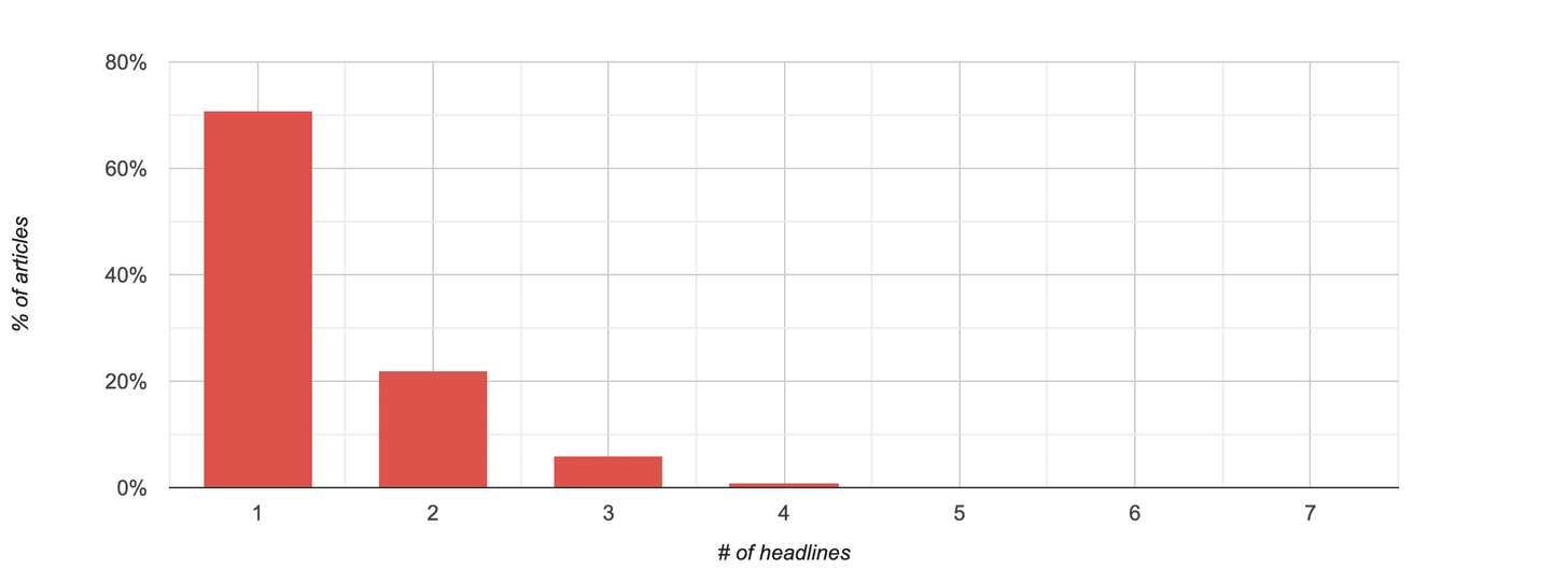
In full accordance with its statement, the New York Times does conduct A / B testing of article headlines. Somewhere in 29% of materials have several titles. The maximum number of headings noted for one article is currently eight .

In many cases, changes boil down to minor fixes: it often happens on the New York Times website that a punctuation or spelling error is corrected after publication. And it also happens that copywriters seem to be unable to decide whether to write an excuse with a capital letter or with a small one?

In other cases, the New York Times changes its headline as new information becomes available. Here's a whole gripping story that is made up of a chain of titles:

- SpaceX will launch another prototype rocket to Mars in test mode (10%)
- SpaceX has suspended testing of a prototype rocket to fly to Mars (1%)
- SpaceX will make another attempt to launch a prototype rocket to Mars (13%)
- SpaceX's prototype rocket went to Mars, landed and exploded (14%)
- The prototype rocket from SpaceX this time managed to land on Mars before the explosion (24%)
- SpaceX's prototype rocket this time manages to land on Mars before the explosion (10%)
- SpaceX's prototype rocket exploded after landing on Mars (27%)
But for the most part, the headline change is clearly the result of A / B testing undertaken to collect more clicks. For example, here is an article about Biden and his management policy - its title has changed radically.

- Calm speech and large-scale program (7%)
- Biden is against Trump, and it works (93%)
The only goal these replacements can pursue is to increase engagement. And it works! This article went hot just hours after the headline was changed (and this confirms my hypothesis that liberals love to read something about Trump).
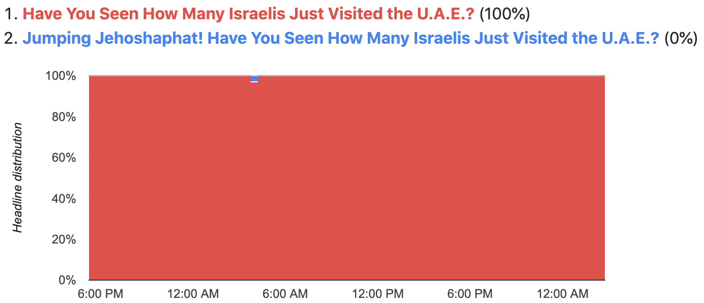
But not all A / B tests are successful. Here's an example of an A / B test that clearly failed - you may have to strain your eyes to see a tiny blue dot on a red background.

- Have you seen how many Israelis have just visited the UAE? (one hundred%)
- Josaphat jumpy! Have you seen how many Israelis have just visited the UAE? (0%)
I hope this failure did not dampen the weird editor who thought of Josaphat the Jumper. What the New York Times sorely lacks are references to the Bugs Bunny cartoon .
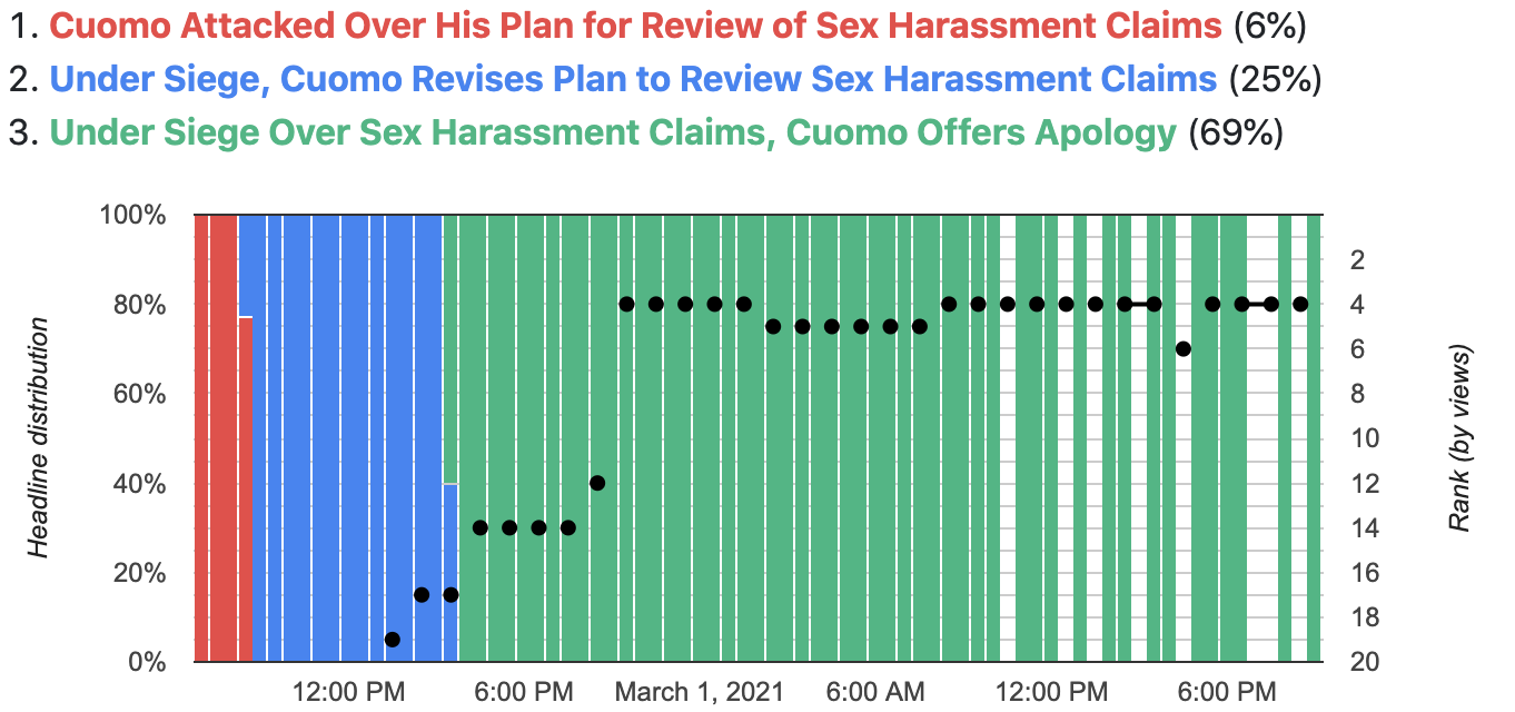
But in general, there is a pattern in the changes: over time, headlines tend to sound more dramatic. Take, for example, an article about Cuomo and his sex life scandal:

- Cuomo under attack for his plan to investigate harassment allegations (6%)
- Besieged by attacks, Cuomo changes plan to investigate harassment allegations (25%)
- Besieged by allegations of harassment, Cuomo apologizes (69%)
After the first replacement, it turns out that Cuomo is not just being attacked, but literally under siege, and after the second, he abruptly moves from a simple revision of plans to an apology. Moreover, the tactic worked: on the charts, you can see how, as the title is adjusted, the article rises higher and higher in the viewer rating.
In the article about Trump's speech at the Conservative conference, everything turns out to be even more incendiary:

- Trump makes an appeal to conservatives and plans to lead the Republican party (3%)
- Trump reveals plans to lead Republican party at conservative conference (7%)
- Trump proclaims himself Republican leader in speech at conservative conference (2%)
- Trump hints at third term at Conservative conference and pledges to lead Republicans to unity (4%)
- Trump pledges to bring Republicans to unity, then blames those who supported impeachment (6%)
- Trump unveils Republican casualties at a conservative conference, a warning shot for the entire party (79%)
It all starts with Trump speaking to the Conservatives and declaring himself the leader of the Republican Party, but the last heading comes down to the lists of victims and warning shots. And - who would have doubted - due to all this pathos, the article takes off and falls into the number of "most read".
Well, the last example is a sensational article based on an interview that Meghan Markle gave to Oprah:

- , – , (3%)
- , – , (1%)
- , (80%)
- « »: , (16%)
I was not even too lazy to watch this two-hour interview and I can tell you that the first two headings reflect its content many times better. Yes, Meghan does admit to having suicidal thoughts, but this is a five-minute interlude in an interview that said a lot of other things. For example, no headline mentions the impact of racism on Meghan's state of mind - and this topic has been given a lot more time than suicidal thoughts.
Is there an effect?
The articles I dwelled on above have garnered a ton of additional attention thanks to A / B tests. But what about the other materials?
I made some calculations and found that for articles that go through the testing procedure, the likelihood of being "hot" increases by 80%. Also, unsurprisingly, the total number of headlines tested correlates with increased engagement .

Disclaimer: There is a correlation between the number of headlines and engagement, but it's difficult to determine which of this is the cause and which is the effect. In my opinion, it is logical to assume that the more heavily different headline variations are tested, the more likely people will read, like, or share on social media. On the other hand, it is possible that the New York Times is spending more time polishing articles that have already piqued public interest. Although, within the framework of private observations, I must say that many of the articles that I looked through went through a series of headlines even before they took the lead.
So what have I learned?
The New York Times conducts A / B headline testing to increase reader engagement
.
Overall, testing is not widely applied.
Actually, I'm a little surprised that the tests cover such a small number of headings. For most articles, testing is not applied at all, and where it is applied, as a rule, only two headings are used.
I vaguely assumed that the editors of the New York Times required employees to submit all articles with, well, there, six headings, and some automated system would run all these six in the first hour. But this is obviously not the case, although the data suggests that more aggressive A / B testing would have resulted in more engagement.
One possible explanation: 62% of the New York Times' profits come from subscriptions and only 27% from advertising (and this figure is falling every year). This means views are not as important as subscriptions - and if there is one continuous clickbait on the homepage, it can scare potential subscribers away.
And yet, the result is headlines that hit the emotions.
The New York Times, of course, does not stoop to the level of BuzzFeed, but, nevertheless, it should be borne in mind that their view of things cannot be called neutral either. As the examples above show, after A / B testing, headlines give events a lot more dramatic color than they actually do. Those who constantly read this resource may get the impression that the world is scarier and more unpredictable than it really is.
Further
In the next article, I will be exploring the home page of the New York Times website, namely:
- How long are the articles hanging there
- Which of the articles are delayed there, and which leave quickly
- What type of content appears most often on the homepage and which is least likely
- How time spent on the homepage correlates with overall engagement
- And other interesting things.
Data
If my free EC2 instance is still alive, you can track the header data yourself in real time. Just keep in mind two things: the data is presented starting from February 13, 2021 and arrives with a slight lag, since the cache is updated every thirty minutes.