A little about us, so that you understand what you are dealing with. Yandex.Fueling is a relatively young service, we launched it at the end of 2018. Then we did not meet such services, so in many ways we had to stuff the bumps.
For two years everything grew rapidly. We connected fuel networks, entered new regions and added services. As a result, there are now more than 7000 filling stations in service located throughout Russia. But during the intensive work on the development of gas stations, they began to notice that some of the drivers are cut off before paying, when the dispenser number and type of fuel have already been entered. It seemed strange, and we started to figure it out. The result was an update of the application interface.
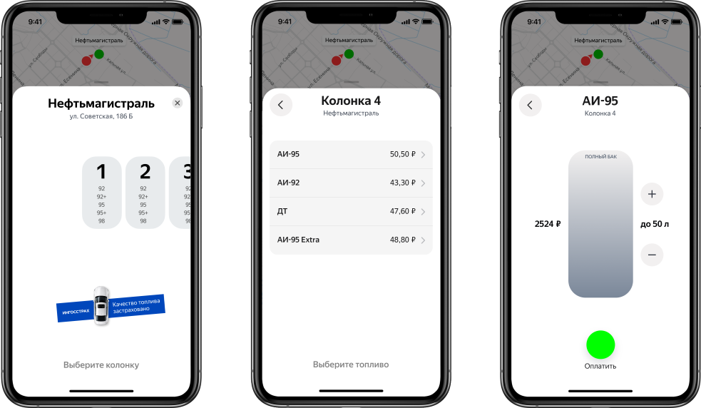
New user journey when paying for fuel
Previously, in Yandex.Fuel stations, all information - column, fuel, payment method - was indicated in the petrol station card on two screens. This is similar to what happens in reality at the checkout. Drivers tell the cashier all at once with one short phrase: “Second column. 95th. 30 liters. Payment by card ". Nobody expects clarifying questions or confirmation at every step. Therefore, during the launch of the service, it seemed logical to fit all the order options compactly.

But, as practice has shown, some drivers who first got on the payment screens did not understand how to be. And in the end they faced a choice. On the one hand, there is an unfamiliar interface with several buttons, in each of which you have to "fall through", and then go back one step. On the other hand - the ability to pay in the old fashioned way, without thinking about anything. Add to this a line of other drivers who can honk in the back at any moment if you hesitate. It is logical that someone gave up and went to the cashier. It takes longer, but more familiar.
This was confirmed by both the reviews and the sales funnel. The service was interesting to many, but not everyone reached the completion of the payment. We specified some of the data and closed the application. They needed a new, easier way.
And we came up with this principle: one action - one screen. The driver no longer needs to specify all the parameters of the order on one screen. There is no need to go back. He does everything in stages, moving from card to card: he chooses the column at which he got up, then indicates the required type of fuel, volume, and then - the method of payment. This makes it easy to go through all the steps, making sure at each that the data is entered correctly. As a result, it is easier to complete the payment. And if you think about it, then in reality everything happens in stages. The driver first decides which speaker to drive up to. Then he chooses a pistol with the correct grade of gasoline. Then he pays.
Filling up to full tank
In addition to the fact that we have placed one action on the screen, a completely new opportunity appeared in the payment process - to choose refueling to a full tank.
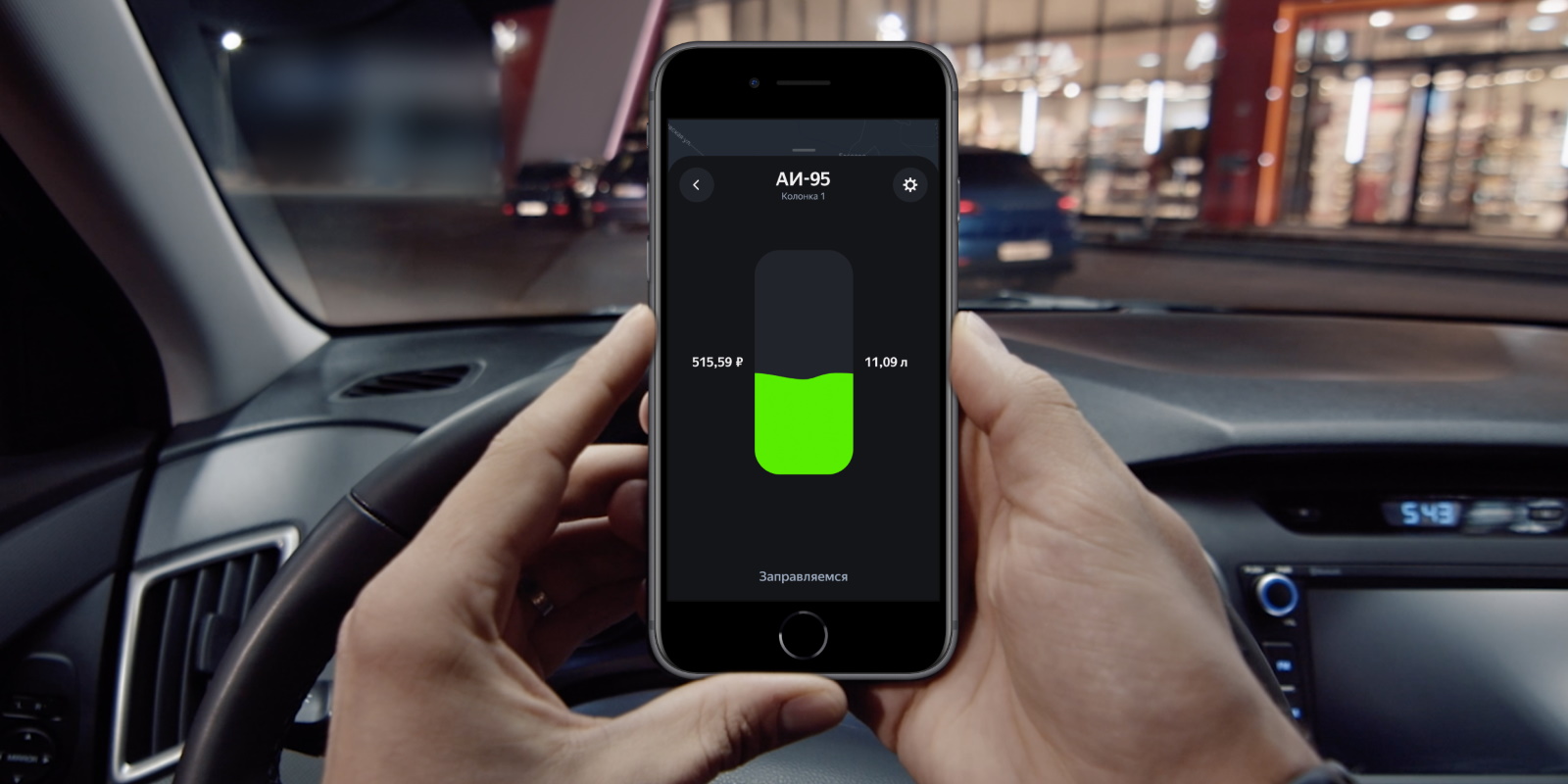
In the comments on the App Store and Google Play, users have long asked for a magic button that will allow you to do this in one click. And we added it, only it's not really a button. Now, in the Yandex.Fuel application, there is a slider on the screen with a choice of fuel volume - something like a car tank.
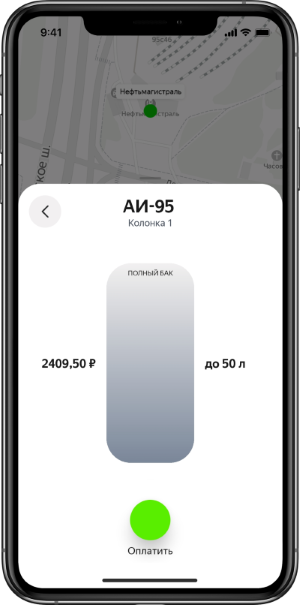
With one movement it can be unscrewed to a full tank - no unnecessary clicks, everything is clear.
The default full tank capacity is 60 liters, like most passenger cars, so many drivers won't have to change anything. But if the tank is non-standard, then you can specify any other volume in the settings, and the application will remember it.
In addition to clear visualization when refueling to a full tank, it is also important to quickly return change. It is likely that the driver will order more than needed, because the tank is never completely empty.
Therefore, we freeze the amount on the driver's bank card until the gas station reports the exact amount of fuel poured. Then we remove the total amount, and unfreeze the primary one. In most cases, the money is returned much faster than if it was debited and then canceled.
We started rolling out the app update at the end of January. In less than a month, about 22 thousand users at least once adjusted the volume of the tank and refueled to full. Now, on average, a thousand drivers do this a day.
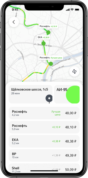
Comparison of prices for gas stations along the route
Another improvement is not directly related to payment. But it is also about convenience, and also about economy. We've noticed that drivers don't usually drive purposefully to refuel. They build it into their daily activities - for example, they stop by at the gas station on the way to work.
Therefore, in the updated application, when building a route, all gas stations on the right side of the road are highlighted and the one with the lowest price for the required fuel is marked. And the rest shows how much the cost differs there. As a result, the driver can choose a suitable station and add it to his route.
Results and conclusions
We made sure that the principle of "one action, one screen" is easier to understand, and the user experience is better. This can be seen in the metrics as well: conversion to orders increased by 17%. And the number of drivers who come to the service to refuel increased by almost 20%. But that is not all.
After the update was rolled out, we asked the drivers who had already used it to rate it. The survey involved 30 thousand people. At first, iOS users - their ratings were positive, the majority gave us 5. Then it was time for Android users. About 70% of them bet 4 and 5, but some bet 1.
We decided to interview the latter in more detail. It turned out that it was inconvenient for them to select the exact volume or amount using the slider - sometimes the finger slips and the result is not what they wanted. So we refreshed the screen almost immediately.
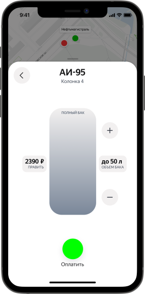
Now, under the total, you can click "Edit" and specify the exact number, and the number of liters can be adjusted using "+" and "-".
This update has shown that the actual user experience is not always the same as we imagine it. We will be glad to receive your other feedback as well!
PS Soon all this will appear not only in the Yandex.Fuel application, but also wherever the service operates - in Navigator and Yandex.Maps.