Our translation today is about Data Science. A data analyst from Dublin told how he was looking for housing in a market with high demand and low supply.
I have always envied those professionals who can apply their work skills to their daily lives . Take a plumber, dentist, or chef, for example: their skills aren't just useful at work.
For the data analyst and software engineer, these benefits are usually less tangible. Of course, I am tech-savvy, but at work I mostly deal with the business sector, so it is difficult to find interesting use cases for my skills to solve family problems.
When my wife and I decided to buy a new home in Dublin, I immediately saw an opportunity to use the knowledge!
The content of the article:
- High demand, low supply
- Looking for data
- From idea to tool
- Basic data
- Improving data quality
- Google Data Studio
- Some implementation details (and then moving on to the fun part)
- Geocoding addresses
- Calculation of the time that the property is on the market
- Analysis
- findings
- Conclusion
The data below was not scraped but generated with this script .
High demand, low supply
To understand how it all started, you can read my personal experience of buying real estate in Dublin. I must admit that it was not easy: the market is in very high demand (thanks to the excellent economic performance of Ireland in recent years), and housing is extremely expensive. Ireland had the highest housing costs compared to the EU in 2019, according to a Eurostat report (77% above the EU average).

What does this diagram mean?
1. There are very few houses that fit our budget , and in areas of the city with high demand there are even fewer of them (with more or less normal transport infrastructure).
2. The condition of secondary housing is sometimes very poor, since it is not profitable for the owners to invest in repairs before selling. Homes for sale often have low energy efficiency ratings, poor plumbing and electrical equipment, which means buyers will have to add renovation costs to an already high price.
3. Sales are based on an auction system and in most cases, buyers' bids exceed the starting price. As far as I understood, this does not apply to new buildings, but they were significantly beyond our budget, so we did not consider this segment at all.
I think that many people around the world are familiar with this situation, since, most likely, things are the same in large cities.
Like everyone else in our property search, we wanted to find the perfect home in the perfect area at an affordable price. Let's see how data analytics helped us do this!
Looking for data
In any Data Science project there is a data collection stage, and for this particular case, I was looking for a source containing information about all the housing available on the market. In Ireland there are two types of sites:
- websites of real estate agencies,
- aggregators.
Both options are very useful and make life much easier for sellers and buyers. Unfortunately, the user interface and suggested filters do not always provide the most efficient way to extract the required information and compare different properties. The following are some questions that are difficult to answer with search engines like Google:
1. How long will it take to get to work?
2. How many properties are there in one area or another? It is possible to compare city districts on classic websites, but they usually cover several square kilometers. This is not enough detail to understand, for example, that too high a sentence on a particular street indicates some kind of trick. Most specialized sites have maps, but they are not as informative as we would like.
3. What facilities are there near the house?
4. What is the average asking price for a group of properties?
5. How long has the property been on sale? Even if this information is available, it is not always reliable, as the realtor could delete the ad and place it again.
Redesigning the user interface for consumer friendliness and improving data quality made finding a home much easier and allowed us to draw some very interesting insights.
From idea to tool
Basic data
The first step was to write a scraper to collect basic information:
- raw address of the property,
- current seller price,
- link to the page with the property,
- basic characteristics such as number of rooms, number of bathrooms, energy efficiency rating,
- number of ad views (if available),
- type of property (house, apartment, new building).
This is, in fact, all the data that I could find on the Internet. For deeper analysis, I needed to improve this dataset.
Improving data quality
When choosing a home, my main argument in favor of buying is a convenient road to work, for me it is no more than 50 minutes for the entire journey from door to door. For these calculations, I decided to use the Google Cloud Platform:
1. Using the Geocoding API, I got the latitude and longitude coordinates using the address of the property.
2. Using the Directions API, I calculated the time it takes to get from home to work on foot and by public transport. Note: Cycling is about 3 times faster than walking.
3. Using API seats (Places API)I have received information on the amenities around each property. In particular, we were interested in pharmacies, supermarkets and restaurants. Note: The Places APIs are very expensive: with a database of 4,000 properties, you would need to run 12,000 queries to find information on three types of amenities. Therefore, I excluded this data from the final dashboard.
In addition to the geographical location, I was interested in another question: how long has the property been on the market? If the property has not been sold for too long, this is a wake-up call: perhaps something is wrong with the area or the house itself, or the asking price is too high.
Conversely, if the property has just been put up for sale, it should be borne in mind that the owners will not agree to the first offer received. Unfortunately, this information is fairly easy to hide. Using basic machine learning, I estimated this aspect using ad view count and a few other metrics.
Finally, I improved the dataset with a few service fields to make filtering easier (for example, adding a column with a price range).
Google Data Studio
With an improved dataset that was fine for me, I was going to create a powerful dashboard . I chose Google Data Studio as a data visualization tool for this task. This service has some disadvantages (its capabilities are very, very limited), but there are also advantages: it is free, has a web version and can read data from Google Sheets. Below is a diagram describing the entire workflow.

Some implementation details
To be honest, the implementation was pretty straightforward and there is nothing new or special here: just a bunch of scripts to collect data and some basic Pandas transformations. Except that it is worth noting the interaction with the Google API and the calculation of the time during which the property was on the market.
The data below was not scraped but generated with this script .
Let's take a look at the raw data.
As I expected, the file contains the following columns:
id
: Ad ID._address
: Address of the property._d_code
: . D<>. <> , (, ), — ._link
: , ._price
: .type
: (, , )._bedrooms
: ()._bathrooms
: ._ber_code
: , : «», ._views
: ( )._latest_update
: ( ).days_listed
: — , ,_last_update
.
The point is to bring all this to the map and leverage the power of geolocalized data. To do this, let's see how to get latitude and longitude using the Google API.
To do this, you will need a Google Cloud Platform account, and then you can follow the tutorial on the link to get the API key and enable the corresponding API. As I wrote earlier, for this project I used the Geocoding API, Directions API and Places API (so you will need to enable these specific APIs when creating the API key). Below is a code snippet for interacting with Google Cloud Platform.
# The Google Maps library
import googlemaps
# Date time for easy computations between dates
from datetime import datetime
# JSON handling
import json
# Pandas
import pandas as pd
# Regular expressions
import re
# TQDM for fancy loading bars
from tqdm import tqdm
import time
import random
# !!! Define the main access point to the Google APIs.
# !!! This object will contain all the functions needed
geolocator = googlemaps.Client(key="<YOUR API KEY>")
WORK_LAT_LNG = (<LATITUDE>, <LONGITUDE>)
# You can set this parameter to decide the time from which
# Google needs to calculate the directions
# Different times affect public transport
DEPARTURE_TIME = datetime.now
# Load the source data
data = pd.read_csv("/path/to/raw/data/data.csv")
# Define the columns that we want in the geocoded dataframe
geo_columns = [
"_link",
"lat",
"lng",
"_time_to_work_seconds_transit",
"_time_to_work_seconds_walking"
]
# Create an array where we'll store the geocoded data
geo_data = []
# For each element of the raw dataframe, start the geocoding
for index,
in tqdm(data.iterrows()):
# Google Geo coding
_location = ""
_location_json = ""
try:
# Try to retrieve the base location,
# i.e. the Latitude and Longitude given the address
_location = geolocator.geocode(row._address)
_location_json = json.dumps(_location[0])
except:
pass
_time_to_work_seconds_transit = 0
_directions_json = ""
_lat_lon = {"lat": 0, "lng": 0}
try:
# Given the work latitude and longitude, plus the property latitude and longitude,
# retrieve the distance with PUBLIC TRANSPORT (`mode=transit`)
_lat_lon = _location[0]["geometry"]["location"]
_directions = geolocator.directions(WORK_LAT_LNG,
(_lat_lon["lat"], _lat_lon["lng"]), mode="transit")
_time_to_work_seconds_transit = _directions[0]["legs"][0]["duration"]["value"]
_directions_json = json.dumps(_directions[0])
except:
pass
_time_to_work_seconds_walking = 0
try:
# Given the work latitude and longitude, plus the property latitude and longitude,
# retrieve the WALKING distance (`mode=walking`)
_lat_lon = _location[0]["geometry"]["location"]
_directions = geolocator.directions(WORK_LAT_LNG, (_lat_lon["lat"], _lat_lon["lng"]), mode="walking")
_time_to_work_seconds_walking = _directions[0]["legs"][0]["duration"]["value"]
except:
pass
# This block retrieves the number of SUPERMARKETS arount the property
'''
_supermarket_nr = 0
_supermarket = ""
try:
# _supermarket = geolocator.places_nearby((_lat_lon["lat"],_lat_lon["lng"]), radius=750, type="supermarket")
_supermarket_nr = len(_supermarket["results"])
except:
pass
'''
# This block retrieves the number of PHARMACIES arount the property
'''
_pharmacy_nr = 0
_pharmacy = ""
try:
# _pharmacy = geolocator.places_nearby((_lat_lon["lat"],_lat_lon["lng"]), radius=750, type="pharmacy")
_pharmacy_nr = len(_pharmacy["results"])
except:
pass
'''
# This block retrieves the number of RESTAURANTS arount the property
'''
_restaurant_nr = 0
_restaurant = ""
try:
# _restaurant = geolocator.places_nearby((_lat_lon["lat"],_lat_lon["lng"]), radius=750, type="restaurant")
_restaurant_nr = len(_restaurant["results"])
except:
pass
'''
geo_data.append([row._link, _lat_lon["lat"], _lat_lon["lng"], _time_to_work_seconds_transit,
_time_to_work_seconds_walking])
geo_data_df = pd.DataFrame(geo_data)
geo_data_df.columns = geo_columns
geo_data_df.to_csv("geo_data_houses.csv", index=False)
Calculation of the time that the property is on the market
Let's take a closer look at the data :
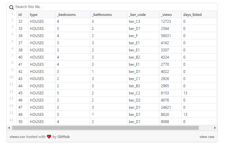
As you can see in this sample, the number of views of properties is not reflected in the number of days during which the ad was active: for example, a house with id = 47 has ~ 25 thousand views, but it appeared on that day. when i loaded data.
However, this problem is not common for all properties. In the example below , the number of views is more comparable to the number of days that the ad was active:

How can we use the information above? Easily! We can use the second dataset as a training set for the model, which we can then apply to the first dataset.
I tested two approaches:
1. Take a "comparable" dataset and calculate the average number of views per day, then apply that value to the first dataset. This approach is not without common sense, but it has the following problem: all properties are combined into one group, and it is likely that an ad for the sale of a house worth 10 million euros will receive fewer views per day, since such a budget is available to a narrow group of people.
2. Train the Random Forest model on the second dataset and then apply it to the first dataset.
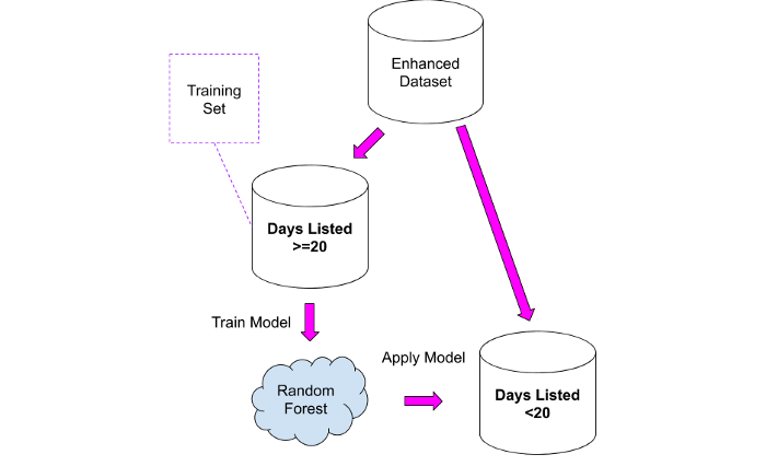
The results should be viewed very carefully, bearing in mind that the new column will only contain approximate values: I used them as a starting point to analyze properties in more detail where something seemed strange.
Analysis
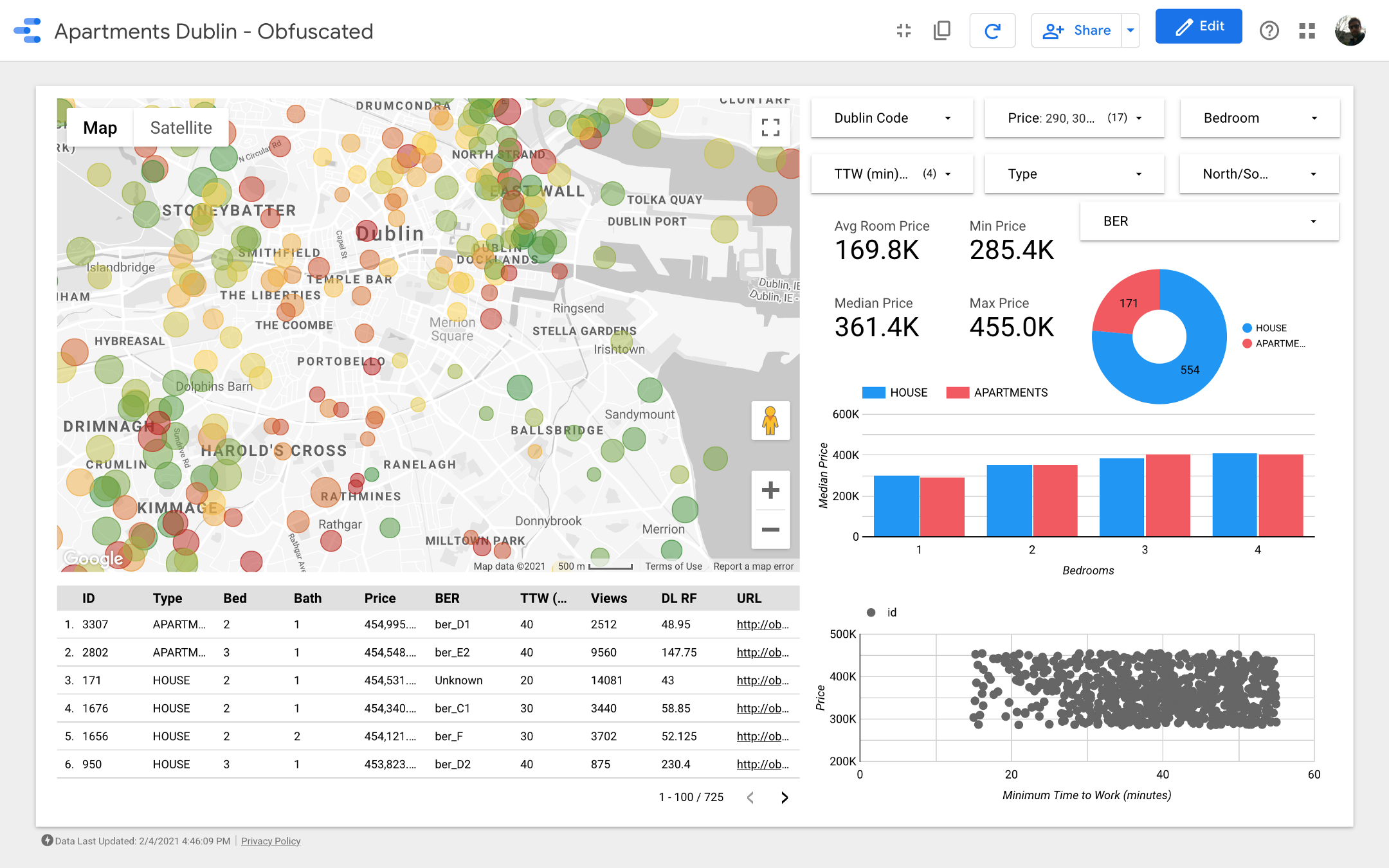
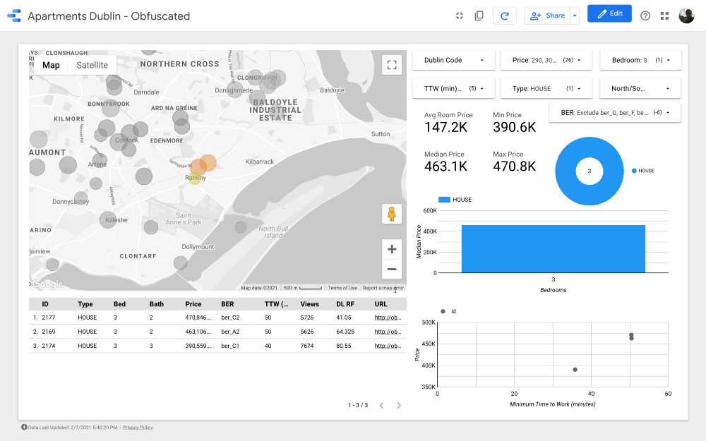
Ladies and gentlemen, I present to your attention the final dashboard . If you want to dig into it, follow the link .
Note: Unfortunately, the Google Maps module does not work when embedded in an article, so I had to use screenshots.
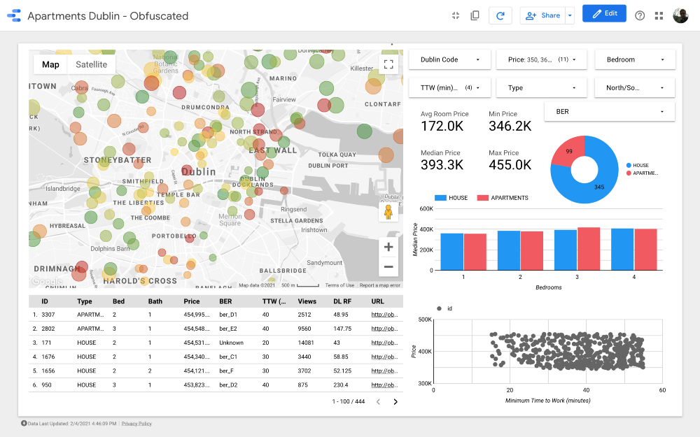
https://datastudio.google.com/s/qKDxt8i2ezE The
map is the most important part of the dashboard. The color of the bubbles depends on the price of the house / apartment, and the coloring takes into account only available properties (corresponding to the filter settings in the upper right corner); the size of the bubbles indicates the distance to work: the smaller it is, the shorter the road.
Charts allow you to analyze how the asking price changes depending on some characteristics (for example, the type of building or the number of rooms), and the scatter chart compares the distance to work and the asking price.
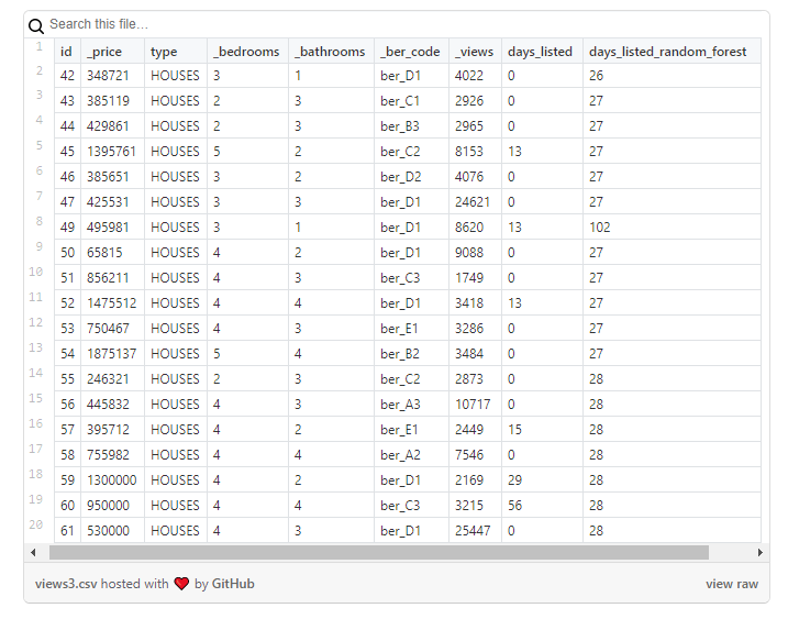
Finally, the raw data table (
DL RF
stands for Days Listed Random Forest and shows the number of days the ad was active, the Random Forest model).
findings
Let's dive into the analysis and see what conclusions we can draw from the dashboard.
The dataset includes about 4,000 houses and apartments: of course, we cannot view all of them, so our task is to identify a subset of records containing one or more properties that we are ready to consider buying.
First, we need to clarify the search criteria. For example, let's imagine that we are looking for a property that meets the following characteristics:
1. Type of property: House.
2. Number of rooms (bedrooms): 3.
3. Distance to work: less than 60 minutes.
4. Energy efficiency rating: A, B, C, or D.
5. Price: from 250 to 540 thousand euros.
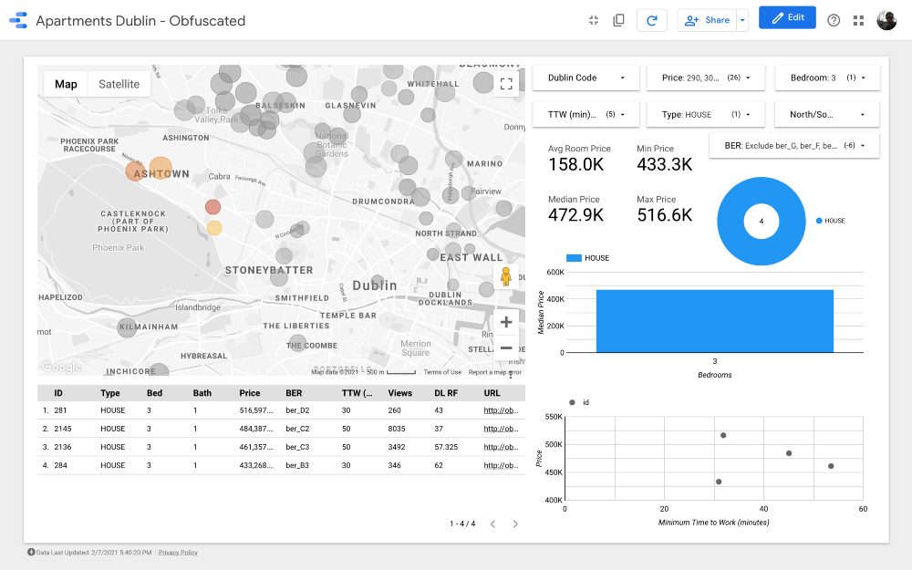
Let's apply all filters except the price and look at the map (filtering out only those that are more expensive than 1 million and less than 200 thousand euros).
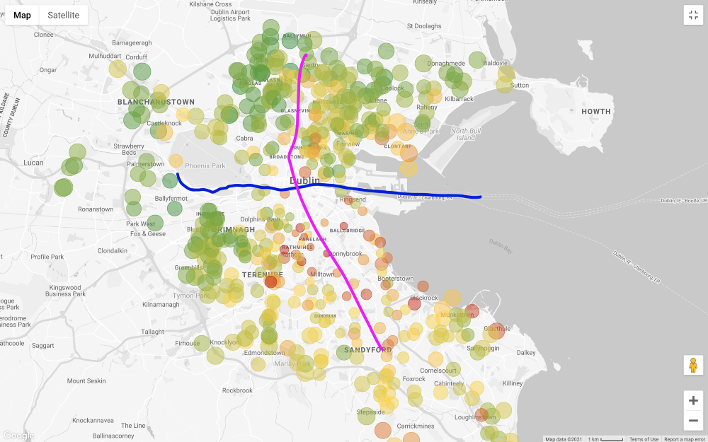
In general, the asking price for properties in the south of Liffey is much higher than in the north, with a few exceptions in the southwest of the city. Even the “outer areas” in the north, that is, the northeast and northwest, seem less expensive than the north of the city center. One reason for this pricing is that Dublin's Main Tramway Line (LUAS) crosses the city from north to south in a straight line (there is another line that runs from west to east, but it does not run through all business districts).
Please note that I am making these considerations based on visual inspection only. A more rigorous approach requires testing the correlation between the price of a house and its distance from public transport routes, but we are not interested in proving this connection.
The situation becomes even more interesting, if you set the filter prices in line with our budget (do not forget that on the map above shows the house with 3 bedrooms, and get to work in less than 60 minutes, and on the map below added only filter by price):
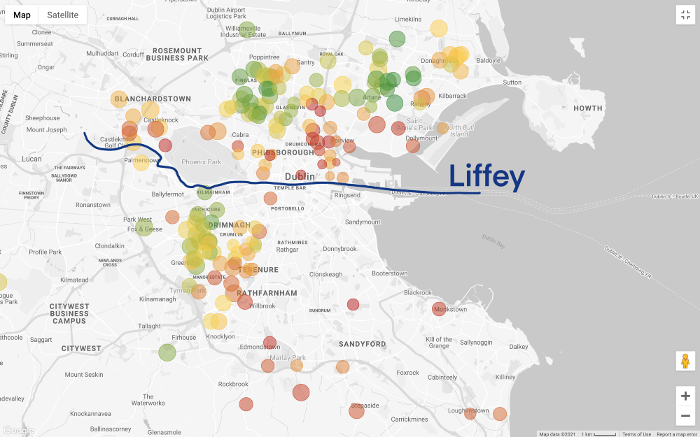
Let take a step back. We have a general idea of the areas that we can afford, but now the most difficult thing is ahead - the search for compromises! Do we want to find a more budget option? Or do we consider the best home our hard-earned savings can buy? Unfortunately, data analytics cannot answer these questions, this is a business (and highly personal) decision.
Suppose we chose the second option: we prioritize the quality of the home or area over the lower price.
In this case, we need to consider the following options:
1. Areas with a low concentration of proposals - an isolated house on the map may indicate that there are not many offers in the area, which means that the owners are in no hurry to part with their home in such a good area ...
2. A home located in a cluster of expensive properties - if all other properties near a particular home are expensive, this may mean that the area is in high demand. This is just an additional note, but we could quantify this phenomenon using spatial autocorrelation (for example, by calculating Moran's I ).
Even if the first option seems attractive, it should be borne in mind that the very low price of property compared to other offers in the same area may imply some kind of catch in the house itself (for example, small rooms or very high renovation costs). For this reason, we will continue our analysis focusing on the second option, which, in my opinion, is the most promising given our goal.
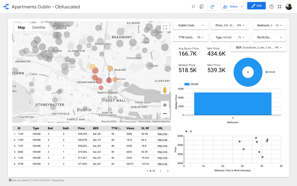
Let's take a closer look at what there are proposals in the area:

We have already reduced our options from 4,000 to less than 200, and now we need to better break the points and compare the clusters.
Cluster search automation won't add much to this analysis, but let's apply the DBSCAN algorithm anyway.... We use DBSCAN because some of the groups may be non-globular (for example, k-means will not work properly on this database). In theory, we need to calculate the geographic distance between the points, but we will use the Euclidean system, as it gives a good approximation:
import pandas as pd
from sklearn.cluster import DBSCAN
data = pd.read_csv("data.csv")
data["labels"] = DBSCAN(eps=0.01, min_samples=3).fit(data[["lat","lng"]].values).labels_
print(data["labels"].unique())
data.to_csv("out.csv")

The algorithm showed a pretty good result, but I would revise the clusters as follows (taking into account the knowledge of Dublin's business districts):

We refuse areas with lower prices, since we prioritize the maximum quality of housing and a comfortable road to work within our budget so Clusters 2, 3, 4, 6 and 9 can be excluded. Note that Clusters 2, 3 and 4 are located in some of the most budget-friendly areas of northern Dublin (probably due to less developed public transport infrastructure). Cluster 11 presents expensive options located far from work, so we can also exclude it.
Looking at the more expensive clusters, number 7 is one of the best in terms of distance to work. it Drumcondra , a beautiful residential area in the north of Dublin; despite the fact that it is not very conveniently located relative to the tram line, bus routes pass along it; in cluster 8, housing prices and distance to work are the same as in Drumkondra. Another cluster worth analyzing is number 10: it seems to be in an area with lower supply, which means that people here probably rarely sell housing, and the area is also quite conveniently located for public routes. transport (provided that all areas have the same population density).
Finally, clusters 1 and 5, located next to Phoenix Park, the largest fenced-in public park .
Cluster 7

Cluster 8
Cluster 10
Cluster 1

Cluster 5
Great! We have found 26 properties worth seeing first. Now we can carefully analyze each offer and, ultimately, arrange a viewing with a realtor!
Conclusion
We started our search, knowing practically nothing about Dublin, and in the end we got a good understanding of which areas of the city are especially in demand when buying a home.
Note, we did not even look at the pictures of these houses and did not read anything about them! Just by looking at a well-organized dashboard, we came up with some useful conclusions that we could not have arrived at in the beginning!
This data is no longer useful, and some integrations can be done to improve the analysis. A few thoughts:
1. We did not integrate the amenities dataset (the one we compiled using the Places API) into the study. With a larger budget for cloud services, we could easily add this information to the dashboard.
2. In Ireland, a lot of interesting data is published on the website of the statistical office : for example, you can find information on the number of calls to each police station by quarter and by type of crime. Thus, we could find out in which areas there is the most theft. Since it is possible to obtain census data for each polling station, we could also calculate the crime rate per capita. Please note that for these advanced features, we need an appropriate geographic information system (eg QGIS ) or a database that can handle geographic data (eg PostGIS ).
3. Ireland has a database of previous house prices called the Residential Property Register . Their website contains information on every residential property purchased in Ireland since January 1, 2010, including the date of sale, price and address. By comparing current home prices to past home prices, you can see how demand has changed over time.
4. The prices for home insurance depend to a large extent on the location of the home. With some effort, we could scrap the insurance companies' sites to integrate their "risk factor model" into our dashboard.
In a market like Dublin, finding a new home can be a daunting task, especially for someone who has just moved to the city and doesn't know it very well.
Thanks to this tool, my wife and I saved ourselves (and the realtor) time: we went to watch 4 times, offered their price to 3 sellers, and one of them accepted our offer.