So, as we remember from the last article, we have a SharePoint Online site with lists and libraries for the onboarding system, a form on PowerApps, a data flow on Power Automate, and Power BI reports. It's time to add a personal account, in which the employee and / or manager would see their tasks for the adaptation period and could complete them by performing certain actions.

Creating a PowerApps personal adaptation account application
Getting started and first of all go to the Microsoft PowerApps editor page and create a new application.

Next, inside the editor, create the first screen. Initially, we plan that the application will be able to display different options for personal accounts, depending on the user's belonging to a particular role. A little later, we will adapt this mechanism and make automatic determination of the user's role when opening the application, but we will start with the authorization screen.

On this screen, we have two buttons for entering your personal account. One leads to the employee's personal account, the second to the manager's personal account. Depending on the user's membership in a particular group, the "Log in as manager" button may appear disabled if the current user is not a manager. Next, we make the next screen. This will be the employee's screen, where basic data about their own profile will be displayed, as well as a list of activities that must be completed during the trial period.

As you can see, visually, this screen is divided into two main areas: the upper area with basic information about yourself and the lower area with planned events. Events are displayed using the visual "Gallery" component, all other objects are buttons and text areas. The screen also displays a "Help" button to go to the help page and buttons to go to the checklist files and probationary tasks, which I will talk about a little later.
For a beginner, the screen is ready, here he has the maximum necessary information for a trial period. Now let's move on to creating the manager's screen, it will be a little more difficult with it, because the manager should be able to perform his tasks within his personal account.
So, we make the first screen of the manager's personal account. On it, the manager should see a list of his "newcomers" and be able to see basic information about them.

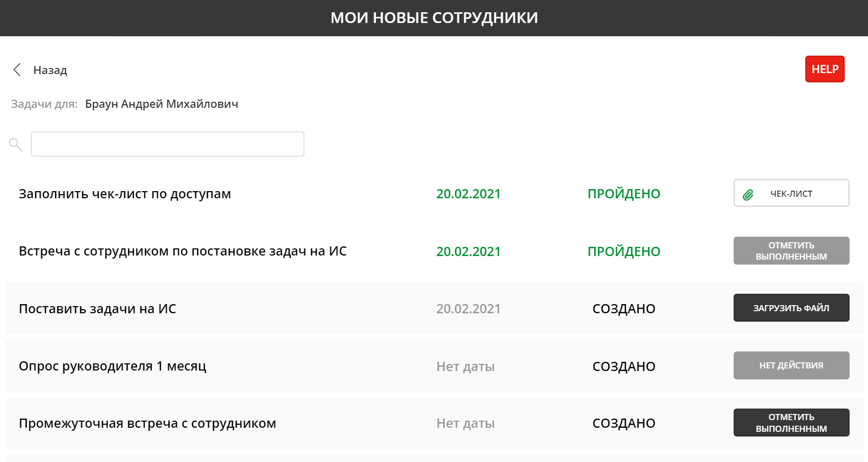
On this screen, the manager can view basic information about his employees, as well as go to help information using the "Help" button. In addition, it is possible to search for information and, in addition, you can get to an additional screen with tasks for the selected employee by clicking the "Tasks" button.

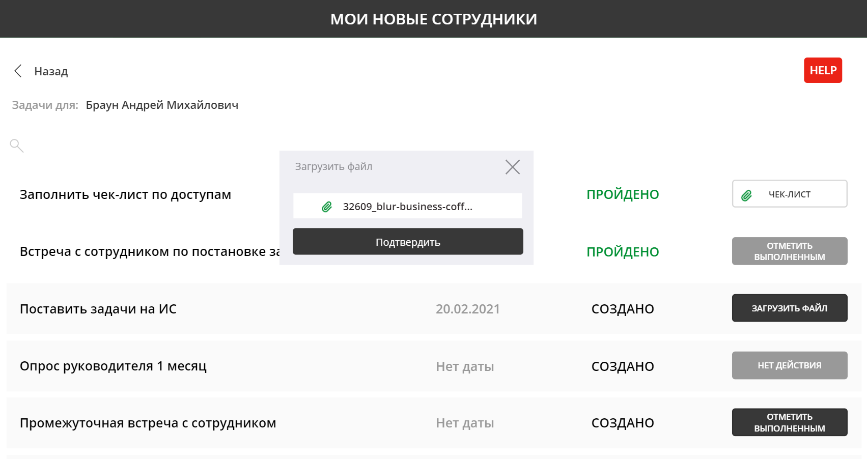
On this screen, the manager can see his tasks for the trial period for the selected employee, as well as perform various operations. Within the framework of this system, there are two actions - "Upload a file" (for a checklist and tasks for a trial period, respectively) and "Mark the event completed". Each of the actions calls its own version of the dialog box, for example, the "Load file" button calls up the following window:

In this case, all other buttons are blocked and there is no way to perform any other operation until either the file is attached or we close this window. The "Confirm" button is initially disabled, but becomes active as soon as the file to be added is specified.

The second variant of the operation is "Mark completed" and the dialog looks like this:

What happens when you click the "Confirm" button? Everything is very simple - the Power Automate flow is launched with the forwarding of key parameters.

Based on these parameters in the Power Automate flow, we understand exactly what we need to do and what information to save. That is, the same stream is used to download the file and to mark the execution, but with different input parameters.

Moreover, after the file of the checklist or tasks for the trial period is added and loaded, the button instantly transforms from the download button to the button for viewing the downloaded file.

The manager's personal account is ready. And there is one more version of a personal account, the so-called "superposition", when a newcomer is a leader and he can have the same newcomers on a trial period. We merge the two screens and make a small navigation menu.

Using the navigation menu, you can instantly switch between the beginner screen and the executive screen.

By the way, the postal address is also clickable and allows you to immediately trigger the creation of a new letter to a beginner.

Remember, at the very beginning, I said that a little later we will deal with the first authorization screen and maybe completely abandon it? This time has come. This screen is really not really needed if we can automatically check the current user and figure out what role he belongs to. We go to the OnStart event of our application and write checks.

Depending on whether our user is an employee, a manager, or a two-in-one, we immediately redirect the user to the desired screen when starting the application, bypassing the authorization screen inside the application. The application is ready. All that remains is to embed it in Microsoft Teams.

In conclusion, I want to say that the Microsoft Power Platform has a wide set of capabilities that help you create applications for your purposes, not only in terms of functionality, but also provides opportunities for the use of certain design elements that make the interface pleasant and beautiful. In the following articles, we will analyze even more different solutions based on the Microsoft Power Platform. Have a nice day everyone and thank you for your attention!