When I searched for the keyword "machine learning" I found 246,632 machine learning repositories. Since they are all related to this industry, I expected their owners to be experts or at least competent enough in machine learning. Therefore, I decided to analyze the profiles of these users and show the results of the analysis.
How i worked
Tools
I used three scraping tools:
- Beautiful Soup to fetch the URL of all repositories tagged with machine learning. It is a Python library that makes scraping much easier.
- PyGithub . Python- Github API v3. Github- (, , ..) Python-.
- Requests .
Methods
I parsed far from all, but only the owners and 30 most active contributors of 90 top repositories that appeared in the search results.


After removing duplicates and profiles of organizations like udacity, I got a list of 1208 users. For each of them, I parsed the information for 20 key parameters.
new_profile.info ()

The first 13 parameters were obtained from here.

The rest I took from the user's repositories:
- total_stars total stars of all repositories
- max_star maximum number of stars of all repositories
- forks total number of forks of all repositories
- descriptions descriptions from all user repositories of all repo
- contribution number of contributions for the last year

Visualizing data
Histograms
After cleaning up the data, it was the turn of the most interesting stage: data visualization. I used Plotly for this.
import matplotlib.pyplot as plt
import numpy as np
import plotly.express as px # for plotting
import altair as alt # for plotting
import datapane as dp # for creating a report for your findings

top_followers = new_profile.sort_values(by='followers', axis=0, ascending=False)

fig = px.bar(top_followers,
             x='user_name',
             y='followers',
             hover_data=['followers'],
            )
fig.show()
Here's what happened .
The histogram is a little awkward because it has a very long tail of users with less than 100 followers. So it's better to scale it up.

As you can see, llSourcell (Siraj Raval) has the most followers (36261). The second most popular has three times less followers (12682).
We can go ahead and find out that 1% of profiles got 41% of all followers!
>>> top_n = int(len(top_followers) * 0.01)12>>> sum(top_followers.iloc[0: top_n,:].loc[:, 'followers'])/sum(top_followers.followers)0.41293075864408607
Next, we visualize information on total_stars, max_star, forks using a logarithmic scale.
figs = [] # list to save all the plots and table

features = ['followers',
               'following',
               'total_stars',
               'max_star',
               'forks',
                'contribution']
for col in features:
    top_col = new_profile.sort_values(by=col, axis=0, ascending=False)

    log_y = False
    #change scale of y-axis of every feature to log except contribution
    if col != 'contribution':
        log_y = True

    fig = px.bar(top_col,
             x='user_name',
             y=col,
             hover_data=[col],
             log_y = log_y
            )

    fig.update_layout({'plot_bgcolor': 'rgba(36, 83, 97, 0.06)'}) #change background coor

    fig.show()

    figs.append(dp.Plot(fig))
It turns out like this .
The resulting picture is very close to the distribution according to Zipf's law. We are talking about an empirical pattern of distribution of the frequency of words in a natural language: if all words of the language are ordered in descending order of frequency of their use. We have a similar dependence here.
Correlation
But what about dependencies between key data points? And how strong are these dependencies? I used the scatter_matrix to find out.
correlation = px.scatter_matrix(new_profile, dimensions=['forks', 'total_stars', 'followers',
                                 'following', 'max_star','contribution'],
                               title='Correlation between datapoints',
                               width=800, height=800)
correlation.show()

corr = new_profile.corr()

figs.append(dp.Plot(correlation))
figs.append(dp.Table(corr))
corr
It turns out like this and so on .
The strongest positive relationships are formed between:
- Maximum number of stars and total number of stars (0.939)
- Forks and total stars (0.929)
- The number of forks and the number of followers (0.774)
- Followers and total stars (0.632)
Programming languages
In order to find out which programming languages are most common among GitHub profile owners, I did some additional analysis.
# Collect languages from all repos of al users
languages = []
for language in list(new_profile['languages']):
    try:
        languages += language
    except:
        languages += ['None']

# Count the frequency of each language
from collections import Counter
occ = dict(Counter(languages))

# Remove languages below count of 10
top_languages = [(language, frequency) for language, frequency in occ.items() if frequency > 10]
top_languages = list(zip(*top_languages))

language_df = pd.DataFrame(data = {'languages': top_languages[0],
                           'frequency': top_languages[1]})

language_df.sort_values(by='frequency', axis=0, inplace=True, ascending=False)

language = px.bar(language_df, y='frequency', x='languages',
      title='Frequency of languages')

figs.append(dp.Plot(language))

language.show()
Accordingly, the top 10 languages include:
- Python
- JavaScript
- Html
- Jupyter Notebook
- Shell, etc.
Location
In order to understand in which parts of the world the profile owners are located, you need to perform the following task - to visualize the location of users. Among the analyzed profiles, geography is indicated for 31%. For visualization we use geopy.geocoders.Nominatim
from geopy.geocoders import Nominatim
import folium

geolocator = Nominatim(user_agent='my_app')

locations = list(new_profile['location'])

# Extract lats and lons
lats = []
lons = []
exceptions = []

for loc in locations:
    try:
        location = geolocator.geocode(loc)
        lats.append(location.latitude)
        lons.append(location.longitude)
        print(location.address)
    except:
        print('exception', loc)
        exceptions.append(loc)

print(len(exceptions)) # output: 17

 # Remove the locations not found in map
location_df = new_profile[~new_profile.location.isin(exceptions)]

location_df['latitude'] = lats
location_df['longitude'] = lons
Well, then, to build a map, use Plotly's scatter_geo
# Visualize with Plotly's scatter_geo
m = px.scatter_geo(location_df, lat='latitude', lon='longitude',
                 color='total_stars', size='forks',
                 hover_data=['user_name','followers'],
                 title='Locations of Top Users')
m.show()

figs.append(dp.Plot(m))
According to this link is available the original map with a zoom.
Description of repo and bio users
Many users leave a description for their repositories and also provide their own bio. In order to visualize all this, we use W ordCloud! for Python.
import string
import nltk
from nltk.corpus import stopwords
from nltk.tokenize import word_tokenize
from nltk.stem import WordNetLemmatizer
from nltk.tokenize import word_tokenize
from wordcloud import WordCloud, STOPWORDS
import matplotlib.pyplot as plt

nltk.download('stopwords')
nltk.download('punkt')
nltk.download('wordnet')


def process_text(features):
  '''Function to process texts'''

    features = [row for row in features if row != None]

    text = ' '.join(features)


    # lowercase
    text = text.lower()

    #remove punctuation
    text = text.translate(str.maketrans('', '', string.punctuation))

    #remove stopwords
    stop_words = set(stopwords.words('english'))

    #tokenize
    tokens = word_tokenize(text)
    new_text = [i for i in tokens if not i in stop_words]

    new_text = ' '.join(new_text)

    return new_text

def make_wordcloud(new_text):
  '''Function to make wordcloud'''

    wordcloud = WordCloud(width = 800, height = 800,
                background_color ='white',
                min_font_size = 10).generate(new_text)


    fig = plt.figure(figsize = (8, 8), facecolor = None)
    plt.imshow(wordcloud)
    plt.axis("off")
    plt.tight_layout(pad = 0)

    plt.show()

    return fig

descriptions = []
for desc in new_profile['descriptions']:
    try:
        descriptions += desc

    except:
        pass

descriptions = process_text(descriptions)

cloud = make_wordcloud(descriptions)

figs.append(dp.Plot(cloud))

And the same for bio
bios = []
for bio in new_profile['bio']:
    try:
        bios.append(bio)

    except:
        pass

text = process_text(bios)

cloud = make_wordcloud(text)

figs.append(dp.Plot(cloud))
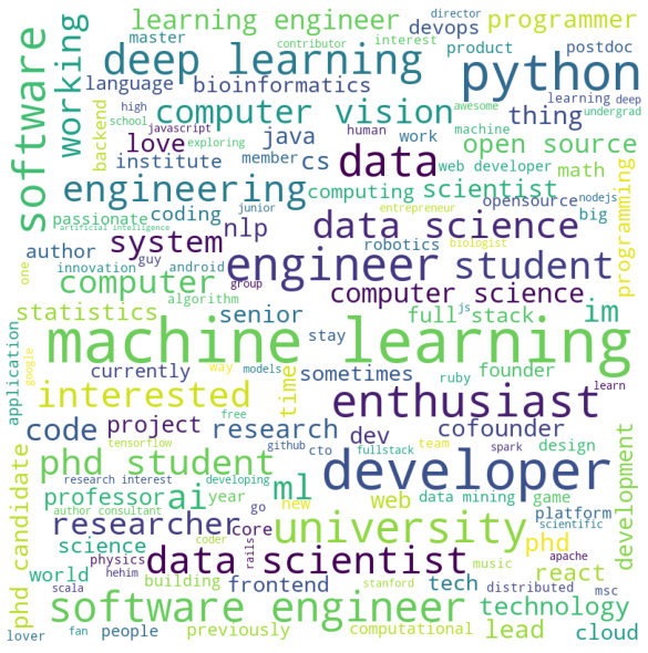
As you can see, the keywords are quite consistent with what you can expect from machine learning specialists.
findings
The data was received from users and authors of 90 repositories with the best match for the key "machine learning". But there is no guarantee that all top profile owners are on the list by machine learning experts.
Nevertheless, this article is a good example of how the collected data can be cleaned and visualized. Most likely, the result will surprise you. And this is not strange, since data science helps to apply your knowledge to analyze your surroundings.
Well, if necessary, you can fork the code of this article and do whatever you want with it, here is the repo </ a.
, Data Science AR- Banuba - Skillbox.
, «» github- . , , ..
:
1) , , . ( , 'contribution'). , .
'contribution' , . .
, , . , , ().
2) , . , . , , . , , - . ( ), - , , .
: , . .