We could just change the design of the buttons and move the blocks, but we got confused - we decided to make the site so convenient. We show what we have done.
Determined who we are making the site for
The application was received in April 2020: due to self-isolation, this was the first job for us when the project manager never saw the designers in person. Four people worked on the site: a project manager, a UX designer, and two UI designers. We talked on the phone every day, discussed concepts and processes. We started, as always, with research.
Before starting to create a website, UX analysts looked at website statistics through Yandex.Metrica. We studied traffic indicators, socio-demographic data of users, their content preferences, session parameters and patterns in page views. Then we collected all the data together and formed three target audiences.
MASS MEDIA.Journalists visit the president's website mainly for press releases and most often visit the "News" section.
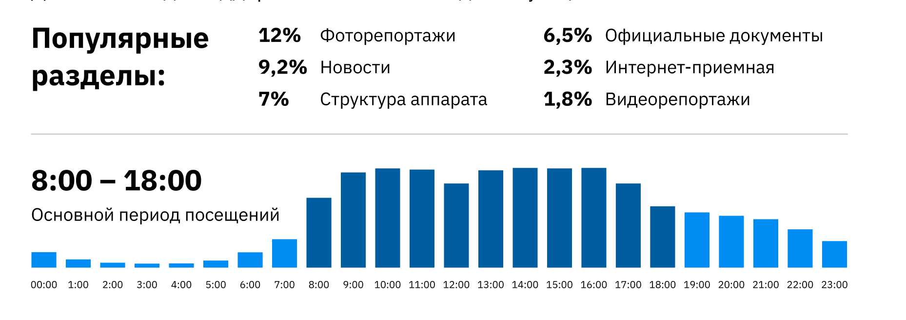
Journalists copy news text, download photos and videos - this is the main use case for
civil servants. Employees of state institutions are interested in the "Documents" section. We calculated this group by the time of using the site: the main period of visits on the site is from 8 to 11 am, from 12 to 13 the indicators fall (everyone has lunch), then users are again active from 14 to 19 hours. No one visits the site at night.
This user group reads and downloads decrees, orders and decrees of the President of the Republic.
Residents of Tatarstan.Most often they are interested in the section "Information about the President" or want to leave their appeal through the feedback form.
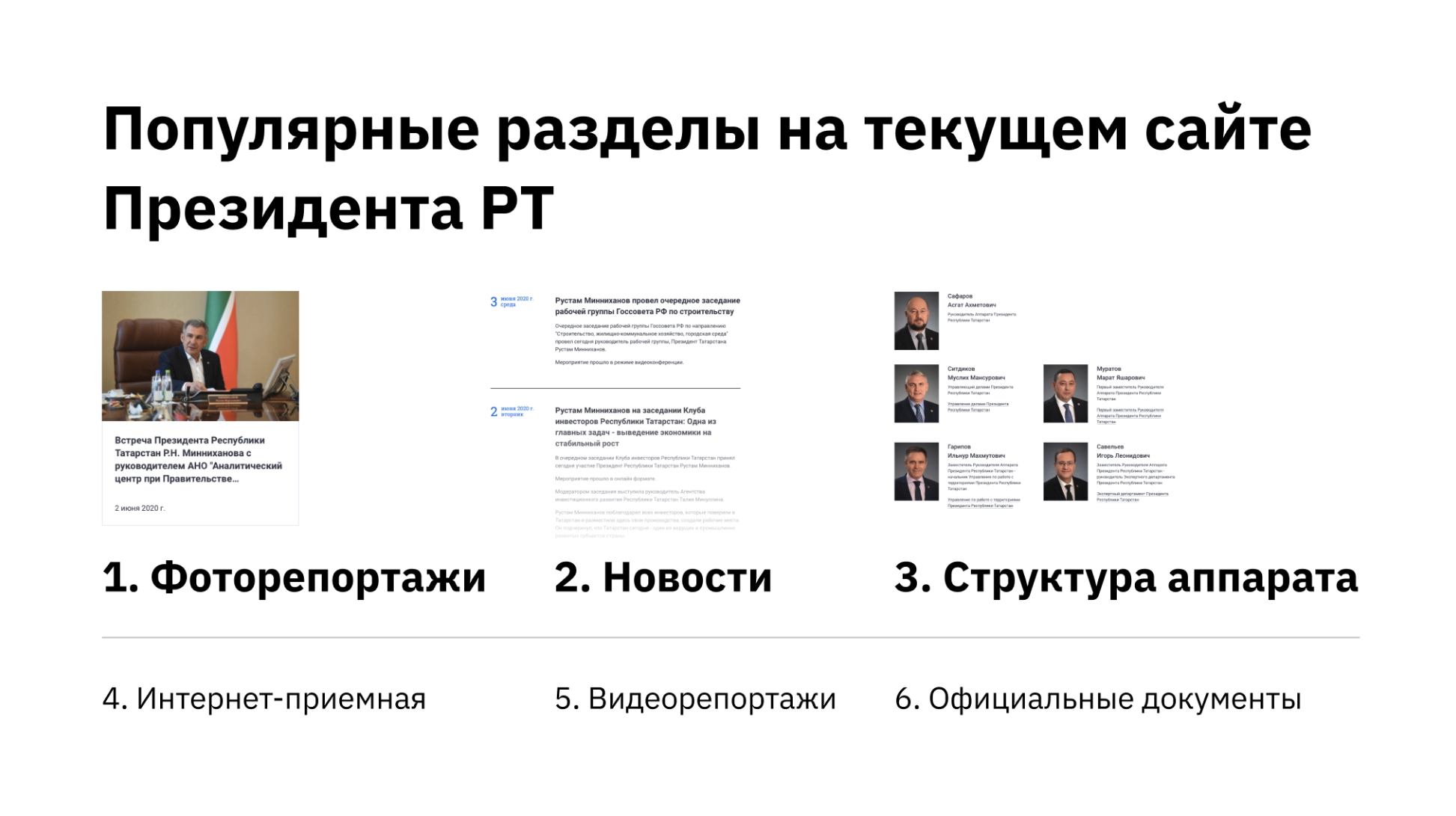
Each user group has its own "favorite" sections
Made friends UX and UI
After we identified the main audience segments, we started prototyping in Figma - defining the order of the screens and placing blocks. All ideas were brought there right away - so that nothing was lost. We practically did not touch the structure of the site itself.
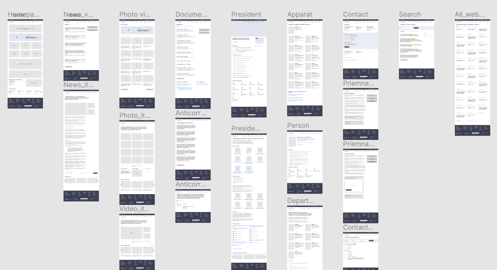
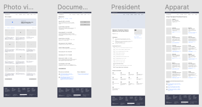
The site consists of 6 sections and 29 pages. State sites are regulated by law and some things cannot be changed, for example, the Internet reception.
We took up the concept design - drawing the main page and 6-7 internal pages in Figma in detail.
The first sketches of the concept design looked something like
this.The idea of the adopted website design did not come immediately: we had several options that did not pass our internal check and we did not show them to the President's Office - they were good, but there was nothing new in them.
There was such an option.
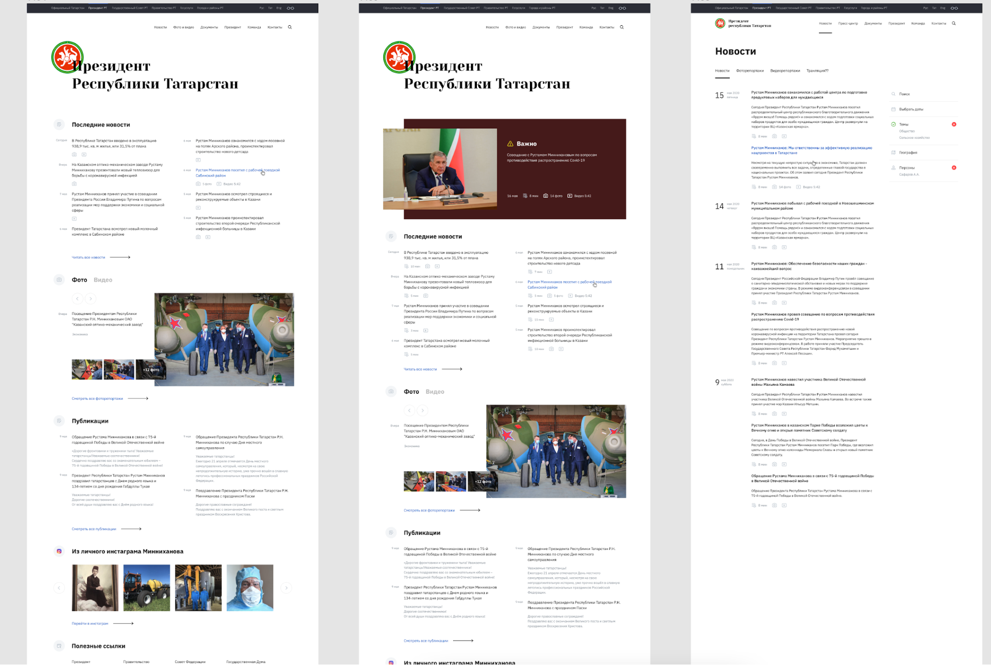
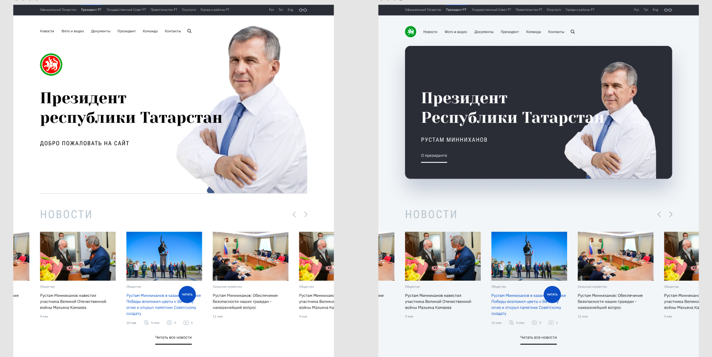
In the process of work, we studied the sites of the heads of other regions, presidents of different countries, government bodies. The site kremlin.ru turned out to be the closest to us in terms of goals - we used it as one of the references. For example, we have borrowed the division of the news feed into right and left columns.
We took it as a basis, but added or reworked a lot. Here are some of the ideas we tested:
- Vertical menu,
- Large photo of the president on the main page,
- One news on the main page in full screen with a photo,
- Emoji in the interface,
- Video broadcasts with the president on the main page,
- Photo galleries like on Instagram.
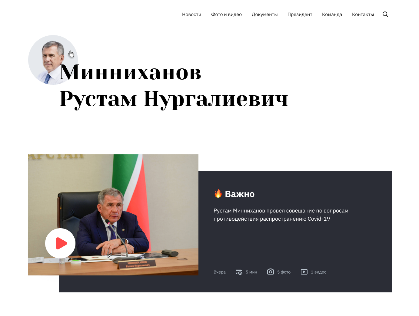
Emoji on the main and video broadcasts.
At the same time, we refined the idea itself: when entering the site, a journalist sees the latest news on half of the screen - all the ready-made information in zero clicks. Copy text, download photos - it's simple. If you need previous news - on the left is the column with the twenty latest news.
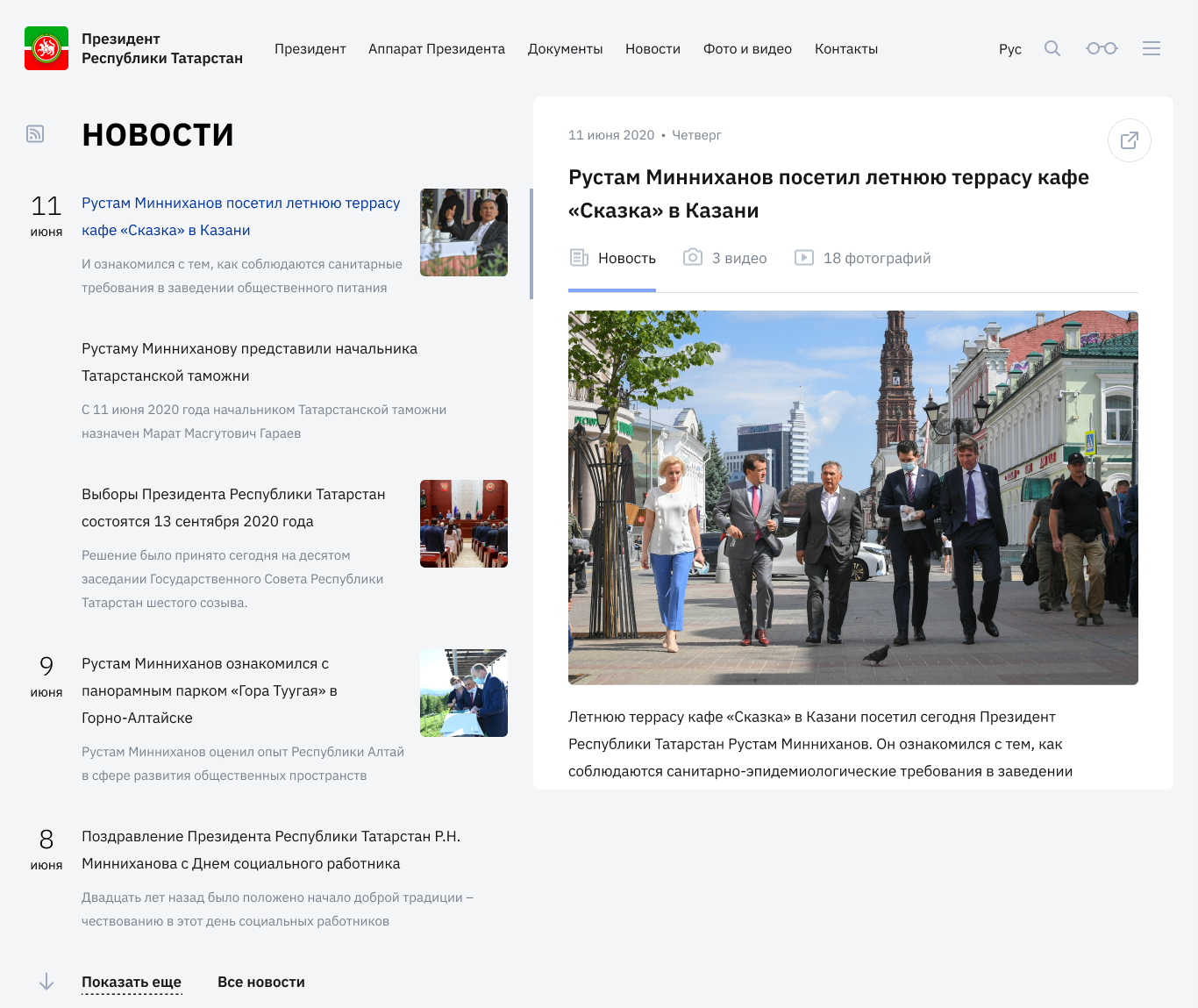
The site visitor can read the news without going to the detailed pages. This reduces the time of access to content, and it is now faster and more convenient to receive fresh information.
It is easy to switch between news, video and photo reports on the site. This is not the case on ordinary news and government sites - you need to open it in a new tab.
We wanted the site to work as a service and be a convenient tool for the journalist. Usually, no more than two or three news items appear on the site a day - the site is designed so that they can be seen immediately.
We made a website in 3 months
The project was quick - journalists literally attacked the site with requests. This is how we worked:
- April - problem statement and research;
- May - prototype and prototype approval;
- June - development of the concept design of the site and approval;
- July - layout;
- August - development, testing.
Although the task was set back in April, there was no time to cool off. Here's what we did to speed things up:
Gathered feedback quickly. Usually, on such projects, a focus group is assembled and tested for about a month. We didn’t do this, but went to our press center and collected comments in just a couple of days.
Take the risk. Having agreed on the design in the first instance, we did not wait for all the approval circles, but continued to complete the site without final approval. We could sit and wait or work - guess which one we chose?
Shared teamwork. Every day we called the team for 10-15 minutes to determine who is doing what - no two-hour planning meetings on the project.
We managed to make the site on time : on April 6, we started research, and on June 30, after a lot of approvals, it was sent to development. The site was launched on time - in early September.
See what we got: president.tatarstan.ru and write your opinion in the comments.