My name is Ksyusha Lugovaya. At SberCorus, I am maintaining the Korus-UI React component library.
Almost every developer sooner or later faces the problem of choosing a library, and sometimes the solution can be non-trivial. Questions arise: what to be guided by when choosing a library, what popular solutions does the market offer, what are their pros and cons? Reviews and testimonials don't always help you find a solution.
In the development world, there is no perfect fit for all situations. Therefore, in the article I will tell you how we solve this problem, and analyze with examples of analyzing several popular solutions, how to choose a library of React components for your project.
The main criteria for choosing a library
Library usage scenarios. This sounds obvious, but a clear understanding of the tasks is the primary selection criterion.
Application component types. The type of application determines which components you need. Often a set of buttons / checkboxes, basic input fields, lists / menus with ready-made styles are enough. This means that you can use simple components with a minimum amount of settings and ready-made styles.
Customization, formatting and interactivity in design. If you need to significantly format and style your components, this is also important to decide in advance.
When the requirements are clearly stated, answer the questions:
Is the project documentation well-written, are there interactive examples?
How actively is the project supported?
How many issues are in the project and how quickly are they resolved?
Is the project free or commercially licensed?
How easy are the components to customize?
Is the library code covered by tests?
?
, . , — .
, :
Material-UI,
Semantic-UI-React,
yandex-ui,
arui-feather,
Korus-UI.
, – Material-UI Semantic-UI-React, .
– , (, ) , opensource .
.
— , .
.
Layout-
, , , . :
;
props.children;
;
: h1, section, div, span, Icon, Avatar.
- , . , Material-UI Semantic-UI . - .
- (controls)
, , , , — , «» .
:
;
props;
UI (disabled, required, isLoading).
, .
:
;
layout- (, , );
.
|
|
Layout |
Controls |
Modules |
|
Material-UI |
App Bar, Avatars, Badges, Bottom Navigation, Divider, Grid List, Lists, Paper, Progress, Snackbar, Tables, |
Button, Chip, Selection Controls, Text Fields, Pickers* |
Dialog, Cards, Drawers, ExpansionPanel, Menu, Stepper, Tabs, Tooltip |
26** |
Semantic-UI-React |
Container, Divider, Flag, Header, Icon, Image, Label, List, Loader, Placeholder, Rail, Reveal, Segment, Step, Breadcrumb, Form, Grid, Menu, Message, Table, Advertisement, Card, Comment, Feed, Item, Statistic |
Button, Input, Checkbox, Radio, Select, Text Area |
Accordion, Dimmer, Dropdown, Embed, Modal, Popup, Progress, Rating, Search, Sidebar, Sticky, Tab, Transition, Visibility, Confirm, Pagination, Portal, Ref, Transitionable Portal |
52 |
yandex-ui |
Badge, Divider, Icon, Image, Text, UserPic, ListTile, Spacer, Link, Spin |
Attach, Button, Checkbox, Menu, Radiobox, RadioButton, Select, Slider, Textarea, Textinput, Tumbler |
TabsMenu, Drawer, Dropdown, Messagebox, Modal, Popup, TabsPanes, Tooltip, Progress |
30 |
arui-feather |
Amount, CardImage, FlagIcon, Form, GridRow, GridCol, Heading, Icon, InputGroup, Label, Link, List, Paragraph, Spin |
Attach, Button, CardInput, CheckBoxGroup, CheckBox, FormField, IconButton, Input, RadioGroup, Radio, Select, TagButton, Textarea, Toggle |
CalendatInput, Calendar, Collapse, EmailInput, InputAutocomplete, IntlPhoneInput, Menu, MoneyInput, Notification, PhoneInput, Plate, Popup, ProgressBar, Sidebar, SlideDown, Tabs |
44 |
Korus-UI |
HTML tags factory***, Currency, Tags |
Button, Checkbox, Input, Radio, Rating, Slider, Switcher, Textarea |
Autocomplete, ButtonGroup, Collapse, Collapsible, DatePicker, DateRange, DateTimePicker, DateTimeRange, Dropdown, DropdownLink, DropdownSelect, Dropzone, FileDrop, FileUpload, Loader, MaskedInput, Modal, MultiSelect, Notifications, NumericRange, NumericTextBox, Pagination, Password, ProgressBar, StatusBar, StickyPanel, Tabs, TimePicker, TimeRange, Tooltip, Tour, Validation, VStepper, Wizard, form |
45 + - HTML- |
*Material-UI
** ,
***Korus-UI HTML- c API
50% Material-UI Semantic-UI-React 30% yandex-ui arui-feather — layout-. Korus-UI 70% — .
. .
Material-UI
MuiThemeProvider. React .
. className.
classes.
CSS-in-Js, , CSS-. CSS-in-Js HOC withStyles() makeStyles() .
Semantic-UI-React
Semantic-UI-React , Semantic-UI.
, .
:
, site.variables;
css- ;
theme.config;
assets .
yandex-ui
. .
:
themekit;
() ;
- yaml json. (css, json, js, ios, android) .
arui-feather ( )
. className, .
Korus-UI ()
LedaProvider. React .
. API- (. theme). .
. , , ( Loader ).
.
Material-UI
component.
, List <ul>
. React :
<List component="nav">
  <ListItem button>
    <ListItemText primary="Trash" />
  </ListItem>
  <ListItem button>
    <ListItemText primary="Spam" />
  </ListItem>
</List>
Semantic-UI
Semantic-UI-React as:
<Button as='a' />
React- . .
yandex-ui
render-override. .
:
import React from 'react'
import { useRenderOverride } from '@yandex/ui/lib/render-override'

const ElementOriginal = ({ children }) => <div>{children}</div>
const MyComponent = ({ renderElement }) => {
  const Element = useRenderOverride(ElementOriginal, renderElement)
  return (
    <>
      <Element />
    </>
  )
}
yandex-ui .
arui-feather ( )
.
Korus-UI
API. Render. , , .
:
labelRender={() => <MyCustomLabel />}
:
({ Element, elementProps, componentProps, componentState }) => React.Node
Element
-
elementProps
- props
componentState
,componentProps
- props state
, , :
<L.CheckBox
  labelRender={({ elementProps }) => <MyCustomLabel {…elementProps} />}
>
  Label
</L.CheckBox>
React- 2 :
Typescript
PropTypes
React Typescript. , . PropTypes — .
Typescript. Semantic-UI JS, Typescript Semantic-UI-React, React.
— . , . , . .
, — . .
( ) ( ).
.
|
|
|
|
% |
Material-UI |
Chai, Mocha, Sinon |
Unit |
95.28% Statements 87.22% Branches 97.51% Functions 95.26% Lines |
Semantic-UI |
Jasmine, Karma |
Unit |
|
Semantic-UI-React |
Chai, Enzyme |
Unit |
|
yandex-ui |
Jest, Enzyme |
Unit |
|
arui-feather |
Jest, Enzyme |
Unit |
88.1% Statements 73.84% Branches 66.61% Functions 87.19% Lines |
Korus-UI |
Cypress, Jest |
Unit, end-to-end |
69.28% Statements 56.14% Branches 66.29% Functions 71.78% Lines |
, . Storybook .
|
|
|
|
Storybook |
Material-UI |
https://material-ui.com/ru/ |
- |
- |
Semantic-UI-React |
https://react.semantic-ui.com/ |
+ |
- |
yandex-ui |
https://yastatic.net/s3/frontend/lego/storybook/index.html |
- |
+ |
arui-feather |
https://digital.alfabank.ru/ |
+ |
- |
Korus-UI |
https://opensource.esphere.ru/korus-ui/ |
+ |
+ |
, . , .
. , , , , . : , .
-. , . , , .
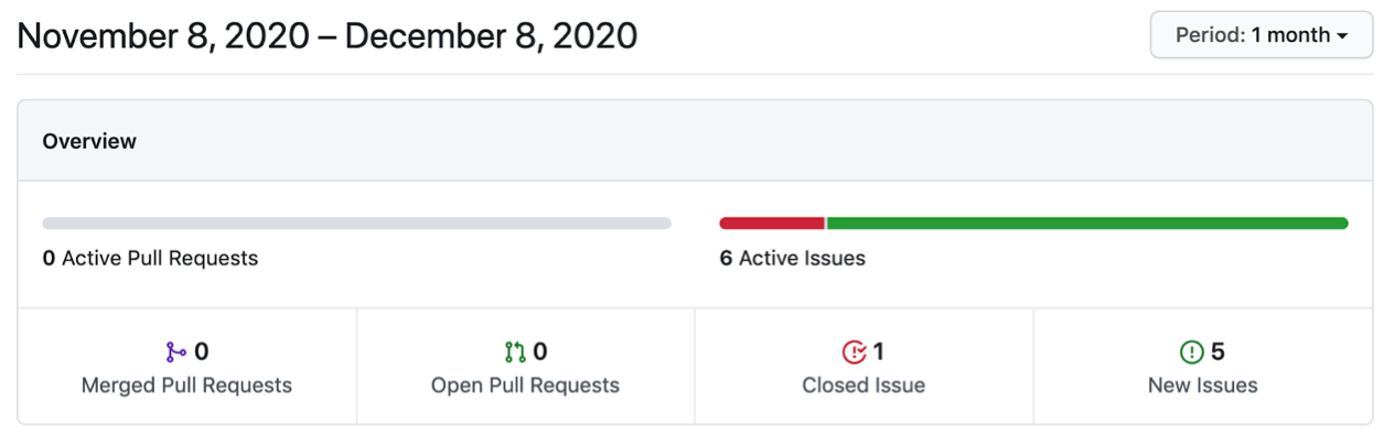
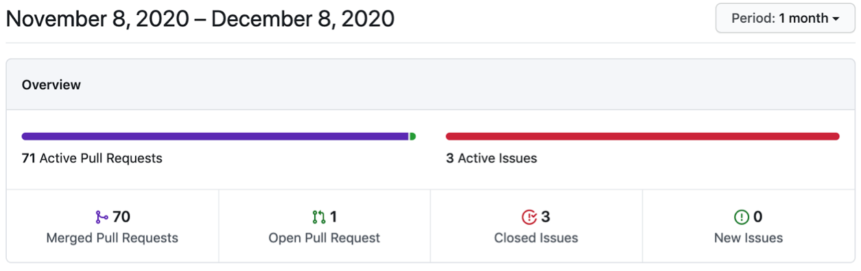
Pulse GitHub Pull Request . Insights . .
Material-UI

Semantic-UI
yandex-ui
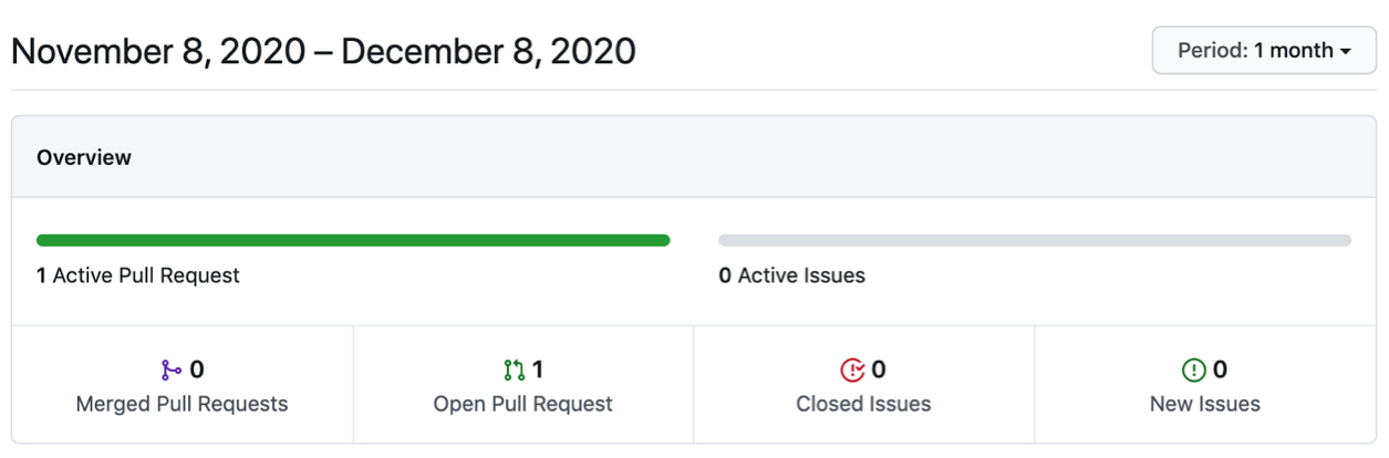
arui-feather ( )
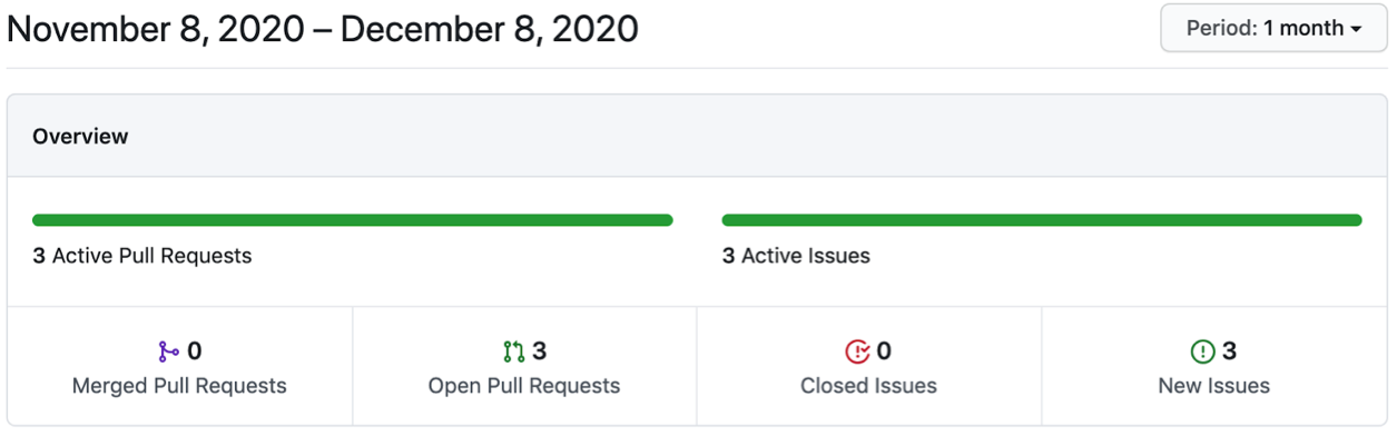
Korus-UI ()
GitHub npm-. , . .
, — SEO-, . , , Stackoverflow, Medium, DEV. issues .
, , . .
|
|
|
|
, % |
Material-UI |
63 400 |
6 372 353 |
0,99 |
Semantic-UI |
48 800 |
541 299 |
9 |
Semantic-UI-React |
11 900 |
8 620 967 |
0,14 |
@yandex/ui |
212 |
15 902 |
1,33 |
arui-feather ( ) |
559 |
26 744 |
2 |
. . , , , . , .
: . , .
, , ( ). (-), .
.
: . , , , «».
Korus-UI
const BasicForm = () => (
  <L.Div>
    <L.Input
      isRequired
      requiredMessage="Login is required"
      form="form"
      name="login"
      placeholder="Login"
    />
    <L.Input
      isRequired
      requiredMessage="Password is required"
      form="form"
      name="password"
      placeholder="Password"
    />
    <L.Button _warning form="form">
      Submit
    </L.Button>
  </L.Div>
);
Material-UI
const BasicForm = () => {
  const [login, setLogin] = React.useState("");
  const [loginError, setLoginError] = React.useState(false);
  const [password, setPassword] = React.useState("");
  const [passwordError, setPasswordError] = React.useState(false);

  return (
    <div>
      <form
        onSubmit={(e) => {
          e.preventDefault();
          setLoginError(!login);
          setPasswordError(!password);
        }}
      >
        <p>
          <TextField
            error={loginError}
            placeholder="Login"
            value={login}
            onChange={(e) => {
              setLoginError(false);
              setLogin(e.target.value);
            }}
            onBlur={(e) => {
              setLoginError(!login);
            }}
            helperText={loginError && "Login is required"}
          />
        </p>
        <p>
          <TextField
            error={passwordError}
            placeholder="Password"
            value={password}
            onChange={(e) => {
              setPasswordError(false);
              setPassword(e.target.value);
            }}
            onBlur={(e) => {
              setPasswordError(!password);
            }}
            helperText={passwordError && "Password is required"}
          />
        </p>
        <Button type="submit" color="primary" variant="contained">
          Sign Up
        </Button>
      </form>
    </div>
  );
};
Semantic-UI-React
const BasicForm = () => {
  const [login, setLogin] = React.useState("");
  const [loginError, setLoginError] = React.useState(false);
  const [password, setPassword] = React.useState("");
  const [passwordError, setPasswordError] = React.useState(false);

  return (
    <div>
      <Form
        onSubmit={(e) => {
          e.preventDefault();
          setLoginError(!login);
          setPasswordError(!password);
        }}
      >
        <Form.Group>
          <Form.Input
            error={loginError && { content: "Login is required" }}
            placeholder="Login"
            name="login"
            value={login}
            onChange={(e) => {
              setLoginError(false);
              setLogin(e.target.value);
            }}
            onBlur={(e) => {
              setLoginError(!login);
            }}
          />
          <Form.Input
            error={passwordError && { content: "Password is required" }}
            placeholder="password"
            name="password"
            value={password}
            onChange={(e) => {
              setPasswordError(false);
              setPassword(e.target.value);
            }}
            onBlur={(e) => {
              setPasswordError(!password);
            }}
          />
          <Form.Button content="Submit" />
        </Form.Group>
      </Form>
    </div>
  );
};
arui-feather
const BasicForm = () => {
  const [login, setLogin] = React.useState("");
  const [loginError, setLoginError] = React.useState(false);
  const [password, setPassword] = React.useState("");
  const [passwordError, setPasswordError] = React.useState(false);

  return (
    <Form
      onSubmit={(e) => {
        e.preventDefault();
        setLoginError(!login);
        setPasswordError(!password);
      }}
    >
      <FormField>
        <Input
          error={loginError && "Login is required"}
          placeholder="Login"
          value={login}
          onChange={(value) => {
            setLoginError(false);
            setLogin(value);
          }}
          onBlur={(e) => {
            setLoginError(!login);
          }}
        />
      </FormField>
      <FormField>
        <Input
          error={passwordError && "Password is required"}
          placeholder="Password"
          value={password}
          onChange={(value) => {
            setPasswordError(false);
            setPassword(value);
          }}
          onBlur={(e) => {
            setPasswordError(!password);
          }}
        />
      </FormField>
      <FormField>
        <Button view="extra" type="submit">
          Submit
        </Button>
      </FormField>
    </Form>
  );
};
yandex-ui
const BasicForm = () => {
  const [login, setLogin] = React.useState("");
  const [loginError, setLoginError] = React.useState(false);
  const [password, setPassword] = React.useState("");
  const [passwordError, setPasswordError] = React.useState(false);

  return (
    <form
      onSubmit={(e) => {
        e.preventDefault();
        setLoginError(!login);
        setPasswordError(!password);
      }}
      className={cnTheme(theme)}
    >
      <Textinput
        error={loginError}
        placeholder="Login"
        value={login}
        onChange={(e) => {
          setLoginError(false);
          setLogin(e.target.value);
        }}
        onBlur={(e) => {
          setLoginError(!login);
        }}
        hint={loginError && "Login is required"}
      />
      <Textinput
        error={loginError}
        placeholder="Password"
        value={password}
        onChange={(e) => {
          setPasswordError(false);
          setPassword(e.target.value);
        }}
        onBlur={(e) => {
          setPasswordError(!login);
        }}
        hint={passwordError && "Password is required"}
      />
      <Button type="submit" view="action">
        Submit
      </Button>
    </form>
  );
};
, Korus-UI , .
Material-UI yandex-ui , Semantic-UI-React arui-feather <form>
.
, Korus-UI. .
React-
React-.
|
|
Korus-UI () |
Material-UI |
Semantic-UI-React |
arui-feather ( ) |
yandex-ui |
|
|
Storybook |
+ |
– |
– |
– |
+ |
|
+ |
– |
+ |
+ |
– |
|
|
Pull Request |
70 |
241 |
2 |
0 |
0 |
|
|
MIT license |
MIT license |
MIT license |
Mozilla Public License 2.0 |
Mozilla Public License 2.0 |
|
> 50% |
+ |
+ |
– |
+ |
|
E2E |
+ |
– |
– |
– |
– |
|
|
Chrome |
85.0.4183.121 |
>= 49 |
Last 2 v. |
Last 2 v. |
Last 2 v. |
Firefox |
81.0.1 |
>= 52 |
Last 2 v. |
Last 2 v. |
>= 23 |
|
Edge |
85.0.564.44 |
>=14 |
12+ |
Last 2 v. |
|
|
IE |
11 |
11 |
11+ |
11+ |
11+ |
|
Safari |
14 |
>= 10 |
Last 2 v. |
Last 2 v. |
|
|
Opera |
|
|
|
Last 2 v. |
>= 12.1 |
|
Yandex |
|
|
|
Last 2 v. |
? |
|
Android |
|
|
4.4+ |
5+ |
>= 4 |
|
iOS Safari |
|
|
7+ |
Last 2 v. |
>= 5.1 |
|
|
|
+ |
+ |
+ |
– |
+ |
|
|
+ |
+ |
+ |
– |
– |
|
|
Typescript |
Typescript |
Typescript |
Typescript |
Typescript |
|
GitHub , % |
– |
0,99 |
0,14 |
2 |
1,33 |
|
|
+ |
– |
+ |
+ |
– |
|
+ |
– |
– |
– |
– |
|
. , .
, , .
Korus-UI
: ? React .
, , . — , .
: , . .
React-, . , . , , .
Korus-UI 1,5 . opensource-.
Korus-UI
Korus-UI : form, . , , . , L.form()
. , .
Korus-UI onValidationFail, , . — .
Korus-UI — . :
RegExp
( )
isValid
unmounted
,
API
, _. css-:
<L.Div _flexBox> -> <div class="flex-box"></div>
className .
theme, css- .
Render (. ).
, :
{
  …Event, //  ,  React'

  //    component,
  component: {
    isValid?: boolean, //   ,    onBlur
    name?: string, //  ,
    value: any, //
    … //    (. API )
  }
}
:
is: isOpen
, isValid
, isRequired
, isDisabled
has: hasCloseButton
should: shouldCorrectValue
ref
.
Korus-UI ref, React.
Korus-UI
, . , issue .
iOS Android. . .
React- Material-UI, Semantic-UI-React, arui-feather ( ), yandex-ui, Korus-UI (), .
, :
Korus-UI, . , , Korus-UI .
. , Storybook.
Korus-UI opensource GitHub. opensource, , :)
I would also like to express my gratitude to the SberCorus development team, the father and ideological inspirer of the library, Artem Povolskikh . If you are interested in how front-end development works in SberCorus, read Artyom's article .
Share your experience with component libraries in the comments. It is interesting to discuss what advantages and disadvantages you have come across from personal experience and what functionality you lack in the process.