3D animation in JS
The first trick is a wonderful 3D effect in JS.

As you can see, when the mouse pointer moves over this "card", the elements inside it acquire three-dimensionality.
How to do it
First the HTML div is created:
<div class="card">
<div class="header">
<img src='image.png' alt="image">
</div>
<div class="info">
<h1 class="title"><a href="https://hackerone.com/hensis">Hackerone</a></h1>
<h3>Started on 6/20 Signal : 5.67 Reputation : 360 Impact : 26.25</h3>
</div>
</div>
Here we have a main class (card) and two other classes inside card (header and info). Header will be the class containing the image (in our example, the Medium logo), and info will contain the text in the card. Now let's add some CSS to make the map look better.
.card {
transform-style: preserve-3d;
min-height: 64vh;
width: 20vw;
border-radius: 30px;
padding: 0rem 5rem;
box-shadow: 0 20px 20px rgba(0, 0, 0, 0.2), 0px 0px 50px rgba(0, 0, 0, 0.2);
}
Here I have declared height, width, border, padding and shadow. Refresh the page and you should see the results. The last step is to achieve a 3D effect when you hover your mouse over the map. For this, I used JS:
// declaring variables
const card = document.querySelector(".card");
const title = document.querySelector(".title");
const header = document.querySelector(".header img");
const description = document.querySelector(".info h3");
// Animate In
card.addEventListener("mouseenter", (e) => {
card.style.transition = "none";
title.style.transform = "translateZ(3px)";
header.style.transform = "translateZ(3px) rotateZ(0deg)";
description.style.transform = "translateZ(3px)";
});
// Animate Out
card.addEventListener("mouseleave", (e) => {
card.style.transition = "all 0.5s ease";
card.style.transform = `rotateY(0deg) rotateX(0deg)`;
title.style.transform = "translateZ(0px)";
header.style.transform = "translateZ(0px) rotateZ(0deg)";
description.style.transform = "translateZ(0px)";
});
- Declare variables.
- Create two event listeners for card.
- In mouseenter, translate Z to 3 pixels for title, header and description. You can also decide whether to rotate these elements or not (rotateZ).
- On mouseleave, bring everything back to normal.
That's it: you have beautiful 3D animation. Of course it is raw now. You can add CSS everywhere to change the width, color, etc.
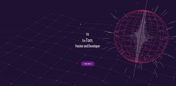
Discover Vanta.js for Background Animation
Tired of static colors and images on your web page background? VantaJs is designed to bring the background to life:
How it's done
It's pretty simple. Add the following code to HTML:
<script src="https://cdnjs.cloudflare.com/ajax/libs/three.js/r121/three.min.js"></script>
<script src="https://cdn.jsdelivr.net/npm/vanta@latest/dist/vanta.globe.min.js"></script>
<script>
VANTA.GLOBE({
el: "#htmlid",
mouseControls: true,
touchControls: true,
gyroControls: true,
minHeight: 200.00,
minWidth: 200.00,
scale: 1.00,
scaleMobile: 1.00
})
</script>
This will set the Vanta.js Globe background to the htmlid.
Vanta.js has 13 pre-built backgrounds
To switch between them, change VANTA.GLOBE to VANTA. [Backgroundname]. Of course, you need to add the corresponding cdn.jsdelivr.net/npm/vanta@latest/dist/vanta . [Backgroundname] .min.js before that.
ScrollReveal
For those who didn’t know about this fantastic JS library, ScrollReveal can display elements as you scroll down a web page:

How it's done
- Add to the header of your HTML.
- In the JS file write:
ScrollReveal().reveal('.htmlclass',{ delay: 400 })
The code will display an element with class .htmlclass with a 400ms delay on page scrolling.
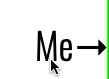
Change the size and color of letters
This little CSS trick is really impressive when used correctly:
How to do it
Create some new HTML span elements and specify their class:
<span class="change">T</span><span class="change">e</span><span class="change">s</span><span class="change">t</span>
3. Applying CSS: hover, we change the size of the letters and their color:
.blast:hover {
color:#08fdd8;
font-size: 30px;
}
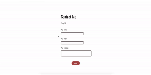
Now when you hover over the letters, you will see how they change size and color. To achieve an even more dynamic effect, I suggest creating a separate class for each letter with different sizes and colors. Additionally, you can apply CSS: hover to every type of element in HTML. For example, I applied it to my contact form too:
Animation property
We supplemented the material with a description of a property from an article by Chris Coyer.
The animation property in CSS can be used to animate many other CSS properties, such as color , background-color , height , or width . Each animation must be defined using @keyframes, which is then called using the animation property, for example:
.element {
animation: pulse 5s infinite;
}
@keyframes pulse {
0% {
background-color: #001F3F;
}
100% {
background-color: #FF4136;
}
}
Each @keyframes rule defines what should happen at certain points in the animation. For example, 0% is the start of the animation and 100% is the end. These keyframes can be manipulated with either the animation shorthand property or its eight subproperties to provide more control over the keyframes.
Subproperties
- animation-name: declares the name of the @keyframes rule to control.
- animation-duration: duration of one animation cycle.
- animation-time-function: Sets predefined acceleration curves such as ease or linear.
- animation-delay: time between loading of an element and the beginning of an animation sequence ( interesting examples ).
- animation-direction: sets the direction of the animation after the loop. Its default value is cleared every cycle.
- animation-iteration-count: How many times the animation should be executed.
- animation-fill-mode: sets what values are applied before / after animation.
For example, you can set the last state of the animation to stay on screen, or you can set it to toggle back when the animation has started. - animation-play-state: pause / play animation.
Then these sub-properties can be applied like this:
@keyframes stretch {
/* declare animation actions here */
}
.element {
animation-name: stretch;
animation-duration: 1.5s;
animation-timing-function: ease-out;
animation-delay: 0s;
animation-direction: alternate;
animation-iteration-count: infinite;
animation-fill-mode: none;
animation-play-state: running;
}
/*
is the same as:
*/
.element {
animation:
stretch
1.5s
ease-out
0s
alternate
infinite
none
running;
}
Here is a complete list of values that each of these nested properties can take:
animation-timing-function
|
ease, ease-out, ease-in, ease-in-out, linear, cubic-bezier (x1, y1, x2, y2) (eg cubic-bezier (0.5, 0.2, 0.3, 1.0)) |
animation-duration
|
Xs or Xms |
animation-delay
|
Xs or Xms |
animation-iteration-count
|
X |
animation-fill-mode
|
forwards, backwards, both, none |
animation-direction
|
normal, alternate |
animation-play-state
|
paused, running, running |
Few steps
If the animation has the same start and end properties, it is useful to separate the 0 and 100% values inside @keyframes with commas:
@keyframes pulse {
0%, 100% {
background-color: yellow;
}
50% {
background-color: red;
}
}
Multiple animations
You can separate the values with commas to also declare multiple animations in the selector. In the example below, we want to change the color of the circle in @keyframe while moving it from side to side with a different property.
.element {
animation:
pulse 3s ease infinite alternate,
nudge 5s linear infinite alternate;
}
Performance
Animating most properties is a performance issue , so we must be careful before animating any property. However, there are certain combinations that can be safely animated:
- transform: translate ()
- transform: scale ()
- transform: rotate ()
- opacity
What properties can you animate?
MDN has a list of CSS properties that can be animated . They tend to be colors and numbers. An example of a non-animated property is background-image.
Browser support
This browser support data is taken from the Caniuse website for more information. The number means that the browser supports the function in this version and above.
Tabletop
| Chrome
|
Firefox
|
IE
|
Edge
|
Safari
|
| 4*
|
5*
|
ten
|
12
|
5.1 *
|
Mobile
| Android Chrome
|
Android Firefox
|
Android
|
iOS Safari
|
| 87
|
83
|
4*
|
6.0-6.1 *
|
Prefixes
While the support for this property in modern browsers is good enough, we might want to support as many older browsers as possible. In this case, you need to use vendor prefixes:
.element {
-webkit-animation: KEYFRAME-NAME 5s infinite;
-moz-animation: KEYFRAME-NAME 5s infinite;
-o-animation: KEYFRAME-NAME 5s infinite;
animation: KEYFRAME-NAME 5s infinite;
}
@-webkit-keyframes KEYFRAME-NAME {
0% { opacity: 0; }
100% { opacity: 1; }
}
@-moz-keyframes KEYFRAME-NAME {
0% { opacity: 0; }
100% { opacity: 1; }
}
@-o-keyframes KEYFRAME-NAME {
0% { opacity: 0; }
100% { opacity: 1; }
}
@keyframes KEYFRAME-NAME {
0% { opacity: 0; }
100% { opacity: 1; }
}
These tricks are great for bringing life to your business card site or the site of a pet project you are working on. If you have any tricks of your own, I encourage you to share them in the comments. And do not forget about the HABR promo code , which gives an additional 10% discount to the one indicated on the banner.

Other professions and courses