Svyatoslav Zborovsky from the DataArt BI team studied which of the colleagues is most often thanked using the corporate system. In an article for Habr, he told how to quickly build and optimize a graph and what clusters he managed to allocate on it.
Svyatoslav Zborovsky, Data Analyst, DataArt
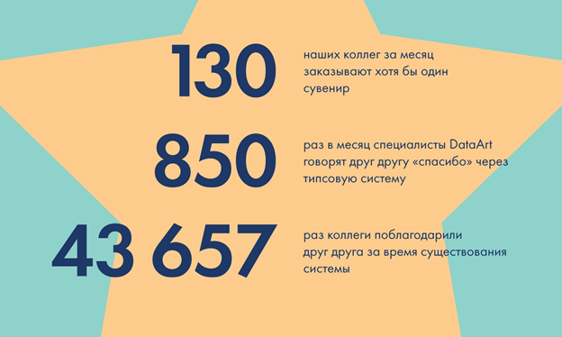
DataArt is a fairly large IT company, more than 3000 people work in our 20 offices in ten countries. Many project teams are distributed in different cities, interaction between employees and before the COVID-19 pandemic most often took place online. Nine years ago, the company came up with a way to remotely thank a colleague using TYPs - Thank you points. Tips are an analogue of the local currency, not tied in any way to bonuses, salaries or seniority. They can be sent to those who helped you, received from those for whom you have done something good yourself, and from time to time exchanged for souvenirs: mugs, backpacks, power banks, rubber ducks, etc. If interested, more about you can read how the TYPs system works herebut, in general, it really is such a "thank you" online.

Illustration from an article on how the tip system works in DataArt , published in the fall of 2019.I
got a job at the company a year ago. Having dealt with the internal systems and, in particular, the institute of tips, I became interested in whom my colleagues usually thank. True, how many people are sent "thanks" (after all, the number of points at the disposal of each person is limited)? What connections and groups within the system can be seen by evaluating the exchange of tips? Is everything given to everyone? Or is the company divided into small clusters - hobby groups? To answer these questions, I decided to build a network graph.
I'll make a reservation right away that tips that are awarded to colleagues on behalf of the company (for participating in conferences, writing articles, speaking at internal events, etc., as well as monthly by default), I did not take into account in the study. After all, this is not a classic "thank you" from a colleague to a colleague.
The graph below shows the dynamics of how many colleagues thank each other over the past four years. Guess the reason for the peaks at the end of each year (spoiler: employees wish each other a Happy New Year).
Important note: the number of employees of the company has been constantly growing for the last four years, therefore the number of donated tips will also increase. Therefore, on the graph, I showed a metric that indicates the ratio of the number of tips donated per month to the number of employees who worked for the company that month. So you can see the actual rate of tip donation.

I chose Gephi as my tool . It is more convenient to use than to manually write your own program in R / Python / choose any language that allows you to explore networks. Firstly, Gephi makes it easier to customize the styling of the network, and secondly, it provides convenient adjustment of the size and color of the text, which makes it easy to read the graph with no extra effort.
The original dataset had the format of a table of links and consisted of 46,896 lines - individual facts of gift tips. Since 2011, this is how many times colleagues have officially thanked each other within the time attendance system. It looks something like this:

Therefore, to simplify the graph, I applied a filter degree> 50, in other words, left only colleagues on it who had more than 50 connections (facts of donation or receipt of tips).
After experimenting with styling, I settled on the Fruchterman Reingold. It looked like this:

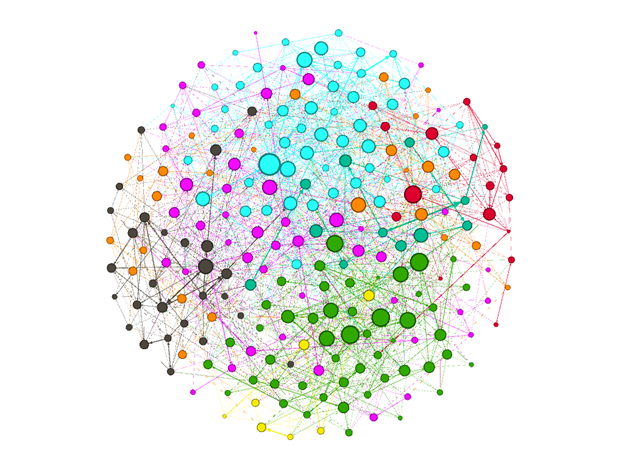
I added modularity statistics to the filtered graph to identify clusters. There were eight of them.
Next, I resized the nodes so that the large dots would fit in with people getting especially many tips. This made it possible to identify the main characters in each cluster.
The final visualization looks like this:

But who are these people? What is the logic to combine them into clusters? In order to understand, I added a node table that displays the names of employees on the graph. Alas, for confidentiality reasons, I cannot include such data in the article, but I can tell you what I managed to establish with their help.
The blue color (20.61% of all observations) represents colleagues from a small development center located in a relatively small city. DataArt is a very strong player in the labor market there, while the professional community as a whole is very small. Under these conditions, the local office occupies a significant place in the life of colleagues, and they communicate with each other very closely, even being engaged in different projects. This is clearly reflected in the frequent "thank you". Leaders - HR managers, sysadmins, accountants and the most experienced of engineers, who act as mentors for interns and actively participate in the life of the local development center. That is, they conduct webinars, present the results of their work and interesting cases in the office, and make presentations at conferences that are popular with colleagues. The central large node is the helpdesk engineer.
Green (18.88%) - by contrast, colleagues from the largest (surprisingly!) Office located in a mid-size, non-capital city. However, the picture is different here: in general, people are less likely to send tips to each other, and I simply do not have any pronounced “favorites”. Most likely, colleagues just have good horizontal relationships. [SZ13]
Purple (18.88%) - managers who help plan travel and calculate budgets, and members of the internal BI team. They also have a pronounced “admirer” category, which includes project managers, delivery managers, team leads and senior developers who are more likely to visit clients' offices.
Black (15.45%) are “good people” who are equally often thanked by colleagues of various levels and specializations. The biggest black dots are system administrators, except for them, office managers and English teachers fall into the category.
Orange (11.59%) brings together senior management, HR managers and those who promote the company in the labor markets. All these people develop the DataArt brand as an employer and, although they work in different teams and departments, they regularly cross over and thank each other. This tendency can be traced throughout all nine years of the system's operation, therefore it is quite logical to combine such colleagues into one cluster.
Another small location is marked in red (6.87%). The biggest points are the two system administrators and the chief HR, who really spends a lot of time communicating with colleagues and in many ways unites them with each other.
Dark green (3.86%) - again sysadmins, but not tied to a specific office. These are those who help to set up virtual environments, establish the work of corporate systems and advise colleagues from different cities and countries. Therefore, it is impossible to identify a specific group, whose representatives would thank them more often than others. All employees of the company are equally grateful to them - for this they are entitled to a separate cluster.
Yellow (3.86%) - the developers of the internal systems Project Manager and EDU, in which we keep track of working hours, monitor the dynamics of activity in projects, accumulate training courses and communicate with each other. In a word, they reflect the whole life of the company, so those who work on them are often thanked, moreover, colleagues from different projects and countries.
I think that the resulting graph accurately reflects the horizontal connections within the company, but outside of individual projects and accounts. It is not so surprising that system administrators have taken a special place in the diagram, but it will not be superfluous to show them it. Let them not doubt how highly their colleagues value them!
The graph was built on the history of Tips connections for the entire period of the Thank you points institute existence. If we repeat the same study, but on a sample of a year / half-year, the structure of clusters will change. The largest clusters will be large projects, where a successful release took place in the selected time frame. The rest of the clusters will form the usual local connections and thanks to managers, sysadmins and English teachers.
I can assume that the experience of my little research may be useful for those who want to better understand the social structure within their collective. Do colleagues really treat each other well? To whom are they often ready to say "thank you"? Moreover, such research helps to identify seemingly invisible heroes who should be encouraged with more than just the usual "thank you".