The year 2021 is approaching, which means that it has been almost 4 years since I joined Pathfinder: Kingmaker as a front-end developer. During this time, the game has evolved from a small prototype with minimal functionality into a huge, complex system. The game has gone through a release, a year of active bug fixing and DLC support, as well as porting to the console. And now that the development of this project can be considered complete, it's time to look back and try to collect a retrospective of how the interfaces were designed and created.
I decided to start with the main, in my opinion, game interface, from the character sheet.
Introduction
Computer Pathfinder: Kingmaker is an adaptation of the Paizo board game Pathfinder, which is very popular in the English-speaking world and slightly less in everything else. And so that all development participants, without exception, understood well what they were doing, the team had an excellent practice: a weekly board game based on the original Kingmaker module.
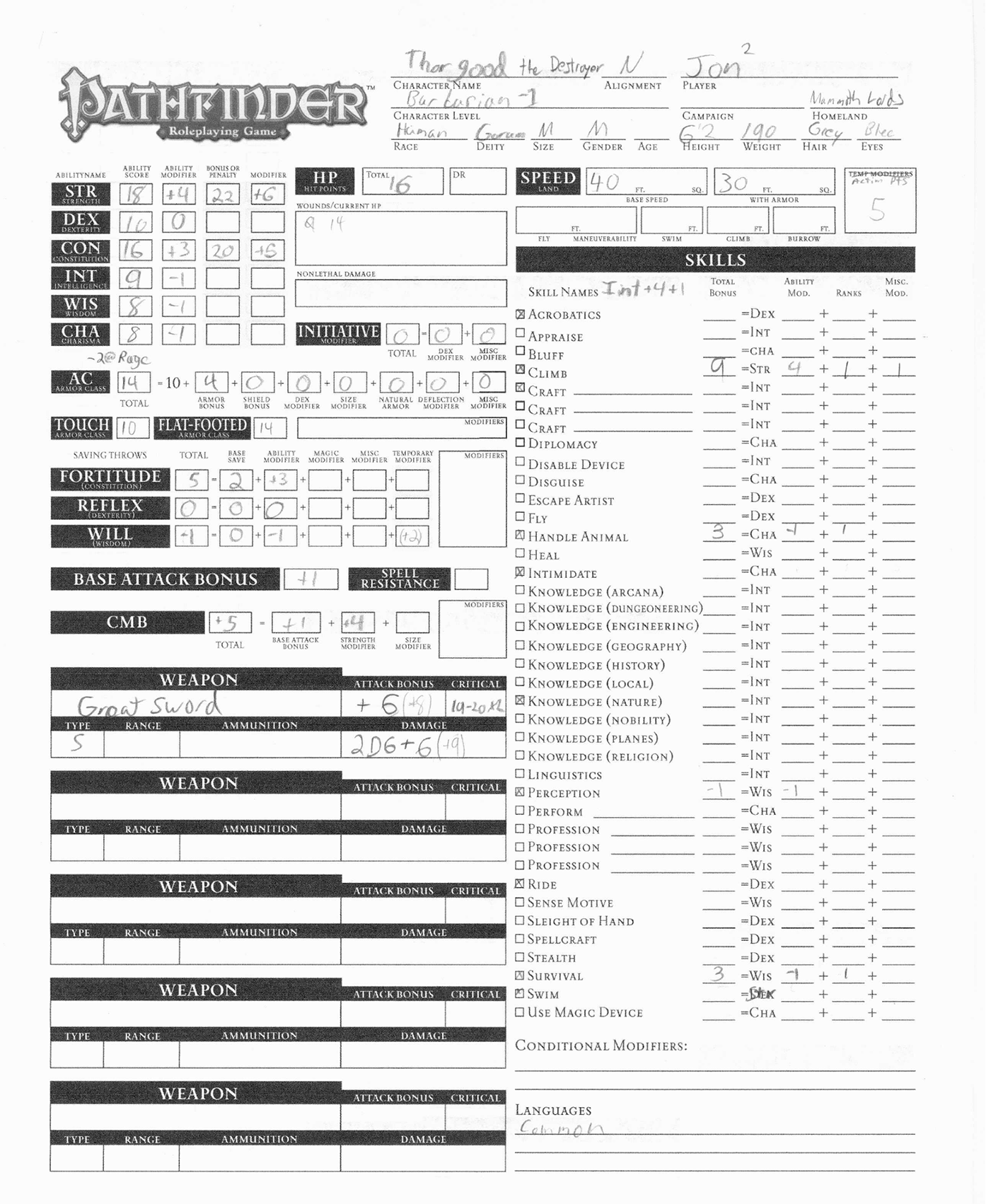
And this helped a lot at the beginning of the development of this and other interfaces, because it is the character sheet that you hold in paper form in your hands, sitting at the table.
Taken from here: http://runelords.peepersbog.org/index.html
Unlike my colleagues who were more experienced in games and development, all my experience in board-role-playing games was reduced to playing in my youth by scraps of D'n'D rules and passing Baldur's Gate at a time when I did not even realize that it was made by board game. And, of course, this experience is a huge disadvantage when you need to transfer a board game to a computer game. However, now I understand that at that moment the flaw turned into dignity, because it made it possible to look at the interface from the point of view of a person who does not know anything about the game. In essence, the task became “explain to yourself how it works,” which, of course, is much easier. After all, no one can tell how to use something, except as a person who has just learned this. At the moment when the task was set to design a character sheet in the game, everything seemed very simple:transfer it to digital form, remove the unnecessary and you're done! And, of course, this was not the case. The deeper I delved into the structure of the board game rules, the clearer it became that Pathfinder was not a game by rules, but by exceptions to the rules.
Information design
The input data was, first of all, the original character sheet, the documentation of the game designers, the Core Rulebook of the board game, and a certain amount of ready-made interface layout, in particular, the inventory.
Obviously, it was impossible to simply turn over the paper Character sheet into a screen version.
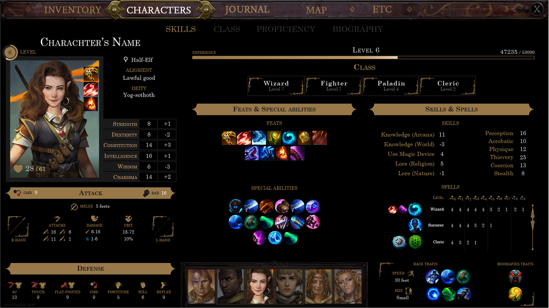
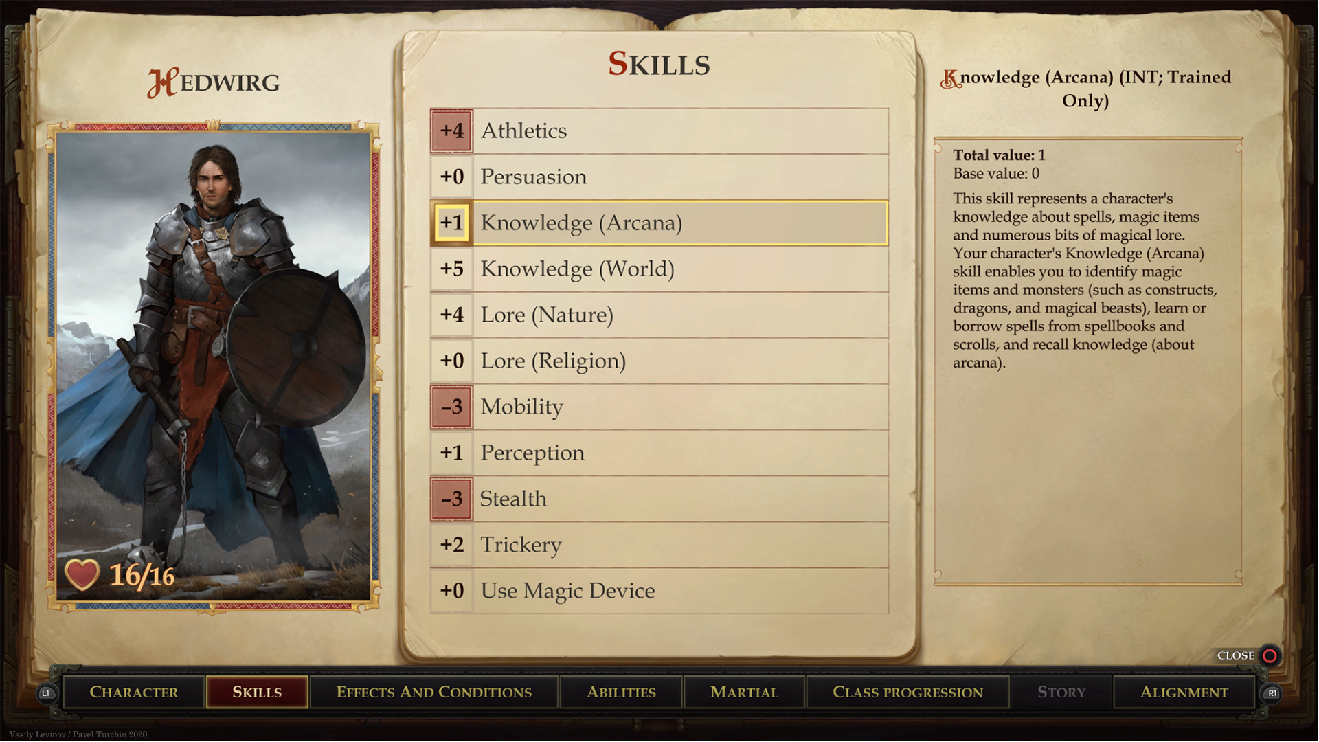
In the computer version, the number of skills was reduced, but at the same time, the display of conditions and buffs was added. In addition, some characteristics were added that, as a rule, were not shown in the paper version.
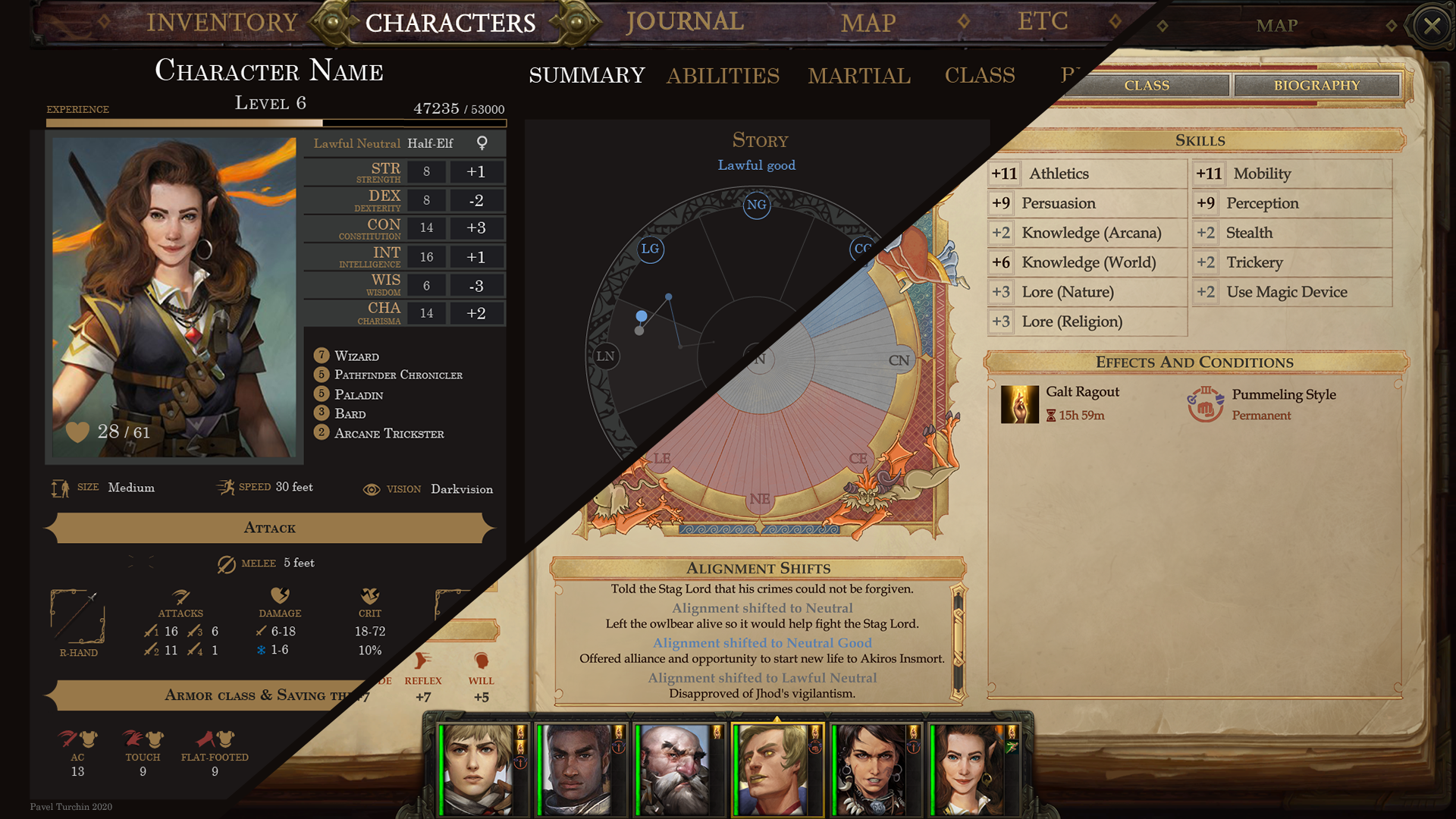
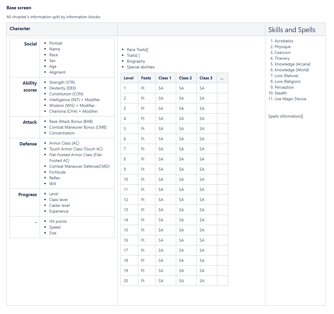
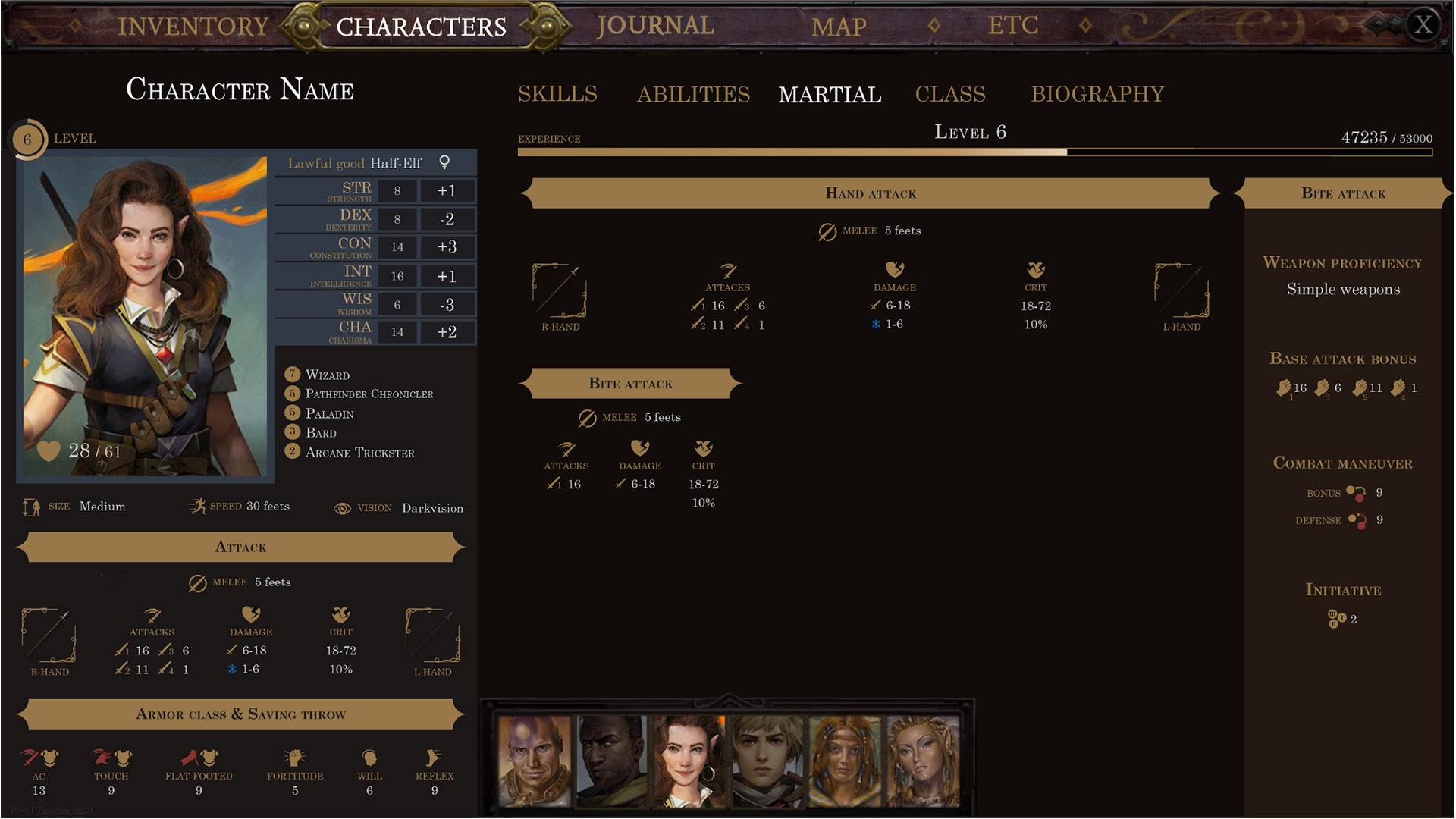
Rethinking the existing, paper, in conjunction with the new, computer, led to the idea of splitting the screen into three columns. Although, it would be more correct to say, to the idea of stretching the already existing layout of the inventory. The left third of the screen was supposed to become a "cross-cutting" information core of the character's interfaces and absorb the main characteristics. And the key part of this block was to be a portrait. Unlike other modern RPGs, where the main representation of the character is a 3D doll, we had a drawn portrait for the role of identifying the player as a hero of the game. This has been emphasized for several reasons: 1. This is the genre, spiritual heritage of Baldur's Gate. 2. A portrait can express more complex emotions and better characterize the character, making the gaming experience deeper. The other components of the block had to answer the questions "who?" and which?":Chaotic good half-orc, barbarian, strong and handsome, but stupid, hits with a hammer like this, protection like that. The other two-thirds were required to reveal details about abilities and skills and history. As a result of information projection, all possible character blocks were grouped and distributed across columns and pages. Thus, there was a logical partition.


Of course, this turned out to be not optimal partitioning, but it became a good starting point for further layout.
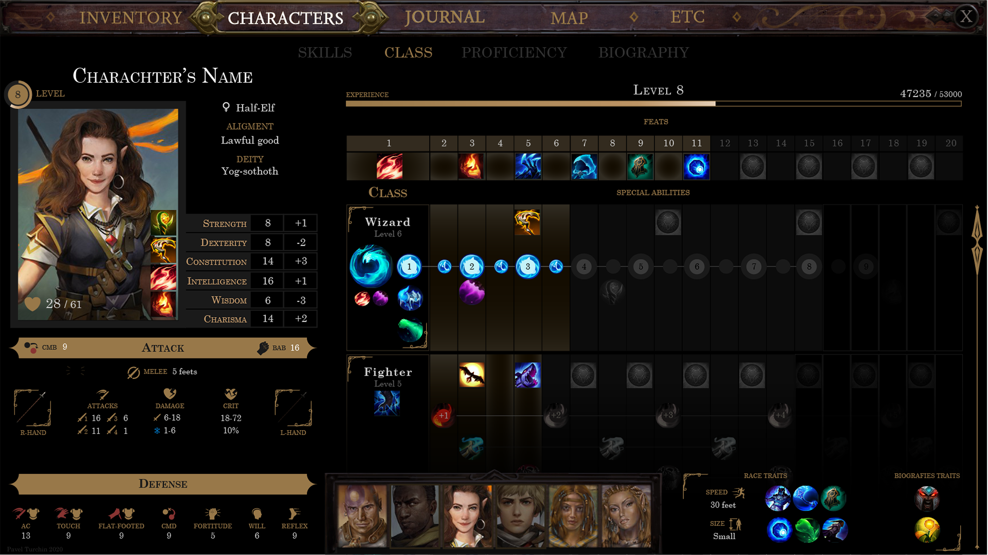
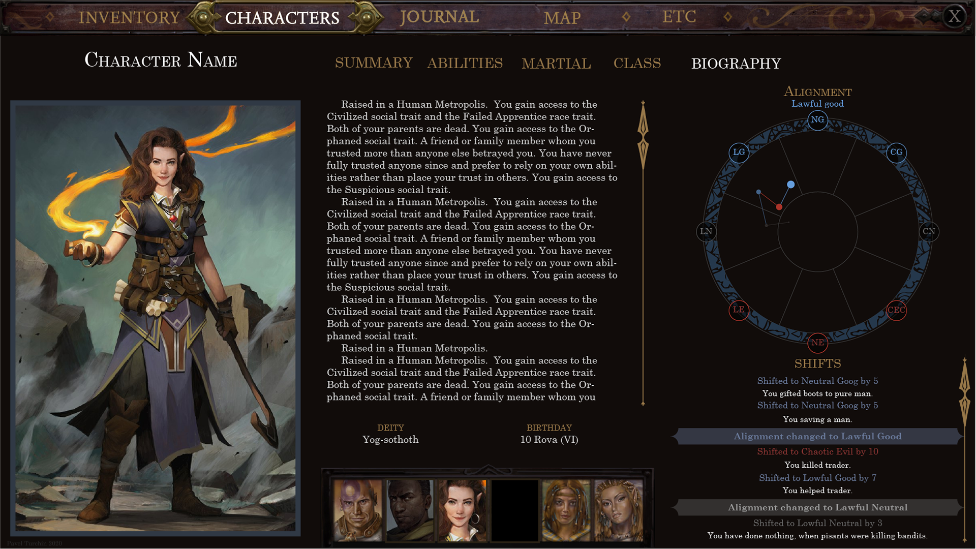
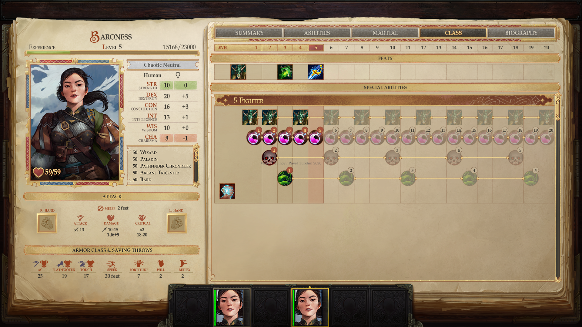
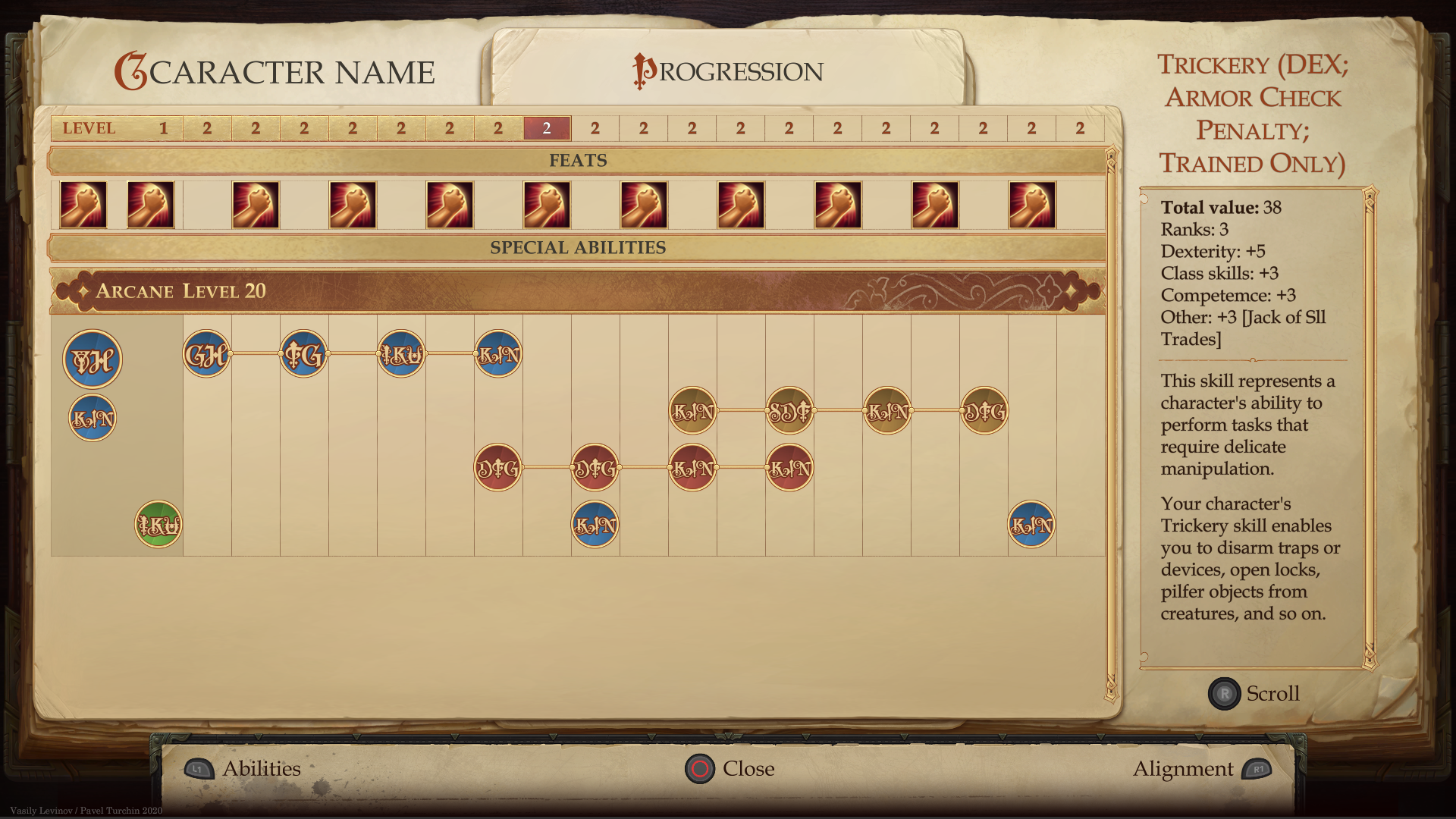
I would like to highlight the visualization of class progressions as a separate topic. The peculiarity of Pathfinder here is that, unlike many games of a similar genre, character development here cannot be formalized into a static development map. A player can choose a different class at any level up and become, for example, a 5th-level magician and a 3rd-level thief, and this is impossible to predict. In addition, each class has archetypes, the choice of which replaces some of the abilities and not necessarily at the same level. And some of the abilities appear in the class only after the player decides on the deity of his character or origin.
To the uninitiated person, the description of almost any class looks like a set of abilities obtained in a random order and incomprehensibly related to each other. So at the stage of collecting information, the task was to understand the pattern of organizing classes and formulate an idea how to simplify its presentation.
The result is several comparison tables with abilities and class characteristics. Perhaps the use of these tables was not so much in themselves as in the conclusions and observations that we came to in the process of compiling them.
In the process of studying the developmental structures of different classes, all abilities were divided into groups:
- Determining abilities that determine the behavior of the class or the appearance of additional abilities: favorite school of magic, domains, origin, pet.
- Abilities with a rank, where the essence of the action does not change, but its characteristics increase: strength, duration, etc.
- Abilities with a similar common component. A paladin, for example, has auras that give bonuses to completely different things.
- Parameterizable abilities, where you can choose one of the parameters. For example, a favorite opponent.
- Solitary abilities that can be related to something incomprehensible.
It was decided to visualize everything collected already at the stage of collecting information in order to assess the size and quantitative characteristics.
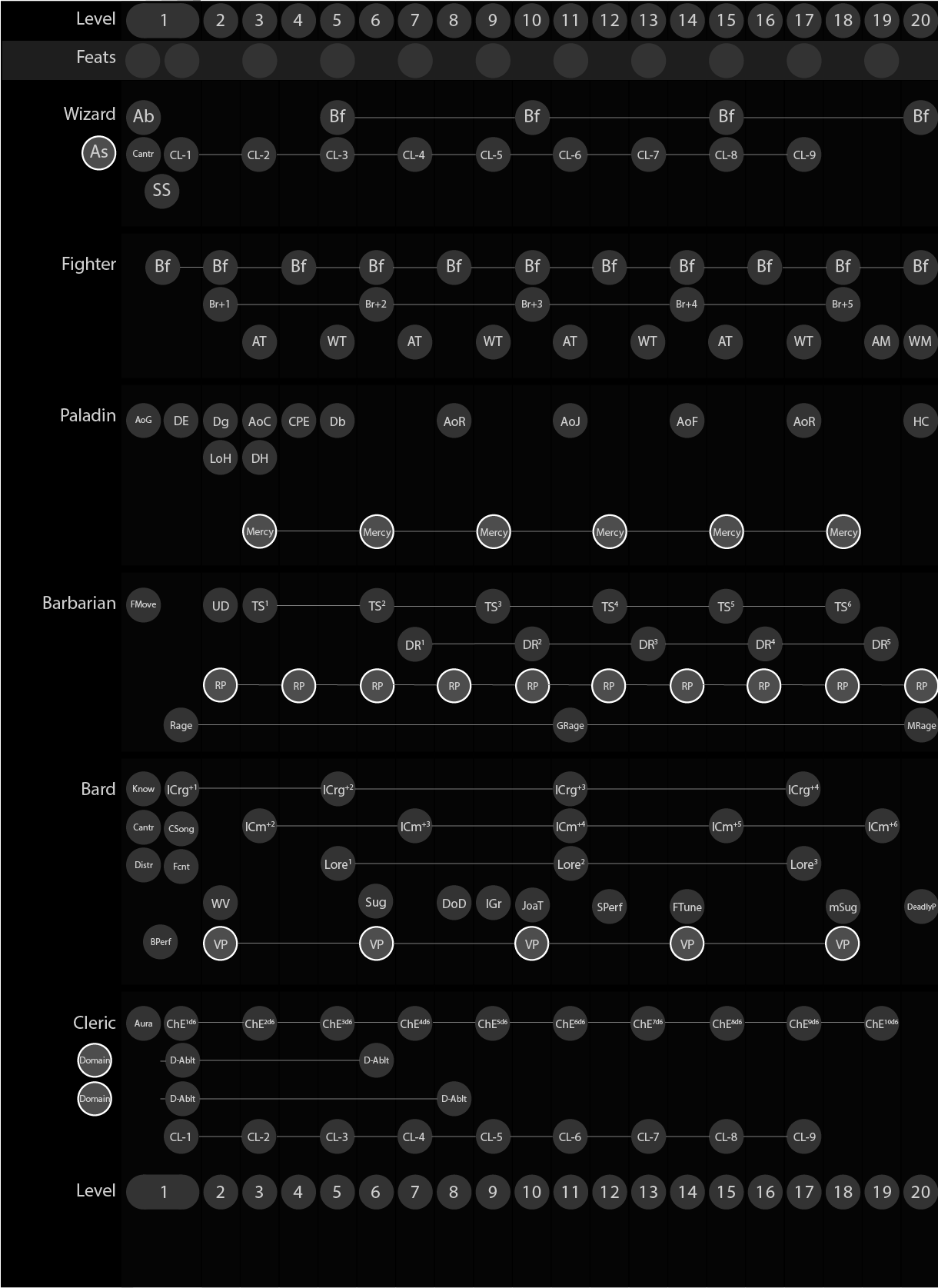
This visualization has since become the skeleton for character development pages across all interfaces. We wrote an algorithm for chaining abilities. Not everything was amenable to automation here, and we combined part of the capabilities manually for the sake of a pleasant visual.
In addition to the chains of abilities, classes affect the ability to wear armor and operate with weapons of one type or another, and I also wanted to somehow systematize this issue. However, here the systematicity took place only in the groups of weapons, which were already determined by the creators of the board. Otherwise, each class had its own additions that defied systematization. Most notably, the Cleric, who wields any simple weapon, plus the favorite weapon of the god he worships. Conclusion: it is necessary to show the entire list of weapons and mark which of them the character owns.
With the received baggage of information about the board game, we started working on interface layouts.
Search markup
Having a logical breakdown of information blocks provides a good starting point for just starting to design something, but this is not enough. It's quite difficult to come up with something without limitations. Our brain needs constant systematization of the environment and if it has nothing to cling to, then it becomes a problem. In addition to logical partitioning, such a limitation was the three-column system, which was spawned by the pre-existing inventory interface. Now came the stage of creating a visual presentation of information in separate blocks and an attempt to somehow combine them. The blocks that turned out to be good, from the point of view of my colleagues and me, flowed into the following layouts. Others are crossed out and remained only in the archives, which I got specifically for this article.
Below are some of the early screens and layout experiments. All of them can be combined by trying to squeeze the entire character sheet onto one screen. And if the blocks of attack, defense and skills in general did not have much variability, then the blocks about abilities and buffs contained an unknown number of entities.
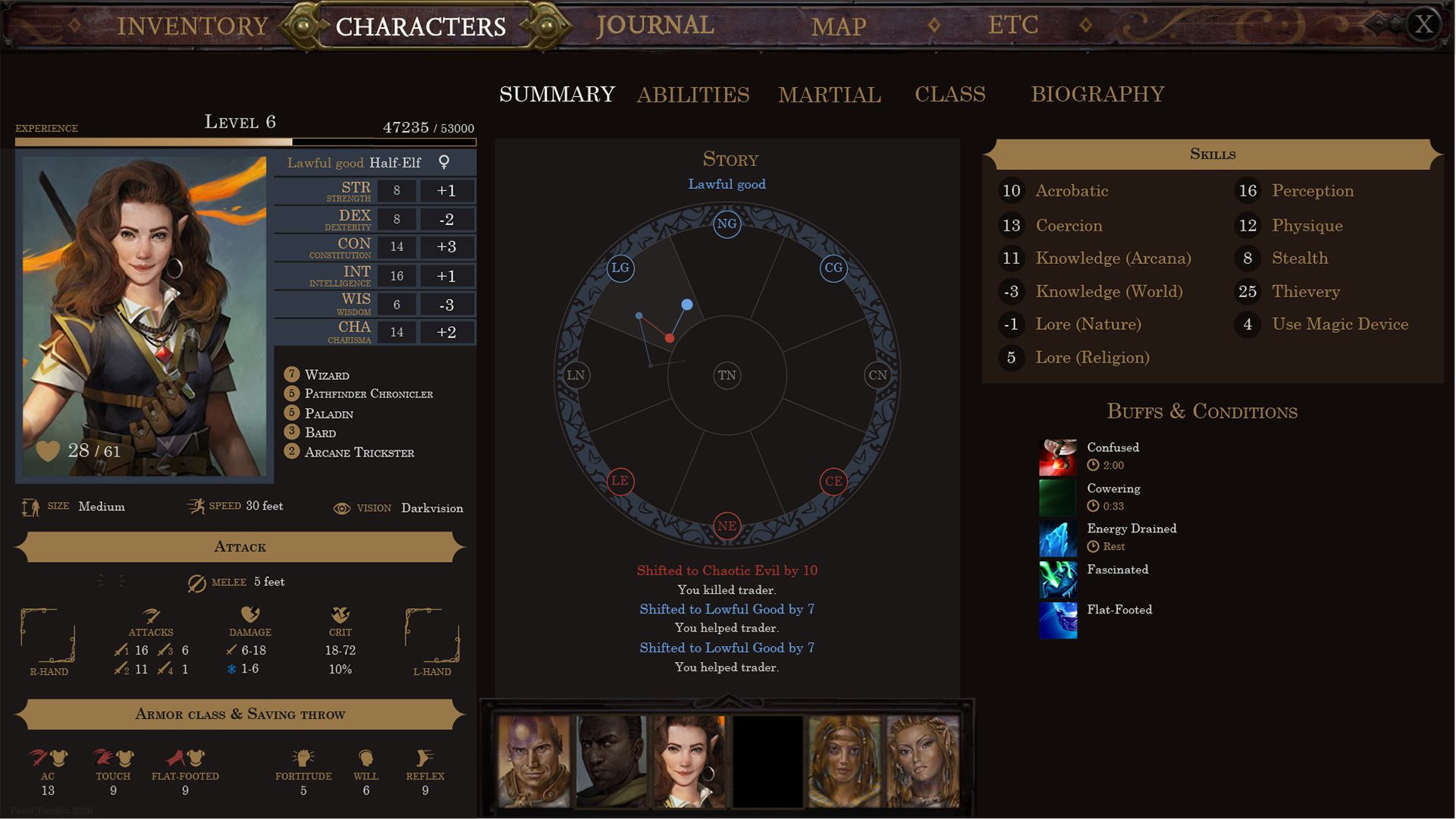
Moreover, at that time, I greatly underestimated the number of options for abilities and often tried to fit them into very small blocks. By the way, at the same time we were trying to find a way to place buffs in the left third, so that they would be visible on the inventory screen too. When discussing the block of buffs, an interesting moment appeared: colleagues who deeply know the rules divided the character's states (tired, blinded, etc.) and buffs (positive or negative effects from spells). This is written in the rules and integrates well into the mechanics. For the interface view, all these entities were icons with text that change the values of other stats. And this discrepancy is clearly expressed within the game code, where the interface code leads to a common denominator of mechanical entities.


Portraits from Baldur's Gate are used in the layouts.
After a series of experiments and attempts to fit everything on one screen, it became clear that the best approach would be pagination and some of the information would have to be sacrificed by putting it under “one more click”.
And if the entire progression tree, character biography and weapon possession could be painlessly evicted to another screen, then I didn't want to give up with the display of abilities. Several more variants were born, including a radial representation of a multiclass character. We hacked it on the same day and did not develop it, because it was poorly suited for characters developing in the same class and had a number of technical limitations.


There were experiments with grouping abilities here. It was necessary to separate the abilities called Feat, which the character chooses regardless of class, from Special Abilities, which are unique for each class. Plus there were Traits, the storyline of the character that the player chooses at the table for a more interesting roleplaying, but in our case, just another way to influence the values of the characteristics. And we also wanted to show many characteristics, which, however, were not always useful in relation to a particular character class. For example, it is not very important for a magician how big his Base Attack Bonus is, he does not use it when throwing fireballs. But still, some blocks have already begun to look for their near-final layout with content checking.

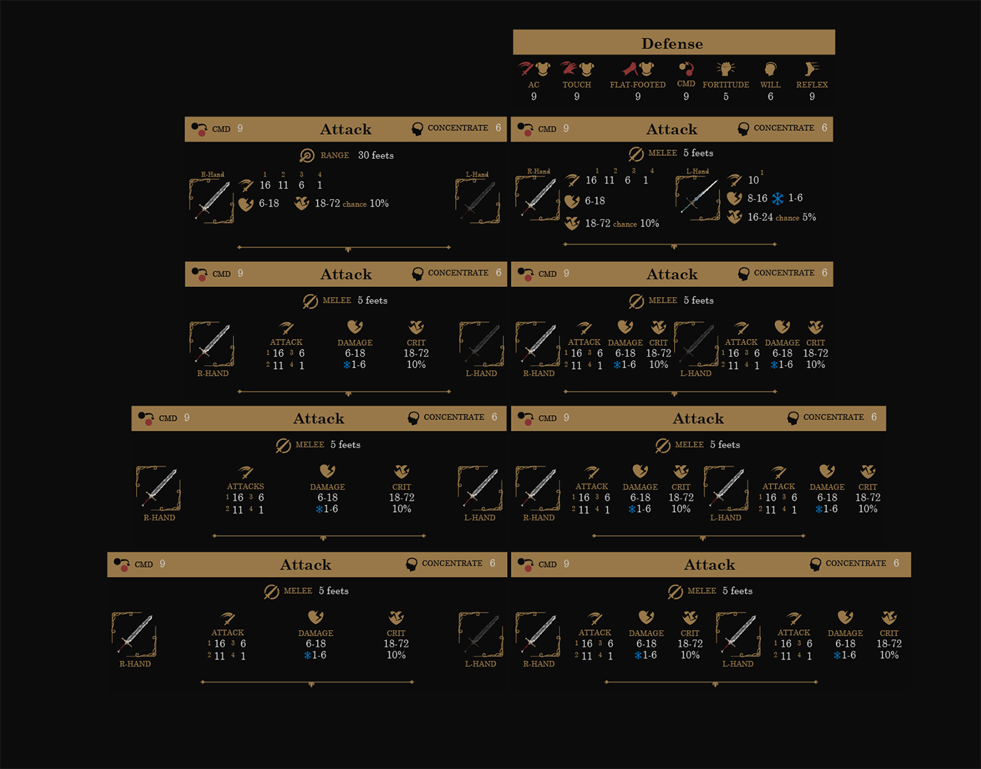
Since this is a retrospective article, now I can say that even such checks cannot take into account all the options for content that may appear during the development process. For example, the attack block was designed for only 4 values and did not take into account that with some combination of character classes and spells, they could become 6. In addition, at the time of design, all participants were sure that the layout would not move after the artwork. But this also turned out to be a delusion. The game is difficult to plan in advance, it is a living process of constant creativity, development and change. And universal, safe solutions, unfortunately, often resemble Excel spreadsheet, faceless and emotionless. I wanted to have fewer such solutions. So in the end, in German, in the case of two weapons in hand,headers start to stick together and even adjusting responsive layout and font scaling can't cope with it. And the lesson here is this: when the product is almost finished, it is worth moving away from it and once again looking at the decisions already made, they may no longer be suitable. There is refactoring in design too.
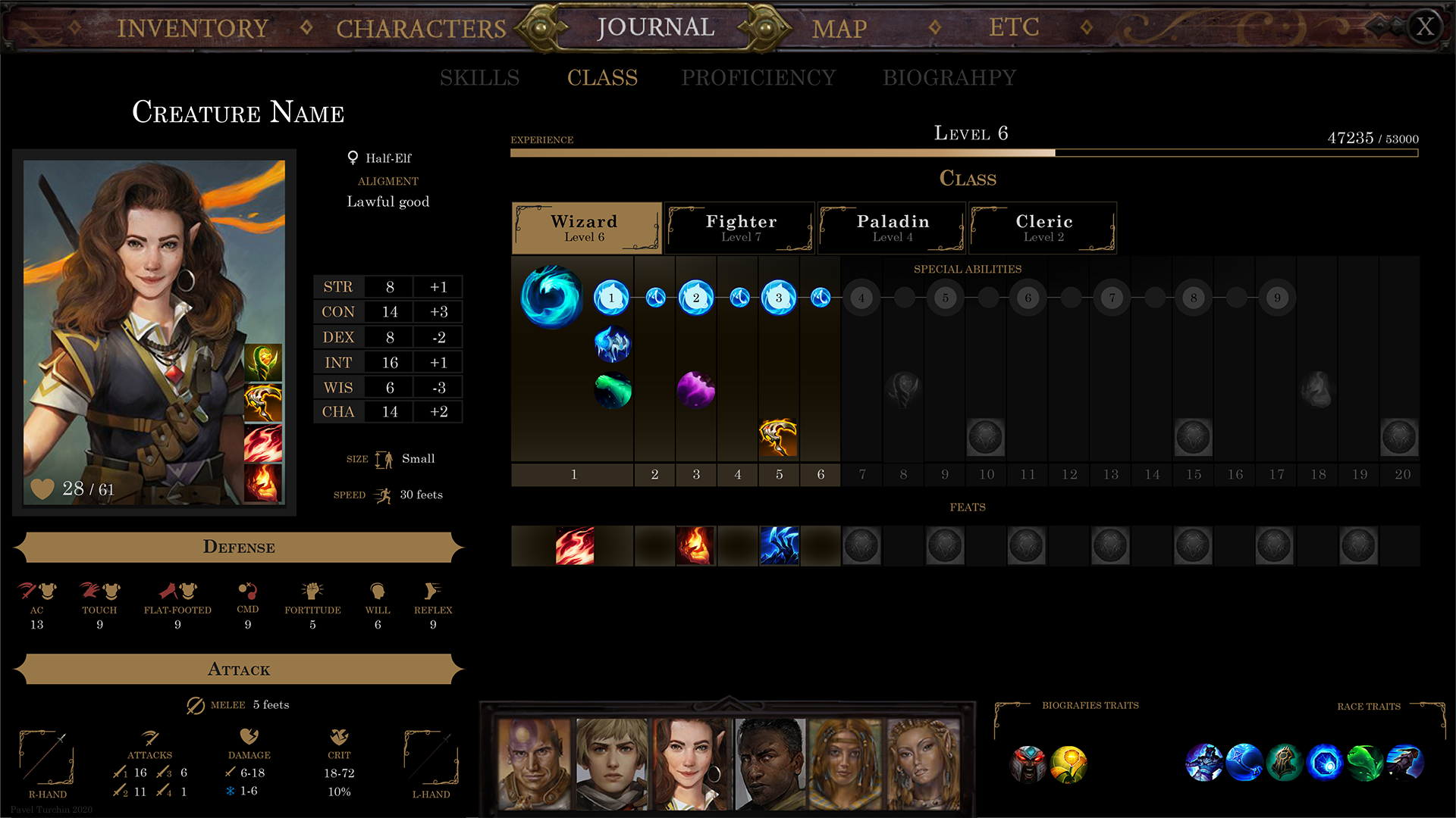
But we will learn this lesson a little later. And then, after the first iterations of the layout search, I collected the first design document that could be substantively discussed with colleagues. There were groupings of abilities, large blocks with selected classes, spell tables. In the progression, we added a chain about the development of the spellbook, and some of the characteristics were completely abolished.
Finalizing the design


The layouts used icons from League of Legends.
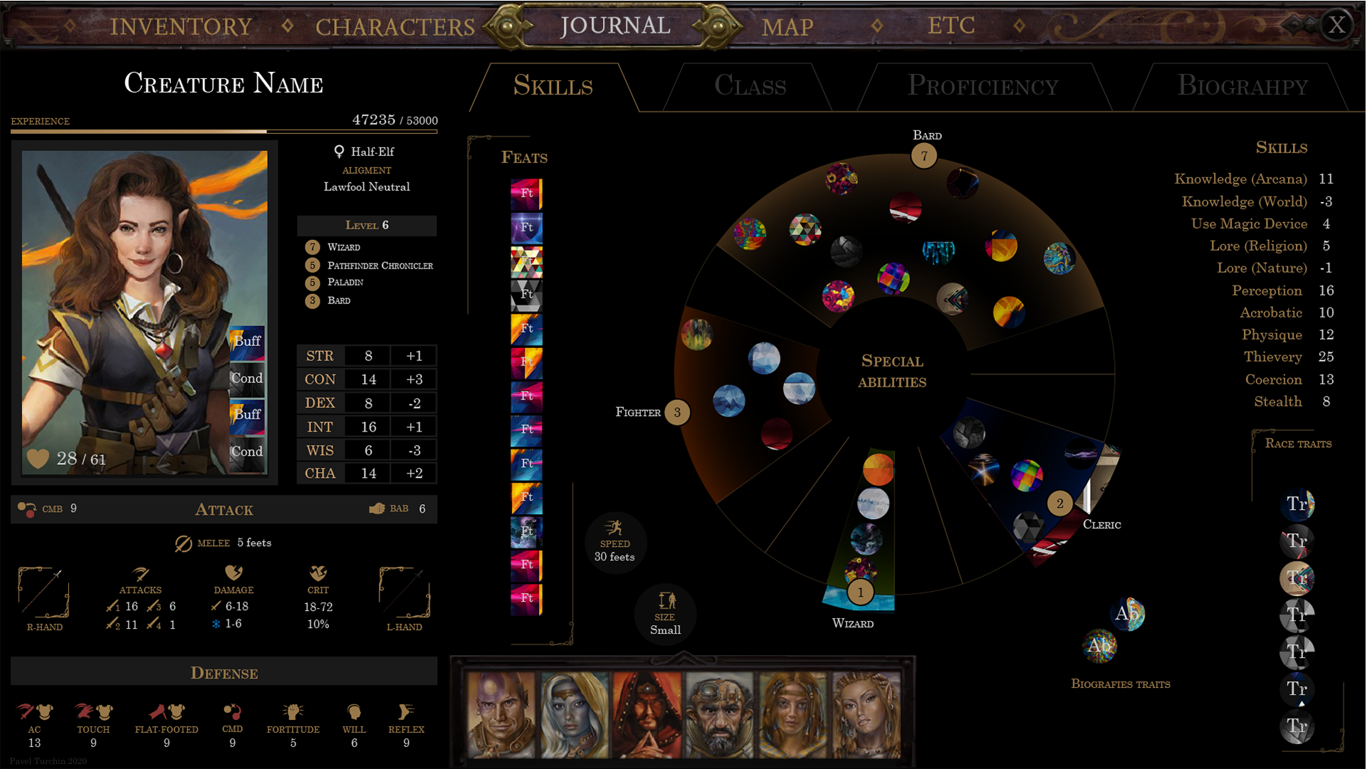
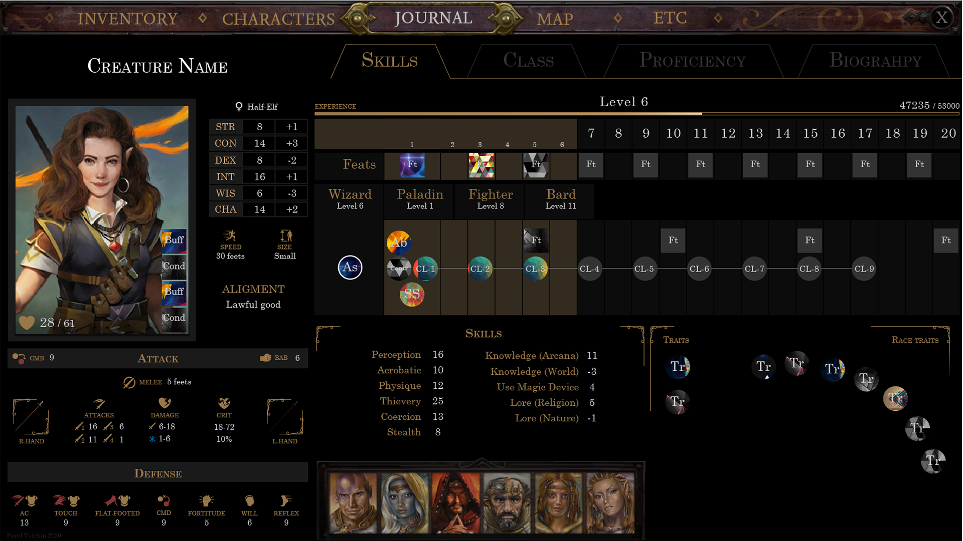
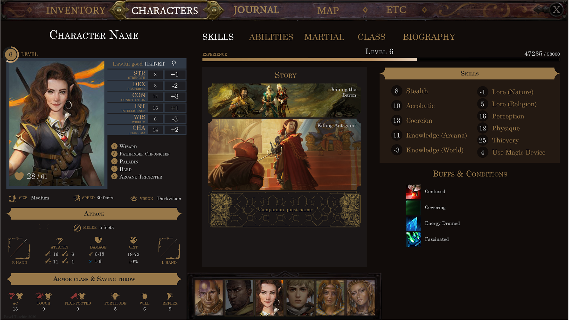
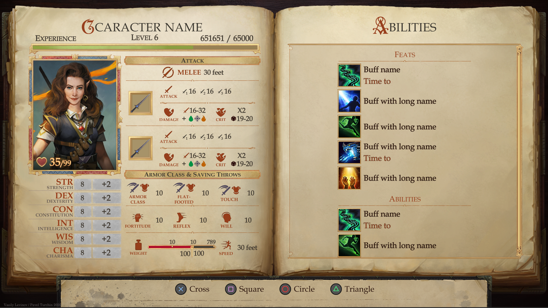
Discussions are always a long process in our country, burdened by numerous clashes of opinions and interests. I do not remember a single meeting that lasted less than 3 hours. Some believe that it is more important to provide as much mechanical information as possible, others - that immersion in history and atmosphere is more important, and mechanical details can be hidden deeper. More often than not, such discussions are the only effective way to break the deadlock and, as a result of exchange of views, come to the next iteration with new ideas. The character biography pages and the class development tree as a whole were approved by all participants. But from the main page it was decided to remove information about abilities, spell table and other numerical characteristics of characters. They decided to make the plot component of the game the center of the interface. For the main character, this became the "Wheel of the Worldview",and for the companions, we came up with a set of story cards, the key events of this character, which will open to the player as he progresses. Buffs in this case were also removed from the left third, but received enough space to be displayed along with the name and the duration parameter. Thus, the screen became much cleaner, and also shifted the focus to the fact that this is primarily a role-playing game, and only then a mechanical one.and only then mechanical.and only then mechanical.

Abilities have moved to a separate page. This made it possible to use not only icons, but also the names of the abilities themselves. Subsequently, this turned out to be very important, because in the end we did not have enough time and resources to draw icons for each ability. In addition, to encode the meaning of each ability into an icon, and even more so to decipher it later for the player, is too difficult a task. But, again, in retrospect, I should note that I grossly underestimated the number of abilities in the Special Abilities block and overestimated their number in the Traits block. This resulted in a very unbalanced layout of this screen. Which we fortunately have the opportunity to fix in the upcoming Pathfinder: Wrath of The Righteous game.

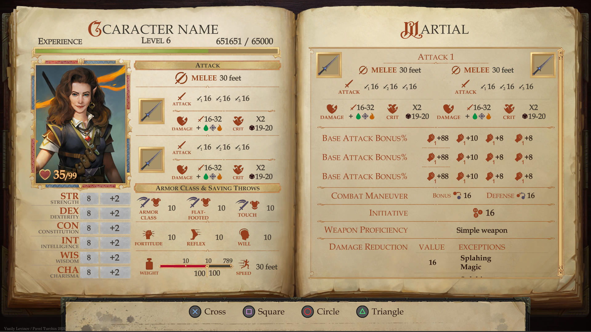
Also on a separate page got all the information about the character's combat characteristics. This, again, turned out to be a very good decision, because by the end of development, the number of characteristics in it almost tripled.
The designs above appeared immediately after that meeting. Next, I'll skip a few small iterations and show the final version. In it, some elements were adjusted and illustrations were selected, taking into account the budget and general style.


Artistic design
This design was already assembled in the alpha version of the game. Some important digression is worth making here. In our UI team, despite the more frequent division into designers and programmers, we use such profiling of developers, when the designer, layout designer and programmer are one person, and the artist is another. This allows you to distinguish between the technical and immersive parts of the interface. And at the time the design was finished, there was no artist with us yet. In addition, at that time we were confident that the interfaces would be dark, with some kind of wood-leather backing and bronze buttons. But time passed, and when we finally found a person who was suitable for us in spirit and began to search for an art solution, it turned out that we did not want leather and wood at all. The colors of our interfaces were inverted and turned into a paper, fairytale book about adventure,released from the pen of one of the heroes. But the art elements introduced additional conditions and restrictions, which ultimately led to a change in the layout to varying degrees and revealed some problems, such as, for example, as I described above about attacks. But overall, I think the interfaces have benefited a lot. Thus, the overall feeling of the game became integral, and the interface ceased to be just a necessary necessity, but became part of the game.


Concluding the story about the part of creating a PC interface, I would like to say that, unfortunately, not all design decisions were ultimately included in the release due to limited resources. Some we do not consider successful and we revise them as part of the work on a new project, and many we will definitely leave. But the lifecycle of Pathfinder: Kingmaker's interfaces didn't end there. We had to port to the console.
Porting to console
A little less than a year passed from the release of the game to the moment when we started porting the game to the console. During this time, we managed to add a lot of features, details, complete a lot and get disappointed in many ways. We received a lot of feedback from the players and identified stones for ourselves that we didn't want to trip over anymore. To a greater extent, the stones concerned the code, many things became difficult to maintain and in some places were too closely intertwined with the mechanics. So, approaching the console interfaces, we have already accumulated some knowledge base, but there was also a problem. For us, this was the first experience in developing interfaces for the console. We carefully analyzed similar projects, identified what we like and what we don’t, read the Technical Requirements, took several consultations from more experienced teams and started developing.
The console interface, unlike a PC, has a number of features:
- 1. They are watched on TV, sitting on the couch. This led to an increase in text size throughout the game.
- 2. According to TRC, it is necessary to have a 5% save-zone, in which important content should not be located.
- 3. The cursor is a tricky solution for the console. Therefore, we no longer have a tooltip in which you can put a description of parameters and abilities.
At the first "pass" through the screens of the character, an attempt was made to inherit the arrangement and layout of elements.

However, unresolved problems arose. The principle of what and when to allow to allocate is not clear. For example, if I allow Ability Scores to be highlighted on the main screen, should I allow them to be highlighted on the Progression page?
Where to display the description of the selected item? How can I scroll through this description without going to a new nesting level? Non-intuitive control cases appear. For example, if a player selects the rightmost element with the left stick, the description is displayed on the left, and scrolls with the right stick.
Based on these problems, as well as the assumption that the console player is still not the core audience of the board game Pathfinder, the conclusion suggests itself that the presentation of information and the structure of screens should be simplified.
So after trying to inherit from the PC version, the following structure was proposed as a basic template for fullscreen interfaces:

On the left side, we decided to place static information from which no action will ever occur.
In the right part, we placed the contextual description of the selected entity, i.e., in fact, we moved there the tooltip that appeared in the PC version when the cursor was hovered over. The right stick of the controller was used to scroll through information.
We have placed all focusing elements (buttons, selectors, parameters, characteristics with a description) in the center. Moving between them is carried out by DPAD or the left stick. In the case of a large amount of content, the scrollbar always tries to position itself so that the element is visible when it is selected. So there was no need for a separate scroll control for the central part.
For moving between screens of the character sheet, we have defined "bumpers" R1-L1.
Switching between characters is carried out using the radial group menu when you press the right trigger R2.
As a result, we have split the interface into 7 screens.


This interface was the first that we ported to the console and it practically did not undergo changes for the release. However, we had to change the lower part, which was reserved for the hints. The lack of a complete list of screens turned out to be very inconvenient. While playing, we constantly missed the right one. And the fact that, for example, the companions have a page of their stories, while the main character does not, only added inconvenience to navigation. So the hint area eventually turned into a menu, through which movement was still carried out by bumpers.


Another interesting thing here is progression navigation. Unlike the usual grid, where you can only move horizontally or vertically, there may be a situation where when you press "up" it is difficult to estimate where I want to move. If there are two elements, one exactly above the current element but two lines higher, and the other one line higher, but 15 ° to the right, then which element to choose, the one that is closer or the one that lies in the direction of the stick's motion vector? And if the same situation is when moving diagonally? To solve this problem, we wrote a navigation that takes into account the direction and distance to the next element. The priority of these parameters was determined by the coefficients, which were selected already manually based on feelings.
We were pleased with the final result of working on this interface. Although, of course, it didn't feel like keeping the focus on the plot aspect like in the PC version. But it is convenient both in terms of navigation and in terms of readability, which is very important when playing from two meters from the TV. In addition, a full-height portrait is always visible here, which in my opinion greatly adds to the atmosphere.
Conclusion
It's not for me to judge whether it worked well or not. You can always do better or differently. We are always glad to criticism and suggestions, we are always in doubt, but are we choosing the right solution?
The game is not just a factory, where a Noname makes his spare part on behalf of the company. The game is a collection of creativity of individual developers, people, for each of whom, this work becomes an integral part of their life and part of the life of other people, players.
Thanks to the people who took part in the work on the character sheet:
Mikhail Rotfort - Lead UI
Vasily Levinov - UI Artist
Vasily Boldyrev - Programmer
Nikita Velikovsky - Programmer
Maxim Savenkov - Programmer
Oksana Merger - UI Programmer
Alexey Gusev - QA Engineer
Alexander Mishulin - Creative Director
Victor Surkov - Art Director
Oleg Shpilchevsky - Head of Owlcat Games
Author: Pavel Turchin - UI Developer