Since Rusfinance Bank specializes in car loans, it was necessary to develop a digital strategy as soon as possible and launch a convenient service that would allow a client to apply and receive approval for a loan without leaving home.
We did not find ready-made IT products that meet our needs and requirements - in the banking sector we have to use third-party IT solutions with caution, so we chose the path of development on our own.
In this article, we will talk about what requirements for the service we put forward, how we turned the MVP into a full-fledged product, and also how we chose ideas and their technical implementation to more effectively solve the set business problems.

Functional requirements
We were faced with an ambitious task: to develop a convenient service that would allow Rusfinance Bank clients to receive a quick solution on a loan application online.
At the same time, it was important to make sure that the data on the application was available to the client in his personal account, and he could fill out the questionnaire in the module using pre-filled data.
To address these and other important aspects, we have formulated detailed functional requirements and described the business process (see diagram below).

Our key requirements are:
- SMS. , .
- . .
, (), , . - . , . , .
- . () . .
- . 3- :
- ― , ;
- ― , , , , api ( );
- ― .
On the first two levels, fields with errors are highlighted, and it is also indicated what is wrong. - SMS-informing clients about the solution . Based on the results of calculating the online application, the client receives an SMS message with the decision. SMS is sent in case of automatic approval or rejection, i.e. in cases where the application has the status "Confirmed" or "Refused". When the request enters the "gray" zone, the SMS is not sent.
- The answer to the client on the site . In addition to responding via SMS, the client gets the opportunity to receive an answer on the site.
Having formulated and described all the basic functional requirements, our team proceeded to their implementation.
Brief description of the MVP business process
We managed to launch Phase 1 of the product - “pre-launch” rather quickly. “Predanquet” differed from a full-fledged online solution in the smaller number of fields and in that the decision on the loan was given preliminary and not final. Nevertheless, thanks to its implementation, we were able to understand the demand, collect the first results and continue working on the full version of the questionnaire.
From MVP to a complete product
The development of the full version of the questionnaire took about a year. It differed from the preliminary version in that:
- in Phase 1 (preliminary), the client was asked for a smaller number of fields, there was no personal account, the decision on the questionnaire was made preliminary. At this stage, we could say “NO” for sure if we saw signs of fraud. We could say the final "YES" only after the client came to the car dealership.
- in Phase 2, the client's personal account was registered, more fields were collected than in the previous Phase, but as a reward for additional efforts, the client immediately received a final decision (of course, if the data that he indicated is reliable and was confirmed on the transaction).
During the development phase of Phase 2 (Q2 2018), we decided to work on the release of the SCRUM questionnaire. Thanks to the well-established SCRUM processes and the willingness of managers to empower the team with powers / resources, we were able to quickly bring the product to market.
By the end of 2018, a full-fledged online questionnaire for a car loan was deployed without visiting the Bank's office. At the same time, the first loan was issued with a client who came from online.
Be afraid of your own reasoning, listen to customers more
Since the appearance of a full-fledged online questionnaire, the bank began to receive LEADs, the number of which has not yet reflected the target indicators.
It was necessary to bring the fill rate of the questionnaires to 60% + to issue 500 loans for 2019.
We conducted a large number of internal discussions, collected feedback from neighboring departments, followed the path of implementing our own hypotheses.
As usual, the clients themselves helped. Almost simultaneously with the appearance of a full-fledged questionnaire, we implemented a simple functionality for collecting feedback.
After filling out the questionnaire, the client collected feedback, asked questions indicating the rating and comments: "Everything was clear", "Ease of use", "I will recommend to friends" and "General comment on the questionnaire."
Every day, team members received a summary file with feedback. Once every 2-3 weeks, we analyzed it and made conclusions.
Of course, first of all, we wanted to see only positive reviews, but we all understood that the ideal client is the client giving criticism. Here we found the very ideas and solutions we needed, which were later implemented on the Bank's website.
As a result, we:
- "Screwed up" a chat with an online assistant;
- renamed the field “the amount that you can allocate for a loan per month” and added a hint on how to fill it in correctly, as clients did not understand this;
- found obvious bugs that were not caught at the test stage;
- added auto-completion of fields - at the stage of entering addresses, at the stage of choosing an employer, at the stage of specifying who issued the passport;
- , , , , ;
- ;
- 2- ;
- , , , ;
- , ;
- , ;
- , ( , );
- .

It seems to us that bug fixes and new features have improved the picture of the world. We began to receive more LEADs, and most importantly, stable sales appeared.
At the beginning of 2019, we issued approximately 10 loans per month. Moreover, the number of LEADs is almost 2 thousand. In Q4, sales were already 5 times higher. And in 7 months of 2020, more online loans were sold than in the entire 2019.
results
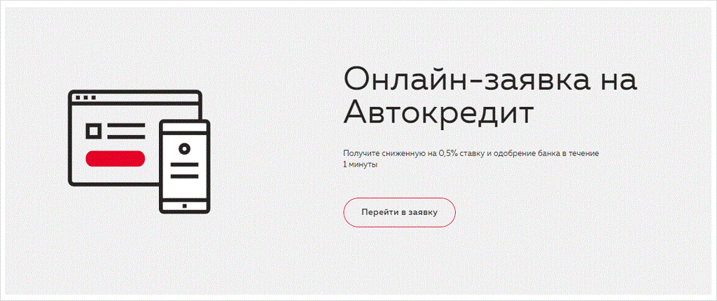
On the website, the online application is modestly placed in the main menu:

You can also get into it by clicking on the "Submit application" button: The

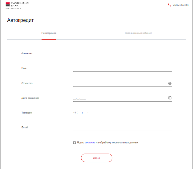
questionnaire has a laconic design:

We decided to implement the response to the client after filling out the application using the Angular framework.
The message display component template is as follows:
<modal-popup #loadingText (onDismissed)="dismiss()">
    <ng-container class="header">
        <header-title [title]="app.getResourse('loading.popup.textHeader')"></header-title>
    </ng-container>
    <ng-container class="content">
        <div class="justify-content-center align-self-center text-center">
            <b>{{text}}</b>
        </div>
    </ng-container>
    <ng-container class="buttons">
        <btn [statistic]="app.getStatistic('questionnaire.contactInfo.popup.rate.button')" (onClick)="submit()"></btn>
    </ng-container>
</modal-popup>
The class of the component for displaying the response message for the questionnaire:
import { Component, Input, ViewChild, ViewEncapsulation } from '@angular/core';
import { ModalPopupComponent } from 'src/app/public/modal-popup/modal-popup.component';
import { ModalService } from 'src/app/views/app/modal/modal.service';
@Component({
selector: 'loading-text',
  templateUrl: './loading-text.component.html'
})
export class LoadingTextComponent {
  @Input() text: string;
  @ViewChild('loadingText') loadingText: ModalPopupComponent;
  constructor(private modal: ModalService) {}

  open = () => {
    this.loadingText.open();

  };
  submit = async () => {
    this.loadingText.dismiss('loading-text submit');
  };
  dismiss = async () => {
    this.modal.open('rate');
  };
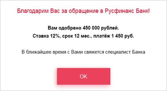
The client receives the answer to the decision on lending on the website in this form (an example of the visualization of the answer, real calculations may differ from those indicated):

Now, by submitting an online application and receiving a quick response on a loan, clients significantly save their time and nerves.
However, we are not satisfied with our laurels and continue to work on new features.