Hello, dear Python lovers and experts!
If you use in your Python applications and cross-platform tools such as the framework Kivy and material design library KivyMD , then you will definitely be interested in this article, which I will talk about additional components to extend the set of widgets KivyMD material library
More recently, we (the KivyMD development team) created the KivyMD-Extension on GitHub , an organization that hosts the repositories of custom add-ons for the KivyMD library. These are bundles of components that are not directly related to the material design specification, but use the KivyMD library under the hood and extend it significantly. I will tell you about several of these packages today.
AKivyMD
AKivyMD (Awesome KivyMD) - an extension with a lot of widgets, animations and other beauties:
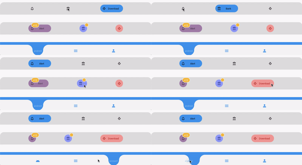
Bottom navigation

Sample code
from kivy.lang import Builder

from kivymd.app import MDApp
from kivymd.uix.screen import MDScreen

from kivymd_extensions.akivymd import *

Builder.load_string(
    """
<On_active_button@Button_Item>
    icon_color: app.theme_cls.text_color
    text_color: app.theme_cls.text_color
    button_bg_color: app.theme_cls.primary_color
    mode: "color_on_active"
    badge_disabled: True


<BottomNavigation>
    name: "BottomNavigation"

    MDBoxLayout:
        orientation: "vertical"
        spacing: "40dp"

        MDToolbar:
            title: root.name
            left_action_items: [["arrow-left" , lambda x: x]]

        AKBottomNavigation2:
            bg_color: app.theme_cls.bg_darkest

            On_active_button:
                text: "Alert"
                icon: "bell-outline"

            On_active_button:
                text: "Bank"
                icon: "bank-outline"

            On_active_button:
                text: "Download"
                icon: "arrow-down-bold-outline"

        AKBottomNavigation2:
            bg_color: app.theme_cls.bg_darkest

            Button_Item:
                text: "Alert"
                icon: "bell-outline"
                icon_color: .3, .2, .3, 1
                text_color: .3, .2, .3, 1
                button_bg_color: .7, .5, .7, 1
                badge_text: "+12"

            Button_Item:
                text: "Bank"
                badge_text: ""
                icon: "bank-outline"
                icon_color: .2, .2, .6, 1
                text_color: .2, .2, .6, 1
                button_bg_color: .6, .6, 1, 1

            Button_Item:
                text: "Download"
                icon: "arrow-down-bold-outline"
                icon_color: .8, 0, 0, 1
                text_color: .8, 0, 0, 1
                button_bg_color: 1, .6, .6, 1
                badge_disabled: True

        Widget:

        AKBottomNavigation:
            items: root.bottomnavigation_items
"""
)


class BottomNavigation(MDScreen):
    bottomnavigation_items = [
        {"icon": "android", "text": "android", "on_release": lambda x: None},
        {"icon": "menu", "text": "menu", "on_release": lambda x: None},
        {"icon": "account", "text": "account", "on_release": lambda x: None},
    ]


class Test(MDApp):
    def build(self):
        return BottomNavigation()


Test().run()
Spinners

Sample code
from kivy.lang import Builder

from kivymd.app import MDApp
from kivymd.uix.screen import MDScreen

from kivymd_extensions.akivymd import *

Builder.load_string(
    """
<SpinnerBox@MDBoxLayout>
    adaptive_height: True
    text: ""

    MDLabel:
        theme_text_color: "Primary"
        text: root.text
        size_hint_x: None
        width: "200dp"
        halign: "center"
        valign: "center"


<Spinners>
    name: "Spinners"

    on_leave:
        root.stop_animation()

    MDBoxLayout:
        orientation: "vertical"

        MDToolbar:
            title: root.name
            left_action_items: [["arrow-left", lambda x: x]]

        MDFloatLayout:
            padding: "10dp"

            AKSpinnerCircleFlip:
                id: circleflip
                spinner_size: "30dp"
                pos_hint: {"center_x": .5, "top": .9}

            AKSpinnerDoubleBounce:
                id:doublebounce
                spinner_size: "30dp"
                pos_hint: {"center_x": .5, "center_y": .7}

            AKSpinnerFoldingCube:
                id: foldingcube
                spinner_size: "40dp"
                pos_hint: {"center_x": .5, "center_y": .4}
                angle: 45

            AKSpinnerThreeDots:
                id: threedots
                spinner_size: "20dp"
                pos_hint: {"center_x": .5, "y": .1}

            Widget:

    MDBoxLayout:
        padding: "5dp"
        spacing: "5dp"

        MDRaisedButton:
            text: "Start"
            on_release: root.start_animation()

        MDRaisedButton:
            text: "Stop"
            on_release: root.stop_animation()
"""
)


class Spinners(MDScreen):
    def stop_animation(self):
        ids = self.ids
        ids.foldingcube.active = False
        ids.threedots.active = False
        ids.doublebounce.active = False
        ids.circleflip.active = False

    def start_animation(self):
        ids = self.ids
        ids.foldingcube.active = True
        ids.threedots.active = True
        ids.doublebounce.active = True
        ids.circleflip.active = True


class Test(MDApp):
    def build(self):
        return Spinners()


Test().run()
Piechart

Sample code
from kivy.lang import Builder
from kivy.metrics import dp

from kivymd.app import MDApp
from kivymd.uix.screen import MDScreen

from kivymd_extensions.akivymd.uix.piechart import AKPieChart

Builder.load_string(
    """
<Piechart>
    on_leave: root.remove_chart()
    name: "Piechart"

    MDBoxLayout:
        orientation: "vertical"

        MDToolbar:
            title: root.name
            left_action_items: [["arrow-left", lambda x: x]]

        ScrollView:

            MDBoxLayout:
                id: chart_box
                adaptive_height: True
                padding: "24dp"
                orientation: "vertical"

        MDBoxLayout:
            adaptive_height: True
            padding: "4dp"
            spacing: "4dp"

            MDRaisedButton:
                text: "Update"
                on_release: root.update_chart()
"""
)


class Piechart(MDScreen):
    items = [{"Python": 40, "Java": 30, "C++": 10, "PHP": 8, "Ruby": 12}]

    def __init__(self, **kw):
        super().__init__(**kw)

    def on_enter(self):
        self.piechart = AKPieChart(
            items=self.items,
            pos_hint={"center_x": 0.5, "center_y": 0.5},
            size_hint=[None, None],
            size=(dp(300), dp(300)),
        )
        self.ids.chart_box.add_widget(self.piechart)

    def update_chart(self):
        self.piechart.items = [{"Python": 70, "Dart": 10, "C#": 10, "Css": 10}]

    def remove_chart(self):
        self.ids.chart_box.remove_widget(self.piechart)


class Test(MDApp):
    def build(self):
        self.piechart = Piechart()
        return self.piechart

    def on_start(self):
        self.piechart.dispatch("on_enter")


Test().run()
Onboarding

Sample code
from kivy.lang import Builder

from kivymd.app import MDApp
from kivymd.uix.screen import MDScreen

from kivymd_extensions.akivymd import *

Builder.load_string(
    """
<MyAKOnboardingItem@AKOnboardingItem>
    source: ""
    text: ""
    title: ""

    MDFloatLayout:

        Image:
            source: root.source
            pos_hint: {"center_x": .5, "y": .6}
            size_hint: .4, .3

        MDBoxLayout:
            orientation: "vertical"
            padding: dp(10)
            adaptive_height: True
            pos_hint: {"center_x": .5, "top": .5}
            spacing: dp(20)
            size_hint_x: .7

            canvas.before:
                Color:
                    rgba: app.theme_cls.primary_dark
                RoundedRectangle:
                    pos: self.pos
                    size: self.size

            MDLabel:
                text: root.title
                bold: True
                size_hint_y: None
                height: self.texture_size[1]
                theme_text_color: "Primary"
                font_style: "H6"
                halign: "center"
                valign: "center"

            MDLabel:
                size_hint_y: None
                height: self.texture_size[1]
                theme_text_color: "Primary"
                font_style: "Body1"
                halign: "center"
                valign: "center"
                text: root.text


<Onboarding>
    name: "Onboarding"
    on_leave: boarding.reset()

    MDBoxLayout:
        orientation: "vertical"
        spacing: dp(10)

        AKOnboarding:
            id: boarding
            on_finish: root.finish_callback()
            circles_size: dp(15)

            MyAKOnboardingItem:
                source: "assets/slide_one_img.png"
                text:
                    "Lorem Ipsum is simply dummy text of the printing and " \
                    "typesetting industry. Lorem Ipsum has been the industry's " \
                    "standard dummy text ever since the 1500s, when an unknown " \
                    "printer took a galley of type and scrambled it to make a type specimen book"
                title:"What is Lorem Ipsum?"

            MyAKOnboardingItem:
                source: "assets/slide_two_img.png"
                text:
                    "It is a long established fact that a reader will be distracted " \
                    "by the readable content of a page when looking at its layout."
                title: "Why do we use it?"

            MyAKOnboardingItem:
                source: "assets/slide_three_img.png"
                text:
                    "Contrary to popular belief, Lorem Ipsum is not simply random text. " \
                    "It has roots in a piece of classical Latin literature from 45 BC, making it over 2000 years old."
                title: "Where does it come from?"
"""
)


class Onboarding(MDScreen):
    def finish_callback(self):
        print("Finish callback")


class Test(MDApp):
    def build(self):
        return Onboarding()


Test().run()
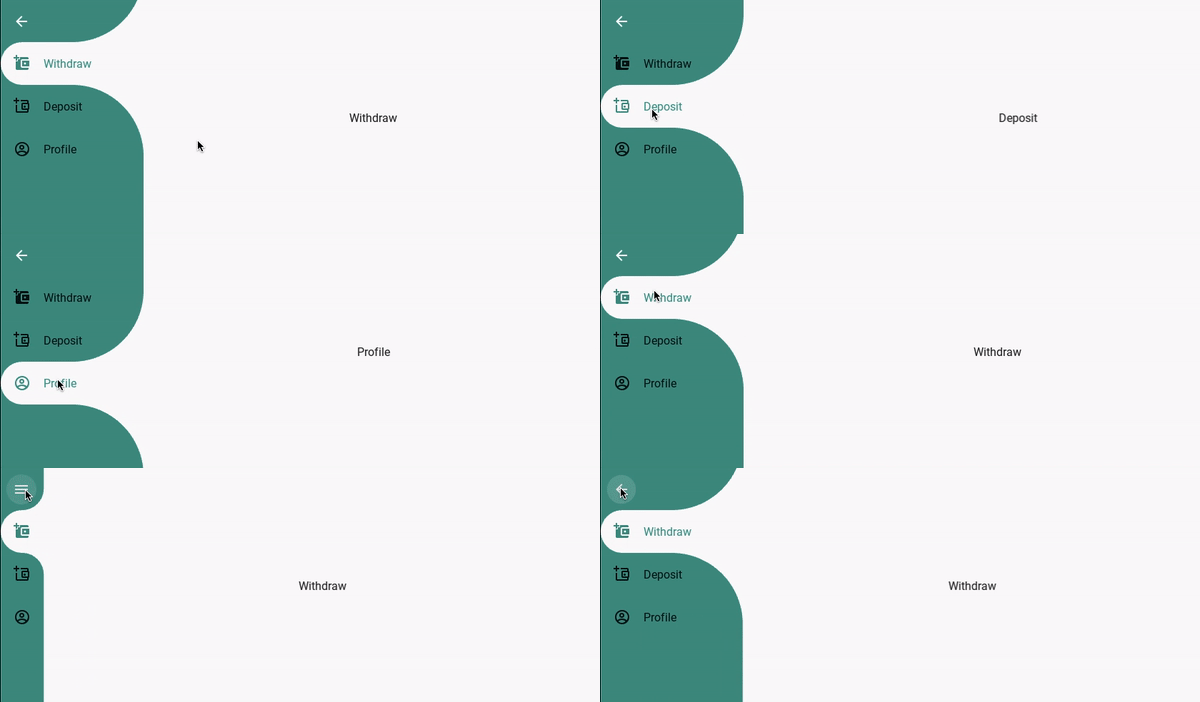
Navigationrail

Sample code
from kivy.lang import Builder

from kivymd.app import MDApp
from kivymd.uix.screen import MDScreen

from kivymd_extensions.akivymd import *

Builder.load_string(
    """
<Navigationrail>
    name: "Navigationrail"

    AKNavigationrail:
        id: rail

        AKNavigationrailCustomItem:
            size_hint_y: None
            height: dp(60)
            padding: dp(5)

            MDIconButton:
                icon: "arrow-left"
                theme_text_color: "Custom"
                text_color: 1, 1, 1, 1
                on_release:
                    if rail.get_state() == "open": rail.dismiss(); self.icon="menu"
                    else: rail.open(); self.icon ="arrow-left"

        AKNavigationrailItem:
            text: "Withdraw"
            icon: "wallet-plus"
            on_release: scr_mng.current= "withdraw"

        AKNavigationrailItem:
            text: "Deposit"
            icon: "wallet-plus-outline"
            on_release: scr_mng.current= "deposit"

        AKNavigationrailItem:
            text: "Profile"
            icon: "account-circle-outline"
            on_release: scr_mng.current= "profile"

        AKNavigationrailCustomItem:

        AKNavigationrailContent:

            ScreenManager:
                id: scr_mng

                MDScreen:
                    name: "withdraw"
                    MDLabel:
                        text: "Withdraw"
                        halign: "center"

                MDScreen:
                    name: "deposit"

                    MDLabel:
                        text: "Deposit"
                        halign: "center"

                MDScreen:
                    name: "profile"

                    MDLabel:
                        text: "Profile"
                        halign: "center"
"""
)


class Navigationrail(MDScreen):
    pass


class Test(MDApp):
    def build(self):
        return Navigationrail()


Test().run()
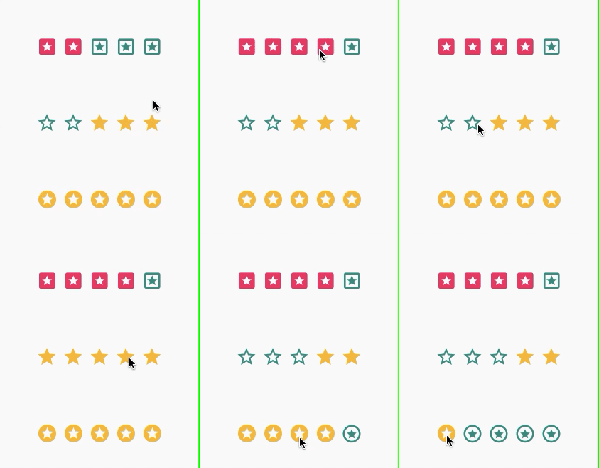
Raiting

Sample code
from kivy.lang import Builder

from kivymd.app import MDApp
from kivymd.uix.screen import MDScreen

from kivymd_extensions.akivymd import *

Builder.load_string(
    """
<Rating>:
    name: "Rating"
    BoxLayout:
        orientation: "vertical"
        MDToolbar:
            title: root.name
            left_action_items:[["arrow-left" , lambda x: x]]

        FloatLayout:
            AKRating:
                normal_icon: "star-circle-outline"
                active_icon: "star-circle"
                pos_hint: {"center_x": .5, "center_y": .3}
                on_rate: print(self.get_rate())

            AKRating:
                pos_hint: {"center_x": .5, "center_y": .5}
                on_rate: print(self.get_rate())
                direction: "rl"

            AKRating:
                normal_icon: "star-box-outline"
                active_icon: "star-box"
                active_color: 1,0,0.4,1
                animation_type: "grow"
                pos_hint: {"center_x": .5, "center_y": .7}
                on_rate: print(self.get_rate())
    """
)


class Rating(MDScreen):
    pass


class Test(MDApp):
    def build(self):
        return Rating()


Test().run()
SilverAppbar

Sample code
from kivy.lang import Builder

from kivymd.app import MDApp
from kivymd.uix.list import OneLineListItem
from kivymd.uix.screen import MDScreen

from kivymd_extensions.akivymd import *

Builder.load_string(
    """
<SilverAppbar>
    name: "SilverAppbar"

    AKSilverAppbar:
        max_height: dp(300)
        title: root.name
        left_action_items: [["arrow-left", lambda x: x]]
        pin_top: True
        hide_toolbar: True
        radius: dp(20)
        toolbar_bg: app.theme_cls.primary_color

        AKSilverAppbarHeader:
            orientation: "vertical"

            Image:
                source: "assets/fly.jpg"
                allow_stretch: True
                keep_ratio: False

        AKSilverAppbarContent:
            padding: dp(10)
            id: content
            size_hint_y: None
            height: self.minimum_height
            orientation: "vertical"
            md_bg_color: app.theme_cls.primary_color
"""
)


class SilverAppbar(MDScreen):
    def on_enter(self, *args):
        for x in range(30):
            self.ids.content.add_widget(OneLineListItem(text="Item %d" % x))


class Test(MDApp):
    def build(self):
        self.sliver_bar = SilverAppbar()
        return self.sliver_bar

    def on_start(self):
        self.sliver_bar.dispatch("on_enter")


Test().run()
These are not all components of the AKivyMD package. You can find information on installation and other components of this package in its repository.
File manager
File Manager is a file manager for the desktop. Yes, just for Desktop, because KivyMD already provides a file manager out of the box for choosing directories and files. No, the File Manager from KivyMD Extensions will work on mobile devices too, but why? Therefore, we do not bother how it will look on a mobile screen. Development is tested only for Desktop:
Usage example:
from kivymd.app import MDApp

from kivymd_extensions.filemanager import FileManager


class MainApp(MDApp):
    def on_start(self):
        FileManager().open()


if __name__ == "__main__":
    MainApp().run()
Sweet alert
Sweet Alert is an analogue of dialog boxes from the sweetalert2 package :
Usage example:
from kivy.lang import Builder

from kivymd.app import MDApp

KV = """
#:import SweetAlert kivymd_extensions.sweetalert.SweetAlert


MDScreen:

    MDRaisedButton:
        text: "EXAMPLE"
        pos_hint: {"center_x": .5, "center_y": .5}
        on_release: SweetAlert().fire("Any fool can use a computer!")
"""


class MainApp(MDApp):
    def build(self):
        return Builder.load_string(KV)


if __name__ == "__main__":
    MainApp().run()

This concludes my small overview of additional components for the KivyMD library. Hope it was helpful.