Hello everyone, my name is Denis. I am a Lighting Artist in the games industry. I often read Habr simply because it’s interesting, and today I saw an article “ Color deficiency in modern films” which stunned me a little. Indeed, in cinema there are entire compositing departments that are engaged in color correction of an image so that the final result looks beautiful and also evokes certain emotions. Therefore, I was very surprised that someone sees a negative side in this.
And now I was about to write a long comment, but I realized that there is so much information that you can write a whole article about it, in fact, why not.
Let's figure out why, in cinema, the color palette is reduced to a few specific colors, and does not represent the full spectrum. I'd like to point out that all of the above applies to modern games as well.
Color circle
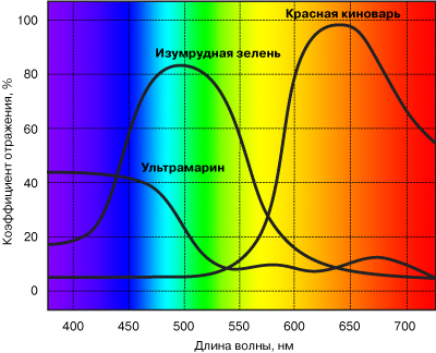
As the author of the article correctly noted, color information can be represented as a spectrum:
In the 17th century, Sir Isaac Newton proposed to fold this spectrum into a circle, combining purple and red. Thus, the color wheel appeared. Newton drew attention to the fact that colors smoothly flow from one to another and identified seven primary colors - red, orange, yellow, green, blue, indigo and purple.
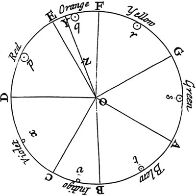
Hands up, who knows what this indigo color is!
The concept of “primary colors” is very subjective, for example, if you ask a digital artist to name the primary colors, he will say red, green, blue. Painters will answer red, yellow, blue. Print people will answer blue, crimson, yellow. The child will answer red, orange, yellow, green, blue, blue, purple.
They all see the same colors, but perceive them differently. A child is like a set of colors, sufficient to draw the sun, grass, sky, rainbow, etc. without mixing colors. Artists perceive primary colors as colors that are sufficient to produce any other color by mixing.
In Newton's time there were no monitors, prints, acrylic paints and other achievements of modern civilization, artists used oil paints, the color of which was due to the pigments known at that time. The range of pigments, in turn, influenced the color wheel. This is what a traditional color wheel looks like:

You can see that blue, yellow and red form a triangle and are the primary colors. The main problem with such a circle is that the colors are unevenly distributed - most of the circle is occupied by warm colors, shades of red and yellow.
Over time, many variations of the color wheel appeared, all of which differed in the distribution of colors around the circle, as well as in the base colors. To this day, there is no single color wheel that everyone would use. It is enough to drive "Color Wheel" into Google and you will see how many different variations of the color wheel exist in the world. However, there are two of the most useful color wheels.
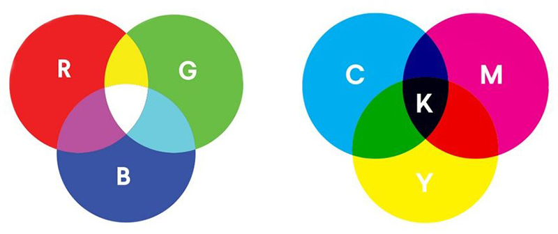
RGB circle. As the name suggests, this circle represents a mixture of three primary colors - red, green, and blue. It is useful for working with digital images, as most of them are a mixture of three black and white channels - red, green and blue.
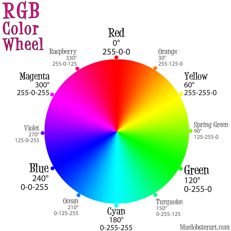
It is also a CMYK circle, since the primary colors can be taken as cyan, crimson and yellow - complementary to red, green and blue.
The difference between RGB and CMYK is color mixing. RGB is an additive model, that is, the color values are added, CMYK is subtractive, that is, the values are subtracted.
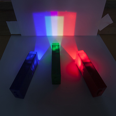
RGB is similar to light - if you take three bulbs of red, blue and green and illuminate one place with them, you will get a total of white light.
CMYK, on the other hand, is similar to a surface that absorbs this light. Cyan ink absorbs 100% red, 50% green, and 50% blue, while yellow ink absorbs 50% red, 50% green and 100% blue. By mixing blue and yellow paint, we get a paint that absorbs 75% of red, 50% of green and 75% of blue, so it reflects more green and our eye perceives it as green. It is because of its similarity to ink mixing that CMYK is used in printing.
The RGB wheel has one drawback - it is mathematically accurate and does not take into account human perception of colors. Therefore, the color wheel from Adobe comes to our rescue . I don’t know what it’s called and couldn’t find the history of its origin, but today it is the most suitable tool for color matching.
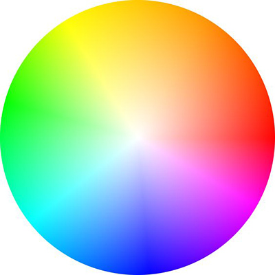
Now that we have decided on the tool, we can talk about color combinations.
Monochrome palette
Monochrome color palette represents shades of the same color with slight variations. A good example is a shot from the movie The Matrix.
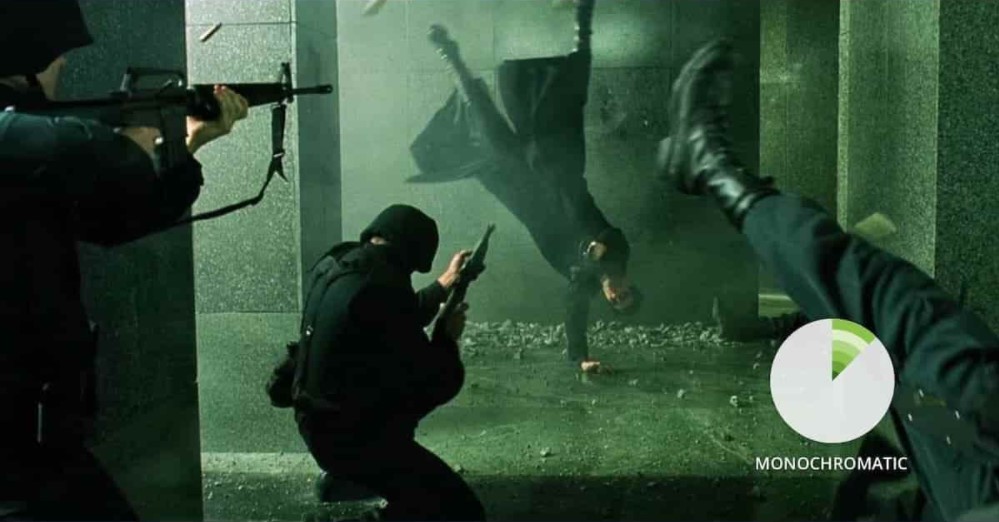
I think it's not a secret for anyone that the green color of the "Matrix" is associated with the green font of the interface in which Neo works, and here the filmmakers wanted to emphasize the artificiality of the Matrix, giving it a slightly greenish tint. In my opinion, instead of the averaged values for the entire film, the so-called Movie Bar Codes look much more informative - all frames of the film are compressed into one strip:
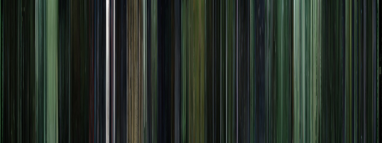
It is clearly seen here that the "Matrix" is, in fact, not only green. Blue segments are clearly visible - this is how the creators divided the real world and the Matrix. Green shades emphasize that the digital world actually consists of green code, blue shades indicate that the real world is cold and harsh.
Analog palette
The analog palette covers a slightly wider spectrum than monochrome. As a rule, these are two adjacent colors. For example, here is a shot from the movie Life of Pi:
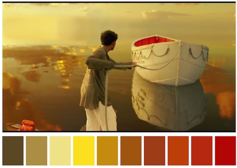
Unfortunately, I have not watched this film, so I cannot give an exact comment, but I know the plot approximately and I would venture to guess by the colors what is happening here, and you will confirm or refute my theory. At the same time, let's see how effectively color works in cinema. Judging by the predominance of warm colors, the picture hints at calmness and pacification, most likely this is the end of the journey, when the boy went through a difficult path, and was finally safe. There is also a clear red accent on the interior of the boat. The boat is red only inside, which can indicate that it is dangerous inside. Not surprising, because the boy swam with the tiger.
Complementary colors
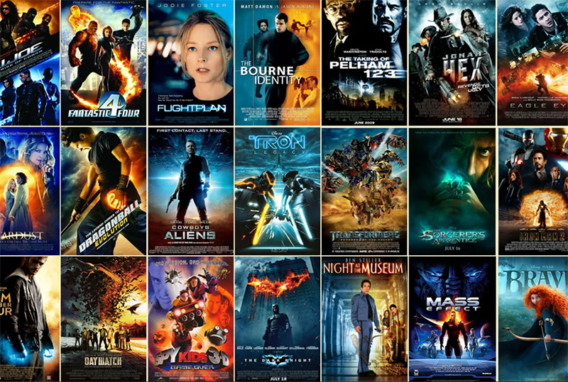
The simplest and most common combination is two colors that are diametrically opposite on the color wheel. The orange / blue-blue combination so common in Hollywood serves as an example here. The combination of complementary colors allows for maximum color contrast, and contrast is the key to an attractive picture. In favor of the combination of orange and blue is also played by the fact that this is a combination of colors that is natural for our environment. Every day we see blue skies and yellow / orange sun. At night, there is a dark blue sky outside the window, and at home there is a warm 5500K bulb. Outside the city, we sit by an orange fire, surrounded by a cold blue darkness. We can say that this combination is a win-win, which is why it is so often used in movies and even more often in movie posters:
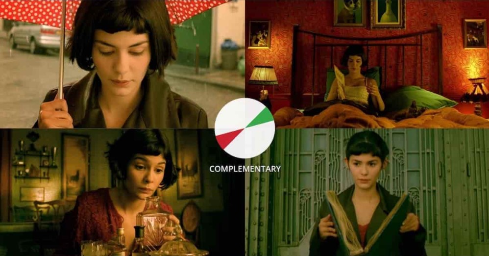
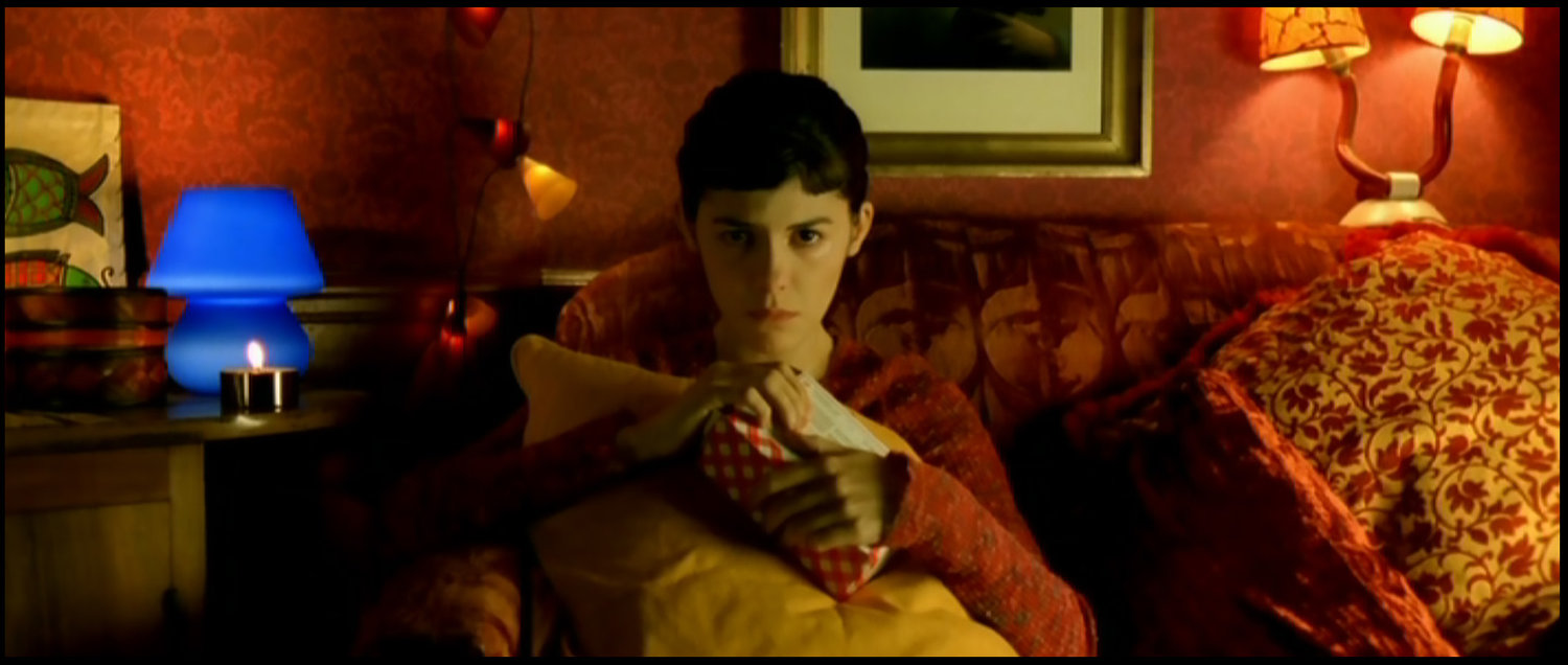
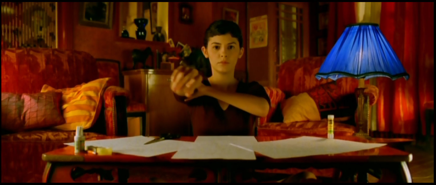
Those who are tired of blue-orange can watch Amelie - complementary red and green in all its glory:
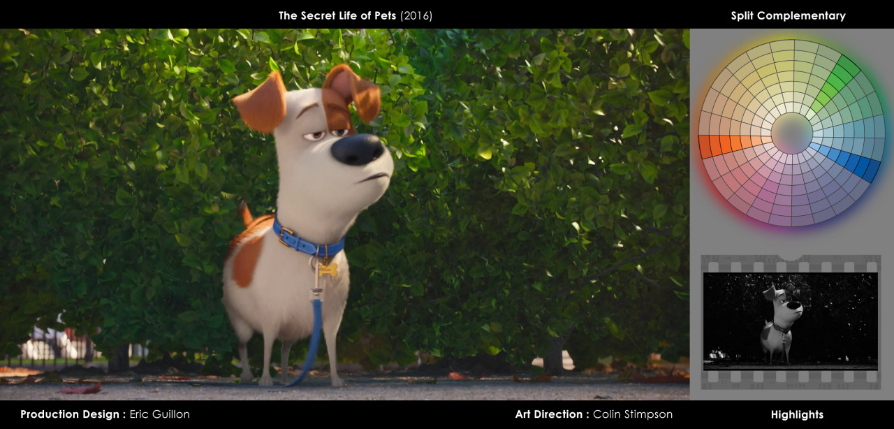
Complementary color palettes can also be more complex. The split complementary color palette assumes that instead of one of the colors, two analog ones are used ("The Secret Life of Pets"):
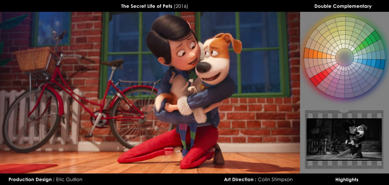
Dual split complementary - both complementary replaced by analog:
Triads
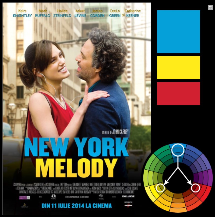
A color triad is a triangle on a color wheel, with colors at 120 degrees to each other. The triad is rarely used in cinema, since it is rather difficult to build a composition with its help. As a rule, one of the colors of the triad is used only as an accent, while the other two form the composition. The triad is more typical for posters or designs.
Color accents
Color accents are introduced in order to grab the viewer's attention. Accents are usually complementary to the primary colors. Again, a good example from The Matrix:
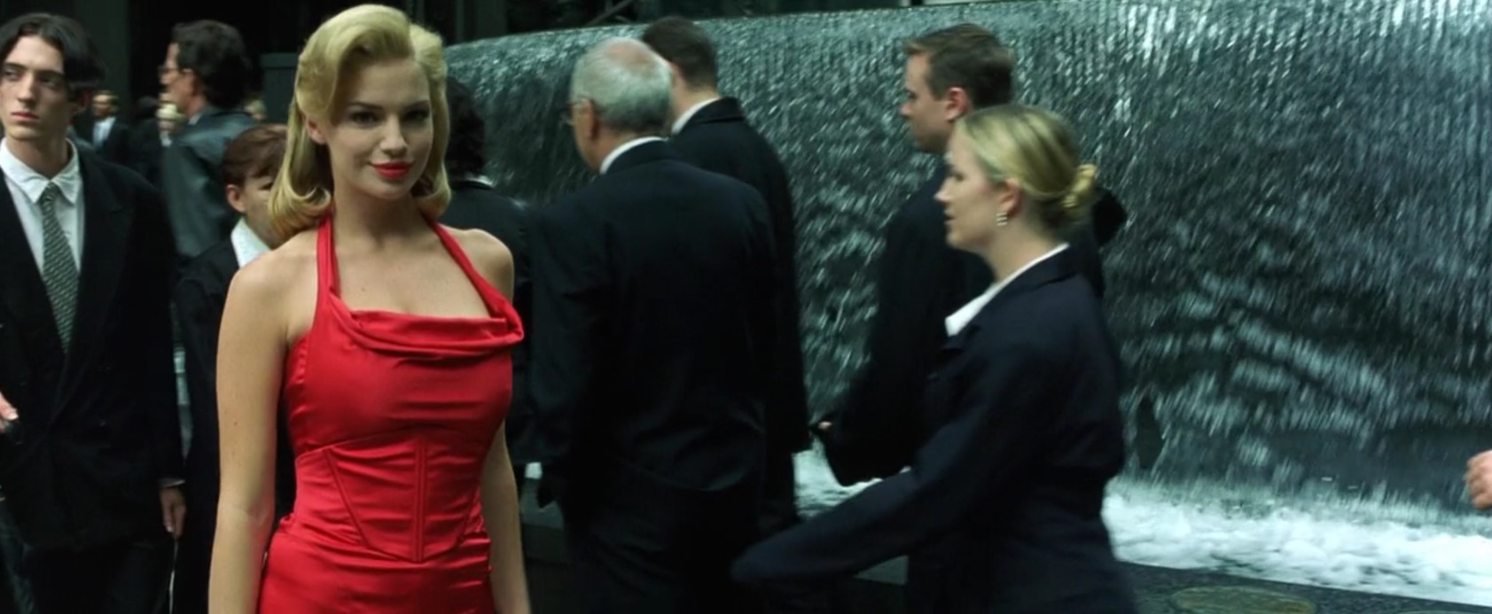
The girl in red is designed to distract the attention of Neo and the viewer. Needless to say, red is complementary to green?
And one more shot from "Amelie". I already mentioned that the film is dominated by green and red, but for an accent, sometimes blue lamps come into the frame:
Associative colors
Associative colors, as the name suggests, are associated with a character, object or place. How it works? Here's an example - think about who / what you associate a combination of green and purple with. I will give the answer a little later, in order to keep the intrigue and you did not spy in the text.
Blue and green in the "Matrix", which I wrote about above, are associative colors. Each evokes in the viewer a strong association with the Matrix / reality.
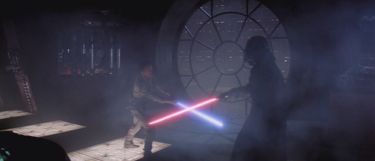
The red and blue colors of lightsabers in Star Wars are also associative. Red is associated with the Sith, blue with the Jedi. The viewer can always tell who is good and who is bad by his lightsaber.
Associative colors work great with superhero and villain costumes. Hulk - green, Superman - Red + Blue + Yellow (triad, by the way), Captain America - white + blue + red - the colors of the American flag that associate the hero with his nation. Remember green and purple? I think most of you immediately remembered the Joker, if not - write in the comments who you remembered (yes, my friend, I know that you remembered Tinky-Winky and Dipsy, and not some kind of Joker).
Color change
Often the colors change to emphasize the changing mood or inner world of the character. A striking example is the cartoon The Incredibles. Superhero everyday life is accompanied by bright saturated colors, while gray office work days are desaturated and neutral.
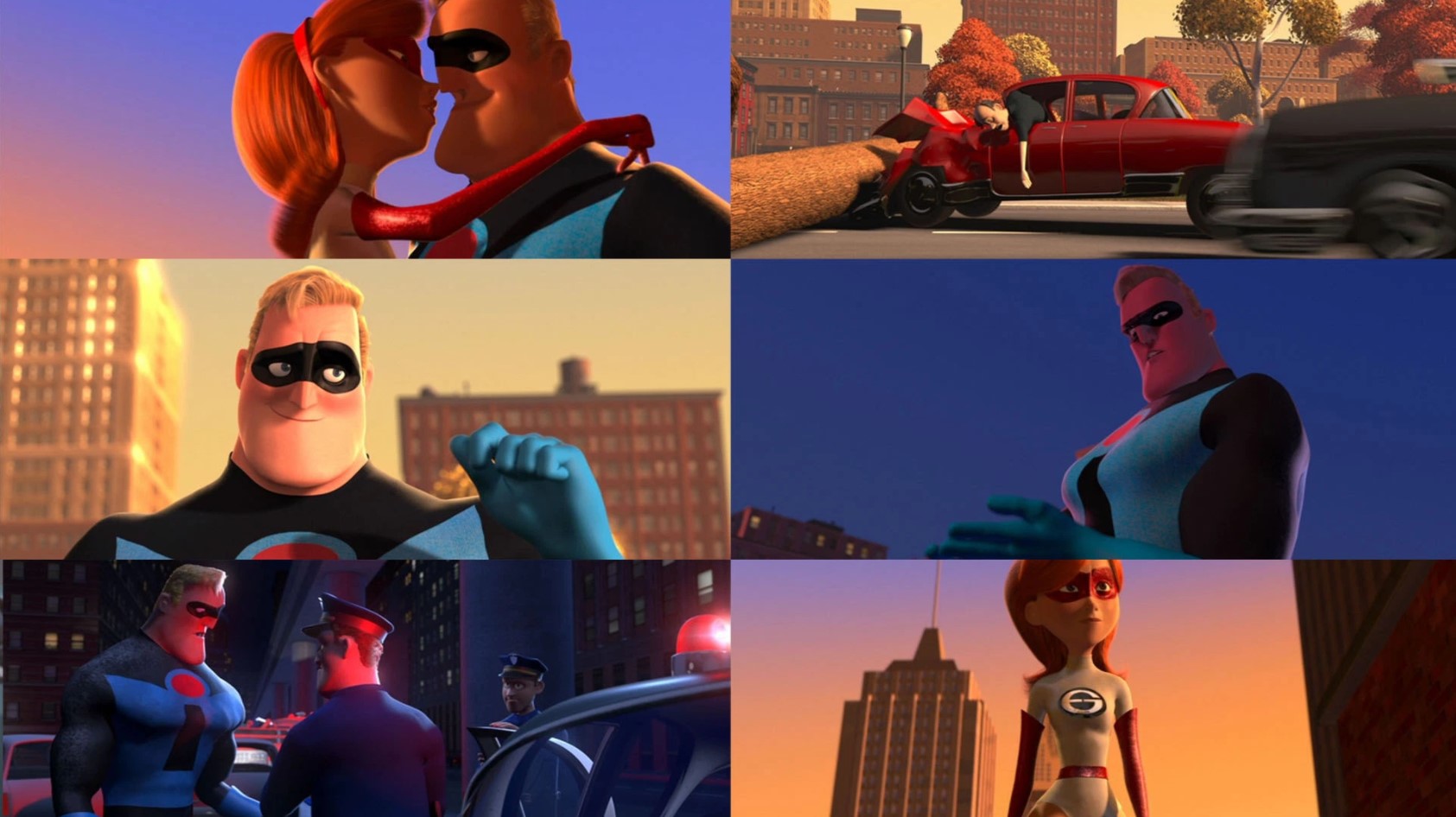
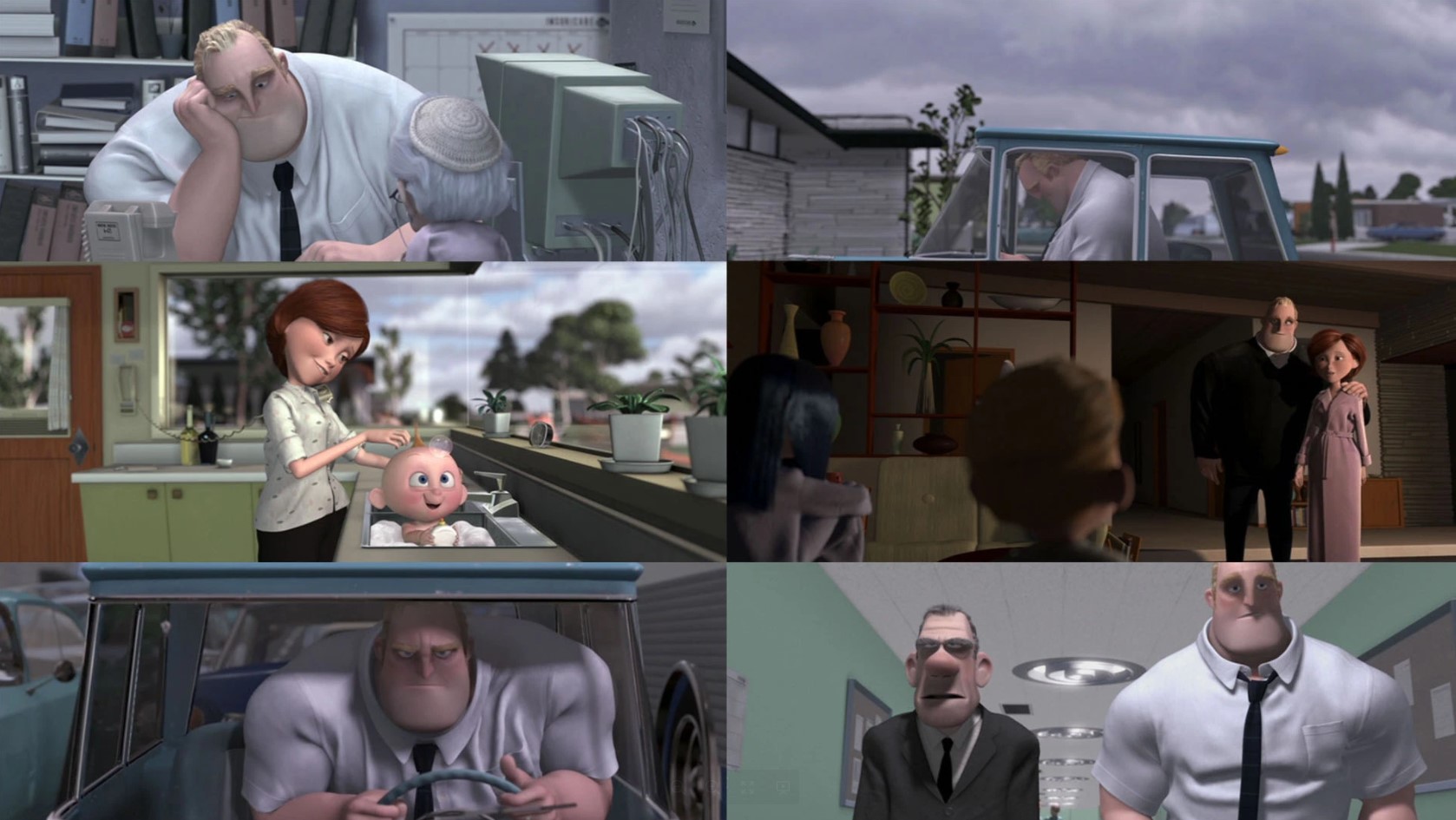
By the way, the very expression "gray everyday life" is the embodiment of the theory of color, we associate gray with something boring and monotonous, therefore we call boring and monotonous everyday life "gray".
As with The Matrix, periods of superheroism and boredom are clearly visible on the Incredibles barcode:
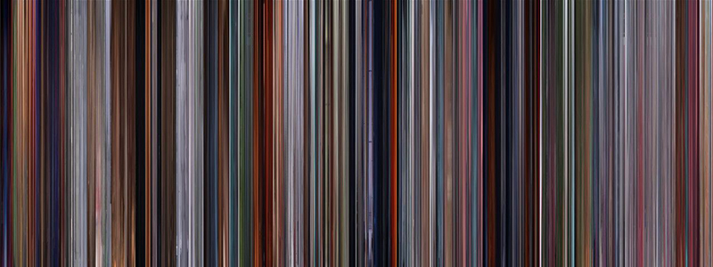
The same technique is in the cartoon "Up". Karl's life with his wife is filled with colors, and after her death the picture becomes faded.
From the mood we move on to the characters. Here, too, everything is simple, look how life battered Harry Potter:
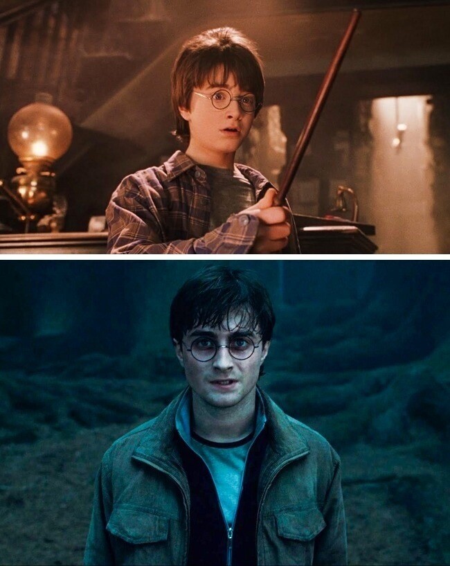
By the way, this applies not only to the character himself, but also to the film as a whole, look at the barcode of the entire saga:
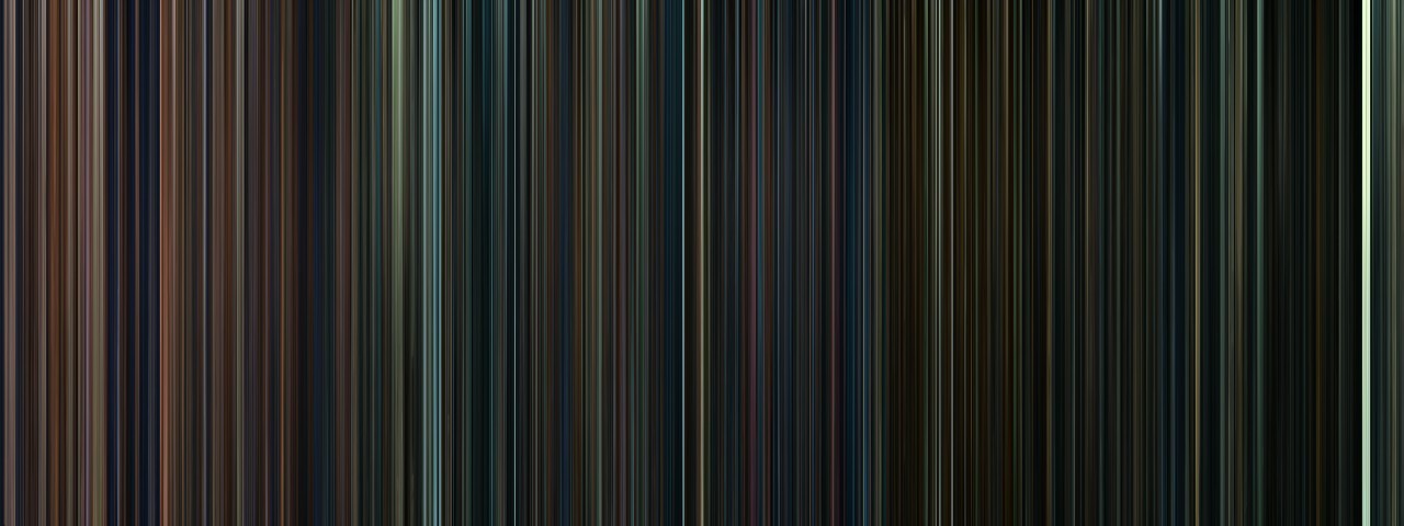
It all starts with warm shades, alternating with cold scenes with troubles (yes, blueorange again) - these are Harry's first years at Hogwarts, he is young and terrible events are still far ahead, so everything is warm and comfortable. Gradually, blue with shades of green begins to prevail in the saga - the troubles get worse, the situation worsens. Not everything is as warm and comfortable as in the first part. Finally, you can see the sharp transition from blue to green - this is the return of Voldemort. Green is often associated with evil, and here it emphasizes that the world is no longer the same and an ominous threat is hanging over it. Gradually, things get worse - Harry's friends die, the picture darkens and becomes almost black by the fatal moment - Harry's death - he can be clearly seen on the white stripe - this is a conversation between Harry and Dumbledore on a white King's Cross.
A couple more striking examples without pictures and comments: Luke Skywalker and Walter White.
Color and emotion
In part, I have already described how it works, but I would like to analyze this topic in more detail. Using the example of gray everyday life, we have already found out that color evokes associations with emotions. On the Internet, you can find many plates with flowers and corresponding emotions:
- Red - anger, passion, rage, desire, excitement, energy, speed, strength, power, heat, love, aggression, danger, fire, blood, war, violence.
- Pink - love, innocence, healthy, happy, contented, romantic, charming, playful, soft, gentle, feminine.
- Yellow - wisdom, knowledge, relaxation, joy, happiness, optimism, idealism, imagination, hope, sunshine, summer, dishonesty, cowardice, betrayal, jealousy, greed, deception, illness, danger.
- — , , , , , .
- — , , , , , , , , , , , , , , , , , , , , .
- — , , , , , , , , , , , , , , , , , , , ,
- — , , , , , , , , , , , , , , .
- — , , , , , , ,
- — , , , , , , , , , , , , , , , , .
- — , , , , , , , , , , , , , , , , ( ), ( ), , ,
As you can see, the set of emotions associated with different colors is quite large. And here it is important to understand one thing - color does not work without context. You cannot show a person the color red and thus make him angry. But you can emphasize what is happening on the screen with color, thereby strengthening the emotions that the plot evokes. This is the main purpose of color grading in cinema.
I would also like to draw attention to the different perception of color in different cultures - for example, white in the west is associated with marriage, and in the east with death. Our emotional perception is influenced by the environment in which we exist. Therefore, different people may perceive the same color in different ways.
Conclusion
Returning to the Article that brought me here, I would like to note that there is no color deficit in cinema. Just with the development of technology, artists have tools for color correction and they use them, trying to make the picture more beautiful and emphasize what is happening not only with the plot, but also with the visual component. Previously, the creators had only film, lens filters and color light sources, now you can repaint blue to red with one slider, tweak the contrast, add green in the shadows, this opened up great opportunities for improving the visual style of motion pictures.
As for the predominance of the blue / orange combination, there is one reason, which entails two consequences. I have already described the reason for this - these are two colors that prevail on our planet - the color of the sky and the color of the sun. All light sources are somehow warm (incandescent lamp, fire, sun) or cold (sky, fluorescent lamps).
First consequence- no matter how you shoot, these colors will be present in the video. the scene is illuminated with either daylight or artificial sources. To drastically change the color, you will have to tint everything in the frame in a different color - for example, make a green interior. And all the same it will be illuminated by a warm incandescent lamp, which will give an orange tint. Yes, there are now compositing tools that let you change all the colors, but you can't paint the sky green and make the sunlight purple, simply because it will look unnatural.
Second consequence- we are accustomed to these colors, they are perceived by any person as natural colors that surround him, so this combination is attractive to the majority, which in turn pushes artists to use this particular combination, because they want to make the picture attractive to the majority.
On this, I think it's time to end. I would like to see the reaction of the community. If the topic of lighting in films and games is interesting, then I have enough material for subsequent articles. Write in the comments if you liked the article and what topic you would like to see in the future. Here are a couple of ideas I have:
- Lighting in movies and games - a similar analysis, but with regard to lighting
- Lighting in Unreal Engine 4 - there are a lot of things you can touch on here, from baked / realtime lighting to post-process and various effects available in the engine
- Parsing films / games and frames from films / games
What to see
If you are bored with modern blue and orange films, here is a small selection of films with great color and lighting:
- Stanley Kubrick's Films - I don't really like his films in terms of script and direction, but when it comes to light, color and framing, he has no equal.
- Wes Anderson's films are, in their own way, the modern successor to Kubrick, great work with color and framing, a virtuoso of symmetry.
- Films directed by Roger Deakins - renowned director of photography. Yes, in his paintings you can often find a combination of blue / orange, but I cannot but mention it, as his works are magnificent.
- She is a great film with an extraordinary color palette and great lighting.
Of course, you can make a long list of well-known hits of all times and peoples, but there are thousands of such collections on the Internet. I have tried to include only what impressed me the most in terms of color and light. Surely I forgot something, if I remember, I will definitely add it.
Materials
Most of the information can be found freely on the Internet, I just put everything together and linked it with text, adding my personal experience. The list contains sites that I used when compiling the article, as well as just useful materials. Pictures are taken from the sites indicated in the list, or from Google.
- James Gurney - Color and Light is an excellent book about color and light, I recommend reading to everyone who is interested in the topic. We sell the translated version, but the quality of the translation leaves much to be desired, so it is better to read the original.
- How to use color in film is one of the most detailed articles on color in cinema - a lot of pictures are taken from there.
- Movie bar codes
- Color palettes of various films.
- There used to be parsing of cartoon color palettes, but now it's empty. You can try looking at old versions of the site.