Hello Habr!
We live at a fast pace. Monday instantly turns into Friday - before you have time to blink, unbridled horsepower languishing in a traffic jam in a matter of seconds accelerates the car to a hundred and in one short jerk takes us to the next traffic jam, and a flight to another continent takes less time than bureaucratic visa procedures ... Yes, we live fast, rich and ... we have less time. This is the paradox of the modern world.
In other words, we are constantly missing the most important resource - time. That is why speed is a clear priority today, including in the world of software. And here there is one little secret that few people think about. The speed of processors and the speed of the program code play today the most insignificant role - they have reached such a level when even a multiple difference in the execution time of operations on various electronic devices is practically indistinguishable for us - it was one hundredth of a second or five hundredths, by and large it does not matter ...
But at the same time, the speed of the user in the same type of programs, at times, differs at times. Here comes into play a more significant factor than machine time - the convenience and speed of working with the application interface. One or two extra clicks or keystrokes - and you are hopelessly behind your neighbor in terms of speed. That is why, when developing a browser, we try to pay attention not only to optimizing the code, but also to this very human performance that can significantly increase performance with similar hardware resources.
However, the introduction is already a bit delayed - it's time to move on to the main topic of today's article and talk about the new features and improvements in Vivaldi browsers for PC and Android, they just resonate very well with what you just read above - saving time when working in the browser. And we will start with the desktop version - by seniority, so to speak.
Vivaldi for PC
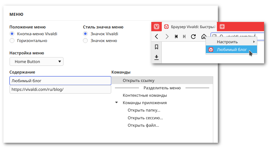
One of the most notable innovations in the new version of the browser is the customizable context menu. This work is a further logical continuation of the expansion of the browser settings options for the tasks and habits of users. And in the case of Vivaldi, which has a huge set of functions, such an opportunity is more than demanded - by constructing their own context menus and removing all unnecessary, the user can significantly speed up his work with many functions. The context menu editor is located in the browser settings, in the "Appearance" section.

It should be noted that the settings are also available for the context menus of interface elements, so you can even place a lot of useful commands under one Home button to speed up your work. The icing on the cake is the option of adding your own links to the context menu both to online resources and to the internal technical pages of the browser (the "Open link" item). Thus, the possibilities of the context menu become even wider.
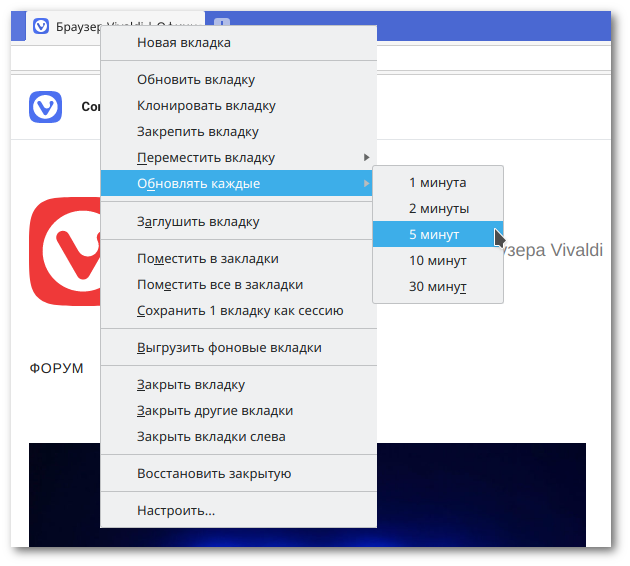
It's no secret that the greatest time savings are achieved through automation. If you give the task to the machine to perform routine actions without human intervention, the free time can be spent on other things. The browser is, of course, not a robot, but it can do something. For example, in this version of Vivaldi, it became possible to schedule an automatic update of a web page at a certain frequency. Now you don't have to waste time manually refreshing the page to see changes in the exchange rate, and the online bank will not close the session if you are chatting on the phone.
Another improvement seems tiny, but this is only at first glance. Reducing operations to perform frequently requested activities saves minutes and hours of free time. And today we decided to speed up the tab placement function a little - as it turned out, it has recently become very popular among users. To perform this action, a mouse gesture and a key combination, a button in the status bar, are provided, but before you place something somewhere, you must first select something. This means wasting precious time.
We've added a bit of "artificial intelligence" to the placement function. Now the priority order will look like this: if you activate the placement function (with a button, gesture, keyboard shortcut), then the browser will first try to place the selected tabs; if there are none, the browser will place the active group of tabs in one window; if there are currently no active groups on the horizon, the browser will place the current active tab and the previous active tab in the same window. Thus, if you looked at one page with a product and went to another page with a similar product, and then decided to compare them by placing them in one window, you do not need to spend extra time highlighting two tabs. You just activate the placement function in a way that suits you.
But, perhaps, you can save even more time by using the following function. The fact is that for many months our developers could not sleep well - they dreamed of the sad eyes of users who were forced to open the bookmark manager to create folders on the Express Panel and there to perform a lot of boring operations for dragging and dropping bookmarks into these folders. This could not go on like this - now there is no need to open the bookmark manager and no need to leave the convenient and beautiful Express panel - just drag one cell onto another and they will automatically create a folder in which they will hide themselves. Yes, miracles do happen.
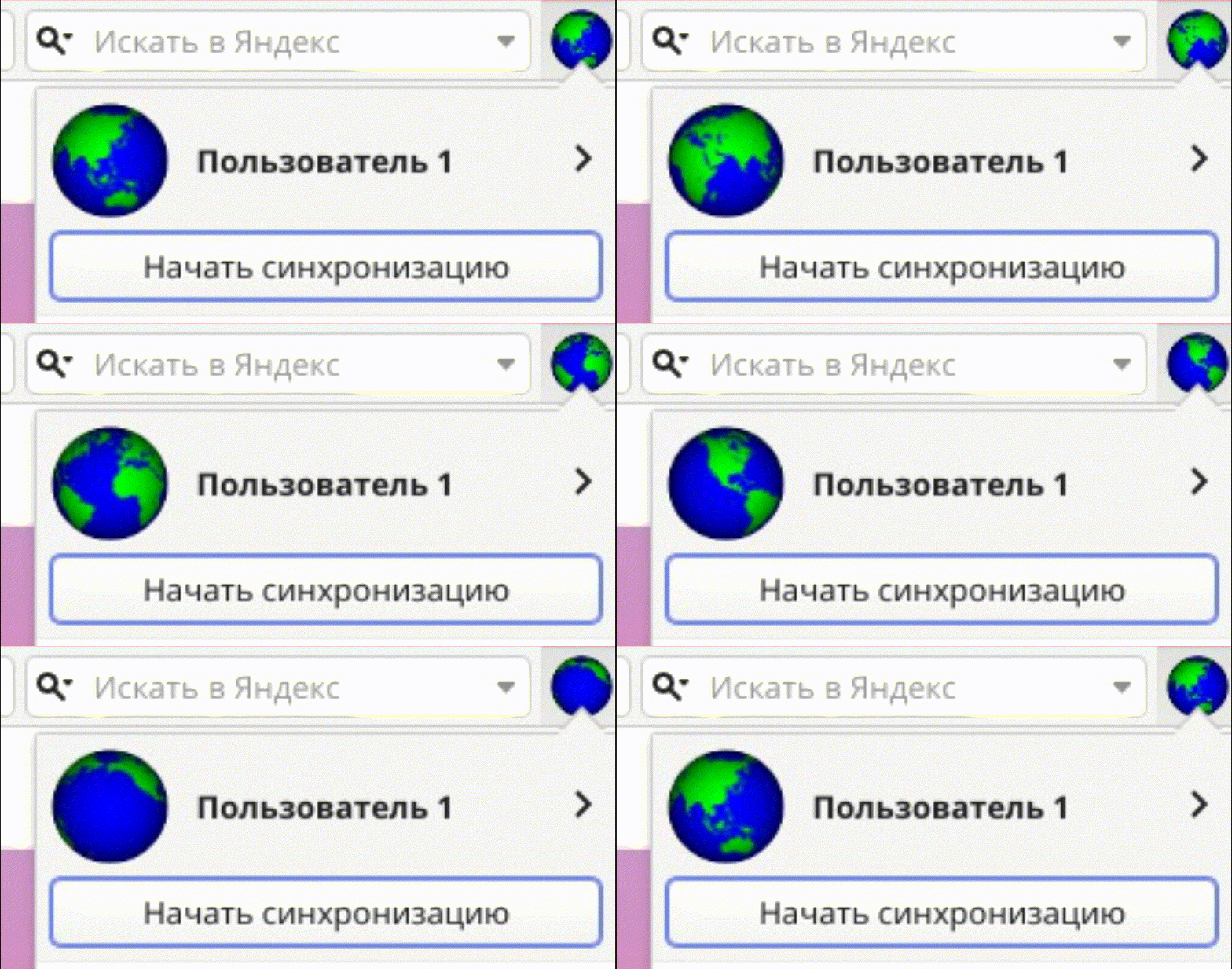
And one more improvement, although it will not speed up the work in the browser, will also add a small grain of joy to the hourglass of user comfort. Now you can set any image from your local computer as a profile picture. Rumor has it that even animated pictures work:
In addition to the above new products, there is one more, also in a certain way connected with time, but more on that later.
You can see the full list of changes in the desktop version here , download the latest version from the download page , and for now we will move on to getting acquainted with the new mobile version -
Vivaldi 3.4 for Android
The mobile browser itself serves to save money or, more precisely, to use time more efficiently - it allows us to increase the duration of our Internet connection not by lengthening the day, which is impossible in principle, but by expanding life situations in which we can continue to work online thanks to mobility. For example, we can read news on the subway commute or watch training videos while taking a taxi ride. But there is still a lot to optimize in the mobile browser.
Despite the ever-growing screen sizes of mobile devices, they are still small and if the screen does not fit all the available information, we are forced to scroll the page to the right place. This also applies to browser components - in particular, the Express panel. It is somehow not quite "express" anymore, if you have to scroll the screen. We tried to improve the situation a little - by popular demand, we added the ability to display small bars instead of cells. Like this:

As you can see, a little more links fit in this way and you need to scroll less often. However, when you select small cells in the settings, there will be even more of them on the Express panel. Well, on the other hand, the slats fit more text - which is also a plus in some situations. In any case, this is just the beginning - we continue to develop various interesting ideas for improving the Express Panel.
And we also slightly changed the main menu - we adapted it for the new interface.
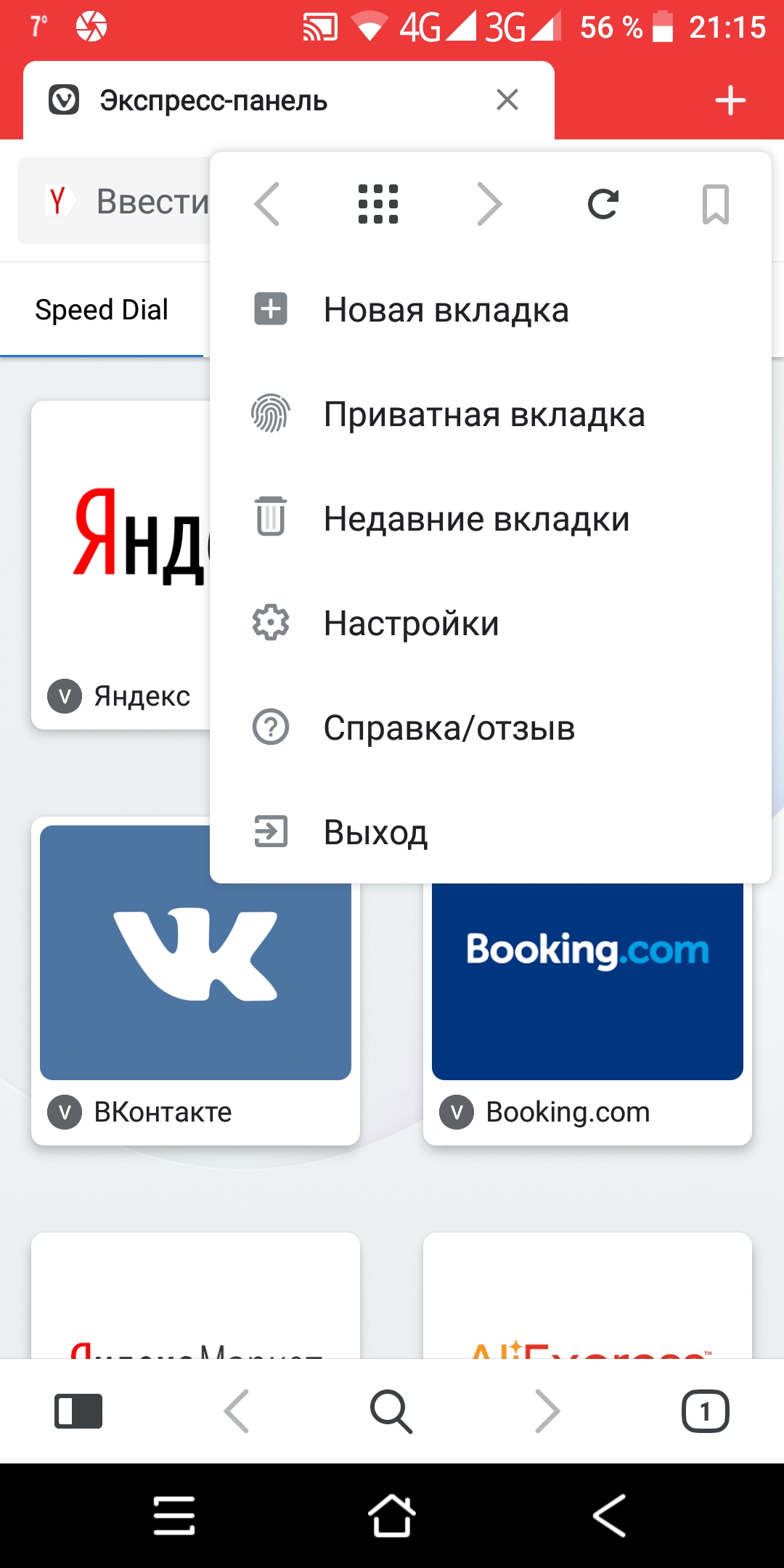
It has become smaller - already a plus, no need to scroll, got clear icons - you can visually quickly identify the desired menu item, and this menu also contains some controls that can be disabled along with the traditional panel, which, again, increases the screen space and you need to scroll less ... But it is attached to "scroll", as if in a mobile browser you only have to scroll. In fact, in a mobile browser, you can do more interesting things, for example - ... However, more on that later, and to begin with, a small lyrical digression.
How we saved the dinosaur
Our Icelandic office is located in a large building where other companies are located. We live amicably, the kitchen is the same for everyone, so we often discuss various topics with colleagues from other projects over a cup of coffee. And somehow, in early autumn, such a story happened.
In the next kitchen gatherings, Björn Jonsson from Porcelain Fortress , quietly thinking about something of his
own with a mug of coffee in his hand, said thoughtfully: - Well, this does not make sense ...
We were alerted - Björn never said something just like that. After a pause, he continued:
- Cacti - it hurts ...
We had to agree with him that although sometimes cacti decorate our home, but they prick quite sensitively, it's true. After a short pause, Björn continued to think aloud:
“Dinosaurs don't jump like that.
Bjorn's train of thought puzzled us - we started looking for a connection between cacti and dinosaurs, while Bjorn finished his coffee and ended the conversation with an even stranger phrase:
“You have to do something about this.
Then he went to his office, where he and his friends were engaged in the creation of computer games.
A few days later, he came to the kitchen with a laptop and showed us a new game that he had conceived for our browser. It was intended to replace the standard Chromium game, which was offered to users in the absence of a network connection - yes, the same T-Rex jumping through cacti. Björn said that a dinosaur race has no purpose, and a good game should always have meaning. And the game must also be beautiful. And he said a lot more, with which we all agreed.
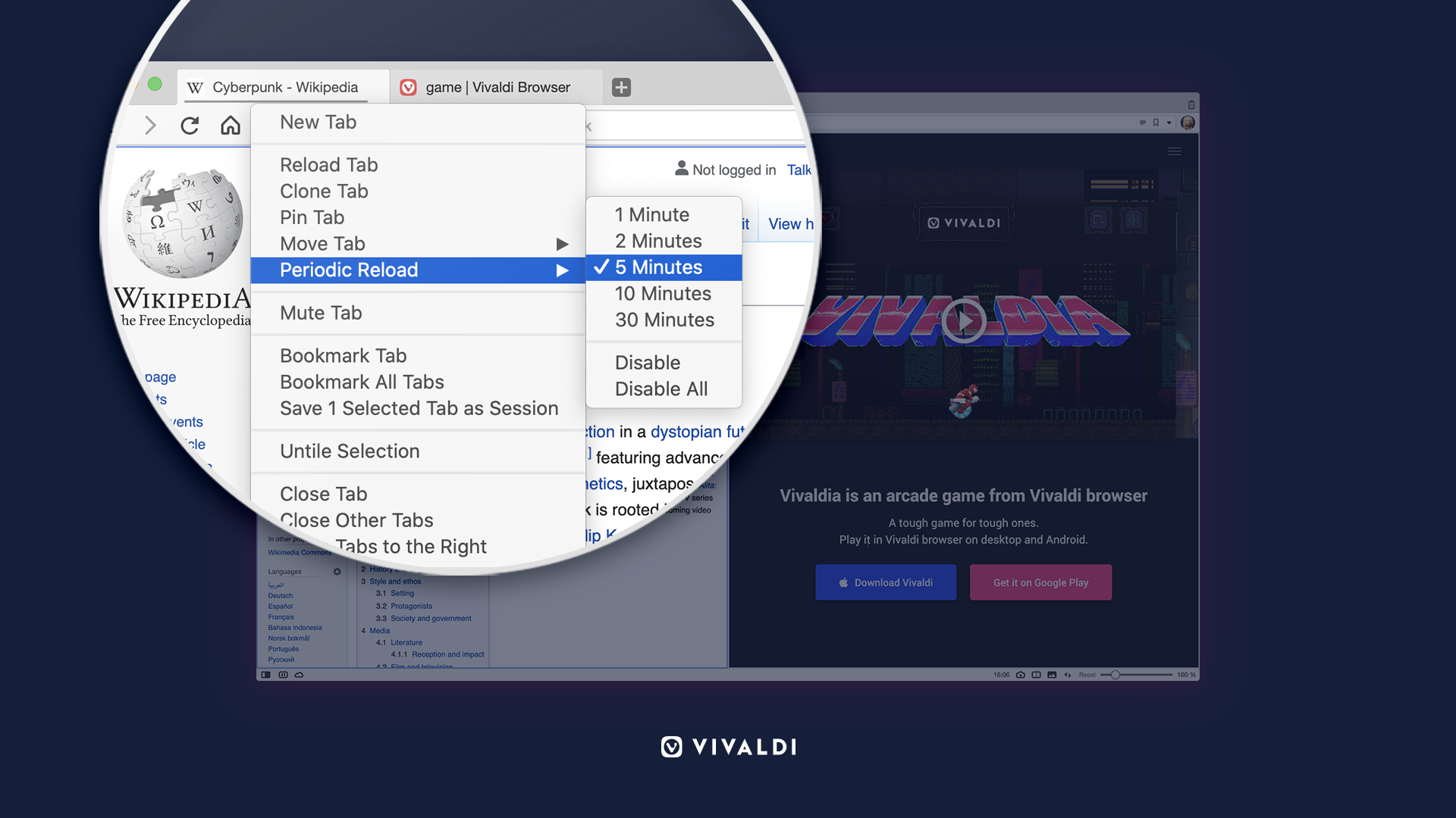
In general, today we present to you this game called Vivaldia. It is not yet present on the disconnected message page, but we are working on it. The plot is simple - the world is conquered by machines, trying to turn people into numbers. And a girl named Vivaldia sets out on her cyber-mono-wheel to save the world. In general, everything is familiar and simple.
This game works on both desktop and mobile browser. Both in normal mode and offline. Button control, in the mobile version, the appearance of the buttons can be changed from the standard:
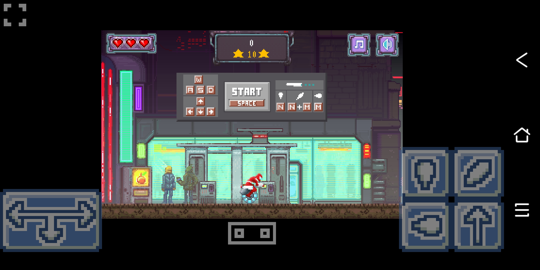
To the simplified one - using the button in the center of the screen:
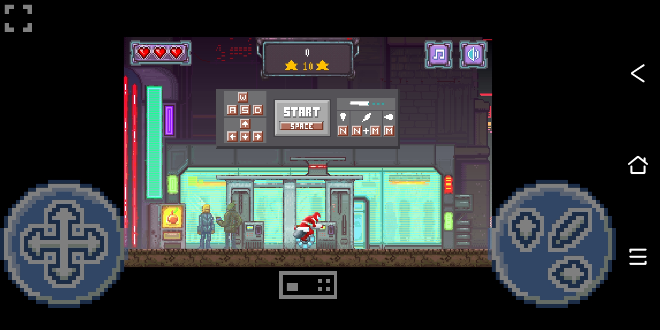
And in such an unusual way we return to the daily constant: we were able to save a little time by adding new convenient functions to the browser, and we immediately found how to take this saved time. However, the game can be turned off if you want to spend time more profitably. The corresponding option is in the settings.
That's all, thank you all for your help in preparing new versions of the browser and we look forward to your feedback and wishes. The mobile version is available on the Google Play Store. PS Screenshots with the results can be published in the comments - such a mini-competition. By the way, you can see Jon von Techner, our director, in the game. Whoever sees it first will receive a gift from us.
