Dark mode remains a major trend in website and app design. We found a great article on this topic and decided to share the translation. User opinion, implementation and support of dark mode, recommendations for developers are further in the article. Which side are you on?
Just a hype or a necessity? Learn more about dark mode. I'll show you how to add dark mode support for the benefit of your users!
Introduction
On this topic, I conducted a voluminous study, studied the history of the issue. If you are only interested in working with dark mode, feel free to skip the first section.
Dark Mode before it went mainstream
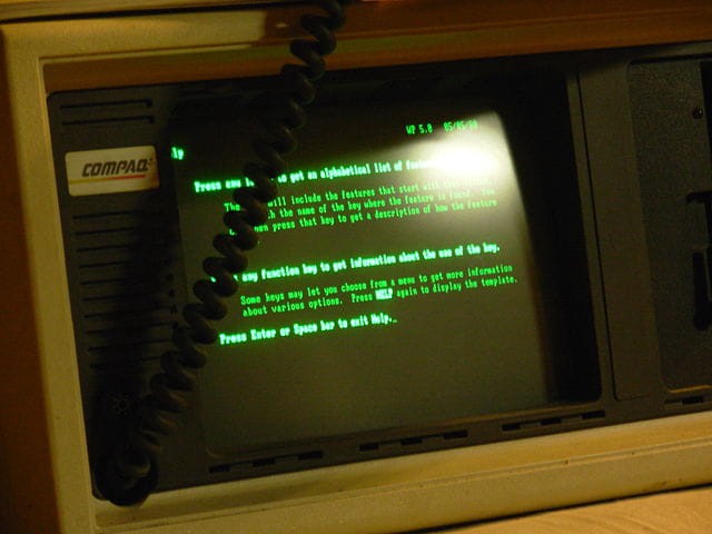
They say history is cyclical. In the dark mode situation, we are back to where it all began. In the early days of personal computers, dark mode was the only option: monochrome CRT monitors worked by irradiating beams of electrons to a phosphorescent screen, and the phosphor used in early CRTs was green. Since the text was displayed in green and the rest of the screen was black, these models were often referred to as green screens .
Subsequently, color CRT displays began to display multiple colors through the use of red, green and blue phosphors. They created white by activating all three phosphors at the same time. With the advent of more modern desktop publishing and WYSIWYG technology , the idea of making a virtual document look like a real sheet of paper has become popular.

At this point in design, the trend "dark on white" was born, it was implemented in the very first web sites on the network - they were more like text documents.
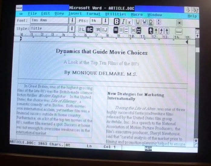
The world's first browser, WorldWideWeb (imagine CSS hadn't been invented yet ) rendered web pages this way. Fun fact: The second-ever Line Mode Browser (terminal-based browser) was green on dark. Today, web pages and applications are usually created with dark text on a light background, which is the accepted norm. This color scheme is built into the stylesheets of modern user agents, including for example Chrome....

Using smartphones ( source ) The
days of CRT monitors are long gone. We now consume and create a huge amount of content on mobile devices that use backlit LCDs or energy efficient AMOLED displays. Smaller and more practical computers, tablets and smartphones have led to new patterns of user behavior. In our free time, we disappear on social networks, program for fun or play computer games. This usually happens after work in the evening in dim lighting or even at night in bed before going to bed. The more people use their devices in the dark, the more popular Dark Mode becomes.
Why Choose Dark Mode?
For aesthetic reasons
When people are asked why they like dark mode , the most popular answers are "It's more pleasing to the eyes" or "Dark mode is beautiful." Apple says openly in its developer documentation for Dark Mode , "The choice of dark or light for most users is based on aesthetic preferences and may not be relevant to lighting conditions."
Find out more in the study why people love dark mode and how to use it.
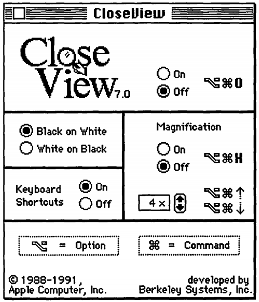
System 7 CloseView ( source )
Dark Mode as an Accessibility Tool for People with Disabilities
Some people need to use Dark Mode: for example, visually impaired users use Dark Mode as an accessibility tool. The earliest use of dark mode as an accessibility tool that I could find was the CloseView feature in System 7, with the ability to change the color scheme from black on white and white on black. Although System 7 supported a color interface, the default user interface was black and white.
This inversion-based method has shown its weaknesses after increasing the number of colors in the interface. Sarit Szpiro and a team of researchers conducted a surveyusers on how visually impaired people handle computer devices. As a result, it turned out that all respondents did not like inverted colors, but many preferred light text on a dark background. Apple addresses this user preference with Smart Invert , which changes colors on the display, excluding images, media, and some applications that use dark color styles.
A special form of low vision is computer vision syndrome, also known as digital eye strain. These terms meanvarious vision problems that are associated with the frequent use of computers (desktops, laptops and tablets) and other electronic devices (smartphones and e-books). Scientists speculate that the use of electronic devices by adolescents, especially at night, is associated with an increased risk of sleep problems, insomnia, and sleep deprivation syndrome. According to other studies , the effects of blue light is involved in the regulation of circadian rhythmand the sleep cycle, and irregular light environments can lead to sleep deprivation, which affects a person's mood and efficiency in performing tasks. You can limit the negative impact by reducing the amount of blue light by adjusting the color temperature of the display (features such as iOS Night Shift or Android Night Light ), or by preventing bright or irregular light in general with Dark Theme or Mode.
Saving Energy in Dark Mode on AMOLED Displays
Dark mode is known to save a lot of power on AMOLED displays. Research on popular Google apps such as YouTube has proven that energy savings can be up to 60%. The video below provides more details on these studies and energy savings for each application.
How to activate dark mode in the operating system
Now that I've covered why dark mode is so important to many users, let's take a look at how you can customize it.
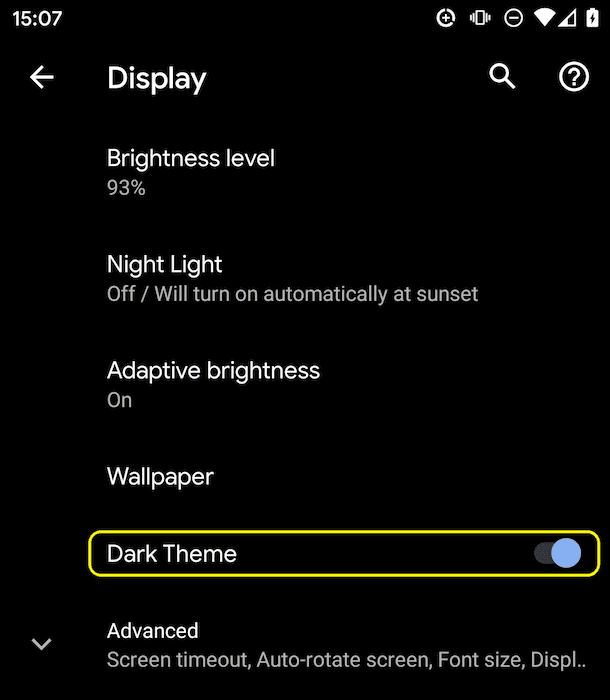
Dark theme settings on Android Q
Operating systems that support dark mode or dark theme usually have the option to activate them in settings. On macOS X, this is under the General section of System Preferences and is called Appearance ( screenshot ), and on Windows 10, it is under Colors called Choose your color ( screenshot ). For Android Q, you can switch the mode to Display as a Dark Theme ( screenshot ), and in iOS 13, you can change the interface color in the Display & Brightness section ( screenshot ).
- prefers-color-scheme
A little more theory before I continue. Media queries allow authors to test and query the values and properties of a user agent or device independently of the rendering of the document. They are used in the CSS media rule to conditionally apply styles to a document and in some other contexts and languages such as HTML and JavaScript. Level 5 media queries introduce so-called user-preferred media properties, which is a signal for sites to discover the user's preferred way of displaying content.
The prefers-reduced-motion CSS media property set can be used to determine if the user requests the OS to minimize the amount of animation it uses. I have alreadywrote about prefers-reduced-motion earlier.
The prefers-color-scheme CSS media property is used to determine which theme, light or dark, is used by a person on the operating system. It works with the following values:
- no-preference : Indicates that the user has not made any preferences known to the system. This keyword evaluates to false in a logical context .
- light : Indicates that the user has notified the system that they prefer a page with a light theme (dark text on a light background).
- dark : Indicates that the user has notified the system that they prefer a page with a dark theme (light text on a dark background).
Dark mode support
Find out if dark mode is supported by the browser
Since dark mode is communicated via a media query, you can easily check if the current browser supports dark mode by finding out if the prefers-color-scheme media query is appropriate . Note that I am not setting a value, but just checking the media query for a match.
if (window.matchMedia('(prefers-color-scheme)').media !== 'not all') {
  console.log(' Dark mode is supported');
}
At the time of writing, prefers-color-scheme is supported on both desktop and mobile (where available) in Chrome and Edge from version 76, Firefox from version 67 and Safari from version 12.1 on macOS, and from version 13 on iOS. For all other browsers, you can find information in the article Can I use support tables .
A custom <dark-mode-toggle> element is available that adds dark mode support to older browsers. I will write about this further.
Dark Mode in Practice
Let's take a look at what dark mode support looks like in practice. Just like in the movie "Highlander" , in the end there can be only one: dark or light! Why am I focusing on this? Because this fact affects the loading strategy. Please do not force users to download CSS at a critical rendering stage for a mode that is not currently being used. Therefore, to optimize the loading speed, I have split my CSS in the example into three parts in order to delay the loading of non - critical CSS :
- style.css contains general rules that are used throughout the site
- dark.css contains the rules needed for dark mode
- light.css contains the rules needed for light mode only.
Loading strategy
The last two, light.css and dark.css, are selectively loaded via a <link media> request.
Initially, not all browsers support the prefers-color-scheme CSS media property (found with the example above ), this is solved by selecting the default light.css via an element in our inline script (light is an arbitrary choice, I could also dark by default). To avoid unstyled content appearing , I hide the page content until light.css is loaded.
<script>
  // If `prefers-color-scheme` is not supported, fall back to light mode.
  // In this case, light.css will be downloaded with `highest` priority.
  if (window.matchMedia('(prefers-color-scheme)').media === 'not all') {
    document.documentElement.style.display = 'none';
    document.head.insertAdjacentHTML(
        'beforeend',
        '<link rel="stylesheet" href="/light.css" onload="document.documentElement.style.display = ``">'
    );
  }
</script>
<!--
  Conditionally either load the light or the dark stylesheet. The matching file
  will be downloaded with `highest`, the non-matching file with `lowest`
  priority. If the browser doesn't support `prefers-color-scheme`, the media
  query is unknown and the files are downloaded with `lowest` priority (but
  above I already force `highest` priority for my default light experience).
-->

<link rel="stylesheet" href="/dark.css" media="(prefers-color-scheme: dark)">

<link rel="stylesheet" href="/light.css" media="(prefers-color-scheme: no-preference), (prefers-color-scheme: light)">
<!-- The main stylesheet -->
<link rel="stylesheet" href="/style.css">
Style sheet architecture
I am using CSS variables , which allows the style.css to be generic, all light or dark mode setting happens in two other files: dark.css and light.css. Below is an example that should be enough to explain the general idea. I declare two variables, --color and --background-color, that create a dark on light and light on dark base theme.
/* light.css:  dark-on-light */
:root {
  --color: rgb(5, 5, 5);
  --background-color: rgb(250, 250, 250);
}
/* dark.css:  light-on-dark */
:root {
  --color: rgb(250, 250, 250);
  --background-color: rgb(5, 5, 5);
}
Then in style.css I use these variables in the body {...} . Because they are defined in the CSS pseudo-class : root - a selector that represents the <html> element in HTML and is identical to the html selector , except that its specificity is higher: variables are cascaded, thus allowing the definition of global CSS variables.
/* style.css */
:root {
  color-scheme: light dark;
}
body {
  color: var(--color);
  background-color: var(--background-color);
}
In the example above, you probably noticed the color-scheme property with light dark values separated by a space.
The property tells the browser which color themes my application supports and allows it to activate special variations of the user agent stylesheet. This is useful, for example, to allow the browser to display form fields with a dark background and light text, customize scroll bars, or to enable a theme-specific highlight color. The details of the color-scheme property are specified in the CSS Color Adjustment Module Level 1 .
Learn more about color-scheme .
Everything else is just CSS styling for the rest of the markup I have on my site. The semantic organization of styles helps a lot when working with dark mode. For example, instead of --highlight-yellow, consider naming the variable --accent-color , since “yellow” may not actually be yellow in dark mode, or vice versa. Below is an example of a few more variables that I am using.
/* dark.css */
:root {
  --color: rgb(250, 250, 250);
  --background-color: rgb(5, 5, 5);
  --link-color: rgb(0, 188, 212);
  --main-headline-color: rgb(233, 30, 99);
  --accent-background-color: rgb(0, 188, 212);
  --accent-color: rgb(5, 5, 5);
}
/* light.css */
:root {
  --color: rgb(5, 5, 5);
  --background-color: rgb(250, 250, 250);
  --link-color: rgb(0, 0, 238);
  --main-headline-color: rgb(0, 0, 192);
  --accent-background-color: rgb(0, 0, 238);
  --accent-color: rgb(250, 250, 250);
}
Detailed analysis
In the following box Glitch you can see an example that uses all that is described above, in practice. Try toggling dark mode in your operating system settings and see how the page reacts.
Impact on download speed
When you play enough with this example, you can see why I load my dark.css and light.css via media queries. Try toggling dark mode and reloading the page: certain, currently mismatched stylesheets are still loading, but at the lowest priority so they don't compete with the resources the site needs right now.
Find out why browsers load stylesheets with mismatched media queries .
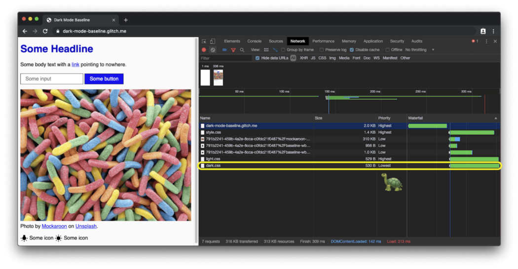
The light website loads the lowest priority

dark styles : The dark website loads the lowest priority light styles:
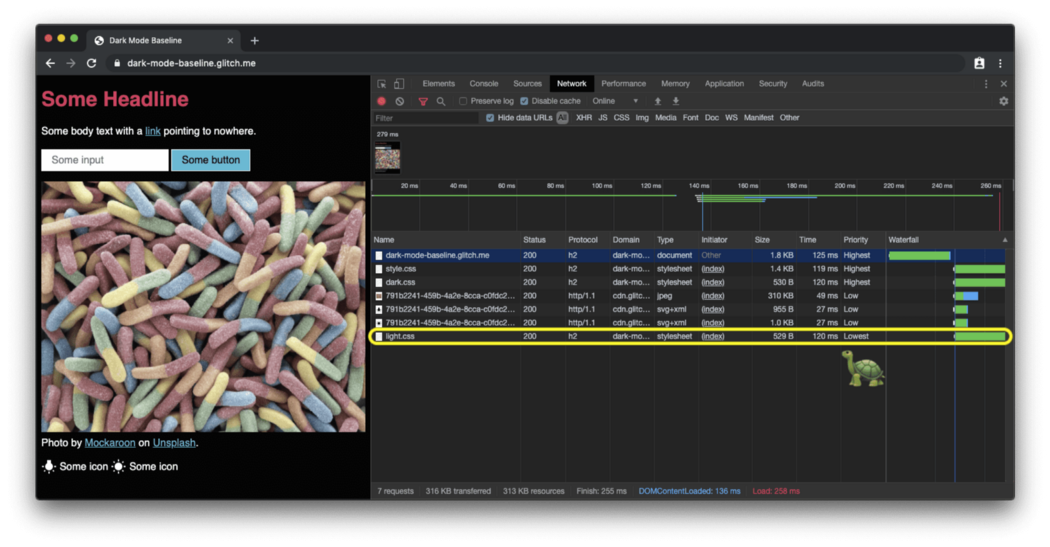
The default site with a light skin in a browser that does not support prefers-color-scheme loads the dark styles with the lowest priority:
How to respond to dark mode changes
Like any other media query change, you can subscribe to a dark mode change via JavaScript. You can use this, for example, to dynamically change the page icon or change the <meta name = "theme-color"> which determines the color of the URL bar in Chrome. The example above shows what is described in action. To see the theme and icon color changes, open the demo in a separate tab .
const darkModeMediaQuery = window.matchMedia('(prefers-color-scheme: dark)');
  darkModeMediaQuery.addListener((e) => {
    const darkModeOn = e.matches;
    console.log(`Dark mode is ${darkModeOn ? ' on' : '️ off'}.`);
  });
Dark Mode Best Practices
Avoid
Pure White You may have noticed a small detail: I am not using pure white. Instead, to prevent the surrounding dark content from glowing, I chose a slightly darker white, something like rgb (250, 250, 250) .
Changing color and darkening photo images
If you compare the two screenshots below, you will notice that not only the main theme has changed from dark to light to light to dark, but the image looks a little different. My survey found that most users prefer slightly less bright and saturated images when dark mode is active. I call this re-colorization.
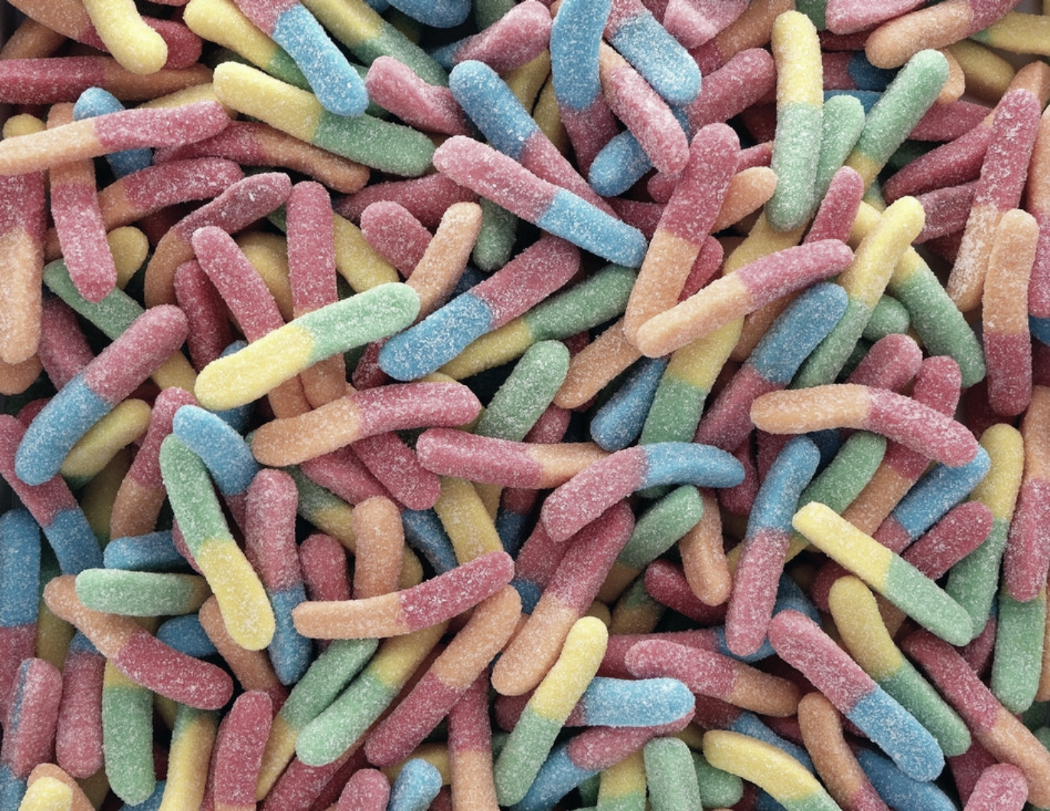
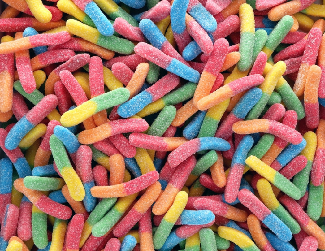
Image colors in light mode You can recolor images using a CSS filter. I am using a CSS selector that fits all images that do not have .svg in their urls. The idea is that I can give vector graphics (icons) a different treatment, more on that in the next section . Notice how I am using the CSS variable again so that I can quickly change my filter later.
Learn more about user preferences from research .
Since repainting is only required in dark mode, that is, when dark.css is active, there are no corresponding rules in light.css .
/* dark.css */
--image-filter: grayscale(50%);
img:not([src*=".svg"]) {
  filter: var(--image-filter);
}
Adjusting the Intensity of Dark Mode recoloring with JavaScript
We are different and each person will have their own ideas of exactly how dark mode should look. By sticking to the recoloring method described above, I can easily make the grayscale intensity a user preference, which is changed by JavaScript , and by setting the value to 0% , I can turn off recoloring entirely. Note that document.documentElement provides a link to the root element of the document, which is the same element that I can refer to using the CSS pseudo-class : root .
const filter = 'grayscale(70%)';
document.documentElement.style.setProperty('--image-filter', value);
Invert vectors and icons
For vector graphics (in my case, used as icons, which I refer to via <img> elements ), I use a different recoloring method. While research has shown that people don't like photo inversion, it works very well for most icons. I again use CSS variables to determine the degree of inversion in normal and : hover states .
Icon is inverted in dark mode:

Icon in light mode:

Notice how again I only invert icons in dark.css but not light.css , and how : hover gets different intensities of inversion in two cases to make the icon look a little darker or a little brighter, depending on the mode selected by the user.
/* dark.css */
--icon-filter: invert(100%);
--icon-filter_hover: invert(40%);
img[src*=".svg"] {
  filter: var(--icon-filter);
}
/* light.css */
--icon-filter_hover: invert(60%);
/* style.css */
img[src*=".svg"]:hover {
  filter: var(--icon-filter_hover);
}
Use currentColor for inline SVG
Instead of using inverse filters for inline SVG images, you can add the currentColor keyword , which represents the element's color value.
This allows you to set a color value for properties that do not receive it by default. In fact, if currentColor is used as the value for the SVG fill or stroke attributes , then it takes its value from the inherited color property. This also works for <svg> <use href = "…"> </svg> , so you can have separate resources and currentColor will still be applied in context. Note that this only works for inline or <use href = "...">SVG, but not for SVG, which are referred to as src images or via CSS. More details here .
<!-- Some inline SVG -->
<svg xmlns="http://www.w3.org/2000/svg"
    stroke="currentColor"
>
  […]
</svg>
Smooth transitions between modes
Switching from dark to light or vice versa can be smoothed out due to the fact that color and background are animatable CSS properties . Animation is as easy as declaring two transitions for two properties. The example below illustrates the general idea.
body {
  --duration: 0.5s;
   --timing: ease;
  color: var(--color);
  background-color: var(--background-color);
  transition:
    color var(--duration) var(--timing),
    background-color var(--duration) var(--timing);
}
Artistic design with dark mode
While for load performance reasons in general I recommend working exclusively with the prefers-color-scheme in the media attribute of the elements (and not inline in the stylesheets), there are situations where you might actually want to work with the prefers-color-scheme inline in your HTML- the code. Decoration is just such a situation. Artistic design - the overall visual design of the page: how the site affects the user, what feelings it evokes.
In dark mode, the designer must decide which image to choose and whether the images will be recolored.suitable. By using the <picture> element, the <source> displayed image can be made dependent on the media attribute. In the example below, I am showing the western hemisphere for dark mode and the eastern hemisphere for light mode or, when no settings are specified, the default as for the eastern hemisphere anyway. The images are of course just illustrating my example . Turn on dark mode on your device to see the difference.
<picture>
  <source srcset="western.webp" media="(prefers-color-scheme: dark)">
  <source srcset="eastern.webp" media="(prefers-color-scheme: light), (prefers-color-scheme: no-preference)">
  <img src="eastern.webp">
</picture>
Disabled dark mode
As mentioned above, most users choose Dark Mode based on their tastes and aesthetic preferences. Some users like to see their OS UI dark and their web pages the way they are used to. Action plan: first wait for the signal that the browser sends via prefers-color-scheme, and then let users override the system-level settings if they want.
Custom element <dark-mode-toggle>
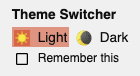
Of course, you can create such code yourself, but you can simply use a ready-made element (web component) that I created specifically for this purpose. It's called <dark-mode-toggle> and adds a toggle (dark mode: on / off) or theme switcher (theme: light / dark) to your page that you can completely customize. The demo below shows the element in action (oh, and I've discreetly used it in all of the other examples above ).
<dark-mode-toggle
    legend="Theme Switcher"
    appearance="switch"
    dark="Dark"
    light="Light"
    remember="Remember this"
></dark-mode-toggle>
<dark-mode-toggle> in light mode:
<dark-mode-toggle> in dark mode:
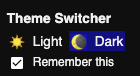
Try clicking or touching the dark mode controls in the upper right corner in the demo below. If you check the boxes in the third and fourth controls, see how your choice of mode is remembered even across page reloads. This allows your visitors to keep their operating system in dark mode but enjoy your site in light mode or vice versa.
Conclusion
Working with and maintaining Dark Mode is fun! New possibilities for design are opening up. Choosing a dark mode can make your user happier. Yes, there are pitfalls and rigorous testing is required, but dark mode is a great opportunity to show that you care about your users. The best practices mentioned in this article and a life hack like the custom <dark-mode-toggle> element should help you create awesome dark mode.
useful links
Prefers-color-scheme media query :
Color-scheme meta tag :
- Chrome Platform Status page
- Chromium bug
- CSS Color Adjustment Module Level 1 spec
- CSS WG GitHub Issue for the meta tag and the CSS property
- HTML WHATWG GitHub Issue for the meta tag
dark mode:
- Material Design — Dark Theme
- Dark Mode in Web Inspector
- Dark Mode Support in WebKit
- Apple Human Interface Guidelines — Dark Mode
: