Alexander studied at the Higher School of Economics at the Faculty of Physical and Technical Sciences and chaired CocoaHeads meetings until he left Russia. He participated in various European and American startups, but at the same time managed to work full-time at Badoo in London. Now Alexander participates in projects in equity. In his speech at the App Live 2019 conference, Alexander toldabout what helped him make the project profitable, and what path he took for this. His story - from idea to result - we transcribed and publish today.

Idea
A long time ago I thought that the idea was like this: I sat down, brainstormed with friends, invented, implemented - cool! But I am more and more convinced that the opposite works for me: the idea evolves over the years and at some point fires. This project was no exception.
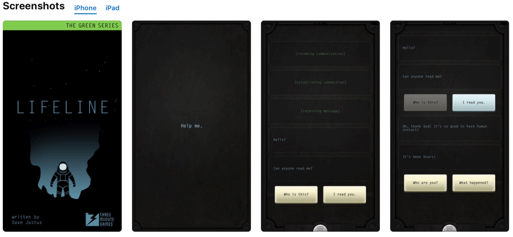
It was 2014, with Interstellar and a bunch of space-themed apps and collections from Apple. Then the Lifeline app appeared in the App Store. This is a chat story where a person found himself in an unknown place on an unknown planet. In the chat format, you could correspond with an unknown character and tell him what to do:
Having become interested in the genre, in 2015 I made my application, taking a romantic trip with a girl as a basis, because it seemed to me that this was a popular topic:

We quickly creative with a friend, but received a reject from Apple - due to the "diversity" - and I forgot about this project. Then we managed to upload it from another account and go through the first time - I think this is a typical story with an Apple review.
In 2018, when I was working at Badoo in London, I took various online courses related to product management and analytics, and saw so many interesting things that I wanted to apply, so I had the idea to launch a new text story.
First idea
First I ran the blogger simulator, then the Norse mythology
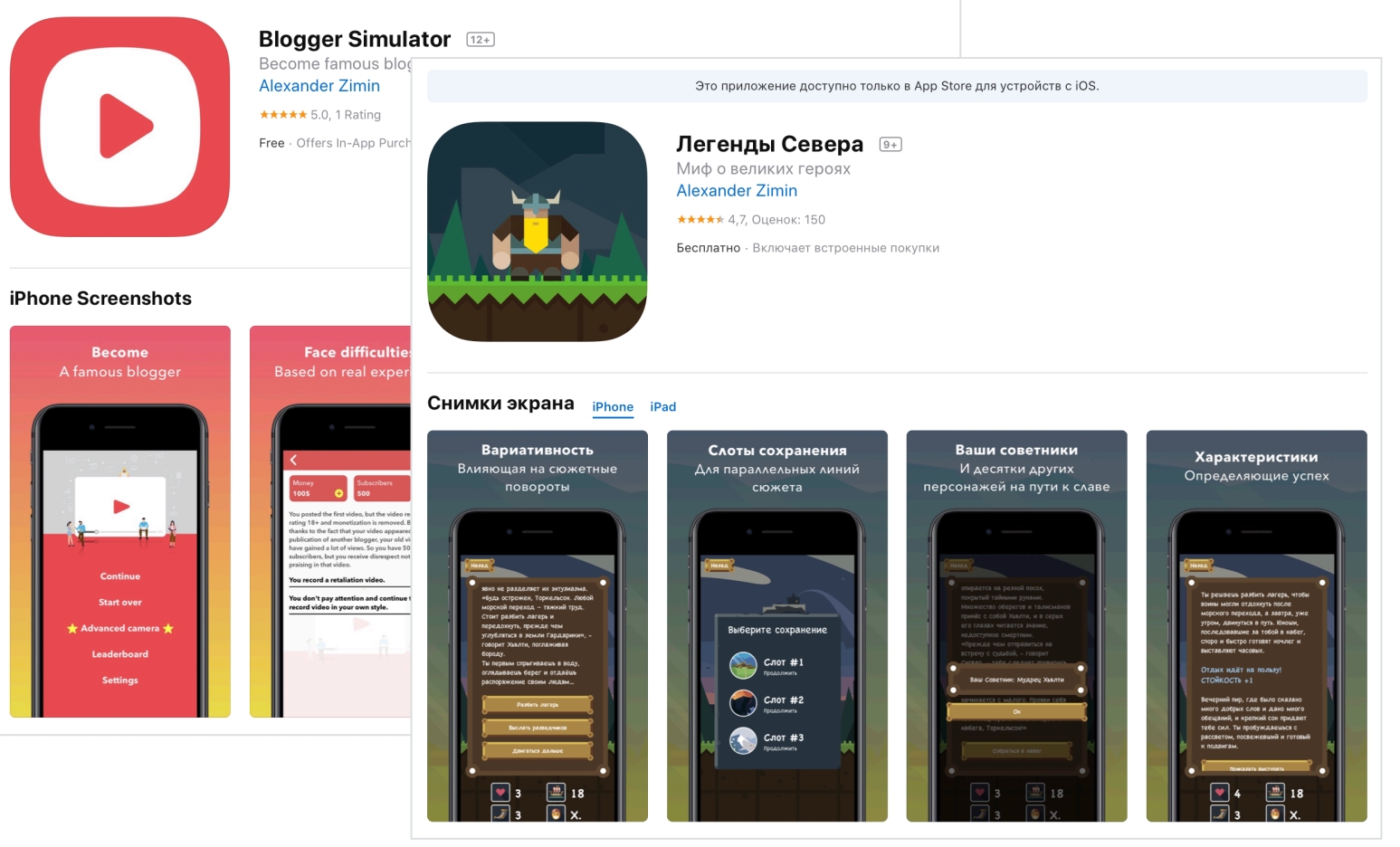
app : These apps had a scalability issue. Too many resources were spent on promotion, on advertising, and the audience did not always perceive them - it was not clear who to target.
Second idea
I decided to launch a text story marketplace. Looked at the market using Sensor Tower , which shows predicted installs and app revenue for the previous month. And I saw that in this area there are many large players who earn millions of dollars and even more:

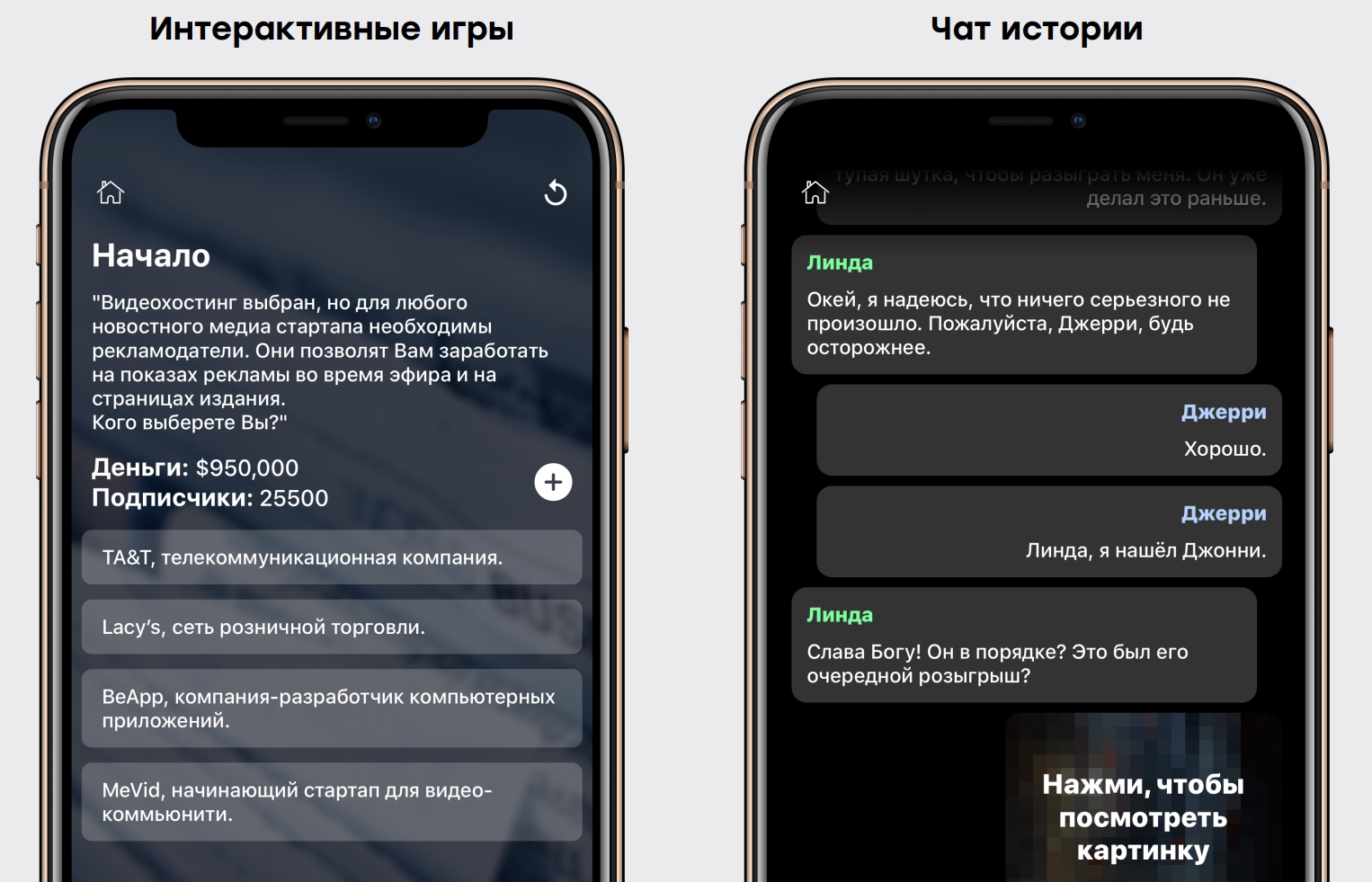
We launched interactive games with a choice of options with additional parameters, static and dynamic stories:

Menu example:
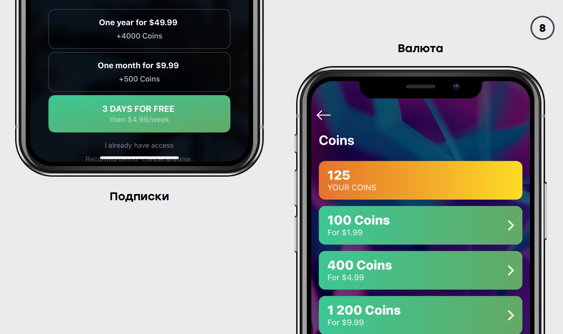
Everything was monetized through subscriptions for additional functionality, through internal currency for buying and advertising:
conclusions
- Successful ideas are those that have been in your head for a long time. I have never been able to come up with an idea in an evening, and the next day to make a successful project, albeit for a long time.
Diversity is serious: Apple is banned.
What knowledge and personal qualities were useful
Facebook Ads
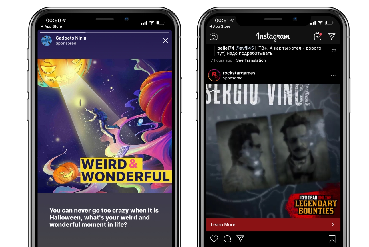
Of course, the first is knowledge of Facebook advertising. If you do not have the ability to distribute your application, then it is in a dead zone, from where people do not download it. Facebook ads can be found on Facebook itself, as well as on Instagram, Facebook messenger and partner platforms. For example, this is how it looks on Instagram - you open stories, you see a sponsor there and you can swipe to see more details. Or, for example, flipping through the feed, you can poke a post and see:
But Facebook ads are cool not only because of their placement channel, but also because Facebook uses machine learning algorithms to figure out who to target. If you have mastered the SDK at least a little, then you can easily choose what you want to pay for, for example, for installations or for some actions within the application. Moreover, Facebook will display all the numbers, and you can see how much the installation costs for each advertising campaign, and how many leads were attracted:

Data-driven Development
The second important quality is the approach that I adopted during the online courses, and then saw it in Badoo - this is data-driven development:
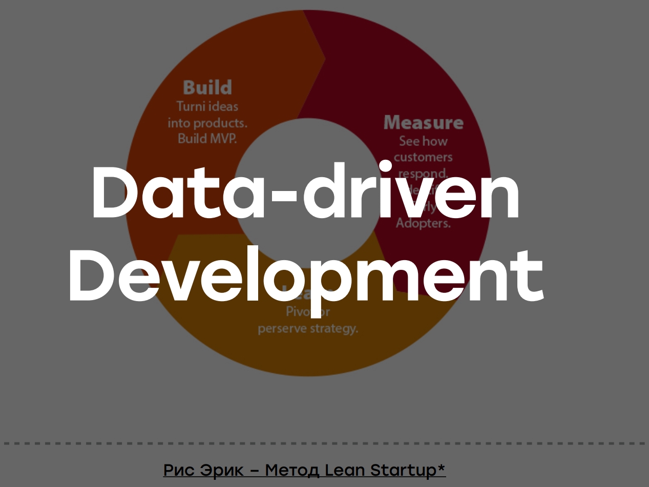
When you have a fairly explicit cycle, then, building your product, you choose what you want to analyze (for example, a feature or a bug), weight it with analytics and decide whether to leave it or not. Depending on the data received, you either leave this feature and iterate over it further, or remove it altogether.
Likewise with a product - you either evolve it, or close it altogether, or make a so-called pivot when you think: OK, this business is probably working, but I'll go to offline books because it seems to work better.
We had a bunch of diagrams, dashboards in analytics, on which we analyzed everything, found insights, watched how it worked, and watched how the product evolved:

Ability to defeat laziness
The last very important quality if you undertake to develop a pet-product is to overcome laziness. You write the code half the time (if you are responsible for it), and the rest of the time you fight all kinds of bullshit. This second half is a terrible stage, I had to (especially in the early stages) often overpower myself:

Where I had to overpower myself:
- . ? , . , , . Google-, , , , . , , .
- .
- , . .
- Sensor Tower, App Annie .. – ! , , , . App Annie 20.000$ . , , , . : , - , . , .
- . , , , .
- You will have to develop your application. It is unlikely that you will be able to immediately launch something successful and great.
- You will have to do boring and non-core work. A lot of boring and non-core work is the key part of any pet project.
How the application was developed
Time
At that time I was still working full-time (this, by the way, to the topic about time), and I was able to work only in the evenings. We partnered with an acquaintance of mine who already worked in this area, just after trying to make the first application in 2015:
- Phoned and thought about an idea (July 11)
- Began experimenting with design and studying competitors (12 July)
- We started writing code (July 13)
- Released (August 7).
That is, in less than a month (when working on evenings and weekends), the project was ready.
Design
We didn't have a designer, but we decided to do it simply: we looked at our close competitors from the big game. The choice fell on Netflix, we thought - why don't we make a similar interface with adaptation for our components?

Such an interface was drawn in an hour:

Now I will express a thought that has greatly changed my view of some things: where you start, so finish. We drew the design in an hour, and in the future we spent about a thousand hours on the project in total, but the original design, as you can see, has not changed much:

New components appeared there, for example, a recommendation system, but in general the interface remained old. The screen of the game itself has also evolved minimally: the "Vote" button has moved, tags have appeared, the interface has changed slightly, but in general everything is the same:

With games, evolution was a little more interesting. I would say there is a new genre or style of play. But if we talk about interactive games, they have not changed at all:
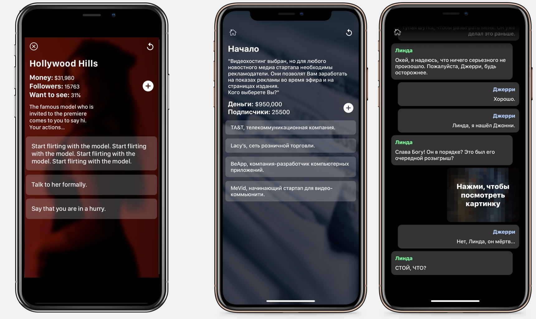
That is, the design drawn in an hour formed the basis for the entire subsequent year of work with the project. This gave me an idea, which I will talk about a little later.
Errors that were made during development
In my opinion, there were two blunders:
- A full-fledged analysis of competitors was not carried out, which is quite important, but again refers to the point when you do non-core work and you are lazy.
- 2 complex mechanisms were introduced, which took a total of 40% of the time and did not pay off.
Let's look at these errors in order.
A comprehensive competitor analysis has not been carried out. These are several competitors from our niche: some earn millions, others hundreds of thousands of dollars. The idea is that we looked at what they are, but didn't pay much attention to the details. Therefore, we started with interactive games:

Interactive games, where there is a choice and some resources, take a lot of energy: on average, it is 20 thousand words. You need to write a mechanism - the so-called engine that will allow you to manage the forks - then test everything, and any upgrades in terms of additional monetization mechanics are difficult, because the games between each other are very different.
At the same time, competitors were making a static chat of stories, where you just read the chat - and the average game fits into a thousand words. It can be assumed how much more difficult it is to make a game with interactive mechanics for 20 thousand words and hard-to-test monetization against static chat stories for a thousand words, which are all similar between each other and simply contain text:
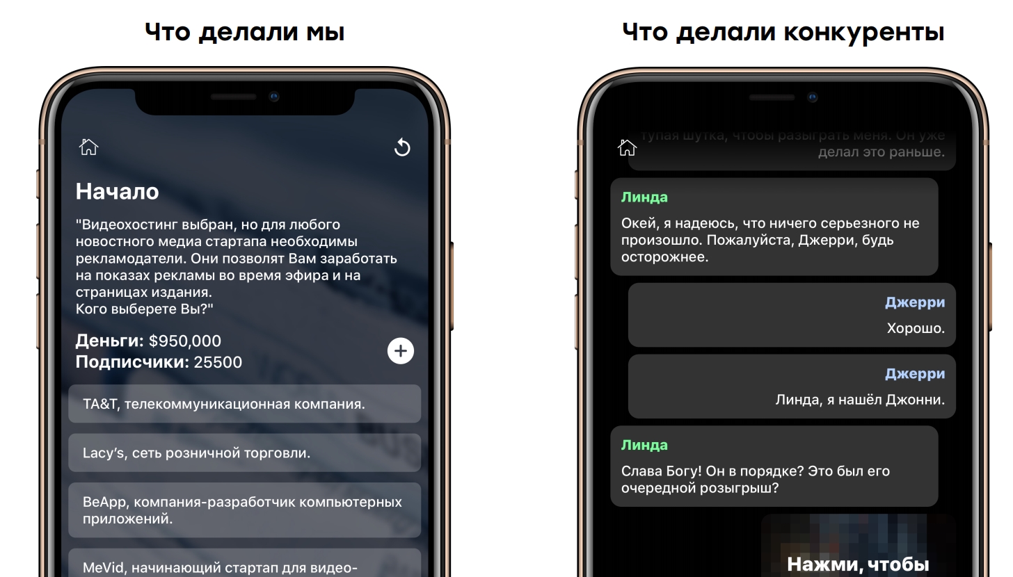
When we implemented it into the application, it turned out that we profitability increased by 30-40%, traffic became easier to drive, and most importantly, the development of such static stories wasted much less resources.
2 complex
Schering mechanisms were introduced . For some reason we thought people would share - that's cool!
How it was done:
- Vendrily Branch.io;
- We made a preview for branch.io in html, uploaded pictures to github, because we didn't have servers;
- We did the processing of deep links and collection for analytics.
In general, a lot of work was done, but for the whole year sharing brought us 20 dollars. In my opinion, it was necessary to do something simpler:
- Make a basic controller for sharing Intent.createChooser / UIActivityViewController and inject analytics on it;
- Logging on click.
That's all! Then we would quickly see that people are not sharing the application (at least in this configuration), and we would refuse to share (or figure out how to implement it differently).
The system for analyzing the authors' profit
For some reason, we thought that we would launch a marketplace, people would play, a lot of subscribers would appear, and we would need to analyze how many people are playing in each game, as in all subscription services (Netflix, Apple Arcade). We developed a complex system for assessing the profits of story authors and covered it with tests. She worked with scripts and analytics to measure the profitability of each story writer. But there was no profit, since the authors did not have to be attracted for a percentage. That is, this work was done just like that.
conclusions
Despite this couple of mistakes, we launched on Russia, brought 12 thousand users of paid traffic, but earned only $ 838 - it is clear that this is not profitable:

It would seem that the project is over, but no. Already a year later, with the same figures, we had 13 times more income. But how much did the attraction cost? This is a complete export of statistics per acquisition. Of course, there is organic there, probably 35 percent. Paid marketing has cost us 35 cents for an average install. At some point (February-March) we reached a payback, but in general, a year later, we came out in a plus:

But this would not have happened if the application had not evolved.
Application evolution
A lot of people who started pet projects and failed, simply stopped releasing the application, or didn't evolve it enough. Therefore, this stage, in my opinion, is the most important, and it is worth talking about it.
How the app evolved:
- We started in Russia and the CIS countries, where content and, most importantly, installations were very cheap. This allowed enough traffic to be driven to test product hypotheses. And already at that moment when we knew our unit economy, we were able to go out into the world.
- We ran 28 A / B tests;
- Have come up with a way to measure the effectiveness of absolutely everything;
- Tried a B2B destination that didn't work;
- Reached payback;
- They discovered a terrible secret.
First things first, let's start with testing.
What's the best and worst icon?
This is a conversion of different icons. The first icon was unrealistically bad, and the last one was unrealistically good. All the others had approximately the same conversion:

To analyze the conversion, we used App Store Browse: Product Page Views / Impressions, where only the icon and name are visible. We watched the conversion of those people who saw the application and went to its page. There is also the AppFollow service, where you can see for your category what the average conversion is for such conversions. So we saw that we were ahead of the conversion in our category.
This useful practice greatly increased our organic matter, and spent, at most, two hours of time.
A / B tests
Let's say you have a hypothesis that if you make a button green, more people will click on it. You divide your audience in half, show half the old red button, half the new green button, and see what percentage of people click on it:
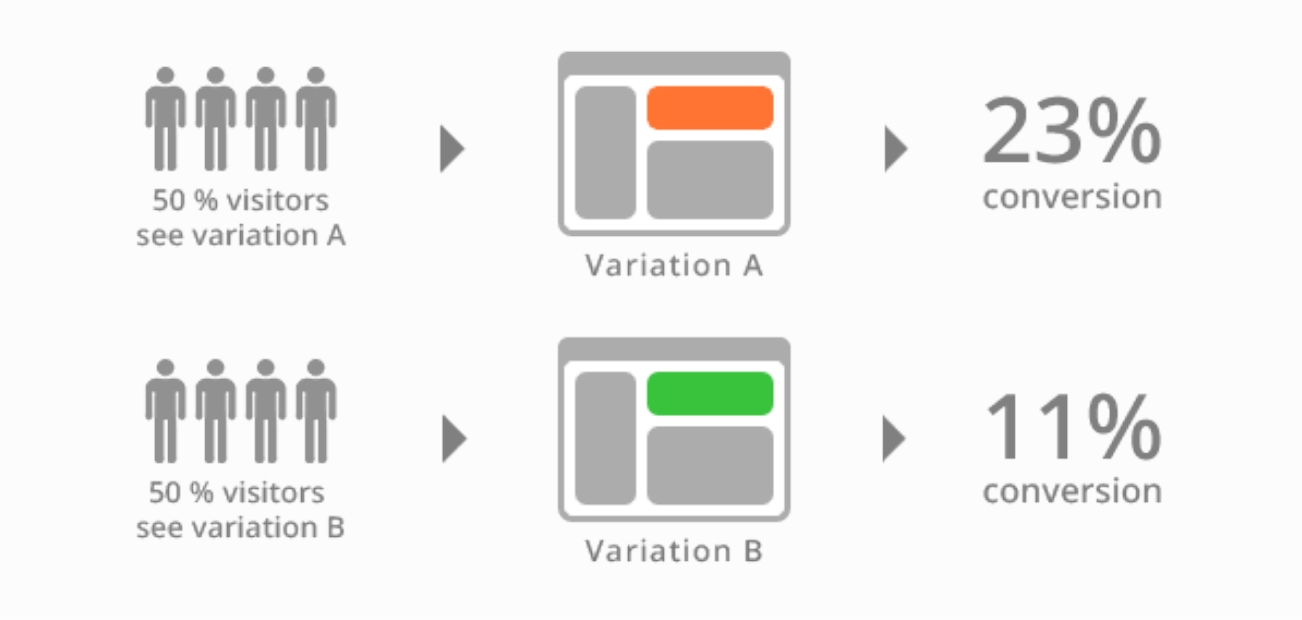
If suddenly the numbers turn out to be significant, then you can just move to the green button and then the conversion will increase.
Example: the start screen of our application. At first we had the main start screen with all the games and stuff, but we found out that people get confused not knowing where to click and not knowing which games to play. We made a fairly simple screen for new users with just two buttons that would go to the two most successful games (depending on user preference). This greatly increased the conversion rate:
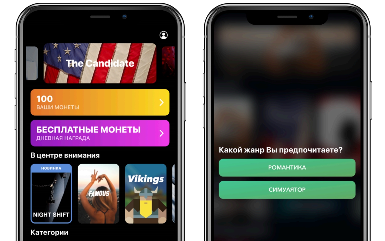
How to test hypotheses and make money on Swift with split tests
Since this is a pet project, we had a Google document where I conducted split tests: what they are, a link to analytics, what groups were, and marked with color which split tests were successful, which failed, and why unsuccessful. Such analysis seems like a routine job, but after a year, especially when you haven't used it for a long time or you need to change the overall app monetization model, such documents help a lot:

Let's go back to A / B tests. Any A / B test has a goal (metric) that you want to change. We had 2 metrics:
- Conversion to purchases (profit);
- Game session length.
After 6 months (and 28 A / B tests), our revenue per user has tripled.
Where to get ideas for A / B tests
Very often, when I communicate with people, they have a question: "I launched the application, everything is cool, but where should I evolve next?" This means: where to get ideas for experiments, for tests? The logical answer is to brainstorm (just make up), but that's not enough. For myself, I brought out three main sources of ideas:
- Study competitors;
- Search for insights in analytics;
- Collect user reviews.
I'll tell you about each source in order using real examples.
Study competitors
Many years ago there were many articles on the Internet on how to request user permission:

Almost all authors said that you need to make a custom window, ask only within the context, gave examples of the Lift application (this is an analogue of Uber in the USA). We also had such a beautiful alert: The

main motivation of the authors was that if the user refuses the system dialogue, then he will have to conduct it in the settings so that he gives permission, and if from the custom one, then you can ask as many times as you like until the user will agree. We experimented with places, thereby increasing the conversion a little. But from the analysis of fairly large competitors, it became clear that they ask for access rights to notifications at the start of the application. We thought why not try:

We conducted a test where one group had an old beautiful screen that asked about the context, and the second asked at the start of the application:

Result: the difference is 8 times! Due to the unrealistic difference, the experiment took only 3 days:
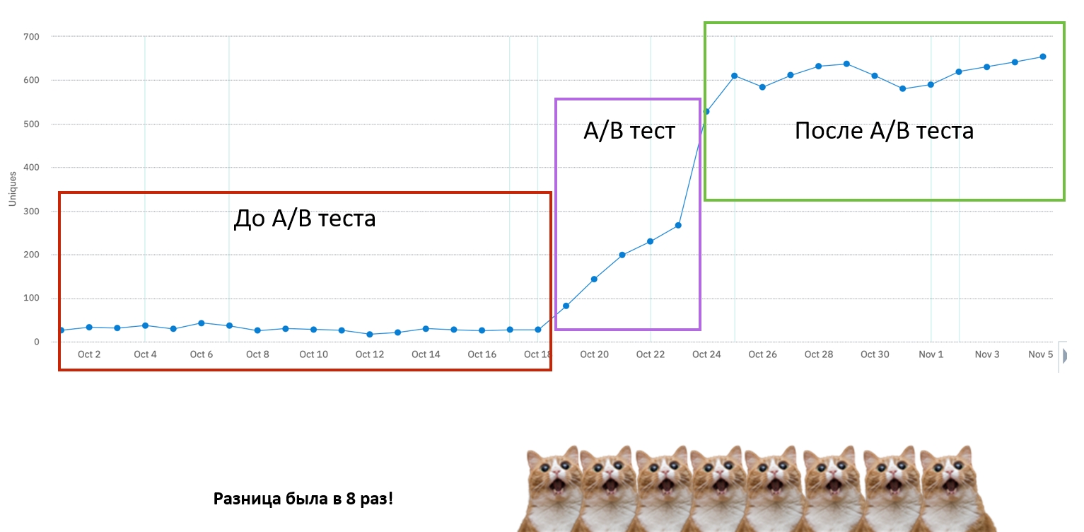
That is, initially only 8% of the entire audience was given access, and when we started requesting on the start screen, they became 50%. Probably, you can somehow increase this parameter, but 50% suited us. I'm not saying that in your case, you also need to ask at the start, I just show that such experiments allow you to understand what is better for your product and what is worse.
Search for insights in analytics
We had 3 groups of people:
- Who installed by advertising and got into the main menu;
- . : - -, , , . , , , .
- . - , , , , . .
We decided to conduct an A / B test, which I already told about, where some of the people who did not get into a certain story, we led to the screen, where our two most popular stories were:

Already at the next visits or when the "EXIT" button was clicked to the main menu. This increased the conversion to a purchase by about 30% and lengthened the average gaming session very much.
Collect user reviews
Usually, user responses say a lot:
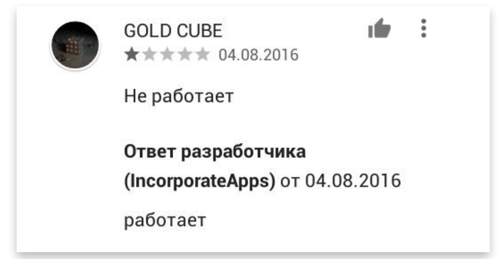
For example, many users complained that they did not have money (they still complain, but less so), and the game's monetization is very aggressive. Indeed, since our KPI was an increase in value, we noticed that in six months we turned monetization into a very aggressive form. At that time, we had a lot of screens where the following types of subscriptions were offered:
- Viewing pictures for subscribers only;
- Waiting intervals of 15 minutes every time;
- Closed stories;
- Additional mechanics, such as collecting evidence in stories related to the detective;
- Coin multiplier;
- ...
We decided to see what factors motivate a person to buy, divided the subscriptions into three groups, and started counting how many times the user saw each screen before buying:
- View pictures for subscribers only
- Wait intervals of 15 minutes once in a while
- Other screens (closed stories, additional mechanics, coin multiplier, etc.)
It turned out that if a person sees a locked screen of the first two types twice, or only once of the first type, then he most likely has already bought a subscription. And if he didn't buy it, he would buy it with only a 7% chance:

Then we decided for those who fell under the above conditions to introduce the following mechanics. We offered such a user, after watching a certain number of advertisements (depending on the mechanics), to get a feature (closed game, closed picture or timer skip) for free. If he wanted, he could always buy a subscription. It turned out that this increased income by 5-10%, but more importantly, it greatly lengthened the gaming sessions:

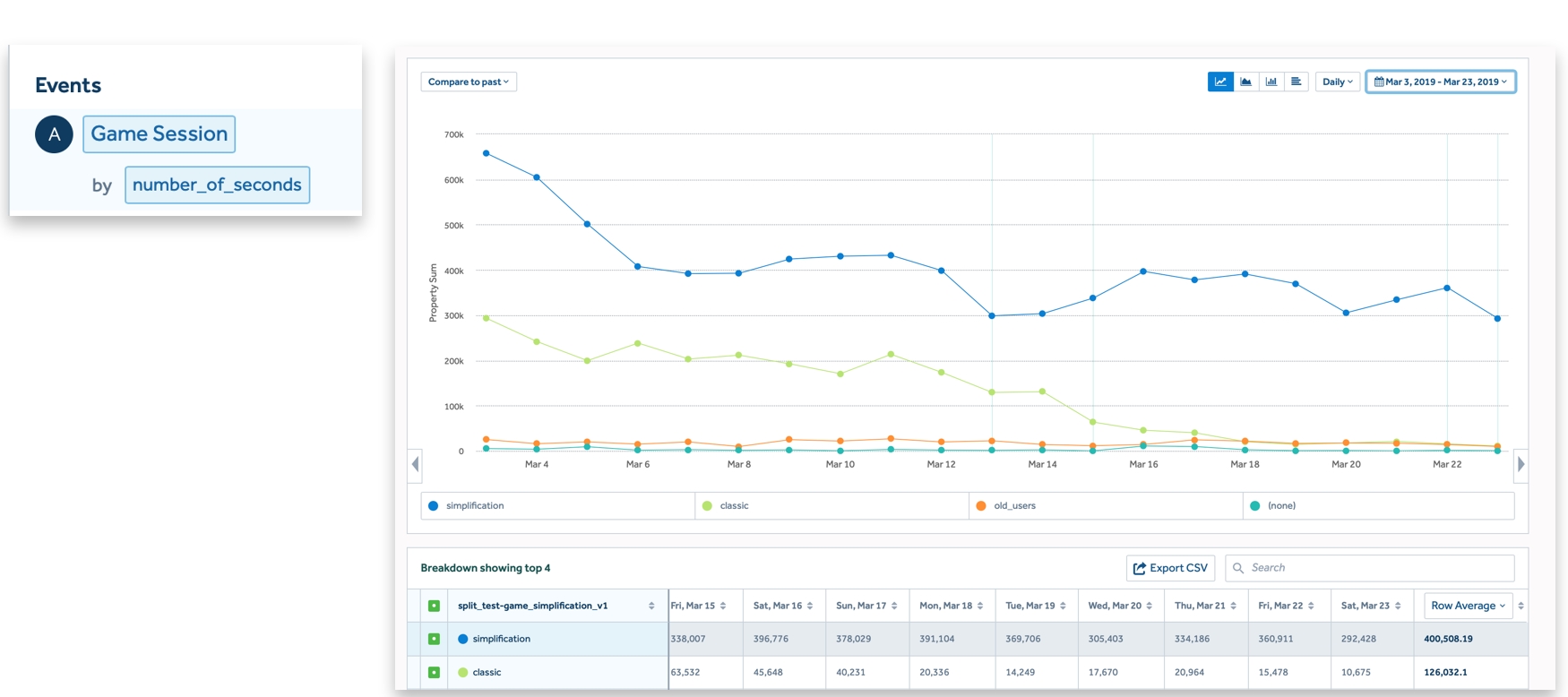
We had a split test. We split the audience in half. The green line is the number of seconds per day per user in the old group, and the blue line is the group where we have already simplified the mechanics. It turned out that people started to play 2.5 times more, and their income increased. Thus, we made life easier for people and increased our income:
How was the growth analysis done?
Until November 2018 (3 months after release), our KPIs were pretty simple:
- Buying currency or full subscription (priority # 1);
- Buying a trial subscription (priority # 2) is a slightly less priority metric.
But this was not very effective, because we could not know how many times money would be debited from the user (which happens after a real subscription). After November 2018, a series of iterations began. We wrote a script that analyzed revenue per user, and this became our main metric. In literally a month we iterated through many experiments:
- Figured out which ad converts best users;
- Understood which stories should be translated into English, which ones to lead the audience to on the start screen;
- Conducted a string of financially successful A / B tests.
By the end of December, they decided to go out into the world.
Outcome
The development of any project is a big stage in life, full of trial and error. Most importantly, there will be features and experiments in which you will invest a lot of effort and they will not pay off, but this is an important experience. Once you stop taking risks, the product starts to stagnate.
It was a challenge for us when we introduced a model where a person had to do some interesting mechanics in the game (in history), or open some secret level, or just completely complete two games. For this he received an additional reward. The funny thing is that challenges not only did not increase retention, but even slightly reduced it. For some reason, audience engagement has dropped.
Or, for example, we did an experiment when we offered to get the maximum functionality and a bunch of coins just for bringing a friend to install the application. It turned out that because of this, monetization sank a little, but in the end, the people who were brought in just installed the application and did not sit in it. This also turned out to be unprofitable, although in words it seemed very cool.
But as soon as you stop doing such complex experiments and think: “OK, I'll only spend 2 hours on a project on the weekend, I'll do something simple that is guaranteed to work,” - your product starts to stagnate and stop showing growth.
Your initial vector is very directional.Now I will most likely go into the field of medicine or ecology. It seems that there is not much money in the initial stages. But it's like with design - at the start you can spend literally an hour choosing, and then you will realize that you have already spent a thousand hours and your initial choice is still with you.
Developing your project is hard work , but it turned out to be very interesting and opened up a lot of insights.
One more thing - subscriptions
In fact, there is one more important detail, without which the report would be a wonderful fairy tale, but in fact it is not, at least for me. Everything that I will talk about next is partly data, partly my own guesswork. I may be wrong about some or even all of the cases. Draw your own conclusions.
Anomaly
When we started going out to the world (USA and other markets) and analyzed subscriptions in the USA, we noticed an anomaly:

On the screen we see how many times a subscriber in the USA pays for a subscription. In this case, a trial subscription is considered. Initially, 12% of people convert from a trial to a paid subscription. The situation is similar for other types of subscriptions and for other countries.
For a specific group of subscriptions, we noticed that 13% of paying users pay more than 13 times. To be precise, by the 20th charge, this number becomes 10%, that is, it does not change much. If the charge is $ 5-10, then some users bring more than $ 100-200. That is, 1.56% of all users who take the trial pay more than 13 times. For this sample, there were 40 of them for a certain period:

OK, our product is probably so great that someone is willing to pay $ 100 or more for it! We open the analytics and see that the retention of the third month for the same users is only 0.3%:
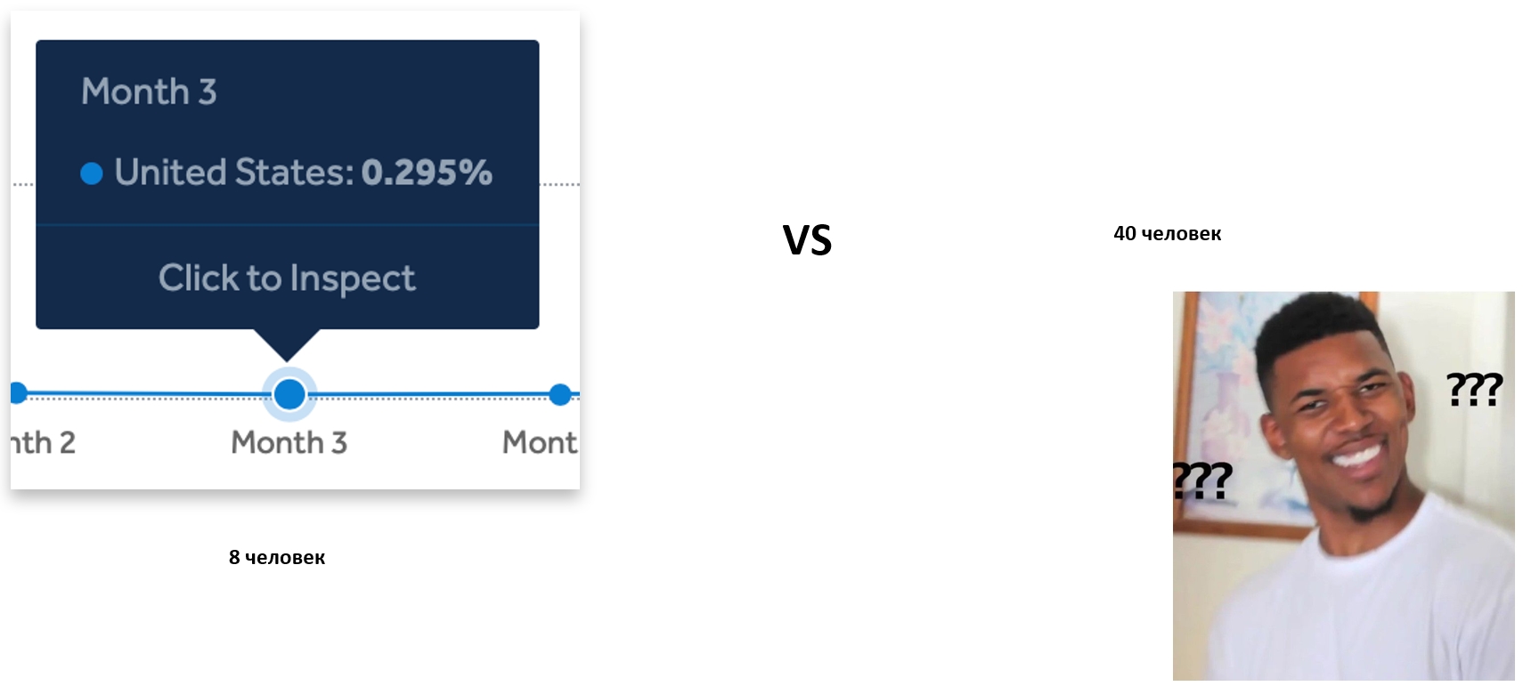
That is, there are only 8 people, about whom we cannot say that they are actively playing, versus 40 who actually pay. Of course, we began to ask questions: what is going on?
I formed the idea for myself that many people, especially in the USA (it depends of course on your market), subscribe inside our application, but do not unsubscribe for months, not even using the application, just bringing money. Most importantly, it turned out that this market is much larger than we would like. For example, take Calm. This is an application that was once valued at a billion dollars. Its profitability is now $ 4-5 million. But I managed to get retention on it, and in fact the retention of the week after the 30th day was only 2%, and the retention of the 90th day was striving for 0:
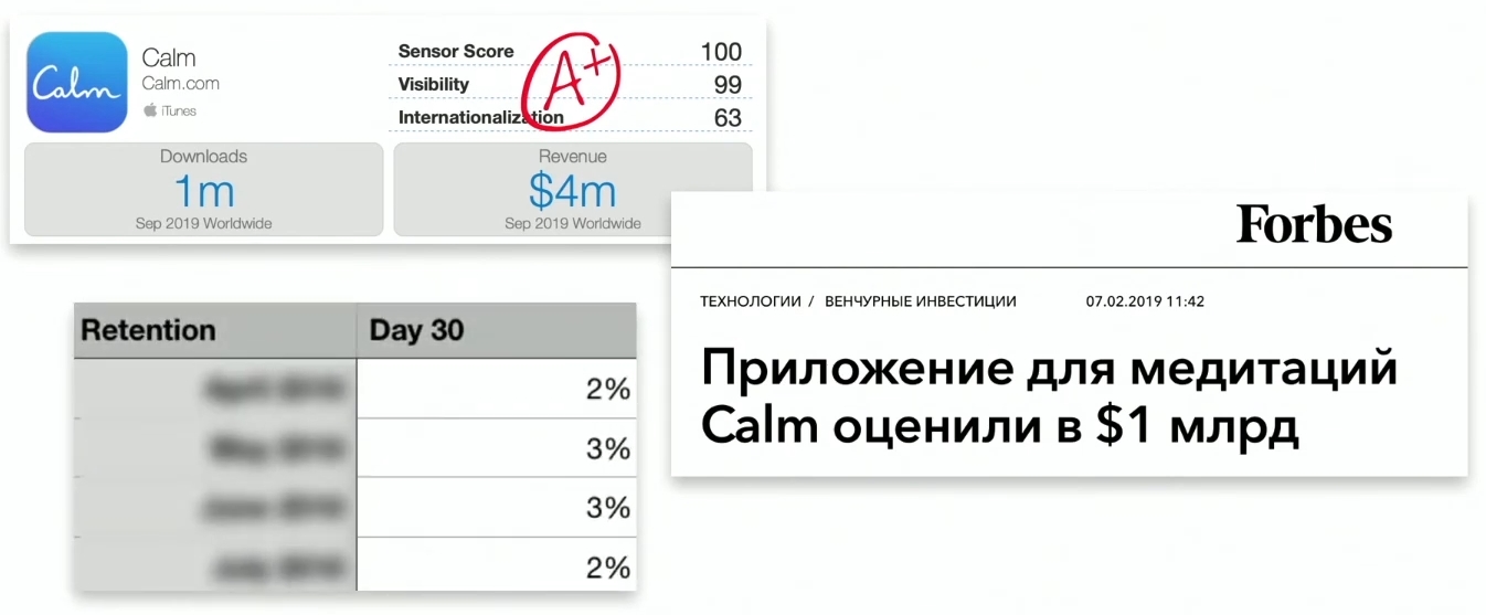
That is, after a while people simply do not use this application. It turns out that each user brings $ 4.
But if you open user reviews and rewind them, then even in the Russian market, every second person says that this application simply takes money: Although, for example, even in our application there were 3-4 such reviews for the entire time, and then they appeared much later. And here is every review! This hints at the exploitation of the same technique, only on a large scale:

But let's go further. I took one application as an example (I will not say which one). Interestingly, from 2015 to 2017, their income per month has grown 20 times, and today it is more than 40 times. But the most important feature is that this application does not grow in the number of installs per month, therefore, its retention is also not very large after years. This is just a cumulative effect, or they are product geniuses and were able to increase profitability by 4000% without changing the core of the product:
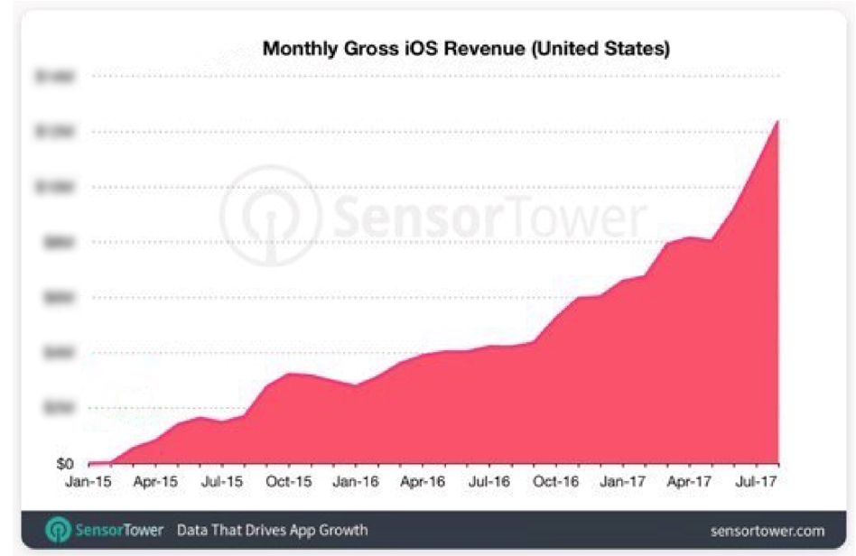
It became more interesting when the New York Times released its semi-investigation that the money passing through the sphere of mobile development horoscopes reached 2 billion dollars. Let's look at one of the applications related to horoscopes (I was told that Russian guys make it):

They have 2 million dollars, and they haven't even made an Android version - why? I will talk about this a little later. I just want to show and list a little the mechanics that tough dudes use.
Let's say we have downloaded a horoscope app. It thinks for a long time, apparently, it loads some flags from the server, we won't guess why (we are not conspiracy theorists). Then a series of micro-comments begins when the application requires your time and your investments, perhaps it is generally personal data, as in this case: who I am, when was I born, what is my status. There are many such details.
Then it starts even more fun: hand scanning. It takes about three minutes, but, of course, there is no talk of any hand scanning - you can scan anything you want (guitar, battery, etc.). Then a long setup takes place, but in time it will be the same, even if you do not scan your palm. Probably, unreal loads are required to send 10 kB JSON. But not the point. The main thing is what happens next.
After you put so much effort into the application, you just get a blocker:
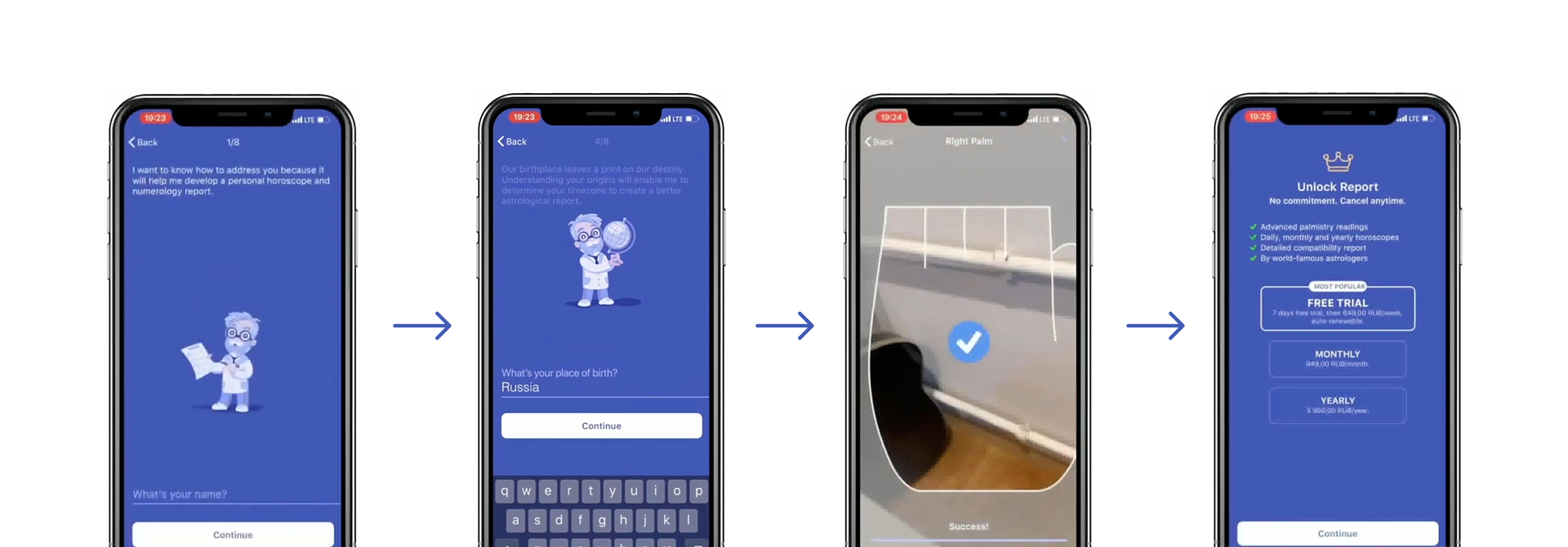
It is logical to assume that if you press CONTINUE, then you will be subscribed to this wonderful trial. And the trial works simply: after 7 days, if the person does not unsubscribe, they will start charging him, in this case, for $ 10 per week. That is, if they have 20 recharges, then they will earn $ 200, if 40 recharges - $ 400.
Don't feel like this is only for small projects. Large applications use this to a greater or lesser extent. Here is, probably, an application familiar to everyone:

It can be seen that they always have much more installations on Android. Let's take a look at their start screen. Honestly, it's better. If you click on the "Decline this offer" button, you can skip the subscription. But if you click "Subscribe Now", then of course you will also get to the trial. In this case, it is 3 days, and after 3 days the price is 1.5 thousand rubles:
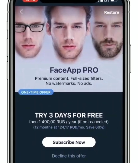
These apps have a lot of different in-app purchases. For example, this one has 20 of them: for a different market, for a different audience there will be a different price. Understandably, the behavior and income of users from market to market are very different. On iOS, their profitability is very nice compared to Android. They receive 900 thousand dollars of income on 600 thousand installations:

I also decided to find out what their retention is. It turned out to be smaller than Calm.
This brings us back to an important topic. Recently there was an article entitled “Annual income per user on iOS for many top applications is from x2.5 to x25 times higher than on Android”. We can assume that iOS users are really so rich, but the article provides a link to games, where even for successful games this income differs by 2 times. These are games, usually x1 on iOS and Android:

But the applications, and some of them are not taken here, which have x350 or x25:

It's clear that this is all thanks to subscriptions. As a result, many applications:
- Targeting stupid audiences. Hello Facebook! - because Facebook allows you to optimize for leads. You just want him to lead you to people who click on the trial, and he will do it for you. You don't even need to be a genius or get a base of such users from somewhere.
- They force you to make micro-commits, as I have already shown - to waste your time, to invest your energy.
- Do blocking screens of subscriptions, although Apple prohibits this. Of course, many applications make it non-blocking for the duration of the review, but Apple knows how this market works. I talked with a man, I will not say who he is, and he said that everyone knows everything.
- Gesture when installing through deep links. This topic requires a separate discussion.
- Exploiting the fact that people forget about subscriptions.
Default option
People themselves are stupid - this is an argument I often hear from those who do this. There is an interesting statistic: the percentage of people willing to donate organs after death:
- Germany - 12%
- Belgium, which borders Germany - 99%.
It seems that in Germany people don't really want to be donors. But no, everything is much simpler. These are statistics from 2017, and then Germany had a rule that if you want to be an organ donor after death, then you need to apply. And in Belgium, the process is reversed: you need to apply in order not to be an organ donor. This is very noticeable on the numbers: the

blue indicates the countries where the rule is that in order NOT to be an organ donor, you need to submit papers, and yellow - those where you need to submit in order to become a donor. It's not that people in "blue" countries are good and kind. Both there and there there are serious programs to inform the population about what you need to become organ donors and why. But, as you can see, even informing works 4 times less efficiently than the option "by default".
In my opinion, one of the solutions that can be implemented in Apple is if you took a trial subscription (because this is the main exploitation tool), then after its completion, when you enter the application, you need to ask: “Do you definitely want was the money written off? " If a person does not come, then in no case should you write off.
conclusions
- More than 10% of the top 250 most profitable apps use this tactic. And this does not mean that 10% have a subscription or trial. This is more - those who are directly gesticulating with blockers, exploiting the tactics of micro-commitments.
- Investments in the horoscope app market alone exceeded $ 2 billion. This is 20% of Georgia's GDP. There is one more market, about which, unfortunately, I have no right to speak - there the GDP of Georgia is exceeded by a factor.
- «» . , , , , . , - , : , , .
iOS 13
But fortunately, not everything is so sad. Apple started doing something. For example, in iOS 13 they made a feature that after deleting the application they tell you that you have a valid subscription:

There are not very many numbers on this yet. For example, in the article I gave, a person analyzes Calm, valued at a billion dollars:

Here, the green line is the forecast, what would have happened if iOS 13 had not been released. Calm would have continued to grow, its estimate would have increased. But after the release of iOS 13, Calm's profitability began to fall - there were red and yellow estimates, with yellow being more important. This means that for some applications that exploit this tactic, most likely the holiday of money is over.
Of course, not for everyone, and only time will tell the numbers. But we will find out!
Apps Live 2020, , . 21 22 - . .
telegram- , , -. : , , , .
!