Ready? If so, let's get started.
Introduction
CSS Variables are values that are declared in CSS for two purposes. The first is the reuse of such values. The second is to reduce the amount of CSS code. Let's look at a simple example.
Styling page elements
.section {
  border: 2px solid #235ad1;
}

.section-title {
  color: #235ad1;
}

.section-title::before {
  content: "";
  display: inline-block;
  width: 20px;
  height: 20px;
  background-color: #235ad1;
}
This CSS example
#235ad1uses the value three times. Imagine this is part of a larger project. In it, similar styles are scattered across many CSS files. You were asked to change the color #235ad1. In such a situation, the best thing to do is to use the code editors' ability to find and replace string values.
But using CSS variables makes these tasks much easier. Let's talk about how to declare CSS variables. The variable name must be preceded by two hyphens. Let's declare a style variable for the
:rootelement pseudo-class <html>:
:root {
  --color-primary: #235ad1;
}

.section {
  border: 2px solid var(--color-primary);
}

.section-title {
  color: var(--color-primary);
}

.section-title::before {
  /*   */
  background-color: var(--color-primary);
}
In my opinion, this piece of code looks much cleaner than the previous one. The variable
--color-primaryis global because it is declared in the style for the pseudo-class :root. But CSS variables can also be declared at the level of individual elements, limiting their scope in the document.
Variable naming
The rules for naming CSS variables are not very different from the rules used in various programming languages. Namely, a valid CSS variable name can include alphanumeric characters, underscores, and hyphens. It is also worth noting that the names of these variables are case sensitive.
/*   */
:root {
  --primary-color: #222;
  --_primary-color: #222;
  --12-primary-color: #222;
  --primay-color-12: #222;
}

/*   */
:root {
  --primary color: #222; /*    */
  --primary$%#%$#
}
Variable scope
CSS Variables have one useful feature, which is that they can be scoped. This idea is based on the same principles that are applied in various programming languages. For example - in JavaScript:
let element = "cool";

function cool() {
  let otherElement = "Not cool";
  console.log(element);
}
In this example, the variable
elementis global, it is available in the function cool(). But the variable otherElementcan only be accessed from the function body cool(). Let's take a look at this idea as applied to CSS variables.
:root {
  --primary-color: #235ad1;
}

.section-title {
  --primary-color: d12374;
  color: var(--primary-color);
}
The variable
--primary-coloris global, you can refer to it from any element of the document. If you override it in a block .section-title, it will lead to the fact that its new value can only be used in this block.
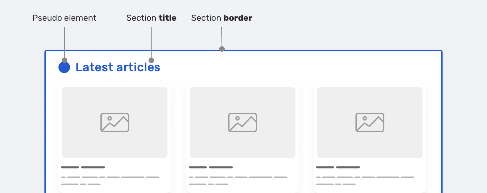
Here is a diagram to explain this idea.

Scope of CSS Variables
This is a variable
--primary-colorused to set the color of the section headings. We need to customize the color of the headings for the Featured Authors and Recent Articles sections. Therefore, in the styles of these sections, we override this variable. The same thing happens with a variable--unit. Here are the styles that the previous diagram is based on.
/*   */
:root {
  --primary-color: #235ad1;
  --unit: 1rem;
}

/*        */
.section-title {
  color: var(--primary-color);
  margin-bottom: var(--unit);
}

/*  ,   */
.featured-authors .section-title {
  --primary-color: #d16823;
}

/*  ,     */
.latest-articles .section-title {
  --primary-color: #d12374;
  --unit: 2rem;
}
Using fallback values
Typically, "fallback values" are used to keep sites running in browsers that do not support some modern CSS mechanism. But here we will not be talking about that, but about how to set the values used in the event that the required CSS variables are not available. Consider the following example:
.section-title {
  color: var(--primary-color, #222);
}
Note that
var()multiple values are passed to the function . The second one,, #222will be used only if the variable is --primary-colornot defined. When specifying fallback values, you can also use nested constructs var():
.section-title {
  color: var(--primary-color, var(--black, #222));
}
This approach to working with variables can be useful if the value of a variable depends on some action. If it may happen that there is no value in a variable, it is important to consider using a fallback value.
Examples and scenarios for using CSS variables
▍Component size control
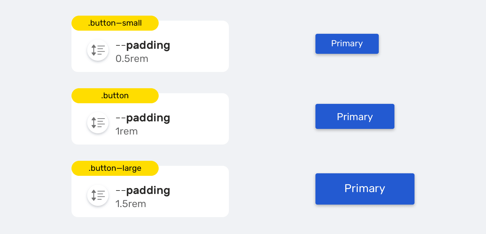
Components of different sizes
Design systems often have, for example, buttons of different sizes. As a rule, we are talking about three sizes (small, regular, large). Using CSS Variables it is very easy to describe such buttons and other similar elements.
.button {
  --unit: 1rem;
  padding: var(--unit);
}

.button--small {
  --unit: 0.5rem;
}

.button--large {
  --unit: 1.5rem;
}
By changing the value of the variable
--unitin scope corresponding to the button component, we create different variants of the button.
▍CSS Variables and HSL Colors
HSL (Hue, Saturation, Lightness - hue, saturation, lightness) is a color model in which the H component determines the color, and the S and L components determine the saturation and lightness of the color.
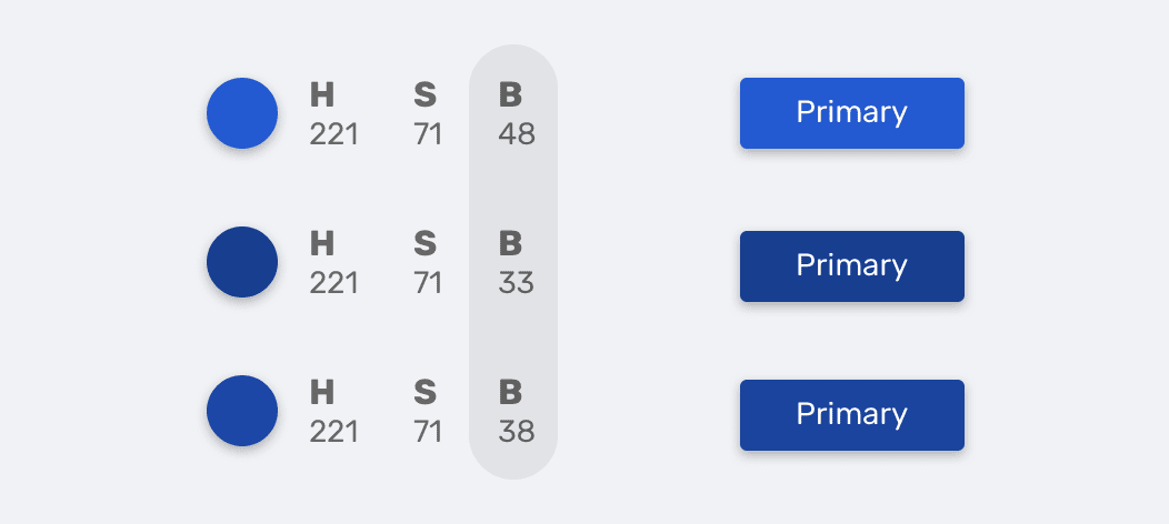
Element colors specified using HSL
:root {
  --primary-h: 221;
  --primary-s: 71%;
  --primary-b: 48%;
}

.button {
  background-color: hsl(var(--primary-h), var(--primary-s), var(--primary-b));
  transition: background-color 0.3s ease-out;
}

/*   */
.button:hover {
  --primary-b: 33%;
}
Notice how I made the button color darker by decreasing the value of the variable
--primary-b.
If you are interested in the topic of using colors in CSS - here is my article on it.
▍Resize elements while maintaining proportions
If you've worked in a design program like Photoshop, Sketch, Figma, or Adobe XD, then you may know about using the key
Shiftwhen resizing objects. Thanks to this technique, you can avoid distorting the proportions of the elements.
There is no standard mechanism for resizing elements in CSS while maintaining aspect ratio. But this limitation can be circumvented by using, as you might guess, CSS variables.
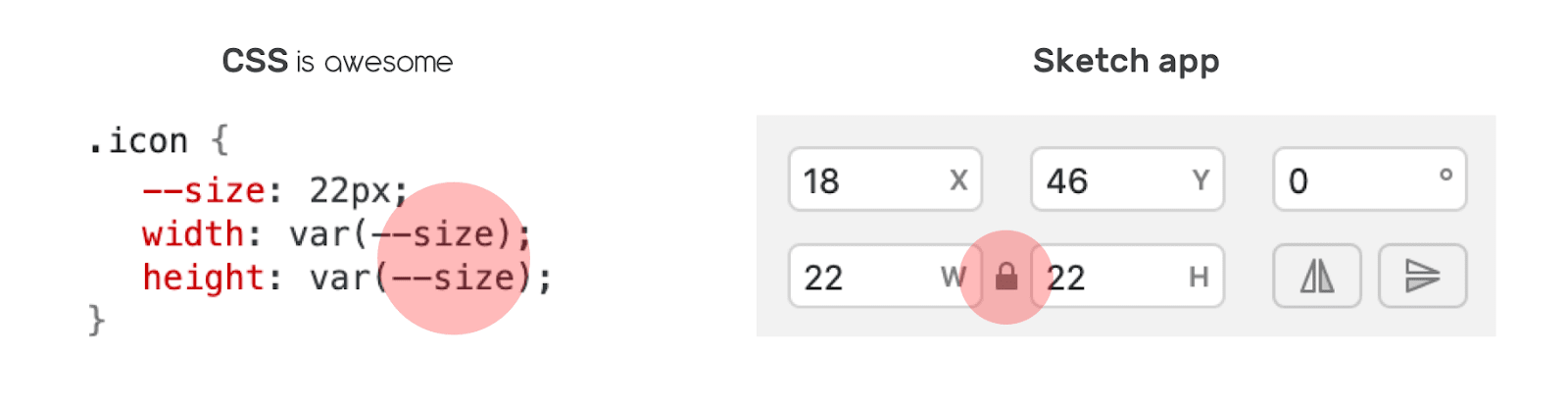
Adjusting Element Sizes Using CSS Variables
Suppose we have an icon whose width and height must be the same. To accomplish this, I defined a CSS variable
--sizeand used it to adjust the width and height of the element.
.icon {
  --size: 22px;
  width: var(--size);
  height: var(--size);
}
As a result, it turns out that this technique simulates the use of a key
Shiftwhen resizing objects. It is enough to change the value of one variable --size. This topic is covered in more detail here .
▍CSS Grid Based Layouts
CSS Variables can be extremely useful when designing page layouts based on CSS Grid. Imagine that you need to make the Grid container render its children based on a predefined width of the elements. Instead of creating a class for each element presentation, which would lead to duplication of CSS code, this task can be solved using CSS variables.
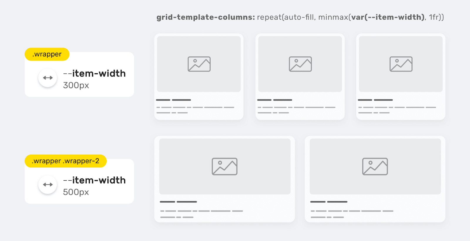
Sizing Grid Elements Using a CSS Variable
.wrapper {
  --item-width: 300px;
  display: grid;
  grid-template-columns: repeat(auto-fill, minmax(var(--item-width), 1fr));
  grid-gap: 1rem;
}

.wrapper-2 {
  --item-width: 500px;
}
With this approach, you can create a flexible grid layout suitable for use in various projects, which is easy to maintain. The same idea can be applied to setting a property
grid-gap.
.wrapper {
  --item-width: 300px;
  --gap: 0;
  display: grid;
  grid-template-columns: repeat(auto-fill, minmax(var(--item-width), 1fr));
}

.wrapper.gap-1 {
  --gap: 16px;
}
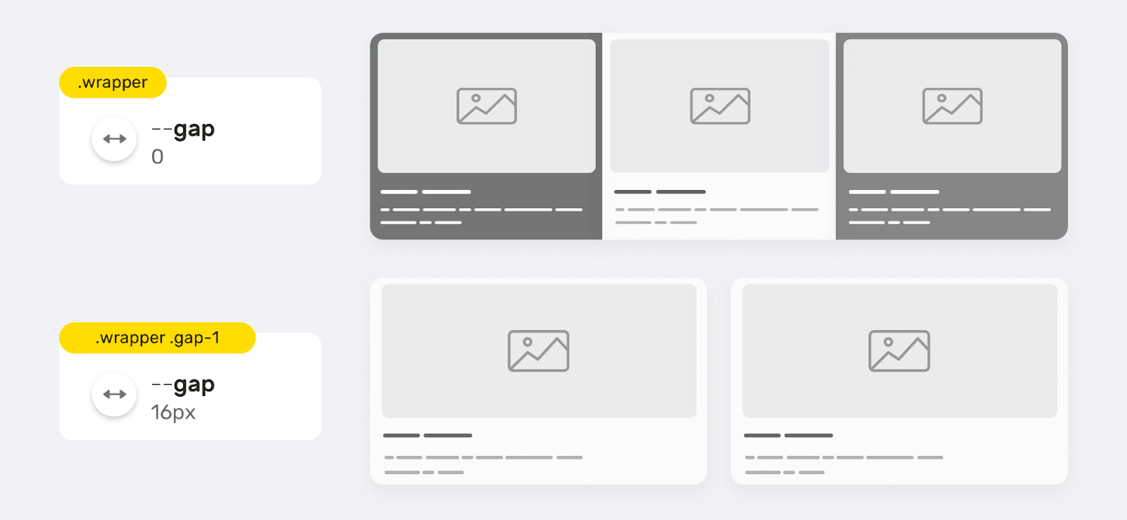
Using the --gap variable to set the grid-gap property
Storing in variable values with a complex structure
▍CSS Gradients
By "values with complex structure" I mean, for example, something like gradients. If the project has a gradient or background that is used in many places in the project, then it makes sense to store their descriptions in CSS variables.
:root {
  --primary-gradient: linear-gradient(150deg, #235ad1, #23d1a8);
}

.element {
  background-image: var(--primary-gradient);
}
In such situations, it is possible to store individual elements of "complex" values in variables. This, for example, could be the angle of the gradient:
.element {
  --angle: 150deg;
  background-image: linear-gradient(var(--angle), #235ad1, #23d1a8);
}

.element.inverted {
  --angle: -150deg;
}
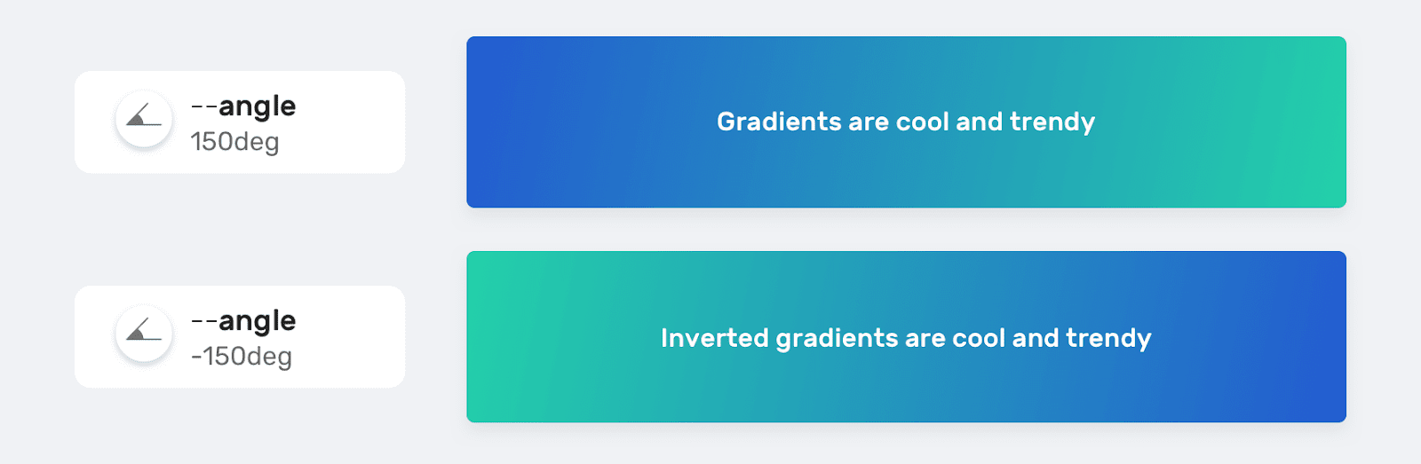
Different gradient options created by changing the variable --angle
▍Position background
As already mentioned, CSS variables can store complex values. This can be useful if you have an element that, depending on what is happening, may need to be placed in different places on the page.
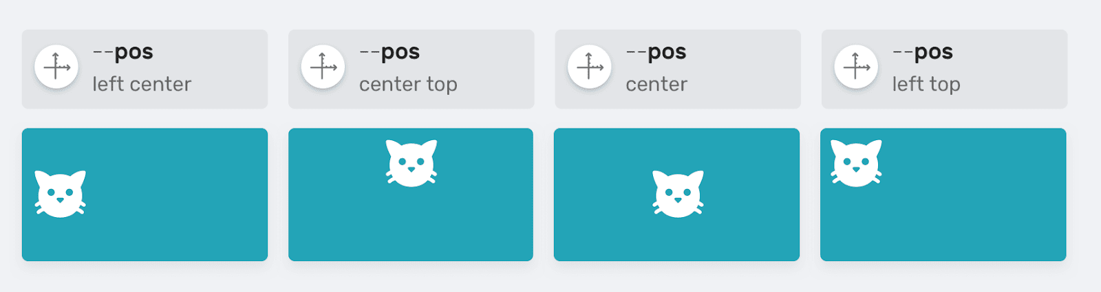
Controlling the position of an element using the --pos variable
.table {
  --size: 50px;
  --pos: left center;
  background: #ccc linear-gradient(#000, #000) no-repeat;
  background-size: var(--size) var(--size);
  background-position: var(--pos);
}
Switch between dark and light themes
Now sites, almost without fail, are equipped with a dark and light theme. To solve this problem, you can use CSS variables, storing information about colors in them and switching between them after analyzing system parameters or settings made by the user.

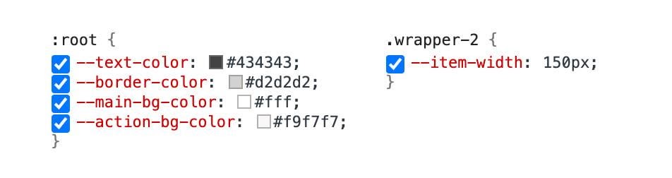
Light and dark themes
:root {
  --text-color: #434343;
  --border-color: #d2d2d2;
  --main-bg-color: #fff;
  --action-bg-color: #f9f7f7;
}

/* ,    <html> */
.dark-mode {
  --text-color: #e9e9e9;
  --border-color: #434343;
  --main-bg-color: #434343;
  --action-bg-color: #363636;
}
Here is a video demo of the above idea.
Setting default values
In some situations, you need to set CSS variables using JavaScript . Imagine that we need to set a property value for an
heightelement that can be resized. I learned about this technique from this article.
The variable is
--details-height-openinitially empty. It is planned to use it in the description of the style of some element. It should contain the element's height in pixels. If you cannot set the value of this variable from JavaScript for some reason, it is important to provide for the use of some default fallback value instead.
.section.is-active {
  max-height: var(--details-height-open, auto);
}
In this example, the default value plays a role
auto. It will be applied if JavaScript fails to set the value of the variable --details-height-open.
Adjusting the width of a container element

Controlling the Width of a Container
Element Container elements used in web pages can have different sizes in different situations. Perhaps one page might need a small container and another might need a larger container. In such cases, CSS Variables can be used successfully to control the size of containers.
.wrapper {
  --size: 1140px;
  max-width: var(--size);
}

.wrapper--small {
  --size: 800px;
}
Inline Styles
Using CSS Variables in Inline Styles can open up a ton of new possibilities for front-end developers that they never knew existed. In fact, I wrote a whole article about this , but here I will still talk about the most interesting ways to use variables in inline styles.
It may be best not to use these methods in production. They are very well suited for prototyping and for exploring various design ideas.
▍Dynamic Grid Elements
For example, to adjust the width of an element, you can use a variable
--item-widthdeclared directly in the element attribute style. This approach can be useful when prototyping Grid layouts.
Here is the HTML for the element:
<div class="wrapper" style="--item-width: 250px;">
  <div></div>
  <div></div>
  <div></div>
</div>
Here is the style applied to this element:
.wrapper {
  display: grid;
  grid-template-columns: repeat(auto-fill, minmax(var(--item-width), 1fr));
  grid-gap: 1rem;
}
Here you can experiment with the example for this section.
▍User avatars
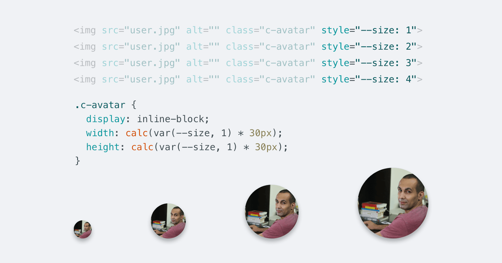
Avatars of different sizes
Another interesting use of CSS variables in inline styles is the creation of elements of different sizes. Suppose we, in different situations, need to display a user's avatar of various sizes. That being said, we want to control its size using a single CSS variable.
Here's the markup:
<img src="user.jpg" alt="" class="c-avatar" style="--size: 1" />
<img src="user.jpg" alt="" class="c-avatar" style="--size: 2" />
<img src="user.jpg" alt="" class="c-avatar" style="--size: 3" />
<img src="user.jpg" alt="" class="c-avatar" style="--size: 4" />
Here are the styles:
.c-avatar {
  display: inline-block;
  width: calc(var(--size, 1) * 30px);
  height: calc(var(--size, 1) * 30px);
}
Let's analyze these styles:
- We have a design
var(--size, 1). It provides a default value. It is used if the value of the variable is--sizenot set using the attribute of thestylestyled element. - The minimum element size is set to
30px*30px.
Media queries
Using CSS variables and media queries together can go a long way toward customizing the values of the variables used across all pages of your website. The simplest example of using this technique that comes to my mind is to adjust the spacing between elements:
:root {
  --gutter: 8px;
}

@media (min-width: 800px) {
  :root {
    --gutter: 16px;
  }
}
As a result, the properties of any element that uses the variable
--gutterwill depend on the width of the browser's viewport. For me, this is just a great opportunity.
Inheritance
CSS Variables support inheritance. If a CSS variable is declared within the parent element, then descendant elements inherit this variable. Let's look at an example.
Here is the HTML:
<div class="parent">
  <p class="child"></p>
</div>
Here are the styles:
.parent {
  --size: 20px;
}

.child {
  font-size: var(--size);
}
The element
.childinherits a variable --sizedeclared in the element's style .parent. The item .childhas access to this variable. I think this is very interesting. Perhaps you are now wondering how it benefits us. I believe the following real life example will help answer this question.
Inheriting CSS Variables
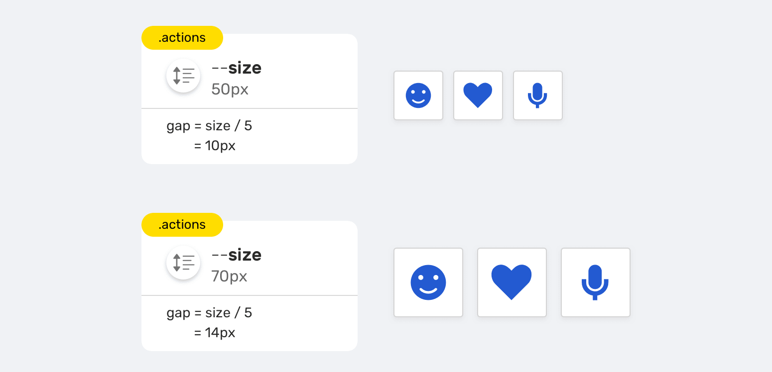
There is a group of buttons that have the following requirements:
- The ability to resize all elements by setting the value of a single variable.
- The distance between elements should dynamically change depending on their size. With an increase in the elements, the distance between them increases, and with a decrease, it decreases.
Here's the markup for this example:
<div class="actions">
  <div class="actions__item"></div>
  <div class="actions__item"></div>
  <div class="actions__item"></div>
</div>
Here are the styles:
.actions {
  --size: 50px;
  display: flex;
  gap: calc(var(--size) / 5);
}

.actions--m {
  --size: 70px;
}

.actions__item {
  width: var(--size);
  height: var(--size);
}
Notice how I used the variable
--sizewhen setting the property for the gapFlexbox items. This allows, based on a variable --size, to dynamically change the distance between elements.
Another example of using the inheritance mechanism of CSS variables is presented by setting up CSS animations. I took this example from here .
@keyframes breath {
  from {
    transform: scale(var(--scaleStart));
  }
  to {
    transform: scale(var(--scaleEnd));
  }
}

.walk {
  --scaleStart: 0.3;
  --scaleEnd: 1.7;
  animation: breath 2s alternate;
}

.run {
  --scaleStart: 0.8;
  --scaleEnd: 1.2;
  animation: breath 0.5s alternate;
}
With this approach, we don't need to declare twice
@keyframes. Styles .walkand .runoverride inherited variable values.
Validating CSS Variables
If it turns out that
var()something is wrong with the CSS variable passed to the function , the browser will replace the value of this variable with the original (inherited) value of the corresponding property.
:root {
  --main-color: 16px;
}

.section-title {
  color: var(--main-color);
}
Here , the value is written to the variable
--main-colorused to set the property . And this is completely wrong. The property is inherited. The browser in this situation works according to the following algorithm:color16pxcolor
- Is the property inheritable?
Here's how the browser works.
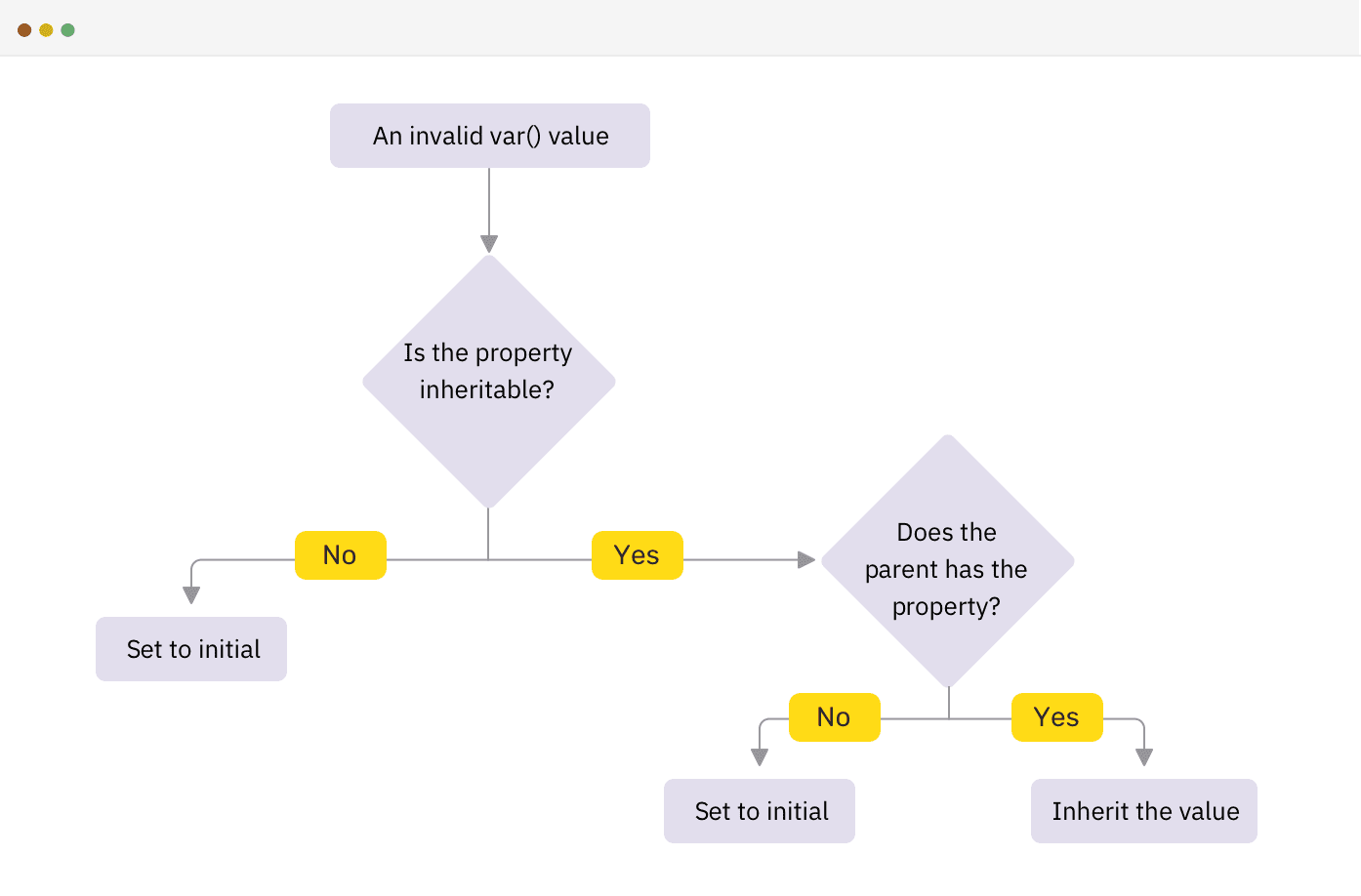
How the browser works when an invalid CSS variable value is detected
▍Concept of invalid value appearing during computation
What was discussed above, from a technical point of view, is called "Invalid At Computed-Value Time" (Invalid At Computed-Value Time). The situation in which such values appear occurs when a
var()valid CSS variable is passed to the function , the value of which is not suitable for writing to the property being configured with its help.
Consider the following example, which I took from this article:
.section-title {
  top: 10px;
  top: clamp(5px, var(--offset), 20px);
}
If the browser does not support the function
clamp(), will it use the value specified in the construction as a fallback top: 10px? To answer this question briefly, no - it will not use it. The reason for this is that by the time the browser detects an invalid value that they are trying to write to a property, it will have discarded the other values in accordance with the order of cascading styles. That is, it will simply ignore the construction top: 10px.
Here's what the CSS spec says about it :
The concept of an invalid value appearing during computation exists because errors associated with variables do not appear, unlike other syntax errors, in the early stages of a system. Therefore, it turns out that when the user agent discovers that the value of a variable is incorrect, it will already discard the other values, in accordance with the order of cascading styles.
As a result, it turns out that if you want to use CSS features that are not widely supported by browsers that are implemented using CSS variables, you need to apply the directive
@supports. This is how it is done in the above article:
@supports (top: max(1em, 1px)) {
  #toc {
    top: max(0em, 11rem - var(--scrolltop) * 1px);
  }
}
Interesting finds
▍ Storing URLs in Variables
Perhaps some of the resources used in your web pages need to be downloaded from external sources. In situations like this, you can store the URL of these resources in CSS variables.
:root {
  --main-bg: url("https://example.com/cool-image.jpg");
}

.section {
  background: var(--main-bg);
}
At this point, the question may arise as to whether it is possible to handle view constructs
var(--main-bg)using a CSS function url(). Consider the following example:
:root {
  --main-bg: "https://example.com/cool-image.jpg";
}

.section {
  background: url(var(--main-bg));
}
This will not work, since the function
url()interprets the entire structure var(--main-bg)as a URL, which is wrong. By the time the browser calculates the value, it will already be incorrect, the considered construction will not work as expected.
▍Store multiple values
Multiple values can be stored in CSS variables. If these are values that look like they should look in the place where you plan to use the variable, then such a construction will work. Let's look at an example.
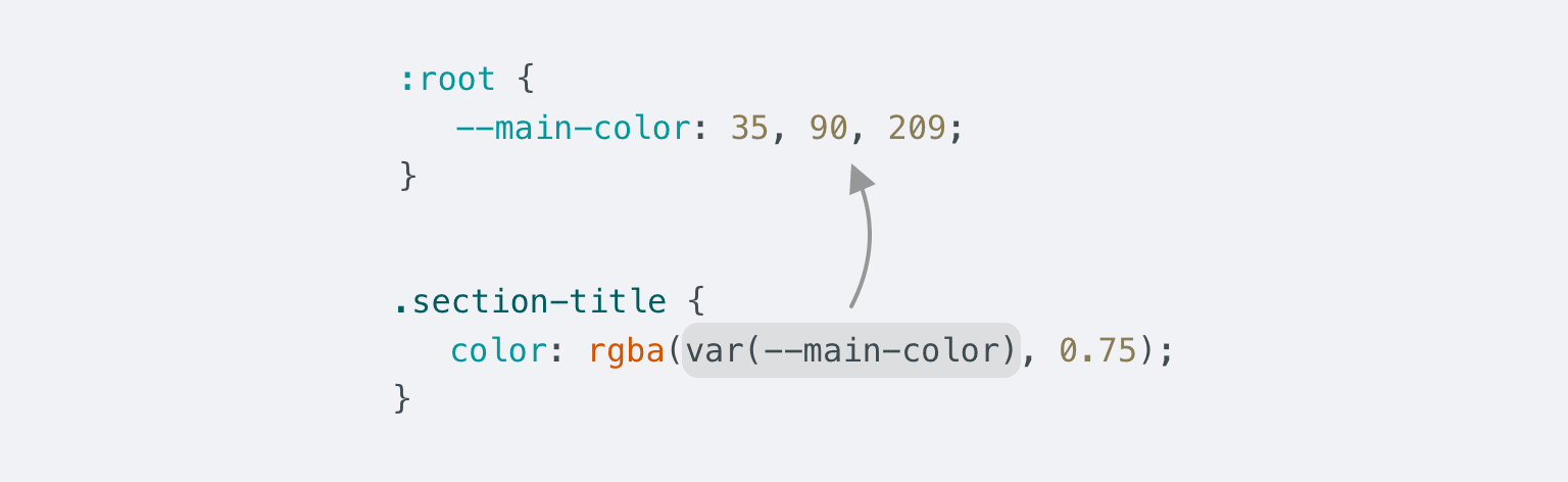
The variable value looks as expected
Here is the CSS:
:root {
  --main-color: 35, 90, 209;
}

.section-title {
  color: rgba(var(--main-color), 0.75);
}
There is a function
rgba()and RGB values, separated by commas, and stored in a CSS variable. These values are used when specifying the color. With this approach to using the function rgba(), the developer has the opportunity to influence the value corresponding to the alpha channel of the color, adjusting the color of various elements.
The only drawback to this approach is that the color assigned by the function
rgba()cannot be adjusted using the browser developer tools. If this feature is important when working on your project, the above way of using the function will probably not work for you rgba().
Here's an example of using a CSS variable to set a property
background:
:root {
  --bg: linear-gradient(#000, #000) center/50px;
}

.section {
  background: var(--bg);
}

.section--unique {
  background: var(--bg) no-repeat;
}
Here's how to style two sections of the site. The background of one of them should not be repeated along the
xand axes y.
▍Changing CSS Variable Values in @keyframes Rule Body
If you've read the spec about CSS Variables, you might have come across the term "animation-tainted" there. It describes the fact that the values of CSS variables do not lend themselves to smooth changes in the rule
@keyframes. Let's look at an example.
Here is the HTML:
<div class="box"></div>
Here are the styles:
.box {
  width: 50px;
  height: 50px;
  background: #222;
  --offset: 0;
  transform: translateX(var(--offset));
  animation: moveBox 1s infinite alternate;
}

@keyframes moveBox {
  0% {
    --offset: 0;
  }
  50% {
    --offset: 50px;
  }
  100% {
    --offset: 100px;
  }
}
The animation in this case will not be smooth. The variable will take only three values
0, 50pxand 100px. The CSS spec says that any custom property used in a rule @keyframesbecomes an animation-tainted property, which affects how it is handled by the function var()when animating elements.
If we need to provide smooth animation in the previous example, then we must do it as it was done before. That is, you need to replace the variable with those CSS properties of the element that you want to animate.
@keyframes moveBox {
  0% {
    transform: translateX(0);
  }
  50% {
    transform: translateX(50px);
  }
  100% {
    transform: translateX(100px);
  }
}
→ Here's an example
I would like to note that after the publication of this article, I was informed that
@keyframesit is still possible to animate CSS variables in . But for this, the variables must be registered using the rule @property. So far, this feature is only supported by Chromium-based browsers.
@property --offset {
  syntax: "<length-percentage>";
  inherits: true;
  initial-value: 0px;
}
Here you can experiment with an example of this feature.
▍Calculation
You may not be aware of the fact that CSS Variables can be used in calculations. Let's take a look at the example we already looked at when talking about avatars:
.c-avatar {
  display: inline-block;
  width: calc(var(--size, 1) * 30px);
  height: calc(var(--size, 1) * 30px);
}
The size of the avatar depends on the value of the variable
--size. The default is 1. This means that the default avatar size is 30px*30px. Note the following styles and that changing this variable will change the size of the avatar.
.c-avatar--small {
  --size: 2;
}

.c-avatar--medium {
  --size: 3;
}

.c-avatar--large {
  --size: 4;
}
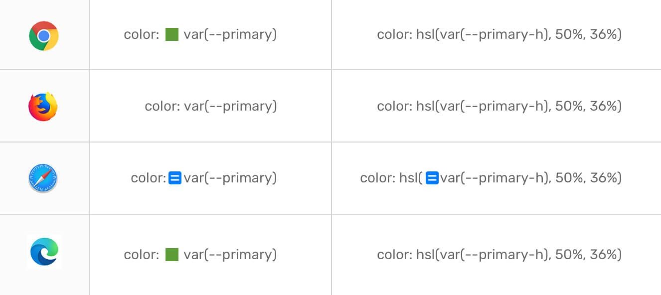
Browser developer tools and CSS variables
When using the developer tools of different browsers, there are some useful tricks that can be used to make working with CSS variables easier. Let's talk about them.
▍Viewing colors defined using variables
I find it useful to be able to see the color described by a CSS variable. This feature is available in Chrome and Edge browsers.
View the color given by a CSS variable
▍Calculated values
In order to look at the calculated value of a CSS variable, depending on the browser, move the mouse pointer over the variable or click on a special button.
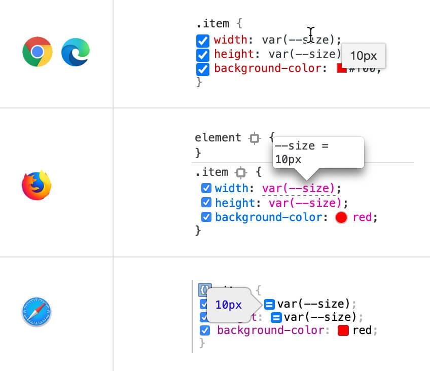
Viewing computed values
In all browsers except Safari, computed values can be viewed by simply hovering over a variable. In Safari, you need to click on the button with a couple of stripes to do this.
▍Auto-complete input
When working on large projects, it is difficult to remember the names of all the CSS variables used in them. But with the auto-completion capabilities available in Chrome, Firefox, and Edge, this isn't a problem.
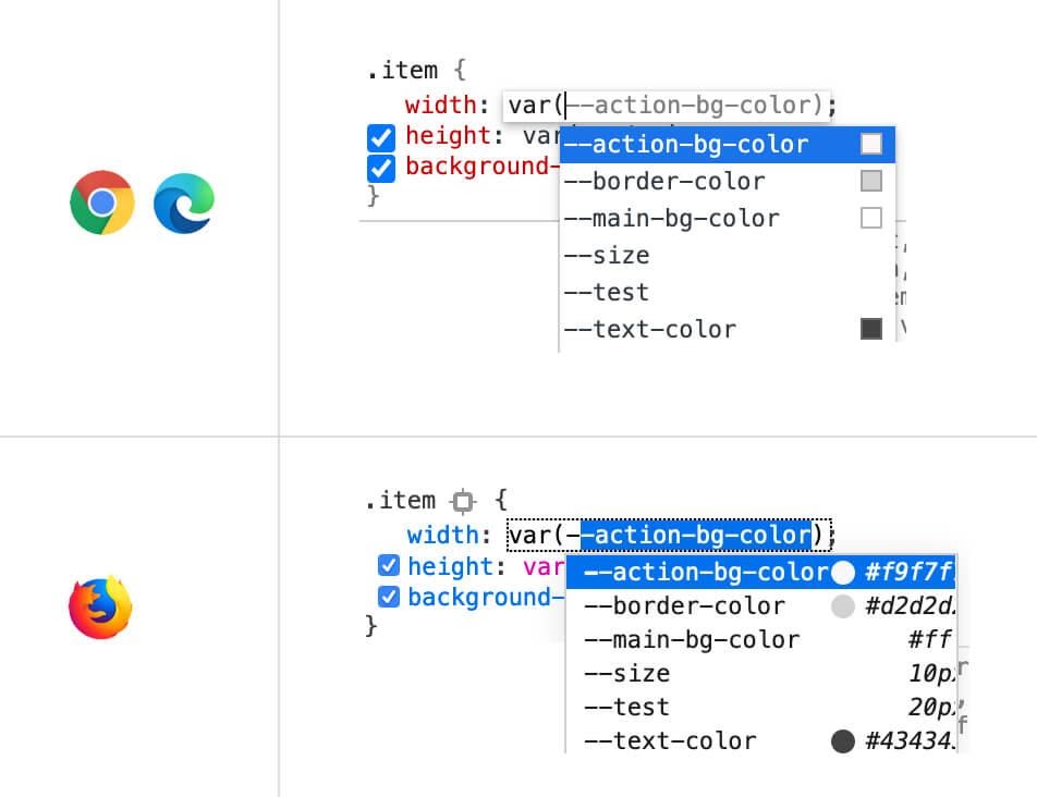
Variable name completion for
this mechanism to work - just start entering the variable name.
▍Disable CSS Variables
If a CSS variable needs to be disabled from all elements that use it, it is enough to uncheck the box next to the variable in the element where it is declared.
Checkboxes to disable CSS Variables
Outcome
I've covered quite a lot about CSS Variables. I hope you find useful what you learned today.
Do you use CSS Variables in your projects?