
It is very difficult to choose good colors for infographics. We will try to deal with this problem.
After reading this article, you will feel more confident in your color choices. And if you have no sense of color at all, then these are just recommendations for good combinations. Let's talk about common color mistakes that surround us everywhere and how to avoid them.
This article will not help you find good gradients or shades. It is designed to provide beautiful, crisp colors for various categories of information (eg continents, industries, bird species) in line charts, pie charts, bar charts, and so on.

FiveThirtyEight, , Pudding, New York Times, The Economist Akkurat
I will talk a lot about saturation, brightness and hue. These are HSB (hue, saturation, brightness) or HSV (hue, saturation, value) color spaces:
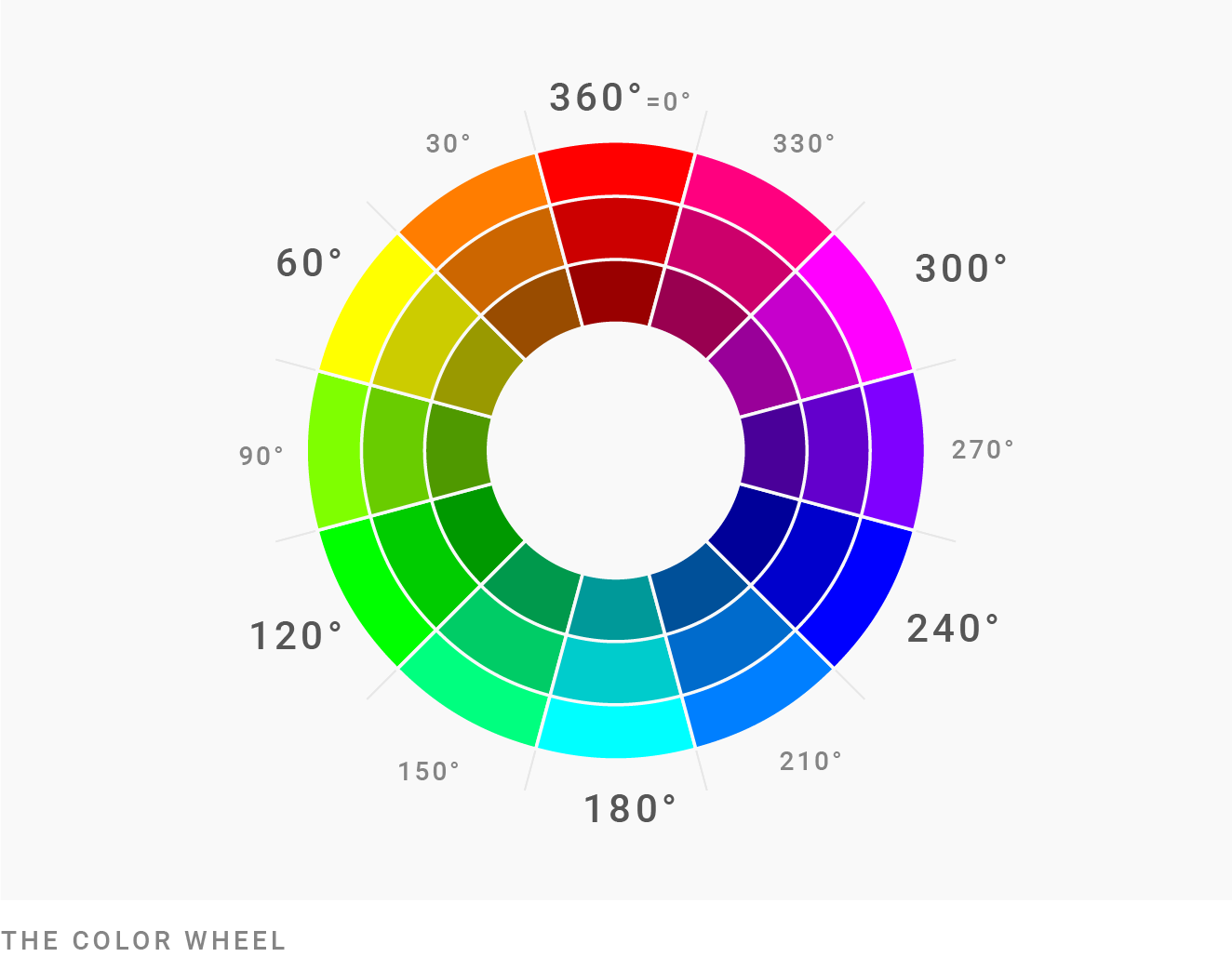
- The hue ranges from 0 ° to 360 °, this is your typical color wheel: ⬤ ⬤ ⬤
- Saturation ranges from 0% (gray) to 100% (superfood colorful !!): ⬤ ⬤ ⬤
- The brightness / value changes from 0% (black) to 100% (actual color): ⬤ ⬤ ⬤
To convert colors from HEX (eg # cc0000) or RGB (eg
rgb(207, 176, 58)) to HSB / HSV, use a tool like colorizer.org .
The relative of HSB / HSV is the HCL color space . There are the same parameters (hue, chroma = saturation, brightness), but closer to "how we really see colors." Our Datawrapper service uses the HCL color space in the color picker:

Since there is no HCL in Adobe Photoshop or colorizer.org, every mention of degrees (eg 0 °) or percent here refers to the HSB / HSV color space.
Okay, let's get started.
Expand your understanding of colors

You might be thinking, “For a chart, I need five colors. So I use green, yellow, blue and red. And ... hmm ... maybe orange? Or purple! "
If you haven't thought about colors since painting your coloring book as a kid, then this thought makes sense. Therefore, I am writing this article to tell you that there are actually more flowers.
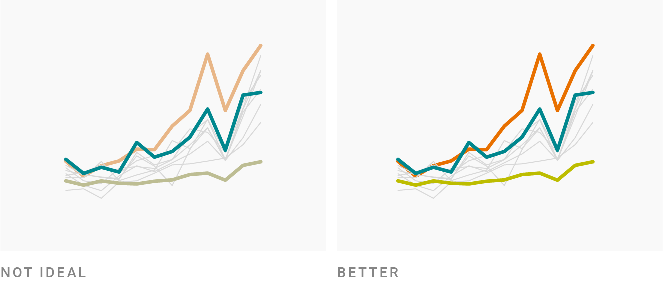
Take a look at this diagram and compare it to the main colors ⬤ ⬤ ⬤ ⬤ ⬤ ⬤ :

Cats or dogs? Author: Nadia Bremer
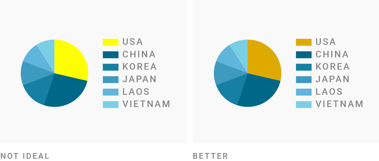
The colors on the chart are completely different. Nadia uses red ⬤ , which is different from regular red ⬤ . Green ⬤ - is it ... can you even call it green ⬤ ?
So before we introduce the rules, let me scare you a little: literally thousands of colors can be used. There is yellowish red ⬤ , bluish red ⬤ and everything in between. There is gray ⬤ , but there is also cool gray ⬤ and warm gray ⬤ . And then there is the color blue. So much blue! Like this ⬤ , this ⬤ , this ⬤ , this ⬤ and this ⬤ . And we haven't talked about orange and yellow yet.
You have a lotoptions. This means that you can stay in a small area of the color wheel and still have many options.
Don't dance around the color wheel
You don't need to take colors from the whole color wheel such as ⬤ ⬤ ⬤ ⬤ ⬤ ⬤ . The diagram will look more professional - and therefore more reliable - when it uses only a few colors and adjacent tones.
At this point, it makes sense to look at the color wheel. Adobe Color or Color Calculator is suitable for this .

Color Calculator for Harmonious Matching
Many of these tools provide harmonious color combinations. One of them is called "square" or "notebook". Don't use it . It will produce too many tones, which should be avoided.
In the video, I use the Paletton color tool , starting with a notebook combination and then decreasing the distance. Notice how prettier the color combinations are.
If the distance is small enough, you mostly use complementary or complementary colors. And this is a great choice! Lots of complementary color pairs work great together. When in doubt, always use complementary colors and their neighbors .
So let's do it - this time with Adobe Color:
Our Additional Colors in Adobe Color
Our colors are opposite on the color wheel, so they clearly complement each other. Hooray! But they are also unusable: the two orange ones are too similar. And everything looks so ... bright.
This is where saturation and brightness need to be changed.
Use saturation and brightness to make tones work

Saturation and brightness are just as important as hue. In fact, you can create new colors simply by changing the saturation and brightness. Here are two pairs of colors with the same tone, only with different saturation and brightness: ⬤ ⬤ / ⬤ ⬤ (if you change the tone a little, the results will be even better: ⬤ ⬤ / ⬤ ⬤ ).
Let's go back to our color combination: ⬤ ⬤ ⬤ ⬤ . After playing with saturation and brightness, it looks like this:

More appropriate complementary colors in Adobe Color
I desaturated light cyan ⬤ and light orange ⬤and made all the colors darker except the light orange. Damn it, you can work with this already!
So if your color combination seems incomplete, you don't need to add another tone right away. First change the saturation and lightness - and see what happens.
Here's what I did with all these color palettes: ⬤ ⬤ ⬤ ⬤ and ⬤ ⬤ ⬤ ⬤ ⬤ and ⬤ ⬤ ⬤ ⬤ . All of them approximately complement each other and all have different saturation and lightness.
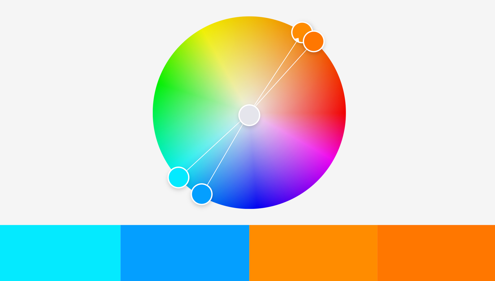
Use warm colors and blue
Infographic designers especially love another combination: yellow / orange / red and blue . Check out, for example, the South China Morning Post portfolio or this one from The Economist (PDF) : they use these colors far more often than purple or green.
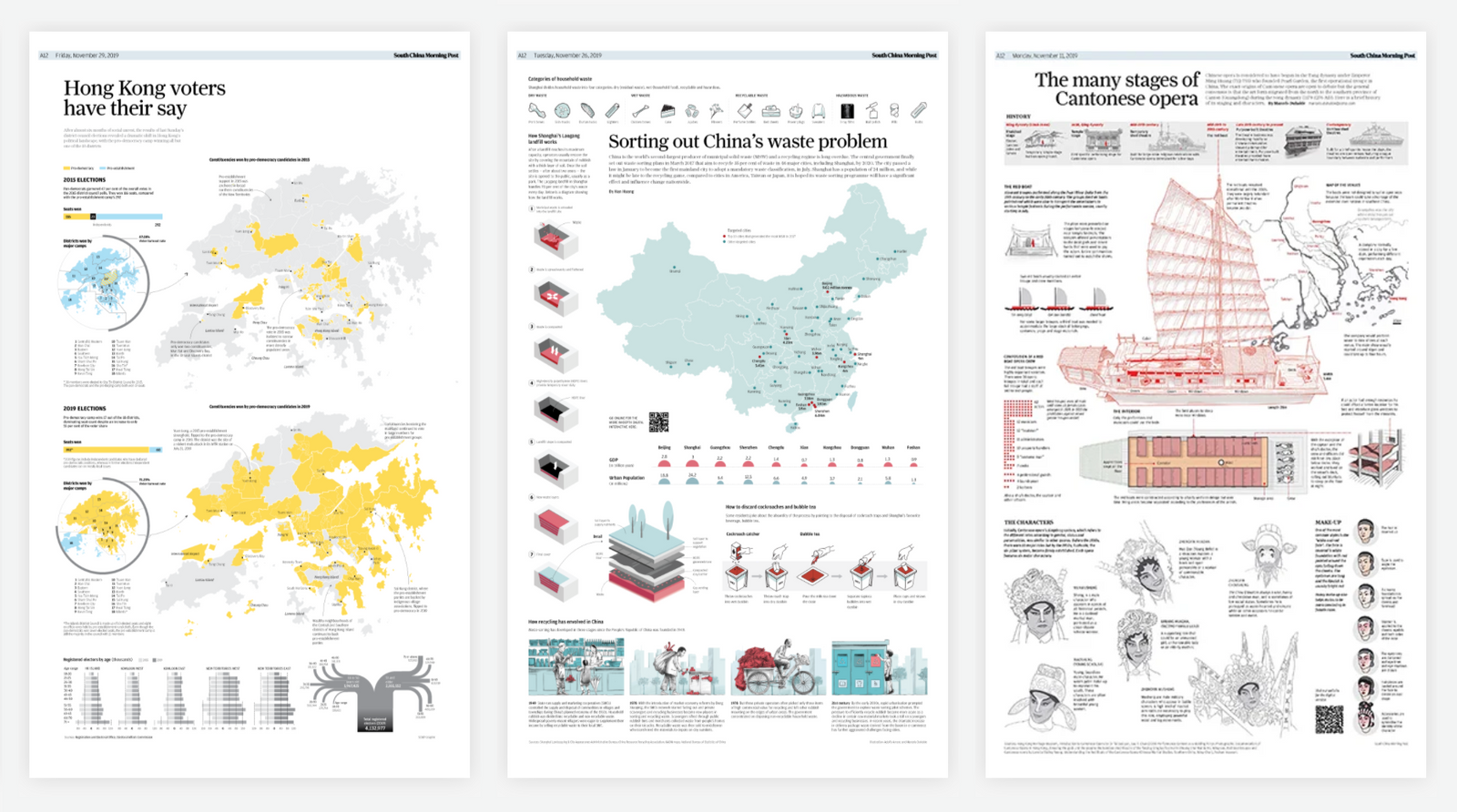
Three pages of the South China Morning Post
The reason is that these warm colors plus blue are quite versatile for differentiating categories. Yellow, orange and red look very nice together, but people still perceive them as different colors: ⬤ ⬤ ⬤ is exactly what we want for category colors. And blue is more flexible than any other tone: a lot of blue, no matter how dark ⬤or light, ⬤ rich ⬤ or not saturated ⬤ , looks nice, soothing and professional.
And they are available: color blind people can easily distinguish between blue and orange / red.
Therefore, when in doubt, use orange / red with blue.
When using green, make it yellow or blue

Vibrant greens are one-sixth on the color wheel, from about 90 ° ⬤ to 150 ° ⬤ , with a peak at 120 ° ⬤ . However, you won't find a good infographic with these colors. Why?
First, green itself is just very dark. And the lightening of the green turns into awkward neon ⬤ . To get a good tone, you need to lighten and desaturate the green a lot - more than other colors. That's exactly what the Washington Post does with its green ⬤ here:

“How Trump Rolls Back Obama's Legacy,” The Washington Post
It's 142 ° green, but only 14% saturated. Same hue with same brightness at 100% saturation: ⬤ . Here's how.
And remember about color blind people: pure green combined with red, orange or brown is difficult for them to distinguish.
So when you use green, make it a little yellow or a little blue. You can see this in the examples at the beginning of the article: all greens except ⬤ have a tone greater than 160 ° (that is, they are bluer) ⬤ ⬤ ⬤ or less than 60 ° (that is, more yellow) ⬤ ⬤ . In this project, which we have already seen, Nadia uses both yellow-green and blue-green:
Cats or dogs? Author: Nadia Bremer
Looks like you can use them in infographics as two different colors: a win-win!
Avoid Pure Colors
The “pure” tones are located in the color wheel exactly 60 °, 120 °, 180 °, 240 °, 300 °, or 360 ° / 0 °:
Here's an example: in HSV / HSB, the hue value of this bright blue ⬤ is 180 °, the value saturation is 67%, and the brightness value is 91%. You can also see the RGB values of your color: if at least two values match, then the color is "pure". For example, our ⬤ is
rgb(77, 232, 232).
To make colors more natural and pleasing to the eye, you can either change the saturation of the pure colors or make them darker. If you want bright, saturated colors, then choose blended colors that are at least 5-10 ° from the clean ones.
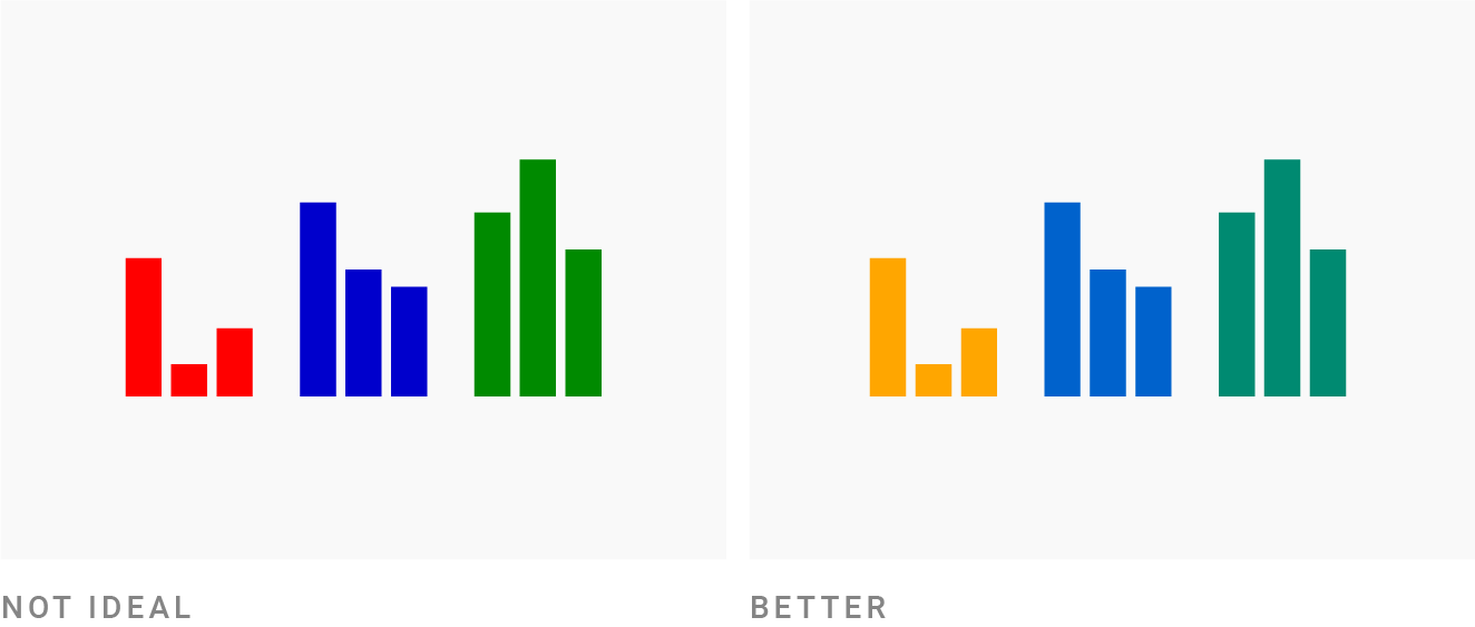
In the image above, red and orange, blue and green have the same saturation and lightness. The only difference is in tone: red ⬤ (0 °), blue ⬤ (240 °), and green ⬤ (120 °) appear more juicy than orange ⬤ (40 °), medium blue ⬤ (211 °) and bluish green ⬤ (170 °).
Avoid bright, saturated colors
The vibrant colors are sure to grab the attention of readers. But these readers won't thank you. Most people tense up a little when they see colors like this: “Very saturated, vibrant colors would NOT be appropriate for serious, trusting or calm [communication],” Bartram, Patra and Stone explain in their 2017 article Affective Color in Infographics ( PDF ) ...
If the colors are approaching 100% saturation and 100% brightness, they are most likely too bright. This definitely applies to pure colors such as ⬤ ⬤ ⬤ ⬤ .
"But I've seen before seen such a crazy color, and they look good" - you say and will call projects like these:

Article New York Times about playlists

ArticleBloomberg Bankruptcy Pudding Celebrity

Article
Comparing the colors in these examples to ⬤ ⬤ ⬤ ⬤ , they are less saturated or darker. 100% saturated and 100% vivid green ⬤ becomes less saturated in the New York Times ⬤ and also less saturated and darker Blo in Bloomberg article and in Pudding article ⬤ .
They retain the fun, attention-grabbing effect of bright colors, but are also easier on the eyes.
It all works because Pudding, The New York Times, and Bloomberg have great designers.When in doubt, avoid 100% saturation combined with 100% brightness .
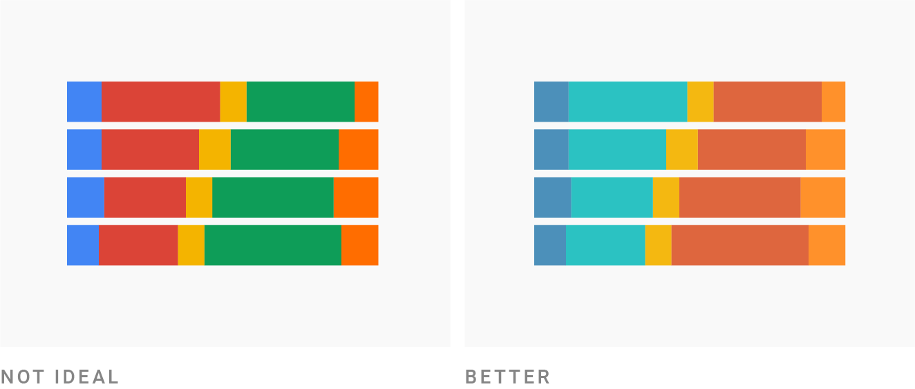
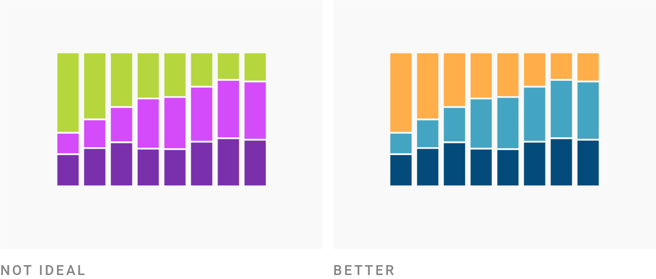
Combine colors with different brightness

Sometimes I come across infographics, especially area charts, where adjacent elements have the same brightness. You can easily check this: just convert your colors to black and white (for example, using our tool ). If everyone has the same gray color, then the brightness is the same.
For example, ⬤ ⬤ ⬤ in the leftmost diagram looks like ⬤ ⬤ ⬤ in grayscale.
To avoid such an unpleasant gamut, there are two options:
- « »: , , , : ⬤⬤⬤. : ⬤⬤⬤
- , ,
I highly recommend the first option (you can still put a white border if you like): the colors will become more dynamic, and the color blind will be grateful to you. In fact, everyone will thank you, regardless of their color discrimination.
In reality, the correct way to set colors for categories is to choose colors from gradients like this:
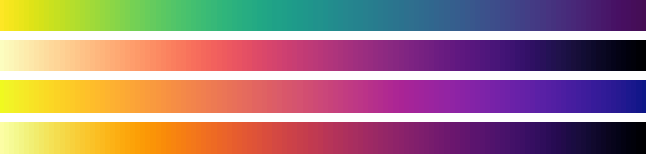
Viridis Color Schemes
All of these gradients go from light to dark, so the colors have different brightness: ⬤ ⬤ ⬤ ⬤ ⬤ or ⬤ ⬤ ⬤ ⬤ ⬤ . If you like this approach, try this color palette generator .
Make the colors equally "colorful"
In your infographics, you often want to highlight colors. There are different ways to achieve this. Colors are distinguished by the following characteristics:
- because they are much darker ⬤ ⬤
- because they are much lighter ⬤ ⬤
- because they are more intense ⬤ ⬤
- because they are cleaner ⬤ ⬤
But usually you just want to highlight one or two colors. Most of the rest should be more or less equally visible .
If you are using colors with different brightness (different in shades of gray), you need to balance them. Try to desaturate bright colors. Add more saturation to the dark .
Or choose a less pure hue: in the image above, the green ⬤ and blue ⬤ are very pure, so I darkened them (this is how they look at 100% brightness: ⬤ ⬤ ).
Then I wanted to add red ... but the bright red is too intense as a pure shade (from 0 °) ⬤ ⬤ ⬤ . So I had two options:
- just darken it: ⬤ ⬤ ⬤ .
- move the hue (and only the hue) 30 ° to make it more orange ⬤ ⬤ ⬤ .
I chose the second one to make it a little more friendly. But both options work.
Avoid too low contrast with the background

A surprisingly large number of infographics use pastel colors on a bright background. They are often not very saturated and terribly light.
This causes problems: if you are working with small areas, lines and dots, then light and desaturated colors are difficult to distinguish. But even if legibility is not an issue — for large areas, for example — your infographic should contrast well with the background to confidently say, "Hey, I'm here and I have something to say."
Here's what to do when the colors are too desaturated and too light ⬤ ⬤ ⬤ :
- Increase saturation: ⬤ ⬤ ⬤
- Make them darker: ⬤ ⬤ ⬤
- Or do both for best results: ⬤ ⬤ ⬤
Of course, this is also a matter of taste. But if you think the colors are too pastel, just try making them richer and darker. Just see what happens. And if it goes well, leave it that way.
Avoid too much contrast with the background

The converse is also true: don't make the colors too dark and saturated against a bright background. When in doubt, try lightening the colors, removing some saturation, and see what happens.
Choose a sufficiently desaturated background

Once you've figured out the colors, a colorful background might seem like a good idea. But this background has two big drawbacks: First, it easily distracts from the data. Second, it extremely limits the potential color gamut and is therefore difficult to work with. In fact, the more saturated the background, the more complex it is, so it is better to choose desaturated colors. Here are some basic rules for the HSB / HSV color space:
- If you want a light background, stay away from colors with less than 95% brightness and more than 7% saturation.
- If you want a dark background, keep the saturation below 20%. Also, don't go completely black - keep the brightness between 10% and 25%.
Just copy the colors or try to understand them
It's hard to feel and choose good colors on your own. So it's perfectly okay to just copy beautiful combinations. Seriously, there is nothing shameful about stealing. I wrote an entire article on where to get color inspiration: movies, artists, other people's color palettes, etc. (and other infographics are a great source).
If you want to intuitively understand which colors work well with each other, try this: Analyze them. Here are some ways to do it:
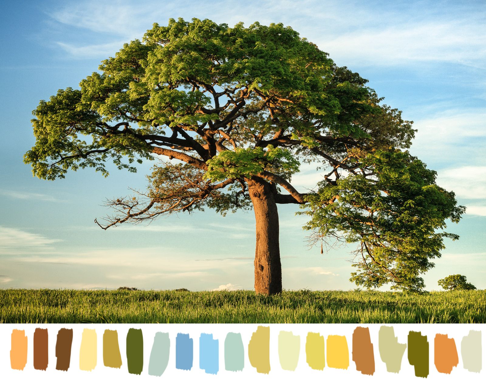
Photo tree niko photos on Unsplash
- , , , . , , Photoshop image-color.com. .
- Adobe Capture, , « »: (, !)
- : . ? ? , ?
- . . ?
Also, the next time you create an infographic and are not happy with the colors, analyze them in the HSV / HSB color space , for example using colorizer.org :
- How saturated are colors - how much better or worse do they get by increasing or decreasing saturation by a few (or many) percentage points?
- What is the meaning of tone ? What happens if you change the tone just a few degrees?
- Are the colors different in brightness ?
Over time, you will move from the level of "This is great, but I don't know why" to the level of "This is great for a reason." And you will find yourself able to break more and more of these rules - and still create great color combinations.