Element attributes are the basis for validators. Using attributes, we can immediately set the following restrictions:
required - the field is required, i.e. requires filling in
min max step - the minimum and maximum allowable values, as well as the step of changing
minlength and maxlength - limiters on the number of allowed input characters
pattern - regular expression
It seems to be not a lot, however, pattern gives us quite rich opportunities for checking values, regular patterns are easily googled allowing to immediately check phone numbers, email addresses and URLs and much more in demand.
Arranged on form elements, these attributes will not automatically allow the button to be triggered from the same form performing the submit values to the server, although today such a case may seem anachronistic to many. But this is not a problem, because with client-side JavaScript, we can use all of these validators in the same or even better way. Therefore, we will not use input type = email, but try to make our own field with checking the input for compliance with the rules for generating email addresses. Let's make a simple form:
<form name="myform" id="myform">
   <input type="text" pattern="^[a-zA-Z0-9.!#$%&’*+/=?^_`{|}~-]+@[a-zA-Z0-9-]+(?:\.[a-zA-Z0-9-]+)*$" placeholder="email here"/>
   <input type="submit">
</form>
The validator immediately works and upon an attempt to press the button, it issues a warning in the language of the browser locale.
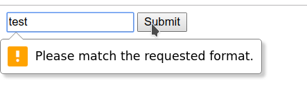
Accordingly, entering mail@example.com results in a successful form submission.
To develop your behavior, you need to access the form instance, this can be done through the global document by name, index (id) or ordinal starting from zero.
<script type="module">
   document.forms.myform.onsubmit = (event) => {
       console.log('validate');
       return false;
   };
</script>
or by the selector using one of the methods, such as document.getElementById () or document.querySelector (),
to check the results, run http-server
npx http-server
after the command runs, you can open 127.0.0.1 : 8080 / or the address that it writes to you in the console in the browser and debug the results.
Let's replace the submit with a regular button and invoke the form validation manually, slightly changing the example.
<form id="myform" action="#">
   <input type="text" pattern="^[a-zA-Z0-9.!#$%&’*+/=?^_`{|}~-]+@[a-zA-Z0-9-]+(?:\.[a-zA-Z0-9-]+)*$" required placeholder="email here" />
   <input type="button" name="subm" value="OK" />
</form>

<script type="module">;
   myform.subm.onclick = (event) => {
       console.log(form.checkValidity());
       return false;
   };
</script>
In this example, you can see that mapping form objects by their id and name works for child elements in relation to the form, which looks very neat. Now our code prints the form's validity state to the console.
The presence of methods for manually launching validation does not mean that it cannot be performed without calling them.
The results of input and other changes to the form are immediately reflected in its state, which is manifested in the presence of pseudo-classes of the valid and invalid styles . If you add color highlighting, then you can see how the validation immediately works.
<style>
  :valid {
       border: 1px solid green;
   }
  :invalid {
       border: 1px solid red;
   }
</style>

In order to prevent the form from annoying the eyes with red before the user tried to enter something into it, you can use a life hack with a placeholder:
<style>
   input:valid {
       border: 1px solid green;
   }
   input:not(:placeholder-shown):invalid {
       border: 1px solid red;
   }
</style>
External handlers for validation events can be hung on form elements.
<script type="module">
   myform.email.oninvalid = (event) => {
       alert('Wrong email !!11');
   };
   myform.subm.onclick = (event) => {
       console.log(form.checkValidity());
       return false;
   };
</script>
In this case, the hook mechanism is used by the name of the event, if there is some event supported by the element, then by assigning a function named on + <event_name> to it, we can be sure that it will be called when it fires.
And one more wonderful point here is that they will no longer be called when data is entered, but only when programmatically jerking validation, i.e. calling the checkValidity () method.
Accordingly, we can handle this behavior:
myform.subm.onclick = (event) => {
   if (myform.checkValidity()) {
       alert('Valid !');
   } else {
       alert('Invalid !')
   }
   return false;
};
In real life, we may also need to call event.preventDefault () if the validation fails to abort the form submission procedure.
At checkValidity () is an analog reportValidity () , which returns the result without causing revalidation.
How do you know which field is wrong?
Each form input element has the .validity property, as well as the ability to call validation methods on it, the property has the following structure:
ValueState: {
valid - general sign of the correctness of the
valueMissing - the value is required, but not set
typeMismatch - the wrong type
is entered patternMismatch - introduced mismatched value
tooLong - value greater than maxlength
tooShort - value less than minlength
rangeUnderflow - value less than min
rangeOverflow - value greater than max
stepMismatch - value does not match the step
badInput - input cannot be cast to value
customError - arbitrary error
}
Basically, as we can see, error properties corresponding to standard validation attributes, while .customError is our headroom for extension. By
calling the .setCustomValidity () method with an error string as an argument, we can mark the form element as invalid. You can also set or get the error text through the .validationMessage property...
In order not to set browser validations, you can use the .willValidate property , which indicates whether standard validations will be called on the field.
By passing an empty string as an argument to .setCustomValidity () we can return its state to valid.
Let's add support for our own my-pattern attribute , which will check the value against a regular expression in the same way for clarity.
In case of an error, the message, in addition to the one provided in the browser, will be displayed next to the field.
Validation will be triggered when the value of our alternative field changes and when the button is pressed.
<form id="myform" action="#">
   <div>
       <input type="text" name="email" id="email" value="" pattern="^[a-zA-Z0-9.!#$%&’*+/=?^_`{|}~-]+@[a-zA-Z0-9-]+(?:\.[a-zA-Z0-9-]+)*$" required placeholder="email here" />
       <span class="msg"></span>
   </div>
   <div>
       <input type="text" name="customInput" id="customInput" my-pattern="^[a-zA-Z0-9.!#$%&’*+/=?^_`{|}~-]+@[a-zA-Z0-9-]+(?:\.[a-zA-Z0-9-]+)*$" required placeholder="text here" />
       <span class="msg"></span>
   </div>
   <button type="submit" name="subm" value="OK">OK</button>
</form>
<style>
   input:valid {
       border: 1px solid green;
   }
   input:not(:placeholder-shown):invalid {
       border: 1px solid red;
   }
</style>
<script type="module">
   myform.customInput.oninvalid = (event) => {
       let el = event.target;
       let msg = el.parentElement.querySelector('.msg');
       msg.innerText = el.validationMessage;
       console.log('oninvalid, id: ', el.id);
   };
   myform.customInput.oninput = (event) => {
       let el = event.currentTarget;
       validateWithMyPattern(el);
       markValidity(el);
   };
   function markValidity(el) {
       el.checkValidity();
       let msg = el.parentElement.querySelector('.msg');
       if (el.validity.valid) {
           msg.innerText = '';
       } else {
           msg.innerText = el.validationMessage;
       }
   }
   function validateWithMyPattern(field) {
       if (field.value) {
           if (field.hasAttribute('my-pattern') &&
               field.value.match(field.getAttribute('my-pattern'))) {
               field.setCustomValidity('');
           } else {
               field.setCustomValidity('My pattern error');
           }
       }
   }
   myform.subm.onclick = (event) => {
       for (let formEl of myform.querySelectorAll('input')) {
           validateWithMyPattern(formEl);
           markValidity(formEl);
       }
       if (myform.reportValidity()) {
           alert('Valid !');
       } else {
           alert('Invalid !')
       }
       return false;
   };
</script>
Now we have two similar fields that check the value with a standard validator and one that we have written ourselves.

The possibilities may not seem rich, however, with the help of them you can implement any validations, incl. groups of fields without stumbling over technical limitations as with popular frameworks.
Of the limitations of the Validation API, I only remember the initial invalidation of fields. For it, in addition to the trick with placeholder or special states a-la untouched, you can do all the validation programmatically on the input and submit events by combining your own validators with the standard ones.
Solving my problems, I came to the need to create my own component that performs the tasks of the form at the same time to support my own input elements, which allows you to set different validation and notification behavior and hang any validators and uses the standardized Validation API. You can look at it here: https://bitbucket.org/techminded/skinny-widgets/src/master/src/form/
and the example code from this article can be found here:
https://bitbucket.org/techminded/myform /