Hello! My name is Sergey Folimonov, at DomClik I am responsible for direct marketing and customer communications. Recently, I am also acting as a PO of the Open Data project , and I want to tell you about the history of the creation of this product, focusing on the problems that we had to face, on the mistakes that we made, and on the final result and its variants. use.
Data-driven culture within the company is, of course, good, but in a world where the concepts of open content, open source solutions and open data in general are gaining more and more popularity, one wants not only to use information, but also to share information. This is what prompted DomClick to create "Open Data".
Let's start!
I joined the product development early on. Well, very early. Let's just say that we had

The next two weeks, on a real drive, we developed the project from scratch, trying to avoid any complex processes, inserting crutches where possible, so as not to delay the MVP and check: "What can we do?"
The result of the first sprint: all the promised data broken down by days / weeks / months are available both on the map (statistics for regions and major cities) and on graphs (city ratings, dynamics). But, as you can guess, only screenshots are now left from that version:
There was a lot of data here, the site worked perfectly functionally, but the UX was not thought out at all. And as a result: the eyes run up, the client's path is not clear and what can be generally learned from this project. Looking ahead, I will say that nothing from the first version of the project was reused in further development.
It would seem like two weeks down the drain ... However, it was the look at the ready-made quick concept and understanding of its shortcomings that allowed us to form the final requirements and wishes for the service. Without going into details, we decided at the first stage to present the data in tabular form, at the next step to provide users with graphs with dynamics, and then work out the visualization on the map and the use of predictive models to build forecasts.
One can argue about whether the first two weeks were a mistake, whether it was possible to avoid wasting time and immediately make a product that could be shown to customers. Yes, we could probably devote the first few days to working out the UX, conduct several interviews and surveys, knock out not 2 weeks, but 2 months for development. But the moral of my story is that you shouldn't be afraid to make fast crutch MVPs. Working at an accelerated pace and with a high level of enthusiasm has strongly rallied us to create a really good product. And yes, don't be afraid to throw the first sketches in the trash: it's much better than turning the raw version into a monolith.
Life After Death MVP
In the course of further work on the project, we encountered a number of extraordinary problems. I will try my best to tell about them so as not to overload the readers with the details of the mortgage business.
Learning to call things by their proper names
At the stage of collecting data on various metrics, I was faced with the fact that different people in our company can call different things the same, and the same things - differently. For example, two different people gave me data on the number of transactions by region, and the numbers did not fight at all for the reason that several business entities can be called transactions at once. As it turned out, on the one hand, I had transactions for the electronic registration of real estate objects, and on the other, mortgage transactions. And the data for the same region within one month may not coincide. Moreover, in both directions: there can be as many registrations as there are mortgage transactions (if suddenly a lot of clients began to buy real estate without a mortgage and simply acquire electronic registration),and less (if the electronic registration service is not in great demand in the region, and the mortgage is taken without it).
Such cases led us to the need to create a reference book, so as not to get confused in the definitions ourselves, and explain all the metrics to the user on the portal in as much detail as possible.

We aggregate different data by time intervals
When it came to additive metrics (and the first metrics we had just such), aggregation did not raise any questions for us. Number of mortgage transactions in August: we take and count all transactions that were issued from August 1 to August 30. We did the same with the "Last 30 days" period, which gives the most relevant picture for each metric.
However, the emergence of non-additive metrics got us thinking. For example, the number of advertisements for the sale of apartments published at a particular point in time cannot be counted "in August". If on August 1, in some region, 1000 ads were published on the storefront, and on August 30 - 1200 ads, then what number should be displayed? Average daily? Monthly median? Mid-month value? We decided that it is easier for us and for users to understand better if such metrics are displayed not for a period, but on the last day of the period. If August is selected, then the data is for August 30; if "last 30 days" is selected, then the data is for yesterday. And information about this is also placed in the directory.

Determine the degree of our openness
In the early stages of data preparation, we wanted to show as much information as possible. If we know that 65 transactions on electronic registration were executed in the city of H in July 2020, then let's tell the users about it! However, at some point we thought about how our competitors could take advantage of this. After all, the disclosure of absolute values in the context of cities, and even with dynamics by week, can lead to the fact that the data will be used to test various hypotheses within specific settlements. Our data is updated every day, which means that market players have the opportunity to monitor almost all the main metrics of our business on a daily basis, conduct various campaigns and instantly assess their effect on our results. In addition, the disclosure of two metrics (e.g.the number of applications and the number of approved applications) can, in fact, reveal another metric (for example, the approval rate) that you do not want to show at all.
To avoid unpleasant situations, we decided to “close” critical metrics for regions and cities with intervals. Moreover, rating building and sorting within the table always takes place according to the real absolute values of the metrics, they just are not displayed to the front to the end user.

For whom and why do we open data
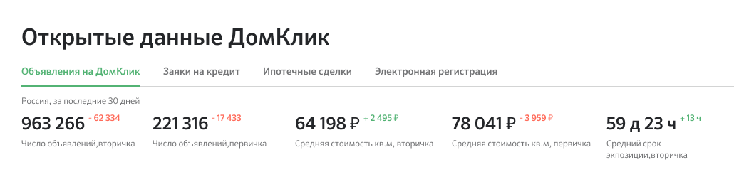
Now the portal has four sections (streams), each of which contains 5-6 metrics in a tabular form with a regional rating. When you click on a region, you can fall into it and see the rating of cities within this region. A choice of a time interval is available (all months starting from January 2019, and "last 30 days"), as well as search by region and city.
This granularity allows data to be used as materials for market research. For example, the analysis of the real estate market , which was carried out by us together with SberIndex, based on Open Data. Special thanks to Nikolai Korzhenevsky, director of the SberIndex laboratory, for his proactive stance on research.
- Real estate supply prices in the country on average in the last two months have grown by 3.0% y / y, according to DomClick. In the primary market, quotations are growing by 6.2% y / y.
- Among the leaders in the increase in supply prices are tourist regions:
- Khabarovsk Territory (18.9% YoY),
- Kaliningrad region (18.0% YoY),
- Altai Republic (17.6% YoY).
- The dynamics of loans issued in July-August also remained close to record values against the backdrop of a rapid fall in mortgage rates. The number of issued mortgage loans, according to our estimates, is growing by 44% yoy.
- Since the pandemic, nearly half of DomClick's approved mortgage applications have been filed online, according to Open Data.
In addition to market analysis and research, Open Data can be useful to several audiences at once:
- , / , ..
- , .
- Excel .
- , / , .
- // . , :)
What's next?
- In the near future, we plan to focus on building charts for more convenient tracking of the dynamics of changes in metrics by months and weeks. The layouts are already ready, the data is there, the work is in full swing.
- At the same time, we select and start collecting data for new sections, trying to understand what will be most interesting for users.
- We want to make it more convenient to export aggregated data to Excel.
- And in parallel, we are working on options for visualizing metrics on the RF map (with a heat map or dots). That is, to some extent, we are returning to the idea of the very first version of the product, but already with experience behind us, a friendly team and a project working in production.
If you have comments / questions about the portal, or ideas about data that would be interesting to "open", then write in the comments, I will try to answer everyone.