This year, there are several interesting opportunities for iOS developers to
Let's start with the definition - widgets are views that show relevant information without launching the main mobile application and are always at the user's fingertips. The ability to use them already exists in iOS ( Today Extension ), starting with iOS 8, but my purely personal experience of using them is rather sad - although a special desktop with widgets is allocated for them, I still rarely get there, the habit has not developed.
As a result, in iOS 14, we see a resurgence of widgets, more integrated into the ecosystem, and more user-friendly (in theory).

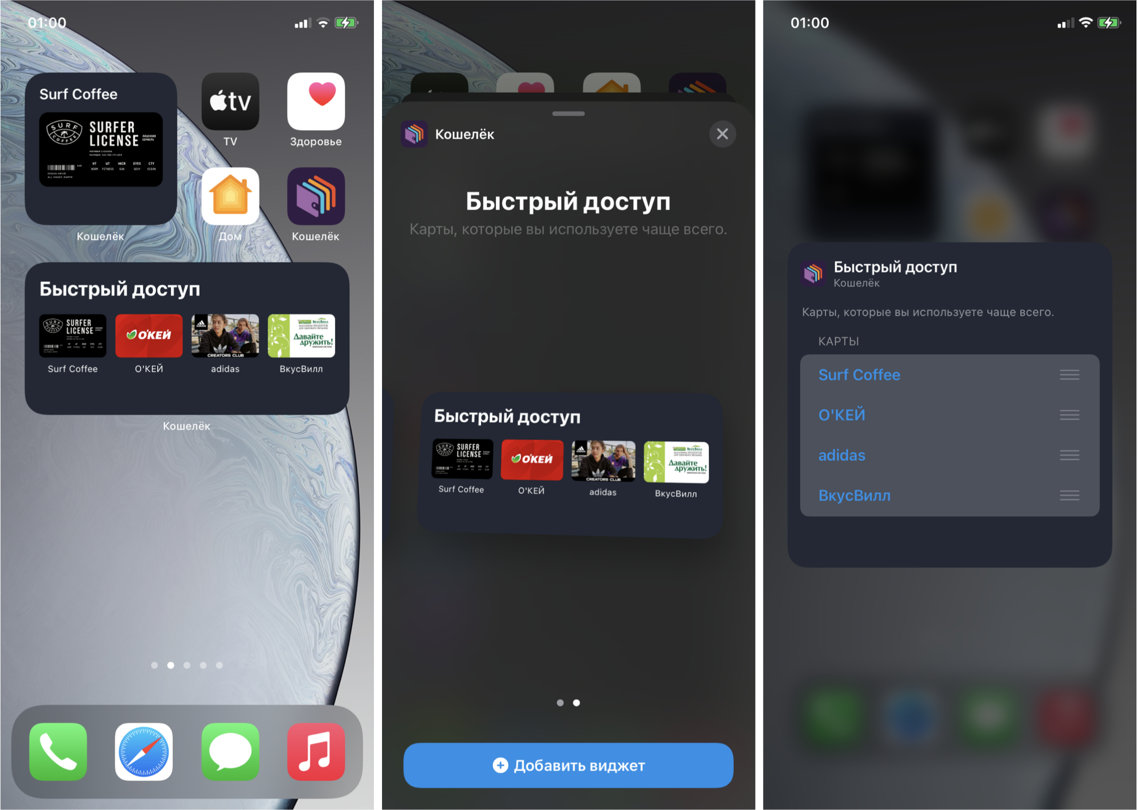
Working with loyalty cards is one of the main functions of our Wallet application. From time to time, suggestions from users about the possibility of adding a widget to Today appear in reviews in the App Store. Users, being at the checkout, would like to show the card as soon as possible, get a discount and run away about their business, because the delay for any time slice causes those very reproachful looks in the queue. In our case, the widget can save several user actions for opening a card, thus making the payment for goods at the checkout faster. Stores will also be grateful - fewer queues at the checkout.
This year, Apple unexpectedly released an iOS release almost immediately after the presentation, leaving developers a day to finalize their applications on Xcode GM, but we were ready for the release, since our iOS team began to make their own version of the widget on beta versions of Xcode ... The widget is currently being reviewed in the App Store. According to statistics , updating devices to the new iOS is pretty fast ; most likely, users will go to check which applications already have widgets, find ours and be happy.
In the future, we would like to add even more relevant information - for example, balance, barcode, last unread messages from partners and notifications (for example, that users need to take an action - confirm or activate the card). At the moment, the result looks like this:

Adding a widget to a project
Like other similar additional features, the widget is added as an extension to the main project. Once added, Xcode has kindly generated the code for the widget and other core classes. This is where the first interesting feature awaited us - for our project, this code was not compiled, since in one of the files a prefix was automatically inserted in the class names (yes, those same Obj-C prefixes!), But not in the generated files. As the saying goes, it is not the gods who burn the pots, apparently, the different teams within Apple did not agree among themselves. Let's hope that they will fix it for the release version. In order to customize the prefix of your project, in the File Inspector of the main target of the application, fill in the Class Prefix field .
For those who followed the WWDC news, it's no secret that the implementation of widgets is possible only using SwiftUI. An interesting point is that in this way Apple is forcing an update to its technologies: even if the main application is written using UIKit, then, if you please, only SwiftUI. On the other hand, this is a good opportunity to try a new framework for writing a feature, in this case it fits comfortably into the process - no state changes, no navigation, you just need to declare a static UI. That is, along with the new framework, new restrictions have also appeared, because old widgets in Today can contain more logic and animation.
One of the main innovations in SwiftUI is the ability to preview without launching it on a simulator or device ( preview ). A cool thing, but, unfortunately, on large projects (in ours - ~ 400K lines of code) it works extremely slowly even on top MacBooks, it's faster to run on a device. An alternative to this is to have an empty project or playground on hand for rapid prototyping.
Debugging is also available with a dedicated Xcode schema. On the simulator, debugging is unstable even to version Xcode 12 beta 6, so it's better to donate one of the test devices, upgrade to iOS 14 and test on it. Be prepared that this part will not work as expected on release versions.
Interface
The user can choose from different types ( WidgetFamily ) of widgets of three sizes - small, medium, large .

To register, you must explicitly specify the supported:
struct CardListWidget: Widget {
    public var body: some WidgetConfiguration {
        IntentConfiguration(kind: “CardListWidgetKind”,
                            intent: DynamicMultiSelectionIntent.self,
                            provider: CardListProvider()) { entry in
            CardListEntryView(entry: entry)
        }
        .configurationDisplayName(" ")
        .description(",     ")
        .supportedFamilies([.systemSmall, .systemMedium])
    }
}
My team and I decided to stick with small and medium - display one favorite card for a small widget or 4 for medium.
The widget is added to the desktop from the control center, where the user chooses the type he needs:

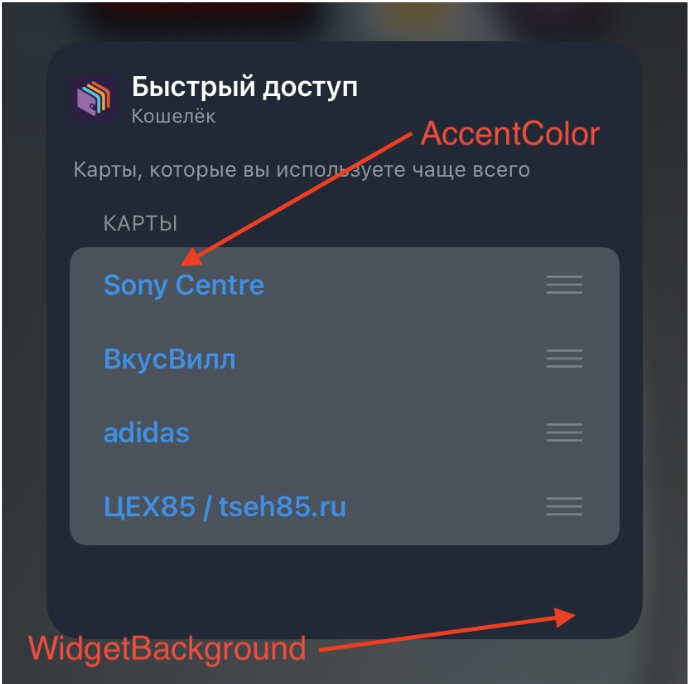
Customize the "Add widget" button color using Assets.xcassets -> AccentColor , the name of the widget with a description too (example code above).
If you run into the limitation on the number of supported views, you can expand it using the WidgetBundle :
@main
struct WalletBundle: WidgetBundle {
    @WidgetBundleBuilder
    var body: some Widget {
        CardListWidget()
        MySecondWidget()
    }
}
Since the widget shows a snapshot of some state, the only possibility for user interaction is to switch to the main application by clicking on some element or the entire widget. No animation, navigation, or transitions to other views . But it is possible to drop a deep link into the main application. In this case, for a small widget, the click zone is the entire area, and in this case we use the widgetURL (_ :) method. For medium and big, view clicks are available , and the Link structure from SwiftUI will help us with this .
Link(destination: card.url) {
  CardView(card: card)
}
The final view of the widget of two sizes turned out as follows:

When designing the interface of the widget, the following rules and requirements can help (according to Apple guidelines):
- Focus the widget on one idea and problem, do not try to repeat all the functionality of the application.
- Display more information depending on the size, rather than just scale the content.
- Display dynamic information that may change throughout the day. Extremes in the form of completely static information and information that changes every minute are not welcome.
- The widget should provide relevant information to users, not just another way to open the application.
The appearance has been customized. The next step is to choose which cards to show to the user and how. There can be clearly more than four cards. Let's consider several options:
- Allow the user to choose cards. Who, if not him, knows which cards are more important!
- Show last used maps.
- Make a smarter algorithm, focusing, for example, on the time and day of the week and statistics (if a user goes to a fruit shop near the house on weekdays and goes to a hypermarket on weekends, then you can help the user in this moment and show the desired card)
As part of the prototype, we settled on the first option in order to at the same time try the ability to adjust the parameters directly on the widget. No need to make a special screen inside the application. However, are users, as they say, experienced enough to find these settings?
Custom widget settings
Settings are generated using intents (hello Android developers) - when creating a new widget, the intent file is automatically added to the project. The code generator will prepare a class inheriting from INIntent , which is part of the SiriKit framework . The intent parameters contain the magic option "Intent is eligible for widgets" . Several types of parameters are available, you can customize your subtypes. Since the data in our case is a dynamic list, we also set the item "Options are provided dynamically" .
For different types of widget, set the maximum number of items in the list - for small 1, for medium 4.
This type of intent is used by the widget as a data source.

Next, the configured intent class must be put into the IntentConfiguration configuration .
struct CardListWidget: Widget {
    public var body: some WidgetConfiguration {
        IntentConfiguration(kind: WidgetConstants.widgetKind,
                            intent: DynamicMultiSelectionIntent.self,
                            provider: CardListProvider()) { entry in
            CardListEntryView(entry: entry)
        }
        .configurationDisplayName(" ")
        .description(",     .")
        .supportedFamilies([.systemSmall, .systemMedium])
    }
}
If custom settings are not required, then there is an alternative in the form of the StaticConfiguration class, which works without specifying an intent.
Title and description are editable on the settings screen.
The name of the widget must fit on one line, otherwise it is cut off. At the same time, the allowable length for the add screen and widget settings are different.
Examples of the maximum name length for some devices:
iPhone 11 Pro Max
28
21

iPhone 11 Pro
25
19

iPhone SE
24
19
The description is multi-line. In the case of very long text in the settings, the content can be scrolled. But on the add screen, the preview of the widget is first compressed, and then something terrible happens to the layout.

You can also change the background color and the values of the WidgetBackground and AccentColor parameters - by default they are already in Assets . If necessary, they can be renamed in the widget configuration in Build Settings in the Asset Catalog Compiler - Options group in the Widget Background Color Name and Global Accent Color Name fields, respectively.
Some parameters can be hidden (or shown) depending on the selected value in another parameter via the Relationship setting .
It should be noted that the UI for editing a parameter depends on its type. For example, if we specify Boolean , then we will see UISwitch , and if Integer , then we already have a choice of two options: input via UITextfield or step-by-step change via UIStepper .

Interaction with the main application.
The bundle has been configured, it remains to determine where the intent itself will take the real data from. The bridge with the main application in this case is a file in the general group ( App Groups ). The main application writes, the widget reads.
The following method is used to get the URL to the general group:
FileManager.default.containerURL(forSecurityApplicationGroupIdentifier: “group.ru.yourcompany.yourawesomeapp”)
We save all candidates, as they will be used by the user in the settings as a dictionary for selection.
Next, the operating system must find out that the data has been updated, for this we call:
WidgetCenter.shared.reloadAllTimelines()
//  WidgetCenter.shared.reloadTimelines(ofKind: "kind")
Since the method call will reload the content of the widget and the entire timeline, use it when the data has actually been updated so as not to overload the system.
Updating data
In order to take care of the battery of the user's device, Apple has thought out a mechanism for updating data on a widget using a timeline - a mechanism for generating snapshots . The developer does not directly update or manage the view , but instead provides a schedule, guided by which, the operating system will cut snapshots in the background.
The update takes place on the following events:
- Calling the previously used WidgetCenter.shared.reloadAllTimelines ()
- When a user adds a widget to the desktop
- When editing settings.
Also, the developer has three types of policies for updating timelines (TimelineReloadPolicy):
atEnd - update after showing the last snapshot
never - update only in case of a forced call
after (_ :) - update after a certain period of time.
In our case, it is enough to ask the system to take one snapshot until the card data is updated in the main application:
struct CardListProvider: IntentTimelineProvider {
    public typealias Intent = DynamicMultiSelectionIntent
    public typealias Entry = CardListEntry

    public func placeholder(in context: Context) -> Self.Entry {
        return CardListEntry(date: Date(), cards: testData)
    }

    public func getSnapshot(for configuration: Self.Intent, in context: Self.Context, completion: @escaping (Self.Entry) -> Void) {
        let entry = CardListEntry(date: Date(), cards: testData)
        completion(entry)
    }

    public func getTimeline(for configuration: Self.Intent, in context: Self.Context, completion: @escaping (Timeline<Self.Entry>) -> Void) {
        let cards: [WidgetCard]? = configuration.cards?.compactMap { card in
            let id = card.identifier
            let storedCards = SharedStorage.widgetRepository.restore()
            return storedCards.first(where: { widgetCard in widgetCard.id == id })
        }

        let entry = CardListEntry(date: Date(), cards: cards ?? [])
        let timeline = Timeline(entries: [entry], policy: .never)
        completion(timeline)
    }
}

struct CardListEntry: TimelineEntry {
    public let date: Date
    public let cards: [WidgetCard]
}
A more flexible option would be useful if using an automatic algorithm for selecting cards depending on the day of the week and time.
Separately, it is worth noting the display of a widget if it is in a stack of widgets ( Smart Stack ). In this case, we can use two options to manage priorities: Siri Suggestions or by setting the relevance value of a TimelineEntry with the TimelineEntryRelevance type . TimelineEntryRelevance contains two parameters:
score - the priority of the current snapshot relative to other snapshots;
duration is the time until the widget remains relevant and the system can put it on the top position in the stack.
Both methods, as well as the configuration options for the widget, were discussed in detail at the WWDC session .
You also need to talk about how to keep the date and time display up to date. Since we cannot regularly update the content of the widget, several styles were added for the Text component. When using a style, the system automatically updates the content of the component while the widget is on the screen. Perhaps in the future the same approach will be extended to other SwiftUI components.
Text supports the following styles:
relative- the time difference between the current and the specified date. It is worth noting here: if the date is specified in the future, then the countdown begins, and after that the date from the moment it reaches zero is shown. The same behavior will be for the next two styles;
offset - similar to the previous one, but there is an indication in the form of a prefix with ±;
timer - analogue of a timer;
date - date display;
time - time display.
In addition, it is possible to display the time interval between dates by simply specifying the interval.
let components = DateComponents(minute: 10, second: 0)
 let futureDate = Calendar.current.date(byAdding: components, to: Date())!
 VStack {
   Text(futureDate, style: .relative)
      .multilineTextAlignment(.center)
   Text(futureDate, style: .offset)
      .multilineTextAlignment(.center)
   Text(futureDate, style: .timer)
      .multilineTextAlignment(.center)
   Text(Date(), style: .date)
      .multilineTextAlignment(.center)
   Text(Date(), style: .time)
      .multilineTextAlignment(.center)
   Text(Date() ... futureDate)
      .multilineTextAlignment(.center)
}

Widget preview
When displayed for the first time, the widget will be opened in preview mode, for this we need to return TimeLineEntry in the placeholder (in :) method. In our case, it looks like this:
func placeholder(in context: Context) -> Self.Entry {
        return CardListEntry(date: Date(), cards: testData)
 }
After that, the redacted (reason :) modifier with the placeholder parameter is applied to the view . In this case, the elements on the widget are displayed blurry.

We can remove this effect from some elements by using the unredacted () modifier.
The documentation also says that the call to the placeholder (in :) method is synchronous and the result should return as quickly as possible, unlike getSnapshot (in: completion :) and getTimeline (in: completion :)
Rounding elements
In the guidelines, it is recommended to match the rounding of elements with the rounding of the widget; for this , the ContainerRelativeShape structure was added in iOS 14 , which allows you to apply the shape of a container to a view.
.clipShape(ContainerRelativeShape())
Objective-C support
If you need to add Objective-C code to the widget (for example, we have written the generation of barcode images on it), everything happens in the standard way by adding the Objective-C bridging header. The only problem we ran into was that when building, Xcode stopped seeing auto-generated intent files, so we also added them to the bridging header :
#import "DynamicCardSelectionIntent.h"
#import "CardSelectionIntent.h"
#import "DynamicMultiSelectionIntent.h"
Application size
Testing was carried out on Xcode 12 beta 6
Without a widget: 61.6 MB
With a widget: 62.2 MB I will
summarize the main points that were discussed in the article:
- Widgets are a great way to get a feel for SwiftUI in practice. Add them to your project even if the minimum supported version is lower than iOS 14.
- WidgetBundle is used to increase the number of available widgets, here is a great example of how many different widgets ApolloReddit has.
- IntentConfiguration or StaticConfiguration will help to add custom settings on the widget itself if custom settings are not needed.
- A shared folder on the file system in the shared App Groups will help synchronize data with the main application.
- The developer is provided with several policies for updating the timeline (atEnd, never, after (_ :)).
On this, the thorny path of developing a widget on beta versions of Xcode can be considered complete, there is only one simple step left - to go through a review in the App Store.
PS The version with the widget has passed moderation and is now available for download in the App Store!
Thank you for reading to the end, I will be glad to suggestions and comments. Please take a short survey to see how popular widgets are among users and developers.