For blind and visually impaired people like me, accessibility is not just a word, it is a real choice: either we can work with the site, or we cannot.
How screen readers work
Screen readers allow blind and visually impaired people to use computers, phones and tablets on their own. Most screen readers use the Text To Speech (TTS) engine, which converts text from the screen to speech.
Screen readers play back everything on the screen aloud and allow navigation with touch gestures and keyboard shortcuts. They also work with other output devices such as a braille display.
These are the most common problems I face on a daily basis.
Unsigned links and buttons
Screen reader users rely on links and buttons to navigate the website and find the information they need. If links and buttons are labeled incorrectly or not labeled at all, it is difficult for users to find the information they need. Ultimately, unlabelled links make it much more difficult to navigate your site easily, quickly.
For example, in a link to a description of a company, the caption “Click here” does not give any idea where it is leading, as opposed to the clear phrase “Learn more about who we are”.
If links and buttons are labeled correctly, then screen readers can read the caption aloud. This means that blind and visually impaired people do not have to click a link or button without knowing where it will lead.
Aside from unlabeled elements, links and buttons without a clear description are also really frustrating. They should be accompanied by clear text where they lead when clicked, not "Click here". Never force users to guess or act through trial and error. This is tedious and inconvenient.
Pictures without description
This is probably the most common problem I encounter while browsing the web. Image descriptions are very important for accessibility. They are known as
alt text(alt text).
Screen readers read these descriptions aloud so that blind and visually impaired people can understand the content of the image in an accessible way. If the images have no alternative text, then the screen readers will simply say the word “image or“ graphics ”, which gives no context or meaning.
Images often convey valuable information. Therefore, it is important that people with visual impairments can also access this information,
alt textbe clearly written and give an accurate description of the image.
Check out our writing tips
alt text .
Bad use of headers
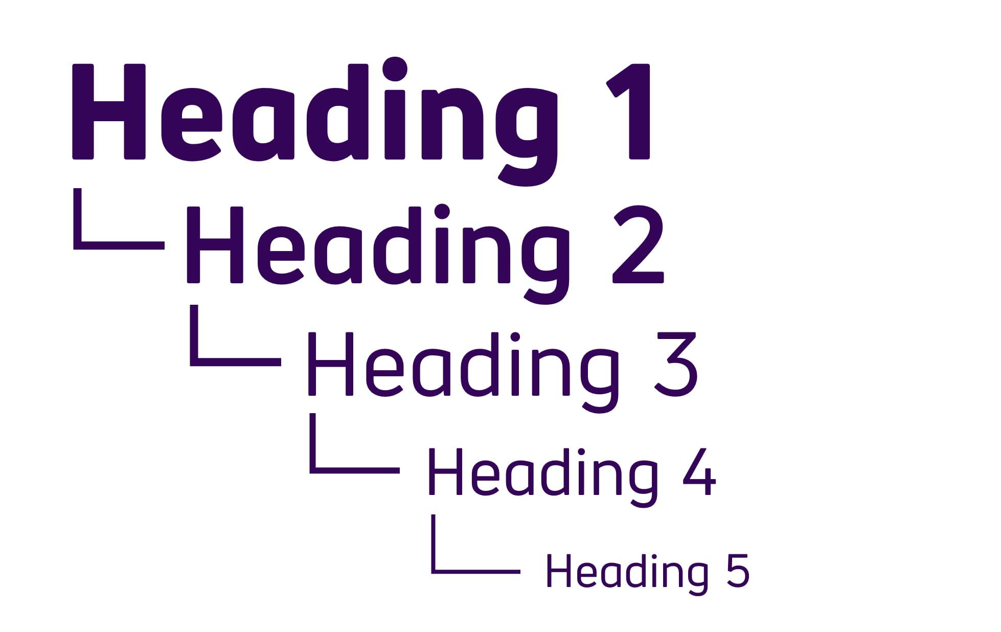
For quick and easy navigation, many screen reader users navigate the page using various elements such as headings. This is a great way to quickly find the information you need. Especially if headings follow a logical structure of H1, H2 and H3, which helps prioritize.

If the site does not have headers, then screen reader users cannot use the corresponding keyboard shortcuts. In this case, on a long page you have to navigate by tabs or arrows to find the information you need.
Headings also help to visually break up content and improve readability. In addition to headings, screen reader users can navigate the page through WAI-ARIA links, lists, and landmarks.
Inaccessible web forms
Most websites use forms in one way or another. Whether it's a product search or a feedback form. But if these forms are not labeled or labeled incorrectly, then we cannot use them.
For example, if a search field is unchecked, then screen reader users have no idea about the purpose of that field. This means that people using screen readers cannot access the same features.
Contact forms are an effective way for customers to contact your company. And for screen reader users, there is nothing more frustrating than these mislabeled forms.
Especially the use of captcha. If it is silent, then we cannot fill out such a form on our own. I often have to resort to the help of a sighted person, but not everyone has such an opportunity.
Auto play audio and video
Most people know how annoying a web page is with loud advertisements that suddenly play. But for screen reader users, the situation is even worse. Auto-playing video or audio can drown out the sound of the screen reader. This makes it difficult to find the pause or stop buttons.
(And if these buttons are not labeled, then it is almost impossible for me to quickly stop the video, which is further annoying). If I can't stop audio or video, I usually close the page.
Solution? Make sure your site does not automatically play video or audio. If you really want to publish the video, make sure the audio is muted and the user can stop playing or hide the media player.
These problems may seem minor to the sighted. But for me it makes a difference whether I can interact with the site or not. And it's very important to implement them correctly.