Namely, here I will show you how to use Flexbox layouts to create high-quality headers for websites. I will share some tips, and in the end, I will demonstrate my project, created specifically for this material. Therefore, if you are really interested in the topic that I decided to raise here, you should definitely read this article to the end.
Here I am assuming you know the basics of Flexbox layout. Here , just in case, is my article written for those who want to learn more about the CSS property
flex.
Introduction
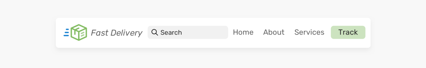
First, let's make sure that you and I call the "site header" or "site header" the same thing. The site header is one of the first page elements that a user sees when visiting a site. It usually contains the logo or name of the site, as well as navigation links. Take a look at the following figure.

Site logo, navigation links and header part container
Regardless of the design of the site header part, its key elements are the logo and the list of links.
Flexbox technology in action
When the layout for the header of a site is created using Flexbox technology, all items at the same level are lined up on a single line. Then all that remains is to use the property
justify-contentto align the elements by distributing the free space between them.
Here is the markup code:
<header class="site-header">
  <a href="#" class="brand">Brand</a>
  <nav class="nav"></nav>
</header>
Here are the styles:
.site-header {
  display: flex;
  justify-content: space-between;
  align-items: center;
}
It's not complicated at all, right? Well, for such a simple headline, it is. But in practice, things can be much more complicated.
Page header container
The page header markup described in the previous section does not contain an inner container element that contains elements that represent the logo and navigation links. On large screens, using this layout can be problematic.

Page header layout created without using an inner container (above) and using a container (below)
Notice that the first page header is too wide because the inner container was not used when it was created. But the second layout looks much better. Therefore, the HTML code of the previous example should be rewritten as follows:
<header class="site-header">
  <div class="wrapper site-header__wrapper">
    <a href="#" class="brand"><img src="logo.svg" alt="brand" /></a>
    <nav class="nav"></nav>
  </div>
</header>
And the flex styles need to be applied to the element
.site-header__wrapper:
.site-header__wrapper {
  display: flex;
  justify-content: space-between;
  align-items: center;
}
Using the flex-wrap property
A property
flex-wrapis a kind of CSS security mechanism. If the screen size is small, there is a chance that you will have to use horizontal scrolling to work with the header part of the page. This is what it looks like.
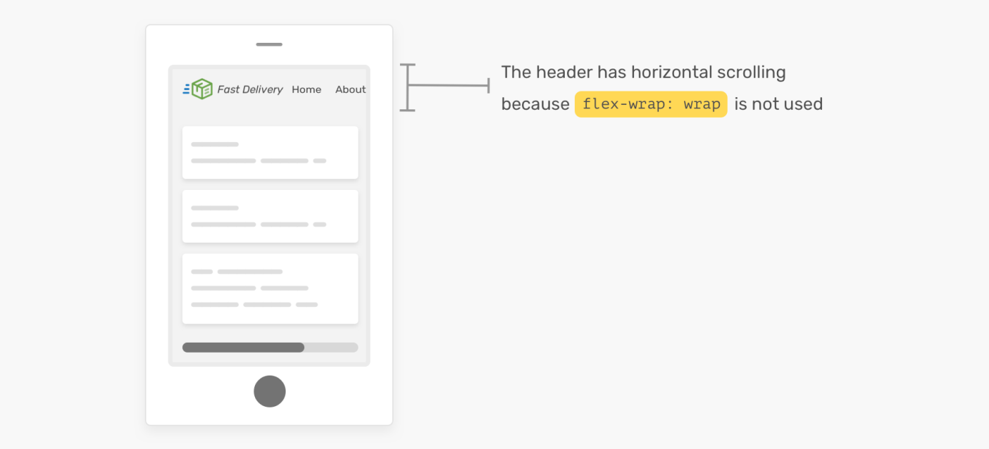
To work with the page title, you need to use horizontal scrolling. The thing is that the flex-wrap property is not used here: wrap
As you can see, it will be inconvenient to work with such a page. So don't forget about the property
flex-wrap!
Exploring different layout options for page header sections
What I like about Flexbox layouts is that they make it easier to support different design options for header sections of pages. In this section, based on the example above, I'm going to explore the possibilities of expanding the layout by adding new elements to it, such as buttons and search fields. Immediately, I want to explore ways to change the display order of the children of the header of the page.
▍Variant number 1
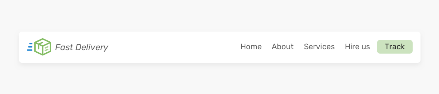
First version of the header part of the page
A button was added to this layout, placed after the block of navigation links. How to do it? Do I need to design it as a link placed inside the element
<nav>? Or maybe it should be made a separate element? I will do just that.
Here's the HTML for my idea:
<header class="site-header">
  <div class="wrapper site-header__wrapper">
    <a href="#" class="brand"><img src="logo.svg" alt="brand" /></a>
    <nav class="nav"></nav>
    <a href="/track-shipment" class="button">Track</a>
  </div>
</header>
In this case, the distance between elements cannot be set using the property
justify-content: space-between. Instead, I will use the property to align the block of links margin-left: auto. This will push links and buttons to the right side of the container.

Elements, thanks to margin-left: auto, are pressed to the right side of the container
Separating the button from the link block is valuable for mobile layouts, where, for example, you may need to leave the button and present the link block as a drop-down menu.

Page header on desktop and mobile
▍ Option number 2
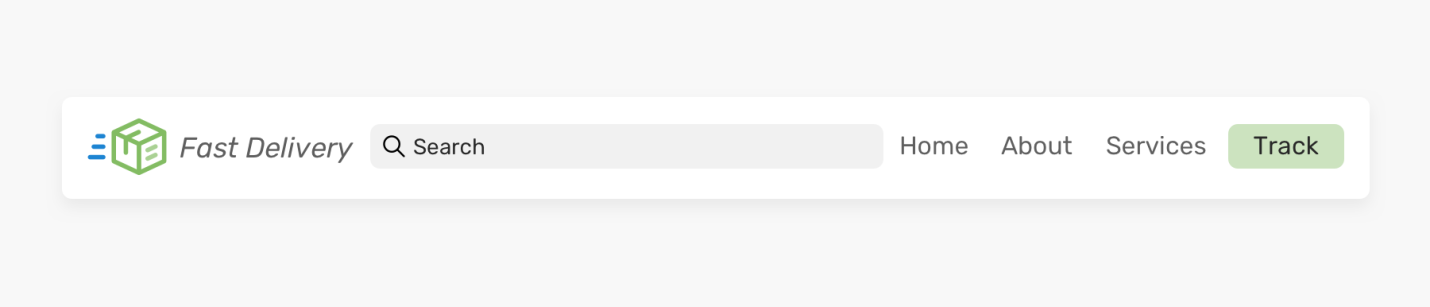
The second variant of the heading part of the page
Here we have expanded the capabilities of the heading part of the page by adding a search field to it. It takes up the free space left after placing other elements on the page. With Flexbox layouts, this can be achieved by applying the property
flex.
Here's the markup:
<header class="site-header">
  <div class="wrapper site-header__wrapper">
    <a href="#" class="brand"><img src="logo.svg" alt="brand" /></a>
    <div class="search"></div>
    <nav class="nav"></nav>
    <a href="/track-shipment" class="button">Track</a>
  </div>
</header>
Here is the style applied to the search box:
.search {
  flex: 1;
}
That's all! Now the field will fill in the empty space between the logo and the link block. However, this approach has some limitations. On small screens, the header of the page will look like below.
Page header on a small screen
The width of the search field must not be less than a certain size. Otherwise, it will be difficult to enter text into it. Below are several solutions to this problem.

Solving the problem caused by decreasing the width of the search field on small screens
I like the second option better, because when using it, the block of links is not hidden too early. In general, I can say that I strive not to hide the element in the event that it does not interfere with the correct display of the layout.
▍ Option number 3

The third version of the heading part
This is the same markup as the first version of the heading. But here the order of displaying elements on the screen has been changed. How to do it? You may decide to use the property here
order. Let's explore this idea.
Here is the HTML:
<header class="site-header">
  <div class="wrapper site-header__wrapper">
    <a href="#" class="brand"><img src="logo.svg" alt="brand" /></a>
    <nav class="nav"></nav>
    <a href="/track-shipment" class="button">Track</a>
  </div>
</header>
Here are the styles:
.site-header {
  display: flex;
  justify-content: space-between;
}

.nav {
  order: -1;
}
And this is what the result of rendering all this looks like.

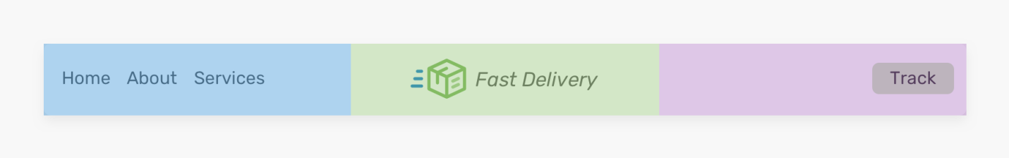
Using the justify-content: space-between property does not align the logo to the center. This property only distributes the free space between the elements.
The solution to this problem is to assign each child element to the header of the page with a property
flex: 1. This will distribute the space between the elements.
Here are the styles:
.brand,
.nav,
.button {
  flex: 1;
}

Uniform distribution of free space between the elements of the heading part of the page
However, something strange happened with the button. It, due to the application of the property
flex: 1, has become too long. The only way to fix this is to put the button in a container element:
<header class="site-header">
  <div class="wrapper site-header__wrapper">
    <a href="#" class="brand"><img src="logo.svg" alt="brand" /></a>
    <nav class="nav"></nav>
    <div class="button-wrapper">
      <a href="/track-shipment" class="button">Track</a>
    </div>
  </div>
</header>
With this approach, you can center align both the logo and the button:
.logo {
  text-align: center;
}

/*      .  -  ,    ,           . */
.button-wrapper {
  text-align: end; /* end - ,  LTR-,   ,   right */
}
Aligning Elements
This approach, however, is also not ideal. Remember that if there are more links in the navigation block, it will lead to problems. Namely, here it is necessary that the width of the navigation block does not exceed a certain size. Here's an example where the logo loses its center alignment.
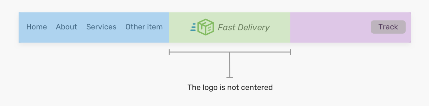
The logo is no longer centered.
As you can see, in the previous image, the logo is no longer centered. It is worth remembering about this feature of the above approach in order not to face unexpected problems.
Now that we've explored the different design options for website header layouts and talked about how to create such layouts, let's take a look at some important ideas that can help us in creating page header layouts.
Tips for Designing Headers for Flexbox-Based Pages
▍The flex-basis property
I prefer to use a property
flex-basis: 100%when the element needs to be full width on mobile devices. For example, if we are talking about an important block of navigation links that cannot be hidden.

The result of applying the flex-basis property is 100%
Applying this property, if you look at the previous figure, might seem like a simple matter. In reality, this is not the case. Typically, the header of a site can have padding, and if we adjust the element to fill the full width, this won't happen until the padding is overlapped. However, removing them is impractical, as it will affect other elements of the layout.
Here's how to fix this problem:
- Let's add
flex: 1 0 100%to the navigation block. - Let's change, if necessary, its property
order. Sometimes we have to take care of other elements as well, so we need to make sure that the navigation box is the last element. - Let's adjust the margins of the navigation box using a negative value equal to the size of the internal margins. This will allow this block to fill the full width of the page.
- Let's adjust the padding so that there is a little "air" in the element.
- Finally, we will use the property
justify-content: centerto center the navigation elements (although this is not particularly important).
Here are the styles (in square brackets are the items in the above list to which they relate):
.nav {
  flex: 1 0 100%; /* [1] */
  order: 2; /* [2] */
  margin: 1rem -1rem -1rem -1rem; /* [3] */
  padding: 1rem; /* [4] */
  display: flex; /* [5] */
  justify-content: center; /* [5] */
}
And here is how the step by step application of the above styles to the list of navigation elements will look like.
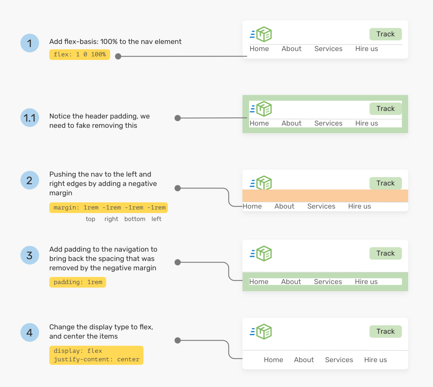
Styling elements step by step
▍Adjusting the distance between elements
Now that the Chrome and Firefox browsers support the property
gap, it's very easy to adjust the spacing between flex items. Take a look at the next header section of the page.

Using the gap property
In order to adjust the distance between the items selected in the figure, you need to add a property to the parent flex item
gap: 1rem. Without using this property, we would have to style the elements the same way.
/*   */
.brand {
  margin-right: 1rem;
}

.sign-in {
  margin-right: 1rem;
}

/*   */
.site-header {
  /*  flexbox-*/
  gap: 1rem;
}
If you use a property
gap, remember that you will need to prepare and a fallback in case it is not supported by the browser in which the page is viewed. I wrote a detailed article about this .
This concludes the conversation, but before we part, let me show you one of my projects.
Headers-css project
Here is an example of page headers that are created within the headers-css project.
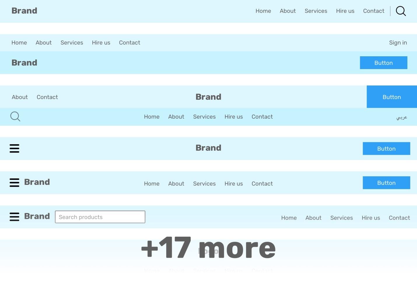
Headers of pages from headers-css
I decided to make a project in which templates for header parts of websites are collected, designed as separate pages. Now, if I need a similar element, I can quickly find it and integrate it into a new project. Namely, I created 17 variations of the page header. I plan to expand this project in the near future. While working on these elements, I paid particular attention to the following:
- Flexibility.
- Fully responsive design.
- Using Sass, which makes it easy to edit my templates (though in this area I still need to refactor the code a little).
- Accessibility (if you come across something wrong - please add an entry to the project task tracker).
Here's a page to see the headers-css project in action. And here is the project's GitHub repository.
How do you create the header parts of your web pages?