We spend most of the development time for our Android application not working on the user interface - we just throw in a view and start writing code. I've noticed that most of us don't really care about the user interface. And I think this is fundamentally wrong. Mobile app developers have to take care of UI / UX as well. I am not saying “be an expert on mobile UI”, but you must understand the design language and its concepts.
I previously wrote an article on shadows in material design and received a lot of good reviews. I want to thank you all. "Mastering Shadows in Android" talks about elevation and shadow in Android. There I also showed how I supplemented my open source UI library with them. ( Scaling Layout ).
In this article, I want to improve my library using StateListAnimator and show you step by step how I will do it.
Content
This article covers the following topics:
- Drawable states
- StateListDrawable
- Animating properties
- StateListAnimator
- ScalingLayout with StateListAnimator
Drawable states
Android has 17 different states for Drawable.

We may have never even met some of them. I am not going to delve into every state. In most cases, we use the
pressed, enabled, windows focused, checkedand so on. D. If we do not declare a state of drawable, it is assumed that this state by default in Android.
We need to understand these states in order to write our own StateListDrawable .
StateListDrawable
It is essentially a list of drawable items, where each item has its own state. To create a StateListDrawable, we need to create an XML file in a folder
res/drawable.
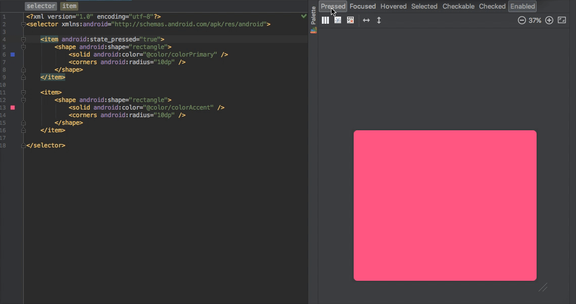
<item android:drawable="@drawable/i" android:state_pressed="true"/>This is an item. It has two properties. Drawable and State .
<selector>
   <item
       android:drawable="@drawable/p"
       android:state_pressed="true"/>
   <item
       android:drawable="@drawable/default"/>
</selector>
This is StateListDrawable. If we do not declare a state for an element, as I mentioned earlier, this means that this is the default state .
Can I use ShapeDrawable?
Yes. Instead of using android: drawable, you can add an arbitrary shape to your element. Here is an element with a ShapeDrawable .
StateListDrawable
You can use StateListDrawable from API level 1. Thus, there is no API level restriction for StateListDrawable.
<View
   android:layout_width="50dp"
   android:layout_height="50dp"
   android:foreground="@drawable/state_list_drawable"
   android:clickable="true"/>
That's all. Now our view has a state. When the user clicks on it, its color will be changed. When the user releases it, it will have a default state and color.
But wait a second. Clickable ? Why did we add this attribute? Do we also need to add it? Yes. But only for custom views. It takes time to find out. Buttons work fine without adding clickable, because they are clickable by default . But if you want to use StateListDrawable for View, ImageView, Custom View, etc., you need to add clickable attribute .

StateListDrawable
I added StateListDrawable in this commit . It is similar to the example I gave above. When the user clicks on the layout, it is colored. But let's improve this with StateListAnimator.
StateListAnimator
Remember that when you click the FloatingActionButton, its Z value increases due to animation. This is a StateListAnimator off-screen so to speak. Some material design widgets have their own StateListAnimator inside.
Let's clear this up with a question on StackOverflow.

(How to remove border / shadow from lollipop buttons).
If Material Design widgets have their own StateListAnimator inside, we can set them to null to remove these functions (not recommended, it's not designed for nothing.) And now the answer sounds much more logical.

(Lollipop has a nasty little function calledstateListAnimatorthat handles the height of the buttons, producing shadows.
RemovestateListAnimatorto get rid of shadows.
You have several options for how to do this:
In code:
button.setStateListAnimator (null);)
So how can we create it?
To understand StateListAnimator, we need to understand property animation . I'm not going to dive into property animation in this article. But at least I want to show you the basics.
Animating properties
Here is the simplest example of a property in an object. X is a property.
class MyObject{

   private int x;

   public int getX() {
       return x;
   }

   public void setX(int x) {
       this.x = x;
   }
}
The property animation system is a robust framework that lets you animate almost anything . You can specify animations for any object property changes over time, regardless of whether it is displayed on the screen or not . A property animation changes the value of a property (a field in an object) over a specified period of time.

X is a property . T is time . During animation, the X property is updated at the specified time. In general, this is how property animation works. Instead of a box, there can be a view or any object.
ValueAnimatorIs the base class for animating properties. You can set up a listener to update the ValueAnimator and watch for property changes.
ObjectAnimator is a class that inherits from
ValueAnimator . You can use ObjectAnimator if the following are more suitable for you:
- You have an object (any class with some property).
- You don't want to watch the ValueAnimator listener.
- You want to update the object property automatically.
So, if we have a view (which is an object) and we want to update the view property (x coordinate, y coordinate, rotation, translation, or any other property that the view has a getter / setter for), we can use the ObjectAnimator . Let's continue creating the StateListAnimator.
<selector>

   <item android:state_pressed="true">
      <objectAnimator
           android:duration="200"
           android:propertyName="translationZ"
           android:valueTo="6dp"
           android:valueType="floatType" />
   </item>

   <item>
      <objectAnimator
           android:duration="200"
           android:propertyName="translationZ"
           android:valueTo="0dp"
           android:valueType="floatType"/>
   </item>

</selector>
The FAB button animates its "translationZ" property when pressed and released.
As I said earlier, we can use the object property directly without observing the changes in the animator. Each View has a translationZ property. This way we can directly animate translationZ using the ObjectAnimator.
We can also combine multiple
<objectAnimator><set>Here's the result! It now also increases when clicked by the user And here's the commit .

You can also define other properties in your
animator.xml. You can find more information on using the ObjectAnimator here.
That's all. I am planning to write more about ValueAnimator and ObjectAnimator. This is a great API for animating an object.
Successful coding!