Surely many of you leafing through Western scientific publications have seen beautiful and simple graphics. Perhaps some of you have wondered what these pundits visualize their data in. And now there is a gorgeous and very simple graphing tool, which is almost everywhere: Windows, linux, android, and others, I'm sure there is even under DOS. It is reliable, simple and allows you to present any text-tabular data in the form of beautiful graphs.
Why gnuplot?
If you have already read my articles " Simultaneous speedtest on several LTE modems ", " Harmonic oscillations ", " Create a hardware random number generator "), you might have noticed beautiful graphs.

Graph from the post about the random number generator
Picture from the post about speetest modems The
graphs are simple and cool. The most valuable advantage of gnuplot is that to plot them you only need a text file with the raw data, gnuplot on your favorite OS (OpenWRT though) and your favorite
At first glance, it might seem that gnuplot is more difficult to use for plotting than MS Excel. But it only seems that way, the entry threshold is a little higher (you can't use a mouse to click, you need to read the documentation here), but in practice it comes out much easier and more convenient. I wrote a script once and have been using it all my life. It's really much more difficult for me to plot a graph in Exel, where everything is not logical, than in gnuplot. And the main advantage of gnuplot is that you can embed it into your programs and visualize data on the fly. Also gnuplot without any problems builds a graph from a 30-gigabyte file of statistical data, while Exel simply crashed and could not open it.
The pluses of gnuplot include the fact that it can be easily integrated into the code in standard programming languages. There are ready-made libraries for many languages, I personally came across php and python. Thus, you can generate graphs directly from your program.
For example, I will say that my good friend, when she was writing her dissertation, mastered gnuplot (at my suggestion). She's never a techie, but she figured it out in one evening. After that she built charts only there, and the level of her work began to differ favorably against the background of colleagues using Excel. For me personally, an indicator of the high quality of scientific work is the graphs built by specialized programs.
Thus, gnuplot is simple, accessible and beautiful. Let's go further.
Gnuplot - application
There are two ways to work with gnuplot: command mode and script execution mode. I recommend using the second mode immediately, as it is the most convenient and fastest. Moreover, the functionality is absolutely the same.
But to start, we run gnuplot in command mode. Run gnuplot from the command line, or in the way that is available for your OS. You can start training not even by reading this article, but right from the very first help command . She will display a gorgeous help and you can go further on it. But we'll go over the highlights.
The graph is plotted by the plot command . As command parameters, you can specify a function or the name of the data file. As well as which column of data to use and how to connect the points, how to denote them, etc. Let's illustrate.
gnuplot> plot sin(x)

After executing the command, a window will open where there will be a sine graph with default signatures. Let's improve this graph and figure out some additional options at the same time.
Let's sign the axes.
set xlabel "X"Specifies the label for the abscissa axis.
set ylabel "Y"Specifies the label for the ordinate axis.
Let's add a grid to show where the graph is built.
set gridI do not like the fact that the sinusoid on the ordinate axis rests on the end of the graph, so we will set the limits of the values that the graph will be limited to.
set yrange [-1.1:1.1] Thus, the graph will be drawn from the minimum value of -1.1 to the maximum value of 1.1.
Likewise, I set the range for the abscissa so that only one period of the sinusoid is visible.
set xrange[-pi:pi]We need to add a title to our schedule so that everything is Feng Shui.
set title "Gnuplot for habr" font "Helvetica Bold, 20"Note that you can set fonts and their sizes. See the gnuplot documentation for what fonts can be used.
And finally, in addition to the sine on the graph, let's also draw the cosine, and also set the line type and its color. And also add legends, what are we drawing.
plot sin(x) title "sinux" lc rgb "red", cos(x) title "cosinus" lc rgb "green"Here we draw two graphs on one canvas, in red and green. In general, there are a lot of options for lines (dotted line, stroke, solid), line widths, colors. As well as types of points. My goal is only to demonstrate the range of possibilities. Let's bring all the commands into one pile and execute them sequentially. To reset the previous settings, enter reset.
reset
set xlabel "X"
set ylabel "Y"
set grid
set yrange [-1.1:1.1]
set xrange[-pi:pi]
set title "Gnuplot for habr" font "Helvetica Bold, 20"
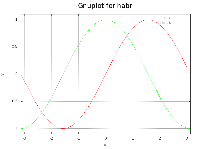
plot sin(x) title "sinux" lc rgb "red", cos(x) title "cosinus" lc rgb "green"As a result, we get just such beauty.
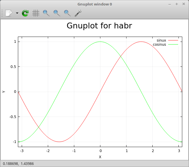
It is no longer a shame to publish the schedule in a scientific journal.
If you honestly repeated all this after me, you might have noticed that manually entering it every time, even copying, is somehow not comme il faut. But is this a ready-made script? So let's do it!
Exit command mode with the exit command and create a file:
vim testsin.gpi#! /usr/bin/gnuplot -persist
set xlabel "X"
set ylabel "Y"
set grid
set yrange [-1.1:1.1]
set xrange[-pi:pi]
set title "Gnuplot for habr" font "Helvetica Bold, 20"
plot sin(x) title "sinux" lc rgb "red", cos(x) title "cosinus" lc rgb "green"We make it executable and run it.
chmod +x testsin.gpi
./testsin.gpi
As a result, we get the same window with charts. If you don't add “-persist” to the title, the window will automatically close after the script is executed.
But it is often not very necessary to create a window, plus it is not always convenient to use it, and you can work in an operating system without a GUI. Much more often you need to receive graphic files. Personally, I prefer the postscript vector format, since with a large number of points, you can zoom in different parts of the graph without losing quality. And also the viewer in Linux automatically refreshes the window with the graph when the postscript file is changed, which is also very convenient.
In order to output data to a file and not to the screen, you need to reassign the terminal.
set terminal png size 800, 600
set output "result.png"
As you might guess, we indicate the file type, its resolution, then we indicate the file name. Add these two lines to the beginning of our script, and we get this picture in the current folder.
In order to save to postscript, you need to use the following commands:
set terminal postscript eps enhanced color solid
set output "result.ps"
Real data
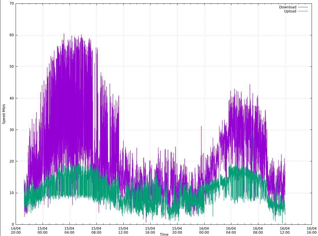
Sines, cosines are certainly cool to draw, but still drawing real data is much more interesting! Let me remind you of a recent task about which I wrote an article - displaying graphs of Internet speed over long periods of time. The data format was as follows.
Operator; #Test; Date; Time; Coordinates; Download Mb / s; Upload Mb / s; ping; Testserver
Rostelecom; 0; 05/21/2020; 09: 56: 00; NA, NA; 3.7877656948451692; 5.231226008184113; 132.227; MaximaTelecom (Moscow) [0.12 km]: 132.227 ms
Rostelecom; 1; 05/21/2020; 10: 01: 02; NA, NA; 5.274994541394363; 5.1088572634075815; 127.52; MaximaTelecom (Moscow) [0.12 km]: 127.52 ms
Rostelecom; 2; 05.21.2020; 10: 04: 35; NA, NA; 3.61044819424076; 4.624132180211938; 135.456; MaximaTe 0.12 km]: 135.456 ms
It can be seen that we have a semicolon as a separator, we need to display the download speed, upload speed depending on time. Moreover, if you pay attention to the date and time are in different columns. Now I'll tell you how I got around this. I will immediately cite the script by which the graph was built.
#! /usr/bin/gnuplot -persist
set terminal postscript eps enhanced color solid
set output "Rostelecom.ps"

#set terminal png size 1024, 768
#set output "Rostelecom.png"

set datafile separator ';'
set grid xtics ytics
set xdata time
set timefmt '%d.%m.%Y;%H:%M:%S'

set ylabel "Speed Mb/s"
set xlabel 'Time'
set title "Rostelecom Speed"

plot "Rostelecom.csv" using 3:6 with lines title "Download", '' using 3:7 with lines title "Upload"

set title "Rostelecom 2 Ping"
set ylabel "Ping ms"
plot "Rostelecom.csv" using 3:8 with lines title "Ping"
At the beginning of the file, we set the postscript output file (or png, if needed).
set datafile separator ';' - we set the delimiter character. Columns are separated by space by default, but the csv file offers many delimiter options and you should be able to use all of them.
set grid xtics ytics - set the grid (you can set the grid only along one axis).
set xdata time is an important point, we are talking about the fact that on the X axis the data format will be time.
set timefmt '% d.% m.% Y;% H:% M:% S ' - set the time data format. Please note that the column delimiter character (";") is included in the time format, so we will treat two columns as one.
We set the labels of the axes and the graph. Then we build a graph.
plot "Rostelecom.csv" using 3: 6 with lines title "Download", '' using 3: 7 with lines title "Upload" - we plot both the download speed and upload speed on one graph. Using 3: 6 is the column number in our source data file, what we are building from (X: Y).
Then we plot the ping graph in the same way. The resulting graph will look like this.
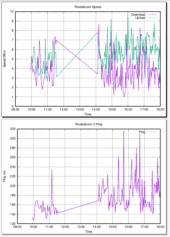
This is a screenshot from postscript. Straight lines in the graph are due to the fact that there are data gaps. Here is a very real example of plotting.
And 3D ???
Do you want 3D? I have them!
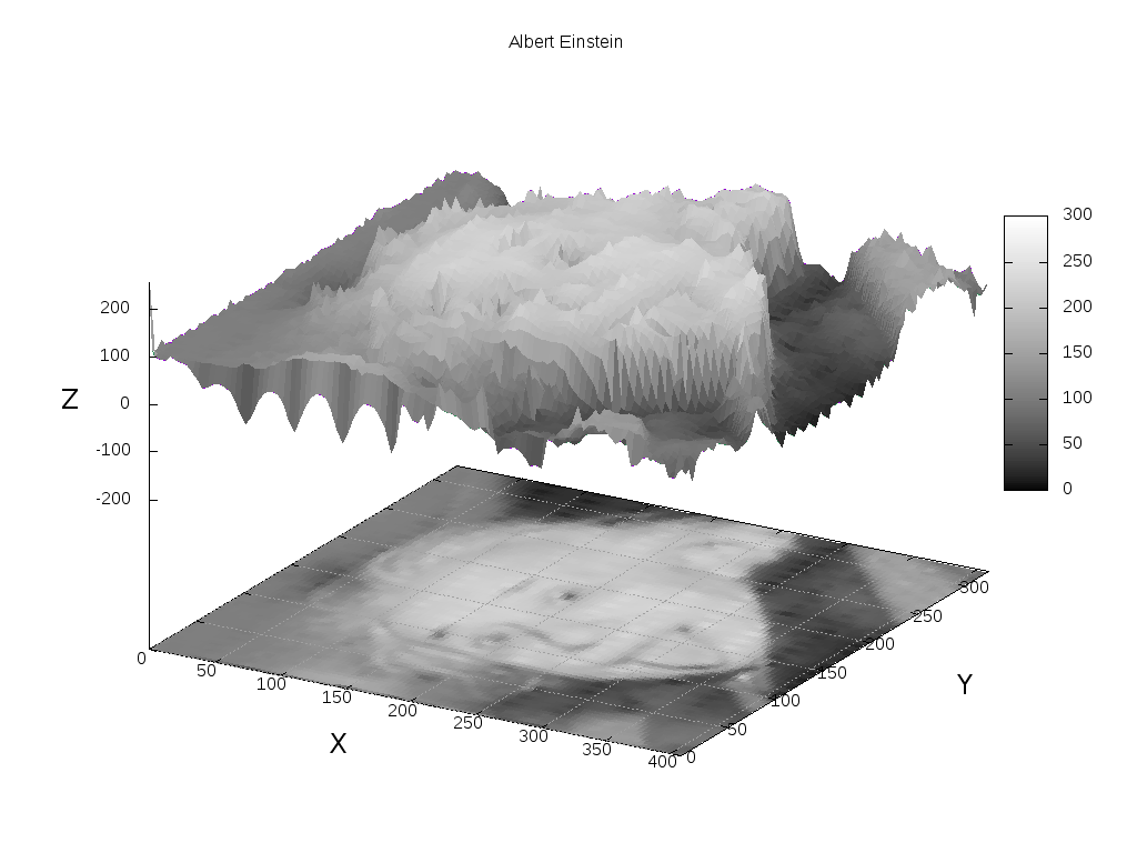
I thought for a long time what example of three-dimensional graphics to give, and did not come up with anything better than visualizing the picture. Indeed, in essence, a picture is a three-dimensional graph, where the pixel brightness is the z coordinate. So let's play a little hooligan.
Take the most famous photo of Einstein.

And let's make a graph out of it. To do this, convert it into pgm ASCII format and remove all spaces, replacing it with a newline, with such a simple command.
convert Einstein.jpg -compress none pgm:- | tr -s '\012\015' ' ' | tr -s ' ' '\012'> outfile.pgm For those who do not understand what is happening here, I explain: we use imagemagic to convert the image to pgm format, and then use tr to replace the carriage return with a new line to a space, and then all spaces to a carriage return and save it all in outfile. pgm. Anyone who is difficult can open the file in gimp and export it as pgm-ASCII.
After that, open the resulting file with our favorite editor
f = open('outfile.pgm')
for x in range(408):
	for y in range(325):
		line = f.readline()
		print ('%d %d %s' % (x, y, line)),
f.close()
Save this as convert.py and run:
python convert.py > res.txtThat's it, now res.txt contains the coordinates of Einstein ... Hmm, or rather the coordinates of his image. Well, in general, you get the idea :).
…
406 317 60
406 318 54
406 319 30
406 320 41
406 321 84
406 322 101
406 323 112
406 324 119
407 0 128
407 1 53
407 2 89
407 3 95
407 4 87
...
Sample file.
The script for building this beauty looks like this.
#! /usr/bin/gnuplot -persist
#set terminal png size 1024, 768
#set output "result.png"
#set grid xtics ytics

#set terminal postscript eps enhanced color solid
#set output "result.ps"

set title "Albert Einstein"
set palette gray
set hidden3d
set pm3d at bs
set dgrid3d 100,100 qnorm 2
set xlabel "X" font "Helvetica Bold	,18"
set ylabel "Y" rotate by 90 font "Helvetica Bold	,18"
set zlabel "Z" font "Helvetica Bold	,18"

set xrange [0:408]
set yrange [0:325]
set zrange [-256:256]
unset key
splot "./res.txt" with l
Before we go to parse the script, if you repeat this, I strongly recommend that you execute the script lines in command mode so that you can rotate the chart with the mouse (of course, without specifying the set terminal). It is very cool!
First, we set the output data type, as well as the data boundaries. The borders are set according to the size of the picture, and plus from the bottom I have spaced 256 characters along the Z axis so that the projection of the picture is visible. Next, we head the graph, label the axes. Using the unset key command - I disable the legends (it is not needed on the chart). And here comes the real magic!
set palette gray - we set the palette. If left as default, the graph will be colored like on a thermal imager. The higher, the more yellow the spot, the lower the darker the red.
set hidden3d- as it were, stretches the curved surface (removes the lines), thus forming a beautiful convex surface.
set pm3d at bs - turn on the 3D data drawing style, which draws data with a grid coordinate and color. Read more in the documentation, a more detailed description is beyond the scope of the article.
set dgrid3d 100,100 qnorm 2 - set the size of the grid cells to 100x100, and antialiasing between the cells. The value 100x100 is already very large, and the program is very slow. qnorm 2 is anti-aliasing (data interpolation between cells).
splot "./res.txt" with l - draw the resulting graph. "With l" means to draw the graph with lines. This is a small hack, because the points are visible on the graph (small points can be set).
After launch, we wait for some time, and we get a polygonal "bas-relief". Try experimenting with the settings to get other rendering options.
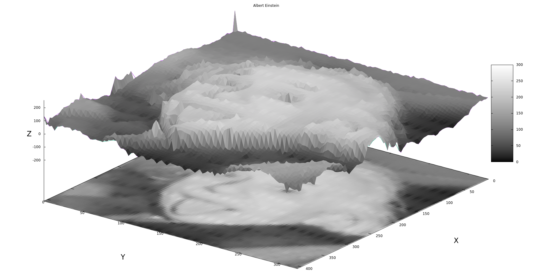
The image is in command mode after being rotated.
An anecdote immediately comes to mind.
How to find Lenin Square?
Only an uneducated person will answer this question, that it is necessary to multiply the height of Lenin by the width of Lenin.
An educated person knows to take an integral over a surface.
Using gnuplot in your programs
The example is taken from stackoverflow with my minor modifications.
The code generates a text file and constantly causes the graph to be rebuilt. I will attach the code under the spoiler so as not to tear the article.
Sample C code using gnuplot
#include <stdio.h>
#include <stdlib.h>
#include <unistd.h>


float s=10.;
float r=28.;
float b=8.0/3.0;
/* Definimos las funciones */
float f(float x,float y,float z){
    return s*(y-x);
}
float g(float x,float y,float z){
    return x*(r-z)-y;
}
float h(float x,float y,float z){
    return x*y-b*z;
}
FILE *output;
FILE *gp;

int main(){
    gp = popen("gnuplot -","w");
    output = fopen("lorenzgplot.dat","w");
    float t=0.;
    float dt=0.01;
    float tf=30;
    float x=3.;
    float y=2.;
    float z=0.;
    float k1x,k1y,k1z, k2x,k2y,k2z,k3x,k3y,k3z,k4x,k4y,k4z;
    fprintf(output,"%f %f %f \n",x,y,z);
    fprintf(gp, "splot './lorenzgplot.dat' with lines \n");
/* Ahora Runge Kutta de orden 4 */
    while(t<tf){
        /* RK4 paso 1 */
        k1x = f(x,y,z)*dt;
        k1y = g(x,y,z)*dt;
        k1z = h(x,y,z)*dt;
        /* RK4 paso 2 */
        k2x = f(x+0.5*k1x,y+0.5*k1y,z+0.5*k1z)*dt;
        k2y = g(x+0.5*k1x,y+0.5*k1y,z+0.5*k1z)*dt;
        k2z = h(x+0.5*k1x,y+0.5*k1y,z+0.5*k1z)*dt;
        /* RK4 paso 3 */
        k3x = f(x+0.5*k2x,y+0.5*k2y,z+0.5*k2z)*dt;
        k3y = g(x+0.5*k2x,y+0.5*k2y,z+0.5*k2z)*dt;
        k3z = h(x+0.5*k2x,y+0.5*k2y,z+0.5*k2z)*dt;
        /* RK4 paso 4 */
        k4x = f(x+k3x,y+k3y,z+k3z)*dt;
        k4y = g(x+k3x,y+k3y,z+k3z)*dt;
        k4z = h(x+k3x,y+k3y,z+k3z)*dt;
        /* Actualizamos las variables y el tiempo */
        x += (k1x/6.0 + k2x/3.0 + k3x/3.0 + k4x/6.0);
        y += (k1y/6.0 + k2y/3.0 + k3y/3.0 + k4y/6.0);
        z += (k1z/6.0 + k2z/3.0 + k3z/3.0 + k4z/6.0);
        /* finalmente escribimos sobre el archivo */

        fprintf(output,"%f %f %f \n",x,y,z);
        fflush(output);
        usleep(10000);
        fprintf(gp, "replot \n");
        fflush(gp);
        t += dt;
    }
    fclose(gp);
    fclose(output);
    return 0;
}
The code works very simply, we open a pipe:
gp = popen("gnuplot -","w");This is similar to the vertical bar in bash, when we write another command after one command, only inside the program. We write the data to the lorenzgplot.dat file. Call the splot command in gnuplot once:
fprintf(gp, "splot './lorenzgplot.dat' with lines \n");And then, when adding a new point, we rebuild the graph.
fprintf(gp, "replot \n");As a result, we get a very nice slow construction of the Lorenz Attractor. Below is a video taken almost ten years ago with an old camera, so don't swear too much. The important thing in the video is that it all works great on such an old hardware as Nokia N800. It is desirable to watch it without sound.
It is important to understand that the replot command eats memory and processor time very well, that is, such a plotting does not slow down the system so much. So, with all the love for gnuplot, this is not the best way to use it. Another problem is that this window cannot be closed or moved.
Conclusion
Finally, I want to show a video in which I collected hundreds of graphs of the random logarithmic distribution of registrations of radioactive particles, real data from one study. Video can and should be watched with sound.
In this article, I could not tell even a thousandth part of the capabilities of this plotter, except that I familiarized the reader with this program a little. Next, you should look for examples on your own, read the documentation on the official website gnuplot.sourceforge.net or www.gnuplot.info . Be sure to look at the examples, there are a lot of interesting and useful things.
For a start, I can also recommend a Brief introduction to gnuplot (rus) . I am sincerely surprised that such a wonderful program is not studied in all technical universities on a par with Latex. For some reason, we learned MS Excel and Word.
Learning gnuplot is not difficult, I spent literally a few days trying to figure it out from scratch. But with this article, I believe that everything will be faster for you. Now I forgot about any Exel / Calc plotters, I only use gnuplot. Moreover, I do not even know a tenth of all the possibilities of plotting graphs.
I want to note that there are many other plotters, no worse than gnuplot, especially since it is quite old. But for me gnuplot turned out to be the simplest and most comprehensive. Plus, it is the most common plotter, and there are a huge number of examples of its use on the web. Thanks for reading!
