
Although this has happened to me quite often, I still have a small list of favorite libraries that I have used in many projects, and which have proven to be extremely useful over time. I have tried many approaches to solving the problems that these libraries solve. My choice was influenced by the convenience of working with the library, the variety of its capabilities, the good appearance of what is obtained when using it. As a result, I have the list that I want to share with you.
1. Hiding elements by clicking outside of them
Sometimes it happens that you need to trigger an event when the user clicks outside of an element. Most often, you need to do this when you want it so that you can close a drop-down list or dialog box. There is one package to implement this behavior that I use in almost every application I develop.
This is the vue-clickaway library .
Hiding an element when you click outside of it
▍Using vue-clickaway
I usually include this package in
main.js, which allows it to be used throughout the application. If it only applies to one or two pages, then you most likely decide to import it only where you need it.
When importing it individually, remember that you are importing a directive, not a component. That is, the correct thing to do is:
directives: { onClickaway }
But not like this:
components: { onClickaway }
Here's how to make the directive available globally (in
main.js):
import { directive as onClickaway } from 'vue-clickaway'
Vue.directive('on-clickaway', onClickaway)
Here's how to use this directive in a template (here is, for simplicity, an abbreviated version of the code):
<button
    v-on-clickaway="closeYearSelect"
    class="select_option gray"
    @click="toggleYearSelect"
>
    <span class="txt">{{ selectedYear }}</span>
    <span class="arrow blind">Open</span>
</button>
Imagine that I have a full-fledged field for selecting items, including a list of items
<li>(it is not shown in the code). The above button is used to display the list on the screen, and when I click outside of this element, I thereby call the method that closes the list. This allows for a much better user experience than always having to click the close button in the corner of the element. We get this functionality by adding the following construction to the button description:
v-on-clickaway="closeMethodName"
Note that
vue-clickawayyou should always use a method that closes something, not a method that shows and hides an element. What I mean is that the method connected to v-on-clickawayshould look something like this:
closeMethod() {
 this.showSomething = false
}
But this method shouldn't be like this:
toggleMethod() {
 this.showSomething = !this.showSomething
}
If you use something like a method
toggleMethod, then when you click outside the element, you will open and close it, regardless of where you click. You probably don't need it. So just use with v-on-clickawaymethods that hide elements.
2. Pop-up notifications
You can create toast notifications using a variety of tools, but I'm a big fan of the vue-toastification library .
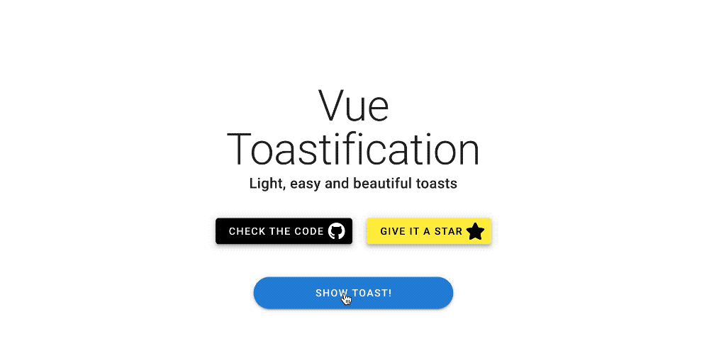
Notification implemented with vue-toastification
It provides a developer with a ton of customizations that can be used to implement notifications to suit a wide variety of needs. The styling and animation capabilities of this library allow you to create attractive and user-friendly solutions that are better than you can create using other packages.
▍Using vue-toastification
The library
vue-toastificationcan be used in a variety of ways. See her documentation for details. So, it can be applied at the component level, at the global level, or even in conjunction with Vuex , in the event that notifications need to be shown based on changes in the state of the application, or on actions related to the server.
Here is an example of global use of this library (in
main.js):
import Toast from "vue-toastification"
//
import "vue-toastification/dist/index.css"
Vue.use(Toast, {
  transition: "Vue-Toastification__bounce",
  maxToasts: 3,
  newestOnTop: true,
  position: "top-right",
  timeout: 2000,
  closeOnClick: true,
  pauseOnFocusLoss: true,
  pauseOnHover: false,
  draggable: true,
  draggablePercent: 0.7,
  showCloseButtonOnHover: false,
  hideProgressBar: true,
  closeButton: "button",
  icon: true,
  rtl: false,
})
Notification styles can be controlled separately by setting them in each component, but in the above case, I made notification styles available throughout the application by importing them into
main.js. After that, I configured the notification settings. This saved me the trouble of writing the same code every time I needed to use the notification. The vue-toastification library has a great playground for experimentation. On it, you can see the effects of the parameters on notifications and immediately copy what you need into your code. This is exactly what I did in the above example.
Let's consider a couple of use cases for this library.
▍Option 1: using notifications in a component (in a template)
<button @click="showToast">Show toast</button>
Here is the method called when the button is clicked:
methods: {
    showToast() {
        this.$toast.success("I'm a toast!")
    }
}
▍Option 2: display a notification when an error occurs (or when an operation succeeds) in Vuex
Here's a sample code to demonstrate how
this._vm.$toast.errorto use it in Vuex when an error occurs:
async fetchSomeData({ commit }) {
    const resource_uri = `/endpoint/url`
    try {
        await axios.get(resource_uri).then((response) => {
            commit(SET_DATA, response.data)
        })
    } catch (err) {
        this._vm.$toast.error('Error message: ' + err.message)
    }
}
You can change the type of notification by simply changing the method name
.errorto .success, .infoor .warning. And if necessary, you can remove it altogether and receive a notification with the default settings.
Toast notifications allow the developer to display some information based on changes in the state of the application, or when an unexpected error occurs. This improves the user experience of the application. Toast notifications give the user a better visual indication of events than modals or ugly alert windows. Indeed, when working with a window, the user needs to click the mouse again to close it. Users will appreciate that you give them visual cues that something is going wrong, eliminating the need to stare helplessly at the screen, waiting for an event that will never happen. In addition, notifications are useful in confirming the success of certain operations.
3. Working with tables
Tables are a very important part of many web applications. Choosing a low-quality spreadsheet library can cause a lot of problems. I've tried many similar libraries and settled on vue-good-table .
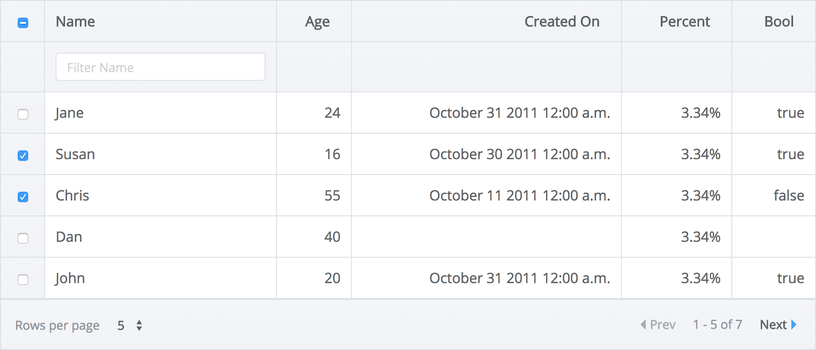
Example of using vue-good-table
I am confident that this library is capable of solving most of the table working tasks a developer faces. And its name, "good-table", is not just words. This is a really good library and gives us a lot more features than we might expect.
▍Using vue-good-table
In the following example, I bind data
:rowsto a Vuex getter called getOrderHistory:
<vue-good-table
    class="mx-4"
    :columns="columns"
    :rows="getOrderHistory"
    :search-options="{ enabled: true }"
    :pagination-options="{
        enabled: true,
        mode: 'records',
        perPage: 25,
        position: 'top',
        perPageDropdown: [25, 50, 100],
        dropdownAllowAll: false,
        setCurrentPage: 2,
        nextLabel: 'next',
        prevLabel: 'prev',
        rowsPerPageLabel: 'Rows per page',
        ofLabel: 'of',
        pageLabel: 'page', //   'pages'
        allLabel: 'All'
    }"
>
Here are the descriptions of the table columns in local data (
data()):
columns: [
    {
        label: 'Order Date',
        field: 'orderDtime',
        type: 'date',
        dateInputFormat: 'yyyy-MM-dd HH:mm:ss',
        dateOutputFormat: 'yyyy-MM-dd HH:mm:ss',
        tdClass: 'force-text-center resizeFont'
    },
    {
        label: 'Order Number',
        field: 'orderGoodsCd',
        type: 'text',
        tdClass: 'resizeFont'
    },
    {
        label: 'Title',
        field: 'orderTitle',
        type: 'text',
        tdClass: 'resizeFont ellipsis'
    },
    {
        label: 'Price',
        field: 'saleAmt',
        type: 'number',
        formatFn: this.toLocale
    },
    {
        label: 'Edit btn',
        field: 'deliveryUpdateYn',
        type: 'button',
        tdClass: 'force-text-center',
        sortable: false
    },
]
Here
labelis the column header displayed on the screen, and fieldthis is the data that is bound in the Vuex getter.
In the example above, I am using some of the vue-good-table table configuration features. This, for example, setting the input and output date format (this allows me to take a complete description of the date and time from the server and show this information to users in a more convenient format). I also use it here
formatFnto format the price using a special method I named toLocale. Then I customize the look of the table cells by binding tdClassto the classes I set in my local tag<style>... The vue-good-table package actually has endless customization options built in. These capabilities allow you to create tables that are suitable for a very wide range of uses.
▍Create your own templates
The vue-good-table library also works fine with templates created by programmers themselves. This means that you can easily embed buttons, fields for selecting values from a list, or anything else in table cells. To do this, it is enough, using the directive
v-if, to indicate the place where something special should be located. Here's an example of adding a button to a table column.
<template slot="table-row" slot-scope="props">
    <span v-if="props.column.field === 'cancelYn' && props.row.cancelYn === 'Y' ">
        <BaseButton class="button" @click="showModal">
            Cancel Order
        </BaseButton>
    </span>
</template>
In this example, I am describing a button that opens a modal window. It is displayed in the field
cancelYn(in the column) if the value of the corresponding data field is equal Y.
To add another column of your own to the table, you just need to add
v-else-ifa construct after the closing tag that used the directive v-if(in our case, it is a tag <span>). After that, you need to describe the logic of the new column. In general, we can say that the vue-good-table library can help in any situation related to displaying tables on web pages.
4. Tool for picking dates
And now I'll tell you about a library designed to organize the selection of dates. Something similar is found in a huge variety of real-life applications. There are many more libraries that implement this functionality than there are libraries for solving other problems that I am talking about here. I regularly return to the vue2-datepicker library to solve this problem .

Example using the vue2-datepicker library The date picker
controls created with this library are easy to style. It supports a ton of customization related to date selection and date range. The library allows you to create neat and convenient user interface elements. It even supports localization tools.
Note that although the package is called vue2-datepicker, you should have no problem using it in Vue 3-based applications (the same goes for the other libraries discussed in this post).
▍Using vue2-datepicker
The library can be imported into a component or included in a template.
Here is an example of importing it into a component:
import DatePicker from 'vue2-datepicker';
//
import 'vue2-datepicker/index.css';
Here's how to use it in a template:
<date-picker
    v-model="dateRange"
    value-type="format"
    range
    @clear="resetList"
    @input="searchDate"
></date-picker>
Here I am using an option
rangeallowing the user to select date ranges. Here I, using a directive v-model, connect the data entered by users to the value dateRange. Then dateRange, for example, vue-good-table can be used to customize the output of the data in the table. In addition, I use event options here - @clearand @input, using them to call methods, one of which dumps the table ( resetList), and the second sends a request to the server ( searchDate). The vue2-datepicker library offers us many more options and events than I've described here. But what I have told about here, I use most often.
5. Ratings
Rating systems can be found, for example, on sites such as Amazon and Rotten Tomatoes. Perhaps you do not use such systems in every project, but I, on every site where it is needed, implement this feature using the vue-star-rating library .

Example using the vue-star-rating library
It might seem like something like this is very easy to create yourself. But if you dig into the details, it turns out that designing such a control can very quickly become much more difficult than you might expect. This library allows you to use your own SVG images to customize the shape of the shapes used for scoring. It allows you to adjust the size of elements, the distance between them, their color.
The rating that a user has given to something using the control from vue-star-rating can be easily used
v-modelto pass it to where you plan to use it. Estimates can be made mutable or immutable using a single parameter.
And if you find that you need more features when working with this library, take a look at the vue-rate-it package by the same author.
▍Using vue-star-rating
Here's how to use this library in a template (with options):
<star-rating
    class="star-rating"
    :rating="newReivew.score"
    active-color="#FBE116"
    :star-size="starSize"
    :increment="increment"
    :show-rating="showRating"
    @rating-selected="setRating"
/>
Here's how to import it into a component:
import StarRating from 'vue-star-rating'

export default {
    components: {
        StarRating
    },
}
Outcome
We've covered 5 libraries for Vue. We hope you found something here that will be useful to you when developing your projects.
Which Vue.js libraries do you use the most?
