

Today we are going to talk about secrets in Apple product designs. What is a Superellipse? What's the magic of icon shape? And why HomePod is a super egg.
Apple products are often contradictory and flawed. But I think no one will argue that in terms of design, Apple is probably the most bothering in the market. And even the shape of icons in iOS is not taken from the ceiling, but calculated mathematically.
It is called a superellipse or Lame curve, after the mathematician Gabriel Lame, who in the 19th century made a great contribution to the theory of elasticity, developed the general theory of curvilinear coordinates, and invented superellipses. What is it?
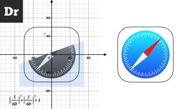
This is a geometric curve that is constructed using an equation like this: This equation defines a closed curve bounded by a rectangle. At the same time, by changing the value of n, we can adjust the degree of convexity of each corner ( you can play here
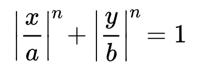
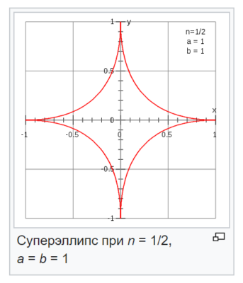
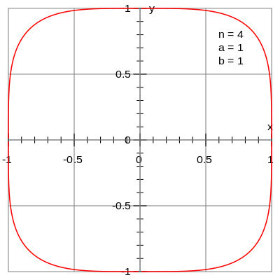
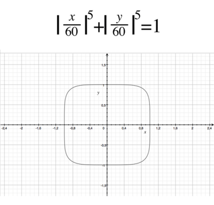
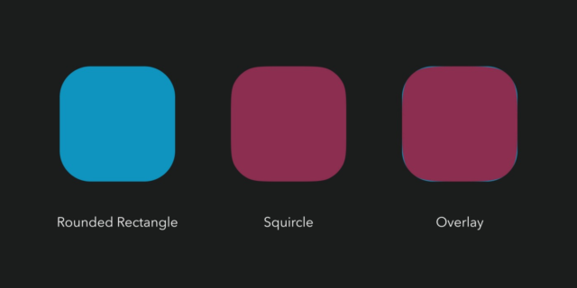
). When n is less than one, we get concave sides, and the shape resembles a star. As n increases, the shape becomes more and more convex. For n = 2, an even circle is obtained. And with n equal to 4 or 5, we get the familiar icon shape. This form even has its own name - squirkle. And, no, squirting is not your favorite section on PornHub. It is derived from square and circle. Those. in Russian squirkl is a square circle or a square circle. By the way, the formula describing iOS icon looks like this: That is, an icon in iOS is neither a circle nor a square, but mathematically, it is something in between.
Ring and Super Egg
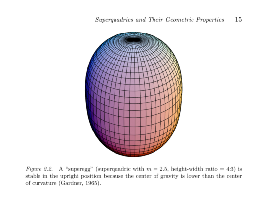
Historical reference. The Danish scientist Pete Hain popularized superellipses and squirkles. In the 60s, he designed the Stockholm transport ring as a superellipse with the values n = 2.5, a / b = 6/5. The junction shape was a hit. And he began to make tables, dishes, but the pinnacle of his creativity was the super egg. As you can imagine, this is a three-dimensional superellipse shaped like an egg. By the way, 3D superellipses are superellipsoids. And any irregular superellipsoids are superquadrics.

Continuity of curvature
But back to the icons! How does a square circle differ from a rounded square? And how did he displease Apple designers? Let's get a look!
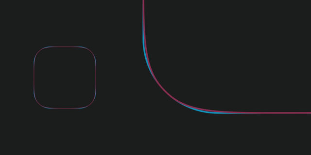
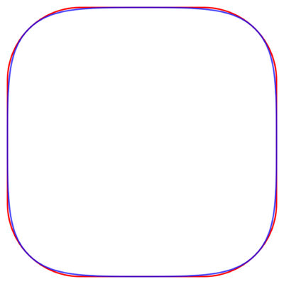
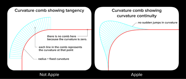
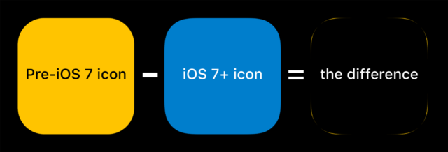
If we compare real icons with fake ones, we will see that the rounding of the square circle starts earlier and the degree of rounding increases gradually. This can be best visualized using these ridges of curvature. It would seem that the difference is a couple of pixels. But smooth transitions allow you to achieve the so-called continuity of curvature. And this gives a stunning effect - the form of an object from an artificial one, as if assembled from different forms, becomes natural and complete. That is why Apple is very active in using superellipses not only in the interface, but also in the design of all its products.

Mac Mini, Apple TV, iPhone, iPad, MacBook and of course HomePod are all sort of superellipses. Even their new campus doesn't have a single straight wall.
The smooth flow of shapes and the absence of abrupt transitions makes Apple products not only attractive in appearance. There is an excellent article by Nikolai Gellar on this subject, which I will quote:
Rather than reminding us of industrial supply chains, assembly lines and chemical laboratories, these milder forms are reminiscent of the beauty of nature. It feels organic and feels good.
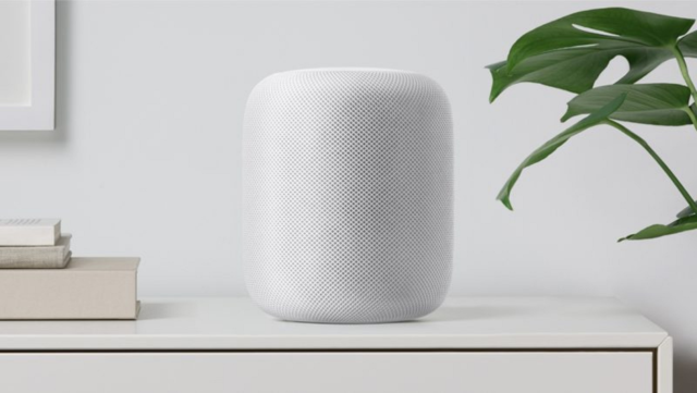
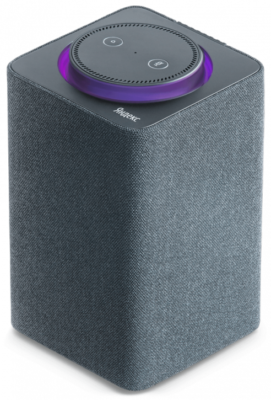
For example, if we compare HomePod and Yandex.Station by design, it becomes clear why the station looks less attractive, as if it had just been released from the factory. And HomePod seemed to have found a Japanese master of suiseki - the art of admiring stones - in his garden. Although Yandex.Station itself is an excellent device. And HomePod is beautiful, but dull (does not know Russian).
Examples of
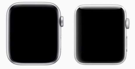
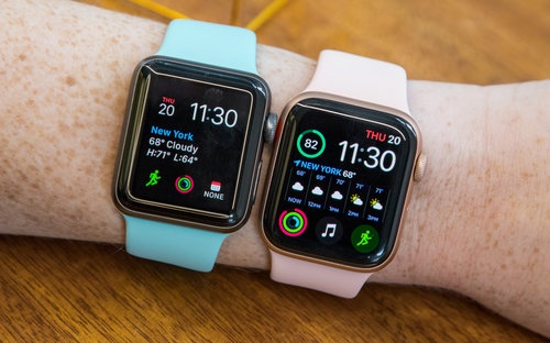
But, of course, Apple didn't come to it right away either. For example, icons and other interface elements became superellipses only starting with iOS 7. The same story with the Apple Watch. In Series 4, not only the display was enlarged, but also the shape was updated. Yes, Apple Watch from the fourth version is also a superellipse (like the screen itself).
Other companies
Naturally, not only Apple plays with superellipses. The same icons in One UI on Samsung smartphones, much more obvious square circles than Apple. But, in my opinion, the selected form does not work for Samsung.
Firstly, because the icons are too rounded, which makes them look unstable, as if at any moment they could roll off the desktop. By the way, in the physical world, the column from Mail.ru makes the same mistake, it is simply unstable. But this is not the most important thing. The main problem is Samsung's interface. I'm talking about a lack of unity. Smooth superellipses here side by side with rough rounded ones. Both inside the interface and in the design of the devices themselves.
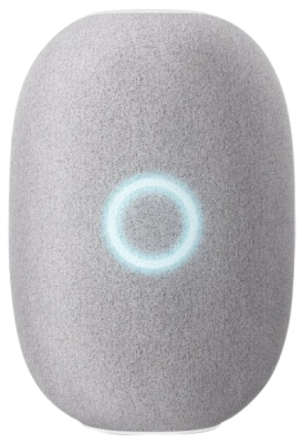
Namely, the unity of approach, from the simplest interface element to the design of the entire product line, makes Apple devices so attractive and responsive to use. Yes, it probably sounds advertising. But, I don't care, I just want to pay tribute to the meticulous approach of the guys from Cupertino.
These dudes showed the world that not only cars and luxury goods can be beautiful, but ordinary laptops and phones. Therefore, all the equipment now looks so cool.