Improving products using cognitive biases and persuasion models.
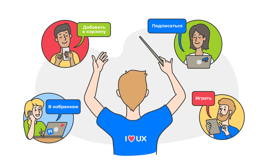
A few years ago a colleague from my former company (BlaBlaCar) introduced me to the Mental Notes game . While developing a function, we, together with several product managers, designers and developers, did “behavioral analysis”, during which we tried to understand how and what principles of behavioral psychology could be applied in the project.
Several years have passed and I still regularly use these principles in projects that I work on as a freelance product specialist. In this article, I will share a few specific examples of how these principles are applied in real products. Hope it helps your projects too!
For reference, the topics below and their descriptions are taken from the Mental Notes card deck .
Social proof
« , ».
If the application requires the user to perform an unusual action or start a new uncomfortable habit, social proof is often used: for example, comments, ratings, reviews, etc.
Take the Petit BamBou meditation application: it shows in real time how many people are meditating or meditated in the last week, month, year, etc. - in this way they want to show us that meditation is available to everyone, and there should be no obstacles to practicing it.
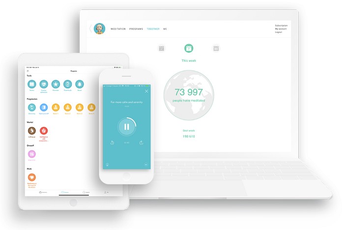
Petit BamBou Meditation App
Countless examples of social proof can be found as we get closer to the bottom of the funnel: for example, related items are often located on the pricing page:
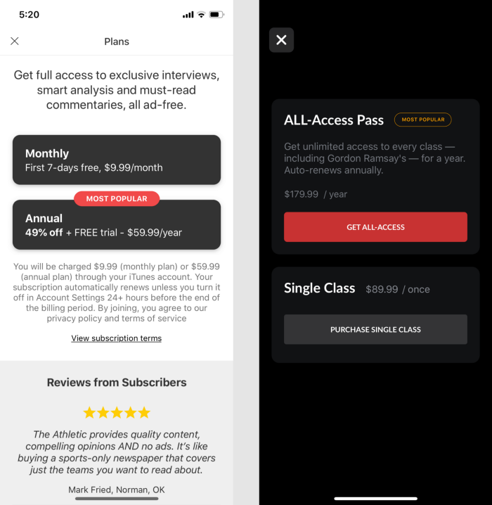
The Athletic and MasterClass mobile pricing pages
The more expensive option is often labeled "Most Popular"; sometimes customer testimonials are given to convince them to finally buy a product or service.
Curiosity
"If a person is teased with interesting information, he will want to know more!"
This is exactly what the Strava fitness app does in its Pace Analysis feature, giving you a preview of what the graph looks like, but no more. To see a detailed analysis, you need to buy a Summit subscription.
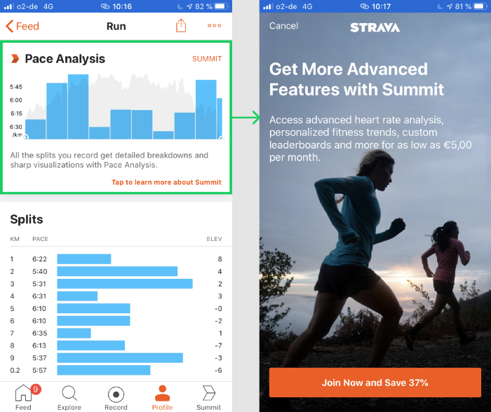
Strava Pace Analysis - a Trigger
to Subscribe to Premium In the quest to gain subscribers and therefore increase income, curiosity is also heavily relied on in the news industry: we are all used to articles breaking off at the most interesting place, and to read all text, you need to subscribe.
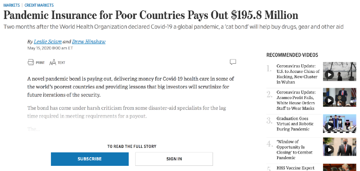
Wall Street Journal Website The
short snippet displayed should be interesting enough to make your visitors want to subscribe.
It's easier to learn than to remember
"Previous experiences are easier to learn than remember."
For this reason, many products give users a choice rather than asking them to remember everything on their own.
For example, Airbnb provides eight different criteria for judging where you stay. This allows you to get enough quantitative information from the guest in case he does not give verbal feedback. It also makes it easier for guests to remember certain moments of their experience. If Airbnb did not offer all of these categories, the ratings would probably be less correct: guests would rate only the most pleasant and unpleasant experiences, and forget about the "middle".
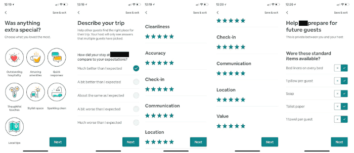
Airbnb's rating system
Therefore, insurance startup Lemonade offers several predefined categories of high-value items.
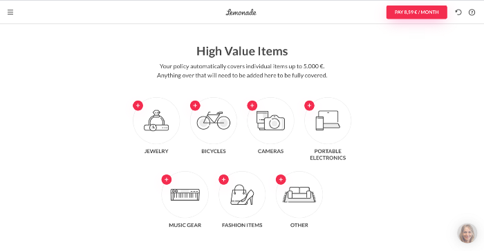
The final step in the Lemonade Quote Process
This approach makes it much easier for users to remember which of their items could be worth a lot of money. Without visual cues, remembering can be more difficult - so as a result, some will drop out of the process and the conversion will be lower.
Pleasant moments
“We remember and respond positively to small, unexpected and fun moments of pleasure.”
For example, the geodata app Zenly sends users lots of compliments (“You’re probably the prettiest here”) and Easter eggs (the ski slopes on the map), which make the app very popular on social media.
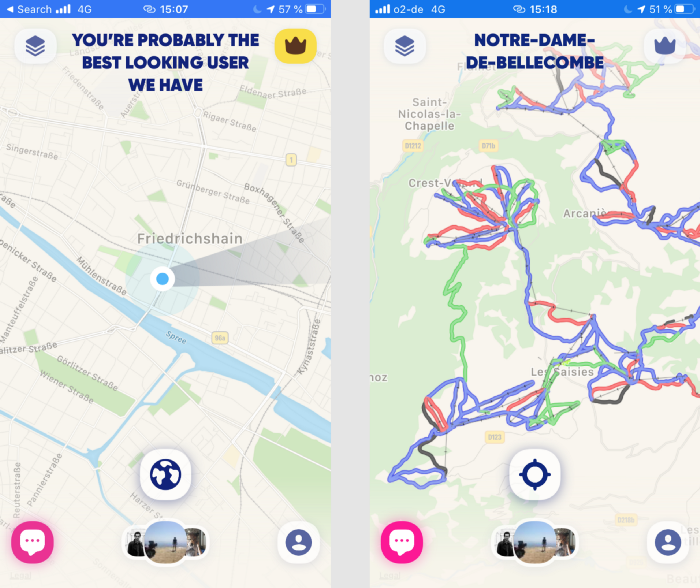
Screenshots of the Zenly app An
impressive list of frontend trivia and easter eggs that can evoke pleasant emotions can be found on the Little Big Details page . For example, here's one of my favorites:
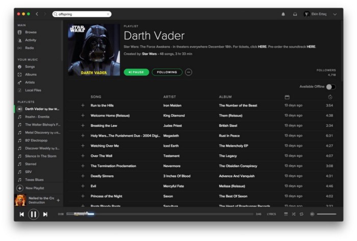
If you include a song from your Star Wars playlists on Spotify, the playbar turns into a lightsaber.
Snapping and adapting
“When we make decisions, we rely too much - or become attached - to one aspect or piece of information.”
For example, when you buy a laptop on Apple.com, you are offered many options ($ 200 - more powerful processor, $ 100 - better video card, $ 400 - more disk space, $ 299.99 - Final Cut Pro X pre-installed, $ 199.99 - Logic Pro X). If taken separately, then for everything you get an impressive amount. But you've already made a mental leap and are paying $ 2799 for a laptop, so it seems like every option is not that expensive, right?

The same approach applies when you pay $ 150 for groceries at the checkout and you are asked to donate $ 0.50 to charity - not that big of a check, right?
Moderate difficulty
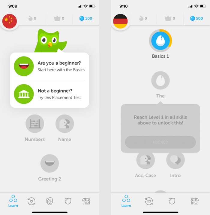
"We love to overcome difficulties - especially when they strike a balance between over-complexity and yawning lightness."
For this reason, the Duolingo language learning app starts with a test assignment so that the first lessons match your level and you don't get bored.
Aesthetics as usability
"Aesthetic designs are often perceived as more user-friendly."
Attractive elements are perceived by us as more convenient to use. The Sunrise calendar app, bought by Microsoft in 2015 for more than $ 100 million, was then the best in its category on iOS and Android platforms, praised by thousands of users for its intuitive, user-friendly interface.
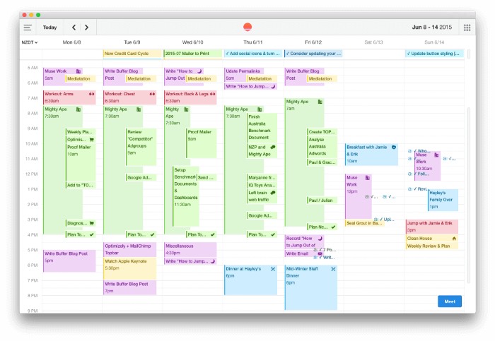
But are Sunrise capabilities really that unique? The app had a few handy features like Facebook events integration. But there was nothing extraordinary there - including nothing that calendars from Apple or Google could not copy in a couple of weeks.
Pierre Walad, founder of Sunrise, is an ardent supporter of quality product design. He wanted to make the most beautiful calendar app in the world, which is why Sunrise is so loved by users.
Establishing value
"We value what is more expensive."
Cost can be expressed in terms of both money and time.
When it comes to money, there are many non-intuitive examples where companies increased conversions and / or revenue simply by raising prices. In Don't Go Crazy at Work , Jason Fraid and David Heinemeier Hensson say that raising Basecamp's starting price from $ 29 to $ 99 per month attracted new customers: sometimes the higher the cost, the more useful the product appears to be.
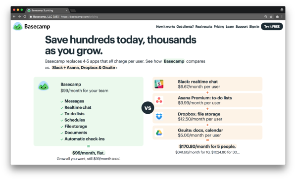
Home prices Basecamp
If we consider the time value, then this is mainly relevant for mobile games or applications using gamification. In shareware shopping games, it can take a long time to get a certain feature or feature, so it is perceived as more valuable - and accordingly, they will be willing to pay more for it.
Fear of loss
“We don't like to lose or miss out on what we already have (even if there is an opportunity to get more).”
A good example of this psychological trick can often be seen when unsubscribing from certain services. For example, if you decide to cancel your Adobe Creative Cloud plan, you will see the following:
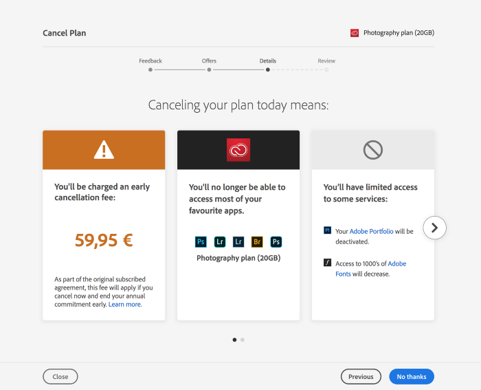
Cancellation process for Adobe Creative Cloud
All you lose is listed for you, both financially (due to early cancellation fees) and features ( which you will no longer be able to use).
Loss fear is widely used in products that you can try without registering - a common case in mobile applications: for example, if you do not register in Angry Birds, you will lose the entire course of the game.
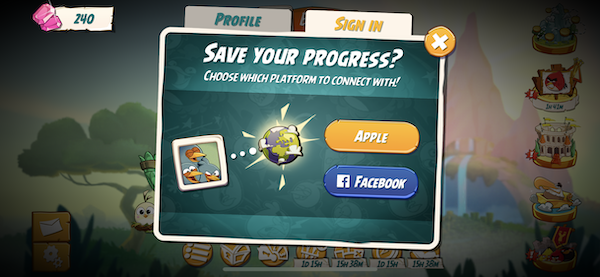
The same is done in Duolingo: if you do not register, you will lose all the initial information entered, as well as the results of the first "introductory" test passed.
Loss aversion is also widely exploited in shareware subscription apps . Let's say you've run an introductory meditation course in Headspace. If you have completed 10 sessions, you can say that you definitely intend to learn meditation. But if you do not subscribe to a paid subscription, you will not be able to continue and will lose the accumulated "moment".
Contrast
"When analyzing new visual information, our attention is drawn to what stands out from the environment."
To illustrate this point, let's compare the step of filling in the passenger information of two airline ticket services. On the one hand, we have Opodo , an online travel agency set up by several European airlines; on the other hand, Ulysse is a French start-up that seeks to change the way people buy air tickets.
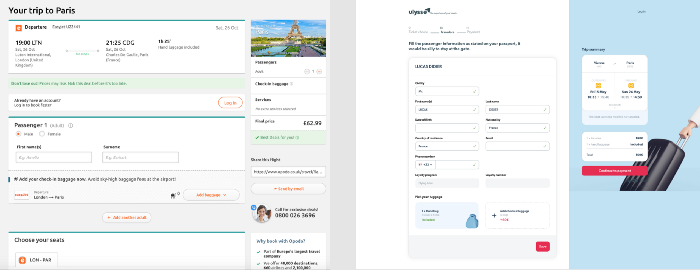
What does the passenger need at this stage? Calmly enter your details, if necessary, add a couple of services - and quickly go to the payment page.
On the Ulysse website, the next step is quite obvious - payment: when you scroll down the page, the blue sidebar remains in place, the color contrast also reflects the described priority of the user's intentions.
In Opodo, however, the hierarchy of actions is not very well reflected in contrast: the sections for choosing a seat, sending by email, adding baggage and logging in are highlighted in the same way as going to the next stages. Even if this hierarchy is aimed at increasing additional sales (and most likely it is), it is likely to lead to a decrease in overall user satisfaction.
Regular events
"Repetitive events generate ongoing interest, expectation, and a sense of belonging."
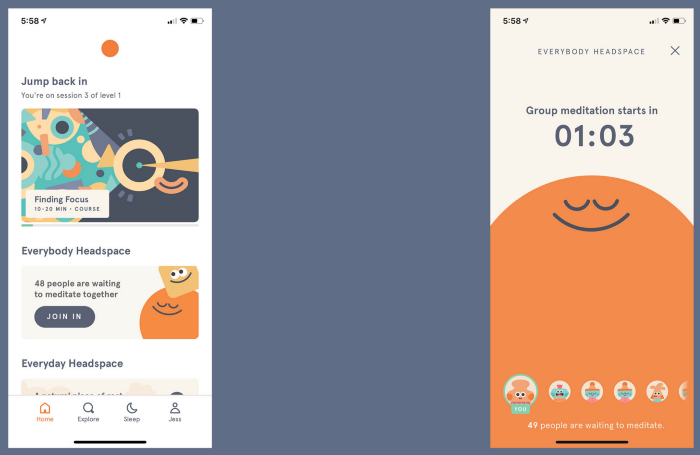
For this reason, Headspace has implemented "group meditation": every day at a certain time, all premium Headspace users can join and meditate together. Such group meditation is said to "encourage the formation and adherence of a meditation regimen." But it's also a great way to ensure long-term user retention and give them a sense of community.
Sequencing
"We are more likely to perform complex activities if it is broken down into smaller tasks."
There are countless good examples of splitting a complex action into a sequence of simple ones. Products often manage to break complex processes into convenient and quick actions. For example, the Airbnb publishing process or the TransferWise money transfer process.
In this article, I will consider the registration process in the N26 online bank: by highlighting a separate screen for each stage of registration, the developers create the impression that opening a bank account is as easy as shelling pears!
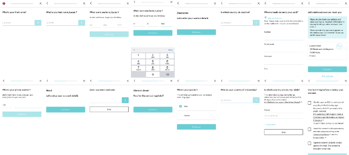
Registration process with N26 in 2018
On the website they even advertise: "Bank account at N26 - in 8 minutes."
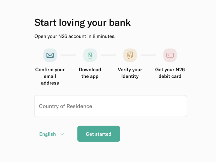
Of course, making a complex process user-friendly doesn't mean simply allocating one screen for each action. There are other principles that need to be taken into account - but I will discuss this topic in another article.
Limited choice
« , ».
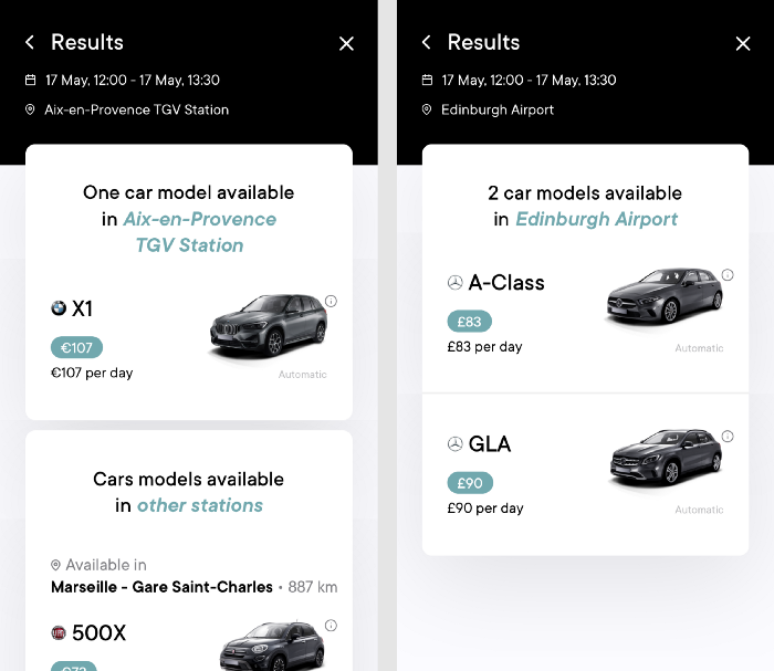
In recent years, some companies have been able to shape their value proposition by simplifying the number of options offered. Virtuo
car rental, for example, builds a business that only offers a few premium cars in each case. Virtuo App Search Results If you are given a limited choice, you are more likely to make a decision. It's the same with the French health insurance company Alan , whose pricing approach is the opposite of the traditional industry model, where everything is confusing and complex. Alan provides a single offer that is calculated based on the client's age. The “simplicity first” philosophy is one of the aspects that clients love Alan for.
Reputation
"We care more about our behavior when it can affect how we are perceived by peers and society."
Reddit and StackOverflow are examples of products based on the concept of reputation: for posts and comments, users either earn reputation (by getting positive votes, badges, trophies, medals) or lose it (by getting negative votes).
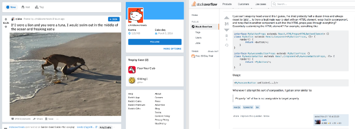
As a result, each user seeks not only to publish relevant information, but also to benefit others, as well as to behave politely and communicate constructively.
Authority
"We prefer to follow the example and advice of a recognized authority."
Some products make money by providing users with competent information in areas where they do not understand very well.
For example, AirHelp helps customers claim compensation for delayed or canceled flights. The service's lawyers know the laws of various countries of the world (related to air traffic) and will help you request as much money as possible. But how can you be sure that someone you don't know personally can help you get your money back?
AirHelp understands this problem - so they add elements to the request process to justify its authority:
- They mention the "EC261 regulation".
- They provide an opportunity to communicate with the person: "Jane is your assistant at AirHelp."
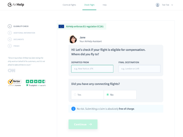
First Page of AirHelp's Claiming Process
It is the human presence that is often sought in many products where users need guidance - especially in banking, real estate and legal technology.
Limited access
"We naturally want what we consider exclusive or belonging to a select society."
I guess I don't need to be reminded of the hype that has arisen around Inbox, an alternative email application from Google: when it went into restricted access a couple of years ago, everyone was trying to get an invite.
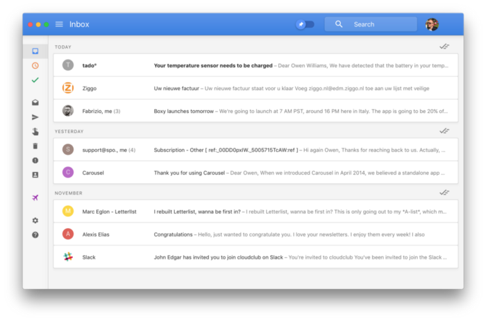
The Inbox application eventually fell into oblivion: Google closed it in 2019.The service offered a couple of new (compared to Gmail) functions, but it did not produce the expected revolution in email. Nevertheless, the promotion of this product in the market was successful. A similar hype is now seen around the Superhuman and Clubhouse .
Another example of restricting access is the Dribbble design community .
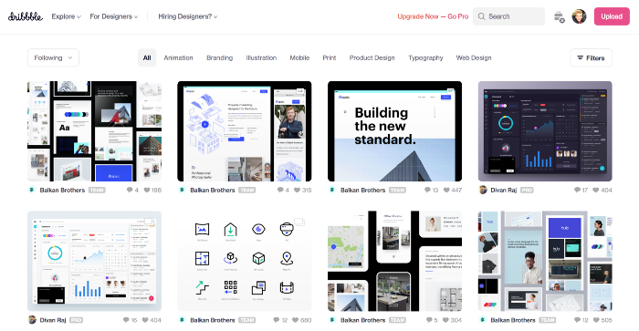
Dribbble Home
Anyone can view Dribbble's pages, but in order to publish your work, you need to get an invitation from a member of the platform - this not only helps to maintain a certain level of quality, but also gives Dribbble an exclusivity over other communities.
Self-expression
"We are looking for an opportunity to express our personality, our feelings and thoughts."
This is a very powerful principle that works in all age groups.
Teen-focused apps almost always give you the option to customize your profile: change colors, avatar, add cool accessories, and more. Examples include Pokémon Go, Snap (with Bitmoji) and (more recently) Stadium Live.
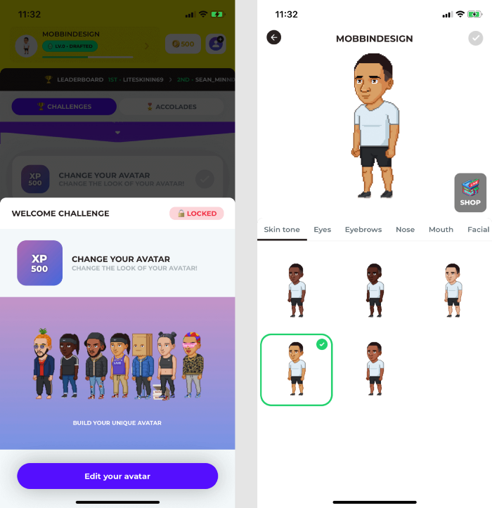
Setting up an avatar in Stadium Live
That's why Facebook came up with the " Frames " feature - so that users can express themselves: add profile frames and thus show support for a sports team, charity work or whatever.
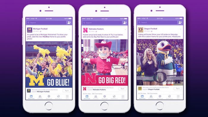
Customizable Facebook profile photo frames
Examples of SaaS tools include: Trello gives users the ability to change the background color and image, Slack offers many themes to customize the interface.
Using the principle of self-expression strengthens the bond between product and users.
Deficit
"If something is limited in availability or advertised as scarce, we tend to give it higher value."
Booking.com demonstrates impeccable skill in applying this principle: when browsing hotels on the search page, it is not uncommon to see several visual cues indicating a shortage of supply.
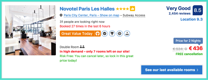
In this section, the following information indicates that the hotel will soon be fully booked:
- “Booked 27 times in the last 6 hours” (this phrase also applies the principle of social proof).
- "Great demand: there are only 7 rooms left on the site!"
In general, on sites that sell something, this trick is often used to nudge an unplanned purchase and increase conversions.
Humorous effect
"Information presented with humor is easier to remember and makes the user happy."
Citymapper is a city navigation app, an alternative to Google Maps. The service has gained a lot of its fans thanks in part to its humor and quirky phrasing.
For example, when looking for a route from A to B, you can sometimes use the Teleport, Catapult or Jetpack functions - and then Boris Johnson will move from A to B in less than 5 seconds.
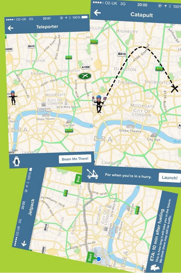
The proposal to "bail out Boris Johnson" sounds funny indeed.
Citymapper and paid subscriptions are based in part on this humorous approach.
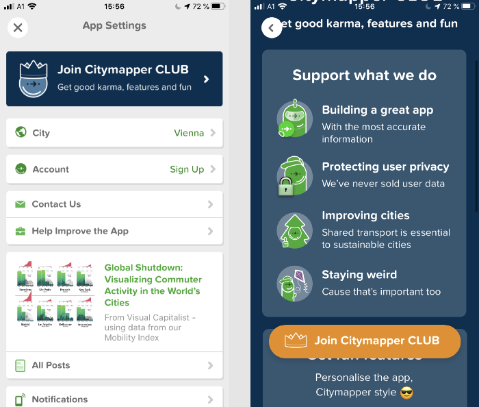
Paid Citymapper - Citymapper CLUB
One of the arguments in favor of a paid Citymapper CLUB subscription is to support developers in what they do, including so they can "keep their quirks - that's important too."
Unpredictable rewards
"Random rewards are powerful motivators: they seem rare and unpredictable (and are less likely to conflict with intrinsic motivation)."
One of the elements that has made Snapchat win over users is “trophies”.
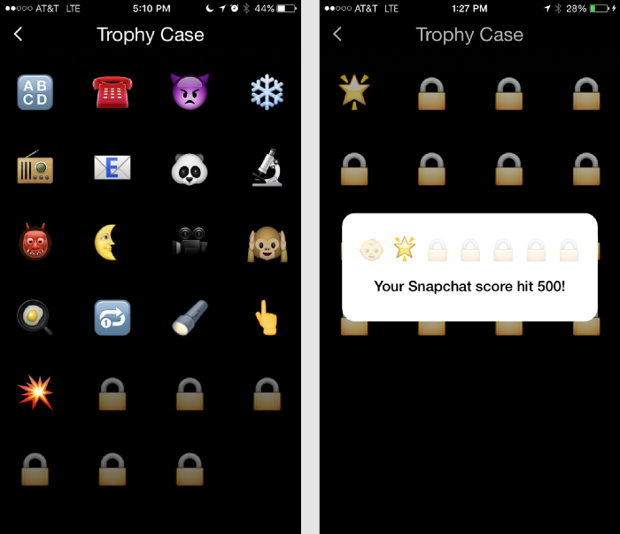
Snapchat Trophies
The trophies section shows the rewards you collect based on your actions. But you are not told how to get a bigger trophy for a certain action, or what other trophies can be won - this makes them "unpredictable rewards." Snapchat awards trophies for unusual use of the app - for example, for sending a photo between 4 and 5 a.m. or with a filter that shows temperatures below freezing.
Other apps like Tinder have also relied on unpredictable rewards in their differentiation strategy. Scrolling through Tinder, you never know what you will see next: by putting unpredictability at the very core of the application, the developers made it very addictive.
For more information on unpredictable rewards and gamification in this deck in general, see Mozza : Mobile Gamification - How The Best Apps Nailed It (Waze, Duolingo, Tinder, Snapchat, LinkedIn, Zenly ...) .
Hope you enjoyed these examples! Maybe you know examples of the implementation of psychological principles in product design? Tell us about them!
If you are interested in Mental Notes and the corresponding deck of cards, then, unfortunately, it is no longer possible to order it. But a similar informational set can be found here: Persuasive Patterns Poster from UI Patterns.
If you enjoyed this article and are interested in the application of psychology to product design, I recommend checking out Growth.design's excellent The Psychology of Design page for an even longer list (101 items!) Of cognitive biases and principles that affect usability ...
About the translator
The article was translated by Alconost.
Alconost deals withlocalization of games , applications and sites in 70 languages. Native native translators, linguistic testing, cloud platform with API, continuous localization, 24/7 project managers, any string resource formats.
We also make advertising and training videos - for websites, selling, image, advertising, training, teasers, explainers, trailers for Google Play and the App Store.
→ More