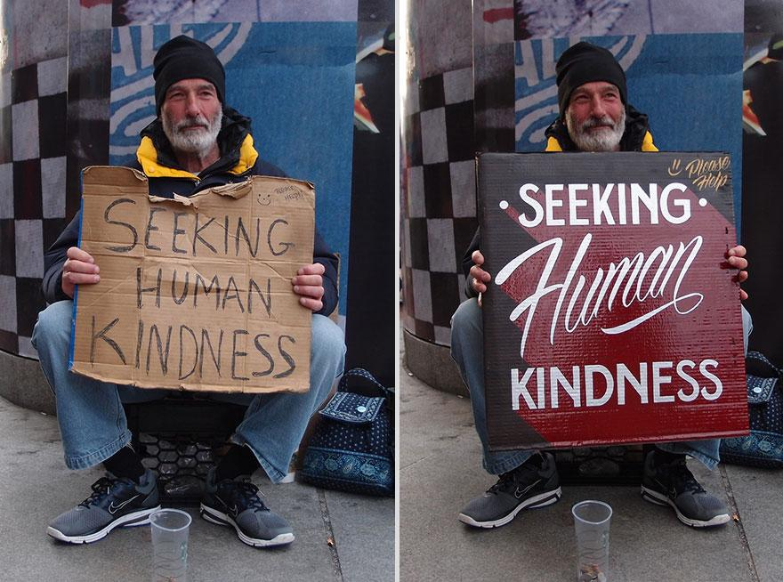
Once I saw a charity project from American designers. They rewrote posters for the homeless in a designer way. It turned out beautifully, but there was no information about whether it was better to serve the homeless after that.
I wondered if anyone had researched how design and copywriting affected the livelihoods of homeless people, and I found a couple of interesting studies.
The year turned out to be difficult, it will suddenly come in handy.

Example from the project Kenji Nakayama and Christopher Hope Signs for the homeless. Unfortunately, their blog does not work, but you can search the Internet for other examples by the name of the project.
In 2016, the University of Michigan conducted three experiments on this topic. The first is about which signs work best: playful or serious. And in the second and third studies, they tried to find factors that influence whether a person will give alms or not, and adjusted the study design by adding control groups, which gave an interesting result.
Communicating to Influence Perceptions of Social Stigma: Implications for the Use of Signs by the Homeless as a Means of Soliciting Funds
Franklin J. Boster, Rain Wuyu Liu, Thanomwong Poorisat, Ying Cheng,
Wonkyung Kim, Nicholas D. Salmon-Seidmann, and Charles T. Salmon
Which works better: serious or playful signs?
Participants
The study was conducted in Michigan, America's 10th homeless city.
The number of participants - 1341, of which men 48.5%, women 51.5%. Most of the respondents were Caucasians (88%), about 9% were African American, and 2% were Hispanic.
The median annual household income was between $ 40,000 and $ 49,999. 36% identified themselves as Democrats, 23.4% as Republicans, 34.6% as undecided and 4.9% as belonging to other groups.
Study
Each respondent was shown six inscriptions - three funny, three serious.


If anything, the respondents were not shown the inscriptions in these pictures. The
respondents had to imagine that they had 60 dollars to distribute. It was possible to distribute all or part of the money - in any proportion among the fictitious homeless.

results
There were no special differences between the tablets within the groups, so donations were summed up for all funny and all serious tablets.
Serious tablets gave significantly more contributions than humorous ones. The median values are $ 49.32 for serious signs versus $ 4.82 for funny ones.

Discussion
The researchers notice that the experiment has a number of problems. For example, there was no control group when there was no sign at all.
The task was to choose from several tablets, although usually we make a donation decision by looking at only one. Also, the respondents did not see the homeless person himself.
Therefore, a second experiment was carried out in which all these problems were eliminated.
Playful signs or lack thereof
Participants
The study involved 513 students: 60.3% girls, average age 20 years, mostly (76.2%) Caucasians.
Study
Students were randomly shown four versions of the images: three pictures of a homeless person with a funny sign, a picture of the same homeless person in the same pose, but without a sign, and the last group received instructions but did not see the picture at all.

Unfortunately, there are no photos in the article.
Before the study, participants filled out a questionnaire with demographic data and read the text:
More than one million people will be homeless in the United States in any year. Most homeless people do not remain homeless for long, with the average time of homelessness being about 6 months.
Contrary to popular belief, not all homeless people have a criminal record. Moreover, not all homeless people suffer from alcoholism, drug addiction or mental disorders. Also, many homeless people have at least hourly jobs.

Students were also given statements that had to be accepted or refuted in order to measure their knowledge of the homeless. For instance:
- Most homeless people move frequently from city to city.
- Most homeless people remain homeless for more than five years.
- Very few homeless people have at least hourly jobs.
All respondents who were shown the image were asked four questions to assess the perception of the person in the picture.
The questions were about the homeless man's criminal past, his addiction to drugs or alcohol, his mental illness, past work.
The number of points showed how positively the respondent perceives the homeless.
It was assessed how comfortable the respondents feel in the presence of the homeless. For instance:
- I'll have a quiet lunch with the homeless man.
- I feel uncomfortable when I meet homeless people.

Last but not least, respondents were asked if they were willing to donate money to a fund to help the homeless. For the answer “yes” one point was awarded, for “no” - zero points.
results
In total, 13.1% of respondents decided to make a contribution.
People who did not see a picture of a homeless person, or saw a picture of a homeless person without a sign, responded significantly more positively to questions about being comfortable around the homeless person.
After analyzing the responses, a model was built that shows how the sign affects the donation, knowledge about the homeless and their perception.

The model shows that the more knowledge a person has about the homeless, the more comfortable he feels around them and the more willing to sacrifice.
Study # 3. Serious plaques or lack thereof
The number of participants is slightly less than in the second study - 413 people. Average age 20, 73.7% Caucasian, 61% female.
Study
Repeats the second experiment, but the three humorous tablets are replaced by three serious ones:

results
16.3% decided to donate money to the fund.
Respondents who saw just a photo of a homeless person without a sign perceived him more positively than those who saw a homeless person with a sign.
The outcome of donations and the level of comfort around the homeless correlated in the same way as in the first experiment, but the rest of the model crumbled and caused too much errors.
Discussion
We realized that homeless people without signs generated more positive reactions and more donations.
It is all the more surprising that most homeless people use signs. The researchers suggest that they also serve to attract attention. That is, although a smaller percentage of people who notice them give alms to the homeless with a sign, a larger percentage of people notice them at all. Probably so few people notice the homeless without a sign that raising the percentage of donors does not pay off.

The second hypothesis is that the presence of a sign reduces the amount of donations precisely because people notice the homeless person better, think about his fate, feel shame and anxiety about their own fate, and want to avoid these feelings by ignoring the homeless person.
conclusions
If life bothers you and you have to beg in Michigan, remember: if you are clearly visible and you are read as homeless, no signs. If it is not very noticeable that you are asking for alms, take a sign, but write as seriously as possible.
It's strange that there are no other studies on the effectiveness of tablets in homeless people. At least I didn't find them. It would be interesting to check: does the color affect? Font? Nameplate material? Will the design posters work like at the beginning of the article?
Research reviews on other topics
Famous designers versus scientific research on font readability Is
beautiful more convenient than ugly? Research Review
Will your icons be understood by international users? Research Review
And also: Homeless people can get back to normal, they just need a little help. For example, the Nochlezhka collects donations to help the homeless deal with bureaucracy, put themselves in order, and get a job. And just not to starve and not freeze on the streets. And a subject for research, if anything, we will find a new one.