The main style is clear, vibrant and modern
Interfaces for children, as well as for adults, should be clear. On the educational platform, nothing should distract from the main occupation - learning. Therefore, the basis of the Uchi.ru style is flat design with the minimum required level of detail of objects and clean geometric shapes.
The same illustration five years ago and now. Outlines are clearer and colors are richer.
Flat design emerged in the 80s and became popular again in the 2010s. Forty years ago, flat design was constrained by technical constraints: it was then impossible to display shadows and gradients. Today, the flat looks modern, while not drawing attention to itself. The user focuses not on the graphics, but on what it frames - the educational process.
We try to make the appearance of Uchi.ru light, juicy and relevant. We use light saturated shades, keep the balance of color and white background, monitor the contrast. All this helps children to clearly distinguish the boundaries of interface elements and intuitively separate them from each other.

Good and bad contrast
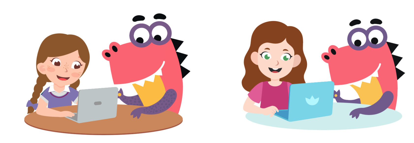
Entertainment element: universe of characters
It is important to speak with the child in his language. Research by the Nielsen Norman Group has shown that children come to the Internet primarily for entertainment. We take this into account and come up with a shell for the educational core - a world in which children are interested in studying. The basis of the world of Uchi.ru is the universe of dinosaurs.
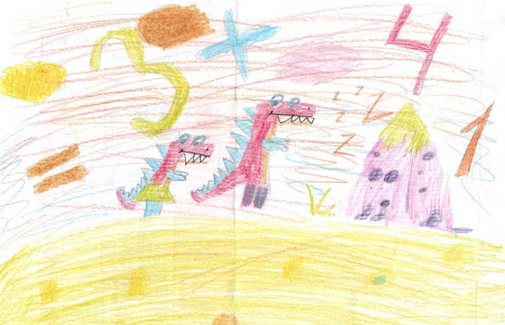
The drawing of a schoolchild of the Tyumen school
Mascot Uchi.ru - the dinosaur Grisha - appeared in 2015 and immediately fell in love with children. Gradually, he has acquired relatives and friends - the universe of dinosaurs continues to grow. Characters don't just decorate interfaces and tasks - they help to establish contact with children. The stories that happen to Grisha involve students and facilitate the learning process, and we are inspired to new ideas.
Children perceive the dinosaur as an authority and their hero. It helps us a lot to speak the same language with our users. We receive several hundred letters from children every year. The guys draw Grisha, tell him about their academic success, come up with new stories.

Stages of developing the image of Grisha
But middle and high school students are no longer so interested in the universe of dinosaurs: it seems too childish to them. Instead, students in grades 5-11 are accompanied on the platform by teenage characters and superheroes who look big and cool.

High School Superhero Characters
Size matters: fonts, buttons, text size
Children perceive interfaces differently than adults. This is especially true for the text.
- Children 3–5 years old cannot read a single word yet and treat words like pictures.
- Children 6-8 years old read slowly. And the younger they are, the more likely they are to do it syllabically. For elementary school students, it is important that the text on the screen is large so that the words are easier to read.
- Children aged 9-12 read faster, but still poorly. A child can master the skill of scanning text only by the age of 13-14.
We have developed several rules that help to take into account the peculiarities of the children's reading style:
- We make sure that the text of our interfaces is large, at least 16px in height.
- There shouldn't be a lot of text. It is better if there is only one word.
- Good buttons are large and contrasting. They should be at least 30px in height, and the clickable area should be much larger than the button itself.

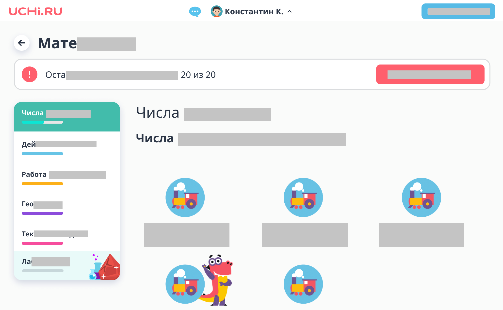
An example of a student's personal account - Recognizing the power of habit: make buttons of the expected shape, place them in predictable places.
. (2017)
, , . , , , . . . , .
, , . , .
. , , . , .

. — . - next step button . , , — .
, , . — , -. .
, . , .
: , , , , , , .
Children use mouse and keyboard differently
While for an adult the task of typing a word is a matter of seconds, for a child it may take up to a minute or more. The younger the child, the worse the fine motor skills of his hands are developed and the more painful it is for him to move the cursor around the screen, click on small buttons and links.
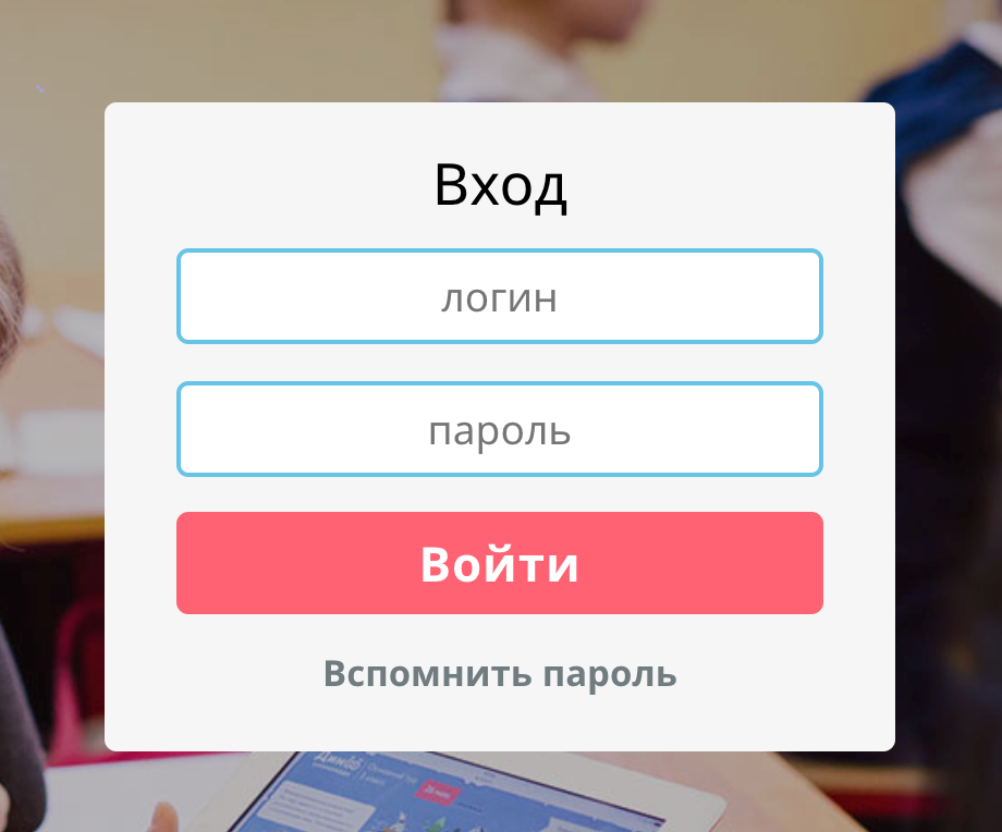
We tried to take all this into account in the first screen - when entering the site.
- The password is visible during the introduction and until the child clicks "Enter". Children are slow to type, so if the password is hidden behind asterisks, they may forget which characters they have already entered and which ones need to be added.
- — . , , , , . , — . .
- . . , . .
- . . , .
.
Attention is gold: no obstacles in the user's path
Buttons look like buttons
Children, unlike adults, learn more about websites and apps. Children under the age of ten are more likely to try a non-standard action. For example, clicking on objects that look like buttons or icons, clicking on them over and over again, expecting that the n-th time will lead to a new result. Adults are more likely to generalize experiences from one or two trials. Therefore, in children's interfaces it is so important to make buttons in the form of buttons, and the rest of the elements - to be as unlike buttons as possible.
Waiting is excruciating
Adults don't like long loading times. Children don't love her even more! If after clicking on the screen nothing happens for a whole second, the child will become annoyed and continue to click. Even 800ms, during which the animation lasts, seems too long for children.
The fewer screens between content, the better
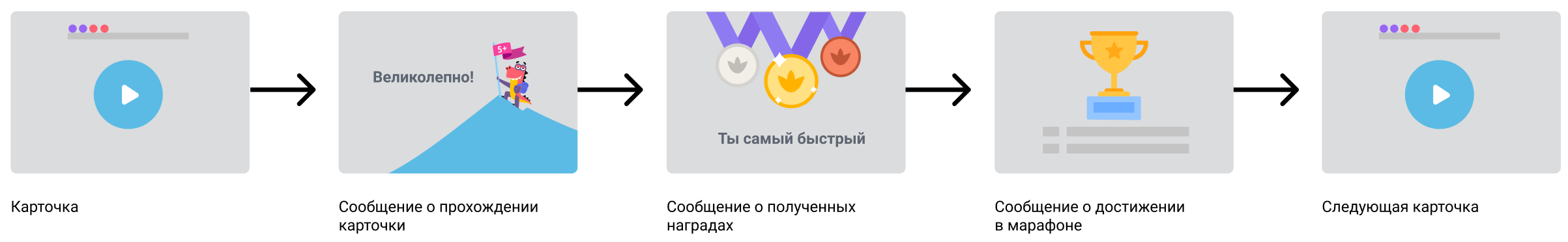
The main simplified purpose of the interface of the educational platform is to immerse the child in solving problems. In between the cards, the child sees notifications about success or failure, gets into the interface of his personal account, where he can go to other subjects or continue the solution.
Over time, there were more competitive mechanics on the platform, along with the increase in the number of alerts. This is how the child's path between the cards could look like, if we continued to communicate all the information without exception:
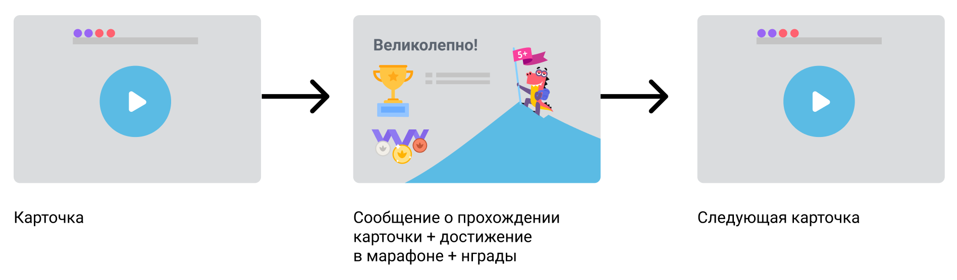
Such a long path would inevitably cause a churn of users, so between tasks we show only one screen with a single "Decide next" button:
About optional - honestly
Give the children the choice to take or not take additional but optional activities.

Details - under the cut
Details and details shouldn't distract from the main action, so they don't belong on the main screen.

Children don't read
In the first seconds, adults will see this screen like this:

A second grade student like this:
This feature must be taken into account and used for their own purposes. So, a screen with a lot of small text will force the child to call an adult to the screen.

Small print and a complex example turn off children's attention, but draw their parents to the screen.
Let's summarize
In many ways, interfaces for children are similar to interfaces for adults. At the same time, there are features that are easy to take into account. Through trial and error, we have identified principles for ourselves:
- Maintain the balance of color and white background, monitor contrast.
- Immerse the student in a fantasy world - this way the material is easier to learn.
- Large labels are easier to read.
- .
- — , .
- . — .
- .
- .
- , .
- .
- . .
- . .