You don't know the names of Norbert D. Larky and David D. Holmes, but you have almost certainly seen their work thousands of times. This result was seen by all people who left the TV on on any cable channel without broadcasts for 24 hours a day. And sometimes it could be seen when the channel had problems and needed to fill the broadcast time with something. In the early 1950s, Larkey and Holmes invented one of the most famous test patterns known to the world. You are familiar with it - it's a table of bright colored stripes that are hard to miss. Today we are going to tell you about it and other TV test patterns.
Unfortunately, the people who invented the color test chart didn't get the credit they deserved.
If you look at an obituary page in a newspaper, say, in the Los Angeles Times , you can see the following lines:
He received his degrees in engineering and electronics from Lehigh University and his master's degree from Princeton University. Dave has had an illustrious career, receiving 13 patents, including a color television patent and a color test chart.
This man got a patent for the invention of color television ? And there is no detailed information about his life?
That was the question that readers of the Times might have asked in August 2018, when the newspaper published an obituary for 91-year-old Norbert David Larkey (he usually preferred to be called a middle name).
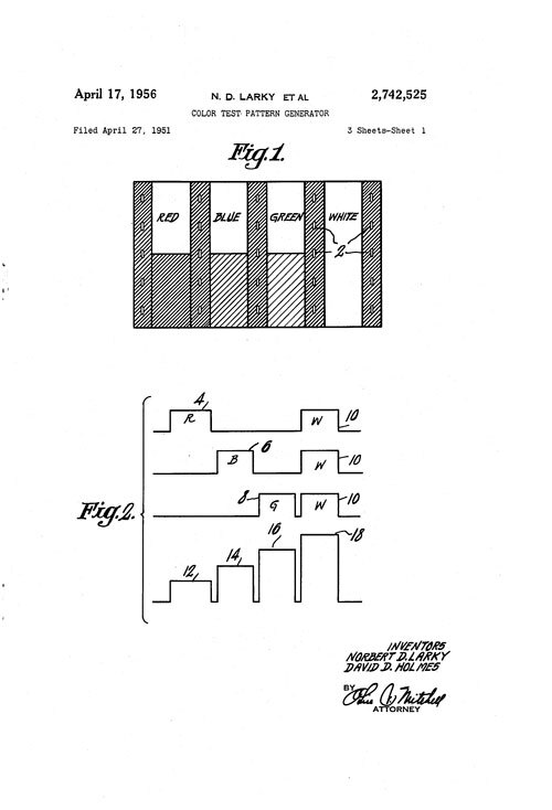
First patent for a color test pattern generator. ( Google Patents )
Apparently, the LA Times , which has been heavily covering the entertainment industry, missed the opportunity as Larkey (with David D. Holmes) received the first patent for a color test pattern generator. The patent application was filed in 1951, and he received it in 1956 .
The idea for color television predates Larkey's work, but as an employee of one of the early innovators of color television, RCA, he developed several key patents in this area.
(It should be said that Larkey and Holmes were the first to obtain a patent for their invention, although at about the same time, without even realizing it, other people were competing with them. For example, Charles J. Hirsch of the technology company Hazeltine wrote in 1953, a long article in the scientific journal Advances in Electronics and Electron Physics , in which he described his company's work on color television, including a discussion of the creation of color stripes .)
These test strips throughout their history of evolution (the last change occurred in 2002 due to the move to HDTV) remained an important aspect of the television industry because it allowed engineers to tweak color schemes to match the picture on the screen.
But more globally, they also represent the first electronically generated graphics ever shown on a screen - a pretty significant milestone in a world in which graphics are almost everywhere. (Graphics, although today it is a fundamental part of computer science, became really popular on computers only in the 1970s, when terminals began to use monitors to display information instead of printers .)
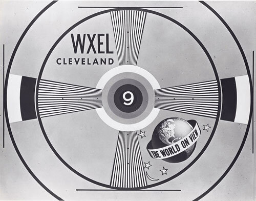
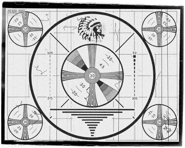
An example of a black and white test chart from the mid 1950s. The Indian Head test chart from the same era is better known, but now it is a relic of the past.
Before these color stripes, all sorts of other black-and-white images were used, the most notable of which was "Indian Head" by RCA in 1938; it became the first popular test pattern of that era.
« , 1930- 1940- , -. , ».
2014 Tribal Television: Viewing Native People in Sitcoms « » — , . , , , ( « ») , .
John R. Meagher explained in his 1948 article in Radio Electronics the need for such test charts. In fact, the first televisions required constant tuning, which meant that samples were needed to help receiver owners check picture curvature, focus, spurious compensation, and interlaced scanning.
“There is no standard test chart. The closest thing to the standard is the RCA Indian Head monoscope, which is used by many TV stations, ”Meager wrote. "The Radio Industry Association has proposed a standard 'resolution table', but for various reasons the TV stations do not use them on their air."
At the beginning of the TV era, this image, accompanied by a sinusoidal sound signal, was shown on some channels several times.
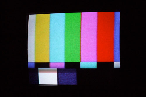
Over time, color stripes have become more familiar to TV viewers than their black and white counterparts. There were technical reasons for their existence (they were originally used to calibrate the first color TVs, and today they are used to check the color and brightness of modern screens), but test tables have gained importance in pop culture as well. For example, in the mobile game show HQ Trivia , color stripes are shown before the game starts, adding a vintage style to the modern application. And Elliot Smith has a song about these bands .
Over time, setting up a TV picture has become easier, that is, in practice, color stripes have become much less common, but they have become part of everyday modern life, especially on TV channels that lacked content for the whole day.
1 kHz is the standard frequency of a sinusoidal audio signal typically played along with color bars and other television test signals. You have probably heard this boring hum many times in your life .
Why does the color bar system look like this?
Over the years, the color bar test pattern has been changed several times to match different color schemes according to the Society of Film and Television Engineers' Basic Guide for NTSC TVs. As you can see in the YouTube video above, the order of the color bars has changed significantly since the first version of 1954, with the bottom bars, which are usually the smallest in modern spreadsheets, took up more than half of the screen.
But even though the overall structure has evolved and its importance has diminished, test charts remain very common.
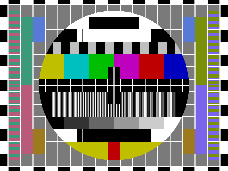
The most famous color stripe scheme, chosen by the Society of Film and Television Engineers in 1978 and updated in 1990, uses three stripe lines.
The first line, which should be a base color field, uses a mixture of the three primary colors (red, green, and blue) in different combinations, starting with white (although in practice it looks grayish); followed by yellow (a combination of red and green), turquoise (a combination of green and blue), green, magenta (a combination of red and blue), red and blue. (Some variations, including the original 1954 specification and the more modern HDTV version, have added shades of gray or black.)
On a TV screen, these blocks appear as rows of colors, but if you look at the stripes on a monitor the form signal, the colors will line up step by step, emphasizing the level of brightness: the brightest color will be on the left, and the darkest on the right.
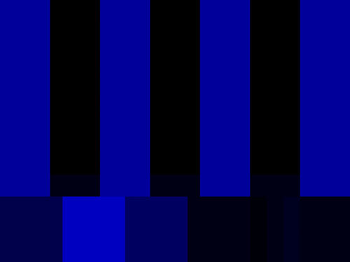
An example of a grayscale version of NTSC color stripes with blue tones separated in Photoshop (multiply mode). As you can see, the first two lines of the stripes are the same.
The slim second line, added in the 1978 edition, is essentially a color-tuning system that takes personal taste out of the equation. If we only displayed the blue version on the screen, as most professional equipment does, then the middle stripes would almost coincide with the upper ones. As a result, we can quickly and objectively change the hue and saturation of colors, which is useful if, for example, you work with a large amount of video equipment and you need to calibrate it.
The last line (which I'll talk about in a simplified way) contains a white block of full brightness and a black block of low brightness. Near the other blocks - dull purple and blue, are used to verify proper demodulation signal, there is a set of short black bars, called " test pulse " (pluge pulse), which are used for calibrating the black level of the monitor. In fact, the bottom line is used as an aid to fine-tune various parameters, as described in the video from Lynda.com shown above .
This allows screens to be calibrated uniformly and ideally. While not so important in today's TVs, it still matters in the world of video production.
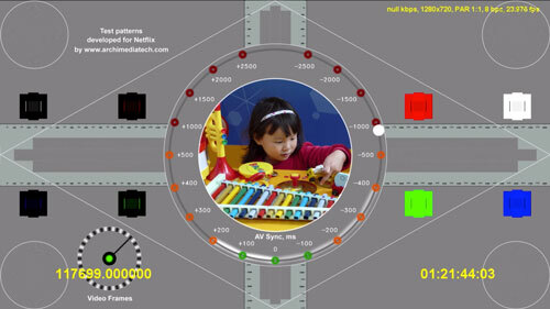
An example of a test chart on the Netflix website. Television test charts have come a long way since the 1940s.
There are test charts hiding all over Netflix and they are more interesting than some of the shows
These kinds of test charts, while not particularly useful for most TV owners, actually didn't go away. In professional fields, they continue to be important.
If you dig around on YouTube, you can find examples of test charts used by major networks; some of them are very different from the standard styles you are used to.
But all of these variations on CBS and NBC color bars are no match for what you find on Netflix. Even though Netflix is a service that doesn't have a traditional broadcast component, there are tons of test tones on its platforms and they're just amazing .
Netflix has four “seasons” of what is guaranteed to be its best ASMR show, Test Patterns“For the most part, these tests are simple, showing moving images, vibrant colors and simple sounds. They are not like what you would find on Netflix, they are kind of Easter eggs, but they are so easy to find that for it doesn't even require an account.
Of course, these test patterns are not the only type of hidden tests available on Netflix. There are many sample tests on this service, including sRGB graphics tests, tests of different menu styles and sample test videos designed for testing aspects such as motion and HDR .
One of the best sample test tapes on Netflix is an 11-minute "sample show" released in the early 2010s, which stars an actor named "Actor." This video was a surprise example of the endlessly amazing content that Netflix is supposed to produce: an unnamed actor runs through the Netflix office, next to a fountain, and in one of the frames he walks moonwalking with a laptop in his hands.
I once spent quite a lot of time looking for examples like this, and it was endlessly exciting. With thousands of hours of video content on Netflix, it makes sense that I decided to look for something that regular viewers shouldn't watch.
It is also worth noting that YouTube is also known for its unusual tests: it has a test channel called Webdriver Torso , which showcases very short and rapidly changing animations with rectangles. Rick Astley's silhouette is sometimes present in the animations . It is not known if Webdriver Torso was originally a test channel. He just appeared on YouTube one day and people noticed him. Google later confirmed that it was a test channel, and if you search for its name in a search engine, the Google logo will change to "Easter egg" .
Color stripe designs, which are actually more complex than they seem, are a great example of an image so ubiquitous in modern life that we don't notice its presence.
But there was one person who noticed him - the creator of the color stripes David D. Holmes, who died in 2006. After his passing, a letter sent to his family members was transferred to Video University 's video-making website. From it, we understand that David was clearly aware of the impact of his color stripe generator on modern culture.
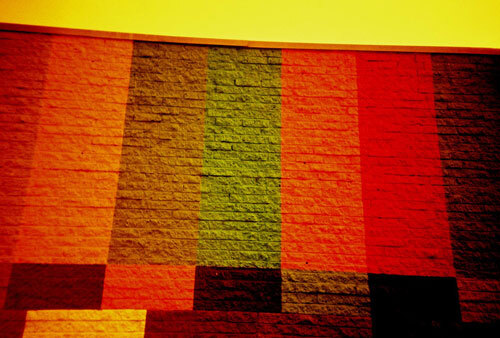
An example of color stripes in the form of wall graffiti inside a barbershop. Colors are distorted due to lomography. ( Cameron Russell / Flickr )
“Later on in my travels around the world, I saw color stripe generators everywhere. There were tens of thousands of them, ” Holmes wrote to family members in 2005 . “If you see a news studio on TV, then most likely there will be a test chart in one of the monitors. They appear regularly on BBC broadcasts in London and other stations. They are exactly like the ones I created fifty-five years ago. "
It saddens me that neither Holmes nor Larkey became known to the general public for their invention, which remains useful today in video shooting around the world. There are many TV shows and films that have become less famous than the color stripes over the years, they appeared and remained forgotten. Of course, the test chart changed, and this could not but happen, because the screen sizes changed, but at the same time it remained unchanged, not only as a simple way to test the image quality, but also as an iconic part of television itself.
It is worth giving credit to this amazing invention and watching it for a while. Who knows, maybe something will happen?