To begin with, a fun fact: before starting work, the entire project group, and this: product director, art director, project manager, analyst, designer, iOS, Android developers and QA specialist, Ascona donated its smart devices - apparently, so that we get better sleep and work more productively. Straight from the factory, pillows, sleep trackers, the base of the bed arrived at our Izhevsk office - all this had to be connected. We actually slept on these pillows - and this is the time when I am ready to passionately recommend them. I could no longer return to my old synthetic winterizer, and after the project was completed I bought smart pillows for the whole family (Ascona does not pay me for advertising, which is a pity).
This is the case when the client took care of their developers and, as a result, we made a cool application. But first things first.
Product approach
Ascona has been developing solutions for comfortable and healthy sleep for over 30 years. By combining the accumulated expertise and modern technologies, the company set out to create a product that would help make sleep more efficient - with this idea the client came to us.
What is Smart Bedroom? It is an ecosystem of devices ranging from controllable bed bases to smart lights and curtains. With its help, you can create an individual atmosphere in the bedroom that is most suitable for a comfortable sleep.
Having studied the idea of the service, we invited our colleagues to act in stages and use a product approach in the development. He was very suitable for the implementation of such a task. We relied not on TK or FT, but on the vision of the product, its ultimate goal. And what functionality would be required for this was decided in the process.
To begin with, we planned to create an MVP application. After the first release, we will evaluate the feedback from users and their requests, and will gradually expand the functionality and connect new devices.
We organized the work on Scrum, two-week sprints, and did not separate design, development and testing into separate stages. Since the whole team was completely immersed in the project from the very beginning, we worked according to the scheme: first, we coordinate all solutions, ideas, features inside, and only then we give them to the customer for approval.
Every two weeks we held a demo for the customer: they showed ready-made solutions, discussed plans for the next sprints. Thanks to this approach, we have always had the opportunity to evaluate the intermediate results and add many useful details to the project.
How we turned an idea into a product
At the first meeting with the customer, we determined the main scenarios for interacting with the application and the procedure for connecting devices.
The MVP includes three devices:
Smart pillow - a smart pillow that monitors a person's heart rate and respiratory rate;
Sleep-dot is a small sensor that monitors the level of humidity and air temperature in the room, as well as records the time a person falls asleep;
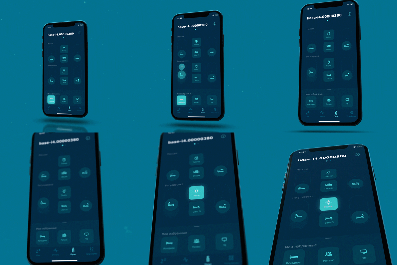
bed base Ergomotion, which consists of several sections with a variable angle and can do massage.
We will collect data from the pillow and the slip-on, based on which we can assess the quality of sleep and the reasons for its deterioration. Data from these devices will help us plot sleep phases in the application. And for the bed base, we implement a convenient control panel in the application.
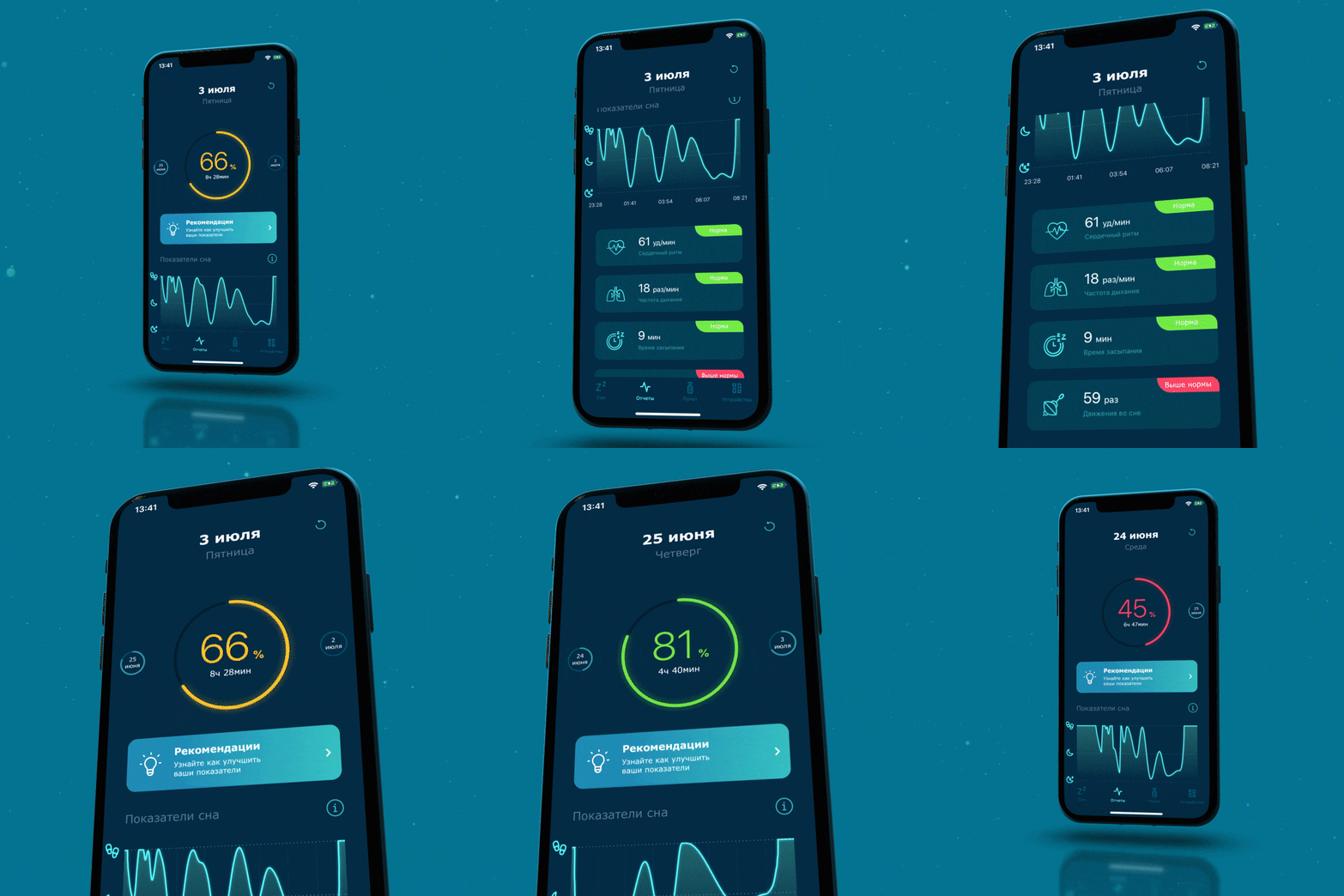
At the same meeting, we sketched out an approximate Customer Journey Map, but at the beginning of the work there was a feeling that it was still not closed, since much was not visible at the start. At first, our imagination was limited to those solutions that were already available, so many cool ideas came already in the process. For example, while working on MVP, I saw a feature that will distinguish our application from similar solutions. Pluggable devices transmit a lot of different data to the application, but in themselves their value is not so great for the user, and it is not easy to understand them. We decided that our application should provide the user with not only scoring, but also personalized advice on how to improve their sleep. This idea fit perfectly with Ascona's goals and product vision,so that the client involved his expert sleep specialists - specialists who deal with the prevention and treatment of sleep disorders - to work on the recommendations.
In three sprints, we implemented the first workable version of the application, which connected to a smart pillow and collected data in real time. After another month and a half, we completely closed this scenario by implementing connection, user onboarding, configuration, status monitoring, report generation and individual recommendations.
For three more sprints, we developed a similar scenario for connecting a slip-dot and switching between devices.
It took us a little more time to connect the base. First, the pandemic made its own adjustments - the team had to travel to the office on a strict schedule to test the devices. And secondly, to connect, we had to write our own libraries.
Development: what to do if there is no SDK
This is not our first experience with devices, but in this project we had to connect devices that could not be reprogrammed. In order to make convenient operation and an intuitive interface of the application, we thoroughly studied the operation of each device. The whole team, without exception, tested pillows and slip-dots, learned how to handle the base. It was important for us to understand how users interact with devices, which can cause difficulties, how to work out abnormal situations, for example, when the battery runs out in a gadget and it stops responding to application commands.
We even had our own memes: “send the command to the base” and “reset the pillow”.
Perhaps the hardest part was for the developers.
At the start of work, they did not have any SDK for devices. Attempting to decompile the native application gave us 16K lines of code with comments in Chinese.
Here the skill of searching on Github came in handy - the guys found the SDK for the pillow and the slip-dot there, but the SDK for the foundation had to be written by ourselves.
The documentation contained a number of errors, while writing the code there were difficulties in connecting via Bluetooth. I even had to sniff the traffic to find discrepancies with the documentation. They were small, but they affected the operation of the application.
We packed all the developments into libraries, which we then successfully used to work on the application. If you want to test them and independently understand the work of the foundation, write in the comments. We will post them in open access if there are many who wish.
We wrote applications using Clean architecture, it was important for us to provide for further product scaling.
Mid-project redesign
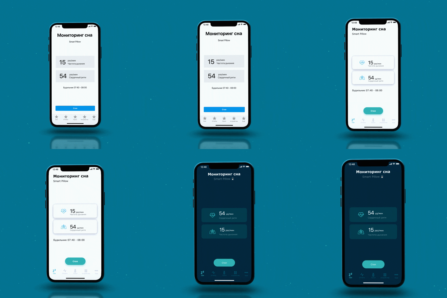
The designers were among the first to join the project. From the very beginning, we chose the dark colors familiar to many sleep trackers. The dark screen does not strain your eyes when the lights are off and does not slow down the production of melatonin.

Everything looked convincing and the customer agreed on the layouts.
But after a few sprints, when it was already possible to work with the application and the pillow, it became clear that the design lacks expressiveness and that what we wanted to build up from competitors does not visually "catch".
Our designers have completely rethought the entire operation of the application and some user scenarios.
First of all, we added more animations: heartbeats, breathing, scoring indicators and charting. We have highlighted the accents in the reports, made the navigation more understandable. In the new version, the color scheme remained dark, but became more contrasting, and there was more air between the elements. The design has become clearer and more understandable, expressive.
This is one of the undoubted advantages of the product approach. If the team understands that the current decisions will not bring the desired result, they can be changed.

Thanks to this immersion of the team in the project, many successful ideas were born. For example, while testing the operation of the base, our designer decided that the usual tilt control of the sections in the form of the + and - buttons, as on a TV remote control, is not very convenient on a smartphone screen. And he suggested replacing them with sliders. We agreed this option with the customer, having decided that such an element would become another feature of our application.

In the application, we added the ability to save presets - individual base settings. There is no such functionality in the factory remote control.
We looked for several solutions outside of the application. For example, what if the device is dead? And how can you help the user to prevent such situations? Our application periodically asks the devices for the charge level. If it is low, then the corresponding indicator is displayed on the device card. So the user will have time to charge his device in time.
Testing: take work home
The application was tested continuously, from the very first sprint.
First we tested the design. Our designer collected the most clickable prototypes for controversial issues, we tested them within our team.
As soon as the very first version of the application appeared with a script for connecting a pillow, they began testing it on real devices, tracking every step of the application. Everyone participated in this process - developers, designers, and QA specialists.
Testers had to literally become akin to smart devices. Real data were needed to verify the recommendations, and they can only be obtained during sleep. The guys had to take pillows and pillboxes home, connect devices at night and run tests, and check everything in the morning. If something went wrong and the test didn’t work, the next test opportunity would only appear at night.
After connecting all devices to the application, we expanded the user group by including Ascona employees who had the necessary devices in the salons. Colleagues used the app and gave us feedback.
From them, we received almost no comments about the operation of the application. This suggests that the teamwork on our side was productive - we made a high-quality, convenient and understandable product.
What's next?
Now the application is already in the stores. It connects to three smart devices, collects information from a pillow and a slip-dot. By analyzing the readings of the devices, the application explains to the user the possible causes of poor sleep or late falling asleep and gives individual recommendations. In the future, we will improve the recommendations, taking into account the history of readings over the past several weeks - they will become even more accurate and personalized.
In the application, we automatically collect feedback from users: the built-in analytics system tracks a number of metrics, from which we learn which features are most often used, which did not arouse the interest of users, where difficulties most often arise. So, in the next stages of product development, we will rely not only on our own vision, but also on big data that demonstrates user requests and requirements.