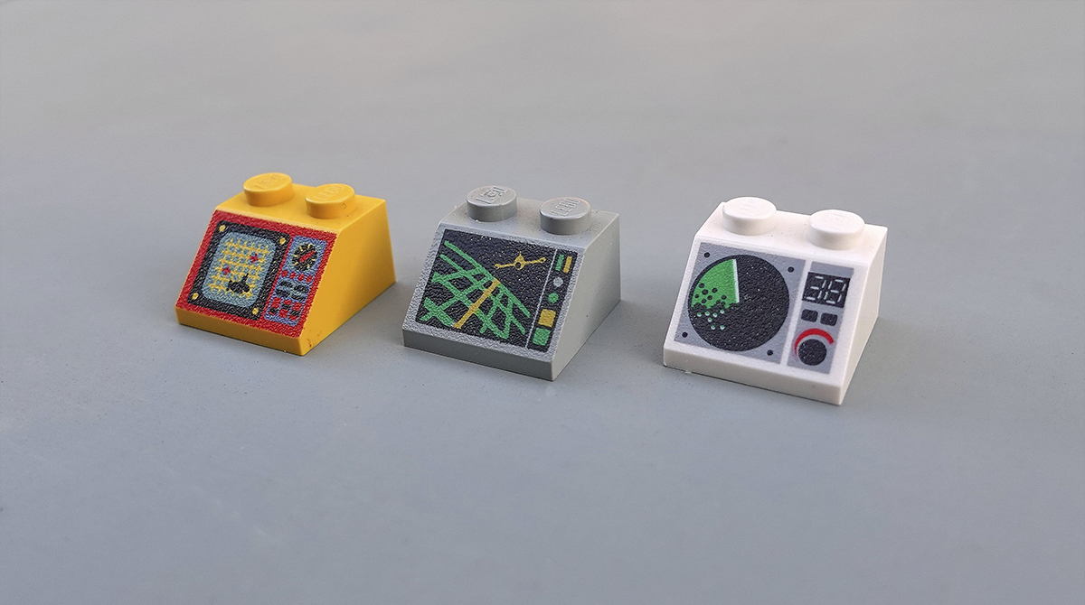
Driving an ocean exploration vessel or a Mars exploration shuttle is serious business. It is hoped that the dashboard will be of the highest quality. Two spikes wide, 45 ° slope, a common Lego piece "2x2 decorated slope" is the interface of this play set, linking it to the exterior.
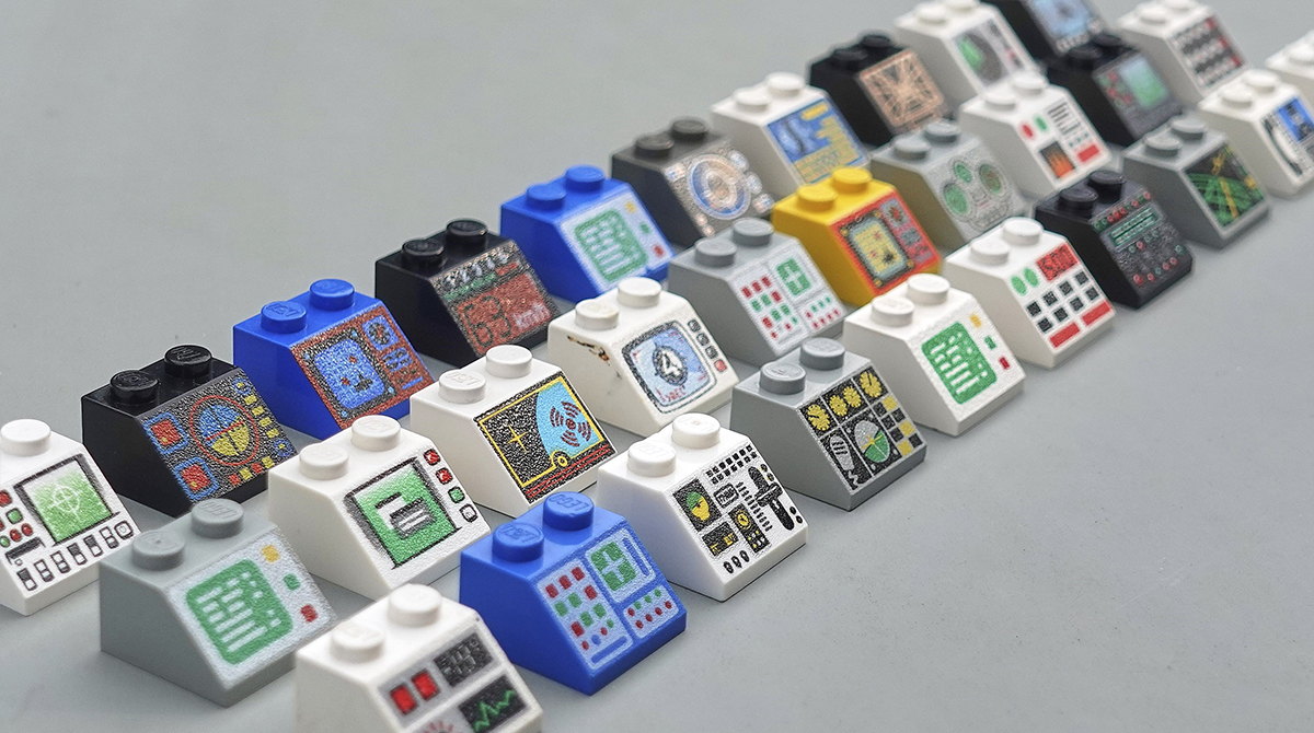
These iconic, low-resolution artwork is the perfect tool for learning the basics of interface design. Let's arm ourselves with 52 bricks and see what they can teach us about design, layout, and organization of complex interfaces.
Welcome to the world of Lego custom experience.
Organized chaos
At first glance, the variety of images can be confusing, but it soon becomes clear that some of the interfaces look a little more chaotic than others. Most interfaces in the real world are a mixture of digital screens and analog input devices such as switches and dials. Lego panels follow the same principle.
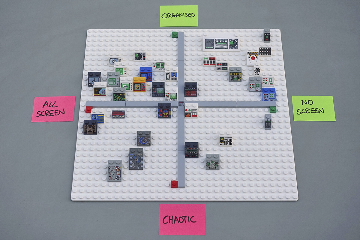
If you place the panels along two axes, "chaotic-organized" (bottom to top) and "full-panel-without screen" (left to right), you get several separate clusters. At the top left, there will be screens combined with a row of buttons. At the top right is a small cluster of highly organized switch panels. The bottom of the center is occupied with unusual concepts that are difficult to understand.
Developing a complex machine interface is a juggling of many different factors, from ergonomics to engineering considerations. However, we can split this problem into two key questions:
- How do you differentiate between the functions of different input devices?
- How do you organize multiple input and output devices so that you can understand their relationship?
Let's take a closer look at the answers to these questions in Lego.
Distinguishing input devices
Why would 400 pilots during World War II begin to remove the landing gear on a B-17 bomber just before landing? Is this a catastrophic human error or something more fundamental?
Psychologist Alfonis Chapanis was the first to suggest that a large number of unsuccessful landings may be due to a poorly designed interface. The landing gear and flap control knobs were located side by side and had the same shape. The pilots simply had no chance.
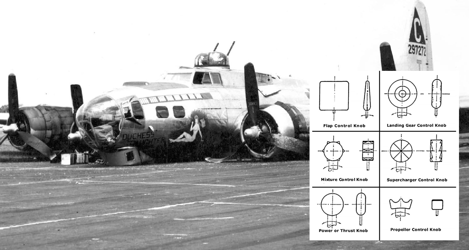
Belly B-17 and coding of functions by form, which made it possible to avoid problems
His proposed temporary solution was to glue rubber strips of different shapes to each of the grips, which would allow you to control the aircraft by touch. As a result, the idea of coding by form was born, and the system of differentiation is still followed in the design of aircraft cabins.
Let's compare the three interfaces shown below to see how this works. Ignore the general layout of the elements - for now, individual buttons are important to us. Imagine that you are trying to grope one of them without looking. When working with the left panel, "Slope 45 2 x 2 with 12 Buttons", you will need precise hand-eye coordination. In the right pane, Aircraft Multiple Flight Controls, a clear distinction is made between control sticks (sweeping vertical movement in a straight line), switches (round vertical toggle switches), and buttons (squares).
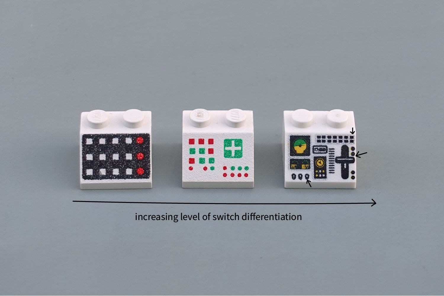
Left to Right: Ugly, Bad, and Not Bad Differentiation Between Controls
Such differentiation remains a serious problem to this day. Ford recalled 13,500 crossovers in 2015Lincoln MKC, because drivers, when traveling at high speed on the highway, constantly shut off the engine by mistake while trying to activate Sport mode. Can you understand why this happened?
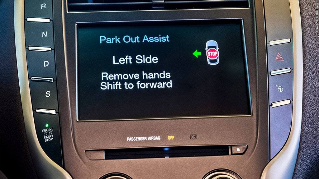
Ford Lincoln MKC control panel before engine start / stop button was moved.
Coding a function by form is one approach to differentiation, but there are others. In our everyday life, we only hear about color coding. But there are others: encoding by size, texture, location and method of work. All of these six are our allies in the design of error-proof interfaces.
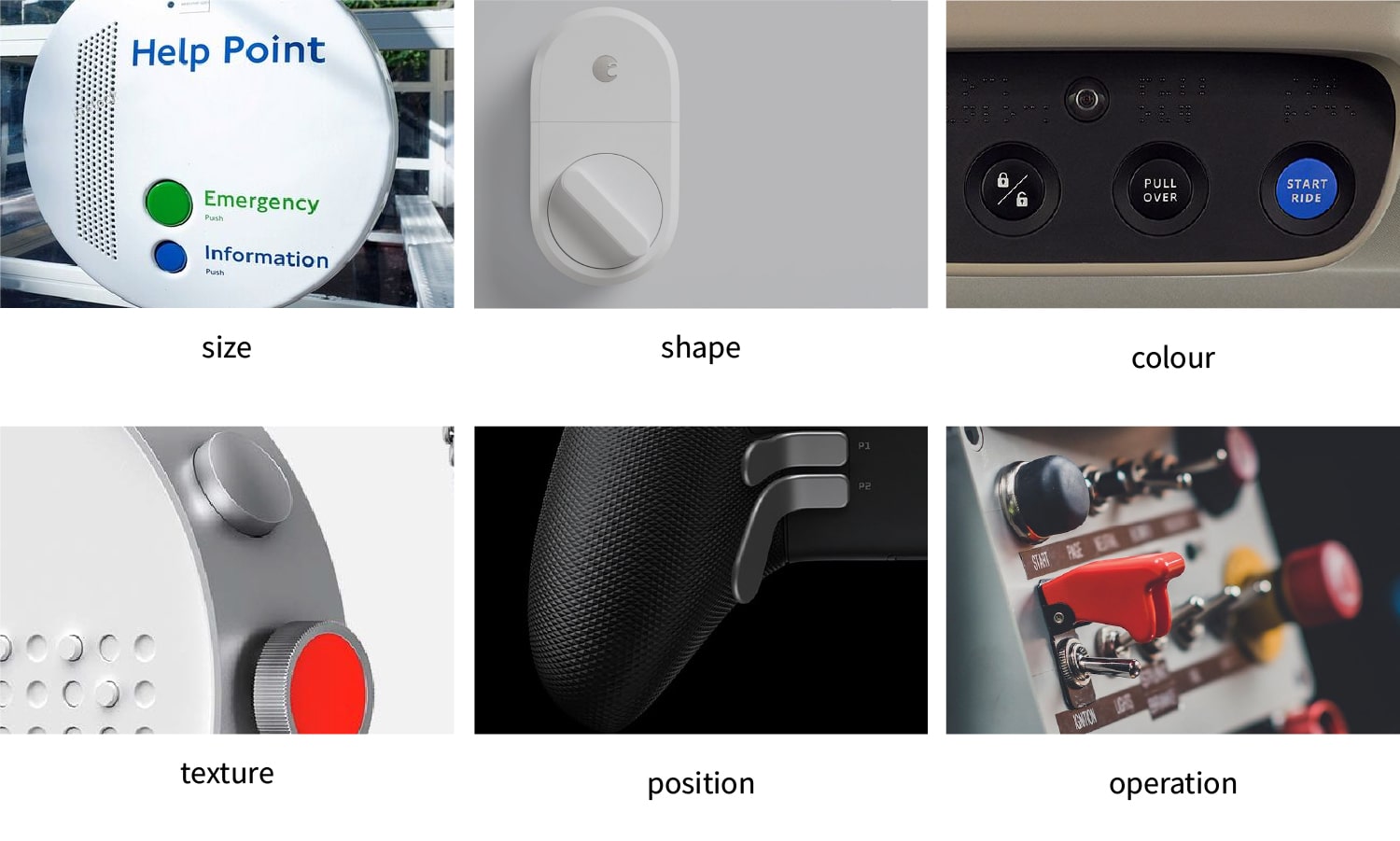
Six basic methods for coding a function. Notice how some of the examples provided use multiple encoding options at the same time.
From left to right, top to bottom: size, shape, color, texture, location, method of work.
It is based on methods of encoding size, color and shape - they can quickly solve many interface problems. Texture is also great for blind work - especially on shallow spinners for fine tuning.
Layout coding seems to be an obvious thing, but it is often not used in full force. Devices with an obvious ergonomic shape (like binoculars or a game controller) can use the natural position of the hands to differentiate between primary and secondary actions.
Finally, work coding assigns different types of movement to different input devices (such as pivoting or vertical sliding). This approach can work great when the type of movement of the input device matches the operation it controls - for example, a crane lifts a load when a lever is raised.
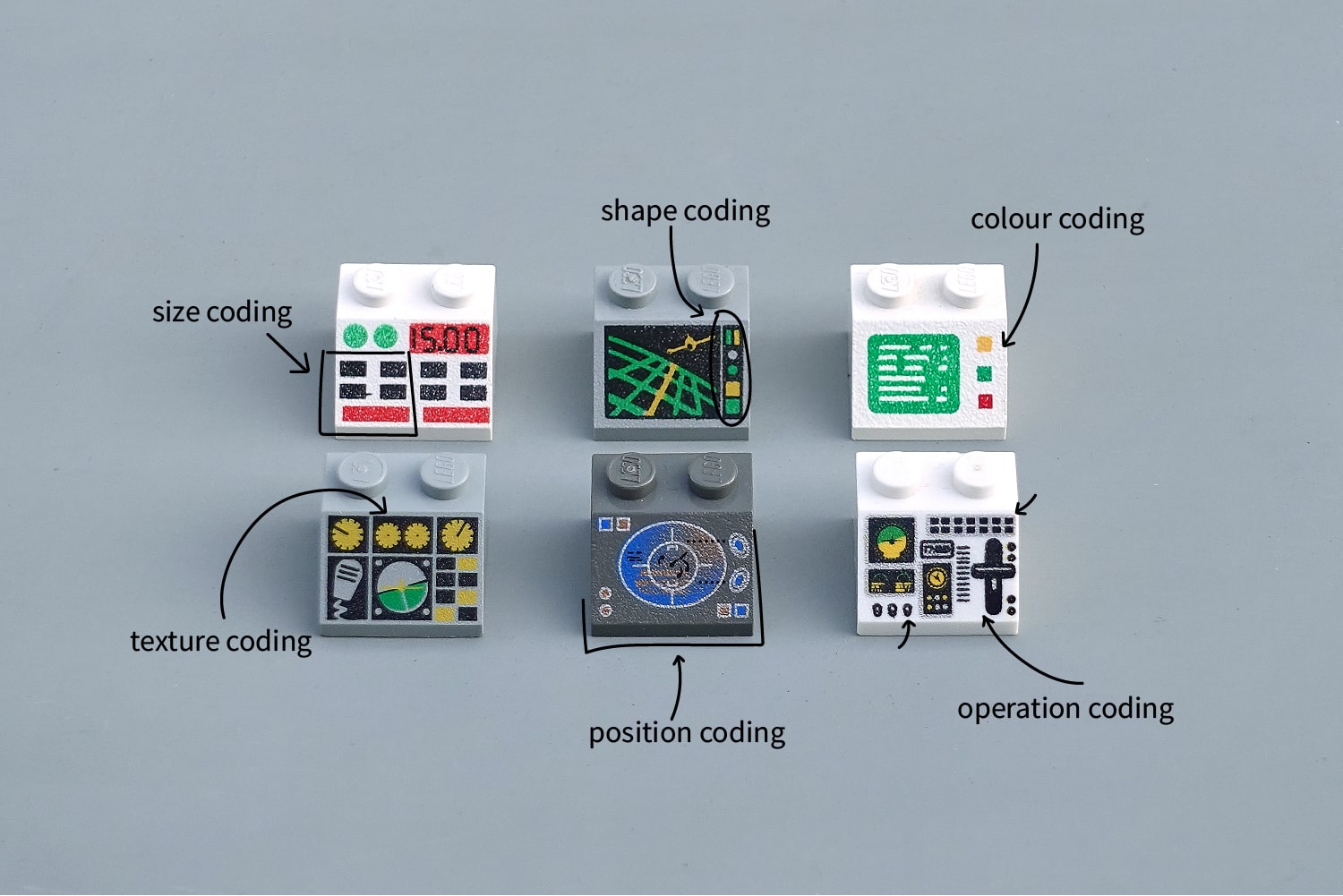
Six different types of coding in Lego interfaces (left to right, top to bottom): size, shape, color, texture, position, method of work.
Differentiation is a good first step to avoid confusing adjacent switches. However, only good organization of input devices will allow us to convey clear and precise mental models of interfaces to the user.
Organization of input devices
Compare the following three panels. The layout of the controls is identical, but the blue bar looks much clearer than the white one. The principles of gestalt work here, combining related entities in one area.
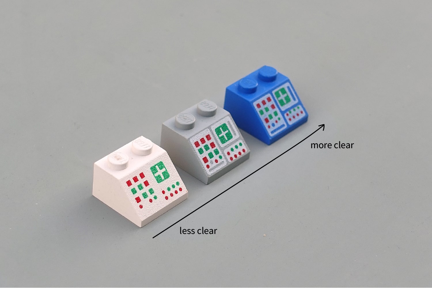
Basic differentiation by the grouping method
Quite simple. But how do we decide which input devices to group?
I like to use Soviet control panels as a starting point . These beautiful walls of mindless twists and turns come to life, organized into giant factory schemes. It would be difficult to think of a more literal organization of information.
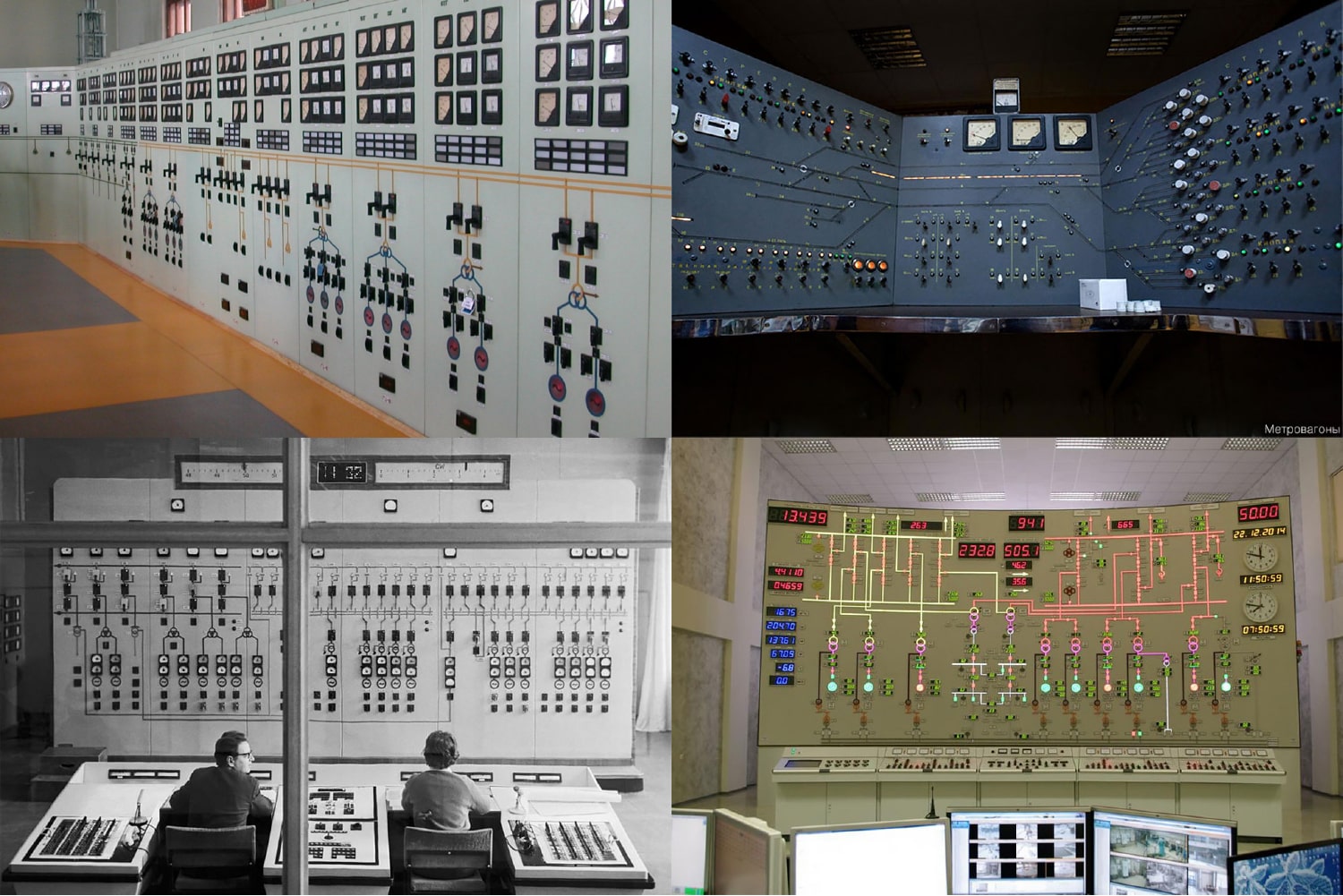
I would call such panels a consolidated interface. All input and feedback elements are collected on one panel. This approachchose Dyson for his car . Now imagine the opposite example - we moved all these switches and lights to the actual valve locations in the factory. Sounds ridiculous - however, these ventilation grilles on the Audi TT show that the distributed approach can also be a great fit for users. I wrote extensively about distributed interfaces last year.
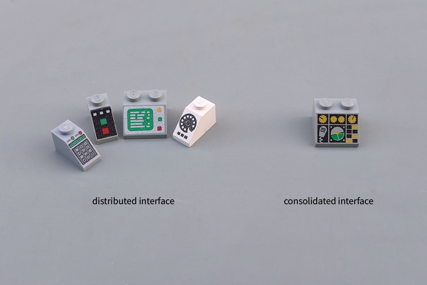
Lego car panels: distributed interface (left) versus consolidated (right)
Let's go back to the Soviet factories. Their interface panels were excellent at answering the question "Does this valve allow water to enter reservoir B?" However, they were completely unsuitable for finding an answer to a question like "are all water valves closed?" or "where are all the switches that I need to prepare for shift transmission?"
Lego uses the Soviet approach for fantastic panels , since the schematic perfectly conveys the mental model of how someone else's system works. However, for everyday use, there are several other, more convenient approaches.
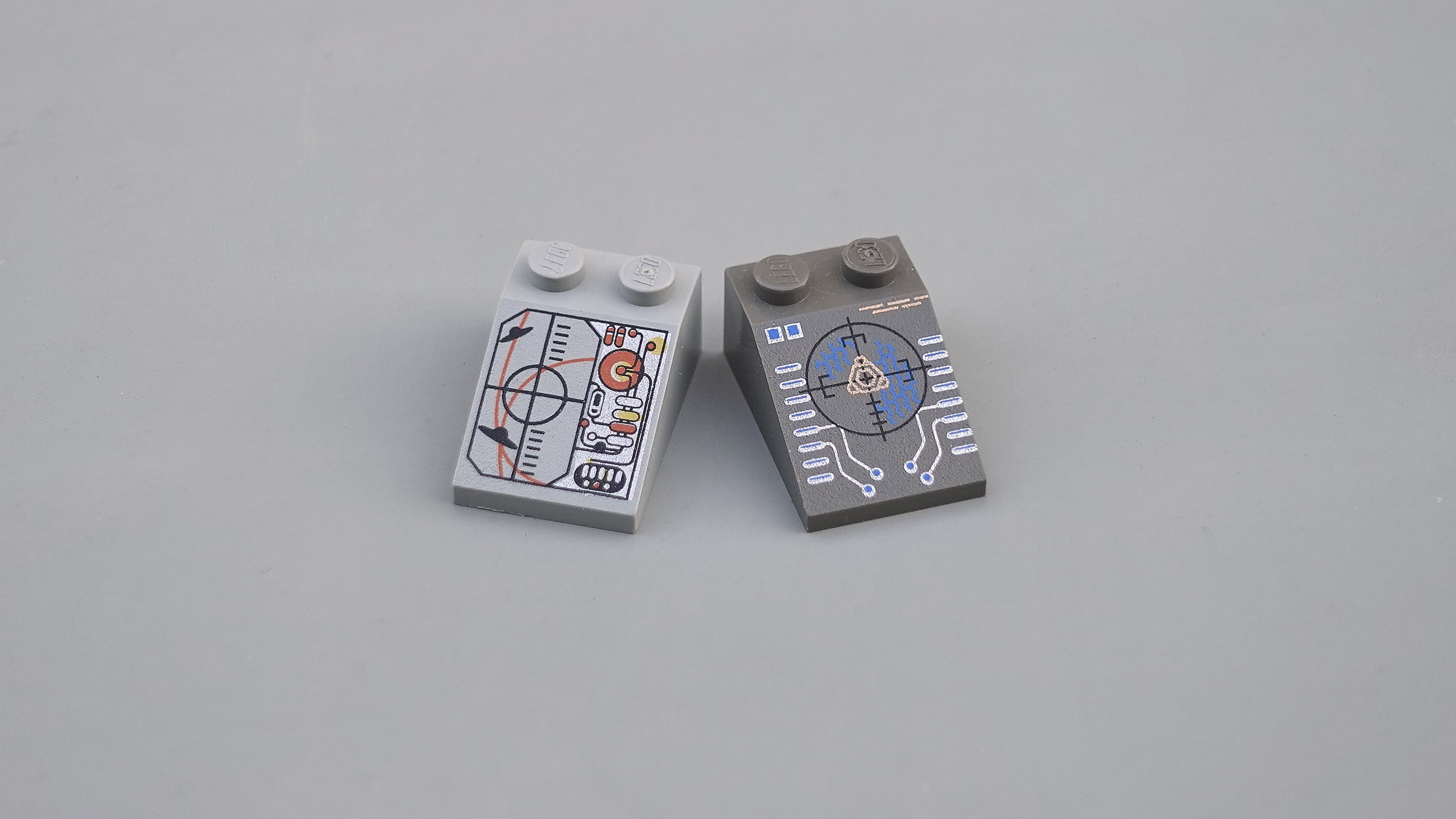
Lego's Insectoid and UFO interfaces. I wonder what exactly these buttons are responsible for?
The most popular design philosophy, which can probably be called the “default” philosophy, is organization based on functionality. Group together all input and output devices for each product feature. The next coronavirus ventilator from Cambridge Consultants will be a great example of this approach - however, we often see this in cars as well, when grouping sets of input devices for ventilation control, and placing all the controls on the side lights on one lever.
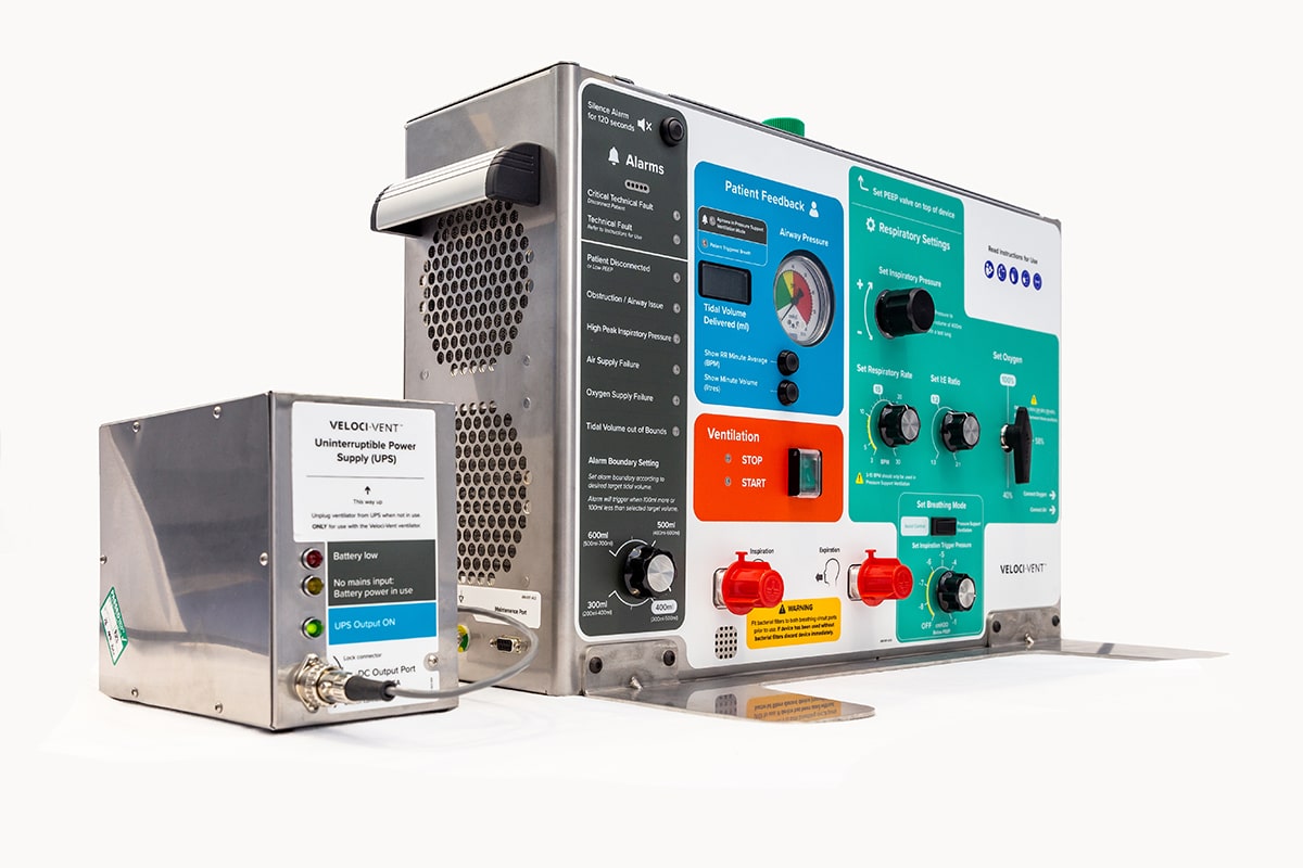
Coronavirus ventilator from Cambridge Consultants with a clear functional organization.
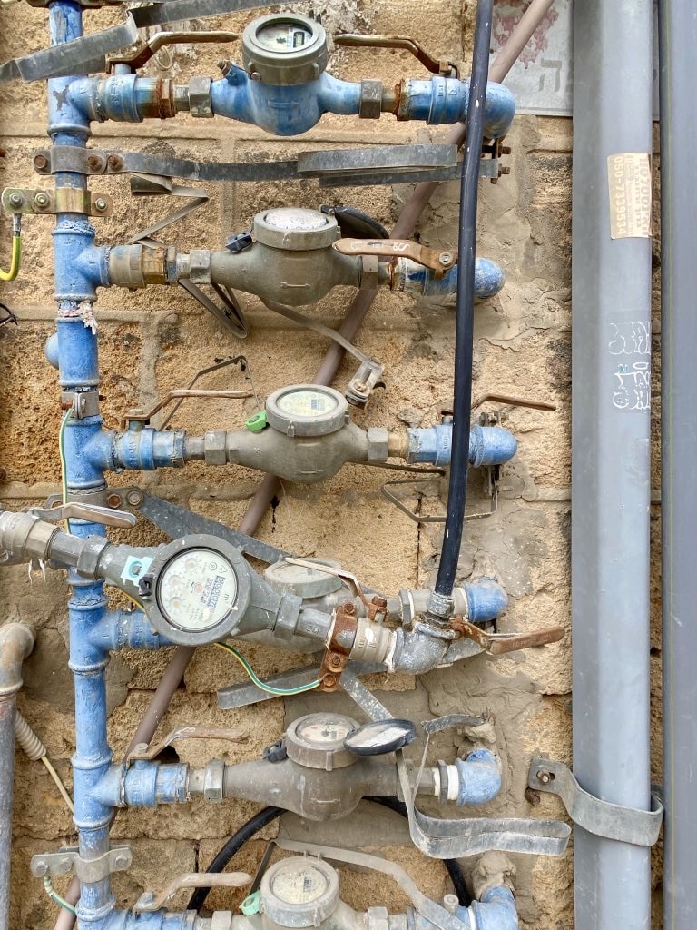
A method of operation organization puts all the switches that work in a certain way in one place. I have no idea what all these valves are for in the photo, but I bet that not all of them open related things. Every time you see a series of switches that look and work the same, but control disparate parts of the system, you are faced with a way of working organization.
Most interfaces today are essentially fly-by-wire control systemshowever, historically, the lever that you pulled, for example, while in the tractor cab, actually moved the hydraulic pistons located under the seat. Dissolving all of these different electrical, mechanical and hydraulic systems can seriously harm the interface grouping and lead to a technology organization.
The modern equivalent of this approach is surprisingly common. It is used by any touch screen with buttons located next to it. In the future, SpaceX may place these physical controls right next to the information they affect, but for now they sit awkwardly next to the screen, as if they should.
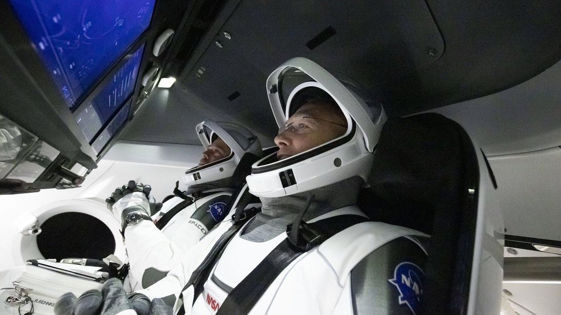
Bob and Doug in the SpaceX Dragon capsule
In Lego, we meet with feature-based organization in the Monitor with -19 ° pattern panel. Two explicit groups of controls - perhaps for temperature control and for vital signs tracking. I don’t know what all these switches in the second panel do, however they are clearly grouped by method of operation, not by functionality.
There are many Lego panels with the same technology separation seen in the SpaceX Dragon capsule, but I like to imagine how this police unit from the early 90s had to separate audio and video playback, since the new reel-to-reel technology was incompatible with an analog telephone line. A technology organization works here.
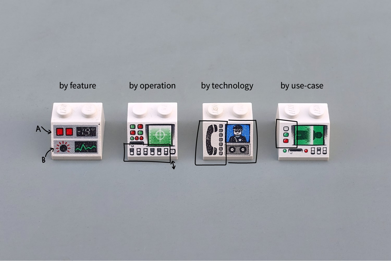
Left to Right: Organizing by Functionality, Method of Operation, Technology, and Situations
So far, all our approaches — organization by function, method of operation, or technology — have been tied to the properties of the system, not the user. An alternative to this is to organize by use cases - grouping by the user's daily tasks.
Imagine workers arriving at a Lego factory every morning to scan people. Grouping controls by task (preparing the car, loading the body, starting the scan) implies the separation of the irradiation and scanner buttons in many areas of the panel. It will be more difficult for a computer, but more convenient for an operator. Only the developer and users will decide what works best for them.
But which interface is better?
I often say that there cannot be a better interface, but there are plenty of examples of the worst interfaces.
However, I have three favorite examples. Nice and visually understandable layout of controls with good differentiation of input devices and simple, clear organization. I would proudly sit at any of these consoles:
