flex? It allows you to set property values flex-grow, flex-shrinkand flex-basis. I noticed that this property is most often used in a view flex: 1, which allows a flex item to stretch to take up available space.
In this article, I want to talk about a shorthand property and the properties that are set using it. I'm going to talk about when and why you can use these properties, I will give practical examples.
flex
Flex-grow property
The CSS property is
flex-growused to adjust what is called the flex grow factor, which allows those elements to stretch to fill the available space. Only integers can be used as values for this property. Let's look at an example.
Here's the HTML markup:
<div class="wrapper">
  <div class="item item-1"></div>
  <div class="item item-2"></div>
  <div class="item item-3"></div>
</div>
Here are the styles:
.wrapper {
    display: flex;
    flex-wrap: wrap;
}

.item {
    flex-grow: 1;
}
A property
flex-growcan affect the width or height of an element, depending on the value of the property flex-direction. When considering the following examples, keep in mind that the property they use is flex-directionset to the default value ( row). If this is not the case, I will tell you about it.
Note that without being used
flex-grow, the flex items will be set to their default width, which is equal to their original width. And if used flex-grow: 1, then the available free space is distributed among the elements.

Above, the flex-grow property doesn't apply. Below is flex-grow: 1 You
might be wondering how exactly the free space is allocated between flex items. This is a good question. I will answer it soon.
The following illustration shows how the elements look without using the property
flex-grow. In other words, items are shown here at their normal size.

The flex-grow property is not used
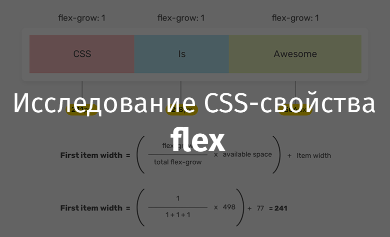
To understand how the width of flex items is calculated, take a look at the formulas below. I found these formulas in the material of Samantha Ming (for which I thank her!).
Let's calculate the width of the first element - the one containing the text
CSS.

Finding the Width of an Element
So, the following formula is used here:
= ((flex-grow / flex-grow) * ) +
Let's analyze this formula:
flex-growIs the growth factor specified for the item.flex-growIs the sum of the values of the growth factors of all elements.flex-grow.flex-grow.
Substitution of real values into this formula results in the following:
= ( (1 / 3) * 498) + 77 = 241
Different flex-grow values for different items
In the previous example, the same value was used for all flex items
flex-grow. Now let's try to assign a property to the first element flex-grow: 2. How will the width of the elements be calculated now? When considering the following formula, keep in mind that the width of the free space in our example is 498px.

Finding the Width of an Element in a Situation When Different Elements Have Different Flex-Grows
As you can see, this uses the same mechanism for calculating the width of elements that was discussed above. The main difference is that the value
flex-growfor the first element is set as2, which is reflected in the formula for calculating the width of the elements.
Can 0 be used as flex-grow value?
Of course you can! Since the property
flex-growaccepts integer values, and can be written to it 0. This means that we don't want the flex item to resize to take up some of the container's free space.

Consequences of Setting the Flex-Grow Property to 0
As you can see, the element to which the property is assigned
flex-grow: 0does not change width. This technique can be useful when you want a flex item to maintain its original width.
Flex-grow doesn't make items the same
There is a common misconception that usage
flex-growallows matching elements to have the same width. This is mistake. The point of use flex-growis to distribute the available space between the elements. As you can see by analyzing the above formulas, the final width of flex items is calculated based on their original width (that is, what they had before being applied flex-grow).
If you need to make all elements from a certain set have the same width, then know that you can do this using the property
flex-basis. We'll talk about this below.
Flex-shrink property
The property
flex-shrinkallows you to set the so-called flex shrink factor. If all flex items are larger than the size of their container, the items will be scaled down according to their assigned property values flex-shrink.

The flex-shrink property is assigned to the center item: 1
Here are the styles for this example:
.item-2 {
    width: 300px;
    flex-shrink: 1;
}
The browser will make the element's width
item-2equal 300pxwhen the following conditions are met:
- The total width of all elements is less than the width of the container.
- The page viewport width is equal to or greater than the element width.
This is how the elements from the previous example behave when displayed in viewports of different widths.

The width of the element with the text Is does
not shrink as long as there is enough space on the screen to display it. As you can see, the element does not shrink, maintaining its width in
300pxas long as there is enough room for it.
Flex-basis property
The property
flex-basissets the base size of the flex item, which it has before free space is allocated according to the flexibility factors set by the flex-growand properties flex-shrink. By default, for all values except autoand content, the value flex-basisis equal to the element's width, and when using the property flex-direction: column, its height.
The property
flex-basisaccepts the same values that the widthand properties can take height. The default value is autoone that is set based on the value content. The value contentis set automatically based on the size of the flex item's content.
Let's apply the
item-1following styles to the element from our example:
.item-1 {
    flex-grow: 0;
    flex-shrink: 0;
    flex-basis: 50%;
}

Usage of flex-basis property: 50%
Here the first item is assigned a property
flex-basis: 50%. In this case, it is important to reset it to a0propertyflex-grow, which will allow you to make sure that the size of the element does not exceed50%.
What happens if you write a
flex-basisvalueto the property instead100%? This will cause the element to occupy 100% of the parent element's width, and other elements to wrap to a new line.
Here are the relevant styles:
.item-1 {
    flex-grow: 0;
    flex-shrink: 0;
    flex-basis: 100%;
}

The result of using the flex-basis property is 100%;
The shorthand flex property
The property
flexallows, in shorthand format, to set property values flex-grow, flex-shrinkand flex-basis. The default that this property takes is auto. It matches flex: 0 1 auto. This means that it allows flex items to grow in size based on the size of their content.
In this context, I would like to draw your attention to one important detail. We are talking about flex items with absolute and relative sizes. And by the way, this has nothing to do with CSS positioning . This applies to the flexbox model.
Flex items with relative sizes
Here's the CSS:
.item {
    /* ,   ,  flex: 1 1 auto */
    flex: auto;
}
Here, flex items are sized based on their content. As a result, items with more content will appear larger.

An element with more content will have more
Flex items with absolute dimensions
If, unlike the previous example, the property
flex-basisis set to a value 0, this will cause all flex items to grow to the same size.
Here's the style:
.item {
    /*  flex: 1 1 0% */
    flex: 1;
}

Items are the same size
Flex property features that I love
The very name of the property
flexhints that it can work flexibly with the values passed to it. This gives it some features that I find attractive. Let's look at some examples.
▍Single value without units
Here's the CSS:
.item {
    flex: 1;
}
Here, a
flexsingle value without units is written to the property . This value will be interpreted by the system as the value of the property flex-grow. Its equivalent will look like flex: 1 1 0.
▍Two values without units
Let's take a look at the following style:
.item {
    flex: 1 1;
}
Here we explicitly set the values
flex-growand respectively flex-shrink. This flex-basiswill reset to the default.
▍Single value representing a certain size
Let's talk about how the following style will be "decoded":
.item {
    flex: 100px;
    /* flex: 1 1 100px */
}
The value
100pxwill be treated by the system as a value flex-basis. And in flex-growand flex-shrinkwill, by default, be written 1.
▍Using 0 without specifying units
Suppose you want to set
flex-basisto a value 0using the property flex. To solve this problem, we will decide to do this:
.item {
    flex: 0;
}
It is not recommended to do so, as it can confuse both those who will read such code and the browser. How to understand - what exactly this one refers to
0? To the property flex-grow, flex-shrinkor flex-basis? In general, the confusion turns out. Here's what the CSS spec says about it : A
zero without a unit of measurement, without two slenderness values before it, should be interpreted as a slenderness value. To avoid misinterpretation or misleading property declarations, authors should use units when specifying flex-basis to zero, or precede this value with two flex-basis values.
That is, in order to avoid ambiguities, the above code should be rewritten as follows:
.item {
    flex: 0%;
    /* flex: 1 1 0% */
}
A construction is used here
0%, but you can, for example, use a construction 0px.
Use the shorthand flex property
When you need to set properties
flex-grow, flex-shrinkand flex-basis, it is best to use a shorthand property for that flex.
A quick look at the CSS spec :
Authors are encouraged to manage flex items using the flex shorthand property rather than using fully qualified property names directly, as applying the shorthand property will correctly reset unspecified values to a state that matches common uses.
Use cases and practical examples
▍User avatars

An avatar configured with the flex property
The flexbox model is often used to style user-related page components. For example, this concerns the user's avatar and the corresponding signature, which must be on the same line.
Here's the markup:
<div class="user">
    <img class="user__avatar" src="shadeed.jpg" alt="" />
    <div>
        <h3>Ahmad Shadeed</h3>
        <p>Author of Debugging CSS</p>
    </div>
</div>
Here's the style:
.user {
    display: flex;
    flex-wrap: wrap;
    align-items: center;
}

.user__avatar {
    flex: 0 0 70px;
    width: 70px;
    height: 70px;
}
Notice that when I set up the element
user__avatar, I applied the property flex: 0 0 70px. This is important, because without this setting, the image may not be displayed correctly in some outdated browsers. Moreover, the priority of the property is flexhigher than the priority of the property width(when it comes to the situation in which it is applied flex-direction: row) and the property height(in the situation when it is applied flex-direction: column).
If you change the size of the avatar, affecting only the property
flex, the browser will ignore what is set in the property width. Here's the relevant style:
.user__avatar {
    /*   100px,   70px */
    flex: 0 0 100px;
    width: 70px;
    height: 70px;
}
▍Element Title

Element Title
Suppose we need to style the title of an element. This heading should take up all the space available to it. You can solve this problem using the property
flex: 1:
.page-header {
    display: flex;
    flex-wrap: wrap;
}

.page-header__title {
    flex: 1;
}
▍Input field for preparing the message

Input
Box Fields like this are often found in messaging applications such as those found on Facebook and Twitter. Such a field should occupy all the space available to it. In this case, the button for sending a message must have a fixed width. This is how it looks in CSS:
form {
    display: flex;
    flex-wrap: wrap;
}

input {
    flex: 1;
    /*   */
}
This example is a good demonstration of the use of a property
flex-grow.
It should be noted that some methods of using the property are
flexnot given enough attention in publications devoted to this property. Let's fix this.
▍Align the bottom elements that are on different cards

The goal is to align both dates with the red line.
Let's say we have a CSS Grid layout with two columns. The problem here is that the dates displayed at the end of the text content of the cards are not aligned. And we need them to be on the same line shown in the previous figure.
The flexbox model can be used to solve this problem.
Here's the markup:
<div class="card">
    <img src="thumb.jpg" alt="">
    <h3 class="card__title">Title short</h3>
    <time class="card__date"></time>
</div>
You can achieve our goal by using the property
flex-direction: column. An element card__title, a header, can be styled by applying a property flex-growand making it take up all the space available to it. As a result, it turns out that the date line will appear at the bottom of the card. This will happen even if the title itself is short enough.
Here are the styles:
.card {
    display: flex;
    flex-direction: column;
}

/*   */
.card__title {
    flex-grow: 1;
}
This problem can be solved without resorting to the property
flex-grow. Namely, we are talking about using a flexbox model and a mechanism for automatically setting margins using a keyword auto. By the way, I wrote a detailed article about this .
/*   */
.card__date {
    margin-top: auto;
}
Using different values for slenderness factors
In this section, I want to talk about using properties
flex-growand flex-shrinkthat are assigned values other than 1. Now I will give some practical examples of using a similar scheme for setting these properties.
▍Control panels

A set of controls
For this example, I was inspired by the design of Facebook (I also took the icons from there). The control panel (item
actionsin the following code) has four items. The last (elementactions__item.user) has a width that is smaller than the width of the other elements. You can create such a control panel like this:
.actions {
    display: flex;
    flex-wrap: wrap;
}

.actions__item {
    flex: 2;
}

.actions__item.user {
    flex: 1;
}
▍Animation in which the element is stretched

Element stretches when you hover over it
Flex items can animate when you hover over them. This technique can be extremely useful. Here's the relevant CSS:
.palette {
    display: flex;
    flex-wrap: wrap;
}

.palette__item {
    flex: 1;
    transition: flex 0.3s ease-out;
}

.palette__item:hover {
    flex: 4;
}
Here you can find a video demonstrating it all in action.
▍Increase the size of the active card
I really like this project on CodePen, which implements a mechanism for increasing the size of the card with a description of the tariff plan, which the user clicked on. The card is resized by setting its property
flex-growto a value 4.

Increase the size of the active card
▍What if the contents of the container are larger than the container itself?

Items do not fit into the container
Some time ago I received an email from one of my readers who told me about a problem he had and asked for help with solving it. The essence of this problem is presented in the previous figure. There are a couple of images here that should be within the container element, but these images are larger than the container.
Let's try this style:
.wrapper {
    display: flex;
}

.wrapper img {
    flex: 1;
}
But even when using the properties, the
flex: 1images are not placed in the container. Referring to the CSS spec :
Flex items, by default, do not shrink to less than the size of their content (the length of the longest word or fixed-sized element). To change this, you need to use the min-width or min-height properties.
In our case, the problem is that the images are too large for the flexbox model to resize to fit in the container. You can fix it like this:
.wrapper img {
    flex: 1;
    min-width: 0;
}
See this article of mine for details.
Outcome
Here I told you about the property
flexand how to use it. I hope you learned something new and useful from this material.
Are you using the flex CSS property in your projects?
