And the developers are faced with the question - how to place the interface of a large application on a small screen of a mobile phone?

Below the cut is a story about solving the problem of a complex interface for music applications. The application was made for the VK Mini Apps platform , but, perhaps, the general principles will be suitable for other platforms as well.
History of music editor interfaces
Music editors are complex graphics-intensive programs. Even the simplest "A Christmas tree was born in the forest" consists of several tracks for drums, bass, piano, and each of the tracks contains hundreds of notes.
All this must be somehow placed on the screen, and all elements must be editable.
The UI usually looks like this:
The very principles of UX / UI for music programs have not changed for many years. This is how they looked 30 years ago:
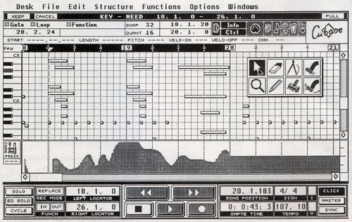
- in fact, more colors and buttons were added.
How have mobile interfaces evolved?
On the standard extensive path.
The interface of the desktop application was taken and reduced in size, and the functionality was mercilessly cut off.
Here's an example of a mobile version of FL Studio (this one is one of the best DAWs):
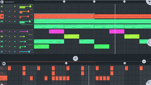
- the buttons are too small to press with your finger, the elements do not fit on the screen and are partially hidden in the drop-down menus, and the pictures of the tracks are too small to see anything.
Difficulties in porting the interface to small screens
To make the depth of the problem clearer, consider a conventional 10-band equalizer.
Most people use it without even knowing what it is. For example, here is the equalizer built into the Yandex Music service:
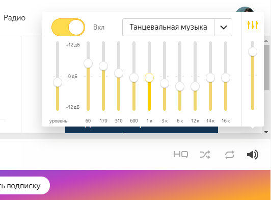
for comfortable finger pressing, buttons and scrollbars must be at least 1 cm in size. The equalizer has 10 scrollbars, i.e. its total width should be 10cm.
But this is more than the width of mobile phones! And this is just one of many controls.
It turns out that you need to either do everything small and inconvenient for pressing, or make visible only a small part of the controls, and throw away the rest or hide them in drop-down menus, etc.
Finding a solution
Are there approaches to help you create complex yet user-friendly interfaces for small screens?
Sure.
These are cards. And not only in mobile phones, but also on the desktop.
Maps use scale and visibility layers for elements. Shows millions of interactive objects on a small screen.
Most use them intuitively, which confirms the usefulness of this UX / UI approach.
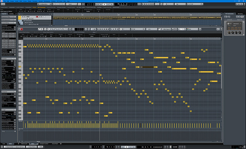
Solution example
It was decided to lay the tracks on top of each other and add scaling to the entire Piano roll along with the controls.
In statics it looks like other applications from the music field:
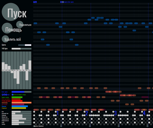
But in dynamics it is clear that its behavior is very different:
Open video of work with the application
The project from the video can be opened in VKontakte to test:
- open in app
- works both on phones and inside VKontakte feed messages
The total
application of the UI scaling approach allowed for a large number of elements to fit on a small screen.
- all elements are "close at hand" and quickly accessible
- the user has the opportunity to see the entire project as a whole, and not in parts that fit on a small screen